
Don't wanna be here? Send us removal request.
Statistics
We looked inside some of the posts by anushakowkuntla and here's what we found interesting.
Average Info
Notes Per Post
1
Likes Per Post
1
Reblog Per Post
0
Reply Per Post
0
Time Between Posts
2 days
Number of Posts By Type
Text
16
Last Seen Tumblr Blogs


Fun Fact
1,644 Tumblr posts in 1 second.
Text
Coursera- Machine Learning - Week 4 Assignment
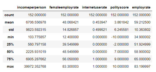
A k-means cluster analysis was conducted to identify underlying subgroups of countries based on their similarity of responses on 7 variables that represent characteristics that could have an impact on internet use rates. Clustering variables included quantitative variables measuring income per person, employment rate, female employment rate, polity score, alcohol consumption, life expectancy, and urban rate. All clustering variables were standardized to have a mean of 0 and a standard deviation of 1.
Because the GapMinder dataset which I am using is relatively small (N < 250), I have not split the data into test and training sets. A series of k-means cluster analyses were conducted on the training data specifying k=1-9 clusters, using Euclidean distance. The variance in the clustering variables that was accounted for by the clusters (r-square) was plotted for each of the nine cluster solutions in an elbow curve to provide guidance for choosing the number of clusters to interpret.
Code:
import pandas as pd import numpy as np import matplotlib.pyplot as plt import statsmodels.formula.api as smf import statsmodels.stats.multicomp as multi from sklearn.model_selection import train_test_split from sklearn import preprocessing from sklearn.cluster import KMeans
data = pd.read_csv(r'C:\Users\AL58114\Downloads\gapminder.csv', low_memory=False)
data['internetuserate'] = pd.to_numeric(data['internetuserate'], errors='coerce') data['incomeperperson'] = pd.to_numeric(data['incomeperperson'], errors='coerce') data['employrate'] = pd.to_numeric(data['employrate'], errors='coerce') data['femaleemployrate'] = pd.to_numeric(data['femaleemployrate'], errors='coerce') data['polityscore'] = pd.to_numeric(data['polityscore'], errors='coerce') data['alcconsumption'] = pd.to_numeric(data['alcconsumption'], errors='coerce') data['lifeexpectancy'] = pd.to_numeric(data['lifeexpectancy'], errors='coerce') data['urbanrate'] = pd.to_numeric(data['urbanrate'], errors='coerce')
sub1 = data.copy()
data_clean = sub1.dropna()
cluster = data_clean[['incomeperperson','employrate','femaleemployrate','polityscore', 'alcconsumption', 'lifeexpectancy', 'urbanrate']] cluster.describe()
clustervar=cluster.copy() clustervar['incomeperperson']=preprocessing.scale(clustervar['incomeperperson'].astype('float64')) clustervar['employrate']=preprocessing.scale(clustervar['employrate'].astype('float64')) clustervar['femaleemployrate']=preprocessing.scale(clustervar['femaleemployrate'].astype('float64')) clustervar['polityscore']=preprocessing.scale(clustervar['polityscore'].astype('float64')) clustervar['alcconsumption']=preprocessing.scale(clustervar['alcconsumption'].astype('float64')) clustervar['lifeexpectancy']=preprocessing.scale(clustervar['lifeexpectancy'].astype('float64')) clustervar['urbanrate']=preprocessing.scale(clustervar['urbanrate'].astype('float64'))
clus_train, clus_test = train_test_split(clustervar, test_size=.3, random_state=123)
from scipy.spatial.distance import cdist clusters = range(1,10) meandist = []
for k in clusters: model = KMeans(n_clusters = k) model.fit(clus_train) clusassign = model.predict(clus_train) meandist.append(sum(np.min(cdist(clus_train, model.cluster_centers_, 'euclidean'), axis=1)) / clus_train.shape[0])
plt.plot(clusters, meandist) plt.xlabel('Number of clusters') plt.ylabel('Average distance') plt.title('Selecting k with the Elbow Method') plt.show()
model3 = KMeans(n_clusters=4) model3.fit(clus_train) clusassign = model3.predict(clus_train)
from sklearn.decomposition import PCA pca_2 = PCA(2) plt.figure() plot_columns = pca_2.fit_transform(clus_train) plt.scatter(x=plot_columns[:,0], y=plot_columns[:,1], c=model3.labels_,) plt.xlabel('Canonical variable 1') plt.ylabel('Canonical variable 2') plt.title('Scatterplot of Canonical Variables for 4 Clusters') plt.show()
clus_train.reset_index(level=0, inplace=True)
cluslist = list(clus_train['index'])
labels = list(model3.labels_)
newlist = dict(zip(cluslist, labels)) print (newlist)
newclus = pd.DataFrame.from_dict(newlist, orient='index') newclus
newclus.columns = ['cluster']
newclus.reset_index(level=0, inplace=True)
merged_train = pd.merge(clus_train, newclus, on='index') merged_train.head(n=100)
merged_train.cluster.value_counts()
clustergrp = merged_train.groupby('cluster').mean() print ("Clustering variable means by cluster") clustergrp
internetuserate_data = data_clean['internetuserate']
internetuserate_train, internetuserate_test = train_test_split(internetuserate_data, test_size=.3, random_state=123) internetuserate_train1=pd.DataFrame(internetuserate_train) internetuserate_train1.reset_index(level=0, inplace=True) merged_train_all=pd.merge(internetuserate_train1, merged_train, on='index') sub5 = merged_train_all[['internetuserate', 'cluster']].dropna()
internetuserate_mod = smf.ols(formula='internetuserate ~ C(cluster)', data=sub5).fit() internetuserate_mod.summary()
m1= sub5.groupby('cluster').mean() m1
m2= sub5.groupby('cluster').std() m2
mc1 = multi.MultiComparison(sub5['internetuserate'], sub5['cluster']) res1 = mc1.tukeyhsd() res1.summary()
Results:


Interpretation:
The elbow curve was inconclusive, suggesting that the 2, 4, 6, and 8-cluster solutions might be interpreted. The results above are for an interpretation of the 4-cluster solution.
In order to externally validate the clusters, an Analysis of Variance (ANOVA) was conducting to test for significant differences between the clusters on internet use rate. A tukey test was used for post hoc comparisons between the clusters. Results indicated significant differences between the clusters on internet use rate (F=71.17, p<.0001). The tukey post hoc comparisons showed significant differences between clusters on internet use rate, with the exception that clusters 0 and 2 were not significantly different from each other. Countries in cluster 1 had the highest internet use rate (mean=75.2, sd=14.1), and cluster 3 had the lowest internet use rate (mean=8.64, sd=8.40).
0 notes
Text
Coursera- Machine Learning - Week 3 Assignment
Continuing on the machine learning analysis of life expectancy from the GapMinder dataset, I conducted a lasso regression analysis to identify a subset of variables from a pool of 10 quantitative predictor variables that best predicted a quantitative response variable measuring the life expectancy of the countries in the world. I have added several variables to my standard analysis that are not particularly interesting to my main question of how life expectancy of a country is affected by income in order to have more variables available for this lasso regression. The explanatory variables I have used in this model are income per person, employment rate, female employment rate, polity score, alcohol consumption, hivrate, co2 emissions, breastcancerper100th and suicideper100th. All variables have been normalized to have a mean of zero and standard deviation of one.
Code:
import pandas as pd import numpy as np import matplotlib.pyplot as plt from sklearn.model_selection import train_test_split from sklearn.linear_model import LassoLarsCV
data = pd.read_csv(r'C:\Users\AL58114\Downloads\gapminder.csv', low_memory=False)
data['internetuserate'] = pd.to_numeric(data['internetuserate'], errors='coerce') data['incomeperperson'] = pd.to_numeric(data['incomeperperson'], errors='coerce') data['employrate'] = pd.to_numeric(data['employrate'], errors='coerce') data['femaleemployrate'] = pd.to_numeric(data['femaleemployrate'], errors='coerce') data['polityscore'] = pd.to_numeric(data['polityscore'], errors='coerce') data['alcconsumption'] = pd.to_numeric(data['alcconsumption'], errors='coerce') data['lifeexpectancy'] = pd.to_numeric(data['lifeexpectancy'], errors='coerce') data['oilperperson'] = pd.to_numeric(data['oilperperson'], errors='coerce') data['relectricperperson'] = pd.to_numeric(data['relectricperperson'], errors='coerce') data['urbanrate'] = pd.to_numeric(data['urbanrate'], errors='coerce')
sub1 = data.copy() data_clean = sub1.dropna()
predvar = data_clean[['incomeperperson','employrate','femaleemployrate','polityscore', 'alcconsumption', 'lifeexpectancy', 'oilperperson', 'relectricperperson', 'urbanrate']] target = data_clean.internetuserate
predictors=predvar.copy() from sklearn import preprocessing predictors['incomeperperson']=preprocessing.scale(predictors['incomeperperson'].astype('float64')) predictors['employrate']=preprocessing.scale(predictors['employrate'].astype('float64')) predictors['femaleemployrate']=preprocessing.scale(predictors['femaleemployrate'].astype('float64')) predictors['polityscore']=preprocessing.scale(predictors['polityscore'].astype('float64')) predictors['alcconsumption']=preprocessing.scale(predictors['alcconsumption'].astype('float64')) predictors['lifeexpectancy']=preprocessing.scale(predictors['lifeexpectancy'].astype('float64')) predictors['oilperperson']=preprocessing.scale(predictors['oilperperson'].astype('float64')) predictors['relectricperperson']=preprocessing.scale(predictors['relectricperperson'].astype('float64')) predictors['urbanrate']=preprocessing.scale(predictors['urbanrate'].astype('float64'))
pred_train, pred_test, tar_train, tar_test = train_test_split(predictors, target, test_size=.3, random_state=123)
model=LassoLarsCV(cv=10, precompute=False).fit(pred_train,tar_train)
dict(zip(predictors.columns, model.coef_))
m_log_alphas = -np.log10(model.alphas_) ax = plt.gca() plt.plot(m_log_alphas, model.coef_path_.T) plt.axvline(-np.log10(model.alpha_), linestyle='--', color='k', label='alpha CV') plt.ylabel('Regression Coefficients') plt.xlabel('-log(alpha)') plt.title('Regression Coefficients Progression for Lasso Paths') plt.show()
m_log_alphascv = -np.log10(model.cv_alphas_) plt.figure() plt.plot(m_log_alphascv, model.cv_mse_path_, ':') plt.plot(m_log_alphascv, model.cv_mse_path_.mean(axis=-1), 'k', label='Average across the folds', linewidth=2) plt.axvline(-np.log10(model.alpha_), linestyle='--', color='k', label='alpha CV') plt.legend() plt.xlabel('-log(alpha)') plt.ylabel('Mean squared error') plt.title('Mean squared error on each fold') plt.show()
from sklearn.metrics import mean_squared_error train_error = mean_squared_error(tar_train, model.predict(pred_train)) test_error = mean_sqaured_error(tar_test, model.predict(pred_test)) print('training data MSE') print(train_error) print('') print('test data MSE') print(test_error)
rsquared_train=model.score(pred_train,tar_train) rsquared_test=model.score(pred_test,tar_test) print ('training data R-square') print(rsquared_train) print ('') print ('test data R-square') print(rsquared_test)
Results:


Data were randomly split into a training set that included 70% of the observations (N=42) and a test set that included 30% of the observations (N=18). The least angle regression algorithm with k=10-fold cross validation was used to estimate the lasso regression model in the training set, and the model was validated using the test set. The change in the cross-validation average (mean) squared error at each step was used to identify the best subset of predictor variables.
Of the 10 predictor variables, 8 were retained in the model. During the estimation process, income per person and hivrate were most strongly associated with life expectancy, followed by alcohol consumption, employ rate and female employee rate. The last predictors were co2emissions, breastcancerper100th and polity score. Income per person, alcconsumption, breastcancerper100th and polity score variables were positively correlated with life expectancy while hivrate, employrate, femaleemployrate and co2 emissions are negatively correlated with life expectancy. These 8 variables accounted for 63.3% of the variance in the life expectancy response variable.
0 notes
Text
Coursera- Machine Learning - Week 2 Assignment
The main drawback to a decision tree is that the tree is highly specific to the dataset it was built on; if you bring in new data to try and predict outcomes, you may not find the same high correlations that your decision tree featured. One method to overcome this is with a random forest. Instead of building one tree from your whole dataset, you subset the data randomly and build a number of trees. Each tree will be different, but the relationships between your variables will tend to appear consistently. In general though, because decision trees are intrinsically connected to the specific data they were built with, decision trees are better as a tool to analyze trends within a known dataset than to create a model for predicting the outcomes of future data.
Code:
import pandas as pd import numpy as np import matplotlib.pyplot as plt from sklearn.model_selection import train_test_split import sklearn.metrics from sklearn.ensemble import ExtraTreesClassifier
data = pd.read_csv(r'C:\Users\AL58114\Downloads\gapminder.csv', low_memory=False)
data['internetuserate'] = pd.to_numeric(data['internetuserate'], errors='coerce') data['incomeperperson'] = pd.to_numeric(data['incomeperperson'], errors='coerce') data['employrate'] = pd.to_numeric(data['employrate'], errors='coerce') data['femaleemployrate'] = pd.to_numeric(data['femaleemployrate'], errors='coerce') data['polityscore'] = pd.to_numeric(data['polityscore'], errors='coerce')
binarydata = data.copy()
#convert response variable to binary
def internetgrp (row): if row['internetuserate'] < data['internetuserate'].median(): return 0 else: return 1
binarydata['internetuserate'] = binarydata.apply (lambda row: internetgrp (row),axis=1)
#Clean the dataset
binarydata_clean = binarydata.dropna()
predictors = binarydata_clean[['incomeperperson','employrate','femaleemployrate','polityscore']] targets = binarydata_clean.internetuserate pred_train, pred_test, tar_train, tar_test = train_test_split(predictors, targets, test_size=.4)
from sklearn.ensemble import RandomForestClassifier
classifier_r=RandomForestClassifier(n_estimators=25) classifier_r=classifier_r.fit(pred_train,tar_train) predictions_r=classifier_r.predict(pred_test)
#Print the confusion matrix
sklearn.metrics.confusion_matrix(tar_test,predictions_r)
#Print the accuracy score
sklearn.metrics.accuracy_score(tar_test, predictions_r)
#Fit an Extra Trees model to the data
model_r = ExtraTreesClassifier() model_r.fit(pred_train,tar_train)
#Display the Relative Importances of Each Attribute
model_r.feature_importances_
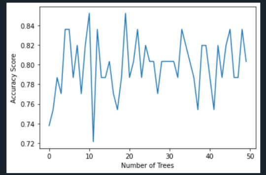
#Run a different number of trees and see the accuracy of the prediction
trees=range(50) accuracy=np.zeros(50)
for idx in range(len(trees)): classifier_r=RandomForestClassifier(n_estimators=idx + 1) classifier_r=classifier_r.fit(pred_train,tar_train) predictions_r=classifier_r.predict(pred_test) accuracy[idx]=sklearn.metrics.accuracy_score(tar_test, predictions_r)
plt.cla() plt.plot(trees, accuracy) plt.ylabel('Accuracy Score') plt.xlabel('Number of Trees') plt.show()
Results:
Interpretation:
The confusion matrix and accuracy score are similar to that of my previous post. Examining the relative importance of each attribute is interesting here. As expected, income per person is the most highly correlated with internet use rate, at 54% of the model’s predictive capability. Employment rate (15%) and female employment rate (11%) are less correlated, again, as expected. But polity score, at 20% of the model’s predictive capability, stood out to me because none of the previous models I’ve examined with this dataset have had polity score even near the same level of importance as employment rates. Interesting. Finally, the graph shows that as the number of trees in the forest grows, the accuracy of the model does as well, but only up to about 20 trees. After that, the accuracy stops increasing and instead fluctuates with the random permutations of the subsets of data that were used to create the trees.
0 notes
Text
Coursera- Machine Learning - Week 1 Assignment
My code:
import pandas as pd import sklearn.metrics from sklearn.model_selection import train_test_split from sklearn.tree import DecisionTreeClassifier
data = pd.read_csv(r'C:\Users\AL58114\Downloads\gapminder.csv', low_memory=False)
data['internetuserate'] = pd.to_numeric(data['internetuserate'], errors='coerce') data['incomeperperson'] = pd.to_numeric(data['incomeperperson'], errors='coerce') data['employrate'] = pd.to_numeric(data['employrate'], errors='coerce') data['femaleemployrate'] = pd.to_numeric(data['femaleemployrate'], errors='coerce') data['polityscore'] = pd.to_numeric(data['polityscore'], errors='coerce')
binarydata = data.copy()
def internetgrp (row): if row['internetuserate'] < data['internetuserate'].median(): return 0 else: return 1
binarydata['internetuserate'] = binarydata.apply (lambda row: internetgrp (row),axis=1)
binarydata_clean = binarydata.dropna()
binarydata_clean.dtypes binarydata_clean.describe()
predictors = binarydata_clean[['incomeperperson','employrate','femaleemployrate','polityscore']]
targets = binarydata_clean.internetuserate
pred_train, pred_test, tar_train, tar_test = train_test_split(predictors, targets, test_size=.4)
print ('Training sample') print (pred_train.shape) print ('') print ('Testing sample') print (pred_test.shape) print ('') print ('Training sample') print (tar_train.shape) print ('') print ('Testing sample') print (tar_test.shape)
classifier=DecisionTreeClassifier() classifier=classifier.fit(pred_train,tar_train)
predictions=classifier.predict(pred_test)
sklearn.metrics.confusion_matrix(tar_test,predictions)
sklearn.metrics.accuracy_score(tar_test, predictions)
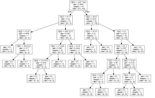
from sklearn import tree from io import StringIO from IPython.display import Image out = StringIO() tree.export_graphviz(classifier, out_file=out) import pydotplus graph=pydotplus.graph_from_dot_data(out.getvalue()) Image(graph.create_png())
Results:
Interpretation:
Decision tree analysis was performed to test non-linear relationships among the explanatory variables and a single binary, categorical response variable. The training sample has 91 rows of data and 4 explanatory variables; the testing sample has 61 rows of data, and the same 4 explanatory variables. The decision tree results in 27 true negatives and 16 true positives; and 11 false negatives and 7 false positives. The accuracy score is 70.5%, meaning that the model accurately predicted 70.5% of the internet use rates per country.
0 notes
Text
Coursera- Regression Modelling - Week 4 Assignment
Although my data set (GapMinder) does not contain any binary data, I wanted to create an example of a logistic regression model. Therefore, I divided employee rate into two categories with 0 being a “low” employee rate (defined as a rate above the median rate) and 1 being a “high” employee rate, and then compared it with income per person.
My code:
import pandas as pd import numpy as np import statsmodels.formula.api as smf import scipy.stats
data = pd.read_csv(r'C:\Users\AL58114\Downloads\gapminder.csv', low_memory=False)
data['employrate'] = pd.to_numeric(data['employrate'], errors='coerce') data['incomeperperson'] = pd.to_numeric(data['incomeperperson'], errors='coerce') data['urbanrate'] = pd.to_numeric(data['urbanrate'], errors='coerce')
binarydata = data.copy()
def employeerate (row): if row['employrate'] < data['employrate'].median(): return 0 else: return 1
binarydata['employrate'] = binarydata.apply (lambda row: employeerate (row),axis=1)
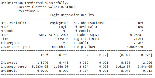
lreg1 = smf.logit(formula = 'employrate ~ incomeperperson', data = binarydata).fit() lreg1.summary()
np.exp(lreg1.params)
params = lreg1.params conf = lreg1.conf_int() conf['OR'] = params conf.columns = ['Lower CI', 'Upper CI', 'OR'] np.exp(conf)
lreg2 = smf.logit(formula = 'employrate ~ incomeperperson + urbanrate', data = binarydata).fit() print (lreg2.summary())
params = lreg2.params conf = lreg1.conf_int() conf['OR'] = params conf.columns = ['Lower CI', 'Upper CI', 'OR'] np.exp(conf)
Results:


Summary:
My first examination was of internet use rate versus income per person. I found that the relationship is highly significant, with a p-value of 0.000. The odds ratio came out to be 1.000608, which indicates that as income per person goes up, so will the internet use rate. However, the odds ratio is very close to 1, so the correlation is not particularly strong. The 95% confidence interval for this odds ratio is 1.000403 to 1.000813, which is a fairly small interval, telling us that our odds ratio is most likely accurate to several decimal places.
Next, I brought employment rate into the analysis as a second explanatory variable. Because it did not change the statistics of income per person much, I can be confident that it is not a confounding variable. With this additional variable, the p-value of income per person stayed the same, at 0.000, and the p-value of employment rate is 0.019. Because this is below our limit of 0.05, both variables are significant. The odds ratio of income per person is now 1.0005, and the odds ratio for employment rate is 0.944. Increasing income per person leads to increasing internet usage, but decreasing employment rates will also increase internet use. The confidence intervals for these odds ratios are similarly as small as the single-variate results.
These results match my previous analysis, that increasing employee rate will lead to an increase in the internet use rate, but conversely increasing the employment rate leads to a decrease in the internet use rate.
0 notes
Text
Coursera- Regression Modelling - Week 3 Assignment
My code:
import pandas as pd import seaborn as sns import matplotlib.pyplot as plt import statsmodels.api as sm import statsmodels.formula.api as smf import scipy.stats
data = pd.read_csv(r'C:\Users\AL58114\Downloads\gapminder.csv',low_memory = False)
data['employrate'] = pd.to_numeric(data['employrate'], errors='coerce') data['urbanrate'] = pd.to_numeric(data['urbanrate'], errors='coerce') data['oilperperson'] = pd.to_numeric(data['oilperperson'], errors='coerce') data['incomeperperson'] = pd.to_numeric(data['incomeperperson'], errors='coerce')
data_centered = data.copy() data_centered['employrate'] = data_centered['employrate'].subtract(data_centered['employrate'].mean()) data_centered['urbanrate'] = data_centered['urbanrate'].subtract(data_centered['urbanrate'].mean()) data_centered['oilperperson'] = data_centered['oilperperson'].subtract(data_centered['oilperperson'].mean())
print ('Mean of', data_centered[['employrate']].mean()) print ('Mean of', data_centered[['urbanrate']].mean()) print ('Mean of', data_centered[['oilperperson']].mean())
scat1 = sns.regplot(x="urbanrate", y="employrate", scatter=True, data=data_centered) plt.xlabel('urban rate') plt.ylabel('employee rate') plt.title ('Scatterplot for the Association Between urban rate and employee rate in a year') plt.show()
reg1 = smf.ols('urbanrate ~ employrate', data = data_centered).fit() reg1.summary()
reg2 = smf.ols('urbanrate ~ employrate + oilperperson + incomeperperson', data = data_centered).fit() reg2.summary()
reg3 = smf.ols('urbanrate ~ incomeperperson + I(incomeperperson**2)', data = data_centered).fit() reg3.summary()
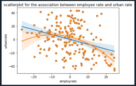
scat1 = sns.regplot(x = 'employrate', y = 'urbanrate', scatter = True, data = data_centered) scat2 = sns.regplot(x = 'employrate', y = 'urbanrate', scatter = True, order = 2, data= data_centered) plt.xlabel('employrate') plt.ylabel('urbanrate') plt.title('scatterplot for the association between employee rate and urban rate') plt.show()
fig4 = sm.qqplot(reg3.resid,line = 'r') print(fig4)
plt.figure() stdres = pd.DataFrame(reg3.resid_pearson) plt.plot(stdres, 'o', ls ='None') l = plt.axhline(y=0, color = 'r') plt.ylabel('standardized residual') plt.xlabel('observation number') plt.show()
fig2 = plt.figure() fig2 = sm.graphics.plot_regress_exog(reg3, "incomeperperson", fig=fig2) fig2
fig3=sm.graphics.influence_plot(reg3, size=8) fig3
Output:


The analysis shows that life expectancy is significantly correlated with income per person(p-value=0.000) ,employrate(p-value=0.000) and hivrate(p-value=0.000). With a coefficient of 0.0005 income per person is slightly positively correlated with life expectancy while employrate is negatively correlated with a coefficient of -0.2952 and hivrate is strongly negatively associated with a coefficient of -1.1005. This supports my hypothesis that lifeexpectancy could be predicted based upon incomeperperson, employrate and hivrate.
When I added internetuserate to my analysis, it exhibited a p-value out of range of significance, but it also threw several other variables into higher (but still significant) p-value ranges. This suggests that internetuserate is a confounding variable and is associated with the others but adding it to my analysis adds no new information.
Examining the plots posted above indicates that a curved line is a much better fit for the relationship between incomeperperson and lifeexpectancy. However, I do not believe a 2-degree polynomial line is the best; the data appears to match a logarithmic line better. Indeed, the Q-Q plot does show that the actual data is lower than predicted at the extremes and lower than predicted in the middle. This would match my theory that a logarithmic line would be a better fit. The plot of residuals has one data points fall outside -3 standard deviations of the mean; however, I am concerned that so many fall within -2 to -3 deviations. I attribute this to the poor fit of the polynomial line as compared to a logarithmic line. The regression plots and the influence plot show an alarming point (labeled 111 and 57 in the influence plot) which is an extreme outlier in terms of both residual value and influence. These points show up again in the plot Residuals versus incomeperperson and the Partial regression plot. I must examine what these points are and possibly exclude it from the rest of my analysis.
0 notes
0 notes
Text
Coursera- Regression Modelling - Week 2- Assignment
My code:
import pandas as pd import seaborn as sb import matplotlib.pyplot as plt import statsmodels.formula.api as smf data = pd.read_csv(r'C:\Users\AL58114\Downloads\gapminder.csv',low_memory = False)
data['employrate'] = pd.to_numeric(data['employrate'],errors = 'coerce') data['urbanrate'] = pd.to_numeric(data['urbanrate'],errors = 'coerce') print('OLS regression model for the association between employrate and urbanrate') reg1 = smf.ols('urbanrate ~ employrate', data = data).fit() print(reg1.summary())
scat = sb.regplot(x='employrate', y = 'urbanrate', scatter = True, data= data) plt.xlabel('employee rate') plt.ylabel('urban rate') plt.title('scatterplot for the association between employee rate and urban rate') plt.show()
data_centered = data.copy() data_centered['employrate'] = data['employrate'].subtract(data_centered['employrate']) print('mean of', data_centered[['employrate']].mean())
scat1 = sb.regplot(x='employrate', y = 'urbanrate', scatter = True, data= data_centered) plt.xlabel('employee rate') plt.ylabel('urban rate') plt.title('scatterplot for the association between employee rate and urban rate') plt.show()
reg2 = smf.ols('urbanrate ~ employrate', data = data_centered).fit() reg2.summary()
Results:


Description:
A regression model is a statistical technique that relates a dependent variable to one or more independent variables. The F-statistic is 20.51 which tells us to reject the null hypothesis or not. The association between employee rate and urban rate is slightly negative which indicates the negative value. The best fit line for this graph is urban rate = (99.6552)+ (-0.7293) i.e coefficient of employee rate and since the intercept is negative we will have a minus value -0.7293. and the mean value for the employee rate is centered as 0.0.
0 notes
Text
Coursera- Regression Modelling - Week 1- Assignment
Sample:
The sample is from the Gap minder, founded in Stockholm by Ola Rosling, Anna Rosling Rönnlund and Hans Rosling, GapMinder is a non-profit venture promoting sustainable global development and achievement of the United Nations Millennium Development Goals. It seeks to increase the use and understanding of statistics about social, economic, and environmental development at local, national, and global levels. Since its conception in 2005, Gapminder has grown to include over 200 indicators, including gross domestic product, total employment rate, and estimated HIV prevalence. Gapminder contains data for all 192 UN members, aggregating data for Serbia and Montenegro. Additionally, it includes data for 24 other areas, generating a total of 215 areas.
Procedure:
GapMinder collects data from a handful of sources, including the Institute for Health Metrics and Evaluation, US Census Bureau’s International Database, United Nations Statistics Division, and the World Bank. My sample uses mainly uses three variables namely employrate, urbanrate, oilperperson which are collected from World Bank Work Development Indicators, UNAIDS online database, Human Mortality Database respectively.
Measures:
Employee rate indicates 2007 total employees age 15+ (% of population) Percentage of total population, age above 15, that has been employed during the given year. Urban rate indicates 2008 urban population (% of total) Urban population refers to people living in urban areas as defined by national statistical offices (calculated using World Bank population estimates and urban ratios from the United Nations World Urbanization Prospect oilperperson indicates 2010 oil Consumption per capita (tones per year and person)
0 notes
Text
Coursera- Data Analysis Tools-Week 4- Assignment
My code:
import pandas import numpy import scipy.stats import seaborn import matplotlib.pyplot as plt
data = pandas.read_csv(r'C:\Users\AL58114\Downloads\gapminder.csv', low_memory = False)
data['employrate'] = pandas.to_numeric(data['employrate'],errors = 'coerce') data['urbanrate'] = pandas.to_numeric(data['urbanrate'],errors = 'coerce') data['oilperperson'] = pandas.to_numeric(data['oilperperson'],errors = 'coerce')
data_clean = data.dropna() print(scipy.stats.pearsonr(data_clean['employrate'],data_clean['urbanrate']))
def employerate (row): if row['employrate'] <= 50: return 1 if row['employrate'] <= 70: return 2 if row['employrate'] > 70: return 3
data_clean['employerate'] = data_clean.apply (lambda row: employerate (row),axis = 1)
check = data_clean['employerate'].value_counts(sort=False, dropna = False) print(check)
sub1= data_clean[(data_clean['employerate'] == 1)] sub2= data_clean[(data_clean['employerate'] == 2)] sub3= data_clean[(data_clean['employerate'] == 3)]
print ('association between employerate and urbanrate in the countries') print (scipy.stats.pearsonr(sub1['employrate'], sub1['urbanrate'])) print (' ')
print ('association between employrate and urbanrate for moderate employee rate countries') print (scipy.stats.pearsonr(sub2['employrate'], sub2['urbanrate'])) print (' ')
print ('association between employrate and urbanrate for high employee rate countries') print (scipy.stats.pearsonr(sub3['employrate'], sub3['urbanrate'])) print (' ')
scat1 = seaborn.regplot(x = "employrate", y = "urbanrate", data = sub1) plt.xlabel('employee rate') plt.ylabel('urban rate') plt.title('association between employee rate and urban rate in low employee rate countries') print(scat1)
scat2 = seaborn.regplot(x = "employrate", y = "urbanrate", data = sub1) plt.xlabel('employee rate') plt.ylabel('urban rate') plt.title('association between employee rate and urban rate in moderate employee rate countries') print(scat2)
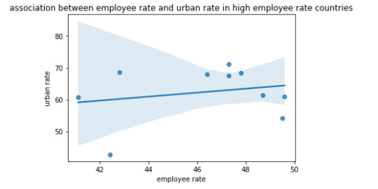
scat3 = seaborn.regplot(x = "employrate", y = "urbanrate", data = sub1) plt.xlabel('employee rate') plt.ylabel('urban rate') plt.title('association between employee rate and urban rate in high employee rate countries') print(scat3)
Results:


Interpretation or the overall summary:
For every sub range urban rate is negatively associated with employee rate.
There are around 48 countries who has less than 70 employee rate, and around 10 countries which have less than 50 as their employee rate. and there exists only 4 countries which have more then 80% as their employee rate.
There is very significant value of 0.2235 as a co-efficient value and p value is 0.534 for low employee rate countries. It indicates the slightest positive value, where the same is indicating in the scatter plot association between the employee rate and urban rate.
0 notes
Text
Coursera- Data analysis Tools- week 3- Assignment
My Code:
import pandas import numpy as np import seaborn as sb import scipy import matplotlib.pyplot as plt
data = pandas.read_csv("C:/Users/AL58114/Downloads/gapminder.csv", low_memory = False)
data['employrate'] = pandas.to_numeric(data['employrate'], errors = 'coerce') data['urbanrate'] = pandas.to_numeric(data['urbanrate'], errors = 'coerce') data['oilperperson'] = pandas.to_numeric(data['oilperperson'], errors = 'coerce')
data['employrate'] = data['employrate'].replace(' ',np.nan) data_clean = data.dropna()
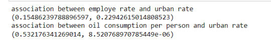
print('association between employe rate and urban rate') print(scipy.stats.pearsonr(data_clean['employrate'], data_clean['urbanrate']))
print('association between oil consumption per person and urban rate') print(scipy.stats.pearsonr(data_clean['oilperperson'], data_clean['urbanrate']))
scat = sb.regplot(x = 'employrate', y = 'urbanrate', fit_reg = True, data= data) plt.xlabel = 'employee rate' plt.ylabel = 'urban rate in an year' plt.title = 'scatterplot for the association between employee rate and urban rate'
scat1 = sb.regplot(x = 'oilperperson',y = 'urbanrate',fit_reg = True, data= data) plt.xlabel = 'oil consumption per person in a year' plt.ylabel = 'urban rate in a year' plt.title = 'scatterplot for the association between oil consumption per person and urban rate'
Results:


Interpretation:
A correlation coefficient is a numerical measure and its meaning is statistical relationship between two variables. The variables may be two columns of a given data set of observations, often called a sample, or two components of a multivariate random variable with a known distribution.
The association between the two variables i.e employrate and urban rate is given as below. The correlation between the other two variables i.e oilperperson and urban rate is given as follows:
0 notes
Text
Coursera-Data Analysis Tools- Week 2-Assignment
A Chi-Square test is a test of independence between 2 categorical variables. It compares the frequencies you observe in certain categories to the frequencies you might expect to get in those categories by chance.
This week I am continuing with the Gapminder dataset.
My hypothesis for the Chi-Square test, I have mentioned them in the previous week assignment.
My Code:
import pandas as pd import seaborn as sb import scipy.stats import matplotlib.pyplot as plt
data =pd.read_csv(r'C:\Users\AL58114\Downloads\gapminder.csv',low_memory = False)
data['employrate'] = pd.to_numeric(data['employrate'],errors = 'coerce') data['urbanrate'] = pd.to_numeric(data['urbanrate'],errors = 'coerce')
sub = data.copy()
sub1 = sub[['employrate','urbanrate']].dropna() sub1['employee_rate'] = pd.cut(sub1.employrate, 3, labels=['low','mid','high']) sub1['urban_rate'] = pd.cut(sub1.urbanrate, 2 , labels = ['low','high']) sub2 = sub1.copy()
#chi-square test
ch = pd.crosstab(sub2['employee_rate'], sub2['urban_rate']) ch
colsum = ch.sum(axis = 0) colpercent = ch/colsum colpercent
cs = scipy.stats.chi2_contingency(ch) cs
sb.factorplot(x='employee_rate',y = 'urbanrate', data = sub2, kind = "bar", ci = None) plt.xlabel('employee rate') plt.ylabel('urban rate')
#post-hoc tests
recode = {'low': 'low', 'mid': 'mid'} sub2['COMP-Low-v-Mid'] = sub2['employee_rate'].map(recode) ct1 = pd.crosstab(sub2['urban_rate'],sub2['COMP-Low-v-Mid']) ct1
colsum = ct1.sum(axis=0) colpercent = ct1/colsum colpercent
cs1 = scipy.stats.chi2_contingency(ct1) cs1
recode1 = {'low': 'low','High': 'High'} sub2['COMP-Low-v-High'] = sub2['employee_rate'].map(recode1) ct2 = pd.crosstab(sub2['urban_rate'],sub2['COMP-Low-v-High']) ct2
colsum = ct2.sum(axis = 0) colpercent = ct2/colsum colpercent
cs2 = scipy.stats.chi2_contingency(ct2) cs2
recode2 = {'mid': 'Mid', 'High': 'High'} sub2['COMP-v-High'] = sub2['employee_rate'].map(recode2) ct3 = pd.crosstab(sub2['urban_rate'], sub2['COMP-v-High']) ct3 colsum = ct3.sum(axis = 0) colpercent = ct3/colsum colpercent cs3 = scipy.stats.chi2_contingency(ct3) cs3
Results:


Here, my explanatory variable is employee rate and has 3 groups i.e low, mid, and high so I conducted Chi-square post-hoc tests to determine which groups are different from others. My response variable is urban rate which has 2 groups i.e low and high.
0 notes
Text
Coursera - Data Analysis Tools- Week 1 assignment
In the previous module I have selected the gapminder dataset as per my interest. Since I have read and understood the dataset keenly, I will continue with the same dataset in this module.
My code:
#importing libraries import pandas as pd import numpy as np import statsmodels.formula.api as smf import statsmodels.stats.multicomp as multi data = pd.read_csv(r"C:/Users/AL58114/Downloads/gapminder.csv",low_memory = False)
data['employrate'] = pd.to_numeric(data['employrate'], errors = 'coerce') data['urbanrate'] = pd.to_numeric(data['urbanrate'],errors = 'coerce')
sub = data.copy()
sub2 = sub[['employrate','urbanrate']].dropna() sub2['employee_rate'] = pd.cut(sub2.employrate, 3, labels=['low','mid','high'])
model = smf.ols(formula = 'urbanrate~C(employee_rate)', data = sub2) results = model.fit() results.summary()
m = sub2.groupby('employee_rate').mean() m
sd = sub2.groupby('employee_rate').std() sd
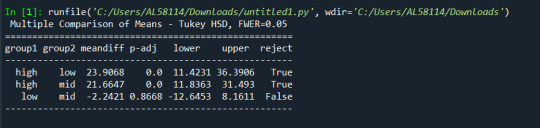
mc = multi.MultiComparison(sub2['urbanrate'], sub2['employee_rate']) res = mc.tukeyhsd() print(res.summary())
Output:
Hypothesis for the test:
Null Hypothesis: There is no relationship between the means of the urban rate and increase in employee rate with the increase in urban rate. Alternative Hypothesis: There is a relationship between the employee rate and urban rate variables.
Here, I am analyzing the two variables i.e employee rate, a categorical variable and urban rate, a quantitative variable. Employee rate is categorized into low, med, and high. Then I performed analysis of variance (ANOVA).
0 notes
Text
Coursera - Data Management and Visualization - Week 4 assignment
The new code for this week assignment is found below. The code to import the data and convert it can be found in my earlier posts.
My code:
#univariate analysis for employe rate
sn.displot(data['employrate'].dropna(),kde= False) plt.xlabel('Employee rate in a year') plt.ylabel('Countries') plt.title('Distribution of employee rate')
#univariate analysis for urban rate
sn.displot(data['urbanrate'].dropna(),kde= False) plt.xlabel('urban rate in a year') plt.ylabel('Countries') plt.title('Distribution of urban rate')
#univariate analysis for oil consumption per person
sn.displot(data['oilperperson'].dropna(),kde= False) plt.xlabel('oil consumption in a year') plt.ylabel('Countries') plt.title('Distribution of oil consumption ')
scatt = sn.regplot(x='employrate',y='urbanrate', data=data) plt.xlabel('employee rate per year') plt.ylabel('urban rate') plt.title('Scatterplot for the association between employee rate and urban rate')
scatt1 = sn.regplot(x='oilperperson',y='urbanrate', data=data) plt.xlabel('oil consumption per person in a year') plt.ylabel('urban rate') plt.title('Scatterplot for the association between oil consumption and urban rate')
Results:

The quantitative distribution graph for the employment rate shows the unimodal distribution. The average employment rate is 55% .

In the above univariate graph for urban rate, it is a left-skewed distribution. Since it is longer on the left side of its peak than its right side.
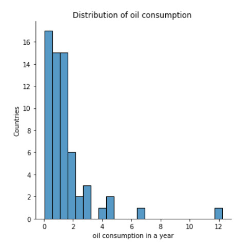
The quantitative and univariate graph shown above is for the oil per person consumption in a year. The above graph is a right skewed distribution, it occurs when the long tail is on the right side of the distribution.
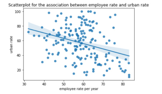
The above scatter plot shows the relation between employee rate and urban rate. These two are quantitative variables. There is a weaker negative relationship between the employee rate and urban rate.
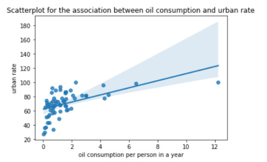
The above scatter plot implies the relation between employee rate and urban rate. These two are quantitative variables. There is a positive relation between the oil consumption and urban rate.
0 notes
Text
Coursera-Data Management and Visualization-week 3- Assignment
This week we are more focused on various approaches to clean, summarize and group data at a higher level. I added the week 3 code to the previous code and executed the result. The code presented below is only the week 3 new code.
1) My code:
#data management for employment rate
print("\nEmploye rate -----------------------------\n")
print("Descriptive Statistics") print(data_cleaned['employrate'].describe())
#quartile split, employe Quintiles: One common approach to dividing employe is by using employe quintiles, which separate the rate into five equal groups, or quintiles, based on their employment levels.
data_cleaned['emplyerate'] = pd.qcut(data_cleaned['employrate'], q=5, labels=["1=0%tile","2=25%tile","3=50%tile","4=75%tile","5=100%tile"])
print("\ncounts") print(data_cleaned['emplyerate'].value_counts(sort=False, dropna=False))
print("\nfrequency distribution") print(data_cleaned['emplyerate'].value_counts(sort=False , normalize = True, dropna=False))
#crosstabs evaluating which employe ranges were put into which employe rate category
print (pd.crosstab(data_cleaned['emplyerate'], data_cleaned['employrate']))
#data management for urban rate
print("\n Urban rate -----------------------------\n")
print("\nDescriptive Statistics") print(data_cleaned['urbanrate'].describe())
#binned urban rate class into 5 groups
data_cleaned['urban_rate'] = pd.cut(data_cleaned['urbanrate'],[0,20,40,60,80,100])
print("\ncounts") print(data_cleaned['urban_rate'].value_counts(sort=False, dropna=False))
print("\nfrequency distribution ") print(data_cleaned['urban_rate'].value_counts(sort=False , normalize = True, dropna=False))
print (pd.crosstab(data_cleaned['urban_rate'], data_cleaned['urbanrate']))
#data management for oil consumption per person
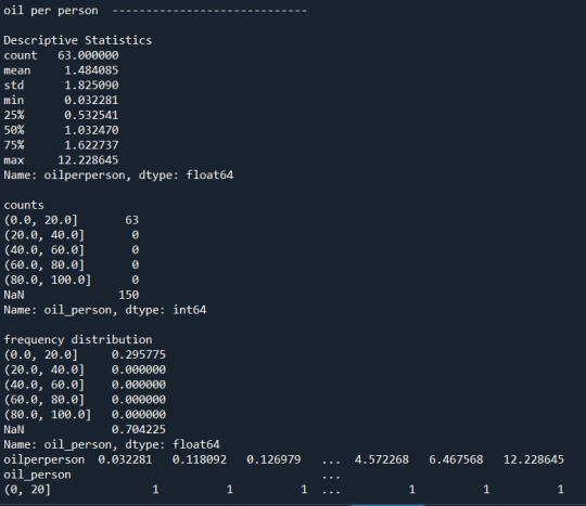
print("\noil per person -----------------------------\n")
print("\nDescriptive Statistics") print(data_cleaned['oilperperson'].describe())
#binned oilperperson class into 5 groups
data_cleaned['oil_person'] = pd.cut(data_cleaned['oilperperson'],[0,20,40,60,80,100])
print("\ncounts") print(data_cleaned['oil_person'].value_counts(sort=False, dropna=False))
print("\nfrequency distribution ") print(data_cleaned['oil_person'].value_counts(sort=False , normalize = True, dropna=False))
print (pd.crosstab(data_cleaned['oil_person'], data_cleaned['oilperperson']))
2) OUTPUT:


3)Summary or analysis on the whole:
According to the results displayed above, we can see maximum number of missing data is found in the 3rd variable that is oilperperson. I have replaced all the missing values in the data set to Nan. Mean, standard deviation for all the three variables is calculated. I have made 3 additional secondary variables by grouping them into bins of the original variables. Each employe rate group contains either 36 or 35 each alternative and the distribution is almost close to linear. There are about 35 countries without employe rate value.
For the urban rate, there are about 10 countries without urban rate value only 1.8% percent of countries have high urban rate . 60-80% is the most common rate representing 58% of the countries.
At the end, the most astonishing factor is that about 150 out of 213 countries do not have an estimated value of the oil consumption per person. Only 0-20% is the most common rate representing 2.9% of the countries.
0 notes
Text
Coursera-Data Management and Visualization-week 2- Assignment
1) Your program: --------------My Code---------
#import libraries
import pandas as pd import numpy as np
#bug fix to avoid run time errors
pd.set_option('display.float_format', lambda x:'%f'%x)
#read the dataset
data = pd.read_csv(r"C:/Users/AL58114/Downloads/gapminder.csv")
#print the total number of observations in the dataset.
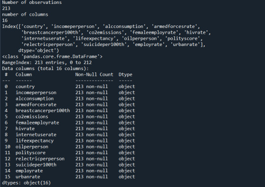
print("Number of observations") print(len(data))
#print number of columns count
print("number of columns") print(len(data.columns))
#print to see the column names
print(data.columns)
print(data.info())
data_cleaned = pd.DataFrame(data , columns = ['country','employrate','urbanrate','oilperperson'])
data_cleaned = data_cleaned.replace(r'\s+', np.nan, regex = True) data_cleaned['employrate']=data_cleaned['employrate'].astype('float64') data_cleaned['urbanrate']=data_cleaned['urbanrate'].astype('float64') data_cleaned['oilperperson']=data_cleaned['oilperperson'].astype('float64')
print(data_cleaned.info())
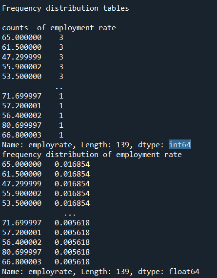
print("\nFrequency distribution tables\n") print("counts of employment rate") print(data_cleaned['employrate'].value_counts())
print("frequency distribution of employment rate") print(data_cleaned['employrate'].value_counts(normalize = True))
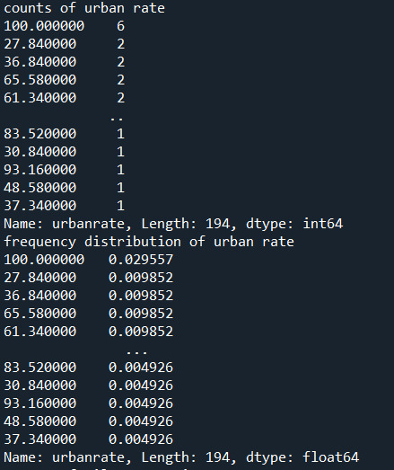
print("counts of urban rate") print(data_cleaned['urbanrate'].value_counts())
print("frequency distribution of urban rate") print(data_cleaned['urbanrate'].value_counts(normalize = True))
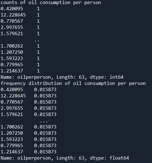
print("counts of oil consumption per person") print(data_cleaned['oilperperson'].value_counts())
print("frequency distribution of oil consumption per person") print(data_cleaned['oilperperson'].value_counts(normalize = True))
---------------End of code----------
2) the output that displays three of your variables as frequency tables
Below are the outputs displayed for each variable on the anaconda console window. Since the output is too long for reasons I have pasted them in parts.

3) a few sentences describing your frequency distributions in terms of the values the variables take, how often they take them, the presence of missing data, etc.
Summary:
I added additional Pandas functions to help visualize the data below.
There was no need to subset the data since it's already aggregated per country. The 3 chosen variables span 213 countries and I would like to include each country in my study.
Typically, I would drop the blank cells from my percent calculations below, however the Python code we were presented with this week had "dropna=false".
Each of the 3 chosen GapMinder columns\variables has missing data. Removing the missing data from each column may not affect the overall research questions, however the same rows have different missing data, thus in aggregate removing all rows with missing values will likely have an impact on the research questions.
Rather than remove the rows with missing data another approach is to calculate the column mean and add it to the missing cells.
Variable Details:
Employ Rate:
"Employment rate" shows the number of times a particular Employment rate occurred. For example, a employe rate of 52.8 occurred 2 times in the data set.
"Employe rate" is the number of times a particular employe rate occurred divided by the count of all employe rates, There are 213 countries\rows which also include blank cells.
Urban Rate:
Urban rate shows the rate of people living in urban areas. There are missing data in some countries. There are 2 countries with the maximum rate of 100 in the dataset.
"Urban Rate" is the number of times at which population of urban areas occurred divided by the count of all the urban rates. There are 213 countries in the whole dataset.
Oil per person:
"oilperperson" refers to the oil consumption per person on yearly basis. There are a lot of blank cells in the gapminder dataset. 70% percent of the countries oil per person consumption lies between 0-2. In the countries with high urban rate their seems to be more oil consumption per person.
0 notes
Text
Coursera-Data Analysis and Interpretation-Week 1-Assignment
In this course, there were five codebooks given. Based on my interests I selected GapMinder data.
My first research question and topic of interest is to find the association between the employee rate and urban rate. The GapMinder variables I have considered are country, employrate, urbanrate. My assumption is that both the employment rate and urban rate are directly proportional. Since, most of the employed people live in urban areas thereby, increases the urban rate. Most of them migrate to urban regions because of their job.
My second research question and topic of interest is whether urban rate is related to oil consumption per person. GapMinder variables are: oilperperson. My hypothesis is that people living in urban areas travel by their own vehicles rather using public transport due to heavy population. Every individual in the house has their own vehicles in cities. People look for their comfort in travelling. Due to this, oil consumption per person gradually increases.
In this topic, oil per person might be a variable factor. Not every house has individual vehicles. Some prefer to travel by public transport mostly by metro in order to save time.
Literature Review, search terms used:
Is employment rate related to urban rate?
urbanization and employment
relation between urban rate and oil consumption
Research on my first Research question:
"Urban areas have more jobs to offer and can lure people out of rural areas with the promise of a better life and a higher-paying salary. People find more jobs in virtually every industry while looking in cities and towns than they do searching rural locations. There are more people in urban areas, which means there is more employment rate. In developing countries, employment opportunities often open rapidly through the process of industrialization."
source: What is Urbanization and What are the Positive and Negative Effects? (conservationinstitute.org)
"Developing regions will have more people living in urban areas than rural areas." "There is a capacity of urban areas to create jobs for youth population."
"Urban areas are characterized by high competition for jobs, and the sectoral composition of economic growth hugely influences the distribution of benefits and costs across urban populations."
Source: Urbanization and the employment opportunities of youth in developing countries; Background paper prepared for the Education for all global monitoring report 2012, Youth and skills: putting education to work; 2012 (psu.edu)
Research on my second Research question:
"Population living in urban areas is associated with higher energy consumption."
Source: Commodity Markets Outlook. October 2021. (worldbank.org)
"Energy demand is positively related to affluence (economic growth). Urbanization and Population are bound to increase in the future in urban areas, consequently resulting in increased energy demand and consumption."
Source: Impact of urbanization on per capita energy use and emissions in India | Emerald Insight
At the end, there exists an interesting pattern associated between urban rate and energy consumption per person.
"World Bank data sources have been used for investigating the relationship between urbanization, affluence and energy use."
Source: Impact of urbanization on per capita energy use and emissions in India | Emerald Insight
1 note
·
View note