
Aspiring artist and writer, still working out the kinks though so bare with me
Don't wanna be here? Send us removal request.
Statistics
We looked inside some of the posts by anxious-art and here's what we found interesting.
Average Info
Notes Per Post
1M
Likes Per Post
863K
Reblog Per Post
586K
Reply Per Post
498
Time Between Posts
3 months
Number of Posts By Type
Text
3
Photo
13
Note
1
Last Seen Tumblr Blogs


Fun Fact
Tumblr has a 66 index score for customer satisfaction in the US.
Text
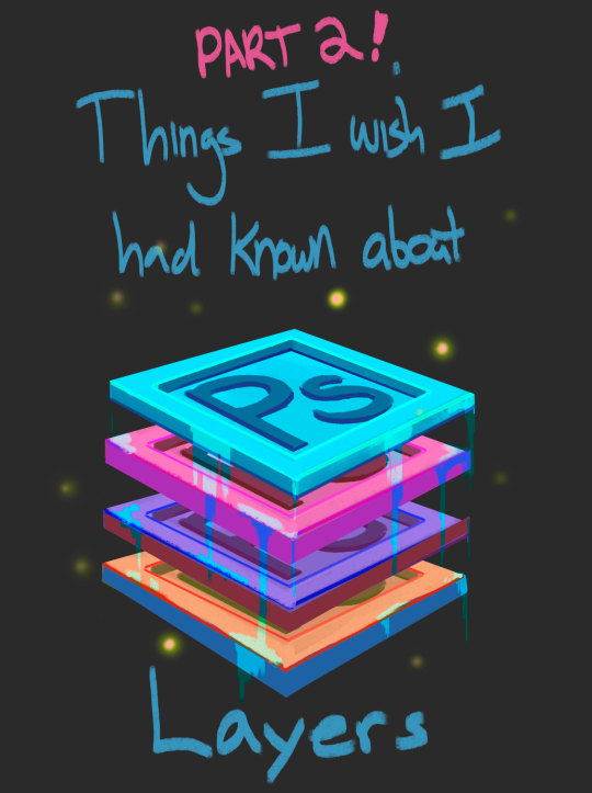
Small Tips For ClipStudio
I have some hours before work so I’ll use them to actually detail why I’ve found CSPaint to be so efficient for bastard-aligned painters who like to take shortcuts.
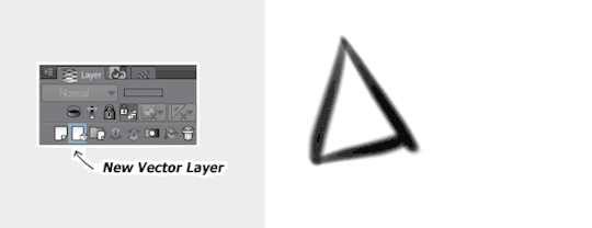
This will seem familiar to most of you guys, but this functions a little bit different from Photoshop. It turns everything you draw on the layer into editable curves, but retains the aliased smoothness of an ordinary raster layer. Practically a cheat to access the whole suite of amazing tools CS offers for lineart. Such as:
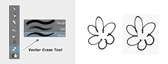
The vector eraser is The Best™. You can be as messy as possible and this tool erases the excess. One pen-flick and it’s done. Much faster than cleaning it up by hand. You can also tweak the settings of this brush to encapsulate more/less lines as you erase but that’s getting a little more involved. Anyway, last thing:
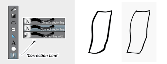
Maybe the only thing better than the vector eraser. There are multiple settings, but these three are the most handy. You can smooth wiggly edges, connect broken strokes, and tweak the width/weight to exactly how you want it. This also has a ton of settings you can play around with. It’s great!
There’s a lot more tools you can use, but you get the point! It’s a really good drawing program. I recommend it!
42K notes
·
View notes
Photo
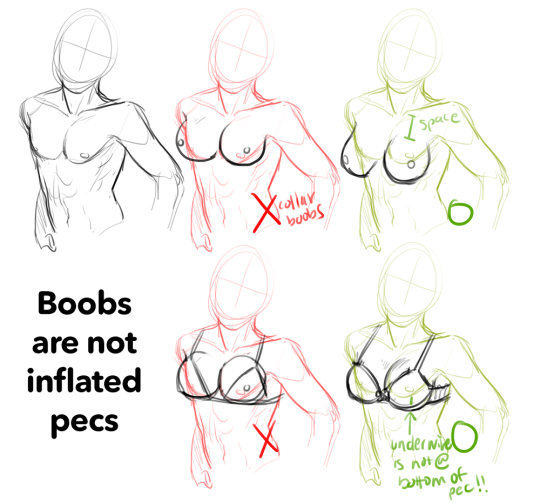
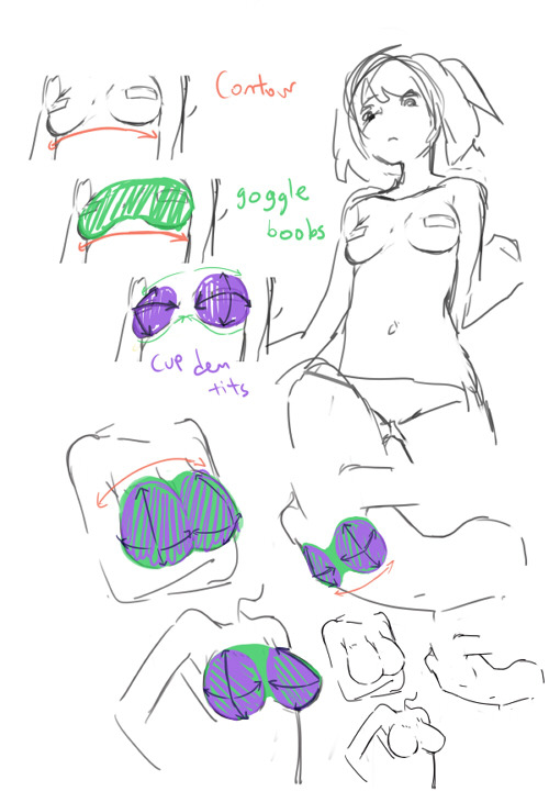
I feel like i’m so close to understanding why people can’t draw boobs. I think i’ve figured out one more step of the puzzle, specifically why collar boobs. Other than the fact that people think boobs are naturally super perky, people probably have a better idea of where pecs are on a person since guys can go topless anywhere, and then just think boobs = puffy pecs so voila. Voi-no
edit: here’s a really good example of what i mean about boobs not just being bigger pecs
6K notes
·
View notes
Text
fat bodies tutorial!
ALRIGHT SO my pal @kalreyno wanted help with drawing fat characters and as a fat artist i felt like i could give a bit of helpful insight on that. there’s also been a lot of complaining about “boo hoo fat characters are hard to draw so i can’t include them in my work Ever” goin on lately so if that’s your case then this is for you too!! and also just for anyone who would like help with fat bodies in general, ofc. anyway, let’s get this show on the road!!

let’s start with some common misconceptions. these are the two main attempts at chubby bodies i run into, so i’ll focus on them.
the Anime Chubby i see everywhere, and it’s just……so wrong in many ways. first of all, there is almost no additional body fat compared to your average thin character - except for where it’s added in “attractive” places (breasts, hips, thighs). the breasts are way too perky, and don’t have the realistic shape fat would give them (though how to draw accurate breasts is another tutorial all on its own lmao). there is still a thigh gap, which usually only happens in very thin people, and bones are still visible on the surface of the skin, which also rarely happens in fat people.
the Michelin Man is better in some ways, but still not that great. it’s a slightly better attempt, but basically all that’s done there is taking a thin character and blowing them up, while giving no thought to fat distribution. the thigh gap is usually still present, and they look a lot more hard than soft - and fat is very soft and pliable.

here’s a chart on how fat usually distributes (if you can’t read my messy writing, “1. next to no fat, 2. moderate amount, 3. most of the fat distribution”). basically, the more muscle an area has, the more prone it is to develop fat, such as the abdomen, thighs, and upper arms. it’s important to note that fat sits on top of muscle, and that it does distribute in different levels, and not evenly across the body as shown in the Michelin Man.
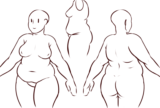
now, here’s an accurate fat body with all of that kept in mind!! notice how the fat isn’t only kept to aesthetically pleasing areas, and how it sits realistically on the character’s body. their breasts sag a lot more, which happens even in thin people with larger breasts, and the nipples are pointing more downwards than straight out. there is no thigh gap in sight, there are no bones in sight, and most importantly, they have fat rolls, which are very important in drawing a convincing fat character!! as far as i know i’ve never met a single person with no rolls at all, and everyone has them, whether thin or fat - they’re just more prominent and more consistently present in fat people. pay close attention to where they are and how they’re shaped.

here are a couple of drawings showing how fat is affected when sitting vs stretching. as seen in the first, the fat specifically on the stomach is distributed a lot more evenly and stretched out, so it becomes “flatter”. the love handles are still pretty visible, though, as well as the fat on the thighs and arms. the breasts are raised with the shoulders, and the fat on the shoulders and near the neck forms rolls as it’s being pushed together.
in the second, there is a lot less room for distribution, so the fat is all pushed together. the breasts sag and the stomach forms rolls and spills into the lap. a good analogy for the way fat works is to liken it to a water balloon, and thinking of how its shape would change when resting flat on a surface, hanging off of a ledge, held upright, etc.
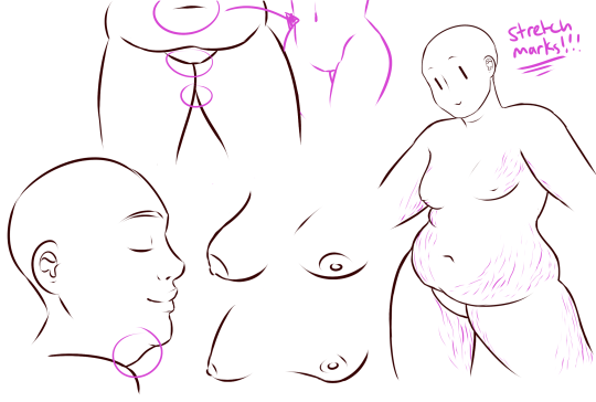
here are a few extra tips i find a lot of people miss!
first on the top is the hip/pubic region. the first circle is showing the way the bellybutton is folded in fat people, as opposed to stretched out in thinner people. the second is the stomach fat spilling over onto the pubic region and creating a separation in the two areas, which is something that’s missing in a lot of art. in addition, the pubic mound also gains fat, making it round as seen in the profile drawing i did up there (i’ve heard people refer to it as fupa?). the last in the hip region is the lack of a thigh gap. i can’t stress this enough!!!! if you’re trying to draw a convincing fat character, make sure their thighs are pretty much always touching!! for reference, mine literally don’t separate until my feet are about 2ft from each other.
the bottom right is showing the double chin, which a lot of people are afraid to draw!! fat does distribute itself here too, and there’s nothing wrong with it, so don’t feel like you shouldn’t give fat characters a double chin in your work for fear of it looking like a caricature.
in the bottom middle, it’s showing how fat affects different types of breasts with the presence of more or less breast tissue.
lastly, at the very right are stretch marks with their usual locations and directions, which i also can’t stress enough!!!!! i sometimes forget to add them honestly, but they’re so important in accurately portraying fat characters, as they literally come from the skin being stretched from fat being gained (and they’re also just rlly neat lookin like why wouldn’t you lmao). some people have less and some people have more, feel free to experiment with them!
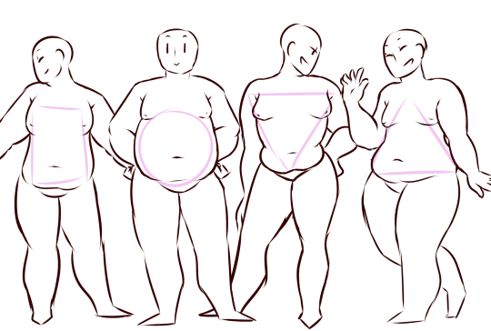
the last thing is body types!! there isn’t one single way for a person to be fat, so feel free to experiment with shapes once you’ve learned the basics!!
so there you have it, a tutorial on how to draw chubs!! now go forth and make some accurate fanart or some rad fat characters, because the world could always use more of both. hmu if you have any questions or concerns, and thanks for reading!!
EDIT: someone pointed out the bad wording in the tutorial. thank you for bringing it to my attention and sorry for offending anybody. i’ve updated the tut, so please reblog this one!
144K notes
·
View notes
Photo
THE LAYERS CHEAT SHEET PART TWO (PART ONE HERE) Once again, I’m no expert- there are things about these layers I probably haven’t covered, so please try them out for yourself! Layers 1-7 help your contrast. They are usually a pair of the former two groups I went over in my last post. 1. OVERLAY: Helps your contrast by boosting your lights and darks, while the more mid tone pixels aren’t affected as much. It does this based on the layers beneath it. “Screens” the lights, “multiplies” the darks. 2. SOFT LIGHT: Similar to overlay, but a “softer” effect. You can think of soft light as more transparent. 3. HARD LIGHT: You can look at hard light as an intense version of overlay, with much brighter colors and a much less transparent look. 4. VIVID LIGHT: This is the heavy metal version of overlay- think of it similar to color dodge and color burn. Very intense colors, good for finding interesting lighting and color combos. 5. LINEAR LIGHT: Crazy amounts of contrast and color is added here, even more than vivid light. so heavy metal 6. PIN LIGHT: This one is interesting because besides it also being an intense contrast layer, it can add random noise to the active layer. Apparently this is a combo of the lighten blend mode on the light pixels and darken on the dark pixels, but the noise effect is what makes it really interesting imo. 7. HARD MIX: You will turn this mode on and be like “no” but it is actually adjusting its fill will reveal another overlay-ish type layer. It throws the colors on the active layer towards a more primary color such as blue, or magenta. _____ 8. DIFFERENCE: This will invert your colors, taking into account the layers below. If colors are very close, they will be black. 9. EXCLUSION: This also inverts your colors, taking into account the layers below. If colors are very close, they are grey. Exclusion and difference are layers that would be good for graphic pieces, I haven’t really gotten used to incorporating them in my painting workflow. 10. SUBTRACT: Similar to the above layers, but more intense. You will notice that the darker you make your active layer with Difference, exclusion, and subtract, the lighter and more transparent looking the result will be. 11. DIVIDE: Divide, however, usually results in crazy highlights that are pretty opaque unless the layer is fairly light, and then it will begin to go transparent. ___ 12. HUE: Makes the lower layer take on the hue of the active layer. 13. SATURATION: The lower layers take on the saturation of the active layer. 14. COLOR: The lower layers take on the color of the active layer. 15. LUMINOSITY: The lower layers take on the luminosity, or brightness, of the active layer. Once again, I’m no expert, but I hope this helps. Thanks guys! http://drawmaevedraw.tumblr.com/
14K notes
·
View notes
Photo


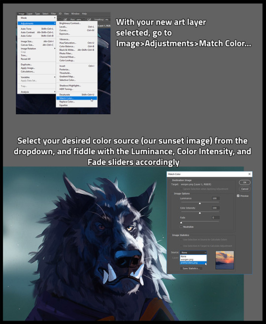
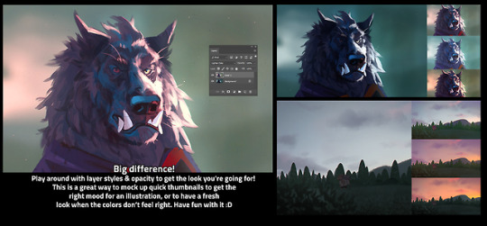
I’m sure a ton of people already know how to do this, but I only learned recently, so I wanted to share one of my favorite thumbnailing tricks! Color matching is SUPER helpful to quickly map out potential color schemes :D
[EDIT] this is in Adobe Photoshop, sorry for forgetting to mention that!
28K notes
·
View notes
Photo
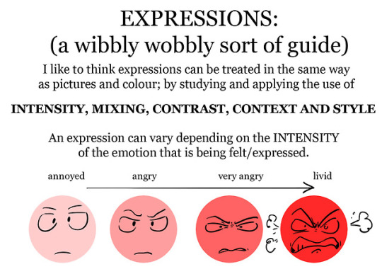
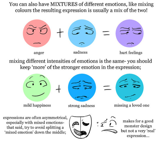
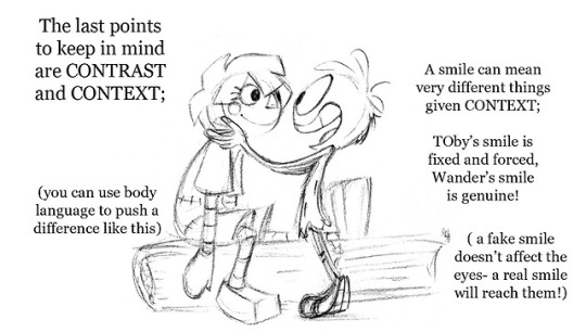
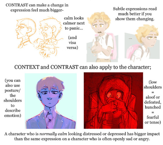
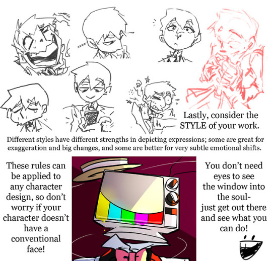
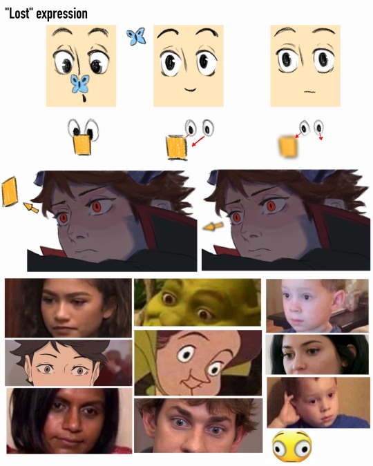
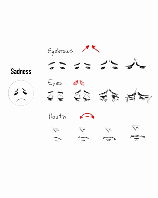
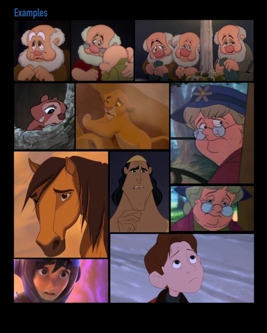
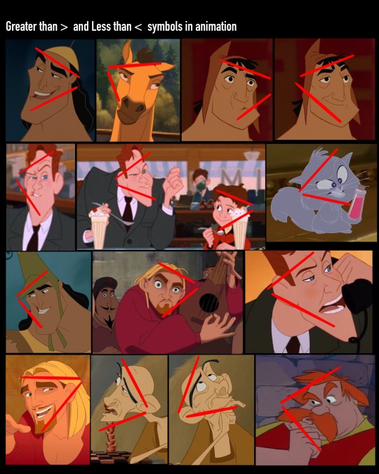
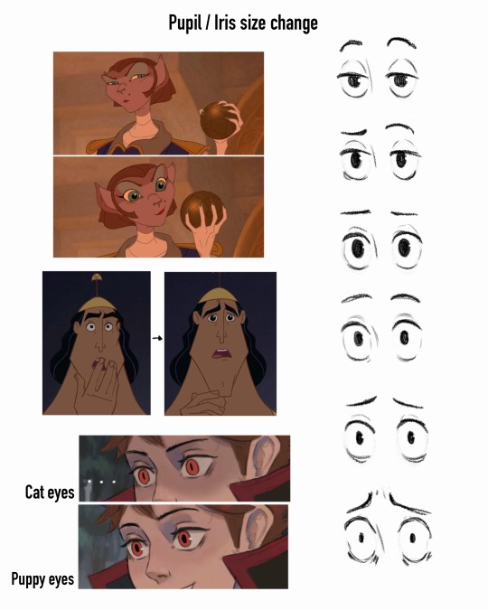
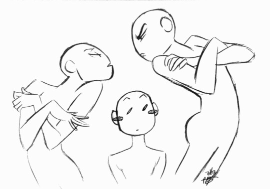
still recovering from travel/hand injury but I have folks asking for advice on expressions a lot so here’s an old patreon early xmas present for you folks! (I make things like this for the 20 dollar tier by request, so if you’d like more…)
as ever this is just stuff I do/have observed and there’s no real right or wrong way of doing things! just get out there and observe, draw, make mistakes, learn from them and do it again! and again, and again…
9K notes
·
View notes
Photo
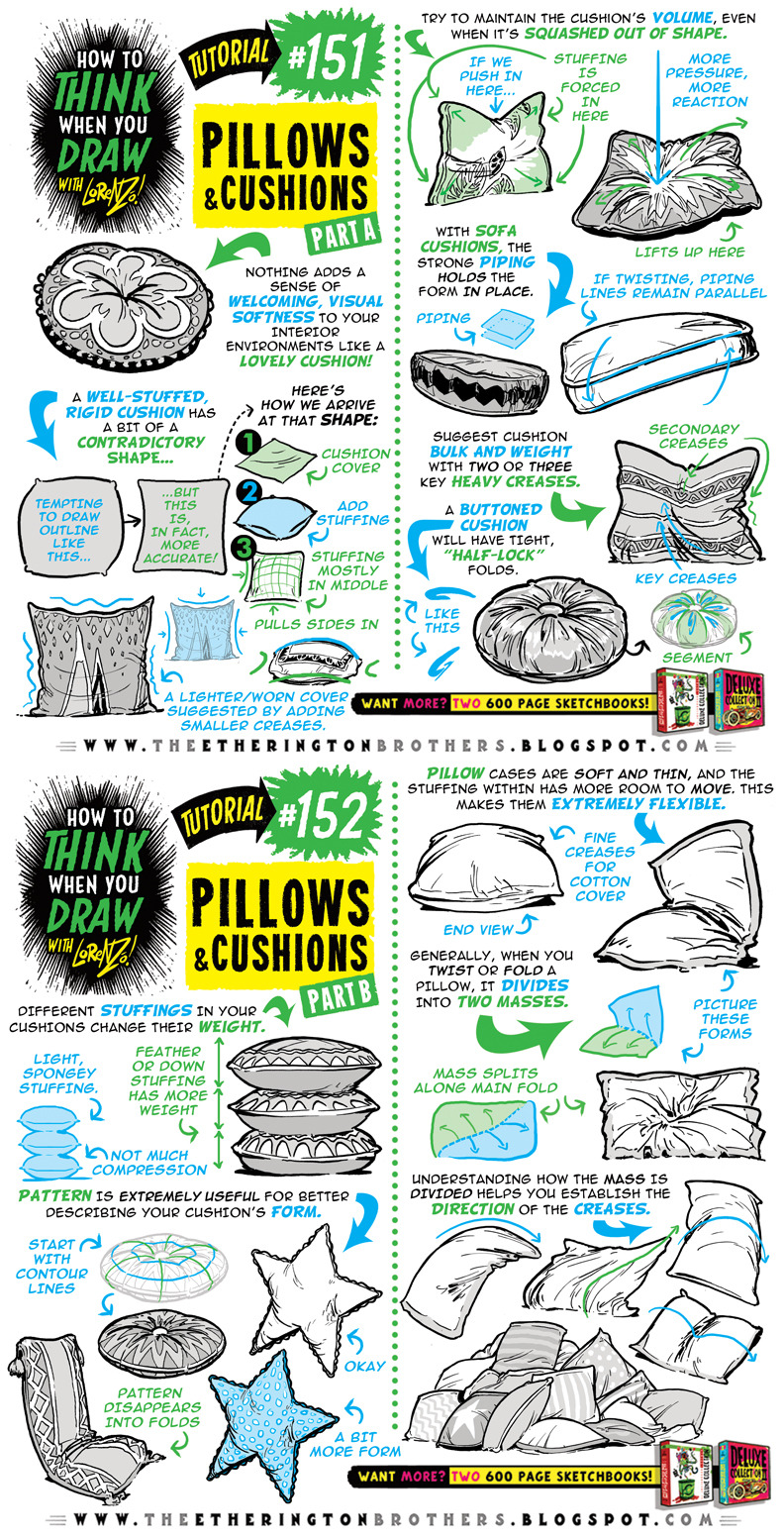
Here’s a BRAND NEW TUTORIAL: How to THINK When You Draw PILLOWS and CUSHIONS! And join us on OUR TWITTER EVERY SUNDAY for #SkillUpSunday, as we have TONS more FREE TUTORIALS,REFERENCE SETS and RESOURCES coming for you! GO HERE to see more!
And GO HERE FOR 150 FREE TUTORIALS!!
Lorenzo!
2K notes
·
View notes


Note
Actually, it makes a lot more sense why Rose was always protected from poofing by Pearl. Can you imagine if a soldier poofed Rose Quartz and a Diamond fell out?
oh.
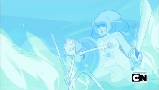
OH.
10K notes
·
View notes
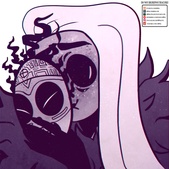
Photo
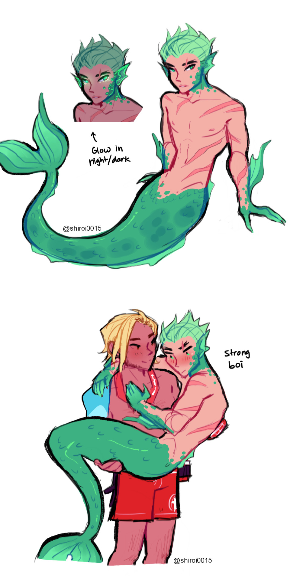
human jesse/merman genji au cause I’m always a sucker for this okay
3K notes
·
View notes
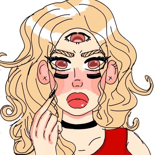
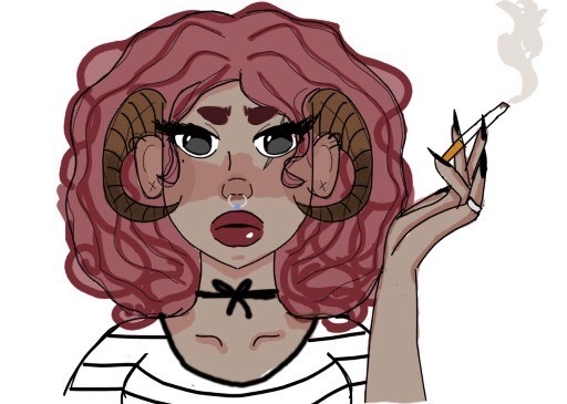
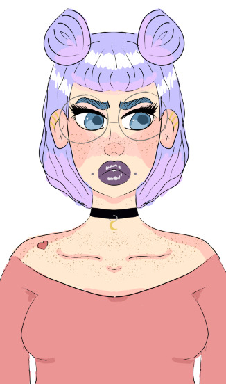
Photo
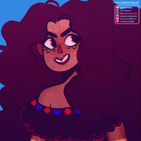
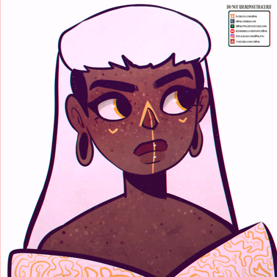
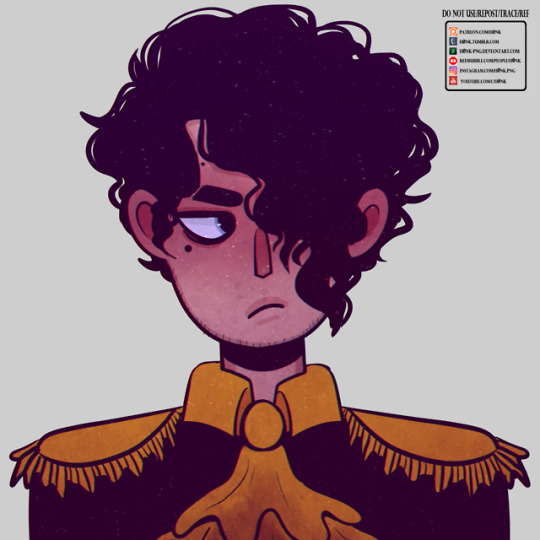
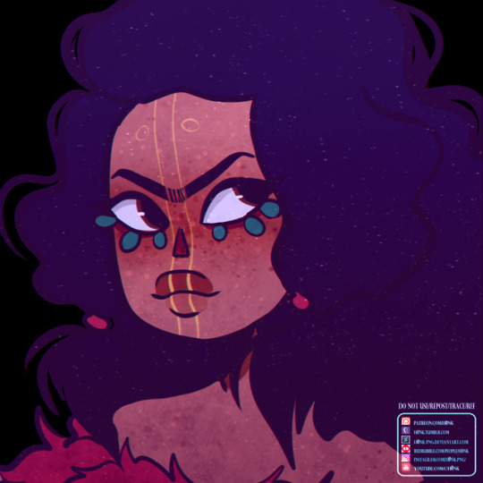
Needed to practice my cartoon style so i drew all my children Do not use/repost/trace/ref (Reblogging is ok) ♡ ALL LINKS ♡
239 notes
·
View notes
Photo
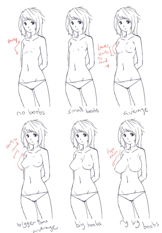
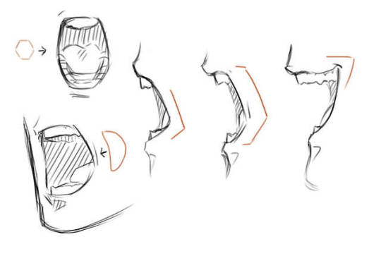
anon asked me how do I draw different sized boobs so I whipped up a tutorial (I draw slow, sorry) I am not a good expert at boobies soo sorry x2! weh haha
basically flat = pointy-ish, as boobs size increase the lower half gets rounder, then the top half. boobies are floppy towards the sides due to gravity
shape/perspective of boobs
all the oppais!
even though I am still not really good at drawing boobs at all sigh… i hope you find this useful even for a bit hahaa……..;;
35K notes
·
View notes