
Last Seen Blogs
slimeproducer
kill
thecircuitsymphony
Untitled

zanebane22
Untitled

deepstudentprince98
The Sabba
fmradio-johnnystation
Captain Trash
Text
Week 10-
The last week was essentially us learning to compile all our work together and create a portfolio. It was a lot of trial and error figuring out what to include and what not to. We also learnt about the process of blogging; and how we must record the whole process. Our lecturer showed us an example of one of her first blogs for an advert for Heinz. Through this we became aware of the sheer amount of research needed, and its importance. I also learnt that blogging should be done daily in order be most effective and manage time better.
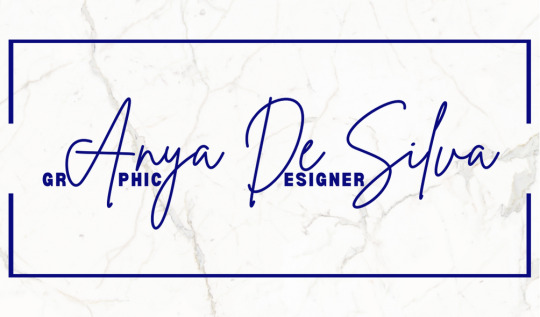
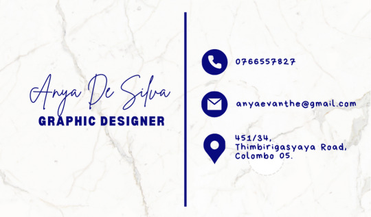
We were also asked to create a business card template.
0 notes
Text
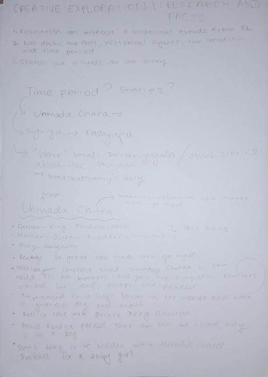
Week 9- IMAGINATIVE HISTORY
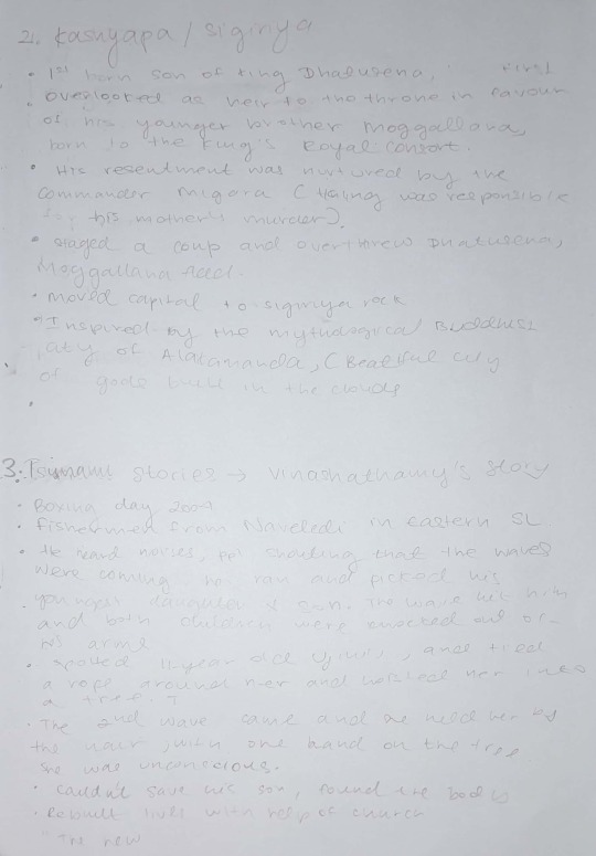
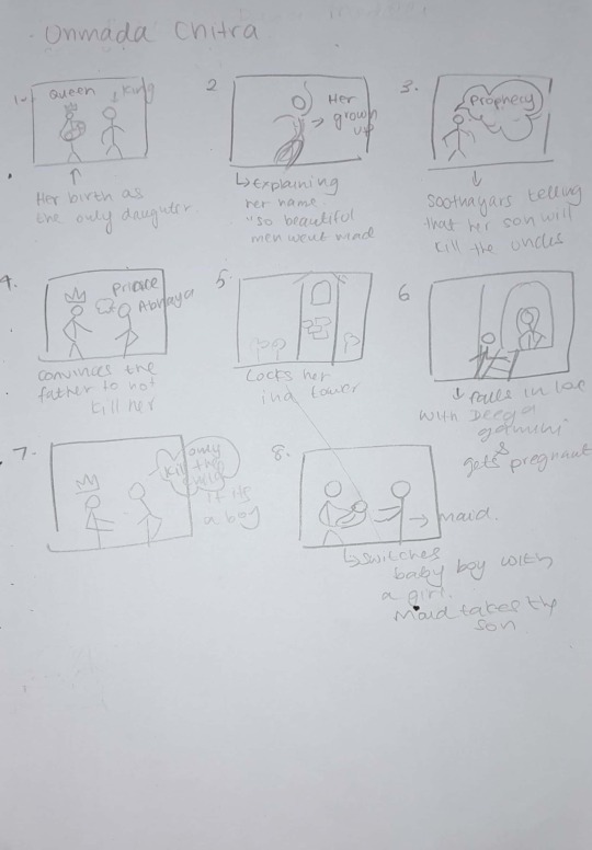
We learnt how imaginative history is a beneficial instrument in evoking ideas, generating new concepts and conveying enthralling stories. Our first submission was based on research and facts. We had to research on at least 3 historical events from Sri Lankan history and list down the facts, historical figures, the location and time period. After this we sketched out the visuals for one story based on how we imagined the elements to fit into each category. Here is my research and sketches, which is quite messy;
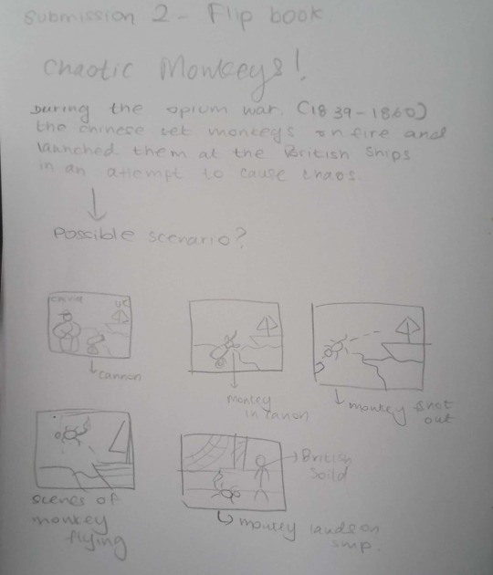
Accordingly, an intriguing assignment we did was a flip book animation based on an amusing piece of history. After researching on countless humorous stories, I settled on one I felt would not only be entertaining but best suited for a flip book animation. My chosen piece of history takes us back to the opium war, in which the Chinese set monkeys on fire and launched them at British ships in an attempt to cause chaos. The most challenging part of this animation was drawing the images consistently as well as drawing many pages if you want a smoother and longer animation. Unfortunately, due to time constraints I couldn't draw as many pages as I would have liked. This was a time-consuming task, yet it was pleasing to see the outcome. First I did a few rough sketches, and then my final attempt;
We also had an amazing session with Shanka. The main focus of Shanaka’s workshop was about how to tell a “Good Story”. I learnt about the vital elements that are required to make a story captivating and memorable to its readers. Firstly, one needs to give your story strong dramatic content, whilst varying rhythm and structure throughout your prose so as to engage the audience. Furthermore, I learnt that one must create believable, memorable characters, that the audience will connect with; for an example Shanaka used character The Joker as an example and in turn stressed the importance of having character arcs too. Other valid facets include the pitch, film form, and film content of a story. It is important to make the important story sections effective and deepen your plot with subplots. Every line of dialogue should count, have a purpose. Additionally, creating a great story should have immersive settings; to put the readers right in the heart of the scene, in its world. It is not just characters that should have personality, but places too. Besides giving place personality, it requires something out of the ordinary to make it truly fascinating, as well as enriching it with detail. An element that was greatly highlighted was creating conflict and tensions in a story. When we think of conflict, we often assume its violence but that is not the case. Shanaka challenged us to give an example of any story (movie, book etc.) that doesn’t have any conflict. Most of us realized that that question was impossible to answer as all stories have to have a conflict, even something as childish as Telly tubbies (which entered the conversation as a possible answer). Next, we were taught the importance of crating beguiling beginnings; and we watched various opening scenes of movies like The Matrix and Jurassic Park, to better understand this notion. Simultaneously, a knockout ending it vital too. A good story ending resolves the primary conflict, rises in tension before giving the reader release, isn’t so tidy that it’s predictable or a cop out, and uses words that convey the sense of an ending. Finally, we learnt about the three-act structure, which is a model used in narrative fiction that divides a story into three parts (or acts), often called the Setup, the Confrontation, and the Resolution. Act one contains the exposition, the inciting incident and the first plot point. Act two illuminates the rising action, midpoint and the second plot point of the story, while act three brings out the pre-climax, climax and the denouncement. Lastly, we learnt the importance of research in creating compelling stories. He taught us the different possibilities of analyzing the story and varying perspectives it can take. For an example in the Lahore attack we were advised to look into the deeper stories of the bus driver and attackers. All in all, it was a thought-provoking session.
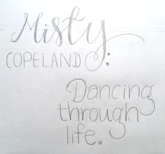
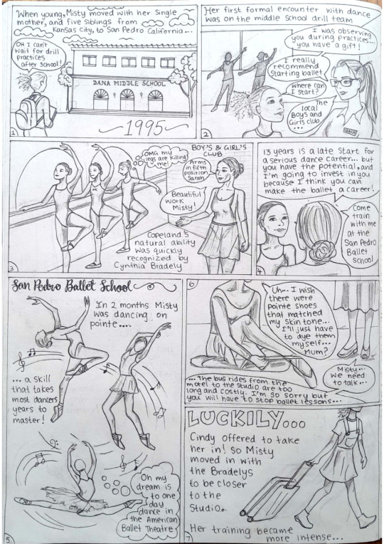
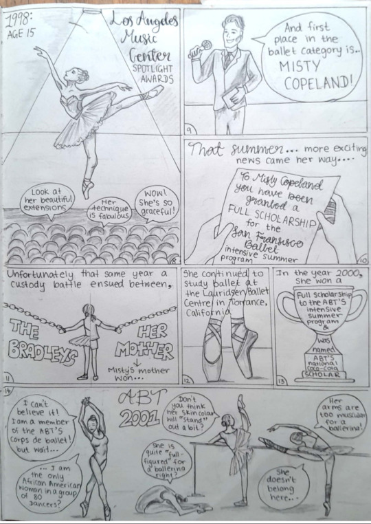
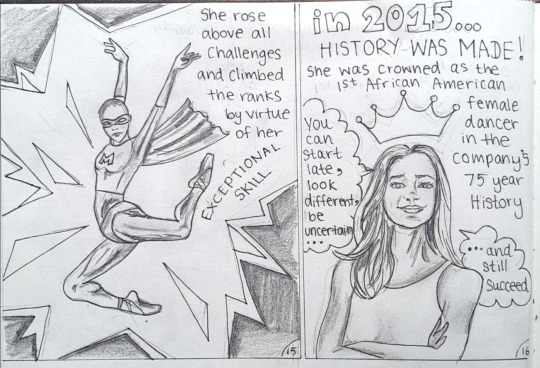
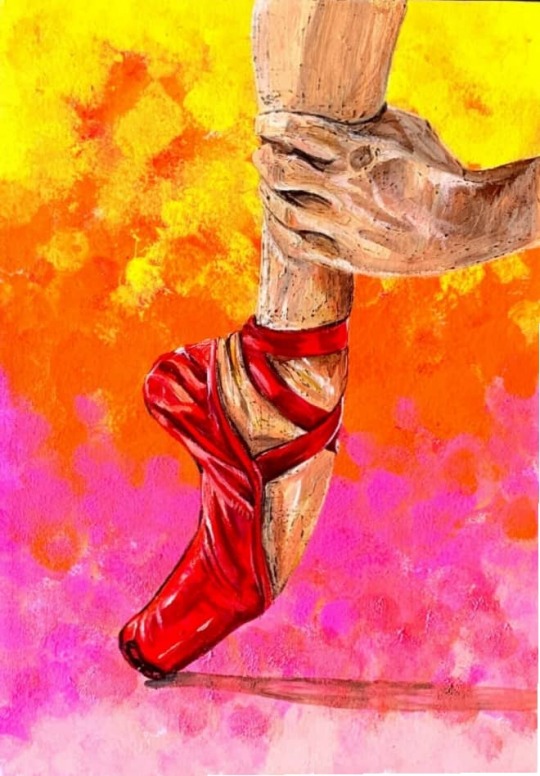
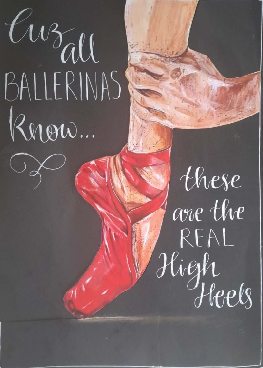
In closing our final submission, we had to choose between a flipbook animation, a graphic novel, or a comic strip. I opted for a comic strip. as you may have noticed already, ballet has been a recurrent them in many of my submissions. we were allowed to choose any story from world or Sri Lankan history, so I chose something important to the ballet history. my comic revolves around the life of Misty Copeland, who made ballet history as the first African American Female Principal Dancer with the prestigious American Ballet Theatre. I did a few very rough sketches.
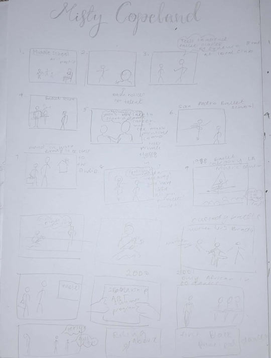
and finally, my comic strip
0 notes
Text
Week 8- USING AI AS A DESIGN AND LEARNING TOOL
This was my first attempt at AI art, and it was an enlightening experience. Before we started on the actual software, we were introduced to the most important component of creating AI images, which is writing prompts or prompting. An AI Prompt is any form of text, question, information, or coding that communicates to AI what response you're looking for. Adjusting how you phrase your prompt; AI could provide varying responses. As such we did many practice prompts using various reference photos presented to us by our tutor. We were given free rein to generate an image. Below are the prompts i wrote;
It is a painting by Rafael Sanders called The school of Athens. It takes a historical Greek setting, containing ancient Greek architecture, including marble statue figurines. There is a crowd of scholars/ people in the center dynamically discussing and interacting with each other; adorned in traditional Togas. The image is realistic, with a central perspective and bright lighting.
It is a black and white portrait of a young woamn between her 20s or 30s. She is an attractive woman, who has thick, defined eyebrows, almond shaped eyes with high cheek bones, narrow jaw and full lips. Her expression is vacant and staring.
It is a mountain scenery during sunset. In the foreground there is a grassy angled floor filled with ink/ magenta flowers. In the background there are mountains which take a bluish tone and follow perspective to gradually disappear. the sky has purplish and pink tones, with the sun shining on the right emanating beams of light.
4. It is a symmetrical image of a robot waist up that has a very feminine face. The background is black with a floral mandala design that is made visible by the orange neon circular light design.
It is a scene of a wooden cottage, with a water turbine attached to the nearby stream which has a small water fall on the right side. It takes a 2D comic book arts style and is shown from a higher perspective looking down onto the cottage. The cottage is surrounded by trees that have yellow and orange ombre effect, as well as rocks, a wooden fence is present.
It is a 2D anime art style image. The main subject is a young girl with rosy cheeks, a baggy white t-shirt with a horizontal green line. She has black straight hair with a rigid fringe and her eyes and mouth are open in wonder. Behind her is a fantasy creature; a white dragon with horns and facial features like a dog/wolf. the background was a forest, with a night sky.
It is a splash of paint that looks like a huge ocean wave that is protruding upwards from the ground surface. It is asymmetrical but very dynamic, with vibrant colours like blue, pink, orange, yellow and with white and clear liquid towards the left side. The background is dull keeping a similar gradient colour scheme.
The image is a modern abstract form of art; grafitti style, with many rigid lines, geometric shapes and vibrant colours. At the top is a abstract representtion of a woman's face, followed by straight lines of varying thickness going downwards. It is not perfectly symmetrical but balanced.
After this we headed to the MGA lab to tryed out a few of the above prompts how closely the generated image resembled the original. They turned out alright, but the various drawbacks made me realise how clear and precise one has to be in order to get the desired outcome.
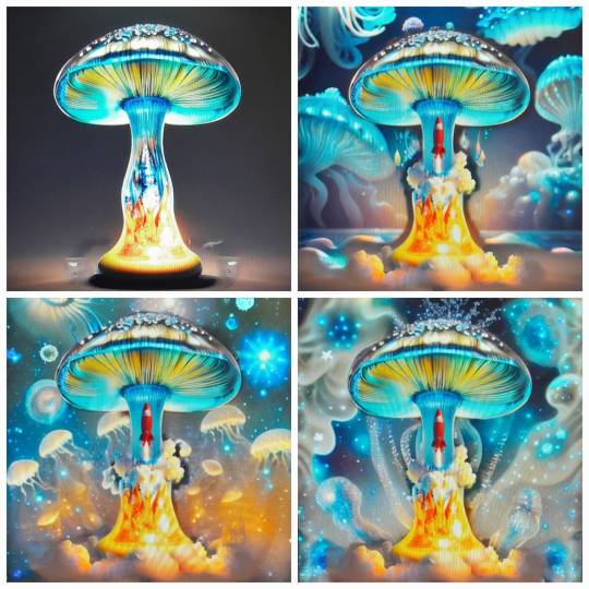
Next we started exoerimenting on Stable diffusion itself. Our tutor gavea few ready made prompts for us to begin with, then he encouraged us to to begin to add, reomove and change the roignal prompt and create and interesting image. He really wanted us to test our creativeboundaries and genrate essentially wild imges, soemhting unique. For an example one of my faviurute prompts he gave went along the lines of a ' nuclear explosion turning into a mushroom, glass ornament...'. After generating a set of images I decided to add a rocket, fire and cloudS/smoke using the inpaint tool. After that I added a galaxy sky with jellyfish (basically a cross between space and the ocean). Here are a few process photos and experiments;
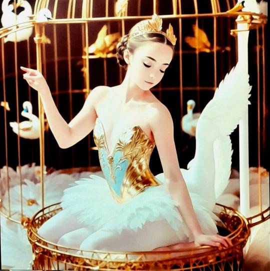
Finally moving onto our final submission of the week, we were allowed to genarte any imgae we desired. My prompt was essentially a realistic Swan Lake ballerina, trapped inside a gold vintage bird cage. At first it was almost impossible to generate a realistic looking ballerina; on many occasions there were multiple limbs, and deformed faces. Yet finally I started getting results that fulfilled my envision. Here are two of my favourite images;
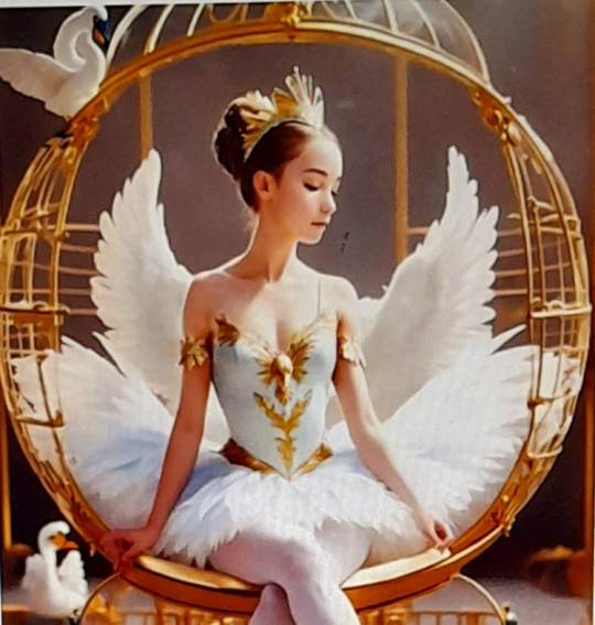
After we generated an image of satisfaction (I chose the 1st image shown above) we combined it with the rest of the class experimenting with different denoises. I resolved with the denoising strength of 0.65 as it felt like the best balance of my own image coupled with the others. Accordingly, my final submission for this week was the following image;

To close the week, we had an informative discussion about Copyrights and Ethics in AI. We were all allowed to feely express our ideas regarding our opinions on AI art and whether it is art at all. It was a lot of mixed ideas as neither of us could come to a definite conclusion on such a subjective topic. As an artist most comfortable with the traditional form I felt I would always give more value to that tangible form of art, but at the same time after trying Ai I had a newfound respect for AI art. Yet still there will be many challenges such as giving credit, plagiarism etc.
0 notes
Text
Week 7
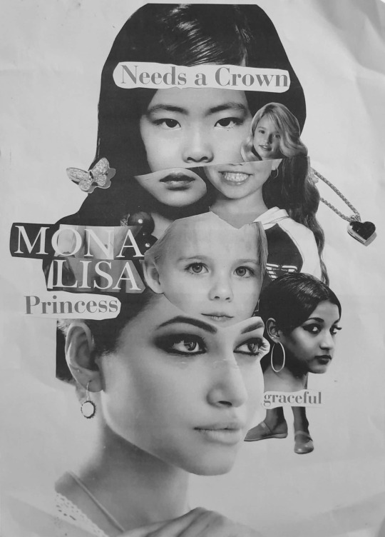
This week, we reverted back to the roots of design; the traditional methods of creativity. Firstly, our session with Alain Parizeau brought light to the difference between an artist and a designer. An artist creates with the purpose of self expression, whereas the designer creates with the intent of evoking specific emotions from its audience. This was key for us to successfully design a poster and convey a message . Here we were instructed to choose one emotion from the The Rasas (nine human emotions) & create a poster using collage. I chose to revolve around ‘Shringar” the rasa of beauty. My poster doesn’t directly represent something beautiful, but rather visualizes a deeper message about beauty standards. This was my original collage poster using coloured magazine cutouts...
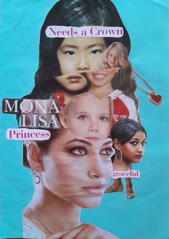
I wanted to convey the idea that there are various forms of beauty; we don’t all have the same features and that there is beauty in diversity. Furthermore a girl does’nt have to fit into the stereotypes to be a beautiful person. This composition was a series of trial and error. As the images were cutouts from magazines, I was able to experiment with different layouts and positions. It was truly a learning process trying to balance the various images, whilst knowing when to cut back and refrain from adding too much. With the advise of my tutor to try out different colour schemes I decided to settle on a black and white photocopy as the final poster. This I believed was better as it made the visual much more cohesive., Especially with the time constraint I am pleased with the final outcome. This is how it turned out;
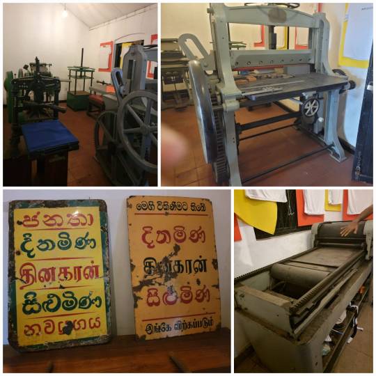
Next, we had a session with our tutor Pathum Egodawatte, who taught us about the importance of typography in visual design. he showed us how different fonts can convey different meanings, and thus seminal to evoke the required emotions in visual communication. Moreover, as this weeks' focus was manual design techniques, we visited the W.A. Silva Museum to witness the manual techniques of typography used in the past. there were various machines such as printing presses, and a Sinhala typewriter. Some photographs are shown below.
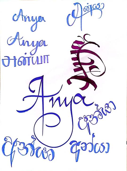
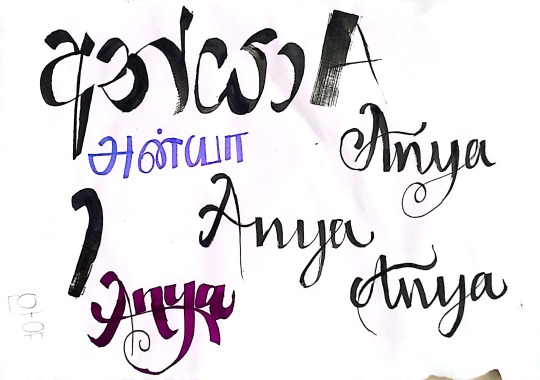
On the last 2 days we had a calliagraphy and origami worksjip. we experimented with various fonts using a variety of tools hown below
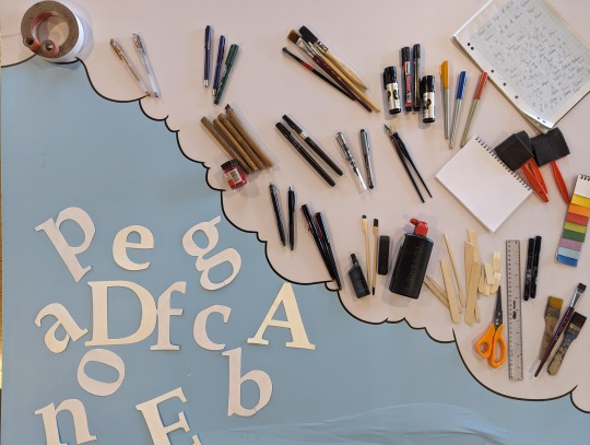
i really enjoyed trying out various writing techniques, we were allowed to let our creativity run wild. ofcourse it was alot of trial and error, as once a mistake was made you couldnt take it make. we were scared to use certain tools at firts, such as the ink paint brushes, but once we started we became more confident. some of the wokr i did shown here;
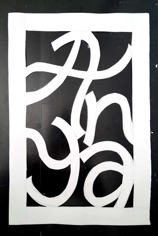
We also created a cut out of our name using cardboard, which could perhaps be used as a decoration of lantern.
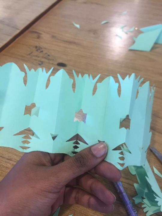
Another fun activity we did was origami! we learnt how to make parrots and even paper chain frogs!
For my final submission this week, I wanted to incorporate the two main manual techniques we focused on; calligraphy and collage. Accordingly I found an extra A3 colour print of one of my paintings, and thought it would be ideal to cutout the subject to use on my poster as collage. Then using a white gel pen I wrote a quote using calligraphy techniques as well as other font styles. it is a rather simple design but i believe it creates my desired impact and conveys the message. the reference photogrpah of my painting as well as the final poster design respetivle yare as folows;
0 notes
Text
Week 6 - INTRO TO DESIGN SOFTWARE
This week we dived into the world of design software and were introduced to fundamental design and animation software such as Adobe Photoshop, Illustrator, InDesign and Maya. Firstly, on Maya we tried 3D animation for the first time, starting at the basic bouncing ball animation. Honestly, I found this quite difficult, but towards the end I sort of got the hang of it, even though there was large room for improvement. I never realised truly how difficult animation was. we also attempted some 3d modeling, in which we had to model a hammer. this turned out worse than my attempt at the animation. yet I'm still motivated to learn in the future.
we also got an insight into Photoshop and illustrator. We experimented with various tool and created a variety of pictures with the guidance of our tutor. my favourite one was the image we created of a mountain in a white mug, with clouds and birds flying above. we had a reference photo to recreate it, but Maria and I (we were partnered as one computer stopped working) decided to switch up the colour scheme. we went for purplish mountains and pink clouds instead of the blue and white in the original.
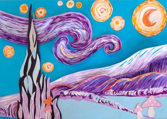
For our assignment this week we were divided into 2 groups and were told to create a cut-out animation. Our group decided to create one based on Van Gogh’s starry night painting. We opted for a pastel purple, blue, pink and yellow colour scheme, and added a fantasy, whimsical theme to it. The back story we wrote for our video is as follows;
here is some of the process work for our Cut-out animation;
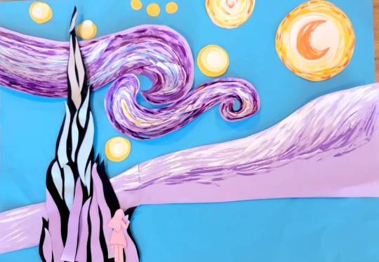
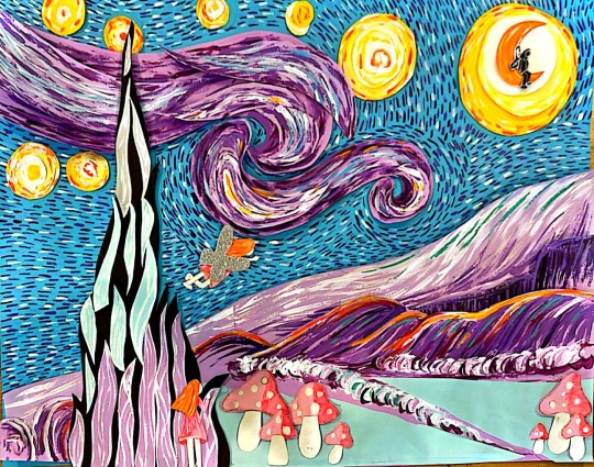
And finally our video! which I like to think is short and sweet...
This was quite a time-consuming task, despite having members to divide work as multiple detailed paper cutouts have to be made even for a short animation. The time constraint made us cut out on certain elements, that would have otherwise made our video longer and more dynamic. All in all, I'm proud of the outcome.
1 note
·
View note
Text
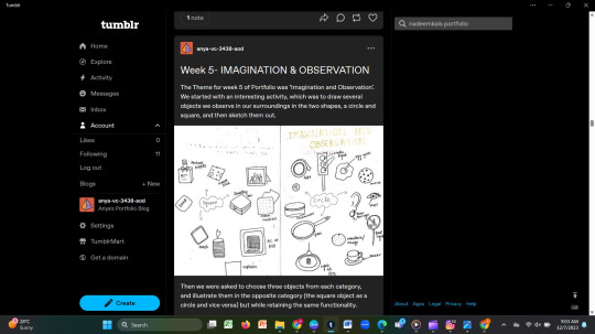
Week 5- IMAGINATION & OBSERVATION
The Theme for week 5 of Portfolio was ‘Imagination and Observation’. We started with an interesting activity, which was to draw several objects we observe in our surroundings in the two shapes, a circle and square, and then sketch them out.
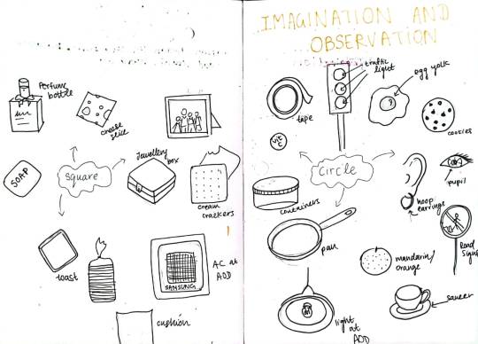
Then we were asked to choose three objects from each category,
and illustrate them in the opposite category (the square object as a circle and vice versa) but while retaining the same functionality.
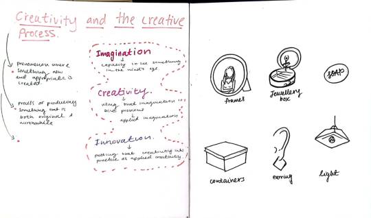
I felt this was a captivating way to warm up our minds and imaginative thinking, as we have to imagine different objects in varying shapes. It would also help in product design! For an instance I drew hoop earrings as my circular object, but also managed to create square shaped earring that hung in a diamond like style. We also analyzed some music videos and stop motion videos which really opened my mind to how creative the human mind is, and how vital imagination is.
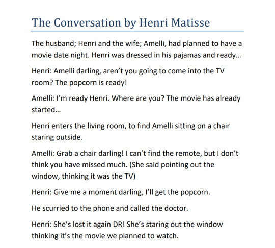
Consequently, we were given our first assessment, which was to study the painting ‘The Conversation’ by artist Henri Matisse and develop a narrative by re-imagining the nature of their conversation, including thoughts of what may have occurred prior to the conversation, as well as events that eventually following the conversation. My story Unfolded as follows;
It was so compelling and entertaining to listen to everyone’s unique interpretations and ideas. It really pushed us to think outside the box, or rather outside the picture. Gradually we were becoming accustomed to honing our imagination.
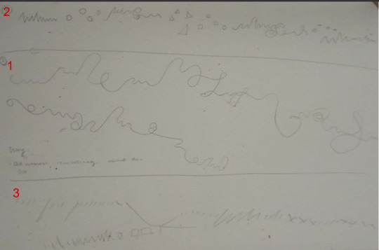
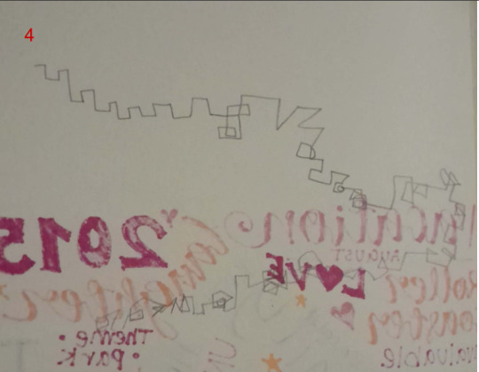
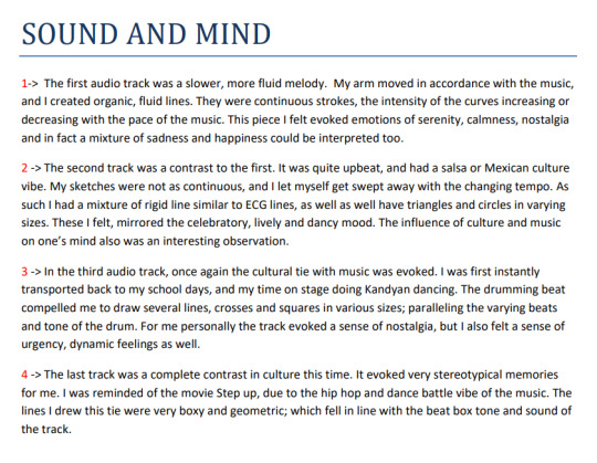
The second assessment was a first for me. We were made to listen to four Audio tracks with our eyes closed and sketch out in our own style what emotions the rhythm evoked in us. I took the approach of
sketching with my eyes closed whilst the music played; allowing my hand and body to move with rhythm of the music simultaneously. For an instance, the first audio was a smooth, calming sort of music, and in accordance I drew organic lines and strokes in a continuous, unbroken motion, the curves intensifying or decreasing in accordance to the tempo. This I felt ignited a calming, nostalgic atmosphere. In contrast the faster more upbeat music was often visualized with rigid broken lines, and more boxy shapes. This
activity also illuminated how various music, especially with relation to culture, may restrict or frame the way we think and imagine. I learnt that we must try to think and imagine beyond the stereotypical
associations our mind makes.
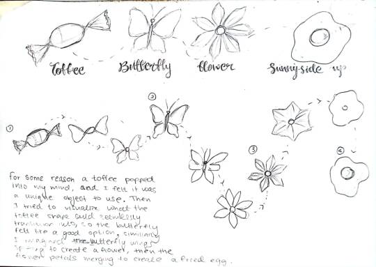
While studying Emile Cohl’s Fantasmagorie, and the unique transitions within the animation we were prompted to choose 4 objects and sketch out a possible transition process, as though a rough sketch for an animation. This was really intriguing, and once again challenged our creative mind and imagination, this is because we has to imagine first how the objects could possibly transform into the next seamlessly or fluidly. this is what i created;
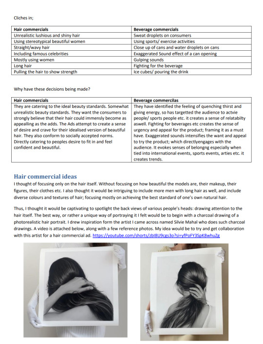
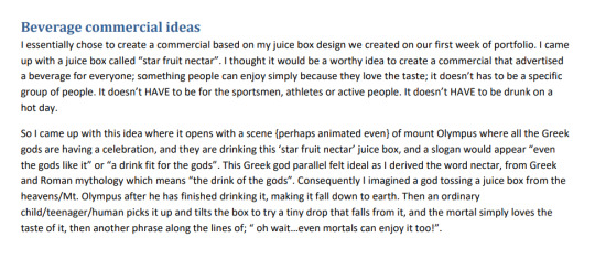
Our fourth assignment was to analyze various clichés used in hair care, and beverage commercials. After this, we were encouraged to create our own ideas for such commercials, devoid of the over used, and commonly used tactics. We were really forced to think beyond clichés depicted in these commercials, and try and come up with unique concepts. It was really eye opening to hear the concepts and ideas developed by my peers as well, because it shattered my belief that it was close to impossible to create new or unique commercials without using clichés. I learnt that there is still a large scope of distinctive concepts that have not been explored in the advertisement industry, and that we must train our mind to derive such ideas. I was most proud of my idea for a hair commercial, in which I thought of collaborating with a photo-realistic hair portraiture charcoal artist; giving unwavering focus on hair itself. These were my thoguths nd ideas;
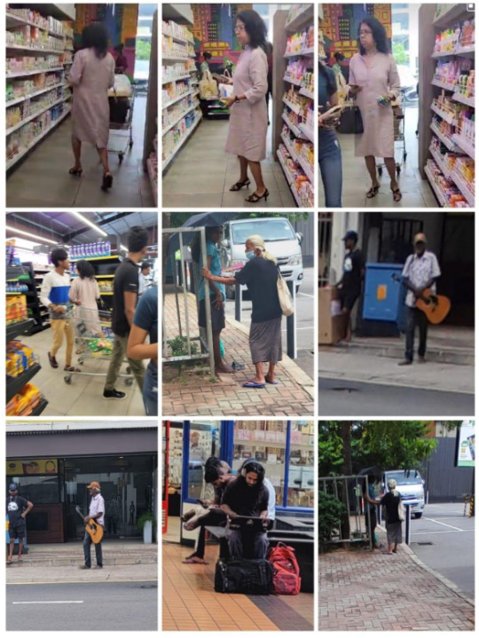
The next assignment was undeniably my favourite one! Here, we were instructed to leave our campus boundaries, and essentially go out into the world, explore and observe the plethora and characters in our vicinity; that we have most probably never paid attention to. I learnt that everyone has their own unique story; the world around us is an ocean of ideas, inspiration and stories. In pairs we began to
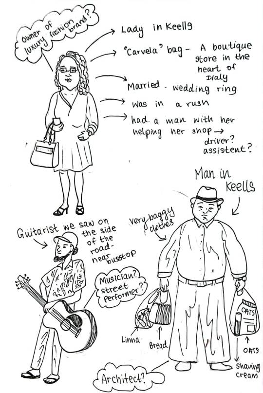
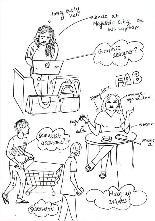
enhance our observation skills, analyzing unique characteristics of certain personas that grabbed our attention in places like Keells, majestic city, FAB, and people roaming the streets. No two people were the same, they had their own individual mannerisms, styles and ways in which they interacted with and responded to their environments. It was truly eye opening to realizes how much inspiration can be jumpstarted by simply paying a little more attention to our surroundings. Here are some reference photos we took, as well as the caricatures i drew;
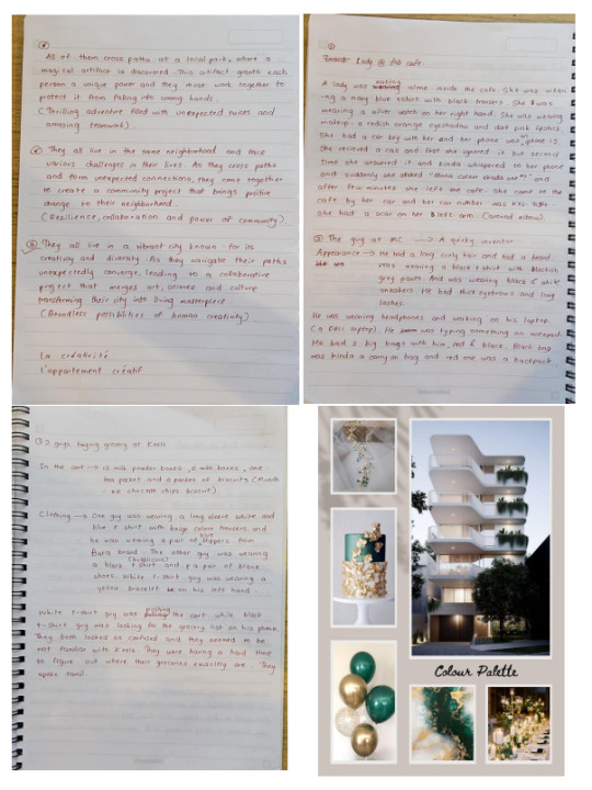
Accordingly we had to choose three characters each from our lists of observations, and create together a cohesive narrative. At first it
was a difficult task to come up with a story incorporating all the characters, but once we started bouncing off ideas, and settled on the idea of an “apartment complex”, the story began to flow freely. I
think working in pairs was a great help in manifesting a worthy story, as we combined and enhanced each other’s ideas. I was really proud of the storyline we created, as well as the message it gave forth. It
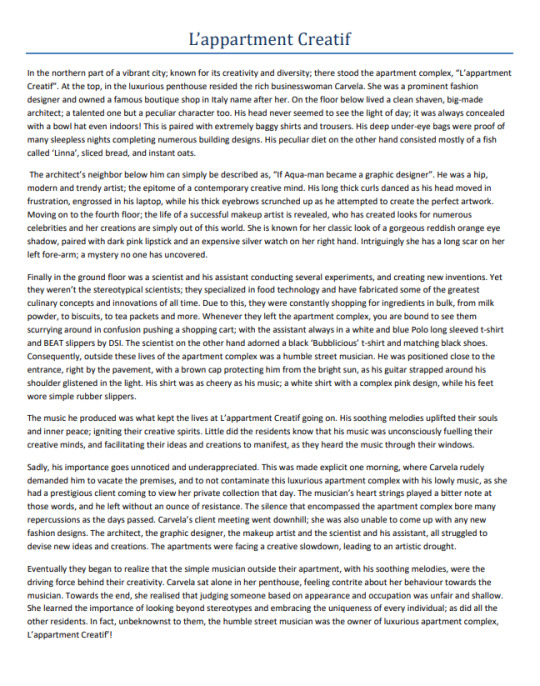
was an appealing experience to utilize our observations of people, and use that as a base for developing specific characters. Our imagination and creative thinking was undoubtedly amplified. My partner was Ayodya, and this is our short story, along with the process work;
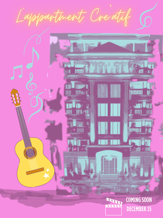
we were also told to design a possible poster for the narrative we created. i chose to create mine as a movie poster;
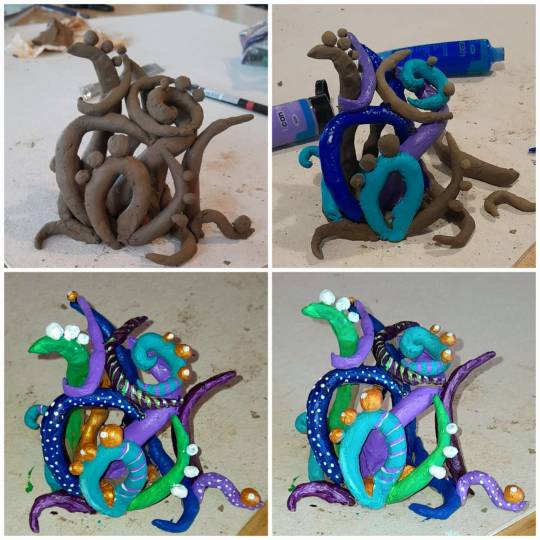
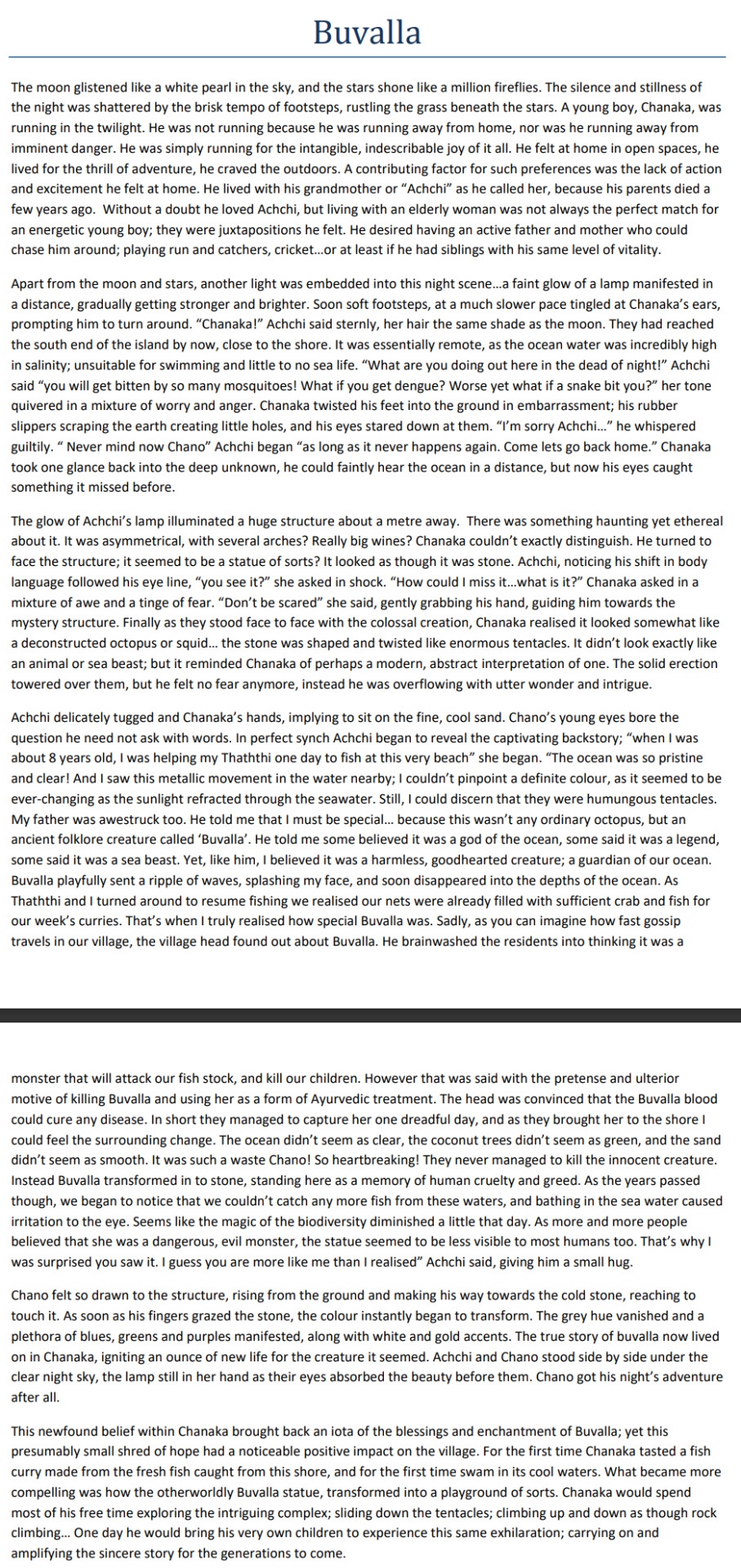
Finally, another engaging activity we did, was to use clay and construct any shape or form, but being creative and using ones imagination. I didn’t really sit and think about exactly what I wanted to create, but I basically let my free will take over. I wanted to create something with movement, a somewhat gravity defining, nothing too perfect or symmetrical. I was pleased and intrigued with how it turned out, especially after adding colour. Then it was revealed to us that we should create a narrative/ story line including this clay sculpture. At first I felt defeated, thinking to myself I should have created something more clearcut and definable. Yet as I stared at my creation, it seemed to remind me of tentacles and perhaps a deconstructed squid/octopus; so I went along those lines to create my short story. the process work for my clay model is shown below;
finally, this is my short story;
Thus, the week was definitely a dynamic and engaging learning experience. I truly believed we enhanced our observation skills and took our imaginative thinking to the next level. Despite the numerous
setbacks and challenges, I feel we rose above them, and opened our minds to new ideas, concepts at opinions..
1 note
·
View note
Text
Week 4- TIMING AND SPACING
Time and space are fundamental instruments in creating visually captivating and cohesive storytelling, in the fields of animation and design. This was our focus for the week, and we explored this idea through dance. We began with a workshop by Umeshi Rajendran; a Sri Lankan-based choreographer, dancer, dance educator and movement coach for theatre. She enlightened us to the link between choreography and design, which honestly was such a thought-provoking session. As a dancer myself I thoroughly enjoyed the workshop as it linked two of my favourite creative paths.
This set the base for our main assignment of the week, which was to choreograph create a dance video. Our class was divided into two groups of four. My group consisted of Shiza, Kais, Movindul and myself. As I was the only one with dance experience, I was mainly in charge of choreography. the first obstacle was deciding what kind of dance video we wanted to create; such as the message and music choice. After much pondering we settled on the song 'Human' by Christina perry
youtube
We chose this song, because it had a powerful message, and I also knew that i could create easy choreography to the lyrics, so that our whole group can manage. it was definitely a patience testing task, but it brought out everyone's personal strengths. As a photographer Kais took charge of the videography, and Movindul was our video editor. Through this assignment, we had to portray our understanding of time and space, which i think we maned to achieve. Undoubtly the dance is not perfect, but with the short span of time we had to choreograph, practice, video and edit, I am honestly really proud of the outcome. We signified the use of time with our synchronization with each other and the music, while space came into play with the manner in which we composed our various positions and formations in the dance. Therefore, i believe we successfully met the brief. this is when i realized that mapping out formations in dance choreography is just like composing and balancing various designs in visual communication. Our final video...after many bloopers is down below;
0 notes
Text
Week 3- DESIGN & CULTURE
Design and culture have a closely integrated and dynamic link; with culture influencing design, and design molding and reflecting culture too. As such, we began by focusing on our cultural identities, and narrowed it down to the smallest unit; our homes/ family. Where you live and come from is the beginning of one’s cultural identity, so this became the basis of our first assignment. Here we were instructed to create a map of our pathway from home to AOD or vise versa. Yet we were encouraged to not display the path in a stereotypical map design, but rather create an eye-catching visual representation of it.
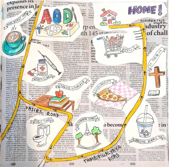
My approach was to choose a few locations I had observed whilst travelling to and from campus. Then I created a visual image to represent each of those locations. The map is not accurate in scale but I believe it still fulfills its purpose as a map, while conserving the creative display. As we were assigned a set size and layout, it was a challenge at first to illustrate the flow of the path as close to the real map as possible. Yet after much manipulations to the roadway, and tweaking the composition several times I arrived at a design I was satisfied with. Then I cut out and coloured the foreground of the map, and decided to put a newspaper in the background. This I felt brought out the informative value that the design still represents, whilst creating a juxtaposition between written word and visuals.
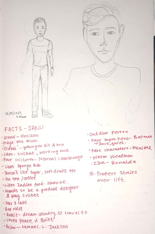
For another activity we were divided into pairs, with my partner being Sanu. Then we were given about 10 minutes to converse and get to know each other, after which we had to divulge everything we learnt f to the rest of the class (Speaking for at least 1 minute). Once again, we were told to converse with our partner, but this time we had to learn a more intriguing story or fact about them, disregarding the usual surface level information. Consequently, we had to present the narrative to our peers. Additionally, we did an entertaining activity in which we had to mirror the movement of our partner, whilst maintaining eye contact. At first these activities seemed senseless, but in the end, I realized they were preparing us and teaching us to be more confident and fluent speakers which would be essential for our future presentations or pitches. As after all there is no point in designing if we cannot present our ideas and justify them confidently.
In our same pairs, we s had to create a caricature by observing them sush as shown below.
Infact, we were told to try once again but using our non dominant hand. this was done with the purpose of igniting our creative mind further, and create something we otherwise might not have. The result is as follows;
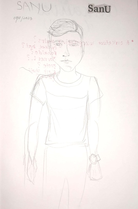
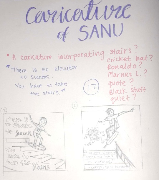
Next, using the unique story we chose to elaborate, we had to a composition with a caricature of our partner and add some form of typography. At first it was tough to narrow down which of Sanu‘s characteristics I wanted to incorporate, but i learnt to know how to cut back and that sometimes less is more. My main focus was an intriguing statement he made which was that he preferred using the stairs over an elevator. Furthermore, we went on a small field trip first walking to the overhead bridge by Bambalalapitya Railway station and Majestic City. We were advised to try and take some reference photographs for our posters. Since I had already decided, I was going to incorporate stairs, I photographed Sanu on Stairs and escalators.
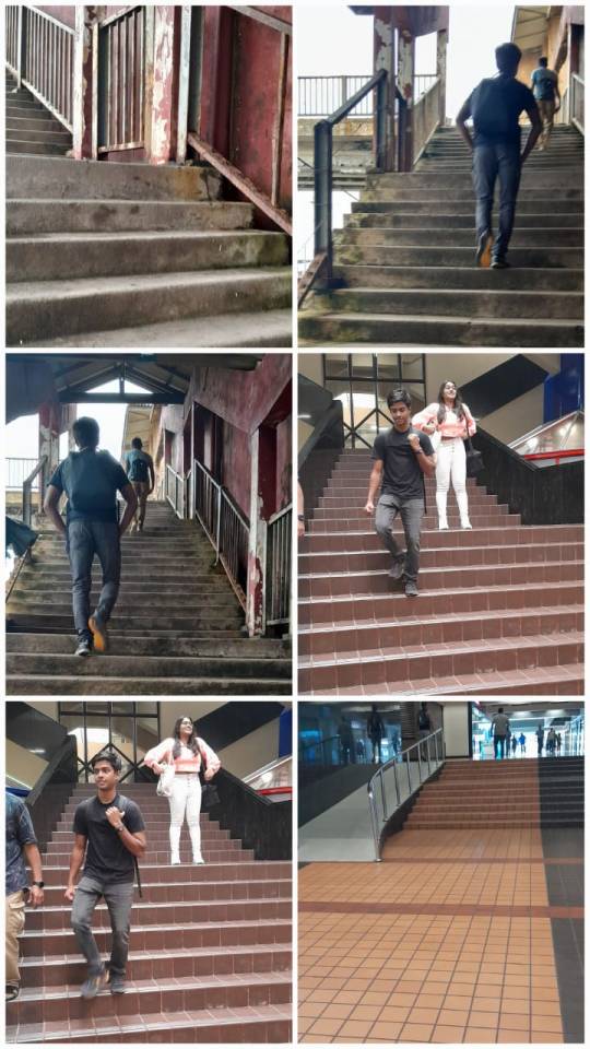
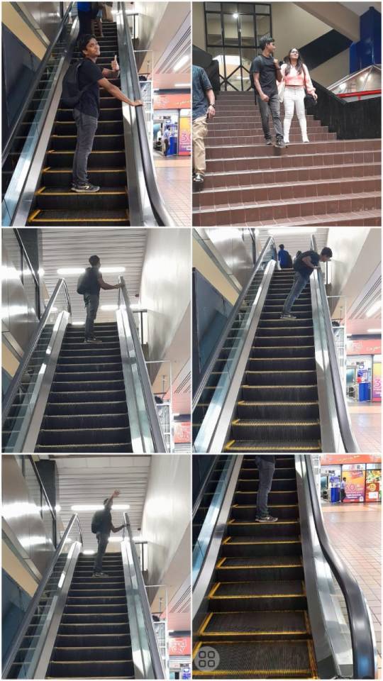
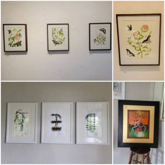
Finally, we ended the day at the Barefoot art Gallery, here are a few photographs,
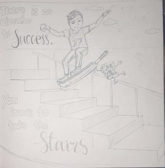
For our final submission this week we had to include typography. As such I found a quote that perfectly coincided with this theme; "There is no elevator to success. You have to take the Stairs". I did a few experiments and planning before attempting the final design, as shown below;
My Final poster, I illustrated using acyrilic paint;
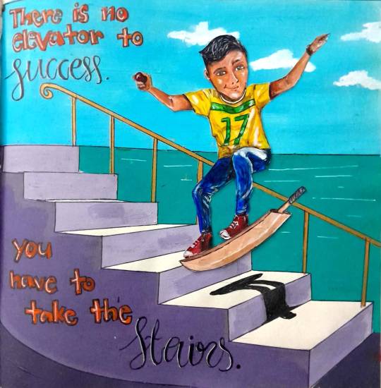
The sea in the background represents his love for the peace, quiet & calm and the colours of his t-shirt reminisce his favourite cricketer (Australian) with the inclusion of his own number; 17. Lastly, he loves cricket, so I replaced the skateboard with a bat. I was pleased with the overall compositions and how I incorporated the typography as well. This was an enjoyable assignment and a learning experience too, as we were compelled to learn to conjure up a visual image based on certain information, and successfully compose and display it too.
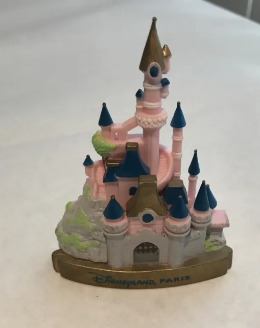
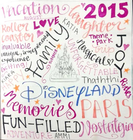
To close the week, we did one more activity. this time we were told to bring any object from home that symbolised some sort of memory or story. I chose a drifge magnet from disney land Paris;
This little object symbolizes one of the most memorable, joyous and entertaining experiences we have had as family. We were asked to divulge the sentimental value of the chosen object to the rest of the class, and it was touching to listen to everyone's stories. After this were assigned to create a visual image using only words, to capture the essence of the object and what it represents. I used a variety of fonts and colours to depict a visual representation in typography, and I believe it mirrors the magic and theme of my narrative. This is how it turned out;
0 notes
Text
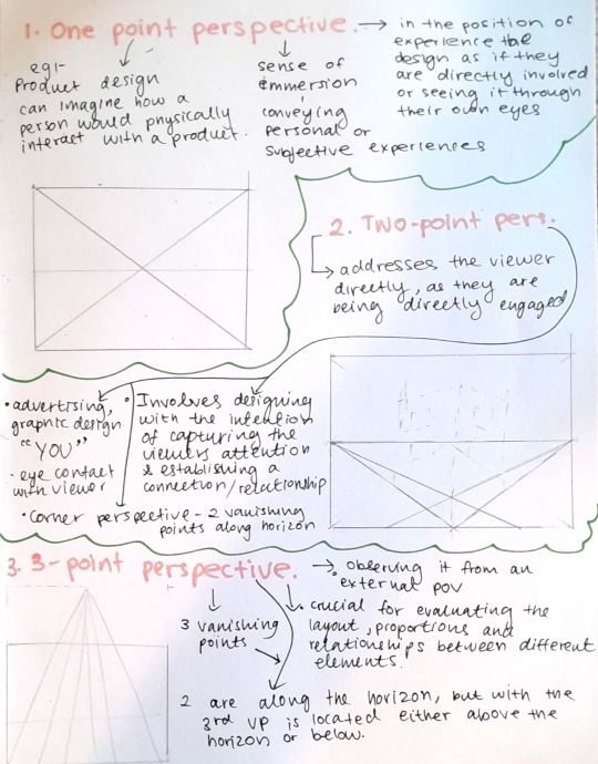
Week 2- POINT OF VIEW
The week focused on how perspective and point of view is a crucial element in visual design. Accordingly, I learnt that there are three main types: First-person perspective, Second -person perspective & Third person perspective.
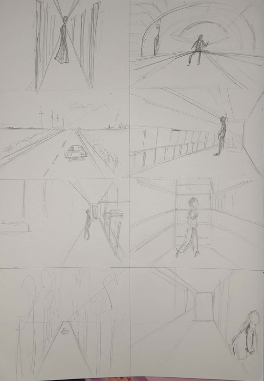
We did numerous timed sketches of various perspective photographs in order to develop our drawing skills with hands on practice.
I began to understand how perspective can truly influence the design process, as it has the power to elicit emotions, convey messages, engage the viewer and create more meaningful & impactful messages, which will be vital for my course.
We were assigned to explore the campus vicinity and take photographs highlighting the different perspectives. Some of the photographs i took our shown below;
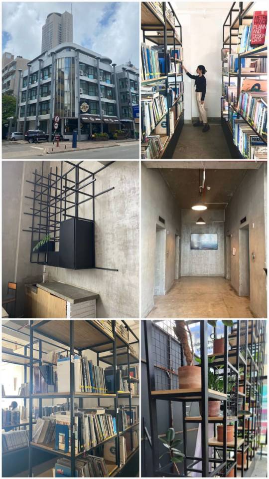
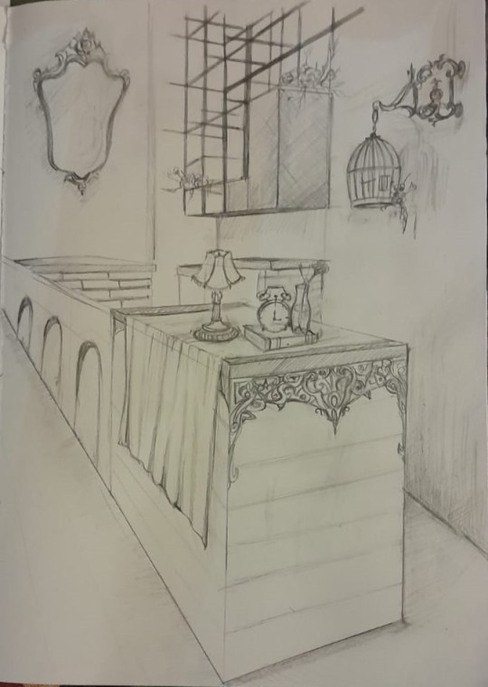
Thenceforth, we were instructed to choose a particular space photographed, and recreate it in your own way, whilst preserving the original perspective. I chose the below Two-point/Second person perspective photograph;
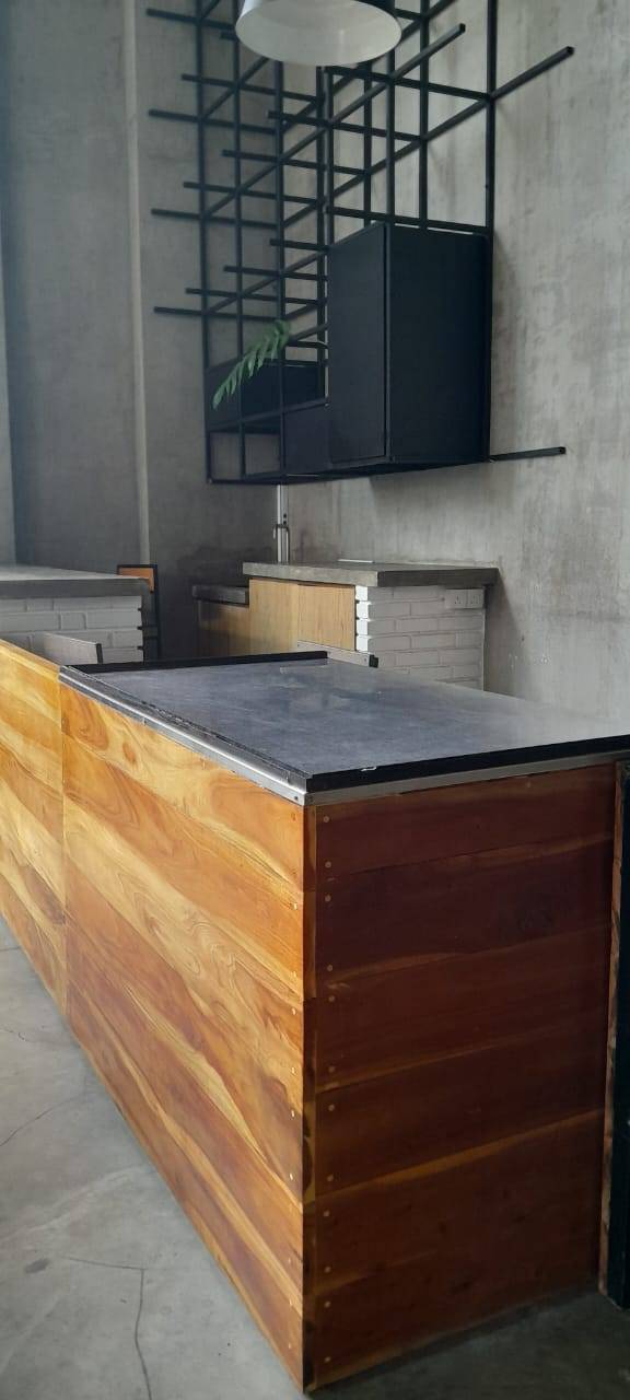
I settled on this particular one as I wanted to challenge myself more than doing a One-point perspective. Yet also because there was so much bare space which available which could be used to my advantage by being able to truly revitalize it. I decided to pursue a vintage/ antique look, which was essentially a juxtaposition to the original. First i did a rough plan too;
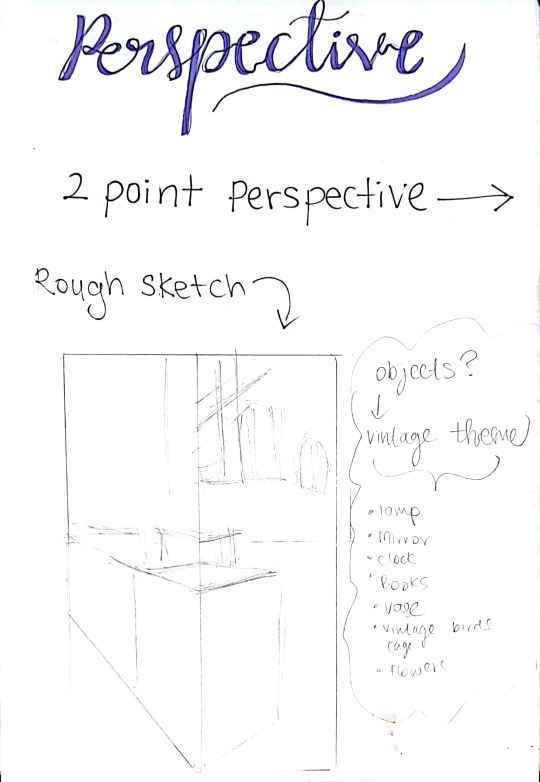
My biggest difficulty was to add objects in the correct perspective and proportions of the background. still as i look at the final drawing I see many imperfections, but I'm satisfied with the outcome. it opened my eyes to how experimenting with various perspectives can provide fresh insights & innovative approaches to design probe. Final submission for this week is shown below;
0 notes
Text
Week 1
My design journey at Aod began with the enlightment that the traditional norms of education we were accustomed to will be broken. Instead we embark on a journey of discovery, facilitating unique ways of thinking, a conscious mind and establishing our designer identity. We were encouraged to push the creative boundaries of the mind; to move beyond one single idea and explore the numerous other possibilities. Whilst also being mindful to work in a collaborative manner as we can help and enhance each other’s skill/ideas, as well as being open to and grateful for feedback that will on only amplify the creativity that resides within.
On the second day, we were prompted to dive deeper into one’s identity. What fuels our design engine? What worthy personal values do I possess that will assist me in my creative path? What inspiration and accomplishments fertilizes my brain? What makes the cog wheels in my mind and soul turn? The answers to such questions I realised were vital for me to reach my full potential as a designer, which was ignited by the activity we did below.
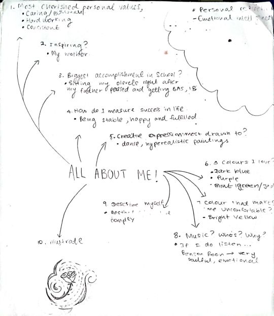
Then we moved on to the VARK theory of learning. My experience experimenting with such modalities was a satisfying challenge. I understood, while attempting to visually express certain words, that we must surpass our initial thought or idea and search for a deeper, unique and more profound visual image and meaning. Consequently the instruction to manifest a short story utilizing the word “chocolate” devoid of its denotation was an intriguing and eye opening experience; in which I drew a parallel to racism. At first i was struggling to come up with a narrative, so I decided to create a mind map as shown below.
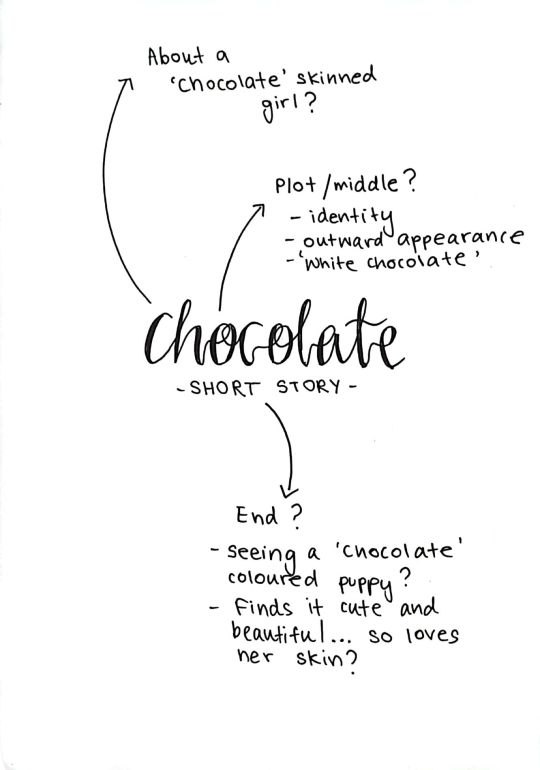
My Short story is as follows;
'CHOCOLATE GIRL'
People are like chocolates. We are different shapes and sizes, we have unique 'flavoured' personalities; some sweet like white chocolate, some bitter like the dark, some are a bit 'nuts' and others a bit sour like 'cranberry'. Nevertheless, this is a story about a little girl. A 'Chocolate' skinned little girl named 'Kandos'.
One morning, as the sun shone brightly, reflecting against her gorgeous earthy, warm, chocolatey skin, she came across a fellow classmate: 'Hershey' walking along the same pavement. Still holding her mother's hand, she waved her little chocolate coloured hand with utmost enthusiasm. Sadly, the joy in Kandos's eyes were not reciprocated.
Instead, he pulled Hershey to his side and sped forwards overtaking them, simultaneously muttering 'dirty skin' which was audible to Kandos's little brown ears.
Her heart broke at those words, something shattered inside the little girl. As she continued to walk along the pavement, her mind was in a world wind of thought. Intrusive thoughts; as she envied the smooth, creamy 'white chocolate' like skin Hershey had. "Oh, how I wish I looked like her, so beautiful, so perfect..." Kandos thought to herself.
Then suddenly there appeared a sweet cheerful puppy, with chocolate brown luscious fur, stunning in the sunlight. She thought to herself "What a pretty little fella". At that moment she realised it was as though she was face to face with a dog version of herself, and if she thought this puppy is beautiful then her chocolate coloured skin is gorgeous too. With a newfound sense of self value, she happily skipped along the pavement holding her mother's chocolate brown hand.
THE END.
Transitioning to the auditory aspect of learning, we created a character using a handful of words we picked out of from the narration of a Dr. Seuss book, whilst our lecturer read it out loud. This is how it turned out,
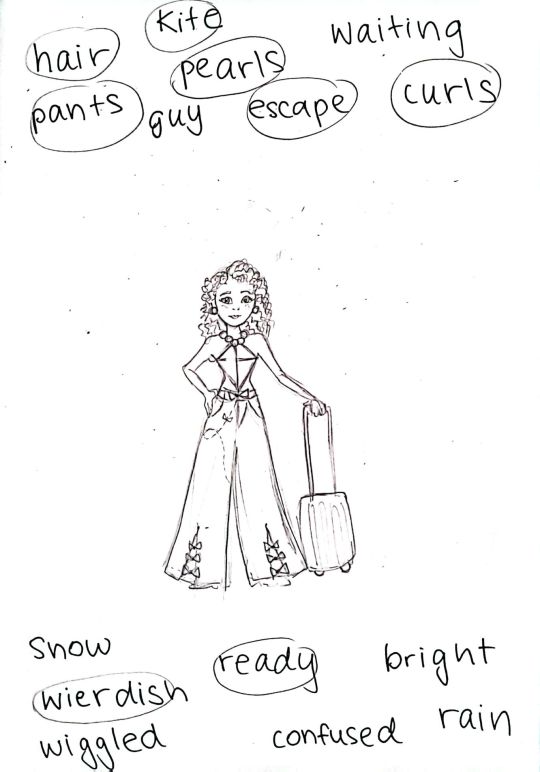
At first, I found it a bit difficult to merge different words into one visual image. Yet I was fairly satisfied with the result. I circled the words I wanted to focus on, and then created the character and sketched it out. Here, I came to an understanding that a mixture of all the VARK modalities was an appealing learning strategy for me. I couldn't pinpoint a specific type of learning that worked best for me, as I believe in different contexts different VARK modalities may suit better, but it was always a mixture.
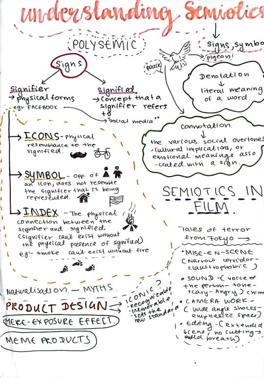
Next we gravitated to further comprehend visual language in design; specifically through Semiotics. This is essentially the various signs and symbols that facilitate visual communication. I learnt the difference between a signifier and signified, and identified the meanings and examples of the words Icon, Symbol, Index, Denotation and Connotation, all of which is captured below;
Additionally, we focused on how the Elements and principles of design are powerful tools to reinvent perception and express ideas. Here, we were assigned to create compositions using only 5 circles, then 5 squares, to exemplify certain words.
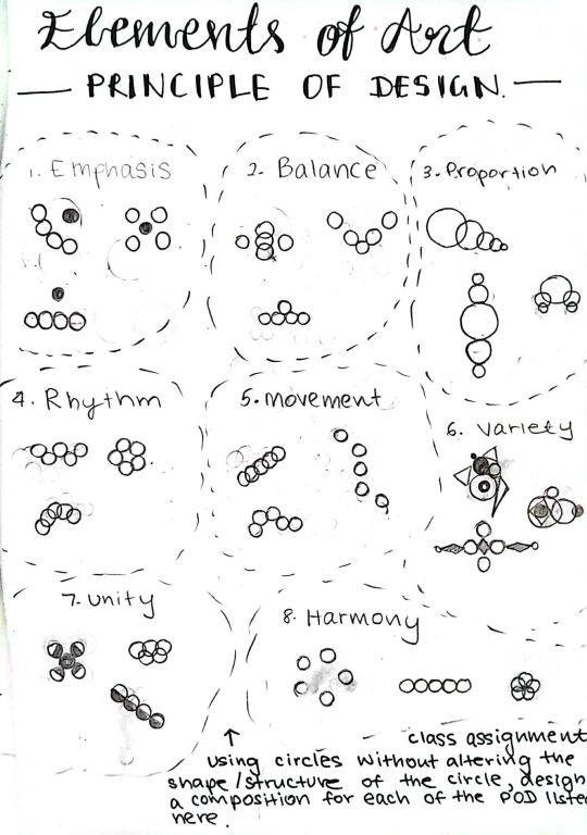
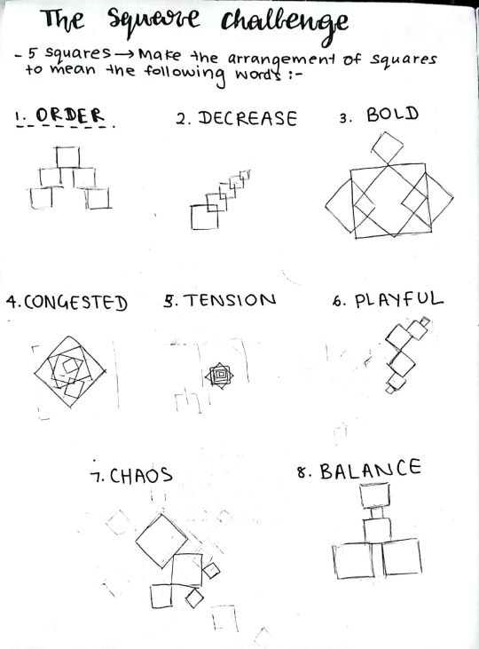
Honestly this was one of the most challenging parts of the lesson thus far, as it was a first experience for me. It really propelled my thinking and challenged me to inculcate unique compositions to encapsulate the meaning visually.
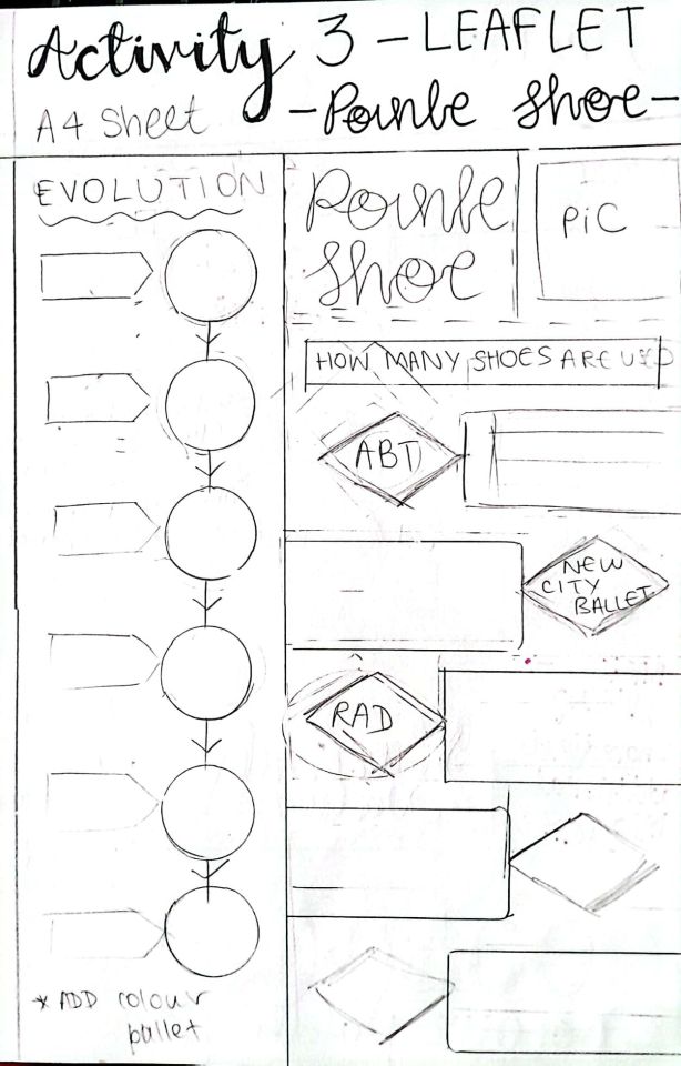
This finally lead us to create an infographic about any topic of our liking. Mine revolved around the “Pointe shoe”; focusing on its evolution and current usage statistics. First we were encouraged to design a rough layout for our infographic/ leaflet, which is shown below;
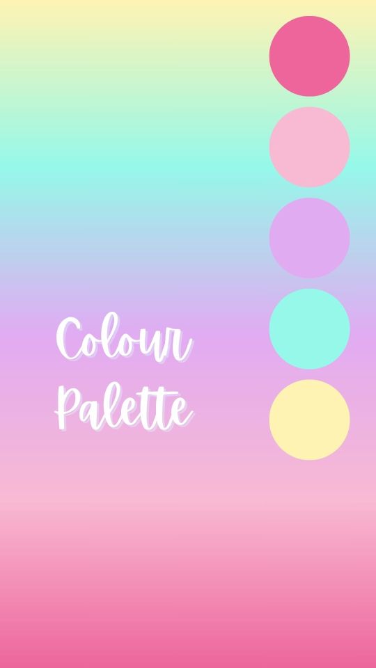
For my final leaflet design I used mostly pastel colours but added a dark pink for that much needed contrast and pop of colour. I felt the colours were in harmony with the theme of the leaflet. I wanted to capture the flow of information with the layout as well, which I feel I achieved. The colour pallet and final leaflet is as follows
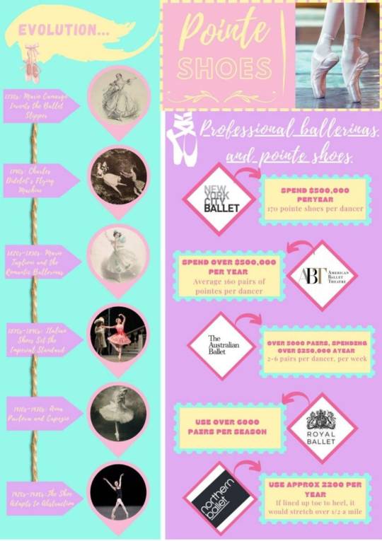
However, especially after printing the leaflet I realised many drawbacks. For an instance the text wasn't as clear as I hoped. As such I was advised by my tutor to refrain from using cursive fonts for largely informative text, as it is difficult to read from a far which would defeat the purpose of a leaflet. Thus it was an eye opening experience.
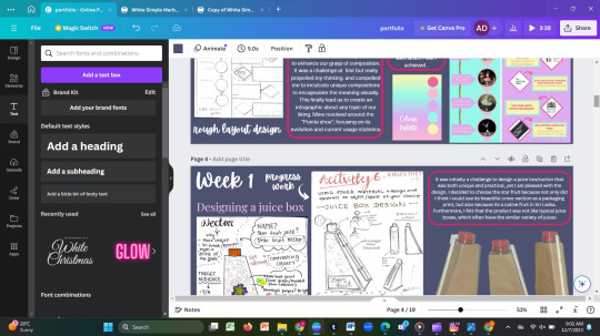
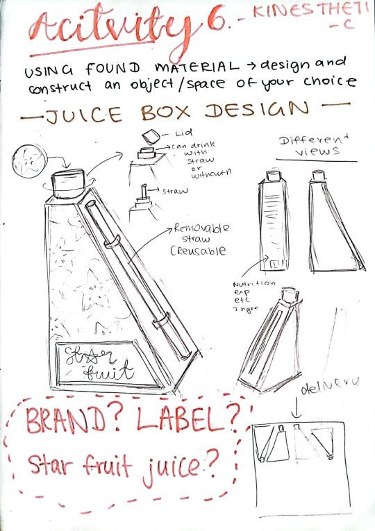
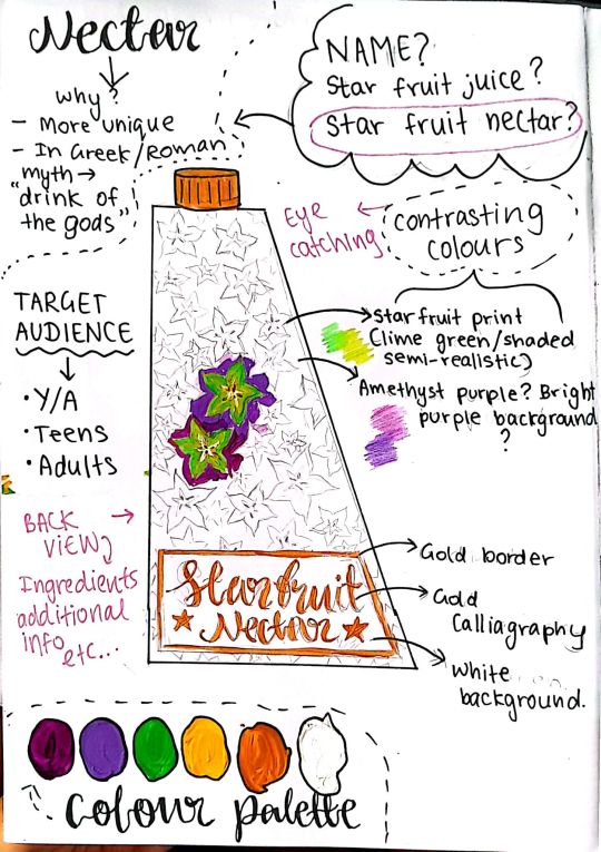
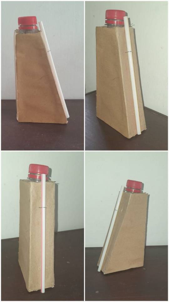
Furthermore, the kinesthetic section of learning was evoked through an assignment to design and create a physical model of a juice box/ carton. This was probably my favourite part of my learning experience so far, because it was so satisfying to see the 2D design I sketched on paper, transforming into a 3D model. It was initially a challenge to design a juice box/carton that was both unique and practical, yet I am pleased with the design. I decided to choose the star fruit because not only did I think I could use its beautiful cross-section as a packaging print, but also because its a native fruit in Sri Lanka. Furthermore, I felt that the product was not like typical juice boxes, which often have the similar variety of juices. these our my thought processes, and design sketches for the juice box;
My 3D construction of the juicebox/ carton is below
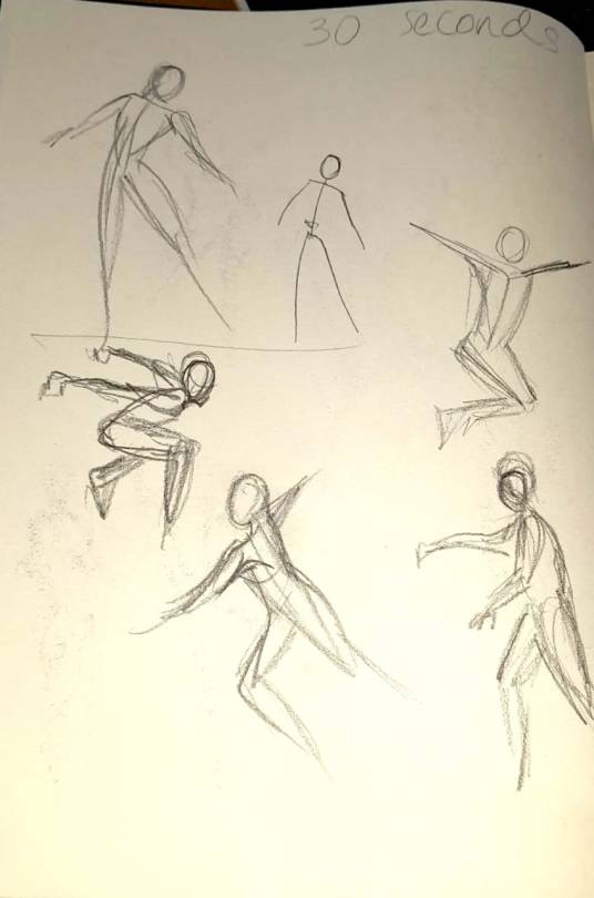
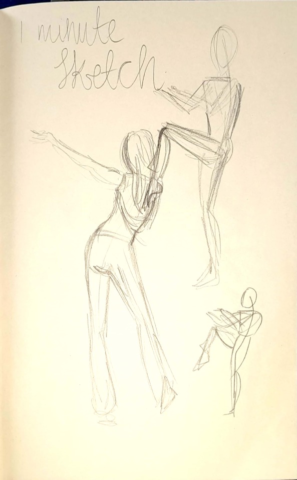
For the last lesson of the week so far, we were taken back to the roots of sketching figures, where we formed a deeper understanding to line, movement and shapes created by the body. Through numerous speedy sketches of ranging from 30 seconds, 1 minute and 5 minutes we slowly began to strengthen the ability to capture the human body, which would later aide in character design. ersonally the time constraint hindered my drawing skills, and im not prud of the sketches, but it did enlight me to how important it is to practice drawing skills in order to sketch really fast and effortlessly. A few of the sketches are shown below
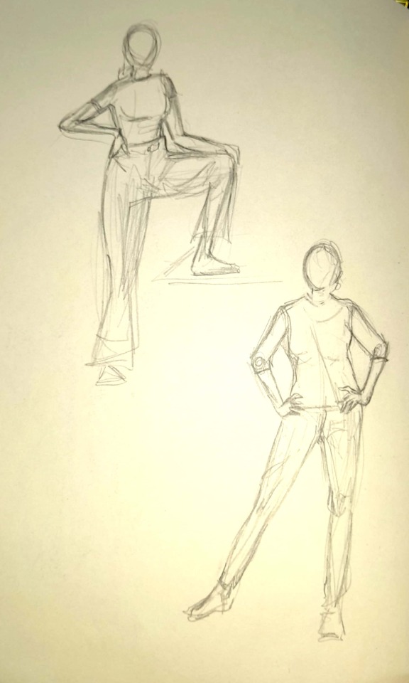
We sketched our classmates too! Shown below is Ayodya, Maria and Shiza respectively;

I have been thoroughly enjoying the course so far, along with its challenges yet fruitful learning outcomes. Slowly but surely, I feel my ability to visually communicate, and design is improving.
2 notes
·
View notes