
DESN_1031. My creative processes and other random things my brain comes up with.
Don't wanna be here? Send us removal request.
Statistics
We looked inside some of the posts by aoc-design and here's what we found interesting.
Average Info
Notes Per Post
5
Likes Per Post
5
Reblog Per Post
0
Reply Per Post
0
Time Between Posts
6 days
Number of Posts By Type
Text
17
Last Seen Tumblr Blogs


Fun Fact
Tumblr.com is the 103rd most visited website in the world.
Text
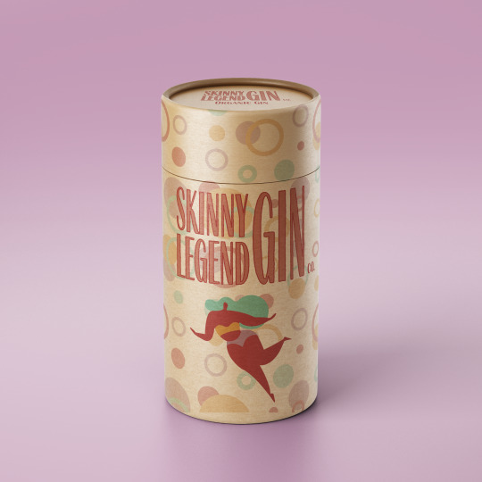
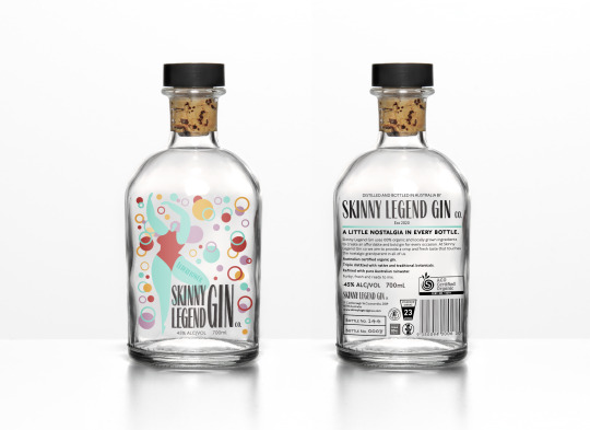
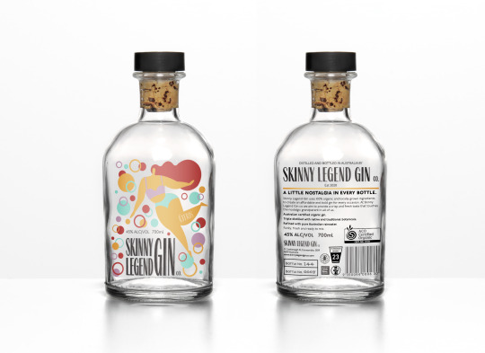
Week 13: Final Mockups
I’m really happy with how my Beverage brand turned out. I think it has managed to mix the modern and retro aesthetics nicely. I chose to extend the brief by creating a series of premixed gins to accompany my original gin, as well as packaging options to allow for the beverage to be gifted. This was a fun assessment and I appreciate the feedback from both my tutor and peers throughout this process.


5 notes
·
View notes
Text
Week 12: Mockup choice
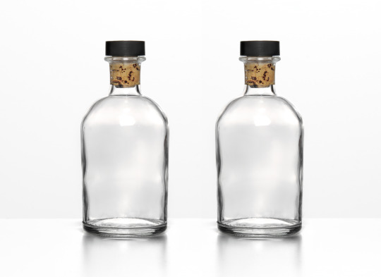
This week I finally found a mockup that I think is appropriate for my beverage brand. The bottle is textured with divots that create more dimension in the glass. I like the use of the cork top, it ties in with the organic aspect of the brand. I like the round shape as well as the size of the glass bottle. I found it on free-mockups.com. The only thing is that it is limited to the one view, however it fits with my drink so well that I don’t really mind. I aim to find other mocks of packaging to accompany my drink fo final submission.
I also finished my label this week, so I thought I’d redo my diagram with the new information.

0 notes
Text
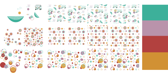
Week 12: Repeat pattern
This week we looked at creating repeat patterns for imaging purposes. The aim was to create something that fits with my beverage brand, which I think I managed to do (eventually). At first I tried to incorporate the retro aspect of my brand, as well as adding a modern twist. Below is the process I used in illustrator

0 notes
Text
Week 11: Label Diagram + imaging progress
This week we looked at what has to be included on certain labels in order to comply with certain beverage guidelines. Since I have chosen to design an alcoholic beverage I have to include certain warnings and info in order for consumers to be informed about their drinking. We were then asked to create a label diagram for our own beverage layout. I did some research to double check the sort of warnings and information that has to be included legally to my label, then I put my label design into InDesign and started labelling. Since I haven’t completed my front label design yet, I just used grey shapes for where I plan to put things. (I’ll add an updated diagram once I’ve finished)

I’ve also included the imaging illustrations that I plan to include in my label designs.

0 notes
Text
Week 11: Case Study
This week we were asked to find a case study of great label imaging. I’m unashamed to say, I spent an hour just looking at the cool stuff on Behance instead of actively looking for good imaging. However, as I was scrolling I did come across ‘San Benedetto’, a really great Italian juice brand that I love. The image choices are thought out and the colour chosen reflects flavours really well.

The design of the bottle is beautiful. I love the way that the flavours are reflected in the colour palette, as well as the imaging itself.

The use of recognisable landmarks as part of the design is genius, it links the drink to Italy and also creates familiarity to its consumers.

Ultimately, I think this is some of the best label imaging I have come across over the span of this course. If I saw these on the shelf in Australia, I would 100% choose it for it’s appearance alone.

0 notes
Text
Week 10 pt 2: Imaging research
Once I was satisfied with my logo design, I then reviewed my mood board to focus on the imaging concepts for my label. I decided that I wanted to use simple graphics with the muted tones of my colour palette. I figured that the bold graphics would compliment the design, leaving me room to play with layout and negative space. I decided that if I was going to use a see through label (which I plan on doing), then I am going to need as little detail, in the way of illustration, as possible.
I went back down the Pinterest blackhole to look for images similar to what I am imagining in my head. I am aiming to use retro patterns of some sort, yet with a modern twist. I cam up with the below mood board which presents the sort of simple graphics I aim to create. I will be using my own colour palette obviously, but with similar combinations in patterns.

I then did a couple of sketches to see what kind of shape combinations I plan on using for my patterns, as well as main graphic ideas.

0 notes
Text
Week 10 pt 1: Logo progress
This past week I’ve been working on my logo design, as well as looking for inspiration for my imaging.
Logo: I started the design of my logo by finding fonts that were similar to the design I’m aiming for.

I then prepared them for manipulation and began rearranging my favourites into different layouts, seeing how they would fit into packaging and other branding designs.

Once I’d decided on my font, I then began arranging it differently, adding shapes, symbols and other design elements. I was hoping to add some sort of image into the logo to emphasise the ‘skinny’ aspect, however I wasn’t happy with anything I tried. I also found that the logo looked best when it was just typographic, so I ended up continuing with that.

I started playing around with colours and seeing how different outlining worked with the design. While I was exploring colours I noticed that my colour palette worked well in representing different flavours for mixed gin versions. I chose Elderflower, Citrus and Berry mixes for the expanded gin range, however I the classic organic gin is going to be my main beverage for presentation purposes.

After continuing to lay with colours I then looked at how the font I am using for my logo would also work for the flavour headings. So, I played with the outlines and tints of the colours to see what would work in my design.

I ended up narrowing my design down to the basic typographic ‘Skinny Legend Gin co.’ logo in black and white for my beverage to make it stand out against the colours I will be using for the imaging. I also chose red and orange coloured versions for other packaging and promotion material.

0 notes
Text
Week 9: Logo ideas
This week I looked at logos for other gin brands to get an idea of the sort of design I should be applying to my own brand. I aim to create a logo that is visually different from the traditional, clean cut, logos that are often used for alcoholic spirits.
I started by going to Pinterest and finding logos that I liked the design of and putting them in a document. I found that I was really drawn to the rough texture of ‘The Mill’ logo and the back shadow effect of ‘Gordon’s Gin’ which makes it stand out on the page and on its packaging.

I then did up some sketched combining the two design ideas I liked and ended up with some very similar aesthetics. I am leaning towards block letters with an offset outline that creates the shine effect (seen on the word Gin in the second image). I think something like this will really stand out on my packaging and work nicely with the retro aesthetic I am aiming for.


0 notes
Text
Week 8: Final concept work
After creating my recorded presentation, I then combined my rationales, mood boards and experimentations to create my final concept sheets for each visual direction. These were then uploaded as part of my A1 submission. In the tutorial on Thursday, my peers chose the ‘fun drunk’ (which I was pretty happy about). The feedback they gave me was super helpful and it seems my colours and concept is what drew them to voting for it. It was suggested that I look at incorporate the retro aesthetic more into my imaging rather than my logo, as it is the part of my drink that people will look at first.
Crystian suggested that in future mood boards I add more to do with the target audience, such as pictures of people at a bar etc. He stated that the use of the roller skates image is what drew him to my ‘fun drunk’ visual direction, because it told him the kind of consumer I am aiming my beverage at. I completely agree with everything my tutor and peers suggested and I plan to use their tips when next presenting a visual concept.
Below are the two final concept sheets for both of my visual Directions. I chose to present them in an A3 portrait orientation in order to fit everything in, as well as create a layout that reflects the way I want the viewer to read/view my concept :


This is the winning visual direction! WooHoo! Next week I hope to have some logo sketches and type options to get some feedback on in tutorial, I am keen to see how I go with this visual direction.
0 notes
Text
Over the break:
During the past two weeks I finalised the slides for my presentation, recorded it and created the final concept pages for the A1 submission.

• This part of the process was relatively easy. I used my updated mood-boards from week 7 for the 2nd & 4th slides and added my rationales with any other sketches, mind-maps and experiments on the 1st & 3rd slides. I focused on creating visual links between each direction’s slides, that way it would make it easier to demonstrate my ideas and reasoning when presenting via recording.

• I found this step a little more complicated because I’d never used timed slides in powerpoint before. I’d also never exported my slides to an MP4 before, which was interesting to learn. I made sure to add notes in the slides when practicing the timings in hopes of mentally retaining the points I wanted to make before recording it without prompts.

• It’s safe to say that this was probably the most confusing part of the process. I had trouble working out how to download the app, let alone actually work it. Once I finally got the hang of the countdown and timing, I was able to record my presentation without too much trouble and was really happy with the outcome (I will definitely be using loom for my other online presentations).
0 notes
Text
Week 7: Rationales + updated Mood-boards
This past week I have added some updates to my rationale and mood boards for both visual directions. My peers gave me some really useful feedback last week regarding the way I have presented my drink brand and whether the images are a little too varied for the specific idea I am trying to portray. So, I went back to my basic ideas and looked at the colour combinations and styles I’m aiming for.
Skinny Legend Gin ‘Clean Drunk’ rationale:
Skinny Legend Gin ‘Clean Drunk’ uses organic ingredients and environmentally friendly practices to create an affordable gin, while still retaining the elegance of a classic spirit. It is perfect for those cursed with expensive taste and tight purse strings.
I chose this concept due to my own experience while shopping for alcohol on a budget. I’m always going for the cheapest, least interesting looking, bottle on the shelf in order to save money and end up hiding it away at the back of a cupboard because it isn’t decorative enough to display.
Skinny Legend Gin is ecological, local and sustainable, not to mention pleasing to the eye. The Gin is made using sugarcane-based ethanol and is non-GMO, making it considerably safer for human consumption…excluding the choices you may make while under its influence. (drink safely)
The natural themes of the beverage are reflected in simple line drawings of both the female body and flowers, and further reinforced by the pastel greens, pinks and purples used in the colour palette. I incorporate the clean and classy appearance associated with a traditional gin in the form of elegant typefaces, including script and humanistic sans serifs, which combine to create legible and visually appealing text. The simplicity of the design is shown in the use of minimal typefaces and the use of space in the layout of design elements such as text and graphics.
The combination of traditional and modern design elements aims to create an almost hand-crafted and refreshing appearance, while still retaining the sophistication of an expensive spirit.
This is a gin bottle that deserves a spot on the liquor shelf at home.

I went for a more delicate and refined approach in this mood-board. I hope to convey an elegant, organic gin that’s simple feminine touches resonate with the female consumer. The muted pastel tones and single line drawings give the drink a minimal and natural appearance. I used illustrator to experiment with line drawing for both the flowers and bodies pictured, this helped me see how thin lines work with the fonts and colours I am looking at using. I think this moodboard better conveys the concept of my ‘clean drunk’ approach to skinny legend gin.
Skinny Legend Gin ‘Fun Drunk’ rationale:
Skinny legend Gin ‘Fun Drunk’ uses organic ingredients and environmentally friendly practices to create an affordable, travel-sized gin that is on hand to get the campfire sing-along started or make a family holiday just that little more bearable.
I came up with Skinny Legend Gins ‘itty-bitty gins’ when packing for a weekend girls trip. Having no way of fitting full-sized bottles in my bag without sacrificing a pair of shoes, or the three extra shirts I always pack, I was left with the dilemma of how to transport my drinks.
Skinny Legend Gin’s ‘Itty-bitty gin’ combines the fun of the 80s & 90s in a retro style design for the nostalgic grandparent in all of us, with the added benefit of being small enough to fit in your handbag.
The choice to use commercial art illustration reflects the pop-art aesthetic of the brand, which is then reinforced in the muted retro colour palette, shapes and collaged graphics that make up the design. To balance the simple style of the graphics, I am using a geometric sans serif typeface for my packaging text and either a hand-writing script or casual script for my branding. I aim to employ a wraparound banner to break up the image and tie in the design elements of a classic gin.
Due to the small design space that comes with a travel-sized bottle, I’ve kept the illustrative graphics and typography uncomplicated and minimal, this frees up space and draws the eye of the consumer. The balance between pop-art aesthetics, vintage design elements and a small canvas creates a travel ready gin that is so cute you’ll want to collect them.
This gin is an interesting combination of organic, nostalgic and artistic, all
wrapped up in a travel-sized bottle for your convenience.

I did up my first mockup Logo/image (pictured in the centre), experimenting with my colour palette and the retro illustration style I think will work well with a solid background colour. I like the idea of using shapes in bold colours as part of my brand’s image, something bold and basic. I want this brand to pop against the traditionally ‘classy’ aesthetic of the typical gin. I think, with the colours, fonts and images I am using, that this mood-board now conveys that better. I am aiming for a small, flat, glass bottle, which I feel will suit the retro style I am aiming for.
0 notes
Text
A little advice:
Week 6:

Paul Rand was an American art director and graphic designer, well known for his corporate logo designs such as Morningstar, IBS, Westinghouse and ABC. He once said “Design can be art. Design can be aesthetics. Design is so simple, that's why it is so complicated.”
It is so easy to get bogged down in the details of a design. I often forget that the art of design lies in communicating something, and the simpler I design it, the easier it is to understand. However, like with every other aspect of life, we tend to overcomplicate it. Text, Graphics, Colour & Layout become part of a visual language that has to be manipulated and stretched to fit a designer’s vision. However, design is just that...text, graphics, colours and layout, and once we understand that, the simpler designing becomes.
Ultimately, my advice is this > Do not over complicate it. Sometimes the best things in life are the simplest.
Also, remember that design is not for you, but for others, and the simpler you can communicate your idea, the easier it will be to understand.
0 notes
Text
Mood Boards 2.0
Week 5:
In last week’s tutorial I displayed my mood boards and explained the decisions I made regarding the images and text included. Afterwards, I got feedback from my tutor and peers, and was given the opportunity to adjust the mood boards I had created in order to better communicate my vision.
#1 The clean drunk: I was fairly confident when presenting my first mood board because I believe the images and fonts chosen work well in clearly showing the feel and style that I am aiming for for this visual direction. Due to my beverage being an alcoholic spirit, the images, graphics and fonts shown are all minimalist, clean and simple.
The feedback I received from my first mood board included:
- Better representation of label text (alcohol percentage, stranded drinks, ingredients etc)
- Exploring the use of clear bottles with transparent labels to show the contents of the beverage.
From this feedback I began looking at simple fonts I could use for my labelling, specifically the ingredients list and other important information used for alcoholic beverages. I added to letter sets that I think could work for my brand’s aesthetic, without dragging too much attention away from the drink itself. I am also playing with the idea of using a paper covering on the bottle that shows the beverage information that can then be removed to reveal more decorative packaging. Below is mood board #1 with adjustments:

#2 The Fun Drunk: My second mood board has a completely different feel to the first, it is fun, with a pop art aesthetic and collage type style. When presenting this mood board I was surprised with how much my tutor actually liked the idea.
I was offered some really good feedback regarding the execution of the idea, more than the moodpboard itself:
- think about overlaying in illustrator and photoshop to create more flow with the pictures I use
- Try to use contrast as much as possible to prevent various elements of my label/graphics from merging into one messy image. E.g. simple text over a busy image makes it easier to use, furthermore, black or white text over a colourful background helps to bring the brand name forward.
- start hiking about what my bottle will look like on a shelf with hundreds of others, what will make it pop?
From this feedback I started thinking about my bottle, if I plan on using a colourful label, it might be a better plan to use a clear or frosted glass bottle instead of a coloured on, otherwise it might blend too much with the bottles that surround it. I looked at the kind of lines and patterns I could use to border my label, as well as the label text for things like ingredients lists and alcohol percentages. I added font names to my suggested brand name, to help me remember which ones I used, but also to show the kind of style and similarities I am looking at using. Below is mood board #2 with adjustments:

0 notes
Text
Initial Mood Boards (1&2):
Ladies and Gentlemen (and those who identify as something else), we have a Beverage Brand concept AND a name!
I am proud to present ‘SKINNY LEGEND SPIRITS!’
Now that I have FINALLY decided on a name and concept, I must work out what visual design direction to go in for my beverage brand. We were asked (in class) to create a mood board for each of the 2 visual design directions we have in mind for our beverage concept and below is what I have come up with:

Skinny Legend Spirits #1: The clean drunk
The concept of ‘Skinny Legend Spirits’ is to create a Gin/Vodka brand that is organic and affordable for consumers, while still retaining the sophistication of a classic spirit. I chose this concept due to my own experience while shopping for alcohol on a budget. I’m always going for the cheapest, least interesting looking bottle on the shelf and end up hiding it away at the back of a cupboard because it isn’t interesting or decorative enough to display. The design for skinny legend spirits incorporates typical clean and sharp vodka and gin appearances with minimal and elegant graphics and type that will make the brand POP. I will use black, white and pastel green tones to highlight the simplicity of the bottle and help integrate natural/organic elements. The bottle itself will be clear, tall and ‘skinny’, fitting in with the brand name and adding to the modern style. The simplicity that it reflects is both classy and refreshing.
Keywords:
• affordable • sophistication • decorative • clean • minimal • organic • modern • refreshing • classy • bold

Skinny Legend Spirits #2: The fun drunk
The concept of ‘Skinny Legend Spirits’ is to create a Gin/Vodka brand that is more organic and affordable for consumers, while still retaining the sophistication of a classic spirit. I chose this concept due to my own experience while shopping for alcohol on a budget. I’m always going for the cheapest, least interesting looking bottle on the shelf and end up hiding it away at the back of a cupboard because it isn’t interesting or decorative enough to display. The design for ‘Skinny Legend Spirits’ brings retro back in style with multi-coloured bottles and collaged graphics. The use of warm tones and vintage black and white imagery will combine to create a pop-art appearance, allowing the bottle to be reused for more ornamental purposes. The brand’s appearance convey’s a nostalgic aesthetic that is collectible, like the post-modern art it’s styled off.
Keywords:
• Affordable • sophisticated • decorative • retro • multi-coloured -•bold • vintage • ornamental • nostalgic • collectible
0 notes
Text
Inspiration boards:
Below are the 2 x Inspiration Boards used to visually source images that I think stylistically communicate the 2 x different visual directions for my beverage brand concept.
The first is an elegant, classic/timeless style. It has a certain classy charm that drew me in when researching branding for spirits such as whiskey, vodka, gin etc. I specifically like how the colourful design of the labels contrasts the clear bottles, something I might look at doing for my own beverage brand. The bottles are cute sizes and shapes and just by looking at them you would think they were targeted at females.

The second inspiration board focuses more on the simplistic side I was looking at. The monochrome colours of some of the beverages are simple, yet refined and would work perfectly with a graphic such as the ones spread throughout the board below.

0 notes
Text
Week 2 Tutorial: Brainstorming is hard
In this week’s tutorial we were tasked with brainstorming and generating ideas regarding out drink branding. I first began with looking at what kind of drink I would like to create a brand for and who my target audience would be. I came up with a couple ideas, my favourite being:
1. old school sodas for the nostalgic and old at heart (collectible packaging perhaps).
2. Elegant, yet cheap, spirits aimed at women. Something fun and fresh to balance out the crazy amount of classy and costly, manly gins and vodkas.
I then did a brainstorm to see what I came up with regarding branding ideas.
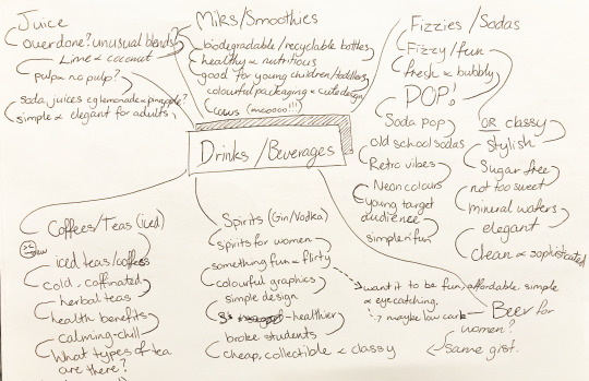
From here I did some word and image association for my favourite 2 to see where my thoughts took me regarding each concept:
1. old school sodas:

2. Spirits for women:


Ultimately I think I like ‘Skinny Legend Spirits’ better, however, I am yet to work out some visual concepts to go with it.
*skinny legend is a term of endearment for someone (normally female celebrities) who are flawless but underrated*
0 notes
Text
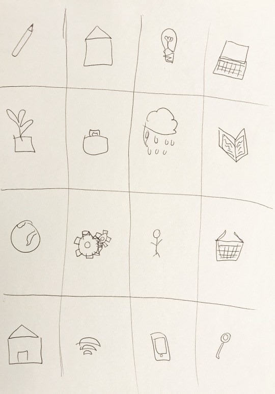
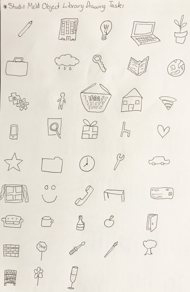
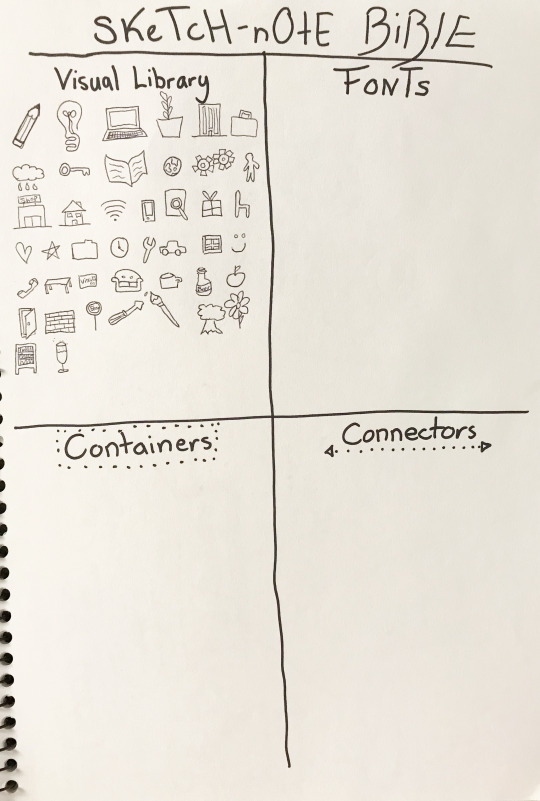
Week 2 sketch-note exercises:
In our lecture this week we were asked to draw the essence of objects and keep up with the recorded speaker, and then to develop those drawings more symbolically and place them in our sketch note library. Below is my first attempt (in the lecture), as well as my second attempt (self-directed).
first attempt:
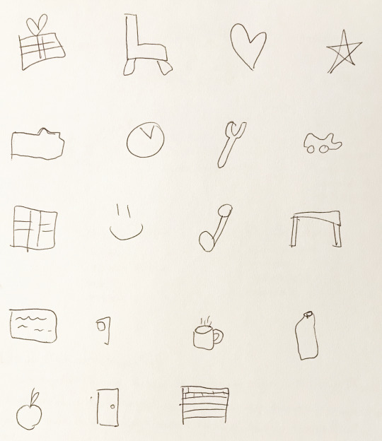
second attempt:
Once we had drawn all/as many of the items listed in the audio file, we then had to simplify them and place them in our sketch note bible to use for reference later on when taking notes (I am yet to fill in the other sections):
0 notes