
Last Seen Blogs

spacexmochis
Gravity
estrellami-1
Naught But A Feral Writer
trollbreak
Ehe Kitty
frzser
* / 𝒑𝒂𝒓𝒕𝒚 · 𝙖𝙣𝙞𝙢𝙖𝙡

brightbracesdds
Bright Orthodontics
Link
This go presents diversity within text, whist keeping an overall subject matter of art deco. This could be a route I could take for my ISTD brief. Could be used as part of campaign to mark the anniversary of 50 years of decriminalisation of homosexuality.
0 notes
Link
New brand campaign in 10 years. After recent research, hate crime against the LGBT community has risen. Therefore ‘Come Out For LGBT’ is a campaign shows an array of real people and famous people supporting the cause visibly and hopes to encourage people to do the same.
A campaign could be possibly outcome of this project as long as its typographically focused.
0 notes
Link
Love Happens Here, is this years London campaign during pride. It was a big year celebrating 50 years of legalisation of same sex. It could be an idea to create a campaign or rebrand of pride to celebrate the same anniversary.
0 notes
Link
This campaign promotes the LGBT community as well as educating the public on how far they've come but how far they've got left to go.
Absolut is one of LGBT biggest supporters. They've been behind the LGBT community for 35 years, promoting and fundraising to help the movement move further.
0 notes
Link
Looking into how companies show support and respect to the celebrations of the LGBT celebrations.
0 notes
Link
Researching in to LGBTQ culture. How its been celebrated in the past, thinking about different idea’s of how to represent an anniversary linking to either pride or LGBTQ community.
0 notes
Text
Picking an anniversary
After looking into words that link to anniversary and what springs to mind when I think of anniversaries. The first thought is traditions around of the world. After thinking and researching into this area. I became confused about what the brief is asking for.
After revisiting the brief, I went back to square one and wrote down annual events I personally celebrate or visit. After a few ideas, Pride came to mind. The weekend event held close to my home. Brighton pride, a growing celebration of the LGBT community. The history of pride and LGBT community is rich with historical moments and is still a current movement in todays society.
With it being the 50th anniversary of homosexuality being decriminalised in England & Wale and the 25th anniversary of Brighton's pride parade it provides plenty on different anniversaries and celebrations to be looked into for this brief.
0 notes
Text
Anniversaries
‘the date on which an event took place or an institution was founded in a previous year.’
Anniversaries is my chosen ISTD brief for this unit, specialist practice.
0 notes
Photo
Evaluation
Concepts of visual language has been a challenging unit for me, due to the broadness at the beginning. Whilst first coming up with initial ideas, It was exciting to know I could create my own brief with own deliverables But further into the initial idea section of the project. I got slightly lost, running back and forth to different ideas. After a while I managed to pin point a subject of value. Which has been very interesting, learning about how todays society is a throw away society, how it’s unlikely for people to fix their belongings anymore. Due to the fact that I pin pointed a subject later in the project than I should of, meant I had less time to create a final piece, which would portray my ideas. However due to having less time to come up with a final piece, really pushed me in making decisions which was my down fall at the beginning. Therefore I had to learn to decide whether to go ahead with an idea or not, I managed to do this by experimentation (trial and error) and research. After getting through this stage I managed to create a deliverable I’m proud of.
The research in this project was very informative, learning about todays society and how people are trying to fix this. It’s a subject I didn't have much knowledge in before. After deciding on a book as a deliverable, I researched into many different types of books, and layouts. Looking at the recent trends and styles. I have tried to analyse all artists work professionaly and informatively, explaining how this will push my project further, explaining What influences I have gained from it. The website ‘It’s nice that’ has been a massive inspiration for me, introducing me to new artists and practitioners. Even reading how they evaluate a project has helped me evaluate my own work. Trying to look at detail and precision. In this project I have learnt other ways of book binding techniques, how to use perforation (neatly) I have learnt further detailing when it comes to book layouts and what the book is trying to say. Overall I have gained and improved on a range of skills.
In this project I mostly struggled with pin pointing a subject and creating a brief. But once I decided on a subject, I moved along a lot quicker. Now I have experienced such a broad unit. I know what to expect for the next one and I know where my weaknesses are and how to overcome them. I know what to do differently. I would jump straight into the project, creating experiments as quickly as I can, this is something I didn’t do in this project. Researching into details about the subject area and push my self out of my comfort zone.
My final piece, overall I'm very happy with, however if I had more time, I have little adjustment’s I would like to make, for example a hard cover, more detailing on the design of the cover. I would also push the idea of making the torn photos into postcards after being used. The concept behind the book, makes sense with the format, however it only slightly helps the problem of a throw away society. I could of created a campaign with different ideas on how to help this problem. However half way through the project I was slightly side tracked into looking at leisure reading and coffee table books. Overall I could of created a better response to the problem. However the final piece is different to anything I have created before, resulting in a wider range of deliverables for my portfolio.
Overall I’m happy with what I’ve created and how I’ve learnt to push myself further. I’m prepared for third year in the sense, that I know I need to carry on pushing myself out of my comfort zone and make quick decisions through testing and trialling.
0 notes
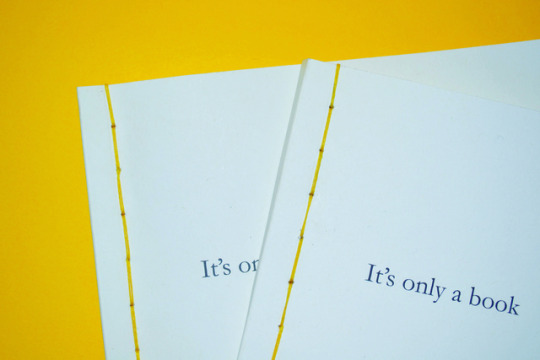
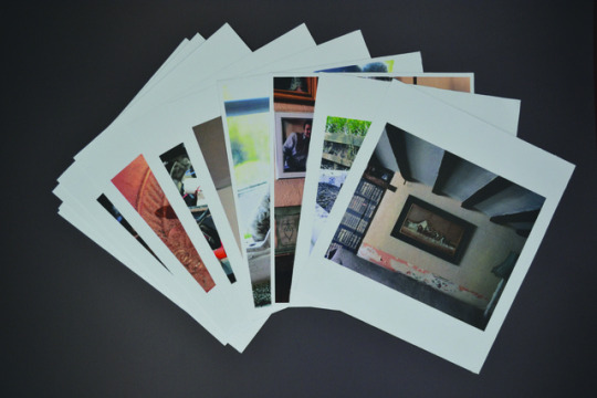
Photo
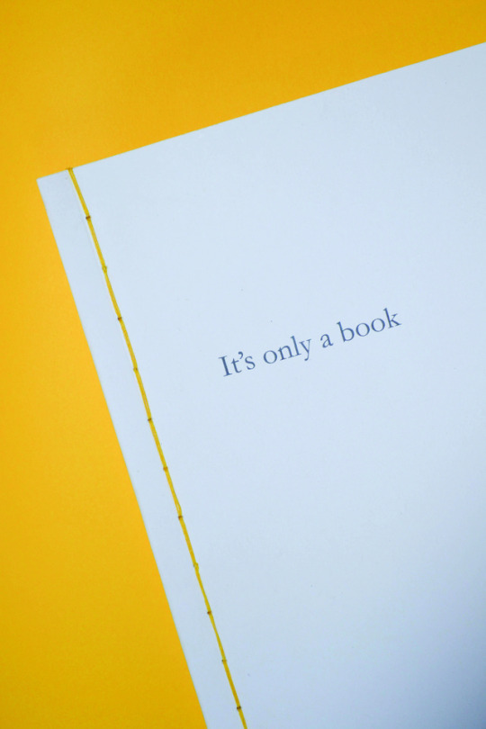


Final Book
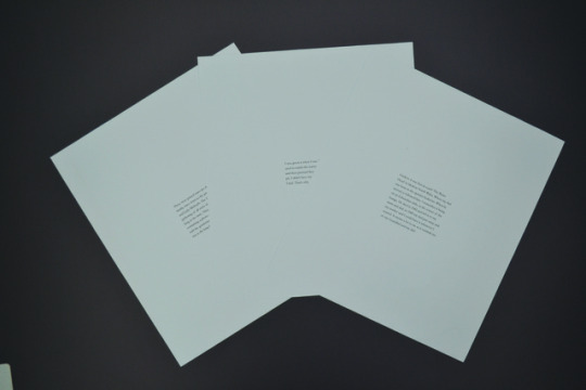
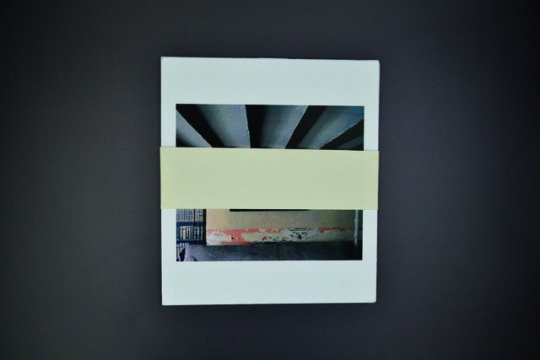
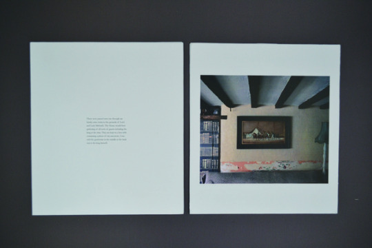
These are some final photos of my book, ‘It’s only a book’. The book contains a series of photo of objects, only revealing the name and age of the objects owner. Within each photo contains a perforated square, for the reader to rip out. At this stage the reader will only be seeing an object, once the image is torn out of the book, it reveals the history between owner and object. Revealing the sentimental value, showing how much the object means to that person. This should then create more of an emotional attachment for the reader towards the object, yet its already been torn and ruined. The tearing out represents chucking away a object showing how easily it is to chuck away value.
The main purpose of ‘It’s only a book’ is to show to a throw away generation that when an object is used and old, it still contains purpose and value. Which holds more than the latest new products out.
Overall I am very happy with my book, after a lot of adjusting and trialling. I have managed to create a subtle flow of images, presenting a range of objects that may be seen as junk or valuable. The images are sized differently on each page, this is to make sure each page is slightly different, therefore not boring and to similar.
The cover is slightly thicker paper, but still uses the same colour as the inside pages. I have separated the paper by adding in two end sheets, using a colour to match the thread, to keep the mustard colour more consistent with the book. After creating the cover and binding. It was then that I wish I made a couple of changes, I firstly wanted to keep the cover simple to match the simply layout inside. However If I was to further improve the book, I would add down the spine the name of the book, as well as a photo and small description on the back. If I wanted to push it even further, I would create a hard cover, this would finish the book off to a high standard and would become more valuable in itself.
0 notes
Photo
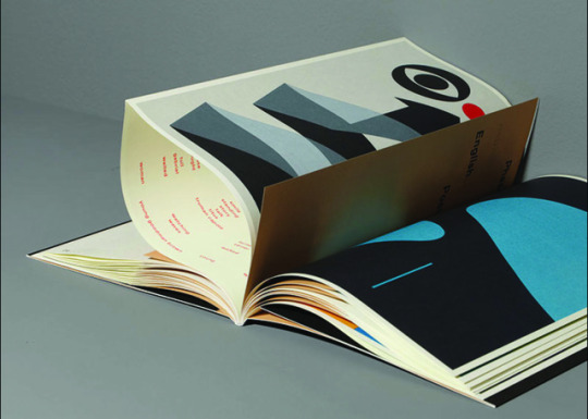
Mainstudio is an amsterdam based graphic design studio, founded by Edwin van Gelder in 2005. The studio creates projects deriving from the intersection of art, architecture and fashion – including publications digital media, and visual identities.
One of their publications was French fold, with hidden information in between the pages.
2 notes
·
View notes
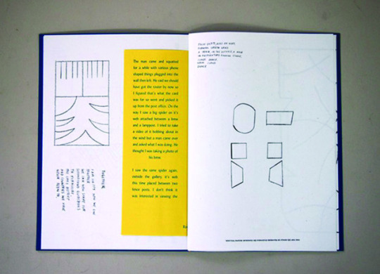
Photo

D&AD student awards 99 research
The Brief was to redesign the bible to appeal to a new generation. It required a concept as well as a good use of typography.
This piece was the winner due to high quality use of typography it’s accessibility and utilitarian quality. The runner’s up design was also unusual innovative and beautifully designed.
The runner up is the piece I’m focusing on. It creates an unusual hierarchy, highlighting and separating text.
Within each story for my book, there are small details I want to
emphasize. The next step will be to respond to this research and take the technique of highlighting text with different font sizes. However taking into consideration not to create to much noise with it and drown out the rest of the text.
0 notes
Photo

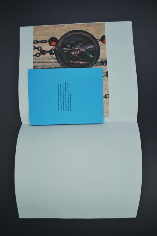
Experimentation with tracing paper, coloured paper and inserts. This experiment consisted of both image and story. The idea behind this layout was to reveal the object at the end of the story. Therefore the page the story was on, either distorted the object or distracted the viewer away until they finished reading the objects background.
Overall I preferred the bright colourful insert due to it making the book more playful, contrasting with the colours in the images. Using inserts also allows the stories to be placed in other parts of the book, referring back to the separate page experiment and allowing the viewer to match up the story with the object. Again this still does not show a clear enough concept.
0 notes
Photo


Examples of layouts I want to experiment with. Using colour pages to present the stories, layered over the image to distort the photo of the object.
0 notes
Photo
Here I used separate pieces of paper, each piece consisted of either a photo of an object, or a story. In result of this, it created a bind-less book. Representing attachment and detachment. Sort of portraying a game. Letting the viewer match them up. Showing the value of the object by itself, compared to when it has a story behind it. Revealing it’s true value.
With this experiment, I liked the thought of creating more of an object than a book. However it still doesn’t show a concept. Therefore I plan on creating layouts where the object is slightly obscured by the stories.
0 notes
Photo

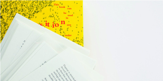

Marc Saporta
Composition No.1 is the first ever book in a box. Its a remake of a the original which was published back in the 1960’s. Each page has it’s own narrative, allowing the reader to order the book in any way they would like.
There has also been created a screen version, which automatically shuffles pages, not giving the reader as much choice of placement as the real thing. This type of book format is very interesting in the aspect that it can be up to the reader how they interpret it.
0 notes
Photo
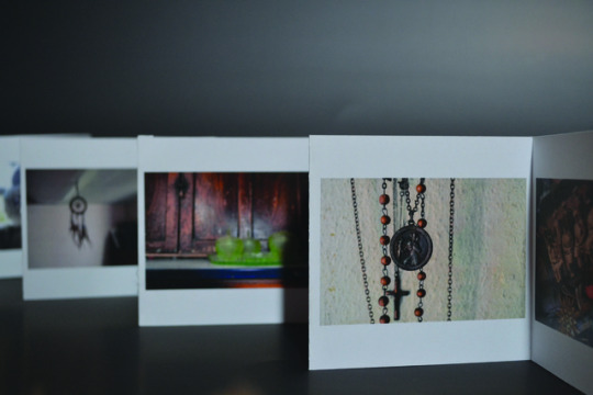
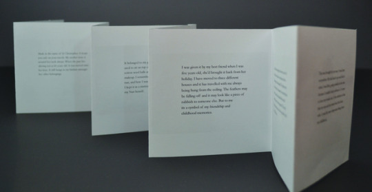
Concertina experiment
The concertina compliments and frames the text elegantly.
Creating a balance between negative and positive space. Whilst the photos flow through the layout consistently. On the back of each photo is the story that matches the object. It helps the context flow
however it doesn’t create a concept. It simply presents the photos and stories separately.
0 notes