
Don't wanna be here? Send us removal request.
Statistics
We looked inside some of the posts by aprilfmp and here's what we found interesting.
Average Info
Notes Per Post
0
Likes Per Post
0
Reblog Per Post
0
Reply Per Post
0
Time Between Posts
1 day
Number of Posts By Type
Text
7
Photo
10
Last Seen Tumblr Blogs


Fun Fact
In 2020, 27% of US Tumblr users had an annual household income of over $100,000.
Text
Project Reflection
Looking over this entire project, it makes me immensely proud to see just how far I have come and how much I have learnt over the last 12 weeks.
I am very proud of my final outcomes as they are something I could never have imagined creating, even six months ago. I didn't even know that rendering was a thing before I started this project.
I think that although the lockdown was difficult, I think it aided my project as it gave me lots of time to research SketchUp and be able to become familiar with it, preparing me for when I returned to college to make my final outcomes.
I aim to take the techniques I have learned from this project further into my personal life by designing rooms in SketchUp and rendering them in my own time, documenting them on my Instagram account.
Thank you.
0 notes
Text
FMP Weekly Evaluation: Week 10
Media, skills, processes and techniques
This week I have used Photoshop to finish my final outcomes, sharpening the images and editing the levels of the interiors. I then posted all of my final outcomes to my blog and final evaluation and analysed them. I also completed my final evaluation and my Google Sites, making sure they are both correctly spelt and looked professional.
Purpose/theme/concept
I had an important talk with one of my lecturers who said that I could push my outcomes further by mocking them up into an interior design magazine spread. This was a great suggestion as it made my interior renders feel more purposeful and rounded.
What are you planning for next week?
Next week is my last week and I am planning on adding the final touches to my project, making sure it’s complete and ready for handing in.
Evaluation methodology
This week I have had lots of help and feedback from different lecturers, this has helped guide me on how to push my project even further and aim for the highest grade possible.
0 notes
Photo

Magazine Spread Outcome
I think this outcome looks realistic and professional because of the use of text and small details like the page number. This outcome makes my project feel more complete and rounded, making my interiors feel like they have a purpose within my project.
This fits the purpose of my project because it puts my final outcomes in the context of a brand and allows my designs to influence people on a bigger scale.
0 notes
Photo


Problem Solving: Magazine Making 06/05/21
I made my magazine spread by opening two art boards in Photoshop and importing my final outcomes into them. I then imported my three pattern designs but came across the problem of finding the rectangles too harsh, to fix this problem I created a clipping mask over a rounded rectangle to make them more softer.
I then added text such as a title and paragraphs. I decided to actually write the paragraphs out instead of writing nothing, I decided to write about how the Art Deco aesthetic has made a comeback in interior design. I then wrote about my brand, AP Interiors, and what designs I have created. I then decided to add an interview section where I quoted myself as if I were interviewed and talked about the aims of my brand, including my thoughts on the environment.
I then decided to play around with the layout of the text and imagery to experiment until I found the best composition for my spread. Finally I took my finished spread and placed it into a mockup to make it look realistic.
0 notes
Photo


Research: Interior Design Magazines
Because I am going to create my own magazine doublers page spread, thought it would behest for me to research real magazine spreads to get a good idea on how the layout should look like.
All of these spreads have a very similar look and design, a clean white background with simple text and large images laid over the top of them.
This research has helped me understand the basic features of interior design magazine spreads. This research will help me create my own in a realistic and professional style.
0 notes
Text
New Development
Yesterday I had a talk with one of my lecturers, she said she liked my final outcomes but felt it could be pushed further. She then suggested that I should create a magazine spread displaying all of my interiors and patterns.
I thought this was a great idea as I had plenty of time to make one and it would make my project feel more purposeful and complete.
0 notes
Text
FMP Final Evaluation
Section 1: Media and Techniques
From the beginning of this project, I knew that I wanted to go down the route of interior design, I just didn’t know how I was going to present those ideas for my FMP. To find out my options I researched different methods of presenting interiors which led me to discovering things like hand-based and Photoshopped interiors. However, there was one that stood out from the rest for me, a 3D modelling software called SketchUp.

This software allows users to create models of interiors on a realistic scale, essentially creating a digital mock-up of a space for a client. This is something I knew I wanted to explore further as I hadn’t done anything like it since middle school.
Once deciding to create my Art Deco interiors, I tried to experiment with different mediums for me to use for my final outcomes. I first tried to create a hand drawn interior that was edited in Photoshop, I then tried adding SketchUp models into Photoshop and creating a room from there. Finally, I settled on creating interiors using SketchUp and importing pattern designs I created in Photoshop.
This meant I had to teach myself how to use SketchUp from scratch and get to a good enough level to create professional and realistic interiors. I overcame this massive problem by watching lots of YouTube tutorial videos and reading lots of SketchUp forum chats to collect any tips that I could use to improve my skills.
Once I had started to research Sketchup models, I noticed the mention of photorealistic rendering amongst the forums and YouTube comments. This was something that intrigued me and wished to look into deeper. Once I had done a little research on the topic, I discovered a way to make my SketchUp models into realistic renders. This was something I knew I had to use as it would make my SketchUp models look very professional and realistic.
This meant that I would also have to teach myself how to use this type of technology I had never heard of before. I overcame this issue by again watching lots of videos and reading lots of articles which eventually led me to the SketchUp plugin called TwilightRender.

One skill that I brought from a previous project was my pattern making skills in Photoshop which I had gained in my Multiverse project. I also used the skills I had learnt from last year such as composition, colour and layout to help make my surface pattern designs look cohesive, sleek and unique.
I have used lots of research to help support and push my project further. This includes a wide range of artist research, looking at multiple ways to improve the planet within the home and two case studies one of which analyses the impact of the historical context surrounding the Art Deco movement.
The most impactful research I have completed during this project was looking at composition within interior photography. This research pushed me to think outside of the box when it came to my models, using depth and angles to create renders that give the viewer a feeling of being transported to that room, instead of looking at a boring four wall room.
Section 2: Purpose/Theme/Context
In the beginning, I was given a list of fifteen themes that could possibly be my path for this project. From this list I had to choose ten to explore further, researching their definition and their context within the art industry.
Once I had explored them, I narrowed the list down to five. I then took these five concepts and researched deeper into them, looking at the historical, social and cultural context surrounding them and what my options were for final outcomes if I chose to go down that path. This research informed me of their importance in the art world which helped sway my decision on which theme to choose.
To help me narrow my options down to one, I created five pro-con lists that showed the clear advantages and disadvantages of choosing that concept. This task helped me come to the conclusion of using the concept of the environment because of its importance as a subject and its potential for interesting outcomes. It was a really close call between the environment and the 1920’s because of the number of ideas I had for both themes.
However, when my lecturer told me that I could use two concepts at once I knew that it would best suit my project to use both as it allowed me to merge all my ideas together, bulking out my project and giving me more options to explore.
The purpose of my project is to challenge the balance between style and sustainability within interior design, showing a client that it is possible to create a space that looks amazing whilst also being environmentally conscious, that you don’t have to sacrifice one to have the other.
Halfway through my project I came across the issue of struggling to balance both concepts equally. This was when I decided to focus more on the theme that I felt more important and beneficial to my project, the 1920’s. This decision helped me a lot as it took the stress off my shoulders about balancing the two themes and allowed me to put all of my energy into making more consistent and detailed outcomes.
Section 3: Outcome
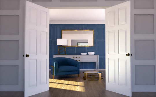
This is the first of three final outcomes. This features my first colour pallet of blue, grey and gold. I think this outcome looks very stylish and sleek, this is because of its minimal and consistent colour scheme. The gold texture is placed all around the interior appearing in the mirror, lamp and coffee table, this makes the room feel more cohesive and creates rhythm. The composition of the interior photograph intrigues and draws in the viewer by including the sense of depth from the use of layers in the foreground and background. I think this final outcome meets the purpose of my project as my Art Deco wallpaper mixed with the gold texture adds a sense of decadence and luxury to the room which is the most important part of recreating the Art Deco style.
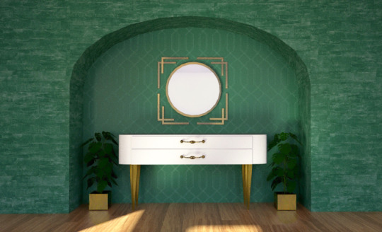
This is my second final outcome featuring the colour pallet of emerald green, white and gold. I think this interior looks minimal yet luxurious because of the simplistic furniture mixed with multiple textures. I think the use of the same gold texture from the last outcome ties the two rooms together, making them feel like a set even though they have completely different colours and patterns. The use of the smooth green stone instantly makes the hallway look more expensive and lavish. The hints of white within the stone matches the white in my Art Deco wallpaper, adding rhythm and making the space feel more harmonious. I think this outcome fits the purpose of my project because it gives off the feeling of Art Deco from the mix of a deep and luxurious colour pallet with expensive textures.
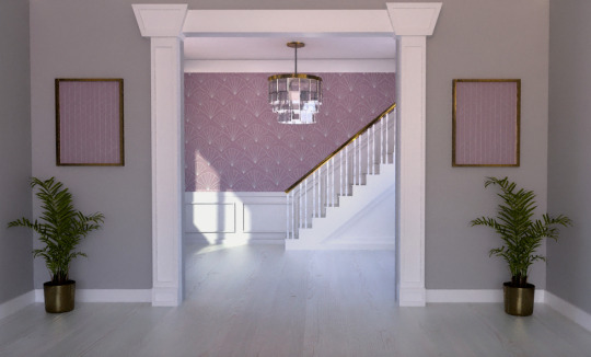
This is my third and final outcome in the colour pallet of muted purple, light grey and gold. With my last final outcome, I wanted to push the boundary of what colours fit into the Art Deco style aesthetic. I had previously done two of the most common colours found within the style and for my last interior, I thought of using a colour that isn't associated with the style. Since Art Deco is all about luxury and wealth, I thought about the colour has historically represented wealth, purple. I think the use of purple in this outcome creates an Art Deco design that is more subtle and less obvious than the other two designs. Like with my first outcome, the image composition adds a sense of depth because of the suggestion of layers with the background and foreground. The two purple frames in the foreground help to make the two areas feel more connected and cohesive as well as adding needed texture to the foreground. I think this outcome meets the purpose of my project as it still keeps the Art Deco aesthetic with the use of wallpaper and gold texture, but offers my client a more softer and subtle option for their home, in case they find the first two options too cliche.
Section 4: Evaluation methodology
I think the biggest strength of my project is my consistency, all of my designs have a distinct colour scheme and style which makes them feel like a set. I also think another strength is the clear journey that my project has gone through, showing all of my twists and turns which lead me to where it is now.
One weakness of my project is the fact that the concept of the environment was pushed to the side as I was unable to balance both themes, this makes my project feel a bit incomplete as the concept I started off with was slowly made less important as the weeks went on.
I was able to constantly evaluate and reflect on myself by completing weekly evaluations on my blog where I talked about what I did, the purpose of those decisions and the problems I had to overcome that week. This allowed me to analyse the development of my project and clearly see my progression of that week.
I also received constant critical feedback from lecturers in assessments and catch-up sessions. This allowed me to get a fresh pair of eyes to see my work and offer a second opinion on how to expand and push my project further.
The most important thing that I have learned from this project was how to create Art Deco themed pieces and how to use digital software like SketchUp and TwilightRender which will aid me in the future as an interior designer.
0 notes
Text
Final Outcomes
Final Outcome 1:

This is the first of three final outcomes. This features my first colour pallet of blue, grey and gold.
I think this outcome looks very stylish and sleek, this is because of its minimal and consistent colour scheme. The gold texture is placed all around the interior appearing in the mirror, lamp and coffee table, this makes the room feel more cohesive and creates rhythm.
The composition of the interior photograph intrigues and draws in the viewer by including the sense of depth from the use of layers in the foreground and background.
I think this final outcome meets the purpose of my project as my Art Deco wallpaper mixed with the gold texture adds a sense of decadence and luxury to the room which is the most important part of recreating the Art Deco style.
Final Outcome 2:

This is my second final outcome featuring the colour pallet of emerald green, white and gold.
I think this interior looks minimal yet luxurious because of the simplistic furniture mixed with multiple textures. I think the use of the same gold texture from the last outcome ties the two rooms together, making them feel like a set even though they have completely different colours and patterns.
The use of the smooth green stone instantly makes the hallway look more expensive and lavish. The hints of white within the stone matches the white in my Art Deco wallpaper, adding rhythm and making the space feel more harmonious.
I think this outcome fits the purpose of my project because it gives off the feeling of Art Deco from the mix of a deep and luxurious colour pallet with expensive textures.
Final Outcome 3:

This is my third and final outcome in the colour pallet of muted purple, light grey and gold.
With my last final outcome, I wanted to push the boundary of what colours fit into the Art Deco style aesthetic. I had previously done two of the most common colours found within the style and for my last interior, I thought of using a colour that isn't associated with the style. Since Art Deco is all about luxury and wealth, I thought about the colour has historically represented wealth, purple. I think the use of purple in this outcome creates an Art Deco design that is more subtle and less obvious than the other two designs.
Like with my first outcome, the image composition adds a sense of depth because of the suggestion of layers with the background and foreground. The two purple frames in the foreground help to make the two areas feel more connected and cohesive as well as adding needed texture to the foreground.
I think this outcome meets the purpose of my project as it still keeps the Art Deco aesthetic with the use of wallpaper and gold texture, but offers my client a more softer and subtle option for their home, in case they find the first two options too cliche.
0 notes
Text
FMP Weekly Evaluation: Week 9
Media, skills, processes and techniques
This week I used SketchUp to create my last outcome before rendering. I also started my Google Sites by uploading some of my best artwork from this year to the pages.
Purpose/theme/concept
This week I had to overcome the problem of choosing which outcomes will be rendered to make them into my final outcomes. I based this decision on which interiors I felt looked the most professional and which ones I’m the most confident with in displaying my skills as a designer.
In the end I decided to have one of each colour scheme as a final outcome. This fits the purpose of my project as it gives my client more options to choose from in colour so they can pick the scheme which best suits them.
What are you planning for next week?
Next week I am planning to finish off my Google Sites, adding all of my final outcomes to display all of my work from the last 9 weeks. I also plan to finish off my final evaluation by adding imagery of my final outcomes and analysing them.
Evaluation methodology
This week I received feedback from peers who said that my interiors look very professional and interesting. This has made me more confident in my outcomes and made me feel ready for presenting them for examination.
0 notes
Photo


Problem Solving: Final Outcome Choosing
Because I made a lot of interior outcomes, I had to choose the best ones for me to take further and render, turning them into my final outcomes.
I also had to decide on how many of each colour palette I should use. To make them feel like a set I decided to have one of each colour scheme, totalling three final outcomes. This decision meets the purpose of my project as it would allow my client to have their pick of three different colour scheme options for their home.
These interiors above are my decided final outcomes, this is because they are the outcomes that I feel look the most professional and interesting which makes me feel more confident presenting them as my final outcomes.
My next step is to render each interior which will take a while but hopefully will be worth it as it will produce realistic versions of these images.
0 notes
Photo


Problem Solving: Outcome Making 28/04/21
Once I had made the draws I realised that the wall looked very bare. To fix this problem I decided to create a mirror to go over the top of it to add some detailing and visual interest to the area. I made the mirror by using the circle and rectangle tool, finishing off with the bucket tool to colour the mirror gold.
I then went onto the side walls and added panel moulding as they looked very boring compared to the feature wall. I made the panelling by using the rectangle and push/pull tool.
I then came across the same problem of finding the focal area too plain and dull. To fix this issue I went into the 3DWarehouse and found a tall plant with a vase. When I downloaded it into my model I saw that the vase wasn't the right style for my Art Deco interiors so to fix this I deleted the vase and created my own using the rectangle and push/pull tool, finally using the bucket tool to colour it gold to fit with the rest of the scheme.
0 notes
Photo


Problem Solving: Final Outcome Making 28/04/21
This is my last outcome design for my project. This time I decided to do another green interior because with the other two green rooms I have done, I didn't feel confident in presenting them as final outcomes.
Inspired by interiors found on Pinterest, I decided to create an arch feature in a wall. I made this arch by using the rectangle and two point arch tool, then using the push/pull tool to extrude it. I then placed this in the wall and created two beams either side to make it fit into the room.
Next I decided to fill in the arch with Art Deco furniture. For this furniture, I wanted to create a piece inspired by Paul Follot and Betty Joel with lots of smooth curves.
To create these smooth curves I used the two point arch tool on a rectangle to create a rectangle with rounded edges, I then extruded this to make a thick table, using a line to separate it into two draws. I then copied and pasted the same handles from one of my blue interiors onto the draws to add a connection within my outcomes and painted the legs gold.
0 notes
Photo

Mood Board Outcome: Pallet 3
This is my mood board for my first colour pallet of purple, light grey and gold.
This mood board is a digital visualisation of my ideas for the interior, this helps my client visualise my plans and the overall feeling of the room.
0 notes
Photo

Mood Board Outcome: Pallet 2
This is my mood board for my first colour pallet of green, white and gold.
This mood board is a digital visualisation of my ideas for the interior, this helps my client visualise my plans and the overall feeling of the room.
0 notes
Photo

Mood Board Outcome: Pallet 1
This is my mood board for my first colour pallet of blue, grey and gold.
This mood board is a digital visualisation of my ideas for the interior, this helps my client visualise my plans and the overall feeling of the room.
0 notes
Text
FMP Weekly Evaluation: Week 8
Media, skills, processes and techniques
This week was my second week of making my final outcomes. I mostly used SketchUp to continue experimenting with different compositions for my interiors. This week I learnt how to properly use composition in interior design, thinking about interesting angles and layouts to make my designs look more visually appealing to my client.
Purpose/theme/concept
This week I made the decision to think more about lighting within spaces, using it to highlight a certain area of a room and show off my pattern designs. This week I mostly struggled with finding good compositions that I was happy with presenting as my final outcomes. I fought against this issue by creating multiple interiors until I became confident with what I was doing and picking the best few to use as final outcomes.
I have also received feedback from a lecturer that I should think about creating digital mood boards for my clients to help support my final renders and pitch the idea to them.
What are you planning for next week?
Next week I am planning on creating another interior and then going back into the ones I have already made to add finishing touches. I then am going to choose the best three rooms to use as my final outcomes, having one interior for each colour scheme so my client could choose the best one for them.
Evaluation methodology
This week I have received feedback from my lecturer who suggested the mood board idea. I have also received feedback from peers who said they really liked my interiors and thought the renders looked very professional. This feedback has given me motivation to push myself for the last stretch of this project and aim for that distinction.
0 notes
Photo


Problem Solving: Final Outcome Making 26/04/21
After adding the staircase, I thought that the wall looked a bit bare so sticking with the same features as all of the other rooms, I decided to add wainscoting to the wall. I made this wainscoting by using the rectangle and push/pull tool.
Then once that was done, the two walls in the front looked very bare in comparison. To fix this I decided to add some framed artwork to the walls, which would be another purple pattern I created, to create some rhythm and repletion in my interior.
I first chose the same pattern as the back wall but with the colours reversed, this unfortunately looked to ‘matchy’ for my liking so to fix this I opened one of my blue patterns in Photoshop and used the colour overlay tool to make it purple. This solution worked so much better as it still had the same colours and feeling as the back wall but it wasn’t over the top or too similar.
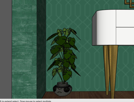
I then decided to add in some plants to add in a bit of texture and life into the interior. This I think made the room feel complete and more lived in.
0 notes