
Don't wanna be here? Send us removal request.
Statistics
We looked inside some of the posts by archanawathore and here's what we found interesting.
Average Info
Notes Per Post
3
Likes Per Post
1
Reblog Per Post
2
Reply Per Post
0
Time Between Posts
5 days
Number of Posts By Type
Text
17
Last Seen Tumblr Blogs


Fun Fact
In Q3 of 2020, 31% of US users access the Tumblr app daily.
Text
Machine Learning Assignment4
Machine Learning Assignment4
A k-means cluster analysis was conducted to identify underlying subgroups of adolescents based on their similarity of responses on 11 variables that represent characteristics that could have an impact on school connectedness. Clustering variables included two binary variables measuring whether or not the adolescent had ever used alcohol or marijuana, as well as quantitative variables measuring alcohol problems, a scale measuring engaging in deviant behaviors (such as vandalism, other property damage, lying, stealing, running away, driving without permission, selling drugs, and skipping school), and scales measuring violence, depression, self-esteem, parental presence, parental activities, family connectedness, and grade point average. All clustering variables were standardized to have a mean of 0 and a standard deviation of 1.
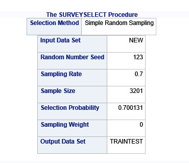
Data were randomly split into a training set that included 70% of the observations (N=3201) and a test set that included 30% of the observations (N=1701). A series of k-means cluster analyses were conducted on the training data specifying k=1-9 clusters, using Euclidean distance. The variance in the clustering variables that was accounted for by the clusters (r-square) was plotted for each of the nine cluster solutions in an elbow curve to provide guidance for choosing the number of clusters to interpret.
Figure 1. Elbow curve of r-square values for the nine cluster solutions

The elbow curve was inconclusive, suggesting that the 2, 5, 6, 7 and 8-cluster solutions might be interpreted. The results below are for an interpretation of the 4-cluster solution.
Canonical discriminant analyses was used to reduce the 11 clustering variable down a few variables that accounted for most of the variance in the clustering variables. A scatterplot of the first two canonical variables by cluster (Figure 2 shown below) indicated that the observations in clusters 2 and 3 were densely packed with relatively low within cluster variance, and did not overlap very much with the other clusters. Cluster 1 was generally distinct, but the observations had greater spread suggesting higher within cluster variance. Observations in cluster 4 were spread out more than the other clusters, showing high within cluster variance. The results of this plot suggest that the best cluster solution may have fewer than 4 clusters, so it will be especially important to also evaluate the cluster solutions with fewer than 4 clusters.
Figure 2. Plot of the first two canonical variables for the clustering variables by cluster.

The means on the clustering variables showed that, compared to the other clusters, adolescents in cluster 1 had moderate levels on the clustering variables. They had a relatively high likelihood of using alcohol or marijuana, alcohol problems, violence, deviant behaviour. Moderate depression lower self-esteem. They also appeared to have fairly low levels of school connectedness parental presence, gpa, parental involvement in activities and family connectedness.
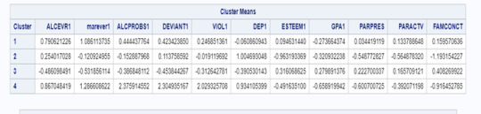
Cluster 2 has a moderate likelihood of having used alcohol, less likelihood of used marijuana alcohol problems, deviant behavior, higher depression, lower gpa, parental presence, and family connectedness. Cluster 2 is moderate compared to cluster 1 and 4.
On the other hand, cluster 4 clearly included the most troubled adolescents. Adolescents in cluster 4 had the highest likelihood of having used alcohol, a very high likelihood of having used marijuana, more alcohol problems, and more engagement in deviant and violent behaviors compared to the other clusters. They also had higher levels of depression, lowest self-esteem, and the lowest levels of gpa, parental presence, involvement of parents in activities, and family connectedness.
Cluster 3 appeared to include the least troubled adolescents. Compared to adolescents in the other clusters, they were least likely to have used alcohol , marijuana, and had the lowest number of alcohol problems, and deviant and violent behavior. They also had the lowest levels of depression, and highest self-esteem, grade point average, parental presence, parental involvement in activities and family connectedness.
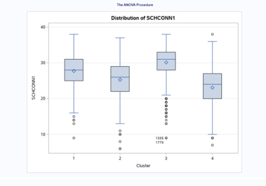
In order to externally validate the clusters, an Analysis of Variance (ANOVA) was conducting to test for significant differences between the clusters on school connectedness. A tukey test was used for post hoc comparisons between the clusters. Results indicated significant differences between the clusters on GPA (F(3, 3197)=255.40 p<.0001). The tukey post hoc comparisons showed significant differences between clusters on school connectedness, with the exception that clusters 1 and 2 were not significantly different from each other. Adolescents in cluster 3 had the highest school connectedness (mean=30.11, sd=4.28), and cluster 4 had the lowest GPA (mean=23.07, sd=5.79).

SAS Code
libname mydata "/courses/d1406ae5ba27fe300" access=readonly;
**************************************************************************************************************
DATA MANAGEMENT
**************************************************************************************************************;
data clust;
set mydata.treeaddhealth;
* create a unique identifier to merge cluster assignment variable with
the main data set;
idnum=_n_;
keep idnum alcevr1 marever1 alcprobs1 deviant1 viol1 dep1 esteem1 schconn1
parpres paractv famconct gpa1;
* delete observations with missing data;
if cmiss(of _all_) then delete;
run;
ods graphics on;
* Split data randomly into test and training data;
proc surveyselect data=clust out=traintest seed = 123
samprate=0.7 method=srs outall;
run;
data clus_train;
set traintest;
if selected=1;
run;
data clus_test;
set traintest;
if selected=0;
run;
* standardize the clustering variables to have a mean of 0 and standard deviation of 1;
proc standard data=clus_train out=clustvar mean=0 std=1;
var alcevr1 marever1 alcprobs1 deviant1 viol1 dep1 esteem1 gpa1
parpres paractv famconct;
run;
%macro kmean(K);
proc fastclus data=clustvar out=outdata&K. outstat=cluststat&K. maxclusters= &K. maxiter=300;
var alcevr1 marever1 alcprobs1 deviant1 viol1 dep1 esteem1 gpa1
parpres paractv famconct;
run;
%mend;
%kmean(1);
%kmean(2);
%kmean(3);
%kmean(4);
%kmean(5);
%kmean(6);
%kmean(7);
%kmean(8);
%kmean(9);
* extract r-square values from each cluster solution and then merge them to plot elbow curve;
data clus1;
set cluststat1;
nclust=1;
if _type_='RSQ';
keep nclust over_all;
run;
data clus2;
set cluststat2;
nclust=2;
if _type_='RSQ';
keep nclust over_all;
run;
data clus3;
set cluststat3;
nclust=3;
if _type_='RSQ';
keep nclust over_all;
run;
data clus4;
set cluststat4;
nclust=4;
if _type_='RSQ';
keep nclust over_all;
run;
data clus5;
set cluststat5;
nclust=5;
if _type_='RSQ';
keep nclust over_all;
run;
data clus6;
set cluststat6;
nclust=6;
if _type_='RSQ';
keep nclust over_all;
run;
data clus7;
set cluststat7;
nclust=7;
if _type_='RSQ';
keep nclust over_all;
run;
data clus8;
set cluststat8;
nclust=8;
if _type_='RSQ';
keep nclust over_all;
run;
data clus9;
set cluststat9;
nclust=9;
if _type_='RSQ';
keep nclust over_all;
run;
data clusrsquare;
set clus1 clus2 clus3 clus4 clus5 clus6 clus7 clus8 clus9;
run;
* plot elbow curve using r-square values;
symbol1 color=blue interpol=join;
proc gplot data=clusrsquare;
plot over_all*nclust;
run;
*****************************************************************************************
further examine cluster solution for the number of clusters suggested by the elbow curve
*****************************************************************************************
* plot clusters for 4 cluster solution;
proc candisc data=outdata4 out=clustcan;
class cluster;
var alcevr1 marever1 alcprobs1 deviant1 viol1 dep1 esteem1 gpa1
parpres paractv famconct;
run;
proc sgplot data=clustcan;
scatter y=can2 x=can1 / group=cluster;
run;
* validate clusters on;
school connectedness
* first merge clustering variable and assignment data with school connectedness data;
data schconn_data;
set clus_train;
keep idnum schconn1;
run;
proc sort data=outdata4;
by idnum;
run;
proc sort data=schconn_data;
by idnum;
run;
data merged;
merge outdata4 schconn_data;
by idnum;
run;
proc sort data=merged;
by cluster;
run;
proc means data=merged;
var schconn1;
by cluster;
run;
proc anova data=merged;
class cluster;
model schconn1 = cluster;
means cluster/tukey;
run;
0 notes
Text
Machine Learning Assignment 3
ML_Assignment3
SAS Code:
libname mydata "/courses/d1406ae5ba27fe300" access=readonly;
**************************************************************************************************************
DATA MANAGEMENT
**************************************************************************************************************;
data new;
set mydata.treeaddhealth;;
if bio_sex=1 then male=1;
if bio_sex=2 then male=0;
* delete observations with missing data;
if cmiss(of _all_) then delete;
run;
ods graphics on;
* Split data randomly into test and training data;
proc surveyselect data=new out=traintest seed = 123
samprate=0.7 method=srs outall;
run;
* lasso multiple regression with lars algorithm k=10 fold validation;
* lasso multiple regression with lars algorithm k=10 fold validation;
proc glmselect data=traintest plots=all seed=123;
partition ROLE=selected(train='1' test='0');
model gpa1 = male hispanic white black namerican asian alcevr1 marever1 cocever1
inhever1 cigavail passist expel1 age alcprobs1 deviant1 viol1 dep1 esteem1 parpres paractv
famconct schconn1/selection=lar(choose=cv stop=none) cvmethod=random(10);
run;
Explanation
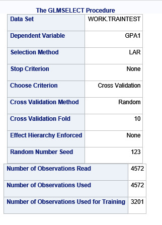
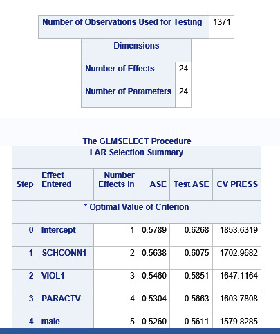
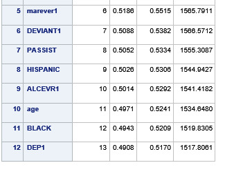
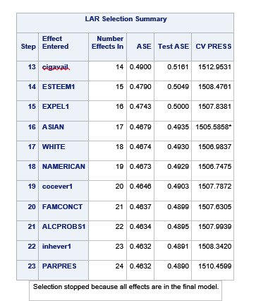
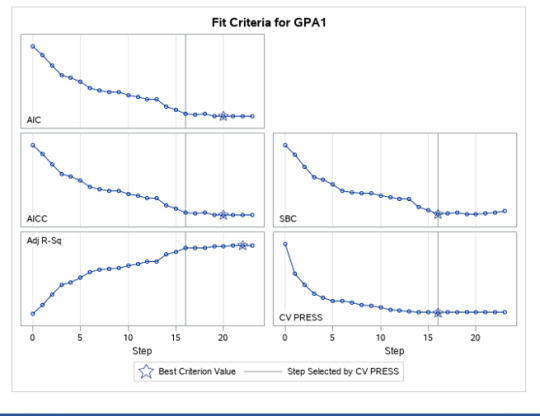
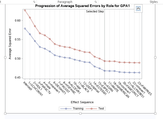
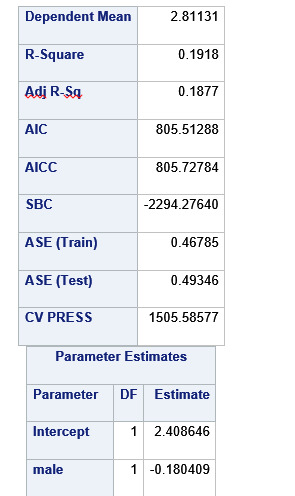
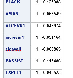
A lasso regression analysis was conducted to identify a subset of variables from a pool of 23 categorical and quantitative predictor variables that best predicted a quantitative response variable measuring grade point average in adolescents. Categorical predictors included gender and a series of 5 binary categorical variables for race and ethnicity (Hispanic, White, Black, Native American and Asian). Binary substance use variables were measured with individual questions about whether the adolescent had ever used alcohol, marijuana, cocaine or inhalants. Additional categorical variables included the availability of cigarettes in the home, whether or not either parent was on public assistance and any experience with being expelled from school. Quantitative predictor variables include age, school connectedness, alcohol problems, and a measure of deviance that included such behaviors as vandalism, other property damage, lying, stealing, running away, driving without permission, selling drugs, and skipping school. Another scale for violence, one for depression, and others measuring self-esteem, parental presence, parental activities, family connectedness and were also included. All predictor variables were standardized to have a mean of zero and a standard deviation of one.
Data were randomly split into a training set that included 70% of the observations (N=3201) and a test set that included 30% of the observations (N=1701). The least angle regression algorithm with k=10 fold cross validation was used to estimate the lasso regression model in the training set, and the model was validated using the test set. The change in the cross validation average (mean) squared error at each step was used to identify the best subset of predictor variables.
During the estimation process, school connectedness and violent behavior were most strongly associated with grade point average, followed by parental activities and male. Being male and violent behavior were negatively associated with grade point average, and school connectedness and parental activities were positively associated with grade point average. Other predictors associated with greater gpa included self esteem, Asian and White ethnicity, family connectedness, and parental involvement in activities. Other predictors associated with lower gpa included being Black and Hispanic ethnicities, age, alcohol, marijuana use, depression, availability of cigarettes at home, deviant behavior, parent was on public assistance, and history of being expelled from school. These 16 variables were selected for grade point average response variable. Ethnicity ASIAN was selected as best model.
Result

0 notes
Text
Machine Learning – Assignment 2
Machine Learning – Assignment 2
Program
LIBNAME mydata "/courses/d1406ae5ba27fe300 " access=readonly;
DATA new; set mydata.treeaddhealth;
PROC SORT; BY AID;
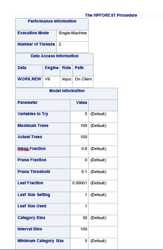
PROC HPFOREST;
target marever1/level=nominal;
input BIO_SEX HISPANIC WHITE BLACK NAMERICAN ASIAN alcevr1 cocever1 inhever1
Cigavail PASSIST EXPEL1 /level=nominal;
input age DEVIANT1 VIOL1 DEP1 ESTEEM1 PARPRES PARACTV
FAMCONCT schconn1 GPA1 /level=interval;
RUN;
Results


Explanation
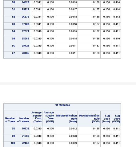
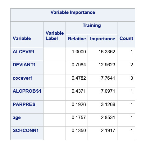
Random forest analysis was performed to evaluate the importance of a series of explanatory variables in predicting a binary, categorical response variable. The following explanatory variables were included as possible contributors to a random forest evaluating marijuana smoking (my response variable), age, gender, (race/ethnicity) Hispanic, White, Black, Native American and Asian. Alcohol use, cocaine use, inhalant use, availability of cigarettes in the home, whether or not either parent was on public assistance, any experience with being expelled from school, alcohol problems, deviance, violence, depression, self-esteem, parental presence, parental activities, family connectedness, school connectedness and grade point average.
The explanatory variables with the highest relative importance scores were alcohol use, deviance , cocaine use and inhalant use. The accuracy of the random forest was 78.3%, with the subsequent growing of multiple trees rather than a single tree, adding little to the overall accuracy of the model, and suggesting that interpretation of a single decision tree may be appropriate.
0 notes
Text
Machine Learning - Assignment1
Machine Learning - Assignment1
Program
LIBNAME mydata "/courses/d1406ae5ba27fe300 " access=readonly;
DATA new; set mydata.treeaddhealth;
PROC SORT; BY AID;
ods graphics on;
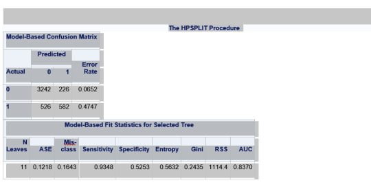
proc hpsplit seed=15531;
class marever1 BIO_SEX HISPANIC WHITE BLACK NAMERICAN ASIAN
alcevr1 cocever1 inhever1 Cigavail EXPEL1 ;
model marever1 =AGE BIO_SEX HISPANIC WHITE BLACK NAMERICAN ASIAN alcevr1 ALCPROBS1
marever1 cocever1 inhever1 DEVIANT1 VIOL1 DEP1 ESTEEM1 PARPRES PARACTV
FAMCONCT schconn1 Cigavail PASSIST EXPEL1 GPA1;
grow entropy;
prune costcomplexity;
RUN;
Results


Explanation:
Decision tree analysis was performed to test nonlinear relationships among a series of explanatory variables and a binary, categorical response variable. All possible separations (categorical) or cut points (quantitative) are tested. For the present analyses, the entropy “goodness of split” criterion was used to grow the tree and a cost complexity algorithm was used for pruning the full tree into a final subtree.
The following explanatory variables were included as possible contributors to a classification tree model evaluating marijuana smokers (my response variable), age, gender, (race/ethnicity) Hispanic, White, Black, Native American and Asian. Alcohol use, cocaine use, inhalant use, availability of cigarettes in the home, whether or not either parent was on public assistance, any experience with being expelled from school. alcohol problems, deviance, violence, depression, self-esteem, parental presence, parental activities, family connectedness, school connectedness and grade point average.
There were a total of 6504 rows but only 4576 were used. There are a total of 11 nodes and 6 leafs.
The alcohol use was the first variable to separate the sample into two subgroups. Which is almost similar percentage of alcohol users and non-alcohol users.
For the adolescent with no alcohol use, it was split into two – with cocaine users and non-cocaine users. The non-cocaine users with no alcohol use there were 106 Marijuana users. The cocaine users with no alcohol use there were 21 Marijuana users.
For the adolescents with alcohol use it was split into two on deviance score >= 4.05 and < 4.05. The adolescents with deviance score >=4.05 were divided into cocaine users and cocaine non users. The cocaine users, with alcohol use and with deviant score >=4.05, there were 89 marijuana users. The cocaine non-users with alcohol use with deviant score>=4.05, there were 404 marijuana users, this is the highest number of Marijuana users.
The adolescents with deviant score <4.05 were divided into alcohol problems score <.06 and >=.06. The users with alcohol problems score< .06, alcohol users, with deviant score<4.05, there were 253 marijuana users. The users with alcohol problems >= .06, alcohol users, with deviant score<4.05, there were 227 marijuana users.
The total model correctly classifies 53% of those who have used marijuana and 93% of those who have not. So we can better predict non marijuana smokers than marijuana smokers. 93% sensitivity and 53% specificity.
Maximum Marijuana users 404 were alcohol users, with deviant score >= 4.05 and no cocaine use.
Next Highest were 253 marijuana users with alcohol use, deviant score < 4.05 with alcohol problems < .06
Next were 227 marijuana users with alcohol use, deviant score is < 4.05, alcohol problems is >= .06
Lowest were 21 marijuana users with no alcohol use, and cocaine users.
0 notes
Text
Regression Models – Assignment 4
Regression Models – Assignment 4
The research question is whether alcohol dependence is related to Major depression and panic disorder.
Result1 – logictic regression for alcohol dependence and abuse with major depression
Here we have generated the logistic regression model – the response variable is alcohol dependency and explanatory variable is major depression. Both of the variables have a binary values of 0 or 1. There are a total of 43,093 observations, p-value is extremely low so it is significant. For MAJORDEPLIFE the p-value is very low so it is statistically significant.
# logistic regression with major depression
lreg1 = smf.logit(formula = 'alcdep ~ MAJORDEPLIFE', data = mydata).fit()
print (lreg1.summary())
Logit Regression Results
==============================================================================
Dep. Variable: alcdep No. Observations: 43093
Model: Logit Df Residuals: 43091
Method: MLE Df Model: 1
Date: Sat, 13 Feb 2021 Pseudo R-squ.: 0.01817
Time: 20:19:32 Log-Likelihood: -24878.
converged: True LL-Null: -25339.
Covariance Type: nonrobust LLR p-value: 2.893e-202
================================================================================
coef std err z P>|z| [0.025 0.975]
--------------------------------------------------------------------------------
Intercept -1.1360 0.012 -91.486 0.000 -1.160 -1.112
MAJORDEPLIFE 0.8035 0.026 30.845 0.000 0.752 0.855
================================================================================
Result2 – Odds Ratios
The odds ratio is the probability of an event occurring in one group compared to the probability of an event occurring in another group. Here the odds ratio is 2.23 which means that people with major depression are 2.23 times more likely to have alcohol dependence compared to people without major depression.
# odds ratios
print ("Odds Ratios")
print (numpy.exp(lreg1.params))
Odds Ratios
Intercept 0.32
MAJORDEPLIFE 2.23
Result 3 – Confidence Intervals For Odds ratio
The confidence interval for odds ratio is 2.12 to 2.35 which means that people with major depression are between 2.12 to 2.35 times more likely to have alcohol dependence, compared to people without major depression. The odds ratio is a sample statistic and the confidence intervals are an estimate of the population parameter.
#%%
# odd ratios with 95% confidence intervals
params = lreg1.params
conf = lreg1.conf_int()
conf['OR'] = params
conf.columns = ['Lower CI', 'Upper CI', 'OR']
print (numpy.exp(conf))
Lower CI Upper CI OR
Intercept 0.31 0.33 0.32
MAJORDEPLIFE 2.12 2.35 2.23
Result4 – Regression with major depression + panic disorder
Both major depression and panic disorder are positively associated with the likelihood of alcohol dependence. The odds ratio for major depression is 2.08 which means that people with depression are 2.08 time more likely to be alcohol dependent than people without major depression after controlling for panic disorder. The odds ratio for panic disorder is 1.61 which means that people with panic disorder are 1.61 times more likely to be alcohol dependent than people without panic disorder after controlling for major depression.
Because the confidence intervals on our odds ratios overlap, we cannot say that major depression is more strongly associated with alcohol dependence than the panic disorder.
For the population we can say that those with major depression are anywhere between 1.97 and 2.19 times more likely to have alcohol dependence than those without major depression. And those with panic disorder are between 1.48 and 1.77 times more likely to have alcohol dependence than those without panic disorder. Here there was no evidence of confounding by variable panic for the association between major depression and alcohol dependence variable.
# logistic regression with major depression + panic disorder
lreg2 = smf.logit(formula = 'alcdep ~ MAJORDEPLIFE + panic', data = mydata).fit()
print (lreg2.summary())
#%%
# odd ratios with 95% confidence intervals
params = lreg2.params
conf = lreg2.conf_int()
conf['OR'] = params
conf.columns = ['Lower CI', 'Upper CI', 'OR']
print (numpy.exp(conf))
Logit Regression Results
==============================================================================
Dep. Variable: alcdep No. Observations: 43093
Model: Logit Df Residuals: 43090
Method: MLE Df Model: 2
Date: Sat, 13 Feb 2021 Pseudo R-squ.: 0.02030
Time: 21:05:23 Log-Likelihood: -24824.
converged: True LL-Null: -25339.
Covariance Type: nonrobust LLR p-value: 4.377e-224
================================================================================
coef std err z P>|z| [0.025 0.975]
--------------------------------------------------------------------------------
Intercept -1.1500 0.013 -91.920 0.000 -1.174 -1.125
MAJORDEPLIFE 0.7321 0.027 27.113 0.000 0.679 0.785
panic 0.4790 0.046 10.502 0.000 0.390 0.568
Lower CI Upper CI OR
Intercept 0.31 0.32 0.32
MAJORDEPLIFE 1.97 2.19 2.08
panic 1.48 1.77 1.61
Python Code:
# -*- coding: utf-8 -*-
"""
Created on Sat Feb 13 19:07:34 2021
@author: GB8PM0
"""
import numpy
import pandas
import statsmodels.api as sm
import seaborn
import statsmodels.formula.api as smf
# bug fix for display formats to avoid run time errors
pandas.set_option('display.float_format', lambda x:'%.2f'%x)
mydata = pandas.read_csv('nesarc_pds.csv', low_memory=False)
##############################################################################
# DATA MANAGEMENT
##############################################################################
#setting variables you will be working with to numeric
mydata['ALCABDEP12DX'] =pandas.to_numeric(mydata['ALCABDEP12DX'], errors='coerce')
mydata['ALCABDEPP12DX'] = pandas.to_numeric(mydata['ALCABDEPP12DX'], errors='coerce')
mydata['MAJORDEPLIFE'] = pandas.to_numeric(mydata['MAJORDEPLIFE'], errors='coerce')
mydata['PANLIFE'] = pandas.to_numeric(mydata['PANLIFE'], errors='coerce')
mydata['APANLIFE'] = pandas.to_numeric(mydata['APANLIFE'], errors='coerce')
data['SOCPDLIFE'] = pandas.to_numeric(data['SOCPDLIFE'], errors='coerce')
recode2 = {0: 0, 1: 1, 2: 1, 3: 1,}
# alcohohol abuse/dependence in last 12 months
mydata['alc12mth'] = mydata['ALCABDEP12DX'].map(recode2)
chk1 = mydata['alc12mth'].value_counts(sort=False, dropna=False)
print (chk1)
# alcohohol abuse/dependence in last 12 months
mydata['alcpr12mth'] = mydata['ALCABDEPP12DX'].map(recode2)
chk2= mydata['alcpr12mth'].value_counts(sort=False, dropna=False)
print (chk2)
# alcohol abuse/dependence
mydata['alctot'] = mydata['alcpr12mth'] + mydata['alc12mth']
# binary alcohol abuse/dependence
def alcdep (row):
if row['alctot'] == 0:
return 0
else:
return 1
mydata['alcdep']= mydata.apply (lambda row: alcdep(row), axis=1 )
chk3= mydata['alcdep'].value_counts(sort=False, dropna=False)
print (chk3)
# panic disorder
mydata['pantot'] = mydata['PANLIFE'] + mydata['APANLIFE']
# binary alcohol abuse/dependence
def panic (row):
if row['pantot'] == 0:
return 0
else:
return 1
mydata['panic']= mydata.apply (lambda row: panic(row), axis=1 )
chk4= mydata['panic'].value_counts(sort=False, dropna=False)
print (chk4)
#%%
##############################################################################
# END DATA MANAGEMENT
##############################################################################
##############################################################################
# LOGISTIC REGRESSION
##############################################################################
# logistic regression with major depression
lreg1 = smf.logit(formula = 'alcdep ~ MAJORDEPLIFE', data = mydata).fit()
print (lreg1.summary())
#%%
# odds ratios
print ("Odds Ratios")
print (numpy.exp(lreg1.params))
#%%
# odd ratios with 95% confidence intervals
params = lreg1.params
conf = lreg1.conf_int()
conf['OR'] = params
conf.columns = ['Lower CI', 'Upper CI', 'OR']
print (numpy.exp(conf))
#%%
# logistic regression with major depression + panic disorder
lreg2 = smf.logit(formula = 'alcdep ~ MAJORDEPLIFE + panic', data = mydata).fit()
print (lreg2.summary())
#%%
# odd ratios with 95% confidence intervals
params = lreg2.params
conf = lreg2.conf_int()
conf['OR'] = params
conf.columns = ['Lower CI', 'Upper CI', 'OR']
print (numpy.exp(conf))
0 notes
Text
Regression Models – Assignment 3
Regression Models – Assignment 3
The relationship between breast cancer rate and urbanrate is being studied.
Result 1- OLS regression model between breast cancer and Urban rate
The OLS regression model shows that the breast cancer rate increases with the urban rate. And we can use the formula breastcancerate = 37.52 + .611 * urbanrate for the linear relationship. But the r-squared is .354% indicating that the linear association is capturing 35.4% variability in breast cancer rate.
print ("after centering OLS regression model for the association between urban rate and breastcancer rate ")
reg1 = smf.ols('breastcancerrate ~ urbanrate_c', data=sub1).fit()
print (reg1.summary())
after centering OLS regression model for the association between urban rate and breastcancer rate
OLS Regression Results ==============================================================================
Dep. Variable: breastcancerrate R-squared: 0.354
Model: OLS Adj. R-squared: 0.350
Method: Least Squares F-statistic: 88.32
Date: Thu, 11 Feb 2021 Prob (F-statistic): 5.36e-17
Time: 15:13:54 Log-Likelihood: -706.75
No. Observations: 163 AIC: 1417.
Df Residuals: 161 BIC: 1424.
Df Model: 1
Covariance Type: nonrobust
===============================================================================
coef std err t P>|t| [0.025 0.975]
-------------------------------------------------------------------------------
Intercept 37.5153 1.457 25.752 0.000 34.638 40.392
urbanrate_c 0.6107 0.065 9.398 0.000 0.482 0.739
==============================================================================
Omnibus: 5.949 Durbin-Watson: 1.705
Prob(Omnibus): 0.051 Jarque-Bera (JB): 5.488
Skew: 0.385 Prob(JB): 0.0643
Kurtosis: 2.536 Cond. No. 22.4
==============================================================================
Result 2 - OLS regression model after adding more explanatory variables
Now I added confounders female employ rate, CO2 emission rate and alcohol consumption to the model. The p-value for CO2 emission rate and alcohol consumption have a low p-value, <.05 and we can say that both of these are positively associated with breast cancer rate. Countries with higher urban rate have 0.49 more breast cancer rate. In a population, there's a 95% chance that countries with higher urbanrate will have between 0.36 and .62 more breast cancer rate
The female employ rate p-value is 0.775, and not significant so we cannot reject null hypothesis – no association between female employ and breast cancer rate. The 95% confidence interval for female employ rate is between -0.164 and 0.220, which means we can say with 95% confidence level that there may be a 0 breast cancer association in a population.
print ("after centering OLS regression model for the association between famele employed, co2emissions, alcohol consumption,urban rate and breastcancer rate ")
reg2= smf.ols('breastcancerrate ~ urbanrate_c + femaleemployrate_c + co2emissions_c + alcconsumption_c', data=sub1).fit()
print (reg2.summary())
after centering OLS regression model for the association between famele employed, co2emissions, alcohol consumption,urban rate and breastcancer rate
OLS Regression Results ==============================================================================
Dep. Variable: breastcancerrate R-squared: 0.495
Model: OLS Adj. R-squared: 0.482
Method: Least Squares F-statistic: 38.74
Date: Thu, 11 Feb 2021 Prob (F-statistic): 1.43e-22
Time: 15:13:59 Log-Likelihood: -686.69
No. Observations: 163 AIC: 1383.
Df Residuals: 158 BIC: 1399.
Df Model: 4
Covariance Type: nonrobust
======================================================================================
coef std err t P>|t| [0.025 0.975]
--------------------------------------------------------------------------------------
Intercept 37.5153 1.300 28.852 0.000 34.947 40.083
urbanrate_c 0.4925 0.066 7.413 0.000 0.361 0.624
femaleemployrate_c 0.0278 0.097 0.286 0.775 -0.164 0.220
co2emissions_c 1.389e-10 4.68e-11 2.971 0.003 4.66e-11 2.31e-10
alcconsumption_c 1.5061 0.282 5.349 0.000 0.950 2.062
==============================================================================
Omnibus: 2.965 Durbin-Watson: 1.832
Prob(Omnibus): 0.227 Jarque-Bera (JB): 2.942
Skew: 0.324 Prob(JB): 0.230
Kurtosis: 2.883 Cond. No. 2.83e+10
Result 3 – Scatter plot for linear and Quadratic model
Here I created one linear scatter plot and another one with quadratic to see if the relation is curvilinear. May it is quadratic.
# plot a scatter plot for linear
scat1 = seaborn.regplot(x="urbanrate", y="breastcancerrate", fit_reg=True, data=sub1)
plt.xlabel('urbanrate')
plt.ylabel('breastcancerrate')
plt.title('Scatterplot for the Association Between urbanrate Rate and breastcancerrate')
# plot a scatter plot# add the quadratic portion to see if it is curvilinear
scat1 = seaborn.regplot(x="urbanrate", y="breastcancerrate", order=2, fit_reg=True, data=sub1)
plt.xlabel('urbanrate')
plt.ylabel('breastcancerrate')
plt.title('Scatterplot for the Association Between urbanrate Rate and breastcancerrate')

Result 4 - OLS regression model with quadratic
Here the R-squared has improved from .354 to .371. A slightly higher value.
print ("after centering OLS regression model for the association between urban rate and breastcancer rate and adding qudratic portion")
reg3= smf.ols('breastcancerrate ~ urbanrate_c + I(urbanrate_c**2)', data=sub1).fit()
print (reg3.summary())
after centering OLS regression model for the association between urban rate and breastcancer rate and adding qudratic portion
OLS Regression Results ==============================================================================
Dep. Variable: breastcancerrate R-squared: 0.371
Model: OLS Adj. R-squared: 0.363
Method: Least Squares F-statistic: 47.13
Date: Fri, 12 Feb 2021 Prob (F-statistic): 8.06e-17
Time: 07:52:49 Log-Likelihood: -704.64
No. Observations: 163 AIC: 1415.
Df Residuals: 160 BIC: 1425.
Df Model: 2
Covariance Type: nonrobust
=======================================================================================
coef std err t P>|t| [0.025 0.975]
---------------------------------------------------------------------------------------
Intercept 34.6381 2.014 17.201 0.000 30.661 38.615
urbanrate_c 0.6250 0.065 9.656 0.000 0.497 0.753
I(urbanrate_c ** 2) 0.0057 0.003 2.048 0.042 0.000 0.011
==============================================================================
Omnibus: 3.684 Durbin-Watson: 1.705
Prob(Omnibus): 0.159 Jarque-Bera (JB): 3.734
Skew: 0.345 Prob(JB): 0.155
Kurtosis: 2.728 Cond. No. 1.01e+03
Result 5 - OLS regression model with quadratic and another variable
Here I have added 2nd order urban rate and alcohol consumption rate to the model. The p-value for alcohol consumption is significant meaning there is association between alcohol consumption and breast cancer rate. The R-squared has increased to 49.8%, slightly improved from previous.
print (“after centering OLS regression model for the association between urban rate and breastcancer rate after adding alcohol consumption rate “)
reg4 = smf.ols(‘breastcancerrate ~ urbanrate_c + I(urbanrate_c**2) + alcconsumption_c ‘, data=sub1).fit()
print (reg4.summary())
after centering OLS regression model for the association between urban rate and breastcancer rate after adding alcohol consumption rate
OLS Regression Results
Dep. Variable: breastcancerrate R-squared: 0.498
Model: OLS Adj. R-squared: 0.488
Method: Least Squares F-statistic: 52.51
Date: Fri, 12 Feb 2021 Prob (F-statistic): 1.21e-23
Time: 08:49:00 Log-Likelihood: -686.27
No. Observations: 163 AIC: 1381.
Df Residuals: 159 BIC: 1393.
Df Model: 3
Covariance Type: nonrobust
coef std err t P>|t| [0.025 0.975]
Intercept 33.4837 1.814 18.459 0.000 29.901 37.066
urbanrate_c 0.5203 0.060 8.627 0.000 0.401 0.639
I(urbanrate_c ** 2) 0.0080 0.003 3.169 0.002 0.003 0.013
alcconsumption_c 1.7136 0.270 6.340 0.000 1.180 2.247
Omnibus: 2.069 Durbin-Watson: 1.691
Prob(Omnibus): 0.355 Jarque-Bera (JB): 1.645
Skew: 0.216 Prob(JB): 0.439
Kurtosis: 3.235 Cond. No. 1.01e+03
Notes:
[1] Standard Errors assume that the covariance matrix of the errors is correctly specified.
[2] The condition number is large, 1.01e+03. This might indicate that there are
strong multicollinearity or other numerical problems.
Result 6 - QQPlot
In this regression model, the residual is the difference between the predicted breast cancer rate, and the actual observed breast cancer rate for each country. Here I have plotted the residuals. The qqplot for our regression model shows that the residuals generally follow a straight line, but deviate at the lower and higher quantiles. This indicates that our residuals did not follow perfect normal distribution. This could mean that the curvilinear association that we observed in our scatter plot may not be fully estimated by the quadratic urban rate term. There might be other explanatory variables that we might consider including in our model, that could improve estimation of the observed curvilinearity.
#Q-Q plot for normality
fig4=sm.qqplot(reg4.resid, line='r')

Result 7 – Plot of Residuals
Here there is 1 point below -3 standard deviation of residuals, 3 points (1.84%) above 2.5 standard deviation of residuals, and 8 points (4.9%) above 2 standard deviation of residuals. So there are 1.84% of points above 2.5, and 4.9% points above 2.0 std deviation. This suggests that the fit of the model is relatively poor and could be improved. May be there are other explanatory variables that could be included in the model.
# simple plot of residuals
stdres=pandas.DataFrame(reg4.resid_pearson)
plt.plot(stdres, 'o', ls='None')
l = plt.axhline(y=0, color='r')
plt.ylabel('Standardized Residual')
plt.xlabel('Observation Number')

Result 8 – Residual Plot and Partial Regression Plot
The plot in the upper right hand corner shows the residuals for each observation at different values of alcohol consumption. It looks like the absolute values of residual are significantly higher at lower alcohol consumption rate and get smaller closer to 0 as alcohol consumption increases, but then again increase at higher levels of alcohol consumption. This model does not predict breast cancer rate as well for countries that have either high or low levels of alcohol consumption rate. May be there is a curvilinear relation between alcohol consumption rate and breast cancer rate.
The partial regression plot which is in the lower left hand corner. The residuals are spread out in a random pattern around the partial regression line and in addition many of the residuals are pretty far from this line, indicating a great deal of breast cancer rate prediction error. Although alcohol consumption rate shows a statistically significant association with breast cancer rate,this association is pretty weak after controlling for urban rate.
# additional regression diagnostic plots
fig2 = plt.figure(figsize=(12,8))
fig2 = sm.graphics.plot_regress_exog(reg4, "alcconsumption_c", fig=fig2)

Result 9 – Leverage Plot
Here in the leverage plot there are few outliers on the left side with a std deviation greater than 2, but they are close to 0 meaning they do not have much leverage. There is one in the right which is 199 which is significant.
# leverage plot
fig3=sm.graphics.influence_plot(reg4, size=8)
print(fig3)

Complete Python Code
# -*- coding: utf-8 -*-
"""
Created on Mon Feb 8 20:37:33 2021
@author: GB8PM0
"""
#%%
import pandas
import numpy
import seaborn
import scipy
import matplotlib.pyplot as plt
import statsmodels.formula.api as smf
import statsmodels.api as sm
data = pandas.read_csv('C:\Training\Data Analysis\gapminder.csv', low_memory=False)
#setting variables you will be working with to numeric
data['breastcancerrate'] = pandas.to_numeric(data['breastcancerper100th'], errors='coerce')
data['urbanrate'] = pandas.to_numeric(data['urbanrate'], errors='coerce')
data['femaleemployrate'] = pandas.to_numeric(data['femaleemployrate'], errors='coerce')
data['co2emissions'] = pandas.to_numeric(data['co2emissions'], errors='coerce')
data['alcconsumption'] = pandas.to_numeric(data['alcconsumption'], errors='coerce')
# listwise deletion of missing values
sub1 = data[['urbanrate', 'breastcancerrate','femaleemployrate', 'co2emissions','alcconsumption' ]].dropna()
# center the explanatory variable urbanrate by subtracting mean
sub1['urbanrate_c'] = (sub1['urbanrate'] - sub1['urbanrate'].mean())
sub1['femaleemployrate_c'] = (sub1['femaleemployrate'] - sub1['femaleemployrate'].mean())
sub1['co2emissions_c'] = (sub1['co2emissions'] - sub1['co2emissions'].mean())
sub1['alcconsumption_c'] = (sub1['alcconsumption'] - sub1['alcconsumption'].mean())
print ("after centering OLS regression model for the association between urban rate and breastcancer rate ")
reg1 = smf.ols('breastcancerrate ~ urbanrate_c', data=sub1).fit()
print (reg1.summary())
#%%
#after adding other variables
print ("after centering OLS regression model for the association between famele employed, co2emissions, alcohol consumption,urban rate and breastcancer rate ")
reg2= smf.ols('breastcancerrate ~ urbanrate_c + femaleemployrate_c + co2emissions_c + alcconsumption_c', data=sub1).fit()
print (reg2.summary())
#%%
# plot a scatter plot for linear
scat1 = seaborn.regplot(x="urbanrate", y="breastcancerrate", fit_reg=True, data=sub1)
plt.xlabel('urbanrate')
plt.ylabel('breastcancerrate')
plt.title('Scatterplot for the Association Between urbanrate Rate and breastcancerrate')
# plot a scatter plot# add the quadratic portion to see if it is curvilinear
scat1 = seaborn.regplot(x="urbanrate", y="breastcancerrate", order=2, fit_reg=True, data=sub1)
plt.xlabel('urbanrate')
plt.ylabel('breastcancerrate')
plt.title('Scatterplot for the Association Between urbanrate Rate and breastcancerrate')
#%%
# add the quadratic portion to see if it is curvilinear
print ("after centering OLS regression model for the association between urban rate and breastcancer rate and adding qudratic portion")
reg3= smf.ols('breastcancerrate ~ urbanrate_c + I(urbanrate_c**2)', data=sub1).fit()
print (reg3.summary())
#%%
print ("after centering OLS regression model for the association between urban rate and breastcancer rate after adding alcohol consumption rate ")
reg4 = smf.ols('breastcancerrate ~ urbanrate_c + I(urbanrate_c**2) + alcconsumption_c ', data=sub1).fit()
print (reg4.summary())
#%%
#Q-Q plot for normality
fig4=sm.qqplot(reg4.resid, line='r')
#%%
# simple plot of residuals
stdres=pandas.DataFrame(reg4.resid_pearson)
plt.plot(stdres, 'o', ls='None')
l = plt.axhline(y=0, color='r')
plt.ylabel('Standardized Residual')
plt.xlabel('Observation Number')
#%%
# additional regression diagnostic plots
fig2 = plt.figure(figsize=(12,8))
fig2 = sm.graphics.plot_regress_exog(reg4, "alcconsumption_c", fig=fig2)
#%%
# leverage plot
fig3=sm.graphics.influence_plot(reg4, size=8)
print(fig3)
0 notes
Text
Regression Models – Assignment2
Regression Models – Assignment2
Relation between breast cancer rate and urban rate.
Python Code:
# -*- coding: utf-8 -*-
"""
Created on Mon Feb 8 20:37:33 2021
@author: GB8PM0
"""
#%%
import pandas
import numpy
import seaborn
import scipy
import matplotlib.pyplot as plt
import statsmodels.api
import statsmodels.formula.api as smf
data = pandas.read_csv('C:\Training\Data Analysis\gapminder.csv', low_memory=False)
#setting variables you will be working with to numeric
data['breastcancerrate'] = pandas.to_numeric(data['breastcancerper100th'], errors='coerce')
data['urbanrate'] = pandas.to_numeric(data['urbanrate'], errors='coerce')
# listwise deletion of missing values
sub1 = data[['urbanrate', 'breastcancerrate']].dropna()
# plot a scatter plot
scat1 = seaborn.regplot(x="urbanrate", y="breastcancerrate", fit_reg=True, data=sub1)
plt.xlabel('urbanrate')
plt.ylabel('breastcancerrate')
plt.title('Scatterplot for the Association Between urbanrate Rate and breastcancerrate')
#regression model between urbanrate and breast cancer rate ist variable response
print ("before centering OLS regression model for the association between urban rate and breastc ancer rate")
reg1 = smf.ols('breastcancerrate ~ urbanrate', data=sub1).fit()
print (reg1.summary())
# center the explanatory variable urbanrate by subtracting mean
sub1['newurbanrate'] = (sub1['urbanrate'] - sub1['urbanrate'].mean())
sub1 = sub1[['urbanrate', 'newurbanrate', 'breastcancerrate']]
print(sub1.head(n=10))
print('new mean')
ds2 = sub1['newurbanrate'].mean()
print (ds2)
print ("after centering OLS regression model for the association between urban rate and breastcancer rate ")
reg2 = smf.ols('breastcancerrate ~ newurbanrate', data=sub1).fit()
print (reg2.summary())
Result:
OLS Regression Results
==============================================================================
Dep. Variable: breastcancerrate R-squared: 0.325
Model: OLS Adj. R-squared: 0.321
Method: Least Squares F-statistic: 82.00
Date: Tue, 09 Feb 2021 Prob (F-statistic): 3.12e-16
Time: 08:44:27 Log-Likelihood: -746.80
No. Observations: 172 AIC: 1498.
Df Residuals: 170 BIC: 1504.
Df Model: 1
Covariance Type: nonrobust
================================================================================
coef std err t P>|t| [0.025 0.975]
--------------------------------------------------------------------------------
Intercept 37.2808 1.426 26.139 0.000 34.465 40.096
newurbanrate 0.5616 0.062 9.055 0.000 0.439 0.684
==============================================================================
Omnibus: 7.683 Durbin-Watson: 1.683
Prob(Omnibus): 0.021 Jarque-Bera (JB): 7.804
Skew: 0.489 Prob(JB): 0.0202
Kurtosis: 2.636 Cond. No. 23.0
Scatterplot

Explanation
The explanatory variable urbanrate is centered by subtracting the mean. The response variable is breast cancer rate. There were total of 172 observations in the data. The F-statistic is 82.0. The P value = 3.12e-16 is very small, considerably less than our alpha level of .05, which tells us that we can reject the null hypothesis and conclude that urban rate is significantly associated with breast cancer rate.
The coefficient for urbanrate is 0.562, and the intercept (y intercept) is 37.28. So the model equation becomes breastcancerrate = 37.28 + .562 * urbanrate, but this is estimated equation. We have p greater than absolute value of t (P>|t|) of 0.000, which gives us the p value for our explanatory variables, association with the response variable.
The R-Squared value is 0.325. It is the proportion of the variance in the response variable that can be explained by the explanatory variable. We now know that this model accounts for about 32.5% of the variability we see in our response variable, breast Cancer rate. The breast cancer rate increases with urban rate.
0 notes
Text
Regression Models – Assignment1
Regression Models – Assignment1
Sample:
Gapminder was started in 2005. Gapminder has data for 192 UN member countries and for additional 24 other areas with a total of 215 areas. It has about 400 indicators on global development indicators including income per person, alcohol consumption, total employment rate, estimated HIV prevalence, Breast cancer rate, female employed rate, urban rate etc.
Procedures:
Gapminder data comes from multiple sources – World Bank, Institute for Health Metrics and Evaluation, US Census Bureau’s International Database, United Nations Statistics division. Sometimes they conduct survey of people from various countries.
Measures:
The are several measures in the gapminder data set. The urban rate is the percentage of population living in urban areas and this data was collected from UN in 2008. Breast cancer rate was collected in 2002 and it is the number of new cases per 100,000 females. This data was collected from International Agency for Research on Cancer. Femaleemploy rate is the percentage of the female population employed.
I tried to research if the breastcancer rates increased with the increase in urban rate. Do urban areas have larger breast cancer rates than the areas that are not urban. Then I thought may be the variable femaleemloyrate also effects the breastcancerrate, so I binned femaleemploy rate into three categories low, medium, high.
0 notes
Text
Data Analysis Tools - Assignment 4
Data Analysis Tools - Assignment 4
Here I will be using the gapminder data. I will comparing the breast cancer rates with respect to the urban rate. I will be using the moderator femaleemployrate to determine if the country’s female employ rate if it has any relation to the breast cancer rate. I will be categorizing the female emply rate into 3 categories 1=low, 2=medium and 3-high.
Python Code
# -*- coding: utf-8 -*-
"""
Created on Wed Feb 3 15:33:50 2021
@author: GB8PM0
"""
# -*- coding: utf-8 -*-
"""
Created on Tue Feb 2 14:38:01 2021
@author: GB8PM0
"""
#%%
import pandas
import numpy
import seaborn
import scipy
import matplotlib.pyplot as plt
data = pandas.read_csv('gapminder.csv', low_memory=False)
#setting variables you will be working with to numeric
data['breastcancerrate'] = pandas.to_numeric(data['breastcancerper100th'], errors='coerce')
data['femaleemployrate'] = pandas.to_numeric(data['femaleemployrate'], errors='coerce')
data['urbanrate'] = pandas.to_numeric(data['urbanrate'], errors='coerce')
data['breastcancerrate']=data['breastcancerrate'].replace(' ', numpy.nan)
data['femaleemployrate']=data['femaleemployrate'].replace(' ', numpy.nan)
data_clean=data.dropna()
scat1 = seaborn.regplot(x="urbanrate", y="breastcancerrate", fit_reg=True, data=data)
plt.xlabel('urbanrate')
plt.ylabel('breastcancerrate')
plt.title('Scatterplot for the Association Between urbanrate Rate and breastcancerrate')
print ('association between urbanrate and breastcancer rate')
print (scipy.stats.pearsonr(data_clean['urbanrate'], data_clean['breastcancerrate']))
#%%
#creating three categories for femaleemployrate
def femaleemploycatg (row):
if row['femaleemployrate'] <= 28:
return 1
elif row['femaleemployrate'] > 28 and row['femaleemployrate'] <= 55:
return 2
elif row['femaleemployrate'] > 55:
return 3
data_clean['femaleemploycatg'] = data_clean.apply (lambda row: femaleemploycatg (row),axis=1)
chk1 = data_clean['femaleemploycatg'].value_counts(sort=False, dropna=False)
print(chk1)
sub1=data_clean[(data_clean['femaleemploycatg']== 1)]
sub2=data_clean[(data_clean['femaleemploycatg']== 2)]
sub3=data_clean[(data_clean['femaleemploycatg']== 3)]
print ('association between urbanrate and breastcancerrate for low female employ rate countries')
print (scipy.stats.pearsonr(sub1['urbanrate'], sub1['breastcancerrate']))
print (' ')
scat1 = seaborn.regplot(x="urbanrate", y="breastcancerrate", data=sub1)
plt.xlabel('Urban Rate')
plt.ylabel('breastcancerrate')
plt.title('Scatterplot Urban Rate and breastcancerrate for low female employ rate countries')
print (scat1)
#%%
print ('association between urbanrate and breastcancerrate for medium female employ rate countrie')
print (scipy.stats.pearsonr(sub2['urbanrate'], sub2['breastcancerrate']))
print (' ')
scat3 = seaborn.regplot(x="urbanrate", y="breastcancerrate", data=sub2)
plt.xlabel('Urban Rate')
plt.ylabel('breastcancerrate')
plt.title('Scatterplot Urban Rate and breastcancerrate for medium female employ rate countries')
print (scat3)
#%%
print ('association between urbanrate and breastcancerrate for high female employ rate countrie')
print (scipy.stats.pearsonr(sub3['urbanrate'], sub3['breastcancerrate']))
print (' ')
scat3 = seaborn.regplot(x="urbanrate", y="breastcancerrate", data=sub3)
plt.xlabel('Urban Rate')
plt.ylabel('breastcancerrate')
plt.title('Scatterplot Urban Rate and breastcancerrate for high female employ rate countries')
print (scat3)
Results:
runfile('C:/Training/Data Analysis/Assignment4.py', wdir='C:/Training/Data Analysis')
association between urbanrate and breastcancer rate
(0.5818686321241642, 1.6316781907186673e-16)
1 17
2 105
3 45
Name: femaleemploycatg, dtype: int64
association between urbanrate and breastcancerrate for low female employ rate countries
(-0.05216618996434125, 0.8423894883651072)
association between urbanrate and breastcancerrate for medium female employ rate countrie
(0.5367838916713512, 3.5759994882098993e-09)
association between urbanrate and breastcancerrate for high female employ rate countrie
(0.7672473708543266, 7.877009591193359e-10)
Summary
Here is the result of pearson coefficient for urban rate and breast cancer rate from all the data. Here it looks like the r=.58 and p=1.63e-16, shows that there is a moderate positive relation between breast cancer rate and urbanrate. A small p value shows that this could not have happened only by chance. The graph shows that in countries where urban rate is higher there is higher breast rates.
runcell(1, 'C:/Training/Data Analysis/Assignment4.py')
association between urbanrate and breastcancer rate
(0.5818686321241642, 1.6316781907186673e-16)

Next, I want to see if increase in breast cancer rate is because of a third variable female employ rate.
I categorized the female employ rate into 3 categories – 1 = less than 28, 2 = greater than 28 and less than or equal to 55, and 3 = greater than 55.
Low Female Employ Rate
The association between urbanrate and breastcancerrate for low female employ rate countries were calculated. Here the pearson coefficient = -0.052 with a p value= 0.842. The r = -0.052 shows a very weak negative relationship, but p is greater than .05, so it is not significant, may be this could have happened by chance.
association between urbanrate and breastcancerrate for low female employ rate countries
(-0.05216618996434125, 0.8423894883651072)
Here is the graph showing association between urban rate and breast cancer rate for countries with low female employ rate. In countries with low female employ rate it looks like breast cancer rate does not have any relation to urban rate.

Medium Female Employ Rate
The category is medium when female employ rate is between 28 and 55. The association between urban rate and breast cancer rate for countries with medium female employ rate was calculated. Here the pearson coefficient is 0.54 with a p value=3.57E-09. The r=0.54 shows a moderate positive relationship. The low p value is significant and could not have happened by chance alone.
association between urbanrate and breastcancerrate for medium female employ rate countrie
(0.5367838916713512, 3.5759994882098993e-09)
Here is the graph showing association between urban rate and breast cancer rate for countries with medium female employ rate. In countries with medium female employ rate it looks like breast cancer rate increases with the urban rate.

High Female Employ Rate
The category is high when female employ rate is greater than 55. The association between urban rate and breast cancer rate for countries with high female employ rate were calculated. Here the pearson coefficient 0.77 with a p value=7.88E-10. The r=0.77 shows a high positive relationship. The low p value is significant and could not have happened by chance alone.
association between urbanrate and breastcancerrate for high female employ rate countrie
(0.7672473708543266, 7.877009591193359e-10)
Here is the graph showing association between urban rate and breast cancer rate for countries with High female employ rate. In countries with high female employ rate it looks like breast cancer rate increases with the urban rate.

Conclusion: The overall graph shows that there is a positive relation between breast cancer rate and urban rate. The countries which are more urban have higher breast cancer rate. But this association is greatest in countries with high female employed rate and moderate in countries with medium female employed rate.
0 notes
Text
Data Analysis Tools - Assignment 3
Data Analysis Tools - Assignment 3
The pearson coefficient is calculated when both explanatory and response variables are quantitative. Here I will be using the gapminder and comparing Incomepersperson to alconsumption
Python Code:
# -*- coding: utf-8 -*-
"""
Created on Tue Feb 2 14:38:01 2021
@author: GB8PM0
"""
#%%
import pandas
import numpy
import seaborn
import scipy
import matplotlib.pyplot as plt
data = pandas.read_csv('gapminder.csv', low_memory=False)
#setting variables you will be working with to numeric
data['alcconsumption'] = pandas.to_numeric(data['alcconsumption'], errors='coerce')
data['lifeexpectancy'] = pandas.to_numeric(data['lifeexpectancy'], errors='coerce')
data['incomeperperson'] = pandas.to_numeric(data['incomeperperson'], errors='coerce')
data['incomeperperson']=data['incomeperperson'].replace(' ', numpy.nan)
scat1 = seaborn.regplot(x="incomeperperson", y="alcconsumption", fit_reg=True, data=data)
plt.xlabel('incomeperperson')
plt.ylabel('alcconsumption')
plt.title('Scatterplot for the Association Between incomeperperson Rate and alcconsumption Rate')
data_clean=data.dropna()
print ('association between incomeperperson and alcohol consumption rate')
print (scipy.stats.pearsonr(data_clean['incomeperperson'], data_clean['alcconsumption']))
Results

runcell(1, 'C:/Training/Data Analysis/Assignment3.py')
association between incomeperperson and alcohol consumption rate
(0.2879846191669146, 0.00013372003550947488)
Explanation
Here the r = 0.288 and p = 0.00013. Pearson Coefficient of r = 0.288 tells us that there is a positive relationship between incomeperperson and alcohol consumption. As the incomeperperson increases, alcohol consumption also increases. As r=0.288 is much closer to 0 than to 1, we can say that the relation is weak.
A value of p =.000133 is less than .05, so this says that it is highly unlikely that the relationship would be due to chance alone.
The r square = 0.0829 This could be interpreted the following way. If we know the incomeperperson, we can predict 8.29% of the variability in the rate alcohol consumption use. Of course, that also means that 92% of the variability is unaccounted for.
0 notes
Text
Data Analysis Tools - Assignment2
Data Analysis Tools
Assignment 2
I am using addhealth data and checking if there is relationship between ethnicity and selfesteem. I am using Explanatory categorical variable H1GI8 for ethnicity, and response variable H1PF33. Used data management strategies to create two levels. Adolescents with types of 1 & 2 were given a ‘good selfesteem’ and 4 & 5 ‘bad selfesteem’.
Null Hypothesis – no relation between ethnicity and selfesteem
Alternate Hypothesis : there is relation between ethnicity and self esteem
Python Code:
# -*- coding: utf-8 -*-
"""
Created on Fri Jan 29 15:47:38 2021
@author: GB8PM0
"""
# import pandas and numpy
import pandas
import numpy
import seaborn
import matplotlib.pyplot as plt
import scipy.stats
# any additional libraries would be imported here
#Set PANDAS to show all columns in DataFrame
pandas.set_option('display.max_columns', None)
#Set PANDAS to show all rows in DataFrame
pandas.set_option('display.max_rows', None)
# bug fix for display formats to avoid run time errors
pandas.set_option('display.float_format', lambda x:'%f'%x)
#define data set to be used
mydata = pandas.read_csv('addhealth_pds.csv', low_memory=False)
#data management-creating selfesteem types of 1 and2 good selfesteem, 4 &5 not good selfesteem
def selfesteem(row):
if row['H1PF33'] == 1:
return 1
elif row['H1PF33'] == 2 :
return 1
elif row['H1PF33'] == 4 :
return 0
elif row['H1PF33'] == 5 :
return 0
mydata['selfesteem'] = mydata.apply (lambda row: selfesteem (row),axis=1)
# Count of records in each option selected for selfesteem
print("% of selfesteem")
pse1 = mydata["selfesteem"].value_counts(sort=True, normalize= False)
print(pse1)
mydata['H1GI8'] = pandas.to_numeric(mydata['H1GI8'])
#cleanup of ETHNICITY so we get only 1, 2,3, 4 #Set missing data to NAN
mydata['H1GI8']= mydata['H1GI8'].replace(5, numpy.nan)
mydata['H1GI8']= mydata['H1GI8'].replace(6, numpy.nan)
mydata['H1GI8']= mydata['H1GI8'].replace(7, numpy.nan)
mydata['H1GI8']= mydata['H1GI8'].replace(8, numpy.nan)
mydata['H1GI8']= mydata['H1GI8'].replace(9, numpy.nan)
#recoding values for H1GI8 into a new variable, USFREQMO
recode1 = {1: "American", 2: "Black", 3: "AmericanIndian", 4: "Asian"}
mydata['ethnicity']= mydata['H1GI8'].map(recode1)
# contingency table of observed counts
ct1=pandas.crosstab(mydata['selfesteem'], mydata['ethnicity'])
print (ct1)
# column percentages
colsum=ct1.sum(axis=0)
colpct=ct1/colsum
print(colpct)
# chi-square
print ('chi-square value, p value, expected counts')
cs1= scipy.stats.chi2_contingency(ct1)
print (cs1)
# graph percent with self esteem within each ethnicity group
seaborn.factorplot(x="ethnicity", y="selfesteem", data=mydata, kind="bar", ci=None)
plt.xlabel('ethnicity')
plt.ylabel('Self esteem')
# make self esteem categorical
mydata['selfesteem'] = mydata['selfesteem'].astype('category')
# compare only two ethnicities
recode2 = {1: "American", 2: "Black"}
mydata['COMP1v2']= mydata['H1GI8'].map(recode2)
print( "comparing American and Black")
print( "---------------------------------------")
# contingency table of observed counts
ct2=pandas.crosstab(mydata['selfesteem'], mydata['COMP1v2'])
print (ct2)
# column percentages for two ethnicities
colsum=ct2.sum(axis=0)
colpct=ct2/colsum
print(colpct)
print ('chi-square value, p value, expected counts')
cs2= scipy.stats.chi2_contingency(ct2)
print (cs2)
# compare next two ethnicities
recode3 = {1: "American", 3: "AmericanIndian"}
mydata['COMP1v3']= mydata['H1GI8'].map(recode3)
print( "comparing American and American Indian")
print( "---------------------------------------")
# contingency table of observed counts
ct3=pandas.crosstab(mydata['selfesteem'], mydata['COMP1v3'])
print (ct3)
# column percentages
colsum=ct3.sum(axis=0)
colpct=ct3/colsum
print(colpct)
print ('chi-square value, p value, expected counts')
cs3= scipy.stats.chi2_contingency(ct3)
print (cs3)
# compare next two ethnicities
print( "comparing American and Asian")
print( "---------------------------------------")
recode4 = {1: "American", 4: "Asian"}
mydata['COMP1v4']= mydata['H1GI8'].map(recode4)
# contingency table of observed counts
ct4=pandas.crosstab(mydata['selfesteem'], mydata['COMP1v4'])
print (ct4)
# column percentages
colsum=ct4.sum(axis=0)
colpct=ct4/colsum
print(colpct)
print ('chi-square value, p value, expected counts')
cs4= scipy.stats.chi2_contingency(ct4)
print (cs4)
# compare next two ethnicities
recode5 = {2: "Black", 3: "AmericanIndian"}
mydata['COMP2v3']= mydata['H1GI8'].map(recode5)
print( "comparing Black and American Indian")
print( "---------------------------------------")
# contingency table of observed counts
ct5=pandas.crosstab(mydata['selfesteem'], mydata['COMP2v3'])
print (ct5)
# column percentages
colsum=ct5.sum(axis=0)
colpct=ct5/colsum
print(colpct)
print ('chi-square value, p value, expected counts')
cs5= scipy.stats.chi2_contingency(ct5)
print (cs5)
# compare next two ethnicities
recode6 = {2: "Black", 4: "Asian"}
mydata['COMP2v4']= mydata['H1GI8'].map(recode6)
print( "comparing Black and Asian")
print( "---------------------------------------")
# contingency table of observed counts
ct6=pandas.crosstab(mydata['selfesteem'], mydata['COMP2v4'])
print (ct6)
# column percentages
colsum=ct6.sum(axis=0)
colpct=ct6/colsum
print(colpct)
print ('chi-square value, p value, expected counts')
cs6= scipy.stats.chi2_contingency(ct6)
print (cs6)
# compare next two ethnicities
recode7 = {3: "AmericanIndian", 4: "Asian"}
mydata['COMP3v4']= mydata['H1GI8'].map(recode7)
print( "comparing AmericanIndian and Asian")
print( "---------------------------------------")
# contingency table of observed counts
ct7=pandas.crosstab(mydata['selfesteem'], mydata['COMP3v4'])
print (ct7)
# column percentages
colsum=ct7.sum(axis=0)
colpct=ct7/colsum
print(colpct)
print ('chi-square value, p value, expected counts')
cs7= scipy.stats.chi2_contingency(ct7)
print (cs7)
Results
ethnicity American AmericanIndian Asian Black
selfesteem
0.000000 18 1 3 11
1.000000 97 28 17 72
ethnicity American AmericanIndian Asian Black
selfesteem
0.000000 0.156522 0.034483 0.150000 0.132530
1.000000 0.843478 0.965517 0.850000 0.867470
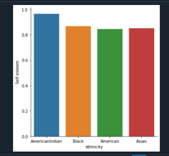
In the graph above we can see AmericanIndian have higher self-esteem compared to other ethnicities.
chi-square value, p value, expected counts
(3.0305672660644833, 0.38693627395786484, 3, array([[15.36437247, 3.87449393, 2.67206478, 11.08906883],
[99.63562753, 25.12550607, 17.32793522, 71.91093117]]))
The chi-square = 3.03 with a p = .38. So assuming null hypothesis is true (ethnicity and self- esteem are independent), a chi-square of 3.03 is very low, and a p-value of .38 indicates that we cannot say that there is a relation between ethnicity and self-esteem. We cannot reject null hypothesis.
Now we will compare each pair of ethnicity to determine if there are any categories where the expected counts are different from observed counts. Since we have 4 categories, we will have to do 6 comparisons. The value of p will have to be less than .0083. Here are chi-square and p-values for all 6 comparisons.
Here is the final chart for all p-value and chi-square comparisons:
American Versus Black – Chi-square=0.0715, p=0.1315
American Versus AmericanIndian – Chi-square=2.04, p=0.0255
American Versus Asian – Chi-square=0.0675, p=0.132
Black Versus AmericanIndian – Chi-square=1.25, p=0.0437
Black Versus Asian – Chi-square=0.025, p=0.1456
AmericanIndian Versus Asian – Chi-square=0.847, p=.0595
1st comparison
comparing American and Black
---------------------------------------
COMP1v2 American Black
selfesteem
0.0 18 11
1.0 97 72
COMP1v2 American Black
selfesteem
0.0 0.156522 0.132530
1.0 0.843478 0.867470
chi-square value, p value, expected counts
(0.07153049981033592, 0.7891212711774603, 1, array([[16.84343434, 12.15656566],
[98.15656566, 70.84343434]]))
Here p=.789/6 = .1315 (has to be < than .0083), which is not significant. So there is no difference between American and Black self-esteem numbers. Cannot reject null hypothesis
2nd Comparison
comparing American and American Indian
---------------------------------------
COMP1v3 American AmericanIndian
selfesteem
0.0 18 1
1.0 97 28
COMP1v3 American AmericanIndian
selfesteem
0.0 0.156522 0.034483
1.0 0.843478 0.965517
chi-square value, p value, expected counts
(2.0402935374418054, 0.15318008443661052, 1, array([[15.17361111, 3.82638889],
[99.82638889, 25.17361111]]))
Here p=.153/6 = .0255 which is not significant (has to be less than .0083). So there is no difference between American and American Indian self-esteem numbers. Cannot reject null hypothesis.
3rd comparison
comparing American and Asian
---------------------------------------
COMP1v4 American Asian
selfesteem
0.0 18 3
1.0 97 17
COMP1v4 American Asian
selfesteem
0.0 0.156522 0.150000
1.0 0.843478 0.850000
chi-square value, p value, expected counts
(0.06757723112128144, 0.7948975519327164, 1, array([[17.88888889, 3.11111111],
[97.11111111, 16.88888889]]))
Here p=.7948/6 = .132 which is not significant (has to be less than .0083) . So there is no difference between American and Asian self-esteem numbers. Cannot reject null hypothesis
4th comparison
comparing Black and American Indian
---------------------------------------
COMP2v3 AmericanIndian Black
selfesteem
0.0 1 11
1.0 28 72
COMP2v3 AmericanIndian Black
selfesteem
0.0 0.034483 0.132530
1.0 0.965517 0.867470
chi-square value, p value, expected counts
(1.2563356875778986, 0.26234583628669483, 1, array([[ 3.10714286, 8.89285714],
[25.89285714, 74.10714286]]))
Here p=.2623/6 = .043 which is not significant (has to be less than .0083). So there is no difference between AmericanIndian and Black self-esteem numbers. Cannot reject null hypothesis.
5th comparison
comparing Black and Asian
---------------------------------------
COMP2v4 Asian Black
selfesteem
0.0 3 11
1.0 17 72
COMP2v4 Asian Black
selfesteem
0.0 0.150000 0.132530
1.0 0.850000 0.867470
chi-square value, p value, expected counts
(0.025210190682473096, 0.8738444339085241, 1, array([[ 2.7184466, 11.2815534],
[17.2815534, 71.7184466]]))
Here p=.8738/6 = .1456 which is not significant (has to be less than .0083). So there is no difference between Asian and Black self-esteem numbers. Cannot reject null hypothesis
6th comparison
comparing AmericanIndian and Asian
---------------------------------------
COMP3v4 AmericanIndian Asian
selfesteem
0.0 1 3
1.0 28 17
COMP3v4 AmericanIndian Asian
selfesteem
0.0 0.034483 0.150000
1.0 0.965517 0.850000
chi-square value, p value, expected counts
(0.8477610153256708, 0.35718650823889897, 1, array([[ 2.36734694, 1.63265306],
[26.63265306, 18.36734694]]))
Here p=.357/6 = .0595 which is not significant (has to be less than .0083). So there is no difference between AmericanIndian and Asian self-esteem numbers. Cannot reject null hypothesis.
0 notes
Text
Data Analysis Tools - Assignment 1
Data Analysis Tools
Assignment 1
I am using addhealth data and checking if there is relationship between ethnicity and romantic relation start age. I am using Explanatory categorical variable H1GI8 and response quantitative variable H1RI3_1.
Null Hypothesis – no relation between ethnicity and romantic relation start age
Alternate Hypothesis : there is relation between ethnicity and romantic relation start age
Python Code:
# -*- coding: utf-8 -*-
"""
Created on Wed Dec 23 15:49:41 2020
Assignment 4
@author: GB8PM0
"""
# import pandas and numpy
import numpy
import pandas
import statsmodels.formula.api as smf
import statsmodels.stats.multicomp as multi
# bug fix for display formats to avoid run time errors
pandas.set_option('display.float_format', lambda x:'%f'%x)
mydata = pandas.read_csv('addhealth_pds.csv', low_memory=False)
#making individual ethnicity variables numeric
mydata['H1GI8'] = pandas.to_numeric(mydata['H1GI8'])
#cleanup of ETHNICITY so we get only 1, 2,3, 4 #Set missing data to NAN
mydata['H1GI8']= mydata['H1GI8'].replace(5, numpy.nan)
mydata['H1GI8']= mydata['H1GI8'].replace(6, numpy.nan)
mydata['H1GI8']= mydata['H1GI8'].replace(7, numpy.nan)
mydata['H1GI8']= mydata['H1GI8'].replace(8, numpy.nan)
mydata['H1GI8']= mydata['H1GI8'].replace(9, numpy.nan)
##Set missing data to NAN for age of romantic relation start
mydata = mydata.replace(r'^\s*$', numpy.NaN, regex=True)
mydata['H1RI3_1'].fillna("95", inplace=True)
mydata['H1RI3_1'] = mydata['H1RI3_1'].replace("95", numpy.nan)
mydata['H1RI3_1'] = mydata['H1RI3_1'].replace("96", numpy.nan)
mydata['H1RI3_1'] = mydata['H1RI3_1'].replace("97", numpy.nan)
mydata['H1RI3_1'] = mydata['H1RI3_1'].replace("98", numpy.nan)
#quantitative response variable
mydata['H1RI3_1'] = pandas.to_numeric(mydata['H1RI3_1'])
# using ols function for calculating the F-statistic and associated p value
model1 = smf.ols(formula='H1RI3_1 ~ C(H1GI8)', data = mydata)
results1 = model1.fit()
print (results1.summary())
sub2 = mydata[['H1RI3_1', 'H1GI8']].dropna()
# group means by ethnicity
print ('means for age started romantic relation by ethnicity')
m1= sub2.groupby('H1GI8').mean()
print (m1)
#standard deviation by ethnicity
print ('standard deviations for age started romantic relation by ethnicity')
sd1 = sub2.groupby('H1GI8').std()
print (sd1)
# compare two ethnicities at a time
mc1 = multi.MultiComparison(sub2['H1RI3_1'], sub2['H1GI8'])
res1 = mc1.tukeyhsd()
print(res1.summary())
Results
OLS Regression Results
==============================================================================
Dep. Variable: H1RI3_1 R-squared: 0.009
Model: OLS Adj. R-squared: -0.006
Method: Least Squares F-statistic: 0.5893
Date: Wed, 27 Jan 2021 Prob (F-statistic): 0.623
Time: 13:35:27 Log-Likelihood: -446.89
No. Observations: 192 AIC: 901.8
Df Residuals: 188 BIC: 914.8
Df Model: 3
Covariance Type: nonrobust
===================================================================================
coef std err t P>|t| [0.025 0.975]
-----------------------------------------------------------------------------------
Intercept 15.6224 0.253 61.686 0.000 15.123 16.122
C(H1GI8)[T.2.0] 0.1064 0.413 0.257 0.797 -0.709 0.921
C(H1GI8)[T.3.0] -0.7177 0.603 -1.190 0.235 -1.907 0.472
C(H1GI8)[T.4.0] 0.0204 0.716 0.028 0.977 -1.393 1.433
==============================================================================
Omnibus: 69.001 Durbin-Watson: 1.840
Prob(Omnibus): 0.000 Jarque-Bera (JB): 295.473
Skew: 1.334 Prob(JB): 6.90e-65
Kurtosis: 8.460 Cond. No. 4.45
==============================================================================
Notes:
[1] Standard Errors assume that the covariance matrix of the errors is correctly specified.
means for age started romantic relation by ethnicity
H1RI3_1
H1GI8
1.000000 15.622449
2.000000 15.728814
3.000000 14.904762
4.000000 15.642857
standard deviations for age started romantic relation by ethnicity
H1RI3_1
H1GI8
1.000000 2.775130
2.000000 2.483258
3.000000 1.179185
4.000000 1.945691
Multiple Comparison of Means - Tukey HSD, FWER=0.05
===================================================
group1 group2 meandiff p-adj lower upper reject
---------------------------------------------------
1.0 2.0 0.1064 0.9 -0.9646 1.1773 False
1.0 3.0 -0.7177 0.6179 -2.2805 0.8451 False
1.0 4.0 0.0204 0.9 -1.8365 1.8773 False
2.0 3.0 -0.8241 0.5603 -2.4755 0.8274 False
2.0 4.0 -0.086 0.9 -2.0181 1.8462 False
3.0 4.0 0.7381 0.8066 -1.5044 2.9805 False
Explanation:
The means of age are listed below:
1.000000
White
15.622449
2.000000
Black or African American
15.728814
3.000000
American Indian
14.904762
4.000000
Asian
15.642857
Based on the data American started having romantic relations earliest at 14.9 age and African American started the last at 15.72 age.
F-statistic: 0.5893
Prob (F-statistic): 0.623
Here the P value of 0.623 is greater than .05 and so we can accept null hypothesis. Which means there is no relation between Ethnicity and romantic relation start age.
0 notes
Text


Data Management And Visualization - Assignment 4
Assignment 4 Python Code for Assignment 4 # -*- coding: utf-8 -*- “”“ Created on Wed Dec 23 15:49:41 2020 Assignment 4 @author: GB8PM0 ”“” #%% # import pandas and numpy import pandas import numpy import seaborn import matplotlib.pyplot as plt # any additional libraries would be imported here #Set PANDAS to show all columns in DataFrame pandas.set_option(‘display.max_columns’, None) #Set PANDAS to show all rows in DataFrame pandas.set_option('display.max_rows’, None) # bug fix for display formats to avoid run time errors pandas.set_option('display.float_format’, lambda x:’%f’%x) #define data set to be used mydata = pandas.read_csv('addhealth_pds.csv’, low_memory=False) #data management- create happiness types of 1 and2 don’t get sad, 4 &5 get sad def happiness(row): if row['H1PF10’] == 1: return 1 elif row['H1PF10’] == 2 : return 1 elif row['H1PF10’] == 4 : return 0 elif row['H1PF10’] == 5 : return 0 mydata['happiness’] = mydata.apply (lambda row: happiness (row),axis=1) # Count of records in each option selected for happiness print(“ph1 - % of happiness”) ph1 = mydata[“happiness”].value_counts(sort=True, normalize= True) * 100 print(ph1) # plot univariate graph of happiness seaborn.countplot(x=“happiness”, data=mydata) plt.xlabel('happiness’) plt.title('happiness level’) #%% #data management-creating satisfaction types of 1 and2 satisfied, 4 &5 Not Satisfied 3 neither def satisfaction(row): if row['H1PF5’] == 1: return 1 elif row['H1PF5’] == 2 : return 1 elif row['H1PF5’] == 4 : return 2 elif row['H1PF5’] == 5 : return 2 mydata['satisfaction’] = mydata.apply (lambda row: satisfaction (row),axis=1) # you can rename categorical variable values for graphing if original values are not informative # first change the variable format to categorical if you haven’t already done so mydata['satisfaction’] = mydata['satisfaction’] .astype('category’) # second create a new variable that has the new variable value labels mydata['satisfaction’] =mydata['satisfaction’].cat.rename_categories([“Satisfied”, “Not Satisfied”]) # % of records in each option selected for mother satifaction print(“ps1 - % of satisfaction - Satisfaction with Mother”) ps1 = mydata[“satisfaction”].value_counts(sort=True, normalize=True) * 100 print(ps1) # plot univariate graph of satisfaction seaborn.countplot(x=“satisfaction”, data=mydata) plt.xlabel('Mother satisfaction’) plt.title('Relationship with Mother satisfaction’) #%% #data management-creating selfesteem types of 1 and2 good selfesteem, 4 &5 not good selfesteem def selfesteem(row): if row['H1PF33’] == 1: return 1 elif row['H1PF33’] == 2 : return 1 elif row['H1PF33’] == 4 : return 0 elif row['H1PF33’] == 5 : return 0 mydata['selfesteem’] = mydata.apply (lambda row: selfesteem (row),axis=1) # Count of records in each option selected for selfesteem print(“% of selfesteem”) pse1 = mydata[“selfesteem”].value_counts(sort=True, normalize= True) print(pse1) # plot univariate graph of selfesteem seaborn.countplot(x=“selfesteem”, data=mydata) plt.xlabel('selfesteem’) plt.title('selfesteem level’) #plot bivariate bar graph C->C satisfaction and hapiness seaborn.catplot(x='satisfaction’, y='happiness’, data=mydata, kind=“bar”, ci=None) plt.xlabel('Relationship With Mother satisfaction’) plt.ylabel('happiness’) Variable 1 – happiness (H1PF10) Univariate graph of happiness. Created two groupings of “0” and “1”. 0 is for adolescents who felt sad and 1 is for adolescents who were not sad. 4435 of adolescents felt sadness, and 932 of adolescents were happy (not sad). Variable 2 – Satisfaction with Relation with Mother Created a Univariate graph of satisfaction with Mother relationship. Created two groupings of “Satisfied and “Not Satisfied”. Around 5404 adolescents were satisfied with the relationship with their mother, and around 363 were not satisfied with the relationship with their mother Variable 3 – Self Esteem Created two groupings of “0” and “1”. 0 is for adolescents who do not like themselves (have low self esteem), and 1 is for adolescents who like themselves (have high self esteem) . 5022 adolescents had high self esteem, and 592 had high self esteem Relationship with Mother Versus Happiness Created a bivariate graph between satisfaction with mother relationship to happiness. It looks like from the graph the 17.8% of adolescents who are satisfied with their relationship and are happy, whereas only 5% of adolescents who are not satisfied are happy
1 note
·
View note
Text
Data Management And Visualization - Assignment 4
Assignment 4 Python Code for Assignment 4 # -*- coding: utf-8 -*- """ Created on Wed Dec 23 15:49:41 2020 Assignment 4 @author: GB8PM0 """ #%% # import pandas and numpy import pandas import numpy import seaborn import matplotlib.pyplot as plt # any additional libraries would be imported here #Set PANDAS to show all columns in DataFrame pandas.set_option('display.max_columns', None) #Set PANDAS to show all rows in DataFrame pandas.set_option('display.max_rows', None) # bug fix for display formats to avoid run time errors pandas.set_option('display.float_format', lambda x:'%f'%x) #define data set to be used mydata = pandas.read_csv('addhealth_pds.csv', low_memory=False) #data management- create happiness types of 1 and2 don't get sad, 4 &5 get sad def happiness(row): if row['H1PF10'] == 1: return 1 elif row['H1PF10'] == 2 : return 1 elif row['H1PF10'] == 4 : return 0 elif row['H1PF10'] == 5 : return 0 mydata['happiness'] = mydata.apply (lambda row: happiness (row),axis=1) # Count of records in each option selected for happiness print("ph1 - % of happiness") ph1 = mydata["happiness"].value_counts(sort=True, normalize= True) * 100 print(ph1) # plot univariate graph of happiness seaborn.countplot(x="happiness", data=mydata) plt.xlabel('happiness') plt.title('happiness level') #%% #data management-creating satisfaction types of 1 and2 satisfied, 4 &5 Not Satisfied 3 neither def satisfaction(row): if row['H1PF5'] == 1: return 1 elif row['H1PF5'] == 2 : return 1 elif row['H1PF5'] == 4 : return 2 elif row['H1PF5'] == 5 : return 2 mydata['satisfaction'] = mydata.apply (lambda row: satisfaction (row),axis=1) # you can rename categorical variable values for graphing if original values are not informative # first change the variable format to categorical if you haven’t already done so mydata['satisfaction'] = mydata['satisfaction'] .astype('category') # second create a new variable that has the new variable value labels mydata['satisfaction'] =mydata['satisfaction'].cat.rename_categories(["Satisfied", "Not Satisfied"]) # % of records in each option selected for mother satifaction print("ps1 - % of satisfaction - Satisfaction with Mother") ps1 = mydata["satisfaction"].value_counts(sort=True, normalize=True) * 100 print(ps1) # plot univariate graph of satisfaction seaborn.countplot(x="satisfaction", data=mydata) plt.xlabel('Mother satisfaction') plt.title('Relationship with Mother satisfaction') #%% #data management-creating selfesteem types of 1 and2 good selfesteem, 4 &5 not good selfesteem def selfesteem(row): if row['H1PF33'] == 1: return 1 elif row['H1PF33'] == 2 : return 1 elif row['H1PF33'] == 4 : return 0 elif row['H1PF33'] == 5 : return 0 mydata['selfesteem'] = mydata.apply (lambda row: selfesteem (row),axis=1) # Count of records in each option selected for selfesteem print("% of selfesteem") pse1 = mydata["selfesteem"].value_counts(sort=True, normalize= True) print(pse1) # plot univariate graph of selfesteem seaborn.countplot(x="selfesteem", data=mydata) plt.xlabel('selfesteem') plt.title('selfesteem level') #plot bivariate bar graph C->C satisfaction and hapiness seaborn.catplot(x='satisfaction', y='happiness', data=mydata, kind="bar", ci=None) plt.xlabel('Relationship With Mother satisfaction') plt.ylabel('happiness') Variable 1 – happiness (H1PF10) Univariate graph of happiness. Created two groupings of “0” and “1”. 0 is for adolescents who felt sad and 1 is for adolescents who were not sad. 4435 of adolescents felt sadness, and 932 of adolescents were happy (not sad). Variable 2 – Satisfaction with Relation with Mother Created a Univariate graph of satisfaction with Mother relationship. Created two groupings of “Satisfied and “Not Satisfied”. Around 5404 adolescents were satisfied with the relationship with their mother, and around 363 were not satisfied with the relationship with their mother Variable 3 – Self Esteem Created two groupings of “0” and “1”. 0 is for adolescents who do not like themselves (have low self esteem), and 1 is for adolescents who like themselves (have high self esteem) . 5022 adolescents had high self esteem, and 592 had high self esteem Relationship with Mother Versus Happiness Created a bivariate graph between satisfaction with mother relationship to happiness. It looks like from the graph the 17.8% of adolescents who are satisfied with their relationship and are happy, whereas only 5% of adolescents who are not satisfied are happy
1 note
·
View note
Text
Data Management And Visualization - Assignment 3
Assignment3
Python Code for Assignment 3
# -*- coding: utf-8 -*-
"""
Created on Wed Dec 23 15:49:41 2020
@author: GB8PM0
"""
# import pandas and numpy
import pandas
import numpy
#Set PANDAS to show all columns in DataFrame
pandas.set_option('display.max_columns', None)
#Set PANDAS to show all rows in DataFrame
pandas.set_option('display.max_rows', None)
# bug fix for display formats to avoid run time errors
pandas.set_option('display.float_format', lambda x:'%f'%x)
#define data set to be used
mydata = pandas.read_csv('addhealth_pds.csv', low_memory=False)
#creating satisfaction types of 1 and2 satisfied, 4 &5 Not Satisfied 3 neither
def satisfaction(row):
if row['H1PF5'] == 1:
return 1
elif row['H1PF5'] == 2 :
return 1
elif row['H1PF5'] == 4 :
return 2
elif row['H1PF5'] == 5 :
return 2
mydata['satisfaction'] = mydata.apply (lambda row: satisfaction (row),axis=1)
# you can rename categorical variable values for graphing if original values are not informative
# first change the variable format to categorical if you haven’t already done so
mydata['satisfaction'] = mydata['satisfaction'] .astype('category')
# second create a new variable that has the new variable value labels
mydata['satisfaction'] =mydata['satisfaction'].cat.rename_categories(["Satisfied", "Not Satisfied"])
# countof records in each option selected for mother satifaction
print(" s1 - count of satisfaction - Satisfaction with Mother")
s1 = mydata["satisfaction"].value_counts(sort=True)
print(s1)
# % of records in each option selected for mother satifaction
print("ps1 - % of satisfaction - Satisfaction with Mother")
ps1 = mydata.groupby("satisfaction").size() * 100 / len(mydata)
print(ps1)
#creating happiness types of 1 and2 don't get sad, 4 &5 get sad
def happiness(row):
if row['H1PF10'] == 1:
return 1
elif row['H1PF10'] == 2 :
return 1
elif row['H1PF10'] == 4 :
return 0
elif row['H1PF10'] == 5 :
return 0
mydata['happiness'] = mydata.apply (lambda row: happiness (row),axis=1)
# Count of records in each option selected for happiness
print("h1 - Count of happiness - happiness")
h1 = mydata["happiness"].value_counts(sort=True)
print(h1)
# Count of records in each option selected for happiness
print("ph1 - % of H1PF10 - happiness")
ph1 = mydata["happiness"].value_counts(sort=True, normalize= True) * 100
print(ph1)
#creating selfesteem types of 1 and2 good selfesteem, 4 &5 not good selfesteem
def selfesteem(row):
if row['H1PF33'] == 1:
return 1
elif row['H1PF33'] == 2 :
return 1
elif row['H1PF33'] == 4 :
return 0
elif row['H1PF33'] == 5 :
return 0
mydata['selfesteem'] = mydata.apply (lambda row: selfesteem (row),axis=1)
# Count of records in each option selected for selfesteem
print("se1 - Count of selfesteem - selfesteem")
se1 = mydata["selfesteem"].value_counts(sort=True)
print(se1)
# Count of records in each option selected for selfesteem
print("pse1 - % of selfesteem")
pse1 = mydata["selfesteem"].value_counts(sort=True, normalize= True) * 100
print(pse1)
Variable 1 – H1PF5
Created two groupings of “Satisfied and “Not Satisfied”. 83% were satisfied with the relationship with their mother, and 5.58% were not satisfied with the relationship with their mother
s1 - count of satisfaction - Satisfaction with Mother
Satisfied 5404
Not Satisfied 363
Name: satisfaction, dtype: int64
ps1 - % of satisfaction - Satisfaction with Mother
Satisfied 83.087331
Not Satisfied 5.581181
dtype: float64
Variable 2 – H1PF10
Created two groupings of “0” and “1”. 0 is for adolescents who felt sad and 1 is for adolescents who were not sad. 82.63% of adolescents felt sadness, and 17.36% of adolescents were happy (not sad)
h1 - Count of happiness - happiness
0.000000 4435
1.000000 932
Name: happiness, dtype: int64
ph1 - % of H1PF10 - happiness
0.000000 82.634619
1.000000 17.365381
Name: happiness, dtype: float64
Variable 3 – H1PF33
Created two groupings of “0” and “1”. 0 is for adolescents who do not like themselves (have low self esteem), and 1 is for adolescents who like themselves (have high self esteem) . 89.45% adolescents had high self esteem, and 10.54 % had high self esteem
se1 - Count of selfesteem - selfesteem
1.000000 5022
0.000000 592
Name: selfesteem, dtype: int64
pse1 - % of selfesteem
1.000000 89.454934
0.000000 10.545066
Name: selfesteem, dtype: float64
0 notes
Text
Data Management and Visualization - Assignment2
Assignment 2
Python Code For Assignment 1
"""
Created on Wed Dec 23 15:49:41 2020
@author: GB8PM0
"""
# import pandas and numpy
import pandas
import numpy
#define data set to be used
mydata = pandas.read_csv('addhealth_pds.csv', low_memory=False)
print("number of rows and column")
#number of rows
print(len(mydata))
# number of columns
print(len(mydata.columns))
# Count of records in each option selected for mother satifaction
print("Count of H1PF5 - Satisfaction with Mother")
c1 = mydata["H1PF5"].value_counts(sort=True, dropna=False)
print(c1)
# % of records in each option selected for mother satifaction
print("% of H1PF5 - Satisfaction with Mother")
p1 = mydata.groupby("H1PF5",dropna=False).size() * 100 / len(mydata)
print(p1)
# Count of records in each option selected for feeling sadness
print("Count of H1PF10 -Feeling Sadness")
c2 = mydata["H1PF10"].value_counts(sort=True, dropna=False)
print(c2)
# % of records in each option selected for feeling sadness
print("% of H1PF10 -Feeling Sadness")
p2 = mydata.groupby("H1PF10", dropna=False).size() * 100 / len(mydata)
print(p2)
# Count of records in each option selected for self-esteem
print("Count of H1PF33 - self-esteem")
c3 = mydata["H1PF33"].value_counts(sort=True, dropna=False)
print(c3)
# % of records in each option selected for self-esteem
print("% of H1PF33 - self-esteem")
p3 = mydata.groupby("H1PF33", dropna=False).size() * 100 / len(mydata)
print(p3)
Results Of Python Assignment 2
Variable 1 – H1PF5
A random sample of 6,504 adolescents were asked the following question, “ Overall, you are satisfied with your relationship with your mother?” Of the total number, about 46.77 % chose category 1 which was “Strongly Agree” and about 36.31% fell into category 2 (“Agree”). About 5.68% gave legitimate skip question
6504
2829
Count of H1PF5 - Satisfaction with Mother
1 3042
2 2362
7 370
3 354
4 266
5 97
8 8
6 4
9 1
Name: H1PF5, dtype: int64
% of H1PF5 - Satisfaction with Mother
H1PF5
1 46.771218
2 36.316113
3 5.442804
4 4.089791
5 1.491390
6 0.061501
7 5.688807
8 0.123001
9 0.015375
dtype: float64
Variable 2 – H1PF10
For the next question, the same students were asked the question: “You never get sad.?” About 54.78 said 4 (Strongly Disagree) about 17.15 said 3 (Neither agree nor disagree).
Count of H1PF10 -Feeling Sadness
4 3563
3 1116
5 872
2 712
1 220
8 14
6 7
Name: H1PF10, dtype: int64
% of H1PF10 -Feeling Sadness
H1PF10
1 3.382534
2 10.947109
3 17.158672
4 54.781673
5 13.407134
6 0.107626
8 0.215252
dtype: float64
Variable 3 – H1PF33
For the next question, the same students were asked the question You like yourself just the way you are. About 42.65% said 2 (Agree) about 34.56% said 1 (Strongly Agree).
Count of H1PF33 - self-esteem
2 2774
1 2248
3 868
4 534
5 58
8 12
6 10
Name: H1PF33, dtype: int64
% of H1PF33 - self-esteem
H1PF33
1 34.563346
2 42.650677
3 13.345633
4 8.210332
5 0.891759
6 0.153752
8 0.184502
dtype: float64
0 notes
Text
Data Management and Visualization - Assignment 1
Step 1-3
STEP 1. Choose a data set that you would like to work with.
STEP 2. Identify a specific topic of interest
STEP 3. Prepare a codebook of your own (i.e., print individual pages or copy screen and paste into a new document) from the larger codebook that includes the questions/items/variables that measure your selected topics.)
I am a Mother with two adolescents and interested in understanding how mother’s relationship effects the adolescents, so that I can be a better mother. I would like to explore the AddHeath data.
There are lot of adolescents who through depression, loneliness which then lead to risky behavior like drugs, alcoholism, teenage pregnancies etc. I would like to understand the mother’s relationship and the effect on Adolescents Sadness. I will be looking at “Section 18: Personality and Family”. In it I will look Adolescents sadness with Adolescent’s satisfaction in Mother’s relation. The variables considered for analysis are - H1PF5 and H1PF10. Here is my codebook.
5. Overall, you are satisfied with your relationship with your mother H1PF5 num 1
3042 1 Strongly agree
2362 2 agree
354 3 Neither agree nor disagree
266 4 disagree
97 5 Strongly disagree
4 6 refused
370 7 Legitimate skip [no resident MOM]
8 8 don’t know
1 9 Not applicable
10. You never get sad. H1PF10 num 1
220 1 Strongly agree
712 2 agree
1116 3 Neither agree nor disagree
3563 4 disagree
872 5 Strongly disagree
7 6 refused
14 8 don’t know
Step 4-5
STEP 4. Identify a second topic that you would like to explore in terms of its association with your original topic.
STEP 5. Add questions/items/variables documenting this second topic to your personal codebook.
There are a number of Adolescents do not feel good about themselves. The second topic I would like to explore is the relation between the self-esteem to sadness. I will look at variable H1PF33.
33. You like yourself just the way you are. H1PF33 num 1
2248 1 strongly agree
2774 2 agree
868 3 neither agree nor disagree
534 4 disagree
58 5 strongly disagree
10 6 refused
12 8 don’t know
Step 6
STEP 6. Perform a literature review to see what research has been previously done on this topic. Use sites such as Google Scholar (http://scholar.google.com) to search for published academic work in the area(s) of interest. Try to find multiple sources, and take note of basic bibliographic information.
Looked at
https://journals.sagepub.com/doi/abs/10.1177/0192513X04270262
https://link.springer.com/article/10.1023/B:JOYO.0000025322.11510.9d
https://link.springer.com/article/10.1007/s10964-005-9009-2
Step 7
STEP 7. Based on your literature review, develop a hypothesis about what you believe the association might be between these topics. Be sure to integrate the specific variables you selected into the hypothesis.
Positive relation with mother will have a better outcome on the Psychological wellbeing and better self-esteem.
1 note
·
View note