
Statistics
We looked inside some of the posts by archiegraves180 and here's what we found interesting.
Average Info
Notes Per Post
1
Likes Per Post
1
Reblog Per Post
0
Reply Per Post
0
Time Between Posts
11 days
Number of Posts By Type
Text
14
Link
2
Video
1
Last Seen Tumblr Blogs


Fun Fact
Tumblr was the first site to host the blog for President Barack Obama in 2011.


Link
“Nature writing often draws heavily on scientific information and facts about the natural world; at the same time, it is frequently written in the first person and incorporates personal observations of and philosophical reflections upon nature.“
0 notes
Text
What the judges are looking for
Your cover design should encapsulate the essence or key themes of the book in an imaginative, instant and engaging way.
Regardless of style, think of your audience
Your cover design can be made using illustration, photography, mixed media, pure typography or graphic elements – it’s up to you! But most importantly, it should give the prospective reader a sense of the tone and content of the book, and appeal to the broadest possible audience for it.
What will make a reader pick up the book?
Think about which covers have made you want to read the book itself. Your cover should:
Evoke an emotion in the reader when they see it, which reflects how they will feel when they read it
Be an attractive piece of design – something that draws people in and makes them want to pick up the book and learn more about it
Be an original and unexpected interpretation of the brief – something that we’re unlikely to have seen and that will surprise us
Stand out, whilst still appealing to readers in the target audience. You should engage with the book market – look at published covers in the same genre and think about how to make your cover design unique
It should also:
Have a strong use of typography
Have executed the use of colour carefully. A well-considered pop of colour, or an unusual palette can make all the difference to how impactful a cover design is
Use type, images and colour that work seamlessly together
0 notes
Text
THE BRIEF
We are looking for a cover design that is, above all, a beautiful package that does justice to Dara’s deeply intimate and sensitive memoir about his experience and the joy of immersing himself in the natural world. The cover should feel timeless and confident and, just as the book breaks the boundaries of traditional nature-writing, whilst still appealing to that readership it should resonate with a much wider audience.
Overall themes discovered within the book or even just a single sentence can spark an idea and concept for your cover design, so do read the book to gain the best possible understanding of the writing, the content and its setting.
Think carefully about your choice of fonts, colour and treatment. This all plays a crucial part in how you represent the overriding feel and communicate the beauty of this very special book.
0 notes
Text
PENGUIN DESIGN AWARDS
Adult Non-Fiction categoryDiary of a Young Naturalist by Dara McAnulty
‘This diary chronicles the turning of my world, from spring to winter, at home, in the wild, in my head.’
Evocative, raw and lyrical, this startling debut explores the natural world through the eyes of Dara McAnulty, an autistic teenager coping with the uprooting of home, school, and his mental health, while pursuing his life as a conservationist and environmental activist.
Shifting from intense darkness to light, recalling his sensory encounters in the wild – with blackbirds, whooper swans, red kites, hen harriers, frogs, dandelions, Irish hares and more – McAnulty reveals worlds we have neglected to see, in a stunning work of nature-writing that is a future classic.
Diary of a Young Naturalist is a powerful and scintillating portrayal of the beauty of the natural world, as it shines a light on autism and of overcoming severe anxiety. It is a story of the binding love of family and home, and how we can help each other through the most difficult of times.
0 notes
Text
Final evaluation
My design decisions were informed by both modern visuals, and visuals and design from the time. Using a condensed Sans-Serif typeface gave the outcomes a modern style, however the photographs and visuals were edited in a way that looked modern, but using noise, and blending options was able to make the imagery look lo-fi. In terms of publication research, I focussed on books that aimed to celebrate a certain subject, as that was what I was aiming to communicate uysing visuals, and written content. When designing my LaserDiscs, my design decisions were directly influenced off of the music video that was being designed for, and followed the same system that I had followed for my editorial piece. Colours used were based off of the 7” vinyl single of that song, to keep a consistency and give the colour palette context. However, blending options meant I could manipulate many of these colours.
My original project aimed to explore gender expression and sexuality within the New Romantic subculture, however I struggled with compiling and generating visuals for this subject from an early start, so aimed to focus my project on the same movement, but direct outcomes to be influenced by more visual aspects. At first, this was looking at album covers, however this lead to another dead end which is when my project adapted to exploring music videos from New Romantic artists. In terms of final outcomes, I had always planned on creating a typographical piece, and based off of the naturen and the aim of celebrating the movement, I was aware it would more than likely take the form of a publication. However, after someone suggesting that I should explore designing record covers, that enabled me to explore more into different music formats and come across LaserDiscs. This was a perfect way to visualise the celebration of New Romantic music videos. However, by this point, I had already began to design an editorial piece so thought I would continue with the editorial.
During the unit I felt that my time-management let me down, however this I believe was down to ISTD submission on the 19th of April, and pandemic in the earlier part of the unit. I also felt that I spent a long time researching New Romanticism as a whole as I felt lost on what to focus on, so fell behind slightly. Once I was able to attend uni, and see where everyone else was at with their project, I was able to time plan better, as other people were helping with motivation and focus, which I had struggled with whilst working at home. In the second half of the unit, I came onto campus daily which really helped out with sticking to my working routine.
I felt that I responded well to feedback, I was able to explore different subjects and routes in my project and tutors helped with decision making in terms of what I should be focussing on. As I love getting stuck into research, it helped having tutors suggest different things to have a look at. I listened to feedback in terms of typographic handling, and different formats that my outcome could take.
Going forward I would like to develop my type more, and become more experimental with it. Whilst developing my advertising posters as a small extra, I really saw the benefit of taking direct layout inspiration from other work, and planning out layouts with more detail I believe really helped with creating a polished poster. Going forward, I want to implement that skill more.
In this last unit, I developed my typographical skills a huge amount whilst working on submission for ISTD, I really felt that my typographical knowledge developed which was my main goal which I then applied to my FMP. I also feel like I found a visual style in terms of image manipulation, using colour and blending options which create my own imagery from existing visuals.
In terms of final outcomes, I wish that I had made a slightly longer editorial piece which explore more contextual background and music videos. However overall I’m very proud of what I’ve managed to achieve over the course of the unit.
0 notes


Link
THE BOOK WITH NO NAME
One of the only books made at the time of the New Romantics. The colour overlays in the book give a cohesive style to it.
0 notes
Text
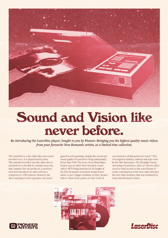
Colour overlay poster
I added a pink overlay, to keep it in keeping with the rest of my project, using colour and texture overlays.
0 notes


Text
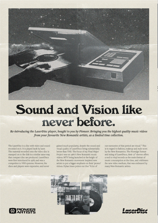
Final Poster (B&W)

I incorporated a 3 column grid, which centred text for headings and subheads. The heading is in ‘Windsor’ and the subhead and body I used Freightext Pro in semi-bold italic, and in light. I added a tint to the text so the colours were’t too harsh, and also made the background a bit of a cream, to mimic ageing paper in a magazine.
0 notes


Text
Typeface references


I tried several ITC typefaces on my posters, such as Kabel and Souvenir which were both popular in 1970/80s graphic design.
0 notes
Text

To keep it in theme with my other work, I added a colour overlay, found from my colour palette used in my editorial. I also started to split up my image in order to give space for my body text, that was common in a lot of the magazine adverts I used. I used Cooper Black, but wasn’t completely happy with the colour, or the layout.
0 notes