
ardn631-isobelchilberto-2024
ARDN631_IsobelChilberto_2024
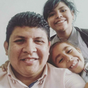
My name is Isobel Chilberto. I am currently an architectural photographer, specialising in historical buildings.
87 posts
Don't wanna be here? Send us removal request.
Last Seen Blogs

askironsecondturel
Turel of the Iron Forges
ossielv
Ossiel V

crazy-rbx
Crazy_Rbx

allthesethingsthatived0ne
punk trash
rhaffhaelha
R H A F F H A E L H A
Text
Week 12 - Little Reflection
Reflecting on this part of the semester, I realise that portrait photography has definitely been a new skill for me to learn. But I have really enjoyed how rewarding it is to photograph other people, especially those close to me. I have learnt of the importance of focus when it comes to photographing other people as we are constantly moving, and there are so many small parts of the face that needs to be focused on.
I have learnt about environmental photography when it comes to photographing a person. I have learnt how to capture how a person interacts and is a part of their environment. And how I can capture that in a flattering way. Using colours, angles and ideas of composition. I have looked at how to create thematic depth in my photographs through collaborative and ethical photographic practice. I have enjoyed working with and understanding the subject I am taking photos of.
I have enjoyed looking at a rang of photographs, exploring potential and similar thematic ideas to my project. I also used them to inform my photographic decisions. Alongside this, looking at photo books to inform my final photo book has been a valuable learning experience in layout and photographic pairings.
In the future, I would want to expand on my project ideas by finding a wider range of individuals going into their twenties around the world. So I can expand the depth of my project and also create a network and range of different people and their experiences. I also would want to go back and take more photographs of my subjects, their environments and items. I think I would have a clearer idea of what to photograph and the framing, lighting and angles I'd use.
0 notes


Text
Week 12 - Photobook Final
Here is my final photobook draft for the summative submission. It is designed for a university setting where fellow university students can find an element of relatability. It is made to be read through from section to section, though there is a content page for anyone who wants to skip to a specific section. I also like my type of choice as it's sleek but nostalgic and elegant, like the people in the book. It also is a visual representation of the word letter as it resembles the idea of a handwritten letter.
I have chosen the black cover and back for a sleek, modern finish and to break up the white pages throughout the book. I am happy with the finished product, but I do feel some photos aren't my best, and if I had more time, I would retake them. I am happy with the narrative I have produced, though, and I think having an introduction to each person adds to the viewing experience.


Photobook Analysis/Rationale for Layout Reasonings:


0 notes
Text
Week 12 - Final Edited Photos Pt.2
Choisy:
I centred Choisy's narrative around her work environment. I have a shot of the place reflected in a glass wall. I then have a shot of her coding in her work environment, showing her present and future. I then have a reflective shot of her in her teaching space. Finally, I paired two shots of her in the staffroom to represent who she has become. As well as a continued reflection on her currently and the future.


When reviewing Choisy's photos, quite a few of them were quite dark in certain areas as she was wearing black in areas with black curtains/wallpapers/floors. So, I needed to do some post-processing to fix this. Also, the reflection photo is blurry, but this is due to the effect, and therefore, I am fine with this.
Unedited Photos:


Kristelle:
For Kristelle's narrative, I focused on showing her personality in three of the shots. She shows her playful energy while in her engineering labs. In the pavilion shot, I wanted to show her curiosity and continued willingness to learn about the world. And in the final shot, she looks towards the future with her back to the university.


When editing the photos in her lab, I played around with the whites and blacks as they were quite interesting in the lab, especially with her clothes and the background. For the pavilion shot, I turned up the highlights a bit and edited it so the contrast between the pavilion and green backdrop stood out more. For the final images, I did some slight editing of the shadows and blacks to make her stand out more.
Unedited Photos:


0 notes
Text
Week 12 - Final Edited Photos Pt.1
Here are my final photos for my submission and photo book. They have been edited and selected to suit my narrative and a photo book format.
I made sure to edit them so if they were to be printed they wouldn't print solid key or paper. Though I had to break this a few times, as in some photos, intense contrast with black was what I wanted. Some photos may not have been as in focus as I wanted, but I went with them due to their significance to my narrative. And some might not have been as photographically interesting, but the content was to the narrative of my theme.
Even though the brief said 13-20, I wanted to have at least 4 photos per person to tell my story. For example, I wanted at least one reflective shot, one to do with their personality and then objects or their environments relating to them. I also wanted a range of landscape and portrait orientations. Therefore, I ended up with 25 photos. In this way, I could lay out my photo book in an engaging, holistic way, and each section was allowed to shine.
Izzy:
For Izzy's narrative, I wanted a shot of her in her causal clothing, showing her in her home environment. Then, I wanted a photo to tell a story of where she wants to go into the future, her goal and what drives her to her degree. I also wanted a shot of her transforming into her nursing uniform, showing who she has become. The final shot is her blooming into who she is, showing both her personality, confidence and aspirations.


For Izzy's photos in her room, I toned down the shadows a bit while bringing up the highlights as the sun was hitting her from her window. In the photos outside, I had to turn down the whites just a bit, especially in the globe photo, as the sky was pure white initially. In the leaves one I turned down the blacks in the leaves to bring out the green more.
Unedited Photos:


Hinami:
For Hinami's narrative, I wanted to show her outside of her home in the ways she portrays herself on the outside. While the next shots in her home showed who she is on the inside. In this section, I focus on objects as they reflect her personality a lot. In two of the shots, she has a teddy bear, an ode to childhood. A shot of her writing on the wall shows a continued willingness to learn. I have also used a reflective shot of her in her home.


For Hinami's photos, there was a bit of shadow in her room, so I just turned them down a bit to lighten the photo for printing. Though they weren't too dark, regardless. In the profile shot of her, the lighting is quite bright, so I toned that down a little as well. Overall they didn't need a lot of editing just a bit of change in the intensity of shadows and highlights.
Unedited Photos:


Zoe:
For Zoe's narrative, I started in her flat in her first photo, which shows her in her home environment. I then have a shot of her grocery shopping, showing her flatting experience going into adulthood. Then, at university, she reflected on who she had become. Then, two photos at her bus stop, a liminal space in her life. I wanted these shots to feel candid and natural, showing a part of adult life.


For the photo of Zoe in her flat, I had to do some post-production to lighten the photo as it is quite dark in the background, and the shadows were quite intense. For the supermarket photo, it was the same while the others were a lot better so I just did a tiny bit of s curve editing to prepare them for print.
Unedited Photos:


0 notes
Text
Week 12 - Kristelle Photos
For the final person I photographed, I photographed my friend Kristelle. We took photos in both her uni, Albert Park and Lorne Street areas. Spaces we occupy a lot as both UOA and AUT students. I wanted to portray her personality in the spaces she occupies and represent a part of her experiences in her twenties. I wanted to portray the way she embraces her playful personality alongside the fact she is going into her 20s.
As it was later in the evenings, I took inspiration from the projects of Grown's use of lighting at night to highlight reflectiveness and a moment in time of reflection. I also took inspiration from She and the use of similar backgrounds to create unity between the person and the backdrop. And how she interacted with the environment around her. I also wanted to emulate the playful energy of Carla Kogelman's Ich Bin Walviertel. Because I felt this suited Kristelle's playful energy and would be the most comfortable shots for her to emulate.
The fact it was dark was a limitation as I had to work with weaker or more artificial light sources. Therefore, my photos did have an interesting use of shadow, but there is a lot of grain. But I think it does add an interesting texture to them and a nostalgic mood.
For the shoot, we started in her engineering lab, where I used the black and white backdrop with her black and white outfit to create a sense of unity. I also had to work with harsher white lights, but this only added to the harsh vibe of the colours. But directly contrasted with Kristelle's playful energy. The next location we used was Albert Park, and we were looking at the pavilion(?), and she was curious about the details on the roof, which portrayed an aspect of her personality. The lighting was warmer and from the top, so it created an interesting orange glow.
We then moved to Lorne Street, where we ate ice cream, which I felt also represented a part of our uni experience with trying interesting foods. I also felt it played into an ode to childhood. The final location was again in Albert Park but when it was much darker. I felt the atmosphere was moody and reflective so I posed her in front of a lamp on one side and then shadows on the other.
Favourites:


I like this shot because of the framing of her face and shoulders. I like the angle at which she faces the camera, as it adds pictorial depth. In the second shot, I found it really cool to try an extreme close-up. It's intimate, personal, and her personality shines forth. I feel she looks youthful but has a glimmer of adulthood in her body language. In the final shot, it shows her playful personality and is a bit fun. Even though it isn't the coolest shot in the world, I like how her hands are in focus but not her face, creating depth in the photos and an idea of the scale of the location.
In these shots, I love the contrasting colours. The artificial lighting also becomes soft in this shot alongside her sweater. Making it feel warm and inviting. I wish there wasn't as much grain, but it couldn't be helped, and it does add an element of nostalgia/something to look back on. I might pair these three together as they create a unity of her personality, which is fun, playful and satisfying to me.

I choose this shot to show reflection and curiosity. I like how the lighting from the pavilion casts an interesting orange glow onto her. It gives a warm, inviting mood, but something slightly chills due to the shadows. The fact that she and the pavilion are glowing orange makes them stand out against the green backdrop. Creating contrasting colours that add depth to the photo. I also like how the pavilion acts as a frame for the photo and Kristelle. I did have shots that were more symmetrical. But I like the asymmetry as it feels more organic and interesting.

I chose this shot for my final selection as I like the candid and intimate feeling of it. Like we're invading into her life and that we are glimpsing into her in the moment. I like how her personality is seen in this, playful and in the moment. The colour of the ice cream contrasts in a satisfying way against the more neutral colours of the photo. The lighting is warmer and inviting, which matches the mood of the shoot. And is evenly distributed across Kristelles' face. Though the ice cream especially shines in the light (it could be melted ice cream!)

In the final shot of my favourites, I lent into a reflective atmosphere. Something more moody, cinematic, and dream-like, reflecting the time of night. I got her to pose towards a lamp with her back in the shadows. It's interesting because she has her back at uni and is looking in the other direction. Kinda like looking to the future. This, therefore, complements my theme. I like how the lamp gives her a golden glow, which I find flatters her complexion.
Contact Sheets:


0 notes
Text
Kristelle Interview
What is your name, age, occupation?
Kristelle Sampang, 20, engineering student
How would you, as you are now, describe yourself?
Burnt out, optimistic, curious person. Playful, “childish” personality
How do you want to be photographed?
Not overly staged, how you (Isobel) sees me
What has been the biggest change going into your twenties?
Independence, living without parents to not, alongside uni at the same time, a lot of change.
What are some challenges you face going into your twenties?
Managing relationships, since she has less time now, it is hard to pick and choose who she spends time with.
What have been highlights going into your twenties?
Freedom, having full control over what she does in life, not being restricted
What do you aspire to do in your twenties?
Experience the world as much as she can, either by travelling and moving to a different country while she's still young and doesn't have to settle down
For me: Who is this person?
My newest close friend but someone I see as very playful, curious and intelligent. Someone who is generous with her time and energy.
0 notes
Text
Week 11 - Photobook Draft
(There is something wrong with the colours (I couldn't figure out how to fix this!!)
This week, I began culling back my photos, but I still need to do this further once I know the photos I have from my final subject, Kristelle. I especially am struggling to part with my photos of Hinami, which I feel I could keep, but I'd have to cull other photos, and then there would be an imbalance. Choisy needs to have her photos changed, I think, or at least the photos of her laptop and books. As I don't think they're that interesting but they do add thematic depth.
For the beginning of my book, I have an introduction page and then a two-page spread of all of my subjects. To create a feeling of unity and introduction to the content in my photo book.
I think the introduction works at the beginning of each person's section. It also honours the time and effort my friends put into letting me take photos and interview them. To supplement this, I have also added names to each photo. Though some are not that creative, they relate to the content and the introduction.
I took inspiration from the clean, modern layouts of the photo books I'd researched. As well as the different pairing styles and sizes of images. I also used this to inform my grid system. I might play more with negative space as most of my pages have big images taking up most of the page. And maybe pairing landscape photos on top of each other?


I also created a clear grid system for my photo book for cohesion, cleanness and readability. I found this elevated the finish and tied each section together, even if each section had a different style/lighting and subject. I added headers as well for the person and also page numbers!

0 notes
Text
Week 11 - Zoe Reshoot
This week, I decided that I wanted to take more shots of Zoe. I wasn't very happy with the shoot before. The lighting wasn't working in her flat so I decided to take some of her at university. Also, the thematic depth wasn't entirely there for me. I also wanted to take inspiration from the photo book of the project by Nikki S. Lee which had these interesting candid shots in liminal spaces like bus stops and out and about.
Therefore, we based this shoot on the uni and the places she frequented, like her bus stop, lab and the engineering building. I wanted to play with the shadows and lighting in this shoot. Particularly inside, as this was where I fell short in the previous project.
I wanted to find the places she spent a lot of time in and present them in a reflective or environmentally focused way. To expand on that more the way she interacts with the environments she spends most of her time in.
Favourites:


These shots were taken in the food court where we were having lunch together. I tried making it natural and candid by talking to her at the same time and letting her take the lead.
I took inspiration from Rachel King's project, which involved a lot of angles from below, making the subject feel confident, powerful and centred. It also gave the feeling of the subject breaking the fourth wall, an element of intimacy and confrontation. I played with the bright light from above, framing her hair in a halo effect. Also, the walls of the food court created a frame that pointed towards her. The lighting on her face from above is really soft but even and I feel it works well with her facial expressions.


I wanted to take some shots at her bus stop based on the shots in the book about Nikki S. Lee's photography. I really liked the candidness and naturalness of the photos, as well as using the bus stop as a frame and a source of shadow alongside intense light on the outside. I lucked out as the sun was shining nicely while the bus stop provided a good source of shadow.
In the first shot, I really like the saturation of the colours and the leaves flowing across the floor. The lines of the pavement and the framing of the stop around her. I love the shot type as I feel it establishes her location, and her posture is strong and powerful but natural to her. In the second, I love the golden glow on her face, and her facial expressions, which is so her! I love the shadows created with her hair and the backdrop of the tree reflecting the shape of her head.


These were the final shots I took, and they were based on where she studied and took naps at uni. I used the bench as a framing device alongside the pillows and positioned her so she leaned into it. The window behind her let in light that framed her silhouettes, and the artificial light overhead provided even lighting. For her body language, I wanted her to sit naturally as she would and also seem reflective and relaxed.
Contact Sheets:


0 notes
Text
Week 11 - Physical Photobook Research
Another photo book I looked at this week was Lorna Simpson: Revised & Expanded Edition (Phaidon Contemporary Artists Series, Hardcover – April 6, 2022), which documented Lorna's career.
I choose it as it was another minimalistic, modern design which I find flattering to honour photos. The use of both black and white was really lovely, too, as I found this made the coloured ones stand out and appreciated more (Maybe I should try some B+W photos?). The use of image and text interaction is also well done, with what I think is a clear grid system. It's clean and informative and adds a feeling of knowledge on the topic.
I liked the spread of multiple photos in a row. I found it emulated a contact sheet but in a refined, clean way. The last page I photographed was my favourite as it created a feeling of unity between the photos. And a clean grid system which was satisfying to view. I also liked the break up of the pages with black being the background, and it brought intensity and significance to this particular page.
I also love the pairing of landscape photos, but instead of full spreads, they make up 2/3 of the page, so it's cleaner and more breathable. The beginning page that uses the photos of the trees as almost a pattern to begin the book is also a neat idea.


0 notes
Text
Week 11 - Physical Photobook Research
This week, I continued my research of photo books by taking a look at Let's be Nikki / Russell Ferguson (August 15, 2001 by Hatje Cantz Publishers). A photo book that looks at the photography of Nikki S. Lee and her exploration of different subcultures and demographics.
This thematically had elements that related to my project, as she looked at multiple youth groups. I found the photos told a story of a place and each person's way they expressed themselves. It showed a person in their environment and how this relates to who they are as a person. I especially liked the candid shots that showed people just going about their lives. It feels natural and relatable and it's beautiful to make art out of the mundane.
For the design of the photo book itself, it was very minimal. The sizes of the photograph never touch the bottom or top of the page, and therefore, there is a lot of negative space. I feel this brings a lot of attention to the images, especially due to the colourful, vibrant details inside them. It helps balance them and gives the eye a rest. The captions were also very minimal but helped give context to the images, even in small doses. I want to play with the use of negative space in my final photo book itself, but I do want to have a lack of this pace for my more detailed images.


0 notes
Text
Week 11 - Scott Photo Shoot
In class this week, we had the pleasure of photographing Scott! We used the black photo studio as we thought the backdrop would work best with his fur and provide contrast. We used two light sources: One on his face from one side and the other behind to highlight his ears. This gave him a well-lit editorial look. We also used a box to get him up to the preferred height. And a reflector to ton down the intensity of the light on one side.
When taking the photos, it was hard to get the focus right, especially on both his eyes and nose, due to his movements. So we had to play a lot with the focus a lot and be quick when taking shots. I also found getting the framing right was hard when he was moving, and I had to really play with the control I had over the camera.


0 notes
Text
Week 10 - Photobook Draft
For this week's photo draft, I started to select my images for each person. I started thinking of pairings such as colours, lines, and their relation to each other. I also started naming my images but found this really hard without writing captions. Which I will need to do next week. I have implemented a clear grid system for cohesion and started experimenting with the scale of my images within this system.
I like my type choice as I feel it reflects the project well. It is reflective and nostalgic but elegant and beautiful. Which I feel matches the reflectiveness of the photos, theme and the beautiful people behind it. I'm also debating adding some headers/page numbers across all pages for cohesion.
One thing I need to do is cull back my images. As there are currently too many. Especially Hinami, which is one of my favourite shoots. Therefore, I had a lot of options regarding what I could use. I also have found gaps in my photos of Zoe, and therefore, I need to do a reshoot. For Choisy, I need to do some further editing as some images are very dark.


0 notes
Text
Week 10 - Physical Photobook Research
A photo book that I want to take inspiration from is Tina Modotti's Photographs by Sarah M. Lowe. This is due to the clean layout that feels cohesive and makes you want to flip through it. Each page flows well and headers/page names add context and a cohesive grid system. I like the use of negative space to frame the images, highlight them and not overwhelm the pages. It gives the eye a break, which is very desirable. This makes it feel very polished and modern.
The cover also entices the viewer with a hero image, which has a lot of empty space in it, so it makes room for the title and author's name. Which doesn't make it look cluttered and creates a clean look. I like the beginning, including another hero image to entice the viewer and a clean page with the title and core credits. The next page is also nice as it lays out the content so the viewer knows where to flip through, supplemented by page numbers. It is also helpful to have the credits on a separate page from the title, as it breaks it up and looks cleaner.
I especially like the page with two landscapes on top of each other. As it's still clean and has a good association with the image on the other page. I also like the back page as it ends with a closing message that wraps up the book with a thought to take with them.


1 note
·
View note
Text
Week 10 - Physical Photobook Research
I took a look at Fashion Images de Mode 6 by Lovati-Smith. I chose this photo book as I really liked the bleed-to-bleed full-page spreads and double spreads. As it was very glamorous and refined. It also brought a lot of focus to the lighting and saturation of the images. I liked the selection of complimentary images for unity and cohesion. And the breakup imagery with text and negative space.
I also really liked the simple and clean binding, which complemented the page layouts and fashion imagery. The paring of bright-coloured images and black and white was very polished. And broke up the pages. The double-page spread is also very beautiful, as you can see all the beautiful colours and details. The way it is laid out gives the illusion it is two images. The double-page spread with the white frame is also nice as it brings attention to the image but concludes it with the frame.
I like the pages with the blonde girl as though different images, facial expressions and clothing; the creator has used the same border, crunchy bits (Page name + date) and framing to create a unity and satisfying viewing experience with the images.


0 notes
Text
Week 10 - Grown (2016-2017)
For another project similar to my theme, I looked at Grown by Seb Agnew. It looks at the border between childhood and adulthood and if there is actually any. In each picture, he depicts what he refers to as physically grown individuals within a moment of sudden subconscious, almost apathetic, reflection. He has staged each photo with a grown-up reflecting amongst the toys/imagination-filled play of their childhood. It explores the connection between us now and then. I liked this quote from an article I read on the project:
“What becomes of early dreams, hopes and fears once we grow up?” Baumann asks. - I think that this could allude to the fact that younger self is still in us now. They still have an influence on us as they have shaped who we have become. So to reflect on who we have become is to look at the younger self and see who we have become from that.
I like how this project explores the ideas of if there is really a switch/significant difference in adulthood vs childhood. That no one really feels like an adult as soon as they hit 20, maybe even never. And I like the idea that we can still have a connection to our younger selves without that negating who we are and our adult-ness.
Though they are more on the staged side I want to take the idea of reflection and connection to the past into account in my work. I have already done a bit with my friend Hinami and her teddy bear. While my other friends, I've captured them in reflection to show them looking back to the past. While we were taking photos, we were talking about who they are now and what has shaped them.
Project Highlights:

I really like the association between the subject, I like that his childhood dream is seen with the duck and shown that has become due to his uniform. The way he looks at the duck reflects this, him looking back at his younger self and his dream. For the composition of the shot. I like the framing using the black. It is contrasted with the stark whites in the background and the saturated black in the tub furthers this vivid contract. The yellow duck stands out alongside the black and white. I also find the mood is very reflective due to the artificial lighting.

The movement in this photo is really effective. I like the way the car door is open and it feels like the sand is pouring out of the person, through the door and onto the ground. It guides the eye in a visually pleasing way. I also like the use of the car light which illuminates the sand and figure to bring visual importance to them. The fact that the figure is in the car representing how he is now but looking out into the sand reflecting on his childhood self.

The use of multiple light sources creates a really cool, moody atmosphere it makes it very reflective, nostalgic and dreamy. The use of the torchlight to bring the subject into focus and create a highlight around them so they pop out towards the view. The red of the shovel also pops out nicely against the primarily green and brown background. Using the tree as a framing device is an interesting way to use both light and shape to frame the subject.

By placing the subject in work clothes on a real road but contrasting this with a toy car. Their is a playful but highly reflective image created The idea of how they once played they were on the road but now they are is kind of beautiful. The bright lights also play into the aspect of childhood but they feel artificial and exposing. The use of shadows and light is a nice way to break up the image and add intensity to the subject. I also like how the tree is centred and slightly over frames the subject.
0 notes
Text
Week 10 - Project Statement Draft 1
This week, for my SDL, I started on the first draft of my project statement. I looked at what I currently had on my Tumblr blog and tried to translate that to it alongside explaining my thought process and reasoning in my project. It was good to get my ideas out on paper as it will help me in creating my writing for my photobook.


To add
- Ideas of reflectiveness linking to the title and photos I have taken.
- Condense/gramma check
- Add other artists before submission
0 notes