
Don't wanna be here? Send us removal request.
Statistics
We looked inside some of the posts by arielasimcuriousblog and here's what we found interesting.
Average Info
Notes Per Post
0
Likes Per Post
0
Reblog Per Post
0
Reply Per Post
0
Time Between Posts
10 days
Number of Posts By Type
Text
6
Last Seen Tumblr Blogs


Fun Fact
Tumblr has been providing a Korean-language service since 2013.
Text
Jose Clemente Orozco & The Muralist Movement

“CITAS DE OROZCO Y SIQUEIROS.” EL RESURGIMIENTO DEL ARTE NACIONALISTA, resurgimiento-arte-nacionalista.blogspot.com/p/citas-de-orozco-y-siqueiros.html.
* Pessimistic artist
*1883-1949
*Most well known for political posters and murals

“José Clemente Orozco Biography, Art, and Analysis of Works.” The Art Story, www.theartstory.org/artist-orozco-jose-clemente.htm.
*Diego Rivera & David Siqueiros
* Mexican Revolution
* Mexico’s confusion caused social & political issues
* Expression

“José Guadalupe Posada.” Wikipedia, Wikimedia Foundation, 28 Feb. 2018, en.wikipedia.org/wiki/Jos%C3%A9_Guadalupe_Posada.
*Orozco took inspiration from Jose Guadalupe Posada

“José Clemente Orozco Biography, Art, and Analysis of Works.” The Art Story, www.theartstory.org/artist-orozco-jose-clemente-artworks.htm.
*ThTrench: 1926
*Religious and Political Symbolism

“09100331.Jpg.” Greg Vaughn Photography, gregvaughn.photoshelter.com/image/I0000JxUfKmUKG8g.
* Father Hidalgo: 1949
*Complicated message of praise and fault
0 notes
Text
I'm Curious-Post 5... Mexican Modernism & Luis Barragan
Megg’s History of Graphic Design inspired me to look further into the Mexican modernism, also called the Mexican Renaissance. Mexican modernism started in the late 1940’s and took artists in a reconstructive of the country perspective after the revolution. This movement influenced architecture as well as designs and paints. Architecture had a rich ground to flourish into the modern era leading Mexico to express a new identity after the revolution. The artist mainly looked for a way to break free of a depressed functionalism of the economy of the country and as much as polish designers moved on in their works with shape and color, Mexico did so as well.
Well-known Mexican architect Luis Barragan (1902 – 1988) was influenced by the traditional structures of Spain and North Africa as well as the avant-garde movement and the German Bauhaus. Barragan was able to influence contemporary architects and designers through visual and conceptual facets. Barragan sought out the construction of plazas, abstract homes, roads, and gardens. Barragan’s architecture was to represent aspects of the traditional styles and modern styles and proceeding to lead artistic trends. Barragan’s home was restored and opened to the public as a museum.

“Architecture is an art when one consciously or unconsciously creates aesthetic emotion in the atmosphere and when this environment produces well-being.”


Barragan’s work can be seen through what is now called “modern design” where the architecture that is being made and pushing the boundaries with shape. However, I do see that one thing most buildings lack is the fun colors that Barragan’s work had. Modern design has improved in the way of being able to construct alongside the natural environment much like Barragan’s loved to do with his own architecture. Yet, Barragan’s work had a playful and mystical wonder to the architecture that he produced that truly engages the people to interact with space and environment. His work brought the beauty of nature and yet allowed modern design to coincide with one another and one did not steal the attention of the other. Modern design although bringing similar concepts of combining green aspects to buildings does lack that magical element and although uses shape does not use color. The color palette I find in most modern buildings seems to be in relation to nature, browns, and whites as well as using a lot of glass.

DIY: poster influenced by Barragan’s use of simplistic shapes and playful colors

Works Cited
“LA CASA LUIS BARRAGÁN.” CASA LUIS BARRAGÁN, www.casaluisbarragan.org/.
“Mexican Modernism – Furniture Design in Mexico – Part # 1.” Don S. Shoemaker Furniture, 29 Jan. 2017, donshoemaker.com/mexican-modernism-furniture-design-in-mexico-part-1/.
0 notes
Text
I'm Curious-Post 4... Ernesto Garcia Cabral
Megg’s History of Graphic Design inspired me to go into more in depth of what Mexico poster design looked like after the revolutionary war. I found a very famous Mexican illustrator named Ernesto Garcia Cabral, aka “El Chango”. Cabral was a very well-known cartoonist in the history of Mexican journalism and became known as the “Greatest Cartoonist You’ve Never Heard Of”. This title was gifted to him because unfortunately Cabral’s creativity in illustration and design was never recognized outside of the Mexican country during his lifetime (1890-1968). Throughout his lifetime he made 25000 pieces and the Illustrations he made for La Tarantula are the first known images of the Mexican Revolution around 1909.

Around in 1912, Garcia Cabral worked in France for the publication La Baionnette, Le Rire, and La Vie Parisienne. From this experience, he gained to know the styles that were improving and expanding and as he traveled back to Mexico at the time he kept his experiences with him throughout his cartoons and illustrations. Some of his less known work would be the example of Rojo, Verde y Oro. This illustration done for Revista de Revistas was inspired using art nouveau, japaneseism and modern art of reduction. Garcia Cabral’s work can be described as humorous and full of life encompassed with energy that earned him the nickname “El Chango”, the monkey.


Cabral is most known for his posters and lobby cards that were created during the Mexican Golden Age of cinema (1936-1956). He had a very unique form of composition and choice of colors and drawing styles that drew the audience in and establish a successful career.

In today’s modern world we find that we still use illustrators/cartoonist in order to create poster designs and satirical cartoons in newspapers and other Medias. Today’s form the doing the illustrations or cartoons have changed and evolved from Cabral’s time. The digital illustrated movie posters have grown to grab the attention of an audience that can relate to the images presented just as Cabral’s audience was drawn to his unique style.


Although Cabral was most known for his lobby cards and cartoon style he also had a more formal and simplistic style that can easily be found in editorial work as well. His works 1920’s for Revista de Revistas is shown today in the more abstract approach of cubism and the modern art movement of reduction. Modern editorial work, for the most part, considers shape and color more so than full on detailed illustrations.


Using the same color scheme as one of Cabral’s 1920′s Illustrations I drew my own editorial like Illustration sketch.

Work Cited:
Anorak. “Ernesto García 'The Chango' Cabral's Bawdy And Brilliant Mexican Movie Posters.” Flashbak, 18 Mar. 2017, flashbak.com/ernesto-garcia-the-chango-cabrals-bawdy-and-brilliant-mexican-movie-posters-376037/.
“- Illostribute.” Ernesto Garcia Cabral | Illostribute, illostribute.com/2011/08/ernesto-garcia-cabral/.
0 notes
Text
I'm Curious-Post 3...Mexican Propaganda Posters & Flyers
The chapters from nine to twelve in Meggs’ History of graphic design inspired me to look into another part of the world and see what was happening at the time. I remembered that in Mexico during the late 20th century there was a revolution was happening and thought it interesting to look into the posters that were being published. I found that the printmaking of posters had fairly different views from the rest of the world about what was published in the late 19th century to the early 20th century though differently than the rest of the world. Mexico because of their revolutionary war the art nouveau that affected the design world did not affect Mexico. Instead, I found that from the late 1800’s Mexico printed simple photo-reliefs, that was made up of woodcut’s, with wood engraving and letterpress such as this example on orange paper created in 1895 by Jose Guadalupe Posada. José Guadalupe Posada (1852-1913) was a well-known artist and big critic in the political field. This poster promotes the verses of Lino Zamora brought from Real de Zacatecas.

During this time Mexico established a framing for connecting illustrations to the ‘productive forces in society at large’. During the revolutionary area, the posters did not take into account aesthetic a lot of the posters examples that were provided in chapter 11 of Meggs’. The prints that were published were of a passionate cause of social change. I found it funny how Mexico took to copy the Uncle Sam poster and used it against them.

In today’s modern society although posters are made drastically different, although the propaganda and effect of the posters still seem to have the same effect. We use the same approach to get people to read and be inspired or motivated to do something, even if that be something positive or negative it depends on the message that the artist decides to depict on the poster. A very iconic poster that has been made was the Obama poster. This poster has the American patriotic colors that connect to the American population. The carefully designed posters placed the colors I a very strategic way that gives a powerful image in our heads once we view it that also correlates to the overall message of Hope that is placed. The big Hope text at the bottom of the poster, although not the first thing our eye see but rather the second, is made to lead our eye throughout the image.

Another fun way that our modern day society takes our culture into propaganda posters is using relevant icons such as social media. Twitter has been a social media platform that has been expanding rapidly throughout recent years and one of the most well-known things about the platform is the limitation of the post. However I found it rather funny how a recent update to the platform allows the users to write much longer posts and this propaganda poster still enforces the previous limitation.

DIY: I made my own little fake flyer

Works cited:
https://www.metmuseum.org/toah/works-of-art/46.46.343/
http://www.docspopuli.org/articles/CaplowReview.html
0 notes
Text
I'm Curious-Post 2...Spanish Illuminated/Illustrated Books
For this week’s I’m curious blog post I decided to look at illuminated manuscripts one more because as I was very interested in how Mexico handled it at the time. I found that Mexico didn’t receive a printing press until 1539.
I tried looking into books that had been illustrated and found very little and instead I stumbled upon documents, Carta de Hidalguia by Garcia Palomo that state the Palomo is in fact a member of nobility status with various privileges. The title of these illuminated documents is called Executorya de Alonso Garzya Palomo en que por ella se declara no poder ser preso por deuda cyvyl por ser caballero hijodalgo y dezyndiente de tales. The translation of this means an executory contract, in which means Palomo should not be arrested for a debt because he is of nobility. Although very ridiculous the title, I found that the documents themselves were beautifully illustrated. The illumination and illustrations are very rich and complex with borders being made up of foliage, flowers, and ribbons. There are over 60 pages with a variety of these combinations. It is believed that there were many artists who worked on the documents that lead to each a very page to be different.


Luis Largarto is a very well-known illuminator and is said to perhaps be one of the artist who worked on the pages due to the mannerist style of the document being familiar with Largato’s style. However, nothing can be proven and it is only a possibility since there are no artists named recorded.

With this knowledge, I decided to indulge further and found various Spanish cartas executorial de hidalguia, some with illustrated pieces. La carta en favor de Francisco de Frias Granada, 1546 has two illustrations on the top and at the bottom. The text is fit in the middle and wraps around the top illustration. It is interesting how the top illustration is framed inside a box and the bottom illustration does not have a border yet is framed with the various details surrounding it.

Illustrated books and forms are everywhere in modern society. I find it rather fascinating how the artists look back at history and reimagine the style and format to create something fresh in our modern eyes. The page layout of books has only expanded throughout history and the incorporation of images and illustrations has become more visually appealing with the perspective of a designer. A form close to what I researched connects are illustrated books. Both children and some adult illustrated books have formatted their pages in a way to correlate the text and the visual aesthetic that unites and harmonizes the overall presentation of the book.
Graphic novels are another interesting example and branches off from illumination and illustrative books in that which looks how to aesthetically and technically unify both image and text in a way that emphasizes the story to the reader. I found book covers that took inspiration of the old illumination and illustrative books and found them to be fascinating how they presented a modern twist to it.


Works cited:
www.prbm.com/FeaturedBooks/_Garcia_Palomo.php.
“Illumination.” Pinterest, 27 Oct. 2014, www.pinterest.com/pin/350084571008560043/.
DIY:
I Illustrated the first page of the first Harry Potter book

0 notes
Text
I'm Curious-Post 1... Mayan Script
Something that the first chapter of Megg’s history of graphic design helped to spark interest in me was the mention of hieroglyphics in ancient Egypt. Hieroglyphics have always been fascinating to me and this chapter got me wondering if other civilizations used hieroglyphs and how they differentiate from the Egyptians ones. Turns out, the Mayan had a written language using hieroglyphs although the language could not be translated for many years.
The Mayan civilization lasted for more than 2000 years (around 1000 BC – 1542 AD), and their civilization consisted of many small tribes within the area who all spoke different languages. It is believed that the tribes who spoke Ch’olan and Tzeltalan language were the inventors of the Mayan writing form. The writing of the Mayan script is speculated to have possibly originated also from the Olmecs.
When looking at Mayan script it appears to be abstract forms shaped to fit into a box, however, these are glyph blocks and each one contains one to various glyphs. The Mayan script is believed to have a total of 800 symbols and can vary from being written as logographs to phonetic glyphs. Although a lot of the Mayan script has been destroyed by conquistadors it has been found that the Mayan script would be carved onto monuments, painted on pottery and drawn on bark-paper books. The Mayan script does not use punctuation or vowels and can be written horizontally or vertically and is read in paired columns.
The Mayan’s scribe would combine logographic and phonetic into the writing for both functional and aesthetic purposes. This means that the same word could be written in various ways. This was also why the Mayan writing system was considered to be complex. Bishop Diego de Landa was the one who destroyed Mayan books believed to have been associated with the devil and yet recorded a summary of Mayan hieroglyphics. The Mayan people, however, only wrote down the syllables they heard.
Although the Mayan language has, for the most part, been destroyed there are still people today that have continued to speak Mayan and are able to continue on the Mayan culture in modern times. The written system of the Maya’s is able to be learned yet not a lot of people bother to actually study it. However, thanks to the written language of the Mayan people, civilizations after their declined have been able to learn from them and how their culture was at the time.
The visual communication of the Mayan people aided in a design point of view because just like the Egyptian hieroglyphs, they both had an aesthetic element to them as well as a functional part of their culture. The script was mainly used for religious purposes; however, it served as decoration of various objects and also served as a form of documentation of their lives. Most of the images are abstract looking and had a very interesting design to them as the language was fused between logographic and phonetic styles. I believe that many designers and artist today could learn in the way the Mayan people set up their hieroglyphs and used this system to create the calendar and used the glyphs in their daily life for all kinds of purposes and influenced them. Designers can interpret these symbols has a way to recreate the same meaning in various ways and using a more graphic approach rather than literal signs or symbols.
in today’s modern times I have found that funny enough, emoji’s have been a form of the hieroglyphs as well as I believe that cooperations have resorted to symbols to represent their name and brand. The usage of the symbols have been easily engraved into our brains and many people around the world could easily interpret the brand it stance for. For example amazon used to have it’s named alongside the logo to get people to recognize and as time went on the name was edited out and now people can still easily recognize the logo as Amazon.
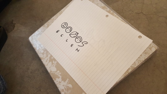
Artifact: I will have the group write their names in Mayan script


Work Cited
Sarkar, Samita. “The Importance of Language as Shown by Ancient Maya Civilization.” BoldFace, 7 Jan. 2014, editorstorontoblog.com/2014/01/08/the-importance-of-language-as-shown-by-ancient-maya-civilization/.
Ancient Scripts: Maya, www.ancientscripts.com/maya.html.
Meggs, Philip B., and Alston W. Purvis. Megg’s History of Graphic Design. John Wiley, 2006.
0 notes