
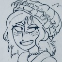
I am a 21 year old male who was born in Pennsylvania but spent most of my childhood in Virginia, and moved to Florida from New York. I am white and a creative in many fields: acting, singing, drawing, and writing is my current focus and what I like to do for fun besides reading. I'm not a member of any organized group, but I do work as a waiter on the weekends while attending school. What makes me uniquely me is my constant thirst for knowledge, reason, art, controversy, and becoming better and more synonymous with my crafts. I am also left-handed and have green eyes.
Don't wanna be here? Send us removal request.
Statistics
We looked inside some of the posts by aritchi and here's what we found interesting.
Average Info
Notes Per Post
1
Likes Per Post
1
Reblog Per Post
0
Reply Per Post
0
Time Between Posts
6 days
Number of Posts By Type
Text
13
Last Seen Tumblr Blogs


Fun Fact
Tumblr has been banned in Indonesia for providing people with access to pornographic content.
Text
ART PROJECT DOCUMENTATION

Acquired materials- I knew I wanted to create my piece on a larger scale, as well as use my graphite as my main medium.

Brainstorm- I took to Pinterest for some inspiration on how to shade and draw the male physique. The knowledge of lighting and lines I learned in this course further helped me make an outline.

First Outline

Looking like a male chest! Started shading and rubbing the graphite pencil around the crevices of the male body with a pure graphite pencil. As you can see, my hand got a little dirty from the process.

Almost finished with graphite process!

Had the idea of mixing blue acrylic paint in some water to dilute it and drip it down the graphite drawing. I used the places of the neck and abdomen to place the paint as they are vulnerable places. Where we feel or get "choked up."

Paint is dripped! Painted onto the actual surface as well with the thicker, pure acrylic.

"BLUE BLOODS"- An ode to the insanity and cries of help seen in the struggles of past art, as well as the inner unseen insecurities of men, who project their insecurities onto society instead of embracing them, severely deteriorating the quality of society as a whole. I decided not to sign my name, instead I chose thumb prints on the right side because individualism is dying. No one cares about the signature anymore, just the value they have. The movie "American Psycho" Matches well with this piece.
0 notes

Text
WRITING CRITICALLY: JACK POLLOCK
Jack Pollock, once an artist of abstract expressionism that pulled from artists like Picasso, began to create paintings that seemingly had no meaning at all. Known as his "drip" paintings, these pieces looked like splashes of paint across massive canvases and many critics never considered them works of art at all. How did Pollock get to that point? The question of this assignment asks why he "removed all imagery" in his works to create these drip paintings, but I disagree with that question itself. There is tons of imagery in Pollock's drip paintings, I see an artist who still told a story but came into his own way of telling it rather than taking inspiration. While there is no end or beginning to these drip paintings, there is equilibrium and a connection to each splatter that resembles both outward images like our galaxies and the inner chaos of Pollock's much addicted mind. I sense much anger in these particular works as well, playing a substitute for alcohol, Pollock's greatest vice. It's no coincidence that he stopped drinking when making these works, but drank during his earlier works and drank after these drip paintings. He always had this art inside of him, pleading to be let out and take over his mind. He simply stopped caring about being an artist to create his best art. Everything was about being nothing, and so forth.
0 notes
Text

Title: Matisse Opera
Date: 1992
Artist: Larry Rivers
Media: Color Photolithograph, Acrylic on canvas, Cast resin fiber and wood multiple
Matisse Opera, made in 1992 by Larry Rivers, is made of wood and cast rein fiber and colored with acrylic paint. The piece is not very large at 47 x 38.25 x 3.87 inches, and the last measurement exists because the piece is actually three dimensional rather than a standard flat painting or tapestry. The scene depicted is an artist and a live model posing, and the dark lines around the model is actually where the painting is raised, creating much depth for the viewer to witness. This piece, considered a mixed media piece because of the complexities of the material used, was made along other mixed media pieces the artist experimented with from the 1980s to the 1990s. However, I would not consider this piece "balanced" as there are a lot of uneven elements in the work due to it's three dimensional make.
This piece made me feel excited because it reminded me of one of my favorite artists, Pablo Picasso, and his works in his later life. Also, while reading about the artist on the plaque next to Matisse Opera, I was elated to find that Rivers found a lot inspiration and was a frequent guest at Andy Warhol's Factory in New York, also one of my favorite artists. The piece instantly stood out to me because of it's familiarity to my love of pop art during the 1980s and it's use of abstract features.
This piece was directly inspired by the nineteenth-20th artist, Henri Matisse, who focused much on the female body in his works as well as live landscapes. It's safe to say that the man depicted in the piece is Henri himself, also known as the subject, while the model is ironically the one that is more illusive to the viewer because they are simply not supposed to be the focus of the work. The painting is an homage and Rivers used Matisse's techniques in his other works as well.
This piece is not considered exactly pop art, but instead is coined under the movement of Abstract Expressionism. Larry Rivers seemed to be an artist that struggled to find his own rhythm, using other artists' uniqueness and incorporating it into his own work which placed him into his own awkward category in the art world, even Andy Warhol admitted that Rivers "fell into a period in between." I understand the approach Rivers attempted with this piece to pay homage, and the message is very clear, but almost too clear and thin.
Although the piece's meaning, in my opinion, is rather weak, the way it was made is extremely important in both society and the art world in terms of experimentation with different elements and materials. Larry Rivers was one of the first major artists to use unique techniques in his paintings such as airbushing and assemblage of canvases during a time where the art world was rigid and elitist, and before the looseness of pop art. He was a pioneer in being unafraid to try new things, not taking things too seriously, and looking up to his inspirations and those he learned from, even during his later years when he was already successful. That humility is the major takeaway of this piece.

0 notes
Text
PHOTO/DESIGN
This Photo is from LIFE Magazine Archives.

The event being depicted is a soldier kissing a random woman he saw on the street in celebration of the end of World War Two, specifically when Japan surrendered during the war. The famous photograph represented the end of suffering and the beginning of an era of prosperity in America. There are also slight undertones of the trigger of the baby boom that began right after this photograph was taken in 1945, when the male soldiers all came back to America and began having babies with their wives. Most people assumed the two kissers knew each other in the photo but they were complete strangers...the unsolicited kiss on the man's part is telling on the time it was taken as well.

0 notes
Text

ART WORLD. (First Panel words say "Trees Better" and "Rain Better")
0 notes
Text
CONNECTING ART TO YOUR WORLD
Around 14 years ago, I was invited to my Uncle's wedding and greeted guests by handing out brochures. My grandmother came in wearing a beautiful, lavender dress that had one strap and flowed down all the way to the floor. It affected my life because the light purple color, my grandmother's favorite, let her real personality shine through and she was the happiest I've ever seen her. The hues of the dress were subtle and so elegant, not much intensity, and it was then and there that I took a liking to fashion.
If I were to pick a color scheme of my life, it would be mostly cool colors (forest green, navy blue, ocean blue) with one or two splashes of violent green and hot pink!
0 notes
Text

WRITING AND LOOKING: (Fig 4.21 in Textbook) In PIETÀ by Michelangelo Buonarroti, there is substantial use of proportions by enlarging Mary's body as well as implied lines to show the curve of Jesus' body overlapping Mary's. The simple use of marble creates unity while the texture is extremely complicated with many folds of fabric and detailed veins from Jesus displayed. Light was also considered in the making of this piece as the shadows casted in the picture above make the piece more elevated yet somber.
Recipe: Proportions, Unity, Implied Lines, Light.
0 notes
Text
JOURNALING: PRINCIPLES OF DESIGN
Unit and Variety: A Yin and Yang type of concept in art, Unit is a consistent art with few different elements attached or embedded into it. Think of a white marble countertop; that is unity. Variety is the opposite, meaning there are more elements involved in the making of the art piece. The picture below is a great example of Variety as the medium used is a bunch of magazine clippings glued together as a collage, made by Vik Muniz:

Balance: Balance is the use of different elements in an equal way for a piece. Think of a cabinet in your kitchen, as both cabinet doors are symmetrical with each other as well as their matching handles to open them.
Emphasis and Subordination: Another Yin and Yang type concept in Art, Emphasis places the emphasis on a specific focal point of an artistic piece while Subordination makes certain areas in a painting or sculpture less noticeable to place more attention on the Emphasis. In every day life, we see this being done when people wear makeup. Foundation and Concealer are used as subordination while highlighter and eyeliner are used to emphasize certain facial features.
Directional Forces: This concept is used by lines, or implied lines, to draw the viewer to a part of the art piece that the artist wants us to see. I work at a Brewery, and the developers purposefully designed the pipes from the beer kegs to go out into the public space and into the bar for the customers to see and question, rather than hiding the pipes in the walls or ceiling.
Repetition and Rhythm: Repetition is when we see elements being used more than once in an art piece while Rhythm is similar but set in a purposeful sequence. We hear Rhythm being used in music every day while Repetition can be seen in house plants around the house; not in any particular order, but plants set around the house to create a sense of consistency and unity.
Scale and Proportion: Scale is the difference and relationship of size from one thing to another while proportion is the analysis of the difference of sizes to an overall product. Let's say you take a picture of you and your dog next to each other. Your dog is much smaller than you are, and that's a scale. However, you are a real human with realistic human proportions as well as that dog within the same dog breed. That is proportion.
0 notes

Text
PERCEPTUAL PROFILE
I am a 21 year old male who was born in Pennsylvania but spent most of my childhood in Virginia, and moved to Florida from New York. I am white and a creative in many fields: acting, singing, drawing, and writing is my current focus and what I like to do for fun besides reading. I'm not a member of any organized group, but I do work as a waiter on the weekends while attending school. What makes me uniquely me is my constant thirst for knowledge, reason, art, controversy, and becoming better and more synonymous with my crafts. I am also left-handed and have green eyes.
0 notes
Text

ART AND WRITING
This is a painting that hangs above my bed. I'm guessing that the media used is of course the canvas and acrylic paint. My room was extremely blank before I left for New York City, and I guess my mom thought it was appropriate to add one decoration that would spruce the room up by the time I moved back home. I think the piece itself it beautiful and calming with it's primarily cool tones, also the fact that it served as a reminder that things did change by the time I moved back home with my tail in between my legs, the painting being a fresh breath of air in a room I was well familiar with.
0 notes
Text

A) The artist of my chosen work, Alice Neel, born in 1900, mainly painted portraits of all types of people.
B) She didn't gain notoriety in the art world until her seventies.
C) It took Alice Neel five years to paint my chosen work, called Self Portrait, and was completed in 1980.
D) This work was only one of two self portraits painted by Alice Neel.
E) The highest price of this work at an auction was 3 million dollars back in 2021.
3. Yes, the way I thought about this work initially is vastly different than how I think about it now. At first, I thought it was rather sad and melancholy, but learning that Alice Neel made this work in response to her late success made me feel happier about it. It shows that growing older doesn't have to be something to fear but to celebrate. And yes, I didn't notice the paintbrush in her hand in the picture at first.
sources:
https://npg.si.edu/object/npg_NPG.85.19Links to an external site.
https://www.artsy.net/artwork/alice-neel-self-portraitLinks to an external site.
1 note
·
View note