
Last Seen Blogs

fatcityreprise-blog
Fat City Reprise

bumperaser
Untitled
fatlanais
شركة نقل عفش الحمدانية

ladymeghangray
Meghan Grayson

fatkodiak
Fat Kodiak 30 - German SSBHM


Photo


Final Design. I got rid of the hyphen because it doesn’t make sense to only have one. I also decided to right align the title to give it more balance.
0 notes
Photo


New Draft, was suggested to extend the 22 and make it transparent to create unity. I also made the columns balanced and created interest by having the profiles in a variety of heights. I also switched the map and table. I switched the columns of the table to create separation and re
0 notes

Photo


My first draft. I got the feedback of restricting my colour palette in my map because it is out of place. The blending style of the 22 on the cover makes a new colour. I was also suggested that there is too much green and it should be an accent rather than a primary colour.
0 notes
Photo

Houschka Pro is a clean and legible modern sans with humanist qualities and a uniquely charming character. Rounded corners and rolling curves give the typeface a soft and friendly appearance.
0 notes
Photo

A draft of my table. I decided to go for this spine like table because it is easy to read while still being minimalist and understandable.
0 notes
Photo

After considering different layouts I decided to keep it simple to start. I decided this so I can get my booklet making sense before adding interest. It is a bit boring right now but I want to get a draft finished before adding exciting elements.
0 notes
Photo


I illustrated the map with the help of the map provided and a designed one found during research. The map is more plain and aesthetically pleasing then the map provided. I made this by using illustrator to trace the roads and buildings that are relevant.
0 notes
Photo


I decided to make the square folded design. After making this layout I decided to make the call to change to the other folded design. This is because it is rows of 4 instead of 3 which would give me more pages and make the people be in the centre two rows. This would be more balanced and make more sense. It also would help me with the awkward spacing that is obvious in the paragraphs and make the layout easier on the eye.
0 notes
Photo

A working colour scheme. I have decided to at first make my colour scheme quite broad and as I work I will decided which colours to cut out of the design.
0 notes
Photo

My photoshopped images. I decided to make each background transparent so I can easily change the colour and customise the backdrop however I like.
I decided to use a Tritone filter on each image to allow the black and white and the coloured images to all look the same. I used PANTONE 2708, PANTONE 297 and PANTONE 2767.
0 notes
Photo


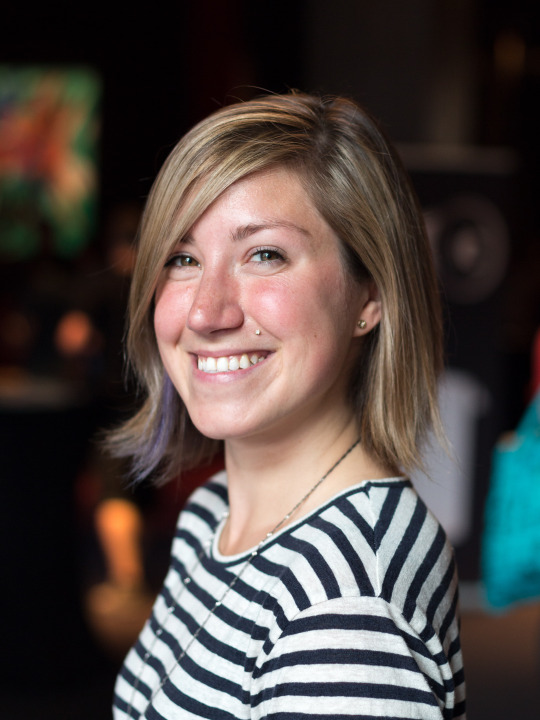
My selected Images of the designers. I chose these images because of their quality, the way their heads are centred in the frame. I am going to recolour all of these images so they match and look cohesive in my design.
https://en.wikipedia.org/wiki/William_Morris
https://www.fontshop.com/content/interview-with-verena-gerlach
https://frerejones.com/about
https://www.prweb.com/releases/2013/6/prweb10827784.htm
https://blog.craftingtype.com/post/90549986965/typedesignersatwork-carol-twombly-checking
https://en.wikipedia.org/wiki/Erik_Spiekermann
http://thegreatdiscontent.com/interview/paula-scher
https://en.wikipedia.org/wiki/Jessica_Hische
0 notes

Video
undefined
tumblr
A square 12 page fold for my Publication. I think I will use this technique as I like how it unfolds.
0 notes