Statistics
We looked inside some of the posts by art-ahw and here's what we found interesting.
Average Info
Notes Per Post
4
Likes Per Post
4
Reblog Per Post
0
Reply Per Post
0
Time Between Posts
1 day
Number of Posts By Type
Text
14
Photo
3
Last Seen Tumblr Blogs


Fun Fact
Women make up for the other 50% of Tumblr’s audience.
Text
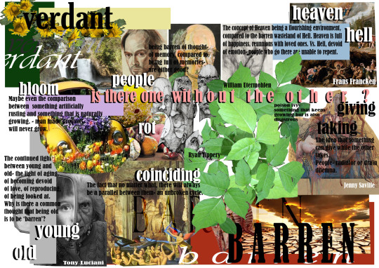
Final Evaluation: Verdant/Barren
At first, the theme ‘verdant/barren’ jumped out to me because it seemed to be so different to the others, in that it could be applicable to pretty much everything. There was something that appealed to me about the contrast of something flourishing to something dying, or being unable to produce life. From my recent escapades in the landscape of Uganda, I had fresh imagery in my mind of illustrious landscapes and fertile land, and so it made sense for me to pick something with more of a nature base.
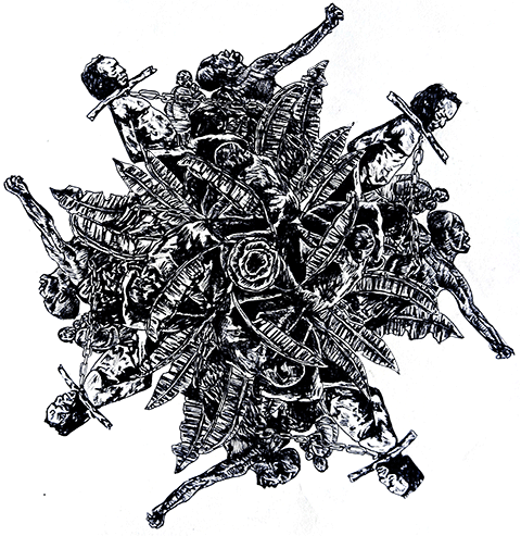
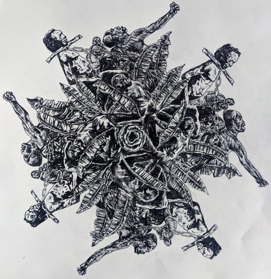
Pablo Picasso has been a massive inspiration in the way that I have incorporated bodies into my pieces- the way that he zeroes in on forms and exaggerates positions is something that I find to be intriguing, especially his piece entitled, ‘Guernica’, which depicts a scene of horror after the bombing of the town. It shows bodies entwined in agony, and helped me along the journey of realising that I wanted to focus on bodies and the way positions can evoke different emotions. Another artist that helped me with this same issue is Fede Bianchi, who inspired my mandalas which were the basis of my ideas moving forward, and a major development in the final outcomes. In terms of the style of painting, Jenny Saville was the definite influence for the final outcomes, with the priority zooming into bodies and faces contorted in different positions. I also tried to take the way that she uses colour and mark making into my own portraits.
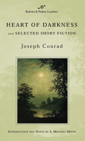
One piece of wider world research that I did at the start of the project was that of the book ‘Heart of Darkness’, conveying a story of a man journeying into the depths of Africa, finding the heart of darkness in the colonialist attitudes of the western powers. I think that reading this book so early on really helped pave the way in my ideas and the eventual final concepts. This is where the forest scenes crawling with black bodies and slaves is introduced, and a scene that has stuck with me and will stick with me in life.
‘Black shapes crouched, lay, sat between trees, leaning against the trunks, clinging to the earth, half coming out, half effaced within the dim light, in all the attitudes of pain, abandonment , and despair. Examining the edge of the forest above and below, I was almost certain I could see movements- human forms gliding here and there.’
My project concept was based on my own experiences with the racist aftermath of white colonialism in Uganda, and I explored the way in which a place that is so bountiful and natural voluptuous can be so vile in energy and have something so barren at the core of its society. In all of my artwork, I tried to depict a clear journey from drawing and capturing abstract energies, to pinpointing physical and specific ideas. I expanded this as well to include the ideas of our own environment in the western world; what our comfort looks like in relation to and in correspondence to the suffering that it is built on.
I experimented with a lot of process such as photoshop, chemical manipulation and painting in this project, learning about how to communicate ideas in many different media. The most important thing that I came to realise in my work is that even though I love to learn new things and explore more of my artistic skills, reverting and playing with my strengths in things like painting can sometimes be the most beneficial thing to do. I think the reason for this is because when there is such an important topic that is so close to my heart and fragile to many people, I need to be able to communicate in a way that I know I can do reliably, and for me that is painting.
The mandalas were definitely a part of my art that I feel like I really excelled on, presenting the message and relaying the theme extremely well. I wanted to show the fertility of the land within a different fruit grown locally in Africa, and then drew bodies intertwining with the leaves and crop- the first development to my final outcomes. I also think that my GIFs were very successful and I would love to work with animation again.
My initial ideas were based on these mandalas and this paired with the different thoughts on comfort in the white community was paired in a collage making brainstorm, where I figured out the imagery that I wanted to use and the message that I wanted to see within my pieces. After this, I then started researching my artists and finding a way to paint realistically, but with an edge. I wanted to create a world in my painting that didn’t look like it was from earth, because deep in the ‘heart of darkness’, it really does feel like that. After having the idea of living room furniture as representation of comfort, I realised that I wanted to include this in my final piece. I had an idea to show an actual living room scene in the exhibition, but as COVID restricted us from doing so, I had to come up with other ideas. I came up with a mini version of that, turning my painting into a chair that you could physically sit on. I photographed a person with their head pressed against it as if they were sleeping, and this picture was so powerful that I wanted to paint it on the back of the other piece. Throughout this process I learnt a lot about myself, and what process works best for me. I realised that inspiration comes from the most unlikely things, and to always embrace it and be on the lookout.
Hypothetically, I would have painted many forest scenes, covering walls in this imagery until it felt like the viewer was in nature- but within the scenes, an uneasy sense as you realise that there are bodies in the background as well as the foreground. However, the concept that I ended up with is tamer, but I would either like to make a full cushion/sofa set, and I would place it in a missionary space/ centre so that unknowingly they would be sitting on it. I would use the fabric prints created as the cushion covers, and I wonder what the reaction to the images seen would be. My painting piece is different, but I think I would like it to be shown in a more central western location, as I want to bring this message into our world.
10 words to describe my final outcome:
Nature
Peace
Contortion
Slave
Naked
Bodies
Illustrative
Fruit
Uneasy
Pain
Soundtrack:
(Album) To Pimp a Butterfly- Kendrick Lamar- an album about blackness in America and the history of slavery, hip hop rap.
Coffee and TV- Blur- the song that depicts the feeling of being in comfort.
Strange Fruit- Billie Holliday- the song that inspired the final piece, haunting melodies and poetry. I would put this song on repeat in the background to create an immersive atmosphere. I spent a lot of time outside of college on this project, at most about 10 hours per week.
Theme:
Research:
https://www.newyorker.com/magazine/2020/04/13/a-missionary-on-trial
Development:
Final Outcome:
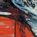
My final paintings- both on the same canvas, one behind the other. I wanted to again bring across the message of what white comfort looks like, the rejuvenation of sleep and peace compared to the energies that brought it there. We forget that our places of happiness are built on the backs of pain and suffering- and the image of peace here is literally on the back of a picture of pain and suffering. Using techniques that I started to explore in my other paintings, I also sewed into this, almost as if the painting behind it is leeching into the former- I used browns and greens for this.
Drawing from my own experiences, I wanted to showcase the power that the white community truly has over the developing countries in our world, and the discomfort we should feel as people with privilege but always cease to address.
4 notes
·
View notes


Text
Week Eleven Reflection
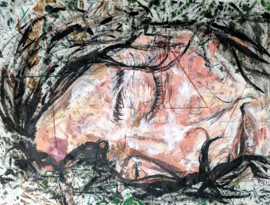
Inspired by Jenny Saville, my last part of my final outcome is now complete. I used acrylic paint, and I think that I did quite well with the image that I had. I had an altercation when I had to paint large scale again, as it means that you have to always step backwards and take in the whole thing- not an issue as such, just a process that I am yet to accept. I am pleased with my final result, and I think that it is very effective in what I want to portray. I especially love the textures that come through from the back of the other painting- it gives the skin texture, making it more realistic somehow.

Furthermore, I also loved the little detail of sewing into the painting, just to give it that slight edge. The way that I used brown and green also adds to the effect of one painting combining with another, and brings the two sides together- I feel like there is a lot to dissect in these paintings, and this comes from the way I am pushing them independently.
In this process, one major thing that I have learnt about myself is the fact that I won’t give up on something unless I feel that I have exhausted every single decision that I could make, and this is evident in the whole process of this blog, the way that I have generated ideas, and experimented with every possible process that comes to mind. At the end of this looking back, I realise that I appreciate this, because along the way I have learnt so much about myself and about different processes.
Next week I am going to be finishing off my blog, evaluating my progress and presenting my final pieces.

0 notes
Text
Second Painting - Final Outcome
I decided to paint the picture - inspired by Jenny Saville - that I took as another large scale piece- actually this time on the back of the other forest scene. This is because I have been intrigued by the way that the paint seeps through from the other side, so much that you can make out the design, and I didn’t want that to be a waste. I thought that it would be interesting to have a seemingly sleeping white person on the back, with the outlines of torture and segregation almost reaching through her face.

I mapped the portrait out with black arcylic, and then started to layer on the pale nude tones, building up the skin until it felt solid. After this, I then went back in with the darker tones and started to add in detail.


After painting the face, I then decided to sew into the canvas as with my other painting earlier in this project, to add another dimension into the theory of the painting on the other side seeping through.


I love this painting, even if it is not exactly the same as the reference image. I think that if I were to do it again I would try to make it more accurate, but as always, I love painting from images because it is my own interpretation of it- I believe that this is what I see, what I want to translate.
0 notes
Text
Photography
Here is the collection of images that I took of two different girls relaxing (sitting, lying, etc) on top of my piece of work. I made them wear all white as that is the colour and community they represent in this segment.

I used my digital camera, and enabled flash in all of these shots, to add a sense of harshness- the stark brightness and reflective nature of white skin is something that I really wanted to demonstrate here.
Below is one of my favourite photos, my model lying on the canvas, the epitome of peace and gracefulness, whilst being on top of a picture of such harrowing meaning.

I would love to paint this picture, adding another layer of depth to the image- the shot and the emotion of the face is a pairing that I am so proud to have captured.


A shot of the chair.


As much as I love these pictures, I think that if I were to do it over again, I would take the chair into somewhere filled with nature itself- its own forest. I think it would be interesting to have someone surrounded by an English countryside, whilst the remnants of the African wild are close by.
0 notes


Text
Week Ten Reflection
This week, I reflected on my previous research, finding inspiration in Fede Bianchi and Pablo Picasso in the way that they portray bodies to finish painting the first part of my final outcome.
I pushed my ideas independently in the way that I knew that the fabric print wouldn’t be enough, and in doing so created an entirely different piece- a large scale painting- and on top of this, will be taking pictures of it next week.

Practically, I experimented with colour and layout in my large scale painting, working mostly through improvising as I tried to figure out what I wanted to include in the bigger picture. It was a tough experience trying to paint a nature scene on that large of a scale, but I quickly got into the flow as I realised that from a distance, everything works out just fine. I feel that I should have used higher quality acrylics, or oil paints to really make the colours pop and the images sharp, but all in all I am quite happy with it.

Next week, I am going to start taking pictures of a person relaxing on the canvas, demonstrating the concept of the western’s relaxation and ignorance when it comes down to opening our eyes to something other than our immediate surroundings. I didn’t want to edit the pictures much, because I didn’t want to take away from the clear message that I care about, and I feel like if I was going to make them chaotic on Photoshop it would take the focus away from the job at hand. I am aiming to take pictures of this piece, and then hopefully my practical work will be finished.
0 notes
Text
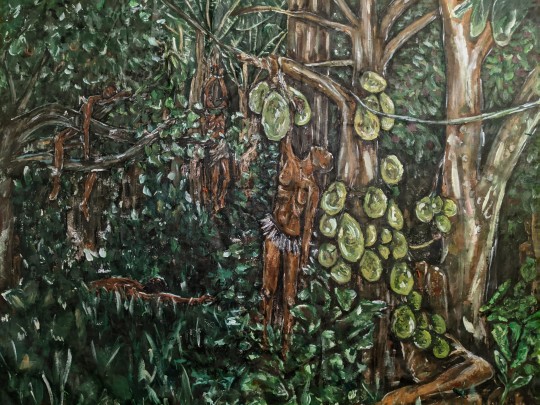
The Forest Scene
Here is the forest scene part of my final outcome, where dense shrubbery is covered in a mass of bodies and as you look deeper, the more bodies you see. As much as I am happy with this outcome, I feel that it could have been better as I feel that one side of it is not as good as the other. Because much of it was based on my own creation, I had to work twice as hard at making my own thoughts become a reality. Although I did have a few of my own forest pictures and limb pictures to work with, it was never possible to have something like this be realistic in the terms that I paint in- mostly very messy, exaggerated brush strokes, etc. I also think that it would have been better in oil paints- purely based on the vibrancy that I wanted, but overall for my first real attempt at painting large scale scenery, I am proud of myself and can’t wait to push this further independently.

0 notes
Text
Painting - The Process
I decided that with this piece, I would work section by section, rather than all at once. My theory is that if you treat it like a series of mini piece, it is not as hard as it seems. I began with the jack fruit tree, painting a figure hanging over the side of the tree trunk, and another from the branch. I think that overall, I love the right side of the painting, because as it is in the foreground, I think that I can add so much more detail on to it, rather than the background, where a wrongly placed stroke of paint can ruin the entire thing.


Colour Palette


0 notes
Text
Primary Picture References
For the forest scene painting, I decided to use the pictures that I took a while back as inspiration. Here are a few examples, but all are evident earlier on in the blog.


0 notes
Text
‘Black shapes crouched, lay, sat between trees, leaning against the trunks, clinging to the earth, half coming out, half effaced within the dim light, in all the attitudes of pain, abandonment , and despair.’ ‘Examining the edge of the forest above and below, I was almost certain I could see movements- human forms gliding here and there.’
- Heart of Darkness
0 notes
Text
Week Nine Reflection
This week, I figured out how to make a fabric print, and experimented with ways to present this, and ultimately realised that I wanted to push myself further and actually complete a larger scale painting. I am taking this as a positive, because it is through trial and error that I now know what I aim for my final outcome to be framed around.

I had fun with the Thursday experimental workshop, and found it fun to use the photo sheets in the way that they weren’t supposed to be used. I had some challenges with the way that it came out, because I would have like the images to have some clarity to them in terms of what they were, but overall I think that it was another positive experience. I learnt from this that there are ways to be clearer in communication of ideas, and made me look in more detail at the lines of trees and how one captures the essence of nature without actually being that realistic or using colour.

Next week I am going to revisit the natural side of things, take a look at the pictures of nature that I took earlier in the project and use them to start crafting a forest of my own. I will also be reading ‘Heart of Darkness’ and reminding myself of the imagery that I want to demonstrate the most.
I am going to experiment with the colours that I use, and the layout that I choose to go with- luckily I have already done mini paintings that have helped me realise what kind of style I am going for.
0 notes
Text
Photographic Workshop
Today we did an experimental session, using kentmere photographic paper, glass and masking tape to create patterns and outcomes to do with our themes. We got some of the paper, put masking tape on the areas that were going to be white, washed it, fixed it, washed it again and then dried it fully. I wanted to create pictures that mimicked trees and forests, but they ended up being quite abstract.


I like my pieces because they come across as somehow ominous, with the shadowy effects and uneven colours. If I were to do this again I would have tried to make it a larger scale work, to add more detail, and to actually make it a cohesive image.


0 notes
Text
Starting the Final Painting
This week I started to sketch out ideas for a large scale painting- a forest scene. I was mapping out the general areas and layout of the trees, and decided to incorporate the different fruits that have featured in my mandalas as well.

0 notes
Text
Creating a Fabric Print
Here is the process I used to experiment with the repeating pattern that I could potentially use in my fabric print.

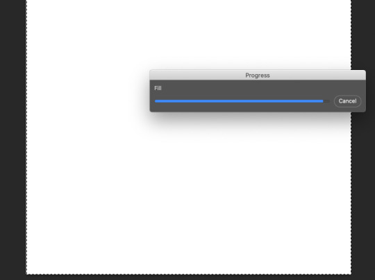
First, I scanned in my paintings and adjusted the levels to make them more vibrant, and then selected the area to make into a pattern. I named the pattern, and then selected a pattern type which would change the way that it repeated.


‘Brick fill’ is the pattern that worked best for the design that I had, and I increased the spacing in order to make the individual prints further apart.

In the end, I had a fabric print that could easily be translated onto fabric, but I decided against it because the amount of fabric that I would have to get would have been extortionate, and even though it would have been an interesting final outcome, I feel that this isn’t my stopping point, and that I need to do something more than a small painting on a fabric print- I can still drape canvas over a chair or a cushion to give the same effect.

0 notes


Text
Week Eight Reflection
This week, it was the start of idea generation, and the process to finding what works for my final outcomes. The research that helped my ideas was finding out about the song ‘Strange Fruit’, and expanding this into the modern day problems with systemic racism. I am excited by the possibilities with the fabric printing, and the way that I have used Photoshop to experiment with different ideas based on collaging.

In addition, I have learnt a lot about myself and the processes that work best for me, including the fact that trial and error and experimentation are all important and worthy ways of finding out what I am going to do, and that it’s okay to be unsure of the final product.
The problems that I have faced this week were mainly to do with the fact that my primary idea for my final piece was not possible, and so in lieu of those facts, I tried to adapt and overcome this by narrowing down my thoughts into a simpler but hopefully still thought provoking sentiment.

Next week, I am going to focus on painting the rest of my designs, and making a mock up of a fabric print that I could potentially use on a chair. As I always tend to lean more into a fine art setting, I think it would be nice to experiment with a digital process, figuring out how my art responds to potentially being printed out or placed in a program.
0 notes