Art blog for @merinarasauce ~ Any pronouns ~ Profile pic traced from Emerald Twilight ~ Header image original art
Last active 60 minutes ago
Don't wanna be here? Send us removal request.
Statistics
We looked inside some of the posts by art-from-another-world and here's what we found interesting.
Average Info
Notes Per Post
774K
Likes Per Post
476K
Reblog Per Post
297K
Reply Per Post
753
Time Between Posts
21 days
Number of Posts By Type
Photo
3
Text
12
Note
2
Last Seen Tumblr Blogs


Fun Fact
When “GIF” was named word of the year in 2012, Oxford Dictionaries U.S.A. credited Tumblr for pushing the word.
Photo
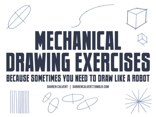
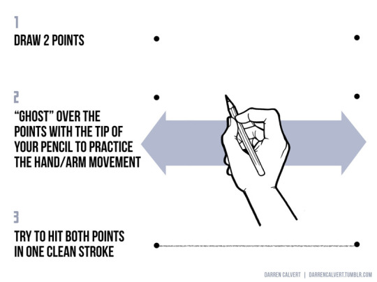
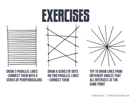

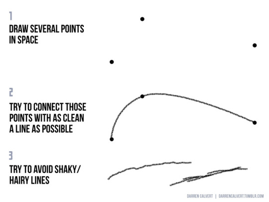

People often say to me: “You draw like some kind of inhuman machine. If I eat your brain, will I gain your power?” The answer is yes, but there is another way. The key to precise drawing is building up muscle memory so that your arm/hand/fingers do the things you want them to do when you want them to do them. Teaching yourself to draw a straight line or to make sweet curves is just a matter of practice and there are some exercises you can do to help improve. If you’re going to be doodling in class or during meetings anyway, why not put that time to good use?
178K notes
·
View notes

Text
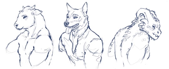
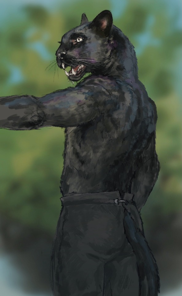
I just had some...thoughts... about sticking animal heads on human shoulders. Bear with me.
I think the reason some anthros look really strange (I’m looking at you, Skyrim) is because animal skulls don’t attach to their spines the same way ours do. Our spines and skulls are very vertical, but many animals’ are closer to horizontal.
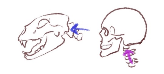
Some people solve this by giving the animal skulls a human skull shape on the back. But, to me it makes them look somehow bald(??) and just kinda weird in general. If, instead, you change their necks to curve so that the spine still connects where their four legged counterparts’ do, they no longer look yucky! (And also don’t need a hair-do!)
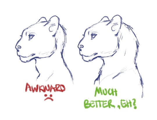
This seems especially applicable for animals like big cats, cows, and lizards — animals whose spines attach very horizontally to their heads.
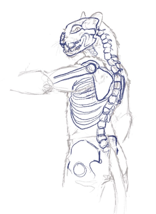
Anyway, enjoy some more art I did while having these very specific thoughts.
61K notes
·
View notes
Note
You probably get asked this a lot, but how do you draw hands? Even when I'm tracing, they look so weird 🙃


I could probably go on and on and on about hands, but here are some key points I compiled! I LOVE drawing hands, and I never hesitate to use my own as a reference
24K notes
·
View notes
Text


a scribbling little rant about """""art tips""""" that infuriate me. hopefully i got my thoughts out in a way that makes sense
[image description: a four page comic about how gender is shown in art tips.
panel 1 shows various exaggerated examples of how artists divide male and female bodies, with men being depicted as strong and angular, and women being depicted as soft and curvy. on the bottom is the artist's sona, an axolotl with glasses named doc, is peaking out from below the background of the panel and saying "a slight bit of comic hyperbole notwithstanding, sentiments like this are very common with it comes to tips for beginner artists. and, while seemingly helpful at first glance, i something to say about any one of these that tries to define how "men" and "women" are to be drawn..."
panel 2 shows doc crumpling up the previous panel in his hands and looking crazed. he says "they're [bleep]in' scams! or, rather, they tend to do more harm than good..."
panel 3 has doc next to two diagrams of characters, the top having all 4 characters with similar body types, and the bottom having all 4 characters with different body types. doc says "setting aside the blatant misogyny, it's also just... repetitive and dull. by limiting the body types you draw by "male bodies" and "female bodies", you are not only severely limiting how visually interesting your designs can be, but also shooting yourself in the foot when it comes to improving at drawing anatomy. note how much more interesting it looks when you diversify bodies!"
panel 4 shows many examples of ways to diversify bodies, including disregarding gender when drawing bodies, diversifying shape language, playing with size and proportions, messing around with facial features and head shapes, and learning how to draw muscles and fat folds. at the bottom is doc giving a thumbs up and saying "don't let a bunch of old dead guys' ideas of gender and beauty weigh down your artistic potential! also, have fun!!" end id]
3K notes
·
View notes
Text
“The addicts [in Vancouver] started to insist on being at every meeting where drug policy was discussed. They took a slogan from the movement of psychiatric patients who were fighting to be treated decently: ‘Nothing about us, without us.’ Their message was: We’re here. We’re human. We’re alive. Don’t talk about us as if we are nothing. They began, haltingly, to find a new language to talk about themselves as addicts. We have certain unalienable rights: to stay alive, to stay healthy, to be treated as people. You are taking those rights away from us. We will claim them back.”
“Since Henry Smith Williams was broken, anybody opposing the drug war had entered the debate in a defensive crouch. They had preemptively pleaded—no, no, we are not in favor of drug use, no, no, we are not bad people, no, no, we are not like those dirty junkies. VANDU [Vancouver Area Network of Drug Users] was different. For the first time, they were putting prohibitionists on the defensive. They were saying: You are the people waging a war. Here are the people you are killing. What are they dying for? Tell us.”
–Johann Hari, Chasing the Scream: The First and Last Days of the War on Drugs (Bloomsbury, 2015)
16K notes
·
View notes
Text

Tips for drawing the female pelvis by SOLRAKA
614 notes
·
View notes
Text
AI disturbance overlays for those who don't have Ibis paint premium. found them on tiktok


133K notes
·
View notes
Text
So! In looking for more resources on Black hair, I found this amazing, simplified explanation for afros, locs, braids, and twists!! Everyone thank "Daisy E" for their contribution to diversity and inclusion within the art space!
It's far past time to draw our Black characters with our hairstyles and natural hair textures. Please take the time to look, and practice!
6K notes
·
View notes
Text

[btr for reach !]
From the river to the sea, Palestine will be free 🍉

1) daily click
all you have to do is to click once a day, every day and a donation will be made to UNRWA who assists Palestine 🕊️
2) help a family in gaza
8K notes
·
View notes
Text
IV DONE IT
I know my science sides been kinda dead but I was getting so frustrated trying to differentiate all artistes 'avians'

...that's it, please use freely and don't feel the need to credit me, JUST USE.
It'll be fun to see arrests look at their avian OCS and going *That's you bud! See?*

Adding this because I forgor
19K notes
·
View notes
Photo
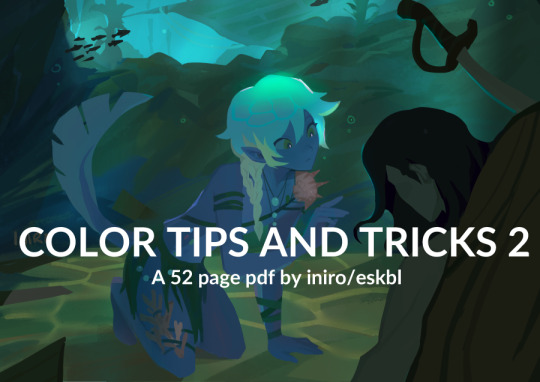
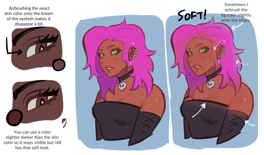


HEYY my 2nd color tips pdf is now available ! ^o^ hope you enjoy!
BUY HERE or HERE
44K notes
·
View notes
Text


Compiled some basic information I know about drawing fat characters for beginners since I've been seeing more talk about absence of really basic traits in a lot of art lately.
Morpho Fat and Skin Folds on Archive.org (for free!)
124K notes
·
View notes
Text
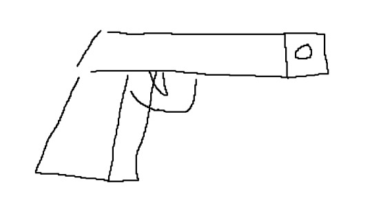
i love love love when artists put a bunch of effort into like human anatomy and facial features and light rendering and drawing fabric folds and shadows and texture and then when they draw a gun they do this
50K notes
·
View notes
Photo


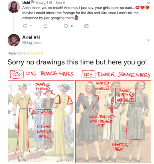
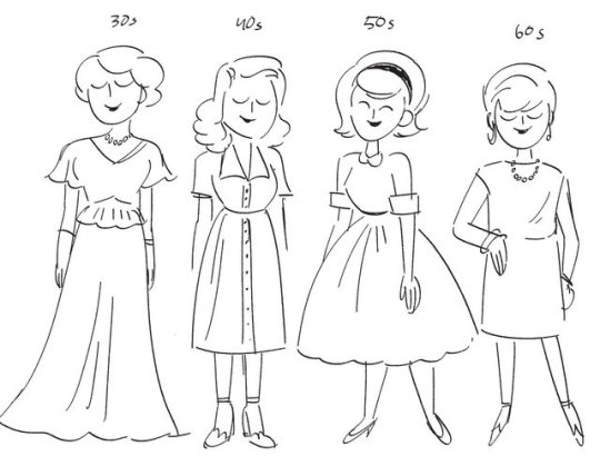
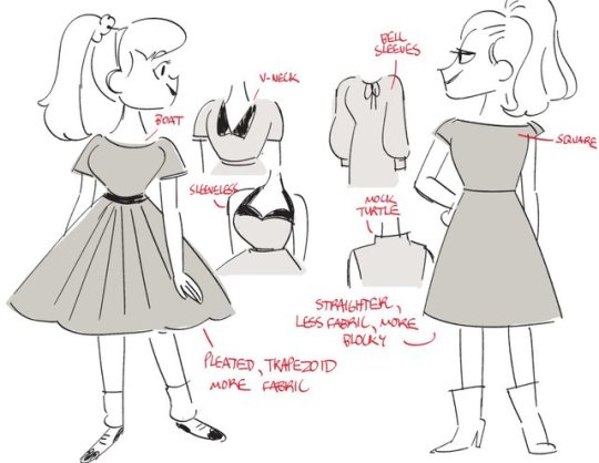
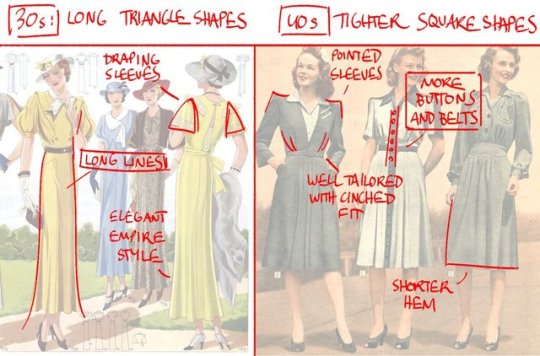
Had an impromptu chat with @ushi418 about fashion history the other day- thought I’d post it here as a quick ref for people!
72K notes
·
View notes
Text

This article was written by Phil Straub back in 2005, and it is as fresh and vital today as it was then. Phil’s tips and trick are timeless, and can help you make your images pop!
Composition is everything! No amount of detail in an illustration or Concept Painting will be successful without a strong composition foundation.
Composition in Environment Concept painting can be quite difficult since your focal point usually isn’t as obvious as in a character piece. In this introduction to Composition we will explore the fundamentals used to create exciting and functional compositions along with a variety of composition techniques. Initially I will show some successful examples of iconic composition, formal composition, the rule of 3rds, the golden rule, etc. There will be a discussion on what makes each piece successful and an explanation on why the artist chose to describe the scene using a particular form of composition.

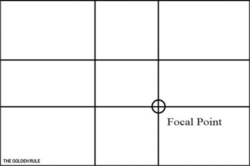
When you take the canvas area and divide it into ‘thirds’ Horizontally and Vertically, where the lines cross in the picture area is a ‘Golden Mean’, or the best spot in which to place your Main Subject or Object of Interest as it is the Focal Point of your picture. The golden rule originates from the Ancient Greeks, since they were great mathematicians as well as artisans, they came to the conclusion that there needed to be a certain balance in composition for it to be pleasing to the eye. They further developed this theory and defined what they called “power points,” Power points are located at the point where the lines used in the golden rule intersect. By placing a main subject on a power point, it further defined that subject as the focal point.
The golden rule can and usually is applied to a paintings canvas proportions. As you read through the following text you’ll notice that most of the imagery presented utilizes similar dimensions and almost all of them fall into the “golden rectangle.” Today you can find the Golden Rectangle almost everywhere: from credit cards to phone cards to book covers, all are shaped with its proportions. The Golden Ratio (the ratio of the longer and shorter sides of the Golden Rectangle) also appears in many natural phenomena. The ratio between the length of your nose and the distance from the bottom of the chin to the bottom of the nose is the golden ratio. The spiral growth of crustaceans follows the golden spiral. The divine proportions are an in-built (or in-grained) aesthetic parameter we judge beauty by.
The imagery [above] represents the division of space when the “golden rule” is applied to a blank canvas. Basically it is the division of a line in two sections, where the ratio between the smallest section and the largest section is identical to the ratio between the largest section and the entire length of the line. In other words A/B = B/(A+B). The ratio is about 1/1.618. Honestly, I’m still not exactly sure what that all means? but, I do know that I used this grid layout a-lot when I first started painting and found it helpful. I still do.
In the beginning you may find it useful to use this as an overlay for every concept piece you do. Having this grid float over your imagery as a reminder of where to place the objects of importance in the scene may help you as your develop your composition.
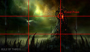
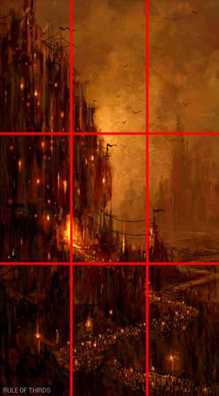
From the golden rule came the “rule of thirds” which is virtually the same concept but slightly altered to fit photographic proportions.I find it a bit easier to follow since it’s very simple in its origin.Here we have a look at the rule of thirds in action.
Notice that the main focal point sits right almost directly over one of the “golden means.” Additionally, other objects are placed near the other converging lines (the bird, for example) but, not directly on them, since that would create competition for the focal point.
There are Four Spots where these lines cross the Upper Left the Lower Left, the Upper Right and the Lower Right. Please note that all the “hotspots” are away from the center position in the picture frame.
The two best “power points” are the Upper Right and the Lower Right because the eye enters the picture frame at the lower left hand corner of the picture frame, travels to the center of the picture area and then reaches the right hand ‘Golden Mean’ position where it stops to look at the ‘Center Of Interest’.
The reason the eye enters a picture at the lower left side is because we are taught to read from Left to Right. This is a psychological fact that has been proven over the years. Next time you’re in an art gallery or art museum that shows the Old Masters paintings, notice how many have the Center Of Interest in the “Golden Rule” positions.

‘Implied Forms’ are a combination of ‘Implied Lines’ and they help to hold a painting together. The eye enjoys these interesting forms and will stay in the picture area to examine each one of them, if they are present. The following text and sample imagery will demonstrate a variety of implied forms and composition approaches.

The Circle is made up of a continuous ‘Curve’ and it’s circular movement keeps the eye in the picture frame. There are many circles in nature and man made objects. You can use the circle in a very obvious way in your composition or simply suggest it.
The image [below] is a very obvious and deliberate usage of circular composition. Notice how the circular shapes created by the dragons also follow a path that leads your eye towards the focal point.
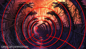
Another example of circular composition! Again, I chose this type of composition to enhance the feeling of motion in the piece. You can see how the eye follows the circular shapes across the picture plane to the focal point. Something interesting to note with this image, it actually uses two composition approaches at one time; circular composition and iconic composition.


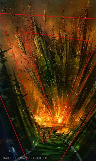
This has a ‘solid base’ and will show Stability. It also has Height and Strength. The Pyramids of Egypt have survived for thousands of years while other types of solid buildings have crumbled in to dust in less time. With the image below I was very deliberate with my arrangement of shapes so the triangle or pyramid composition is obvious. When I began this piece I simply started with a triangle shape as my starting point…nothing more than an abstract composition. I just let everything flow from there….and very quickly the painting began to take shape.

Is a connection of ‘Lines’ meeting in the Center and an expansion of ‘Lines’ leaving the Center. The Radii is usually found in Nature Subjects. The best example of the man made Radii is the spokes of a wheel.
The eye has two ways to go when it comes upon the Radii. It can either be drawn in to the picture area or it can be led out of the picture area. You must be careful how you used the Radii and try to have the eye led into the picture.


A showing of ‘Opposing Force’ that will give the picture a feeling of Cohesion and Relationship. The horizontal bar of the Cross will act as a “stopper’ while the vertical pole can act as a leading line. The windows in a large skyscraper will form crosses and will keep your interest in the building. The Cross also has religious meaning and the subtle use of the Cross can give hidden significance to an image.
In the painting below Hong Kuang uses the cross composition subtly. One could argue this piece is also using an “L Composition.” The strong line across the horizontal center that’s being formed by the characters body suggests “The Cross.” The somber facial expression and subject matter demonstrate an experienced artist’s ability to use symbolic composition to help tell a narrative.
To the right of that is Daryl Mandryk’s work which successfully combines a Cross composition with iconic composition. This is common composition choice for themes of heroism or comics. Fantasy artists like Brom and Frazetta use this type of composition in their work regularly.


This makes an attractive ‘frame’. It can be used to accentuate important subjects. Many times it is a ‘frame’ within a ‘frame’.
A tree with an overhanging branch at the ‘right’ side of the picture area will form a ‘Rectangle’ and help frame the Main Subject in the picture. By doing this you will make the Center of Interest stand out and be noticed clearly.


Some Art theorists contend that the most important information in the image should be placed near the center of the picture plane. This may seem confusing to some students since this contradicts many of the major principles of the “golden rule.” In general iconic composition should and can be used to describe a subject in a certain way. Iconic Composition or “Formal Subdivision” applies best to subjects of a dignified or religious nature. This style of composition was the approach of choice in earlier times and many excellent compositions have been made with it. Usually Iconic composition is used to describe symbolic subjects, heroic subjects, or religious subjects.
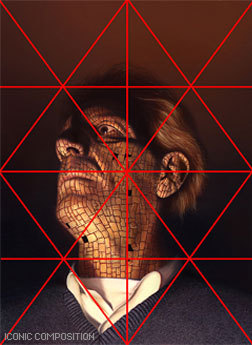
I’ve taken the liberty of drawing over this imagery to demonstrate the division of space in iconic composition. This is a technique used by many illustrators to help define the division of space and focal point when creating an iconic illustration. Well know and renowned illustrator Andrew Loomis used this technique extremely well and his book “Creative Illustration” to demonstrate this further.
Notice, that while the focal point is slightly off center, all the converging lines lead to the center point of interest. Additionally, notice how the figures head sits directly in the diamond shape of the overlay lines I’ve created. It should also be noted that I chose this composition to further enhance the regal and heroic appearance of the character.

Tong Wu uses Iconic composition perfectly here! Notice how the character again falls nearly at center of the canvas. I’ve taken the division of space a bit further on this imagery and have broken down the image into smaller segments so you can so how the artist balances everything in the piece.
Notice how the top right corner is almost a mirror image of the top left corner. In fact, look at almost any opposing segment in the painting, they are very similar! When creating iconic composition, it’s not necessary to duplicate each side exactly, but there should be a feeling of complete equalization of the units or masses, the line and spaces of one side with the other.

So, there you have it, a variety of ways to deal with division of space when you first begin visualizing a painting or drawing. At the end of the day, theses approaches to composition are guides and simply a place to start. Once you become more comfortable with composing a scene you can begin to push the boundaries of formal composition.
Since most Environment Concept Artists work in the entertainment industries, its expected you will be asked to create cinematic moments or “memorable moments” utilizing the environment as a stage.
You’ll want to use your mastery of composition to lead the viewer’s eye and really make the viewer feel like they’re in the scene. The single most important thing you simply must have in any Environment Concept Painting is a clear and dynamic focal point.
Without a place for the viewer’s eye to rest, the painting will lack impact and won’t hold the attention of your audience. It’s the job of the Concept Artist to visualize what can’t be visualized in reality. Concept Artists are the first step in every production and therefore must create dynamic imagery that the rest of the team will be excited to build. There are a few cinematic tricks that you can use as a Concept Artist to make things appear more dynamic.

Sometimes all it takes to add an extra bit of drama to your composition is a simple tilt of the camera. In the image to the right the viewer really feels like they are part of the action, simply by slanting the camera a bit. This approach is especially useful when you are trying to depict action in your environment.


Many Concept Artists today, myself included, use perspective as a tool to create dynamic compositions that appear to have motion and lead the eye to the focal point clearly and concisely.
In the painting below you will notice I’ve used many of the objects that appear in the painting as opportunities to further guide the viewer to the “payoff.” Additionally, I tilted the camera a bit to add to the action.

http://www.cgsociety.org/index.php/CGSFeatures/CGSFeatureSpecial/phil_straub_composition_tutorial
15K notes
·
View notes
Note
How did you learn to draw fat bodies but still keep it cartoony? I love how you draw different types of bodies and make them all seem normal instead of certain body types sticking out like a sore thumb next to others. I struggle to draw fat bodies without it looking weird with the rest of my art. Do you have a specific tutorial you followed or something?
This is a really good question! I'm glad you like my depictions of different body types, i worked really hard to get better at that so im happy folks enjoy em!! I didn't actually learn from a book or tutorial, it was mostly looking at fat bodies IRL and learning to incorporate those features onto what I already drew. As it turns out, we're all human, so if you understand the anatomy enough to draw a skinny person, you have the tools to understand the anatomy of a fat person.
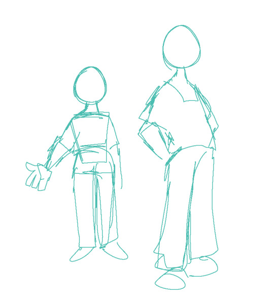
So, like, here, this is my sketch of someone with a very average build. If I were to draw a fat body, I would still use all the basic principles I use here. One mistake I think folks run into is "isolating" parts, which can lead to things like this
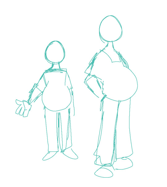
which isn't necessarily bad, but if its not what you're going for, the issue is pretty apparent. Weight affects ALL of the body, not just the stomach or the face or the limbs. If you think about how that weight affects everything in tandem then you can start drawing fat bodies that work more in your style.

for this, this is the same quick sketch using the same pose and principles as the first one. but! I allowed the weight to be distributed across the body. Notice how the legs, belly, arms, etc all got thicker? The key to drawing fat bodies and making them look like they fit is allowing that weight to affect everything. without it, it just looks like you're adding on features to someone rather than considering everything at once.
my other tip is: don't be scared! things like fat arms or chins or bellies or stretch lines are not something that's bad to depict. if you want to draw fat bodies, you gotta not be scared to draw things the way they are. someone having a fat body is not bad, and you drawing that fat body is not bad either. Experiment! To me, art is about representing ideas, and the only way to get better is to experiment with how you represent those ideas. I'm by no means an expert, and I think you can also get a ton done by looking for resources aside from me, but I hope this helps, and have fun!!
5K notes
·
View notes