
Don't wanna be here? Send us removal request.
Statistics
We looked inside some of the posts by artappre2024 and here's what we found interesting.
Average Info
Notes Per Post
0
Likes Per Post
0
Reblog Per Post
0
Reply Per Post
0
Time Between Posts
9 days
Number of Posts By Type
Text
12
Last Seen Tumblr Blogs


Fun Fact
When “GIF” was named word of the year in 2012, Oxford Dictionaries U.S.A. credited Tumblr for pushing the word.
Text
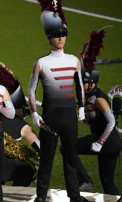
New Horizons

This photo of the sunset was taken during the final rehearsal of my final marching band season. Features of marching band are included around the picture, including the percussion, drum major, and staff that helped make this experience possible. Even as the sun sets on this final rehearsal and takes my passion with it towards the end, the rays of golden sunlight highlight the experience I have gained and the new opportunities waiting for me when the sun rises again.
(closest thing I can document this season with is our final performance and a picture of our group)
youtube

0 notes
Text
Jackson Pollock and his drip paintings
Jackson Pollock likely achieved his drip painting technique to better express his paintings. The removal of imagery allowed Pollock to embody the emotion and aesthetic his painting was attempting to give off by getting rid of all familiar films and only leaving behind raw material. By removing the imagery, he could attain what he was looking for aesthetically when he would be constrained by painting in a traditional fashion. Not only this, but Pollock focused on the beauty of creating by emphasizing the creative process and actions when making the painting. He saw the real art lying in the process rather than the finished product and helped to revolutionize the way people viewed art. The art itself also lead to an invitation from the audience to participate in finding a meaning for themselves or to simply enjoy the art. Pollock was making art for the sake of making art, not to send a clear message to the viewer.
0 notes
Text
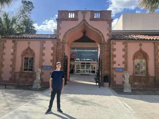
The Agony in the Garden Visual Analysis
In 1580, Francesco Bassano, son of renowned painter Jacopo Bassano, created his artwork The Agony in the Garden. Francesco Bassano is often associated with his rustic biblical paintings and night paintings that are illuminated by candle or torch light. Bassano had grown up in an artistic family and took inspiration from his father's style, later moving to Venice to gain commissions. When I had gone to the Ringling Museum of Art to view The Agony in the Garden, the painting immediately caught my eye with its large stature and subject matter immediately drew me to it. The Agony in the Garden utilizes biblical subject matter, most specifically from the text in Luke (22:41-44) where the words of the verses are brought to life in art. The painting shows Christ and his disciples Peter, James, and John who are all sleeping below, while a kneeling Christ praying to an angel with a chalice to the right of him. Finally, Judas and the soldiers appear with torchlight in the background to make their way toward Christ and arrest him, placing this piece before his sacrifice. The usage of the holy light of heaven in juxtaposition of the faded man made light of the soldiers helps to convey the message of salvation as the angel is answering his call for assistance. The colors of Christ and his disciples' robes are lightened by the brilliance of heaven's light and serve to show their holiness in contrast to the dark and brooding colors on the soldiers in the background that know not of the light. The contrasting elements of the bright light and shining colors of heaven and its influence on Christ help to highlight it in comparison to the dark forest background and even the appearance of the soldiers. When viewing this painting, it evoked emotions such as melancholy for knowing what would become of Christ after this moment but also a sense of tranquility for witnessing Christ's interaction with heaven and seeing his calls answered. These emotions and the strong usage of light and color help to place this piece as part of the late Renaissance movement as they were heavily utilized at the time and often correspond to this movement, on top of the time of which the piece was made. Collectively, these elements depicting Christ's moments before his betrayal and death, and what it would mean for him to take on the bearing of the sins of the world, showcasing the suffering and sacrifice he would endure for humanity, but would have the support of heaven. Its contribution to society as a religious piece to showcase the melancholic moments before Christ's sacrifice made the art piece worth choosing.


0 notes
Text
Connecting Art to Your World
An experience in which color affects me is whenever i listen to music. Often, whenever i close my eyes, i envision colors in my mind that are matched with the mood of the song. The vibrancy and saturation of the colors are changing as well, and whenever i view these colors it affects my mood as well. It can lead me to feeling relaxed and comforted when i envision darker hues and lower saturation of blues, greens and purples, but can inversely brighten my mood when i hear music that helps me envision brighter colors with higher intensitys and brighter hues of yellow, orange and reds. If i were to say my color scheme in life, it would be this, changing and flowing through my life as it progresses.
0 notes
Text
Writing and Looking
Fig. 7.2 Winslow Homer, BOYS WADING

BOYS WADING contains an out of focus background that contrasts with the in focus foreground, implied lines, light color tones, cropping, blank space, gouache, highlights, focal points with light tones and highlights along with contrasts in texture and tone.
0 notes
Text
Journaling
Unity and Variety both involve the elements in a picture, but how they are used differs. Unity combines the visual elements of the picture to create a sense of similarity and togetherness, whereas variety shows these elements in divergence with one another. An example of both of these in one image is seen in Vincent van Gogh's Starry Night, which incorporates bold colors and unique brushstrokes which provides a sense of unity in the piece, yet his wide use of different shapes and patterns creates variety in the artwork.

2. Balance is the equal distribution of visual weight of textures, patterns, colors, and other visual elements in an image. The Balance can be symmetrical or asymmetrical. This principle can be seen in Swan, Rush and Iris by Walter Crane, who utilizes symmetry to create a balance on both sides of the picture of the birds and to maintain a sense of visual weight balance by putting the same image on both sides, just inverted.

3. Emphasis and Subordination work hand in hand with one another, as subordination draws attention from the viewer away from areas that are not being emphasized, meaning emphasis is used by creating focal points that catch the viewer's attention and illustrate underlying themes and tones. The Son of Man art piece displays this by using lighting and colors that are darker in other areas that arent the main focus points while using brighter colors and lighting for the main focus of the apple.

4. Directional Forces are similar to emphasis but prioritize the usage of direction to draw the attention of the viewer through an intended viewing way in art, which also helps to create a sense of stability. This can be seen in old Communist Propaganda posters that utilize directional forces in lines to progression in the photo and keep the art stable.

5. Contrast is producing huge differences in visual elements in a piece of art, such as in color or style. This can be seen in the Ying and Yang symbol, as the symbol utilizes heavily contrasting shades that have an underlying meaning being dark and light.

6. Repitition and Rhythm in art creates patterns or motifs in art that are seen throughout the piece while creating spaces for the 'rhythm' to show the patterns. As seen in Untitled (stack) by Donald Judd, repitition and rhythm are used to produce a piece that had the goal of being as inorganic as possible, and achieves it by creating a perfect pattern by using repitition.

0 notes
Text
Group 1
Logos: Dell (Blue text in a blue circle with the iconic tilted E), Apple (iconic, minimalist bitten apple), under armor (bold, interlocking symbol), YETI (Bold strong letters in white text), Intel (blue text inside of a slanted circle), adidas (iconic three stripes, white and used on their designs), Honda (Metallic H inside of a circle, recognizable and simple), BMW (circle with white and blue in a checkered pattern inside, sleek), Yamaha (red logo, three tuning forks in middle, represents the relationship of their three pillars of business).
I know about these logos because they appear in my everyday life and are among some of the brands actively in my life. These brands, to me, are associated with some of the things i see in my everyday life and are hard to even avoid. The logo's value itself come from its recognizable features and reputation behind the logos. Iconic logos are often associated with notable products. These logos can also give products value as the reputation of the company gives value to whatever the logo is placed on. For example, placing a Nike logo on an unbranded pair of pants can give the pants value beyond what it would have without a logo since Nike is a multi-billion dollar athletic clothing company. It's the logo's value that can give other items value, and making the logo recognizable adds to the value that consumers see when identifying it.
0 notes
Text
Perceptual Portrait
I am 17 year old boy from Atlanta, Georgia who is white. For fun I play games and participate in marching band. I also go to the range with my dad and like to travel sometimes. I am involved as a member of the Marching Band of Pirates. I do not currently have a job but I'm looking to get one when i get settled in to my school schedule. I am uniquely me because I like to get involved and be who i am.
0 notes
Text
Art from my Life

This art piece is from my Grandmother and serves as a reminder of both her and her love for both the beach and collecting shells on the beach. It was created when my grandma went looking for shells on the beach and decided to immortilize them in a glass ball to preserve her passion. She was able to purchased a glass container with a hole at the bottom that she plugged with a rubber plug. Its primary use is to honor her memory and demonstrate the sort of passions she had while living. I do think it is a beautiful piece because it holds meaning behind its initial appearance of just pieces of a beach to the passion and love of a grandmother.
0 notes
Text

Here are 5 Facts about Ai Weiwei's Kippe (2006)
1. The word Kippe is actually german and means the act of mounting parallel bars.
2. In regards to his time spent building this piece and similar pieces, Ai claims hes very interested in the contradiction of spending a vast amount of effort on something useless.
3. The piece was constructed out of wood from Qing Dynasty temples
4. The wood from the temples was deliberately chosen to show meaning in how an object once held great value and received beliefs and hope, but once it shed its old form its meaning became nothing.
5. Due to old chinese construction techniques, the temples did not involve any glue or nails in the construction. The removal of these old methods and the creation of this piece symbolizes the new Chinese drive toward efficiency.
The way i view the art now is quite different after research from how I initial viewed it. I wasn't quite sure of what to think of it beyond a large mass of wood and metal in a cube. Since i now know that the wood came from old chinese temples, the meaning of the piece changed for me and i can see more of it. I can see its a deconstruction of the past and how objects can lose meaning when presented in unfamiliar forms.
0 notes