
Last Seen Blogs
riviae
the ultimate witcher shitposter
isa-in-aurebesh
Isa-in-Aurebesh

newagederpderp
NewAgeDerpDerp
gabyramlloart
[GRL]

moonchild-96
MoonChild
Text
1. JOURNALING-the visual outline of all the Principles of Design. Such as:
Unity and variety-works together to create a balanced and engaging composition, unity creates a sense cohesion and harmony in design. Variety on the other hand involves introducing different elements as well as contrast within design.
Balance-is a key principle of design that refers to the visual weight in the composition and makes sure that no single part of the design overpowers or feels heavier than the other parts which makes a sense of stability and harmony.
Emphasis and subordination-that is the principe of the design that is responsible for the focal point in a design an area that draws the viewers attention first.
Directional forces-this is also known as a moment or the visual flow that guides through viewers eye through a composition or the art work.
Repetition and Rhythm-is a repeated use of certain design elements such as colors, shapes, lines and textures. It helps to establish a sense of unity as well as make a design make more sense with the use of similar elements though out the design.
Scale and proportion -relates to the size of elements and their relationship in the composition making the design harmonized and balanced.
Those principles can be seen in everyday life, like balance can be seen in architectural structures like classical buildings often use symmetry in their facades. Emphasis is used in advertisements and commercials. Directional forces can be seen in road signs, repetition and rhythm is seen in flooring patters, textiles or tiles. Scale and proportion can be seen in product packaging.
2. WRITING AND LOOKING-If artworks could be described in recipe then the artwork “Detroit Industry” by Diego Rivera I would use the ingredients of vibrant earthy color palette, symbolic imagery, historical and social commentary and symmetry.
3. CONNECTING ART TO YOUT WORLD-I am an artists and a huge fan of using acrylic paint. I am currently in the process of making my art portfolio for the art colleges and experimenting with color as well as textures and art forms. Color and color coordination is important when it comes to the acrylic paint, knowing the right use of hues, values and saturation is extremely important. In my art works I try and notice the undertones of the skin when it comes to painting face or body. The development of my art portfolio plays a really important part in my life right now and color is taking a big role in it as well.
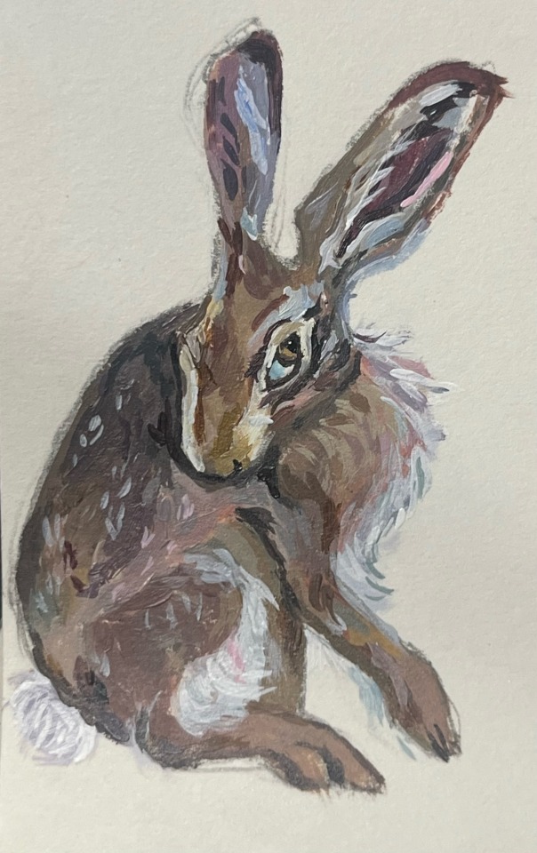
4. ART PROJECT-for my painting art work I am putting in a small detail I did couple days ago for my portfolio art work. However that does not make it any less important to me since bunnies are my favorite animal.
5. PHOTO/DESIGN-already posted in the previous discussion post.
0 notes
Text
GROUP. 6.
photography
color photography vs. Black and White

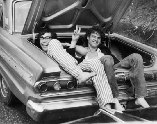
Both of my photographs were made at the famous song festival Woodstock. However even thought they were made at the same festival the color theme and vibes from the photographs are different. On the first colored photograph the picture depicts a sense of youthfulness and fun and unity, as well as colors add the bright essence and spirit of the iconic festival. The vibrant colors bring life to the photograph. On another hand the Black and White photo from the Dave festival adds more of a melancholic feeling and makes the viewer think deeper about the story of people on the photo. Maybe they were best friends or just met at the festival. I feel like that was the motivation of the photograph to capture the core memory during the festival.
0 notes
Text
✭ 1. WRITING AND RESEARCH ✭
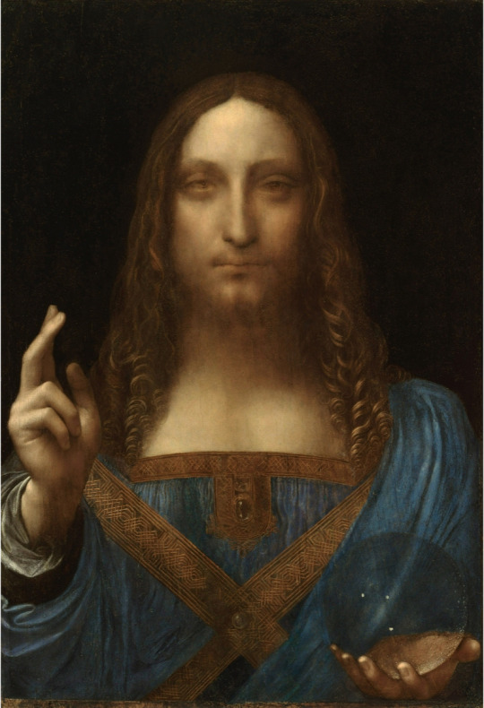
Leonardo d Vinci c. 1500 “Salvator Mundi” (Oil on walnut. 25.8”x19.2”)
• The artwork “Salvator Mundi” became the most expensive work of art ever sold. It was auctioned at Christie’s, New York, on November 15, 2017. It was sold for $450.3 million.
• The artwork “Salvator Mundi” was depicting Christ in the Renaissance theme and also it was most likely the last work by Leonardo d. Vinci.
• There are over thirty extant paintings based and inspired on the Salvator Mundi or on the theme related to Christ the Redeemer.
•“Salvator Mundi” was discovered by an American art dealer Alexander Parish at an art estate sale in mid-2000s. The artwork was sold to an unidentified collector for between $75 million and $80 million in May 2013.
• The art work was called “Salvator Mundi” because, Latin for Saviour of the World, is a subset in iconography which is depicting Christ with his right hand raised in blessing and his left hand is holding an orb, known as a globus crucifer.
3. After taking my time to analyze the art work “Salvator Mundi” my opinion and the way I perceive the piece definitely changed. Beucase after understanding the detail and the symbolism in the piece I developed a sense of depth and story in my head. I noticed the royal and rare, expensive for that time blue “dress” and the crystal clear globe in the right hand which could symbolize the everything seeing eye as well as wisdom. I also compared this piece to the similar theme art work “Albrecht Durer” and found some similarities and differences. I am not a big fan of bible and religion themed art but I do think those pieces have one the most deep and well developed symbolisms.
✭ 2. ART AND WRITING ✭
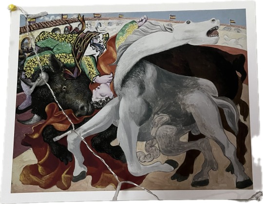
This is a print of a “Bull Fight” art work by Pablo Picasso. I believe Picasso was using oil paint to make this art work. Personally for me it serves a point of decorating my room as well as putting diversity to my personal art collection of prints that I own. I think it is a beautiful art piece for many reasons. I have good memories and feelings about this work beucase my mom bought it for me when she was in an art museum. As well the beautify of this art work and the diversity of colors, textures and the presence of the Fibonacci Spiral which is an expression of the Rule of Thirds.
✭ 3. WRITING A SELF-PORTRAIT ✭ My perceptual profile is interesting and diverse, I am 17 year old girl and immigrant from Russia and an artist. My ethnicity is white, I was born in Moscow and moved to Florida when I was 11. Some things I do for fun is Art, I love sketching and currently I am working on my art collet portfolio, which is extremely interesting and I am having a lot of fun with it. I experiment with different art media and materials, art styles and from. I love the beach and hanging out with my boyfriend, he and his family is my main support and they inspire me so much. I am a member of NHS club as well as Art and Design club, I hosted and organizes my first gallery at my school with the help of the NHS club. I used to work at multiple jobs but currently I am unemployed and focusing on enjoying summer and working on the art portfolio. I consider myself a pretty unique person, just like all the artists I have my personal unique vision and perspective on life.
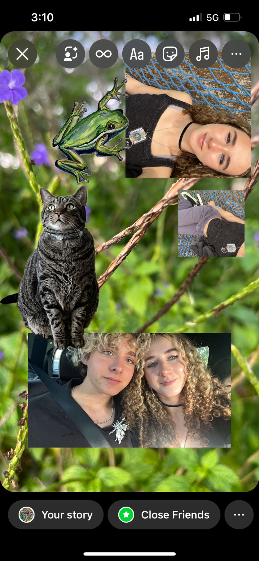
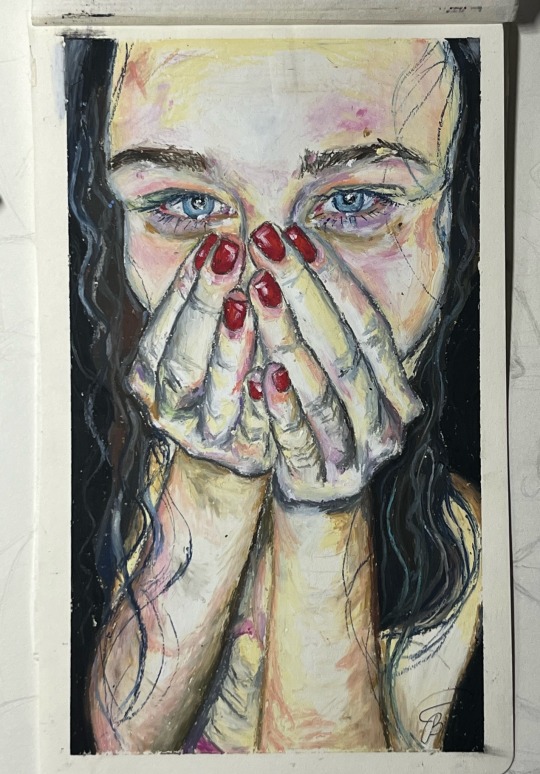
4. ART PROJECT (SELF PORTRAIT)
There is a collage that I made that includes the frog that I did with oil pastels, some pictures of me and a picture of me and my boyfriend. As well as my Art Tutor’s cat who I love and he a very good cat! Then there is an art portrait that I made of myself couple years ago with one of my most loved media-oil pastels. My self portrait shows my blue eyes and my unique art style, which is very detailed for oil pastels.

1 note
·
View note