Text

BLOG POST 13: PROOF 3
Summary
Today Mac and I met up once again to discuss the work she has made for today's proofing. I reviewed her handmade lettering that she created for the half ad and banner, I was pleased with her work. Aside from asking her to ensure legibility with certain letters, I asked her to bring out more of that illustrated mango element in the half page ad. There wasn't much to critique past that, and so we're aiming to be finished next week!
Discussion
Last week, I was happy with how the full page ad was going and then finalized the design for that piece, meaning Mackenzie was now done with that part of the project. We mainly discussed about the half and banner pages. The banner was looking really solid, I think the way she incorporated mango chunks within the composition really helped tie in that exotic and vibrant theming of MANGORA. She hand lettered the typeface which I thought was pretty legible but Reese pointed out that the G in "MANGOES" almost looked like an L. Personally I didn't see it but I thought it was a fair piece of criticism. The only change for the banner was ensuring the type was legible. The half page, however, needed some more (minor) changes. I thought the illustrated mangoes in the back seemed to faded and would have liked them to be a bit in the foreground, possibly overlapping with the type too. I loved her execution of the hand lettering, it perfectly matched the theming of MANGORA.
Changes
I deemed the full banner final today, I'm satisfied with how it looks and the way it connects back to the branding visuals provided in the creative brief. The half pager needed some more illustrative elements in the foreground, to help differentiate itself from the other branding material, and the only change requested for the banner ad consisted of ensuring legibly in the type.
Closing
With two weeks left to go, Mac and I are on the last couple of proofing rounds for this project. As I said before in last week's post, this project was been turning out great and now we're both mainly in the refining stages. Buffering out elements that work and don't work.
0 notes
Text


BLOG POST 12: PROOF 2
Summary
Mackenzie and I met up to discuss the work she made throughout the week. There were a lot of improvements to each piece of advertisements. The full page banner that was presented was deemed finalized by myself with just a few minor fixes needed to be done for that piece. Adding more visual elements for the half page ad and banner were also requested by me to add a bit of variety and strengthen the overall brand narrative.
Discussion
Our discussion mainly revolved us finding ways to create a stronger brand for MANGORA. I wanted to show more of the actual product (in this case, mangoes) throughout the advertisement pieces we were making. I loved how the full banner page was looking and came to the conclusion that having it be fully illustrated was a nice centre piece to finish on in terms of the brand narrative across all the ads. That said, we now needed to show the actual product on the other two pieces. Mac and I discussed how we would execute that and having it be less type focused and including photography could be a great way of achieving that goal. Despite being happy with the full banner page, I did not like it with a white background and also preferred it when it didn't have a white outline around the text, it felt off and didn't add any visual flair to the already stunning typography.
Changes
For me, the full banner page seemed almost final, I had just asked to remove the white outlines and potentially make the yellow stand out a bit more within the gradient, as it did seem to get lost and make some edges of the type hard to read. Mackenzie was experimenting with a bubbly and handwritten typeface for the other two banners which I asked her to develop and see how it looked, I would then review these during our next proofing. With us wanting to add more mango photography we settled on the idea of trying to overlap the type and photography, this is something I also expect to see for next week. Other than that, I was quite pleased with everything else.
Closing
After meeting with my designer, I feel confident in the direction of this project. We are on schedule and personally don't see any hiccups that may come our way from now on. These changes I asked aren't major issues that need to be addressed but it'll take Mackenzie some considerable amount of time to perfect these. Knowing her though, she'll be just fine.
0 notes
Text


BLOG POST 11: PROOF 1
I met with my designer to discuss the work she had made for this week. Overall, pretty impressed with the initial start. Mackenzie was able to capture that exotic and vibrant characteristics of mangoes. From here we were able to create a refined solid colour palette. Sticking with a dark red and vibrant orange became our key colours. Mackenzie also showed me roughs for other ad ideas and logos. I thought the mango 'M' mark was very clever yet strong as a logo for the brand. There was another full page ad rough she showed me (second image, top right, and again on her notebook) which I thought was stronger than the one she showed me.
That was essentially the main talking points of our discussion, for next week I had asked her to come with refined roughs of the assets she already showed me. The logo we're using is final.
0 notes
Text

BLOG POST 10: HEADING TO PROOF 1
I'm so excited that I got Mackenzie as my designer, while I was making my brief I realized how good of a partner she'd be with the style I'm going for with MANGORA! We talked a bit during class, getting her to know the basics of MANGORA, the requirements, ad specs, and visual mood board. Off the bat, Mac had so many ideas for the brand, ultimately I decided to giver her a lot of freedom with the brand and I'd be there to ensure she wouldn't go too far and break the brand guidelines.
With that said, I'm feeling really good about this. Next week I asked her to have some basic colours, typography, and phrases we could use for our ads. Maybe even a logo designed to have as a base to design around.
0 notes
Text
BLOG POST 9: MAKE IT MATTER!
One of the most important things I learned from Project One was allowing myself to trust others with my creative work. As designers, we tend to be protective of what we make, which can make it hard to accept critique or let others contribute.
Working with two other designers, each with different skills and perspectives, caught me off guard. I’m used to working alone and having full creative control, which allows me to experiment freely. But in this project, even as an art director, I wasn’t the one physically designing my own concept. It was scary to hand my vision over to someone else, worrying they wouldn’t execute it how I imagined. At the same time, when I was the one designing, I had my own ideas brewing but had to set them aside because, ultimately, this wasn’t my concept. I had to go with the flow.
This experience taught me a valuable lesson in collaboration. I had to put aside my own creative ego and focus on using my skills to help bring someone else’s vision to life.
0 notes
Text


PROJECT 2 - CREATIVE BRIEF
This is my brief for project 2. I chose a mango as there's a few farms here in Canada that surprisingly grow mangoes up in the north. I immediately think of bright and brash colours, with huge shapes and / or illustrations. Hoping to get someone with strong illustration skills but that's totally okay if not, I think this brand can work with illustrations and without. The colours will carry most of the brand in terms of direction and identity. After project 1, I feel much more confident in how I want to direct this project, and there's a lot more freedom which will be beneficial for me and my designer.
0 notes
Text


BLOG POST 7: PROOF THREE
The final draft. Vanessa and I agreed that we were both pleased with how the spreads were looking, for this round, she raised the brightness on the images a bit to ensure that there weren't any details lost once printed. We added the folklife logo at the end to keep within their brand guidelines.
Other than that everything else stayed the same, there wasn't much to critique last round and the same goes for here as well. Really loved what Vanessa created, pleased to show this to the class for finals.
0 notes
Text


BLOG POST 6: PROOF TWO
Vanessa and I met again to review her progress made this week. Because of how far along she was last week, there wasn't much that she needed to show me. Essentially just minor details that were required to be fixed. Such as kerning, leading, and the possibility of having the sub headers be changed into some sort of green colour. I also asked her to include the FOLKLIFE logo at the end of the spread to maintain the brand guidelines of the publication. We discussed about having page numbers as well but we wanted to keep a sleek and minimalistic design style so we opted out of that choice. Lastly, I was given the sources of the images used in preparation of the presentation I'll be making for the classroom critique session.
This was the general basis of our meeting, like I said in the previous post, I'm pleasantly surprised with the amount of work Vanessa has been able to complete in just over a week. We are almost on the finishing details of the spread and I'm expecting her to have it fully completed before reading break.
0 notes
Text


BLOG POST 5: PROOF ONE
Anyway, today I met with my designer Vanessa. I was happily surprised by how far along she is on her work. The body copy was all placed, most if not all styles are set. She showed me a selection of images we could use. I guided her in which images should be used and how. I gave her more of a clear direction of how I want the images to be placed along with the type. The emphasis on more negative space was asked as well, however, for the most part she was able to capture that minimalist style. Finally, I asked her to find another typeface that was a bit thinner and bolden the title.
For next week, I told her to use the crits she had been received and fix some of the major issues I pointed out throughout her pages. Additionally, she will implement images on those pages and refine some minor type issues. Other than that we are very ahead of schedule and I'm happy with the progress we've gained.
0 notes
Text


BLOG POST 4: READING TO PROOF ONE // REVISED CREATIVE BRIEF
On Friday, I was paired with Vanessa as my working designer for my project. We had a brief yet informative conversation about my expectations for her, setting up our own production schedule, and overall talking about how we'll both approach this project.
Vanessa will be working with FOLKLIFE and the article, "The Slow Death of Free Time." During our conversation we discussed about imagery and she came up with a few good ideas that we'll be using moving forward. After gaining new ideas from her, I decided to revisit my brief and add a few things to help guide her in her path of designing for this publisher. Mainly the addition of a visual board for the photography. Initially I had planned for free range on the designer to choose their own images but after discussing with Vanessa, we both decided on a direction to follow which is represented with that new vision board.
Moving forward, I am hopeful that Vanessa can achieve my vision for this project and am excited to see what she brings to the next production class.
0 notes
Text

BLOG POST 2: FILE STRUCTURE
This is quite close to how I have often arranged my class files for the past two years. Although I'm still making new folders for my other classes, this is all nothing new to me. The advantages of file organization far surpass the difficulties involved and make the effort worthwhile. The biggest advantage of keeping all of my files in their designated folders is that I save time by not having to search for the right file. There have been occasions when I didn't want to make the minuscule effort of organizing my files, and as a result, I unintentionally lost files because I couldn't tell which version was the most recent.
0 notes
Text
BLOG POST 1: WHAT IS AN ART DIRECTOR?
Within the industry, the phrase "art director" has been used indiscriminately. The job of an art director is difficult for many people to adequately define or explain. The role has numerous definitions that can be applied to it. Nonetheless, there are a few essential qualities that an art director must possess. Art directors are typically not at the forefront of execution as compared to designers. Their task is to bring together a multi-perspective environment that is constantly creating new but different ideas and pathways into a single, distinct direction. Art directors are looking at the large picture and asking "why" questions to make sure that the whole picture functions properly as a single, cohesive piece, while designers are busy investigating the project's finer elements, such as "how" those pieces are going to be made.
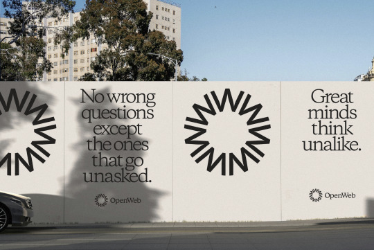
COLLINS / OPENWEB


INSPIRATION.
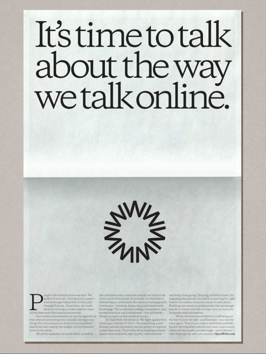
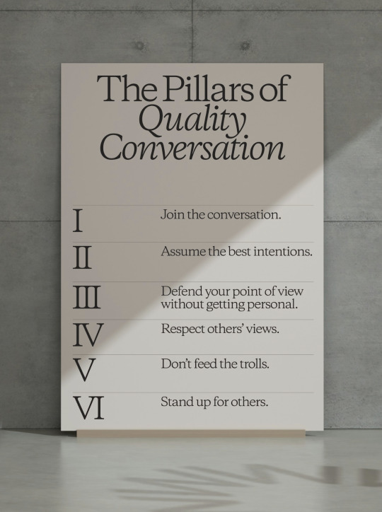
I thought COLLINS work for OpenWeb was fascinating. I personally adore minimalism and the design aesthetic that surrounds it. In general, I think it is quite aesthetically beautiful. It is always a difficult but exciting method to update a brand, and it can be reinvented in a variety of original and imaginative ways, depending on how one looks at it. OpenWeb seeks to transform the internet in a time when it has become stagnant due to oversaturation and nearly useless. They wish to provide an a platform free from the distractions that the internet offers so that genuine conversations can take place. Using that friendly and inviting tone, COLLINS was able to discover a path that suited the brand.
The brand's emphasis on textual communication led COLLINS to draw inspiration from early 20th-century print media typeface and design that would appeal to both publishers and readers. I think it's brilliant how they use varied typeface to highlight various viewpoints, and their new logo further demonstrates how self-aware OpenWeb is of their audience. COLLINS describes it as a tale that illustrates how harmony, enlightenment, and exchange can happen within vastly different viewpoints.
GUIDING PRINCIPLES.
Timeless: OpenWeb's simple yet effective brand from its usage of minimalism is able to easily connect and reach their audience, ensuring that the brand will be consistent and easily adaptable for many years to come.
Universal: The internet is a shared space with everyone around the world, the brand doesn't necessarily have any cultural design work behind it, meaning it can be used as a blank slate for everyone. Reducing bias.
Unexpected: OpenWeb isn't trying to distract its audience by using flashy and obnoxious colours. They want real conversations to happen based on various topics and their simple and almost unexpected approach offers a place of refuge.
0 notes


