
Don't wanna be here? Send us removal request.
Statistics
We looked inside some of the posts by arthiashok-blog and here's what we found interesting.
Average Info
Notes Per Post
0
Likes Per Post
0
Reblog Per Post
0
Reply Per Post
0
Time Between Posts
4 days
Number of Posts By Type
Text
7
Video
10
Last Seen Tumblr Blogs


Fun Fact
Tumblr is used by 21% of adults online aged 18-29 years.
Text
Reflection
Overall I really enjoyed this class. I learnt that coding doesn’t have to be all about the computer science side of things and it can be made into various types of things. Coding is a useful tool I think for design students, I learnt this after this class. Thanks to all the lecturers/tutors for being so helpful when needed and for making the experience nicer. I am happy to see that my programming/coding skills have improved from high school and I can understand more now.
0 notes
Text
Final
Final workflow: Still focused on the output rather than the input.
Using bezierVertex and Vertex processing > Generates multiples of lines (for loop) which is then again repeated to create an effect > Export as a PDF from processing > Print PDF > Hang image up as a gallery art piece

Crazy Bezier
My Aim (In relation to Fundamental Design Principles):
This is my final for this time assignment. As I tried to use and understand for loops in relation to shapes and lines I got the hang of it and picked my most effective for Op Art. I think the piece I have chosen defines my aim very well and follows my main Fundamental Design principles: Movement, Contrast & Perspective. Through the repetition of the bezier curves I was able to create a movement effect in the final form. One main contrast that is mainly used for contrast in op art is black and white as they go to well, I created this by making the background black whilst the stoke is white. Perspective is also a main fundamental design principle in op art, as it is from the eye. I have focused on this by purposely making the left hand side of the work show triangles whilst the right hand is still going, which creates the effect of what is right (perspective).
Exhibition feedback:


After class today I realised Scale was one of my major properties I have used in my design. I didn’t really mention it before but when it is scaled the details are much greater. I thought the exhibition went really well and the feedback too. I was pleased with what I got to show
Entourage:
Gallery Exhibit:

The most obvious place to put this type of art is in an exhibition as it showcases art and the sizing fits right for it.
People looking at the art (Gallery exhibit):


Scale is compared human vs art:

If the print started from exactly where the girl is standing then it’s almost the same size as her, which creates a nice effect.
Smaller Sizes

50by100mm

20mmby40mm

50mmby100mm
Since scale was such a big factor in my work I have used a computer version of my work and made it small to see its effects. I think the lines look more bunched up due to the smaller size. It also effects the quality of the image.
Art Show Poster

Relating back to showcasing my outcome in gallery I thought I would put in a poster people may see.
Phone Case

Phone cases are all so trendy these days that it can literally be anything so I thought it would be cool to show this as a phone case.
Wallet

Since a pattern can be used on anything following from the phone idea I have created a wallet with the op art pattern.
Final Entourage:

Overall when playing around with entourages few weeks back and today I have gotten to put my design in some of the coolest things. I think in my final outcome I played with scale alot so I could show it in different ways. Though the wallet and phone case looked really cool I think the exhibition showcase is the best. This is because of the size it is, it is big that when people look at it in different distances in the exhibition they can clearly see the movement and details it has for “Op Art” which was my overall idea.
Code Breakdown via comments:
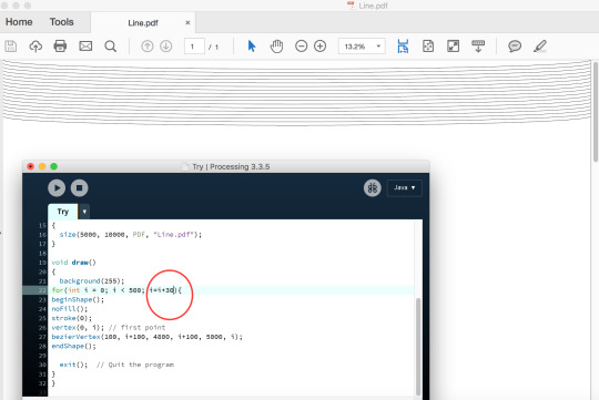
import processing.pdf.*;//This is required to make a PDF
void setup() { size(5000, 10000, PDF, "Line.pdf"); }
void draw() { background(0); for(int i = 0; i < 5000; i=i+20){ // setting up for loop, i's limitation is 5000, i starts at 0 and everytime it is increased by 20 beginShape();// starts drawing shpae noFill(); stroke(255); vertex(0, i*2); // first point, y value is i*2 so first time 0*2=0 and everytime this happens loop continues bezierVertex(4800, i, 800, 400, 4000, i*5);// y value for the first point is i meaning it will change everytime another loop occurs, y value of last point is i*5 so first loop would be 0*5 endShape(); // stops drawing shape beginShape(); noFill(); stroke(255); vertex(250, i*2); // first point, increasing x by 250 bezierVertex(4800, i, 800, 400, 4200, i*5);//increasing x of last point by 200 endShape(); beginShape(); noFill(); stroke(255); vertex(500, i*2); // first point bezierVertex(4800, i, 800, 400, 4400, i*3);//increasing x of last point by 200 and making y of last point i*3 (0*3 in first round) endShape(); beginShape(); noFill(); stroke(255); vertex(750, i*2); // first point bezierVertex(4800, i, 800, 400, 4600, i*5);//increasing x of last point by 200 and making y of last point i*5 (0*5 in first round) endShape(); beginShape(); noFill(); stroke(255); vertex(1000, i*2); // first point bezierVertex(4800, i, 800, 400, 4600, i*3); //increasing x of last point by 200 endShape(); beginShape(); noFill(); stroke(255); vertex(1250, i*2); // first point bezierVertex(4800, i, 800, 400, 4800, i*3); //increasing x of last point by 200 endShape(); beginShape(); noFill(); stroke(255); vertex(1500, i*2); // first point bezierVertex(4800, i, 800, 400, 5000, i*3); //increasing x of last point by 200 endShape(); exit(); // gets saved as a pdf } }
Outputs:
So for this assignment I stuck to focusing on the output from day one. This is because these patterns I got to make I have made through the use of repeated numbers. Data is usually different showing uniqueness as things change which is why I didn’t go into that, I really do hope that makes sense and thats why I did anything and everything I could to make my final print the best it can be.
0 notes
Text
Week 11

I wanted to explore more to show diversity. I wanted to do this by trying curves in op art to try show it in a different way. I was inspire by Bridget Reilly’s work.

https://processing.org/reference/bezier_.html
https://processing.org/tutorials/curves/
Wanting to explore more about the depth I can get to I tried using curves. The specific name for these are known as ‘bezier curves’. They are defined through anchor and control points.
Small scale:
I find it easier to learn as I start to play around and start understanding new functions, below are some examples that I have created so far that.


I drew the bezier curve shape multiples of times to show overlapping. When discussing with my teachers on how to fit this to the whole page, they gave me the idea of scaling it (making the size of the screen large). They told me to do this so the detail is really seen and it the effect is seen visually more. This way it would fit too.
Large Scale:

When sizing to bigger scale. I thought that changing the coordinates of the points int he vertexes would help me get the same design but in a bigger size. However it was more than this to get it to work.
Understanding bezier:

Tried to open outcome in a tiff file however its too large and since it saves as a bitmap it is really blurred as its more zoomed in. To fix this the save format had to change to a pdf instead.
vertex(30, 70); // first point bezierVertex(25, 25, 100, 50, 50, 100);
I have gotten help with understanding this. On the website it shows these as anchor point and the handles similar to pen tool patterns from illustrator. This is how the curve is shaped. The first vertex is the starting point so x and y positions of where the curve starts. The next two numbers and and last two numbers in the bezier identify how far it will go in and where to stop. The middle two numbers create the maximum point of the curve, with this information I am willing to try and make something unique and cool at the same time.
vertex(0, i); // first point bezierVertex(100, i+100, 4800, i+100, 5000, i);
I have tried to create this type of pattern seen above by increasing the x value from the vertex to the bezier to a very high number. I also changed the distance from max x which is 5000 to 4800 so it creates the ‘u’ shape. I did i+100 which is the so everytime it hits the y of the first point and the y of the second point 100 is added to ‘i’ it will start off with 100 since i is 0 and go on.
By increasing the i=i+... it changes the space between the lines which does not give the pattern effect that I am trying to get.

I tried to make the second point of the first coordinate in the bezierVertex add by 1000 to see what effect it gives out. In this I learnt that the curve goes down and up again.
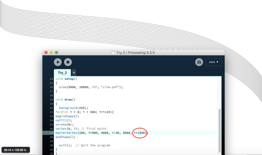
I changed the first y coordinate to i+500 instead of 100 so it is increased by 500 and have also changed the last points y coordinate to i+1500. This made the curve be drawn out more.

By making the bezierVertex first y value i+2000 and the last y value i+4000, there is a first shallow curve and a second deep curve, making it more detailed.

I tried on expanding the conditional statement for the for loop. I had increased it to 500. I had also changed i = i+3 to see what effect I would get. I quite liked it as it was bunched up more however you can still see the pattern the lines create. I also changed the y of my vertex point to i*2 and had decreased the values of i* in the bezierVertex to see its effects and I quite liked it.
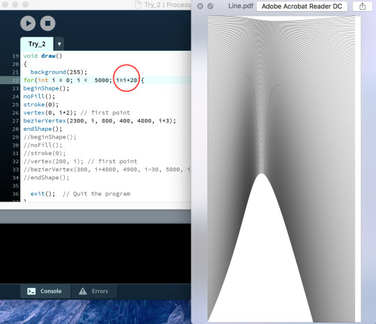
I had changed the limitation to i<5000 so it fitted the screen along with making i=i+20 now so it is accordingly to the limitation and has that little bit of pattern you can see

Tried putting two curves together. I have increased the vertex’s x value by one is 0 other is 1000. The x value for the first point of the bezier goes from 1000 to 2300. And the x value at the end point goes from 1500 to 4000. Which is why there are three types of columns in the image above as it is trying to connect them both but finishes at 1500 and other finishes at 4000.

I tried to use more bezierCurves by overlapping them to see what type of curve I get. I did this by keeping everything in the bezierVertex the same however I changed the x coordinate of the vertex in every single one.

Once again I have created a pattern which is overlapping. But this time all the x values in the shapes change. Which is why there is a oval gap thing at the end of each shape.
Multiples for loops

I tried using the same type of outcome from above by changing all the values of x however this time for every shape I drew I would have a for loop. This what helped with the pipe effect. So for this I would have to change the x value based on the limitation given in the for loop.

I had developed the idea from before that everyone liked after understand bezierCurves. I created this by changing the first point’s x value and bezierVertex’s x value I had to keep everything else the same otherwise it would look weird. I realised that I made this in colour as I just editied from the previous one and also after enlarging it I don’t really think it shows the movement effect anymore.
Note: I realised I have not included all the code in some, most of its repeated and changes in the same range in that value everytime it is drawn. I didn’t get to share this code as the page was massive and I didn’t wanted to show repetition of this.
Colours on favourites:
Liking what I have done so far this time along I wanted to play around with contrasting colours to see which one gives out the best effect. I chose two ideas which then I have used below with colours on it. I only used two colours as I wanted the colour to show contrast and not be so heavy on the composition itself.


Pipe


0 notes
Text
Week 10
Playing around with colour
Using some of my favourite outcomes so far I decided to add in colours to see how it would work. Here are the ideas of what I liked and thought went together. I chose colours that contrasted well against each other.


Pattern images:
I was going to add images of different patterns to enhance the effect of op art seen in these designs however I didn’t. This is because since the shapes themselves already create the effect I am aiming for I don’t want to complicate it that it looks weird.
Entourage
I put my favourite idea so far that I thought worked the best in context. Our aim was to show it on somewhere to see the bigger picture. I made various entourages which helped me notice what I could use it on.

I have always imagined my piece of work at a gallery as it has that movement effect. Here is a representation of it at a gallery with people looking at it.

My transparent print I thought would make a good window shield. I don’t think this worked too well. However it still hides the sun a little so it is not hitting directly at you. Maybe if the print was bigger and the paper quality was better it would have worked.

I think this worked the best. Making my outcome into a context of a book cover creates a cool illusion look which I think makes it stand out really well.

I tried to put my idea in a more creative way to emphasise perspective. I was trying to make it as a floor pattern which can be a sheet, tile or projected which when looking at it shows what are they really walking/standing on type of idea. However only the group of people look like they are on it.
0 notes
Text
Week 9
So today in class I have tried printing out my outcomes to see what is happening to them on print versus what we see on the screen.
Combinations
Trying new ideas always. I tried to combine different outcomes to see it’s results.
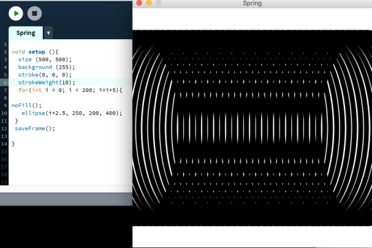
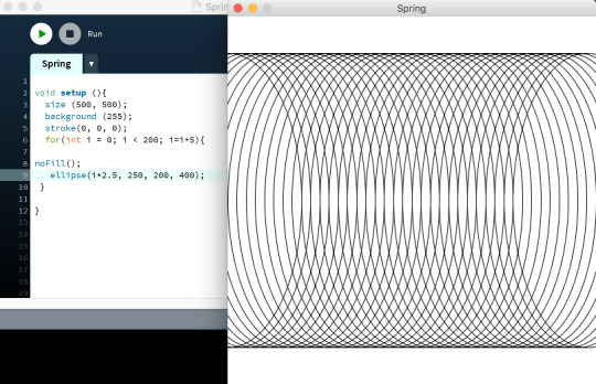
After printing out these outcomes I thought of other ways to try and enhance what I already have to emphasise op art. So for my spring example from before I increased the stroke weight to 10 to explore more. I found the screen’s outcome quite cool it reminds me of sound waves, however I don’t know think if it relates back to op art much.

In this one I have used my oval that is higher vertically and combined it with a rectangle idea I made before. I think the middle of this pattern has a cool effect compared to the sides. The middle defiantly shows some effects that I am trying to show.
Repetition and combination of many circles that helped me create a really cool pattern once again. Here I have combined the circles through the ellipse function many times. However I had changed the y coordinate so it shows that its somewhere in there. I think the pattern for this is quite intricate and detailed which I quite like.

Same as the third one in this post. However I have inverted the black and white colours to see what type of effect I would get. I think the other one worked more than this.

I tried combining two different width and height sized squares to try show a perspective of op art. I think this defiantly shows the perspective of the op art as half of is different to the other half.

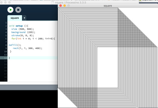
This by far is my favourite as it pops the most with the idea of op art. It is very “trippy” as people would say and movement along with illusion is created quite well with it. In this I have just made the square so it fits the whole screen, I made the square sides 500 by 500 to achieve this. Even though only two sides are seen it still creates the effect I am trying to go for.

http://mikkokanninen.com/new/en/parametric.html
This type of pattern is followed in the half square example.
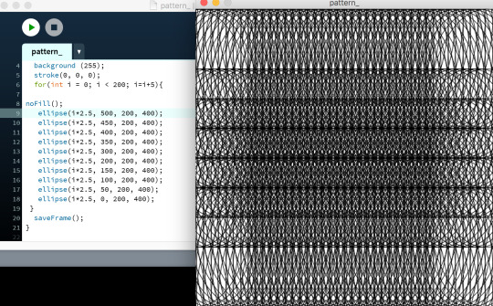
In the example above I have tried to play around with my spring example more. I had changed the x coordinate so it’s very thin however I kept the y coordinate very high to create a different effect. I quite like the outcome this has produced, it reminds me of several threading needles.
Discussion and ideas
So when talking to the teachers they helped me figure out my workflow and processes. We talked about how it may be useful to use data for my outcome as I need to display something in reason and it shouldn’t be random. Projection mapping was talked about which you can see more of below. Also we talked about how these patterns could almost look like op art in moire pattern and how I could try printing it in transparent paper to see what these designs would come out as. The problem with this is so many ideas but the good this is more exploration. Combining some of these patterns together could bring together something cooler. Lastly I will need to try printing in different sizes such as A3, A2, A1 etc.
Projection


I was given the idea of trying to project the ideas I had so far. I have projected them both in corners and on a flat surfaced wall to try different variations with the lines. On the projector it looked really cool on how it was being presented however taking photos were hard. These images are really bad quality due to rainbow patterns being created by the phone throughout the photo taking process so I apologise for that.
0 notes
Text
Week 8
Bridget Riley


I decided to research a little about Bridget Riley after this week’s class as I heard about her being one of the main op art artists. Riley is known to be the “mother” of Op Art. She is known to have started this through the use of black and white with the use of simple geometric shapes along with her vision. I was really interested in Riley as she has become an important person for Op Art itself. I like how her work is very creative yet very simple.
Experiments
For loops

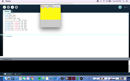
During class this week we were thought about the for loop which I thought was quite intriguing. I had tried to do the same as the teacher thought us with the help of lesser colours I tried different things. As I had changed the circles to have grey strokes along with bright yellow as its fill it showed a little bit of movement when looking it from the left to the right. As I wanted to explore more I tried to duplicate these circles to have more and try create some type of movement within the process however it did not end up working that well.
Op Art Trails
After learning about the for loop I thought it would be the perfect to get a repeated pattern which would help me make op art patterns.
For loops:
for(int i = 0; i < 200; i=i+3)
init i : where the integer starts
i < 200 : this is conditional (checks if the value is under 200) (it forms different actions depending depending whether the condition is true or false)
i = i+3 : first loop starts at 0 then the next loop is added by 3 this continues as a chain as the loop continues
ellipse (i*5, 80, 50, 50) = every time the loop goes through it gets multiplied by 5. so the x coordinate of the ellipse starts at 0 and is multiple by 5 = 0.
Note: Below are examples most of which follow the same for loop statement just the shape/size changed to try different iterations
Circles:
ellipse (x, y, w, h)
x - x coordinate of the ellipse
y - y coordinate of the ellipse
w - width of ellipse
h - height of ellipse

In this using the ellipse tool again I have created multiples of circles however I have kept the basic background.
Ovals:

Same as above with the drawing of the ellipse however I made it so the width of the the circle is bigger.

In this I have made the y coordinate higher to create a nicer effect I like.
In this I have only drawn the ellipse once however it still shows the repetition as it follows the i* rule. I think the simplicity helps with the movement.

I tried the same thing as above where I only drew it once. However I made it so the x coordinate is bigger once again.
Lines
line (x1, y1, x2, y2) :
x1 = x coordinate of the first point
y1 = y coordinate of the first point
x2 = x coordinate of the second point
y1 = y coordinate of the second point

I tried different types of shapes including lines. The above pattern doesn’t really do much or show much but I wanted to explore as much as I could so I used the line().
Squares/ Rectangles
rect (x, y, w, h)
x - x coordinate of the rectangle
y - y coordinate of the rectangle
w - width of rectangle
h - height of rectangle

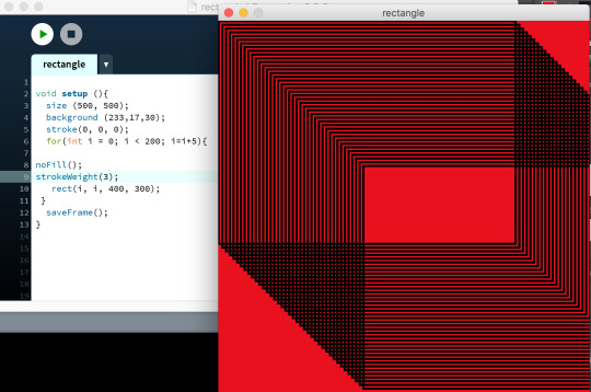
I tried squares next. However since I am repeating several squares in a row it creates it weirdly. The right hand side of the outcome has three missing points, which relates back to op art in relation to perspective.

I finally got the rectangle tool to work and make a square in this I kept it simple by making the x and y coordinate i and the height and width 300, to create a repetition of rectangles.

In this I followed the same ideas as before with only drawing the rectangle out once. However this instead of using i only I used i*4 which created more space between the squares.
I have made a rectangle now. This here is drawn so i=0 and the width is smaller than the height making it a rectangle.

Another. This here is drawn so i=0 and the height is smaller than the width making it a rectangle.
Triangles
triangle(x1, y1, x2, y2, x3, y3)
x = the x coordinates, the numbers represent the points of the triangle
x = the y coordinates, the numbers represent the points of the triangle

I wanted to make sure I have tried all the basic shapes in processing before I carried on so I tried with triangles too. However I found it quite difficult to understand it and since its a triangle with only three sides I didn’t know how to make it look op art like. Only way was if I rotate this into a flower type thing and try.
Formats
In this week’s class I learnt that coding can be done in many ways. Throughout this lesson I learnt new techniques including touch designer Kinect and 3D printing. I realised I defiantly don’t want to do 3D printing however using the Kinect system for projection mapping is also an idea. I think it would be cool to try this out. However the borrowing and using of the actual Kinect system is the problem due to living far from University.
Workflow
Using shape functions processing > Generates multiples of of shapes (for loop) which is then again repeated to create an effect > Export as a PDF/tiff from processing > Print PDF/tiff
0 notes
Text
Assignment Two
Research
The next assignment involves us choosing what to code which can be: a 3D Object, Print or Other Experience.
I have decided to code something which can be printed and has the fundamental design principles of movement along with contrast and repetition. I was driven to this idea with the help of some precedent works:
Casey Reas:
http://reas.com/p6_images3_p/

I really liked these puff prints that Reas has produced. I think they are very simple yet very effective. I want to create something similar to this however I want to create a pattern that creates “Op Art” that when you look at it, it looks like it is moving.
Op Art Research
This type of art is very abstract and is usually in black and white. When people look at it, there is a sense of movement and vibration and sometimes along with this hidden images are visible. Op art is related to how vision function works, it is when two things are in contrastingly opposite. It is created either with lines and patterns, when they are close to each other it can create this effect. Another way is how our retina adjusts to light, with lines that create after images.
For further research, I had used key terms to find specific types of op art:
Generative Op Art:
http://www.soban-art.com/definitions.asp
From reading the link above I have learnt that usually Generative art is created through the use of algorithms and usually creates graphics which visually represent processes. I found some generative art processes in Op Art itself and the animations above are the ones I liked. The way the foreground and background move in motion reinforces the idea of Op Art. There are many design principles seen but the most obvious is the contrast between the black and white along with the movement.
Installation Op Art:


http://www.theartstory.org/movement-installation-art.html
Installation art is when art is placed inside a three dimensional space. I found installation art within Op Art that are visually different in the images above. In the first image it is an open room that is covered in a patterned wallpaper that looks like its moving towards towards the person emphasising the use of the fdp movement. The second image plays with the role of perspective. From what we see it looks like a girl walking across the rope and watching the cars moving along below her, I really liked this image as it showed Op Art in a different way.
Parametric Op Art:


http://mikkokanninen.com/new/en/parametric.html
The lines create such a cool illusion effect from the images above. This type of design is based through wave equations. I found some simple parametric art that were really effective. Both of the images I have chosen for this type of art base on the use of lines and fdp of movement. However the first one uses colour and is flat which has a different effect of Op Art. Compared to the second one which is kind of three dimensional and is black and white.
Data Visualisation Op Art:


http://searchbusinessanalytics.techtarget.com/definition/data-visualization
Data Visualisation consists of patterns and trends which are created to assist people comprehend the significance of data.
Digital Fabrication Op Art:


https://www.opendesk.cc/about/digital-fabrication
Digital Fabrication is a machine that produces fabric through the use of computer programs. The images above are some digital fabrication material that have been produced through a computer software. The first one is a dress that shows movement as the dress flows. The second one is a sheet of colourful patterns that follow op art by being so close to each other that vibration and movement is created when looking at it.
Through the help of these designs in the different key terms I have been able to visually identify Op Art in multiple ways. This has helped me wonder on which format to work with as there are many.
0 notes
Video
tumblr


Unity Final
Blobby Roots
This final was an improvement from “Trees ft blobs”. I began by trying new ways to reduce the glitch effect as at first it was way too high to even see anything. To achieve this I turned off the “Lens Flare” as it did not impact on my final outcome. Using the combinations of the spheres and the trees I have created this weird rooty effect with small circles here and there.
Little Description about the scripts I used:
The mesh renderer allows me to set the size and my shape. In this case I have set my size to be 1 and my shape to be a sphere.
The duplicator script allowed me to increase the amount of trees and spheres I had in my outcome. I had to turn this down my for the y axis as it was too high and increase the x and y axis for the glitch to calm down and actually be able to see the outcome. Though the glitch was annoying, it was what made the whole outcome look a bit cooler. So I did not decrease it by much.
When recording this video I was unfortunately was not able to show the y axis as it wouldn’t let me. However this was the cooler side of things as at the top the things weren’t as bunched up and I didn’t like it as much.
0 notes
Video
tumblr

Quartz Composer Final
Interacircles
This is my final piece for Quartz Composer. I have manipulated my Circle with Mouse experiment to make this.
To make this I have used multiple circles all of which are different colours. I decided for this to be interactive so each circle has a mouse and wave generator attached to it. What this allows the program to do is as you move the mouse the circles move along it too, making the user more in control of what’s on the screen.
The waves I have put in this are all different. They consist of sin, cos and random waves.
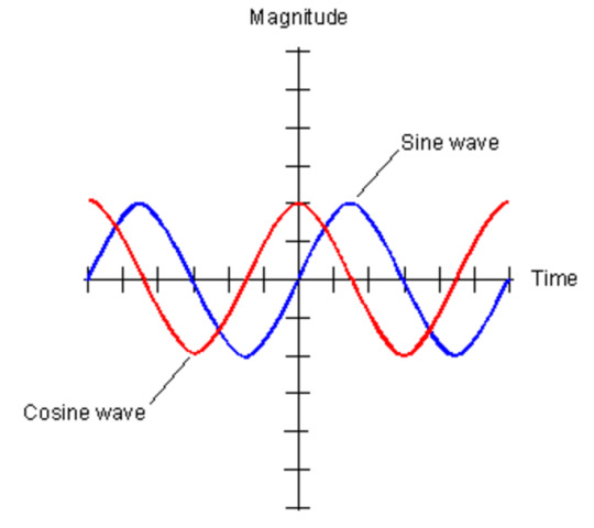
The picture above demonstrates how a sin and cosine create waves. This explains why some of the circles are blinking and are much faster with their time reaching their amplitude then the others. This explains the reasoning to why you need to move the mouse for this experiment to work. Since it has both mouse and wave generator in it, it won’t automatically have the effect. So when opening up the document it will be fast and just blinking different coloured circles so to actually make it work the mouse needs to be in play.
0 notes
Video
tumblr

Processing Final
Blinky Snake
In my final I have developed further from “Rainbow Lollipop”.
This consists of a snake shape blinking and going up and down the screen. I liked how changing something so simple could make something look so cool.
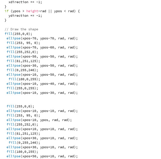
In this I have used coordinates. The use of this allowed me to add more than one circle to the screen. However I needed to apply maths to this too, so it can be shaped into something cooler. With the use of x and ypos along with rad, I had created multiple ellipses. By increasing the positions I had turned the shape into a snake. Every time I added a new circle I had made sure to change it’s colour. To keep it simple I stuck with the rainbow colour theme for this one. This still follows the blink effect my last two developments in processing had. I didn’t change the directions of the axis as I quite liked this.
My initial development was a circle just blinking up and down a screen. I had learnt this from a “bounce” tutorial found on the processing site. As it was really simple and there was only one circle it seemed really boring. So to turn things up a bit I made this (video above) which was just simply re drawing new circles on top the other that created a snake pattern.
0 notes
Video
tumblr
http://threejsplaygnd.brangerbriz.net/s/?id=4769
Threejs final
Cat DJ
geometry2 = new THREE.CubeGeometry(200, 200, 200); material2 = new THREE.MeshLambertMaterial({shading: THREE.FlatShading, color: 0x000000, transparent: true, opacity: 0.17}); mesh2 = new THREE.Mesh(geometry2, material2); scene.add(mesh2); geometry3 = new THREE.TorusGeometry(100, 40, 40, 40, 6.28); material3 = new THREE.MeshLambertMaterial({shading: THREE.FlatShading, color: 0x000000, transparent: true, opacity: 1}); mesh3 = new THREE.Mesh(geometry3, material3); scene.add(mesh3);
The original shape of this was a sphere, however I had changed it’s vertices and its sides to make it into a cooler shape. The original idea itself had a snippet of morphing which was crazy itself as it was quite fast. As I developed it further I had added trails onto the shape. This had left the shape leaving rainbow coloured trails around the screen. I thought this looked really cool as I really liked the pattern of it.
The code above shows what I did to get my final outcome. Though I thought I was finished after adding the snippet of trails. I found out how to add more shapes into this. So this made me more intrigued to try it. So for this I had first added a square it didn’t do much, so I added a circle on top. I decided to keep both the shapes colours black. This allowed it to show what the shape originally does within the shapes and what the shape does after adding trails on the outside. I really liked how it turned out in the end.
0 notes
Video
tumblr


Processing Development for final
Rainbow Lollipop
I have used the bounce experiment from week 2 to develop my final processing piece. In this I decided to keep everything the same however I have added on more circles. For this I had to draw a new circle overtime I wanted one, I chose its fill and have also defined its coordinates so it is not overlapped. This just allowed the object to grow diagonally almost and it is quite weird shaped. I like this but I want to look at what I can do to improve it more
0 notes
Video
tumblr


http://threejsplaygnd.brangerbriz.net/s/?id=4767
Threejs Development for final
Illuminatrials
I have chosen to develop Illuminate Craziness for my final piece in threejs. In this development I have added another snippet to increase the effect on it. I have added the trails snippet which is done through the setup and draw functions. In the setup function I have added a renderer which is suppose to leave trails. Along with this in the draw function I have added two different mesh positions with sin, this is suppose to make the mesh move in a sine wave.
0 notes
Video
tumblr


Tree structure ft. blobs
Being inspired by my last piece of work I tried to adapt something similar in the colour spheres document. I had duplicated the spheres and within the spheres added a 3D object (tree). I added this in the y axis and increased it to a really high number which made it look like a cool structure like object with spheres around it.
0 notes
Video
tumblr
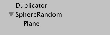

Popper ft. Plane
Using the pop duplicate file, I had changed the values in the duplicator, especially changing the duplicate y to something large to create a different type of effect. I had also added a 3D object (Plane) to the Sphere random to get some craziness.
0 notes
Video
tumblr

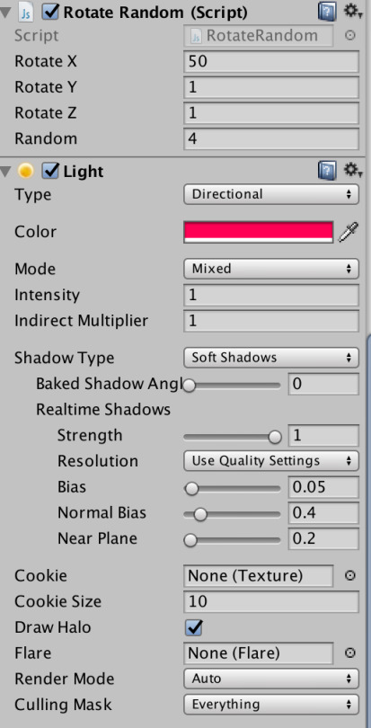
3D AUDIO CUBE (With Light)
I have used the 3d audio file and tried to change it to make it my own. I had increased the x axis duplicator so many cubes are formed. I also changed the rotate random for x along with the cube’s light. This made the cube change colour as it rotated. Unfortunately I couldn’t get the sound to work in this video.
0 notes
Video
tumblr

Interactive Circle
I have created this next piece I used a circle as my main element. I have bough back the wave generator with this and kept it simple with a sin wave. The amplitude is quite low along with the offset. It is a pretty simple piece of work however I have also added a mouse to it. The mouse connects with the x and y position of the circle, this allows there to be interactivity. So when I added a mouse into this, it does not do much unless you use the mouse to actually move the circle.
0 notes