
arthistoryviahappycolor
Art History via Happy Color
Learning more about the art chosen for the Happy Color color by number app's weekly Art category
2 posts
Last active 2 hours ago
Don't wanna be here? Send us removal request.
Last Seen Blogs


resepibughifa-blog
Aneka Resep Rumahan

stellacaerulea
Magnetars
stellacaerulea
Magnetars

jualayamfilletmedan
Supplier Ayam Fillet Medan
Text
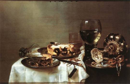
Breakfast Table with Blackberry Pie - Willem Claeszoon Heda, 1631
This painting is really gorgeous. All the textures look so real that I can feel them - the polish on that candlestick, the light refracting through the wineglass - this feels almost photorealistic, from a time long before photographs.
William Claeszoon (or Claesz) Heda painted only still lifes (do people call them still lives? I don't know anything) and was pretty obviously very fucking good at it. Although there are still lifes dating back to Roman times, the modern still life was developed in the Netherlands (Heda's home country) starting in the 16th century. Early still lifes often included religious themes which seems to mean skulls, but other common subjects were flowers, fruit, and food.
This painting came about 10 years into Heda's career, which began in 1621 with a Vanitas (one of those religious-themed still life paintings designed to show "the transience of life, the futility of pleasure, and the certainty of death", as Wikipedia says) but most of the rest of his paintings seem to celebrate the certainty of breakfast. Or pie. Or breakfast pie, as in this case. In fact, he was an innovator in the late breakfast still life genre. I don't know if 'late' is referring to the time the breakfast occurred at or whether he was a latecomer to the breakfast still life scene. I prefer to think the former because it's charmingly specific. No early breakfasts for Willem Claeszoon Heda, thank you.
I find the studded wineglass very interesting because the same glass appears in a lot of Heda's paintings. I wonder if he liked drinking from it - that handle looks uncomfortable?? - but I bet it was interesting to paint.
Heda's talent was acknowledged during his life and these days he is known as one of the Dutch Masters. I hadn't heard of him before coming across this painting in Happy Color, but now I will be keeping an eye out.

The Happy Color version of the painting is one of the earlier paintings in the category, and it is obviously very simplified. They've cropped out the tipped glass and the subtlety of the shading and texturing has gone all the way away. However, you can still see how shiny the candlestick is meant to be and the transparency of the wine in the glass is still represented. They made an effort to soften the colouring in the tablecloth so it wasn't as harsh and separated as in some of the other places like the wine. This version still made me quite interested to see what the real painting looked like, and it was enjoyable to colour if not as complex as some of the later pictures in the category.
Source: Wikipedia
1 note
·
View note
Text
Welcome to Art History via Happy Color! During a particularly obsessive stretch of the last year I abandoned all my other hobbies to colour my way through the entire 'Art' category on the color by numbers app Happy Color and honestly? No regrets. They have a broad assortment of art by a lot of different artists, some of which I was familiar with, like Mucha, Van Gogh, and Da Vinci, but many of which I was not. My interest was piqued by colouring in the paintings and I often ended up looking up the artists to see what the real thing was like.
I don't know anything about art so I can't promise how educational this will be but I hope to share some facts about paintings, artists, and compare and contrast the Happy Color version to the real thing. If you're interested in learning some art history basics along with an absolutely unqualified individual who will try to get things right, let's go!
0 notes