
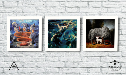
artvinyl
Art Vinyl.
Art Vinyl is the original way to Play & Display your favourite music and vinyl record art. Founded in East London, we are passionate about spreading the vinyl message all over the world and celebrating record cover art. Mix Art & Music.
198 posts
Don't wanna be here? Send us removal request.
Last Seen Blogs


Text
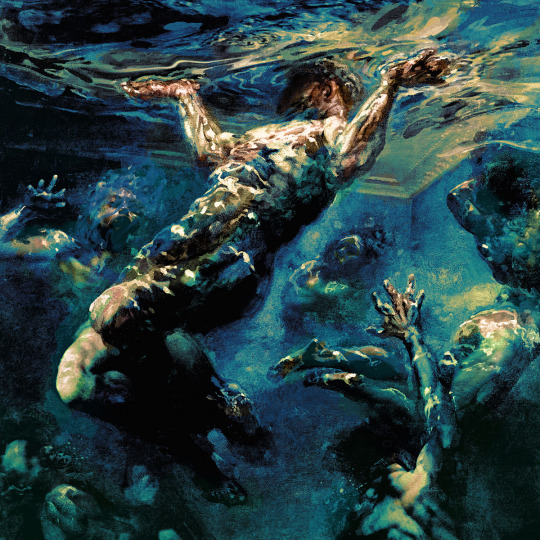
Uncovered: The Ninja Tales
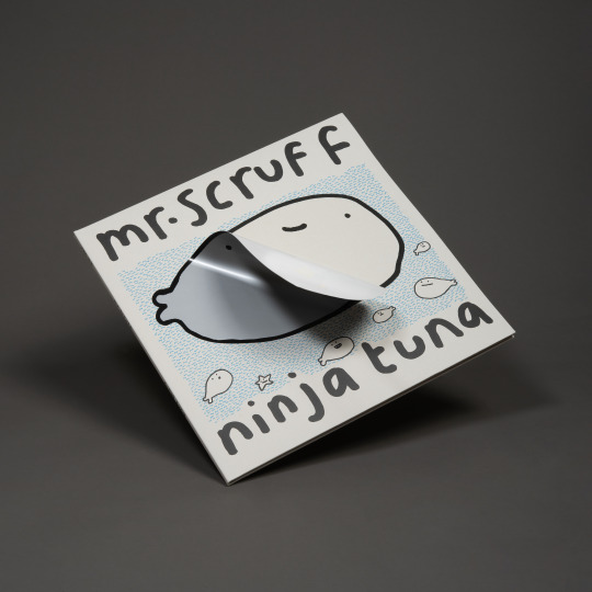
2. Mr Scruff - Trouser Jazz Deluxe 20th Anniversary Edition (2023) AND Ninja Tuna Deluxe Triple LP out today! (29/03/24)
Part II of our ‘Ninja Tales’ series for our ‘Uncovered’ blog explores the creative for two re-releases from Manchester’s own Andy Carthy aka Mr Scruff on Ninja Tune. We speak to Ninja Tune's Head of Production, Sean Preston to get the full story.

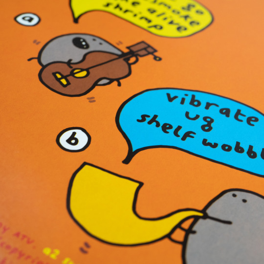
Former fine art student at Sheffield University, DJ and Cartoonist, Andy Carthy’s iconic line art cartoon drawings have illustrated gig flyers, record sleeves and merchandise and usually accompany him at gigs as live animated visuals. Mr Scruff's cartoons feature across his body of work are a big part of his identity, instantly recognisable to electronic music fans.
Trouser Jazz, originally released in 2002, celebrated its 20th anniversary with a Deluxe anniversary edition on a double LP with blue/red vinyl to match the cover palette of the original iconic artwork by Mr. Scruff & Airside with an “infinity” peelable trouser sticker on the cover to reveal silver and gold foiled 20th anniversary trousers.

Ninja Tuna, the fourth studio album by Mr Scruff, originally released on CD in 2008 through Carthy's personal Ninja Tune, is the latest Mr Scruff album to get a fancy makeover and is released on 29th March 2024. Now available for the first time on vinyl, the record is presented as a deluxe triple LP housed in a gatefold greyboard sleeve, complete with bonus tracks, pressed on Biovinyl and also with an “infinity” peelable tuna sticker on the cover.

We spoke to Ninja Tune’s Head of Production, Sean Preston to get the story behind the creative.
Sean explains, “These two records first came out decades ago when budget and RRP limited what we could do. Ninja Tuna didn’t even get a vinyl release. The two new versions utilise the same "gecko sticker” design to take a product concept and roll it out across the act's work. When ‘Trouser Jazz’ came up for an anniversary edition, it felt like a really good opportunity to delve into the original artwork, honour it, and bring it to life. It’s a fun, interactive and borderline silly design package, that is apposite to Scruff’s playful and tongue-in-cheek cartoons.”
He continues, “I had become aware of a “gecko” sticker thanks to music product maestros SixtySix Productions, specifically Emily Robbins there. The sticker is in fact more like velcro than a normal sticker adhesive, which is why it’s often called "infinity peel”. In fact, like velcro you prob get a few thousand re-peels of it, so whilst “infinity” is a stretch, it’ll take some debunking in practice.”

Sean continues, “We took the trousers which make up the original front cover’s central feature, and created new 20 year anniversary trousers, foiled in gold with a beautiful silver belt. Then, traditional marketing sensibility troll that I am, I placed the standard blue trousers over the top as a sticker. The trick here is not only covering up the expensive bit to leave as a surprise for buyers, but to create a small deboss into the sleeve where the foil trousers are, and present the record as it originally was, with the old school blue trousers sitting in place, flush against its surroundings. Of course, at home, once those trousers are peeled off, the owner of the record can put them wherever they want. My Trouser Jazz trousers currently sit on my copy of Bob Dylan’s Street Legal.”

With today’s release of Ninja Tuna on vinyl for the first time the new package design was in keeping with Trouser Jazz's concepts.
Sean told us, “Part of the decision to present Trouser Jazz with this peel and reveal gatefold sleeve was made with an eye on future Scruff reissues. This week we release Nina Tuna on vinyl for the first time, and as a 3LP no less! Its cover features a centrally located tuna fish. No free copies to anyone guessing what we’ve done with it! Andy (Mr Scruff) was very up for reinterpreting the original CD artwork, and got to work on new illustrations to exist alongside original illustrations."


"The main tuna dude on the front gets a beautiful new coat (scale even?!) of silver. It really shimmers in the sun. It’s so fun working with artists like Scruff, he’s totally open to ideas and has such vital advice and feedback. I think initially I was steering towards a greyboard to replicate the original CDs, but availability of that type of board wasn’t what it was 15 years ago, and it tends to be difficult to work with when you want to use heavier versions of it that are necessary for a heavy duty gatefold sleeve.”

Sean continues, “It’s a small thing, but I’m dangerously self-satisfied with the inner sleeves. They spell out NINJA TUNA between them, and reveal vinyl discs pressed onto BioVinyl, which is a relatively new thing in the world of vinyl offered by Optimal Media in Germany. There are a few specifics about Biovinyl that make it a better choice for the environment, but the key is using biogenic waste like cooking oil rather than petroleum. It’s something we are trying to encourage more use of, with one eye on truly eco-friendly, carbon neutral vinyl alternatives that are in development.”


Sean Preston is an award winning product designer and artist from London. He is Head of Production at independent record label Ninja Tune, a bastion of ground-breaking music since 1990, working with artists such as Black Country, New Road, Bonobo, Thundercat, Mr Scruff and more. Sean founded Fiction magazine and publisher Open Pen.
We already loved both these records, but Ninja Tuna getting a first release on vinyl is particularly pleasing for us of course. We shall be peeling and un-peeling our copies with glee! We were also extremely chuffed to have got some words from Andy Carthy (Mr Scruff) himself about this project, “I really enjoyed collaborating on the design with Ninja Tune’s Sean Preston. Both albums needed a lot of re-drawing & re-writing hand-written text, so I did the bit that I am good at (potato drawings & writing) & Sean did the professional design bit, which I struggle with beyond basic illustrator fiddling. The daft hype stickers were fun to do as well!”
With Mr Scruff's back catalogue getting this delightful vinyl upgrade, we're hopeful that there’s another one on the way to complete the set.... !!

NINJA TUNA (Vinyl Debut Edition) by Mr Scruff is released on 29th March 2024 on Ninja Tune. Design by Mr Scruff and Sean Preston. Vinyl record FlipFrames by ART VINYL
#art vinyl#play and display#lp cover frame#vinyl record frame#record cover art#best art vinyl#flip frame#mrscruff#trouserjazz#ninjatuna#ninja tune#art and design#creative process#vinyl records#vinyl collection#vinyl artwork
1 note
·
View note
Text
Uncovered: The Ninja Tales
1. Thundercat - Apocalypse Anniversary Edition
Art Vinyl's quest to ‘Uncover’ the stories behind some of the best vinyl record artwork each year never ceases, and so we turn to take a look at a selection of upcoming releases for 2024 from the consistently excellent independent record label Ninja Tune in our new sub-series ‘Uncovered: The Ninja Tales’.
First one off the press is American bassist, singer-songwriter, Stephen 'Thundercat' Bruner and the Apocalypse Anniversary Edition. This 10th Anniversary reissue of Apocalypse arrives on 15th March 2024 on Brainfeeder and Ninja Tune and features two previously unreleased songs. The original sleeve design is taken to the next level for this release, and we caught up with Ninja’s Head of Production and Design, Sean Preston to give us the exclusive creative process low-down.

Thundercat - Apocalypse 10 Year Anniversary Edition (2024)
Sean says, “This one took the remaining few hairs left on my scalp. Six months of getting it to where it is now, but I’m really happy with how it’s turned out. The brief was to create a sleeve of the existing portrait front cover, that somehow showed Thundercat's portrait skull with holography."
The mark of 90s print processes associated with comic book and cartoon collectables has run through the artworks of Thundercat’s back catalogue of releases, married with striking portrait photography that is often dark or dark-humoured.
Sean told us, "Thundercat is really into holography, constantly pushing the boundaries of what is realistically achieved. With the previous Golden Age of Apocalypse reissue we even had to work with the company that makes tiny holograms for VISA’s credit cards!”
He continues, "The issue we have today is that a lot of the old techniques are no longer workable. Print has streamlined and that often means "holographic print” is actually just standard litho printing on top of reflective cards and that wasn’t enough for us here. Brainfeeder’s Adam Stover came up with the idea of working with implementing a holographic aspect to the original front cover portrait that would present a sort of x-ray of Thundercat, in which a skull would be visible in certain lights. The challenge was to print both the standard colour portrait as per the original, and the holographic skull, which should only be visible in certain lights."
Our conversation with Sean reveals that what at first brief appeared to be an unattainable outcome for this Anniversary edition, in fact culminated in a blend of two quite ordinary techniques to get to an extraordinary finish - a deluxe rainbow holographic sleeve with gold foil detail, housed in transparent PVC outer slipcase with “x-ray” holographic skull print.

Thundercat - Apocalypse (2013) and Apocalypse 10 Year Anniversary Edition (2024)
Sean explains, “We needed to create something new, which is so hard to achieve these days. Holographic techniques don’t really provide the ideal for what we wanted to achieve. Light exposure ink isn’t really at the point where it would create something with the effect of depth and transition we were looking for. I find sometimes the desired effect needs to be unpacked and rebuilt, so when the initial tests didn’t get us to where we wanted to be, we married two fairly traditional print methods in a way that I don’t think has been done before.”
Sean elaborates, “Though we wanted the skull to appear beneath the portrait initially, I found a way to achieve the desired overall consequence of a skull appearing from a portrait, was to have two separate sleeves engage with each other, and in a way that created something we could consider be a new, or at least unique to this release.”
We asked Sean about the techniques used on each sleeve to create this final synergy between them.
He told us, “The first sleeve is a standard print onto a rainbow mirriboard (like silver wrapping paper that presents a rainbow effect under light). By printing the first card sleeve with the original front cover portrait of Thundercat on the iridescent mirriboard, we could get much closer to our ideal by printing a second outer sleeve to cover the first, on a clear APET (a more environmentally friendly plastic) sheet with a process called Cast & Cure. This process is nothing new, but is usually employed on its own, or as an alternative to varnish, but usually as the primary feature of the packaging. It leaves a holographic impression on the clear material which isn’t immediately obvious on its own, but it does react well to light.”
The process didn’t stop there however, as Sean tells us, “Of course, in attempting to create something unique, where the two components will actually land in print, takes us to the unknown, and as such requires a fair amount of testing and development. We wanted something that had more depth in certain areas - aiming for that x-ray aesthetic. We eventually applied a small partial white base in areas and took further measures with the portrait printed mirrirboard cover to increase its vibrancy. Something that really ties the room together from my perspective is the fine gold lacquer (like a gold foil) that we applied for Thundercat’s crown. So regal!”
Sean Preston is an award winning product designer and artist from London. He is Head of Production at independent record label Ninja Tune, a bastion of ground-breaking music since 1990, working with artists such as Black Country, New Road, Bonobo, Thundercat and more. Sean founded Fiction magazine and publisher Open Pen.

Sean Preston, Head of Production at Ninja Tune
With creatives like Sean pushing boundaries and reimagining tried and tested processes to achieve the music artists' end vision, we the humble vinyl collectors, are rewarded with a unique album artwork to cherish. He says, "What I love about this is that in a record shop, you’d approach the record sleeve and it would just look like a slightly iridescent version of the original cover - but on closer inspect and interaction, the skull effect comes to life and reveals the x-ray effect."

APOCALYPSE - TEN YEAR ANNIVERSARY EDITION BY THUNDERCAT is released on 15th March 2024 on Brainfeeder and Ninja Tune. Album FlipFrames by Art Vinyl
Art direction & design by Stephen Serrato – reworked for the Anniversary edition by Adam Stover. Design by Ninja Tune. Cover photography by B+.
#art vinyl#record frames#play and display#lp cover frame#vinyl record frame#record cover art#best art vinyl#thundercat#apocalypseanniversaryedition#flip frame#newalbumartwork
1 note
·
View note
Text
Uncovered: 'Far From Saints' by Far From Saints
The Best Art Vinyl 2023 winners have been announced and we send huge congratulations to our top three winners. We however, never stop our interest in ‘Uncovering’ the stories behind the amazing shortlisted album artworks. We were thus delighted to catch up with US artist, Sara Shepherd Edgar to find out more about her painting that was used for the cover of the debut, eponymous album from the collaborative band Far From Saints - made up of Kelly Jones of Stereophonics with Austin’s Patty Lynn and Dwight Baker of The Wind and The Wave.

The Far From Saints album cover artwork came from a series of Sara Shepherd Edgar’s works with narratives around the circus.
Sara told us, “I was using circus imagery to speak about everyday life struggles and experiences. Many people have positive connections and memories with the circus, having visited it as a child or experienced it with family and friends. I like to use those connections with the imagery to draw in the viewer. It’s a way of gaining the viewer's attention, maybe tricking them into looking closer at the subject matter assumed to be one thing. Still, alternatively, the underlying message is layered, including instances of life's bitterness or intensity. I intend to depict occurrences of the human condition in all its beauty and poignancy.”

'Houseboat' 48” x 48”, acrylic on canvas by Sara Shepherd Edgar
A clear example of this creative direction, is in Sara’s many pieces involving a circus elephant as the focus. She explains, “At first glance, the colours, subject and narrative of 'Camouflage #3' are joyful, but ponder for a moment further, look a little deeper, and realize that it is an elephant trying to blend into the circus tent, who doesn't want to be there, who doesn't belong in the circus. I love this piece because it is the essence of my overarching theme.”

'Camouflage' #3”, 36” x 36”, acrylic on canvas by Sara Shepherd Edgar
Another piece in the artist’s circus series, is a pair of acrobats on a trapeze. Sara tells us, "The painting directs the viewer to recollect the childhood joy of watching such a show, the excitement, the courage of the performers. Upon closer inspection of 'White Flags', the acrobat being held seems to give up in her partner's arms, surrendering to her fate."
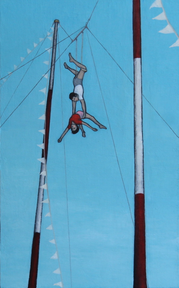
'White Flags' 12” x 16”, acrylic on canvas by Sara Shepherd Edgar
The album cover artwork came from a painting titled 'A Safe Place'. Again, a pair of acrobats fly over an audience in a circus tent. Patty Lynn and the band reached out to Sara to ask about using the piece for their Far From Saints debut album.
Sara says, “I was looking to the viewer to see the wonderment and bravery of the performance, as well as recognize the vulnerability of their predicament and then connect that with personal experiences. I value depicting audiences in my work."
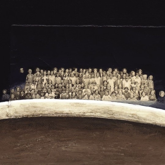
Close-up of the audience imagery on the Far From Saints album cover by Sara Shepherd Edgar
She continues, "I like to use audience imagery, and recently simplified that idea to just eyes in other works, to suggest that we are all being watched, whether it be by family, colleagues, friends, or the anonymous public.”

Reluctant Princess, 12” x 12”, mixed media on panel by Sara Shepherd Edgar

Cozette with Bunny Ears, 12” x 12”, acrylic on panel by Sara Shepherd Edgar
Sara's circus themed work not only features on the Far From Saints album cover, but was also beautifully animated for the band's video for their second track Take It Through the Night off the album.
youtube
Sara is a Utah, USA-based mixed media artist. After graduating from the University of Washington in 1994 with a fine arts degree in metalsmithing, she went on to show her small-scale jewellery sculpture in the Seattle, WA area. Transitioning to starting a family, having a metalsmithing studio and raising young children became challenging, so looking for an alternative artistic outlet, Sara experimented with painting and mixed media, which is still her medium of choice today. Sara is currently represented by Gallery Mar in Park City, Utah.

Sara Shepherd Edgar
Sara told us, “My intent with the work is to provoke thought through familiar narratives to create a connection. It was so satisfying for the band to recognize that in the piece and then want it to represent them in their creative endeavour. It fulfils the purpose of the piece and my work and the personal fulfilment of making art I enjoy so much.”

Far From Saints by Far From Saints on Ignition Records was shortlisted for Best Art Vinyl 2023. Cover artwork by Sara Shepherd Edgar. Design by Richard Welland at R-W Studio.
2 notes
·
View notes
Text
Uncovered: Glüme - Main Character
Continuing our insights into the creative behind the shortlisted album covers for Best Art Vinyl 2023. Andrea Riba talks us through her work and this evocative cover shot of the avant-pop star Glüme who flippantly calls herself the 'Walmart Marilyn' for her latest album Main Character.
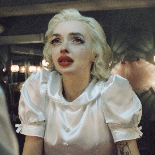
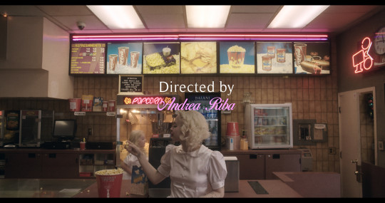
Andrea Riba is a Mexican-Chilean writer, director, producer, and co-founder of Femina Films. The album cover for Main Character was shot on the film set for 'Child Actor' which is the opening track on the album and inspired the short film and music video of the same title produced by Femina Films and Italians Do It Better.
Andrea tells us “It's a surreal film in which Glüme revisits her child self in the 90s. The image was taken after shooting the climax of the film in a preserved 70s dressing room in the outskirts of Hollywood. In this scene, Glüme confronts her mother (played by Riki Lindhome - whose credits include Knives Out, Wednesday) about the loss of her childhood to the demanding world of child acting in Hollywood."

Riba first met Glüme on set for her debut album cover shoot for 'The Internet', although the shoot initially started as a passion project. Andrea explains, “I had a Blue Velvet inspired photoshoot I had been sitting on, and after discovering Glüme through music label Italians Do It Better, I thought she had the perfect cadence for the concept. At the time, the label had already announced the album cover for her debut album The Internet, but when the label saw the photos from our shoot, the plan changed and they landed on one of the images for the album cover and billboards around LA, which was such an exciting surprise.”

The Internet album cover - Glüme 2012
We asked Andrea how the iconic image for the cover of Main Character came about. She told us, “We purposefully scheduled this scene at the end of our 12 hour set day in order for the exhaustion of the day to aid Glüme's performance. After wrapping the scene, I thought of taking film stills to capture Glüme's raw emotions, which were at an all-time high. There was no intention for the image to be the album cover, but the distraught expression captured on Glüme sparked the attention of her label, so they landed on this image as the album cover. There is an interesting contradiction between the title of the album 'Main Character' - someone at the centre of the plot, with an image of a woman tearing and in pure vulnerability.”
Vinyl scan image for 'Main Character' 2023 by Andrea Riba
We wanted to delve into how the vintage feel of this image was captured so effectively. Andrea tells us, "I wanted to shoot the image on Cinestill 800T because this film captures a beautiful halation and glow around practical lights, that being the vintage tungsten bulbs around the mirrors around the entire dressing room we shot in. There is also a thick grain to the film which provides a sort of surreal veneer between the audience and the world captured, which was meant to reflect Glüme's life as a child actor in the 90's. We also wanted to keep it same world, since her first album 'The Internet' was shot on Cinestill as well."

Riba and Glüme have a close professional and personal relationship which may account for how Andrea was able to capture such a wonderfully raw and personal image of the star. She explains, "Glüme approached me about joining her team as a creative director and this was the beginning of, not only an organic professional collaboration between her and I, but a long term friendship. She is an inspiring human being and we share the same aesthetic interests and love for film, music, and people."

Glüme Harlow and Andrea Riba
Main Character by Glüme on Italians Do It Better label is shortlisted for Best Art Vinyl 2023
#art vinyl#record frames#play and display#best art vinyl#bestartvinyl2023#lp cover frame#flip frame#record cover art#glume#maincharacter#childactor
3 notes
·
View notes
Text
Uncovered: Metallica - 72 Seasons
Uncovering the detail behind some of the Best Art Vinyl 2023 shortlisted album artworks, we turn next to the eleventh studio album by American heavy metal band Metallica, released on their own record label Blackened Recordings. We were excited to have the the opportunity to discover the story behind the art from Creative Director Jamie McCathie from General LLC.
72 Seasons was Jamie's first project after leaving his position as Executive Creative Director at a "big fancy branding agency" to go it alone and find new interesting projects. David Turner (Turner and Duckworth) had reached out to ask if he wanted to collaborate on the project and the work began.
Jamie told us. "The band were amazing to work with. I have worked on numerous projects with them and probably the best thing is working with people that are truly creative. Beyond musicians, these are artists. They have a strong sense of style, love concepts and ideating with us. James (Hetfield) is a closet graphic designer (he designed the original logo in 1982). We had a mix of zoom calls and unperson meetings with the band that always felt exciting."
Explaining the idea behind the album's title Jamie tells us, "72 Seasons is about the impact of someone’s first 18 years. The term ‘prisoner of Childhood’ came up in our briefing call and this phrase went on to inspire the prisoner theme depicted through the crib and the die-cut ‘bars’. I remember David Turner had a sketch he did for the ‘Lux Æterna’ single that was just a simple bright yellow background and the words typed small in the middle. The theme of dark/light so clearly came across in this song, the name being almost the most uplifting and optimistic."
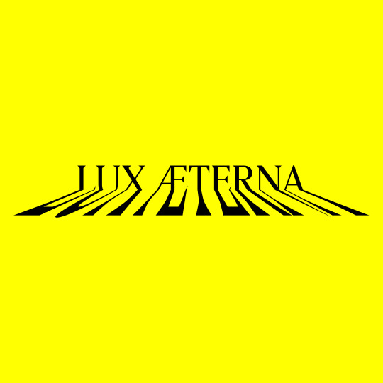
Metallica - Lux Æterna single cover typeface 2022
Jamie continues, "I loved this modern use of colour for the band and we quickly integrated it into the concept and ideas we had, in particular the crib image that at the time was on white and was kind of missing something. The colour became such a powerful tool to tie the campaign together, it’s eye-catching and so different from the heavy metal genre. I loved seeing it in a record store next to every other album, it zings."
Jamie emphasises that the project overall came to fruition through an immense amount of collaboration between the core creative team and every artist that worked on the campaign. Together with David Turner and designer Ian Conklin, Jamie developed the album's visuals, concepts and ideas and they succeeded in developing a visually rich, and layered album experience.

Metallica 72 Seasons full packaging
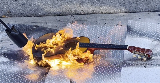
The project was an entirely integrated creative vision that complemented the album artwork. Jamie tells us, “The band were adamant EVERYTHING in this campaign had to sing from the same song sheet, so they put extra pressure on us to develop and oversee everything Metallica would be working on leading up to it’s launch."
It was a collection of talented people that were hired to execute their vision. Jamie explains, "Photographer Stan Musilek was hired to shoot the cover. David had worked with him (Stan) before, we knew we wanted the cover to look precise and elegant, and Stan’s fashion background was perfect for the idea. Mark Welsh and his team were the model team burning and fucking up all of the items outside Stan’s studio on the street in SF. The amount of care that went into this process was incredible."

The inner sleeves were created from honest portraits of the band and Jamie tells us more, "I knew that we had to photograph the band in a new light. Not the overly try hard, leather jacket, sunglass rockstars we are used to seeing. But the real them. This is a band that is getting older, and I wanted to show them in a striped down, authentic way. Discovering photographer Lee Jeffries was serendipity. His portrait work, in particular of homeless people captures the most raw, honest, and beautiful moments in humanity. He was perfect for the shots that became the vinyl sleeves. This approach was so different from a standard band shoot, it made everybody excited to push for this new side of Metallica further."

Photographer Lee Jeffries at work
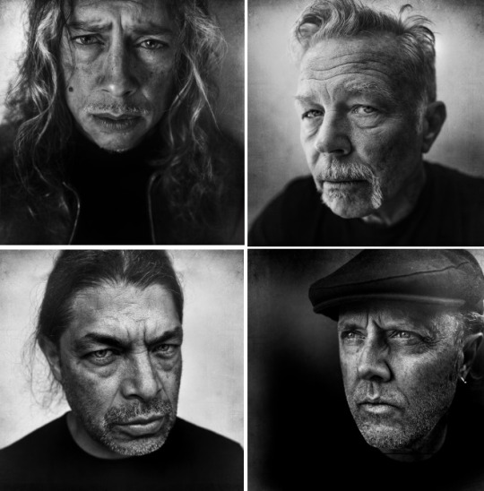
L to R: Kirk Hammett, James Hetfield, Robert Trujillo, Lars Ulrich
The layered album experience even extended to the the music video, in keeping with the cover art as Jamie explains, "When I put forward Director Tim Saccenti to do the music video for Lux, I wanted to challenge the band and its fans. His work has modern art / digital vibe feels lightyears from your average metal band. It turned out so well, he was hired for the rest of the album videos. I love the way we were able to tie together the videos and the rest of the artwork - the screaming suicide video style and the concept fell out of a conversation me and Tim had about Lee Jefferies' portraits. Everything influenced everything, it was beautiful to witness."
Lux Video by Tim Saccenti
Three months after the album launched, Jamie started his business General LLC with friend and co founder Daniel D’arcy. He says, "It’s a company with the vision of working on any kind of creative project and ideas, beyond those you might expect from a corporate design studio. Our current clients include everything from bands to Bourbon distillery owners and a fruit company. Pretty general right? Nimble, small, mighty, with a network of collaborators that we have had the pleasure of working with for the 20+ years we’ve been in industry. Working with interesting people, companies and brands that want to do or make really cool shit is who we are hoping to attract."
We suspect General LLC will never be without a heaving client list with this epic Metallica project in their portfolio!

72 Seasons by Metallica on Blackened Recordings is shortlisted for Best Art Vinyl 2023
Creative Directors: David Turner & Jamie McCathie. Design & Art Direction: Ian Conklin. Cover and object photography: Stan Musilek. Props/burning: Mark Welsh. Band portraits: Lee Jeffries. Music video director & band group shots: Tim Saccenti
#art vinyl#bestartvinyl2023#record cover art#album art#art and design#metallica#72 seasons#record frames#play and display#vinyl record frame#art prize#mixartandmusic
11 notes
·
View notes
Text
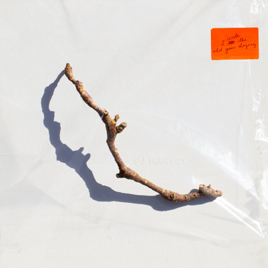
Uncovered: PJ Harvey - I Inside the Old Year Dying
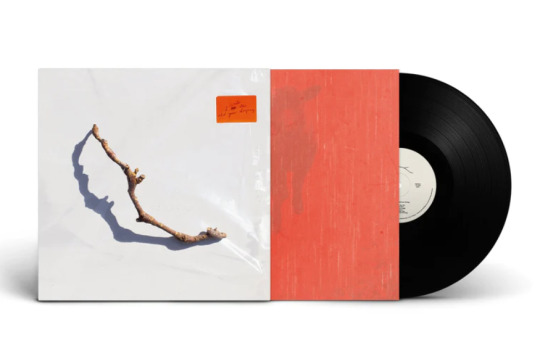
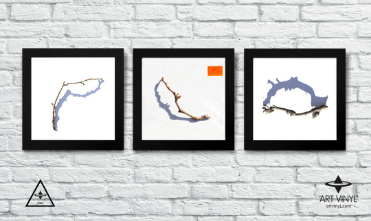
We continue to delve into the detail of the creative process for some of The Best Art Vinyl 2023 shortlisted album artworks and today we take a look at this seemingly simple cover design for PJ Harvey’s tenth studio album that, in fact, couldn’t be less so. The final image is actually a result of months of preparation, awaiting perfect weather conditions and a combination of multiple photographs and techniques. We were lucky enough to get the whole story from artist Michelle Henning.
Henning’s background is in fine art, she started as a painter and installation artist. As well as being a Professor in Photography and Media in the School of the Arts at the University of Liverpool, Michelle works for PJ Harvey as art director/creative director, and as such is very much involved in decisions relating to many of the visual assets.
Michelle explained to us how the creative process starts and about her collaboration with PJ Harvey; “The way I approach the work is to listen to the music. Polly and I don’t discuss visual ideas at first, instead, she gives me everything to do with the album: recordings or demos, poems and lyrics, drawings and notes. I then immerse myself in it and try to get a feel for it and start working. I already had a way into it because I was familiar with her poetry book 'Orlam', which is connected to the album, and I had a strong sense of the world of the album. What matters most to me is trying to find a visual equivalent for the music, not to illustrate it or directly reference lyrics, but sense the atmosphere and convey that.”
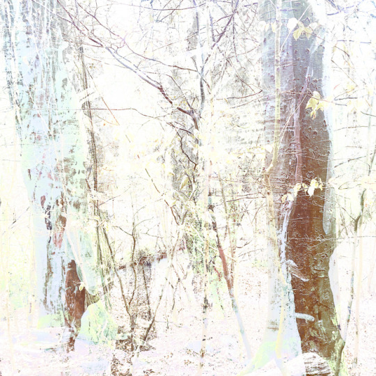
Michelle elaborates, “In the case of ‘I Inside the Old Year Dying’, this album has a strange and interesting feel, on the one hand it’s about a twentieth century rural childhood, with references to Curly-Wurlys and Coca cola but also there are soldiers who appear from a much more ancient past, and there’s a strong presence of nature."
PJ Harvey, I Inside the Old Year Dying concept gatefold (Copyright © Michelle Henning, 2023) with photographs by Steve Gullick and drawings by Polly Harvey
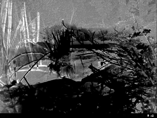
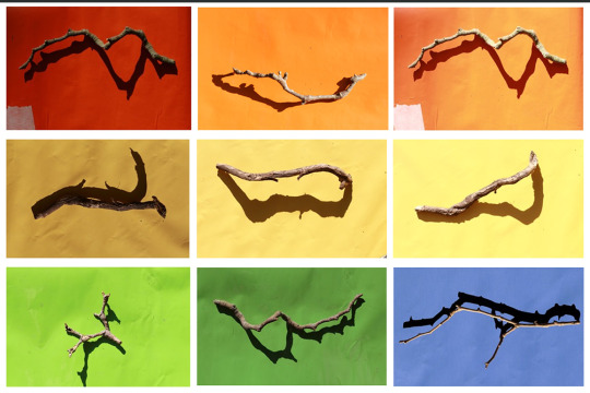
"I started by thinking I would try to put wildlife cameras in a forest, not to capture animals but to get infra-red photos of trees. So I did that for a while but I wasn’t satisfied with the results. Then I started to paint forests, but that didn’t feel right either."
Early Forest concept ideas for PJ Harvey, I Inside the Old Year Dying (Copyright © Michelle Henning, 2023)
"I had a sudden realisation that I didn’t need a whole forest, I just needed one stick and such a simple single object would give it the feel of the classic album covers I admire. Now I realise an unconscious influence was Polly herself, because she had chosen to use drawings she had made of single twigs (“twiddicks”), to break up the sections in 'Orlam'."
Orlam by PJ Harvey
"I think the idea of giving the stick a shadow emerged from the process of finding twigs on the ground and photographing them — the shadows seemed to bring them to life and make something very ordinary suddenly seem almost animate."

Concept ideas for PJ Harvey, I Inside the Old Year Dying (Copyright © Michelle Henning, 2023)
"The back cover is a photograph of Polly by Steve Gullick, onto which I superimposed a scan of a tissue and plastic envelope, so it has a slightly battered, used look. I chose this photo because I loved the way her legs echoed the shape of the twig, and also how it could be cropped so that it seemed as if she was almost kicking the edge of the album away."

Front and back cover artwork for PJ Harvey, I Inside the Old Year Dying (Copyright © Michelle Henning, 2023)
Michelle has produced three album covers and a number of singles for PJ Harvey as well as several for other artists, including for John Parish, Mazgani and Dot Allison. She works with a wide variety of techniques; photography, clay models, printmaking, drawing in ink and watercolour and moves between analogue and digital, with a lot of work in Adobe Photoshop, creating very complex layered files.

Michelle Henning: PJ Harvey, Let England Shake (Island Records, 2011)
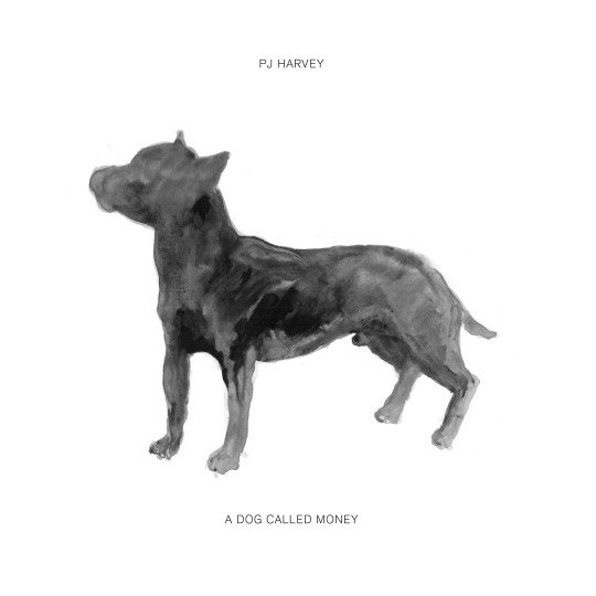
Michelle Henning: PJ Harvey, A Dog Called Money 7" Single

Centre label of Hope Six vinyl | PJ Harvey (Island Records 2016)
Expanding on her techniques for this current album cover artwork, Michelle tells us, “I photographed a lot of sticks in bright sunlight on different coloured and textured backgrounds. At a certain time in the afternoon the sun started to cast really interesting shadows. I remember Polly’s manager Sumit calling me and asking me when I would have something ready to show them, and I said I wouldn’t be ready until we had had more sunny weather. He was very patient with me but he must have wondered what on earth I was doing.”
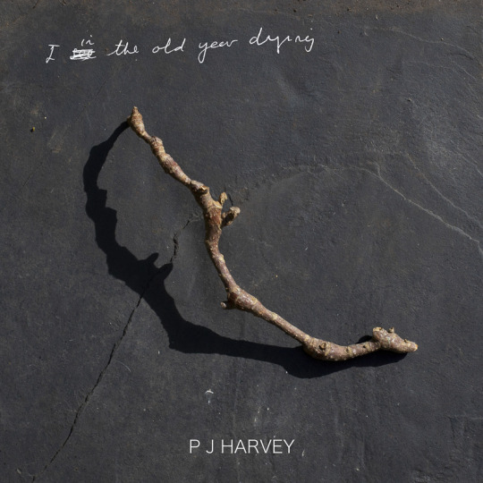
She continues, “The stick that worked best, that I felt had the most mysterious shadow, I then rephotographed under plastic. The final image is a composite of about three or maybe more photographs of this twig, both under the plastic and not. The orange sticker is based on the sticker stuck on this piece of plastic — which was a large transparent folder in which my film photographs were returned to me. I liked the way it brought a pop of colour to the cover.”
"In Photoshop, I changed the lighting on the plastic, added more layers of plastic lighting, superimposed Polly’s handwriting onto the sticker, and created the fake embossed text in the centre (which is a mixture of hand-painted ink drawing and a lot of digital editing)."
"The gatefold is a scan of a 1980s sticky photograph album complete with the blue lines of glue and the plastic layer, and the inner sleeve is based on photographs of red kitchen linoleum superimposed over photographs by Polly of a lamb and a forest. I did a rough layout for the body text and type, and then handed that over to Rob Crane of Rob Crane Design, who did a brilliant job of making the typography on the inside and back covers look elegant and balanced, and made all the files print-ready."
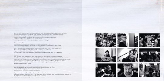
Inner gatefold for PJ Harvey, I Inside the Old Year Dying (Copyright © Michelle Henning, 2023) with typesetting by Rob Crane, and photographs by Steve Gullick gatefold pic
Michelle told us she looked at a lot of great album covers when creating this artwork and there are subtle references to some of them, both in the inner gatefold and the front cover. She says, "I love the idea that there are record cover geeks like myself who like to figure out the echoes of other designs, so I won’t say what they are!" (two iconic late 60s LP covers spring to our record cover geeky minds!)
Michelle Henning: PJ Harvey, I Inside the Old Year Dying concept (Copyright © Michelle Henning, 2023)
I Inside the Old Year Dying by PJ Harvey on Partisan Records is shortlisted for the Best Art Vinyl 2023 Award. Art Director, Design and front cover photography by Michelle Henning. Additional design and typesetting by Rob Crane.
#art vinyl#record frames#play and display#best art vinyl#lp cover frame#bestartvinyl2023#contemporaryart#mixartandmusic#artanddesign#recordcoverart#albumcover#photography
8 notes
·
View notes
Text
Uncovered: Sub Focus - Evolve
As we continue to explore the artworks for some of this year’s shortlisted albums for the Best Art Vinyl 2023 Award, next up is English DJ, record producer and musician Nicolaas Douwma aka Sub Focus and his fourth album 'Evolve' which was created by Mat Maitland from the award winning creative consultancy Big Active.
We caught up with Mat who gave us an insight into the creative concepts and processes for the artwork. He told us, "With any new project we like to discuss things thoroughly before starting to present ideas and for this album it was very collaborative in establishing the creative route."
Big Active had a good starting point for the project and a rich history with Sub Focus having worked on three previous albums with him - ‘Portals’, ‘Reworks I’ and ‘Torus’ and Mat explains, "Often with music campaigns, we are honing in on two things primarily - the central concept and the visual aesthetic.”
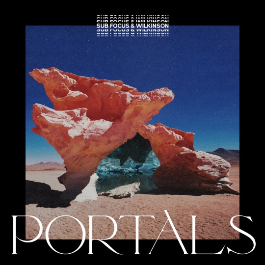
Sub Focus & Wilkinson - ‘Portals’ EMI (2020) artwork by Big Active

Sub Focus ‘Reworks I’ RAM records (2021) artwork by Big Active
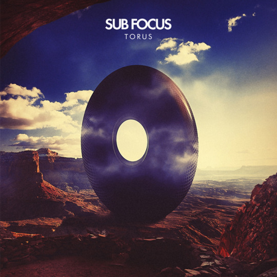
Sub Focus - ’Torus’ RAM Records, Virgin EMI Records (2013) artwork by Big Active
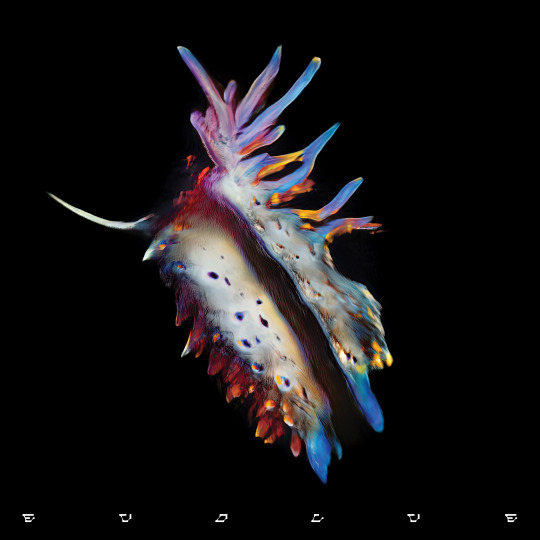
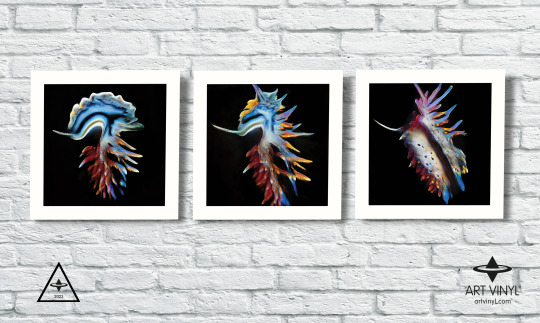
We asked Mat about the inspirations for the current album artwork for 'Evolve', he says, "Conceptually there was something early on that came out of our discussions with Nicolaas, the idea of Nudibranchs - a group of tiny soft-bodied molluscs that live under water, noted for their extraordinary colours and striking forms. Nicolaas is a keen diver and had come across these on his travels. Straight away we felt that this was a really interesting thing to base the campaign on. Firstly, it was an unusual subject matter and secondly it talked to the title ‘Evolve’ perfectly - having a synergy with human evolution as well as sonic mutations symbolised in the music itself."

Mat explains, "Aesthetically we didn’t want to just use straight documentary images of Nudibranchs, so we had some decisions to make in how to present the concept. I had been working on a personal project the previous year with digital artist Claudia Rafael and felt that she would be a great collaborator in elevating how the forms were depicted. After collating a huge bank of imagery we decided to remove any sense of environment, instead having them live in a void of darkness to elevate their impact but also remove any concept of scale. Working with Claudia, we processed all of this source material through GAN machine learning. This is a process whereby the computer is learning to mimic and re-render the imagery and while doing so, creates less accurate versions of it. It also starts mixing up and combining elements from all the separate images to create new versions."

This re-rendered concept and technique was continued for the accompanying single release artworks and, taking the creative concept to a fully immersive offering, Mat and the team also produced a set of animations for each of the releases for an installation at the album launch where the work was projected on huge immersive LED screens.
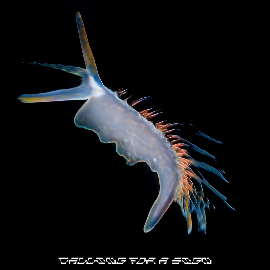
Calling For a Sign - Sub Focus 2023
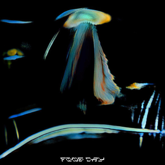
Fine Day - Sub Focus (single cover)

I Found You - Sub Focus (single cover)

Vibrations - Sub Focus (single cover)
Mat continues, "So, this ‘evolutionary’ theme was also inherent in the creation of the final album cover imagery itself which we then took to its full conclusion by producing a ‘lenticular’ LP format where the images animate and evolve in front of your eyes. As GAN renders out thousands of images it was a process of curation with Nicolaas in deciding which frames were chosen for the artwork. Once we had decided on the isolated frames (for the main cover art) we then used the frames either side of this for the lenticular LP…which uses five separate images to create the ‘morph’."
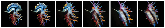
The 'Evolve' lenticular album cover fills Art Vinyl’s album-artwork-archivist hearts with joy. It really is something to be seen in the flesh, morphing before your very eyes and epitomising the joy of owning the physical vinyl release. Another masterpiece of album artwork added to the Best Art Vinyl annals.
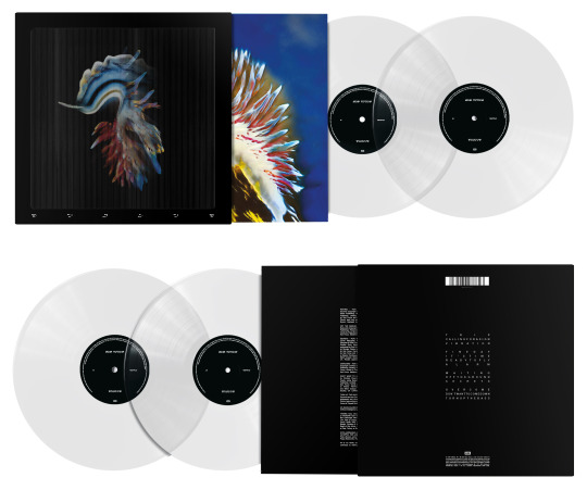
Lenticular LP of Sub Focus - Evolve by Big Active Design
Evolve by Sub Focus on EMI Records is shortlisted for the Best Art Vinyl 2023 Award. Art Direction by Mat Maitland - Big Active Design & Nicolaas Douwma. Artificial Intelligence by Claudia Rafael. Design by Mat Maitland - Big Active Design.
#best art vinyl#record cover art#record frame#flip frame#vinyl record frame#lp cover frame#contemporary art#lenticular#album art#bestartvinyl2023#art prize#art and design
2 notes
·
View notes
Text
Uncovered: 75 Dollar Bill - Power Failures
The shortlisted album artworks have been announced for our annual art prize Best Art Vinyl 2023. We now begin to delve into the creative process behind some of the 50 nominees. First up is 75 Dollar Bill's re-release of Power Failures for the first time on vinyl. We were lucky enough to catch up with the band's guitarist and album cover designer Che Chen.
Che Chen founded 75 Dollar Bill in 2011 with percussionist Rick Brown. He tells us, "I wanted to be a painter before I wanted to be a musician, so the visual aesthetic of the band has always been really important to me. I've done the artwork for all of our physical and digital releases, and many of our posters and fliers too."
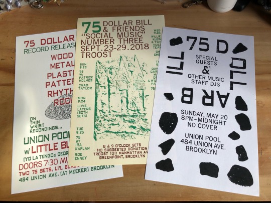
Che Chen flyer design work for 75 Dollar Bill
Che Chen explains, "Power Failures first came out as a digital release on Bandcamp in July of 2020. It was our first pandemic summer, Trump was still president (hopefully for the last time!) and George Floyd had been murdered by Minneapolis Police Officers earlier that summer. There were protests everywhere, against police violence, institutional racism, wage inequality for essential workers, etc. The title of the record was very much a response to all of this, the way the pandemic exposed the failures of the state on all these different fronts."
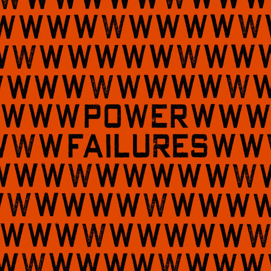
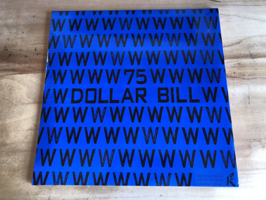
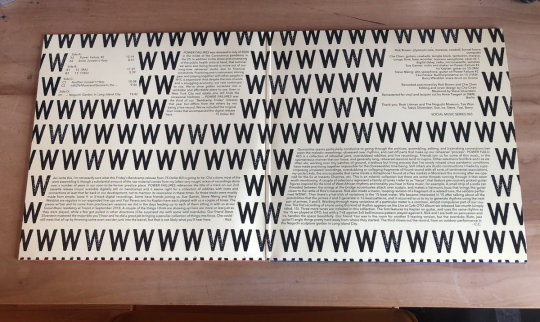
The use of text-based artwork has in fact been a consistent theme for the artist, he told us, "Text has always been central to the visual language of the band, and many of our record covers feature text as the only "image" in the designs. This approach made sense to me for Power Failures, since the title was very evocative of everything that was going on, but also open-ended enough that I didn't want to add an image that might get in the way of whatever associations someone looking at those words might have. I wanted to push the idea of a text only image a bit by using the typography to create a pattern (of W's in this case) which is only broken by the album title. The digital album just had the single square image as its artwork, so when Karl Records in Berlin offered to make a vinyl edition of the album as a gatefold double album, we got to expand the art significantly. I repeated this process on the back cover with the band name and changed the background colour. The LP centre labels refer back to the font and colour schemes of the front and back cover. I should also mention that the beautiful inside layout was done by Roland Küffner at Karl who did a fantastic job."
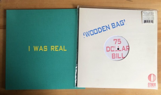
We asked Che Chen about the techniques he uses for his artworks, he explained, "The fonts I've used in most of my designs are actually from industrial moveable rubber stamp type. I've scanned physical prints of each set, several versions so that there are multiple versions of each character with slightly different imperfections, etc. I like the physical character of these fonts, how each impression is unique. For our first LP, Wooden Bag, Rick and I actually hand stamped the covers for the entire first edition using this rubber stamp type, but these days I mostly do the type setting on the computer."
Chen Chen got into music as a teenager in the suburbs of Washington DC in the 1990s when the post-hardcore scene around Dischord Records was thriving. The DIY ethos of bands taking control of their own production, from running their own labels and booking their own tours, to playing protests and benefits for local causes and working the door at their own shows, was and is still a big inspiration to him.
He tells us, "I've tried to carry those ideals on in my own work as best I can. Doing the art and the design for music projects I am involved with (and occasionally for friends) feels like an obvious extension of this. I love bands and labels that have a strong visual aesthetic and also really respect when artists are resourceful and can make striking designs using sometimes limited means. Sun Ra's home made jackets covers for his Saturn Records LPs and Harry Partch's Gate 5 Records are both examples of this for me."

Taken from the 'Sun Ra: Art on Saturn' Book - The Album Cover Art of Sun Ra's Saturn Label
U.S. Highball |Gate 5 Records, Issue No. 6 (First pressing, inscribed to Amos Vogel in 1960) Hardcover – January 1, 1956
Che continues, "Lisa Alvarado’s screen printed album covers for the Natural Information Society records and her paintings that hang while they play (she plays harmonium in the group too) are another perfect fusion of visual and musical aesthetics to me."
Mandatory Reality by Joshua Abrams & Natural Information Society. Artwork by Lisa Alvarado
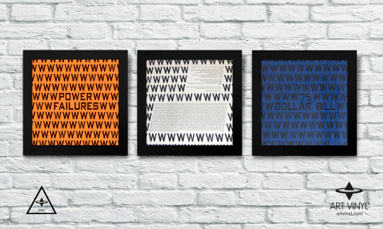
Power Failures by 75 Dollar Bill on Karl Records is shortlisted for the Best Art Vinyl 2023 Award. Artwork by Che Chen.
#bestartvinyl2023#record cover art#record frame#75 dollar bill#album artwork#contemporary art#art and design#best art vinyl#flip frame
2 notes
·
View notes
Text
Best Art Vinyl 2022 Winners
“This year’s winning entry features a hyperreal painting that seeks to portray both stifled desires and “the possibility of soaring liberation”

Read Design Week’s article and interview with Simon Monk, the winning artist of our annual #BestArtVinyl Award:
Artist Simon Monk’s hyperreal painting for UK rock collective Black Country, New Road’s Ants From Up There album has been announced as the winner of the Best Art Vinyl Award 2022.
For its 18th year, the competition received over 200 entries. A panel of artists, designers and music industry experts selected a shortlist of 50 covers, before the final three were chosen via a public vote.
“An image of frustrated desire”
Monk is a UK-based contemporary artist interested in using painting to breathe new life into a cheap or otherwise unimportant object. His hyperreal style is achieved through layering translucent colours and using high-quality oils and alkyds (a polyester resin modified with fatty acids and other components).
Black Country, New Road was drawn to Monk’s style for its nostalgic quality. The band’s drummer Charlie Wayne explains how, for him, looking at the painting is “as familiar as looking at a childhood photograph”. Wayne notes that Monk’s work is very different to the band’s first album cover.
At first glance, the album cover looks exactly like an old photograph, but a closer look reveals it to be a hyperreal painting. Monk explains how his subjects “exist illusionistically in front of the picture plane”, which helps to put it in “the viewer’s space”, adding to the hyperreality.
“My plastic bag paintings were started as a solution to the problem of how to make a still life oil painting in the 21st century without it being boring and old fashioned”, says Monk.
He says that he sees the painting as “an image of frustrated desire” as the airplane is being stifled inside the bag. The plastic bag is struggling to contain it, which Monk says suggests “the possibility of soaring liberation.” After listening to the album many times, Monk says he noticed “a yearning, searching, frustrated quality to the music” that is “analogous to the content of the painting”.
Aside from the painting, all other aspects of the cover design – from the hand lettering to the choice of card stock – was led by the design team at the band’s record label Ninja Tune. Monk says the team were “extremely self-effacing” in showcasing his imagery at the forefront of the cover, rather than “obscuring it with type or covering it with filters”.
Monk planned to create a companion painting of a golden elephant in a carrier bag. Unfortunately, he came to the studio one morning to find a torn bag and a broken elephant on the floor. Since Monk only paints from real life, not from photographs, the second painting was never completed. Monk also created two additional artworks inside the deluxe vinyl box sets available from Ninja Records.
Black Country, New Road - ‘Ants From Up There’ deluxe box set on display at the Art Vinyl Exhibition at The Collection & Usher Gallery in Lincoln until 22/01/23
Hardcore oil painting..
Coming in second was the artwork for French punk/hardcore trio Birds in Row’s third full length album Gris Klein, created by band member and tattoo artist Bart Balboa.
The cover features a cool-toned oil painting of a person admiring a bunch of pink flowers, produced on linen. Although Balboa used a predominantly dark and neutral colour palette, the person’s lips – which sit at a central point of the canvas – are cherry red, while the budding flowers have been painted in pastel pinks.
Balboa revealed that this was the last painting he had managed to finish before falling into “an artistic void”. He also created an accompanying stone lithograph print for the LP.
Imagining a post-apocalyptic landscape..
West Yorkshire-based illustrator Jake Blanchard’s work for Richard Dawson’s album The Ruby Cord came in third place. The album concludes a trilogy of LPs that began with the pre-medieval world of Peasant, released in 2017. The Ruby Cord aims to transport listeners back to the present day, where they are faced with a somewhat dystopian future.
Though Blanchard’s style is characteristic of psychedelia, he also takes influence from the natural world as well as mythology and ancient cultures. His focus for the cover was to illustrate the albums 41-minute opening track, Hermit, which imagines a character “wandering through a post-apocalyptic landscape burdened with supplies”, says Blanchard.
After producing the final sketches, Blanchard moved on to the line work with pen and ink, so he could scan the illustrations and colour it digitally. “A few elements were changed or added with a graphics tablet and then I made and added textures including the background watercolour”, he says.
According to Blanchard, he worked closely with Dawson throughout the design process, who was very open to his suggestions.
All 50 nominated album covers are featured in an art installation in the window of The Hari in London. The winners will also feature in several exhibitions put on by Art Vinyl over the year in locations across the globe, such as Tipton Eyeworks in Budapest. The designs can also be viewed online, on the Art Vinyl website.

Written by Abbey Bamford, Design Week
January 6, 2023
3 notes
·
View notes
Text
Best Art Vinyl - Album Artwork Through The Ages Exhibition
Our Art Vinyl founder Andrew Heeps takes us on a short tour around some iconic record cover designs at our latest exhibition ‘Best Art Vinyl - Album Artwork Through The Ages’ at The Collection and Usher Gallery in Lincoln UK.
The exhibition will run until the end of January 2023, combined with our #BestArtVinyl2022 Award nominations.
youtube
2 notes
·
View notes
Text
Uncovered: Doseone - Enter the Gungeon
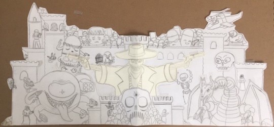
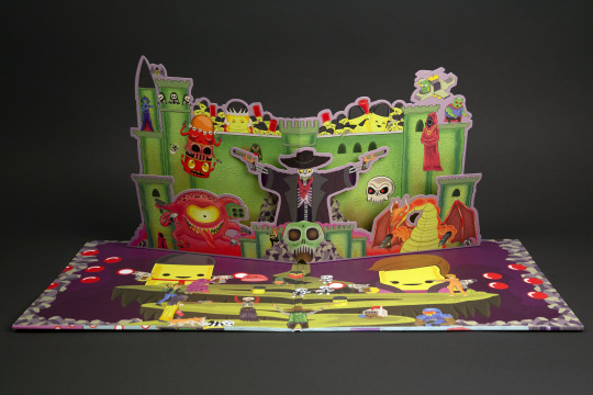
In its 18th year, Best Art Vinyl 2022 sees the first shortlisted album artwork for a video game with this Anniversary Deluxe Edition, pop-up gatefold sleeve art by Joseph Harmon. We couldn’t miss the opportunity to find out more and were lucky enough to have a quick chat with Joseph.

How did you come to work on this project? I worked on a few projects with the sound designer and composer for the game Enter the Gungeon, Adam Drucker (music artist alias Doseone), and he asked me if I would be interested in taking it on.
What was the initial brief and how did you start to approach the artwork? Everyone really trusted me and gave me the freedom and time to approach it the way I thought would be best. I would send early sketches focusing on the design and placement of things, knowing that the drawing was really bad and that it made more sense in my head. They trusted that it was going to shape up, and that means a lot.


The pop up element was intimidating and exciting because I had no idea how that worked. Once I got more familiar with the game I realized how deep it was. There were so many side quests, bosses, and characters. I felt the best way to approach the artwork was to try and make it really full and deep like the game.


Were there early versions that did not make the final cut? Actually, the initial version was more complex with the pop up. A lot more pieces that would have been a nightmare to produce, and never having taken on a pop up before I didn't know exactly what I was doing. In the end a simpler approach was the way to go.
How did you create the pop-up effect and what medium and tools do you use? I would draw things by hand on posterboard and cut them out and piece them together with scotch tape for the mock up. I had to measure everything and make sure they wouldn't be larger than the vinyl record when folded. I also had to make sure there weren't too many pieces stacked on top of each other so it would stay closed properly. Once that was figured out, I would scan the pieces and work on the finished art digitally. Everything usually starts in my sketchbook with a pencil. Then it gets scanned and cleaned up digitally. Even if it's going to be a painting, I usually have a sketch that I work out the size and colours digitally. Pencil, Photoshop, and acrylic paint are probably the materials I use the most.
What were your creative influences? Growing up I loved the box art for a lot of regular Nintendo games. I would rent them based on how weird the box art was. When you play the game, it would be nothing like that, but the box art would stick with me. It was the same with records. There was a Wings record my parents had, Red Rose Speedway, that would scare me based on the cover. It had a close up of Paul McCartney with a rose in his mouth and he looked freaked out, I think there was a motorcycle behind him. It still makes me uncomfortable to this day. I guess Wings and Nintendo inspired me for this.

Paul McCartney and Wings - Red Rose Speedway. Cover photography by Linda McCartney.

Enter the Gungeon by Doseone on Laced Records is shortlisted for the Best Art Vinyl 2022 Award. Artwork by Joseph Harmon. VOTING OPEN UNTIL 12 DEC 2022
3 notes
·
View notes
Text
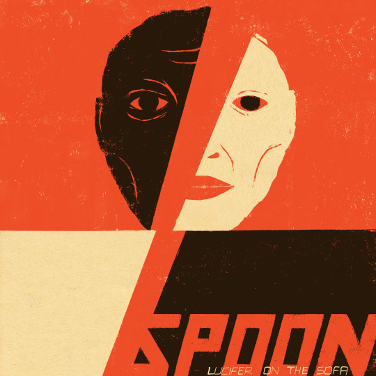
Uncovered: Spoon - Lucifer On The Moon
Not long after Texas rock band Spoon finished their 10th studio album Lucifer on the Sofa, they reached out to UK dub producer Adrian Sherwood to reconstruct the entire album into the aptly-titled Lucifer on the Moon. When this companion album was nominated as one of the shortlisted album artworks for Best Art Vinyl 2022, we caught up with Cuban American artist and illustrator, Edel Rodriguez, responsible for both the albums artworks, to get the back story on his outstanding work.

Edel told us, “Britt Daniel, Spoon’s lead singer and guitarist, reached out to me last year. He had seen an image of mine that he felt captured the right mood for the band’s upcoming album, Lucifer on the Sofa. He asked if I was interested in creating a new image for the album. I’ve been a fan for years and suggested we do a whole set of images. I wanted to create art for the interior of the album, singles and merchandise, and we went from there.”
Lucifer On The Sofa released Feb 2022 on Matador Records
He continues, “I asked for the lyrics of all the songs and was inspired by them. I created dozens of sketches and we talked back and forth about which ones paired well with the songs. Some of the songs hinted at the idea of a two sided figure (where the main image came from) and with Lucifer as a lurking figure. “

Held - Lucifer On The Sofa

The Hardest Cut - Lucifer On The Sofa

My Babe - Lucifer On The Sofa
Edel explains, “This fanged red screaming face popped into my head and I did some sketches and ultimately a painting. That image ended up on an inside sleeve on Lucifer on the Sofa and was picked up for the album cover of the companion album, Lucifer on the Moon.”

“The image was duplicated multiple times, like a reverb effect, by designers Jamie-James Medina and Matt de Jong of Undercard Studio.”
Rodriguez’s bold, figurative works are an examination of identity, cultural displacement and mortality. He has exhibited internationally and his artwork has been commissioned for numerous publications including The New York Times, TIME Magazine and The New Yorker.

Illustrations by Edel Rodriguez for TIME
Edel shared with us, “Much of my work is influenced by Afro Cuban religious iconography, propaganda art, pop art, and surrealism. I try to bring a bit of my life experiences to all of the assignments I’m commissioned for. This piece for the album was painted with acrylic and oil based ink on bark paper.”
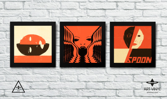
Lucifer On The Moon by Spoon on Matador Records is shortlisted for the Best Art Vinyl 2022 Award. Artwork by Edel Rogriguez. VOTING OPEN UNTIL 12 DEC 2022
8 notes
·
View notes
Text
Uncovered: ‘Malicious Intent’ by Malevolence
Eliran Kantor, the Berlin-based artist and illustrator known mostly for creating album covers for metal bands, spoke to us about his outstanding work for the Brit-Metal band Malevolence's third album, released on Nuclear Blast Records and now shortlisted for The Best Art Vinyl 2022 Award.
Kantor explains, “The cover artwork brief I received from the band was:
With this new album entitled “Malicious Intent” our initial idea for the artwork is to have a central male figure that is chained underwater, by his legs, to two concrete blocks. The chains are long enough for the man to be able to take a breath if he pushes off the sea floor towards the surface. Bones scattering the floor beneath.
All of this to symbolise that he is so close yet so far away. The look on his face of absolute despair as the realisation that his death is inevitable yet he continues to try to survive. The malicious intent in this sense is to give someone a false sense of hope when there is absolutely none at all.
“I told the band I loved the direction, but there were a few elements that I would like to avoid:
1. The concrete blocks would automatically make it look mobsters-themed
2. Bones on the floor are also something I'd avoid as we've seen it on many album covers
3. The concept of certain death and false hope is lost because the viewer doesn't know that the person can't reach the surface - for all we know, if he appears to be able to almost reach it, we can assume he IS able to lift the blocks slightly and move up and even forward, so we might assume he will also manage to move forward over and over until he reaches the shore
So my suggestion for a new concept was this:
Instead of bones and chains, I wanted to amplify the scenario with a few more drowning figures adding to the feeling of dread and panic, while our main dark figure is seemingly able to reach the top of the water surface, just to find out their faith was doomed from the start as the top has been sealed shut. As we wanted him to be a darker figure this time, Instead of relying on a facial expression like on most album covers, I wanted the panicked body movement to be the centre focus as his arms are trying to push the edge to no avail, he is clenching his fingers as hard as he can before his imminent defeat.”
“The medium is digital painting, I paint it all in photoshop and approach it as if I was painting on canvas/paper/board: start with blocking in big shapes in black and white, paint over finer details, then when all the values are right I repaint over in colours.”
The image here shows Kantor’s pre-colourised full bleed version of the album cover artwork.

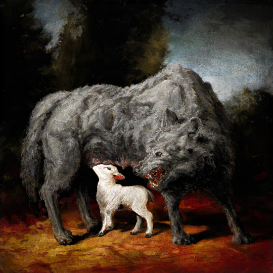
Eliran’s work for other Nuclear Blast releases is equally brilliant mind you, so we also asked for his overview on a couple of these. Dear Desolation, released by Australian deathcore band Thy Art is Murder in 2017, was based on a concept of ‘cynicism and being used’ from the band. The artwork could be an 18th century masterpiece and depicts this concept to great effect. Kantor describes it as “The she-wolf feeding the lamb but in reality making a bigger meal for herself."
Another of Eliran’s wonders was the cover of Titans of Creation, the thirteenth studio album by American thrash metal band Testament that was released on Nuclear Blast in 2020. He tells us about the album artwork concept and his active role in the creative process.
“I was asked if I had an interesting idea for the new album before there were any lyrics or even a title... Humanity was always obsessed with recurring forms in nature, like how some patterns on a leaf or lightning bolts look like the human nerve system, or the connection between celestial movements and how the oceans move. Before science, mankind created mythologies in order to explain even the simplest of natural occurrences, like the weather or sunsets.”
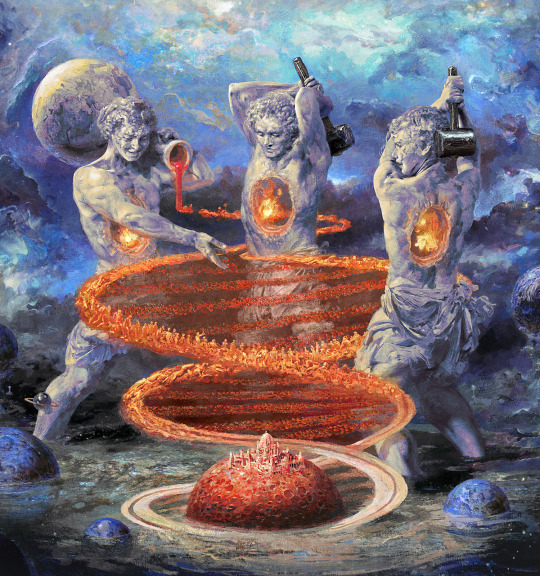
”I came up with our own mythology to symbolize a most fundamental part of nature I wanted to focus on: the fact that the Carbon, Nitrogen and Oxygen atoms in our bodies were created in previous generations of long gone dead stars. These elements combine to form molecules like Adenine, Guanine, Thymine, and Cytosine—the nucleotides in our DNA. In this way, our DNA is made of stardust.”
He continues, “So, for the cover I came up with a place where ancient deities are forming both men and planets. They pour the atoms and pound them with their hammers, creating a spiral staircase of the human DNA, from which the planetary rings of a new-born planet are also born. The fire in the deities’ chest are the dying stars, as us humans are all made of their ashes.
The album was later on named after the cover art. This shows how much of this album was a collaborative effort with everyone contributing—I even co-named the album. I suggested titles like Garden Of The Titans and Creation Of Gods and Eric Peterson combined the two into Titans Of Creation.”
Eliran exhibits his work internationally and creates hand signed & numbered prints of his paintings.
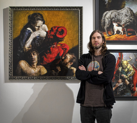
Eliran Kantor with his artwork for album covers: Loudblast - Live Ceremony, Thy Art is Murder - Dear Desolation, Kreator - Hate Über Alles. Photo by ArtCineMove.
‘Malicious Intent’ by Malevolence Artwork by Eliran Kantor is nominated for Best Art Vinyl 2022. Voting is open until 12 December 2022.
1 note
·
View note
Text
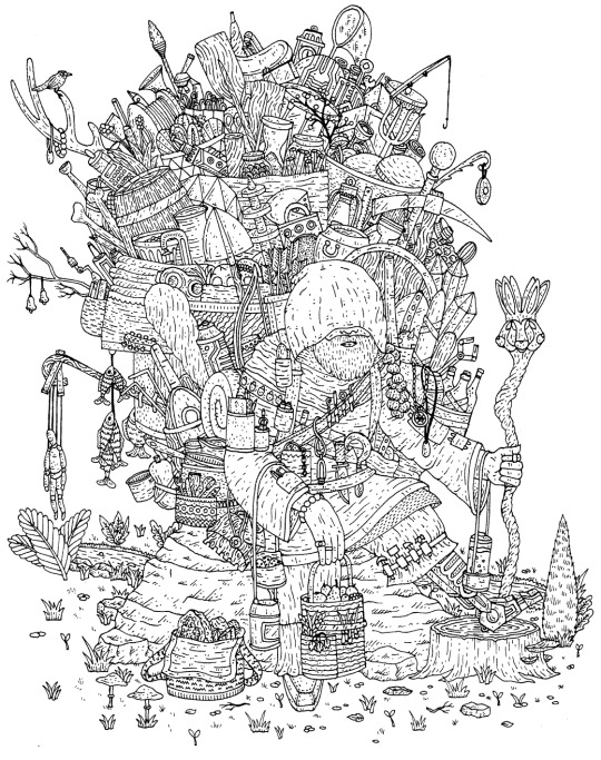
Uncovered: Richard Dawson - The Ruby Cord
As one of the shortlisted album artworks up for Best Art Vinyl 2022, we were lucky enough to catch up with Jake Blanchard, the artist behind the beautifully intricate artwork of The Ruby Cord - the conclusion of a trilogy of LPs that began with the pre-medieval world of Peasant, was brought back to the present day with 2020 and concluded in the somewhat fantastical and sinister future with this, Dawson’s seventh studio album.

Jake told us, “It was really exciting to be asked by Richard to work on the artwork for The Ruby Cord, I’ve known him for a number of years and been a fan for even longer. I’d booked him to come and play in Todmorden a few times and we’d discussed one day working together on a couple of occasions.”
“I worked very closely with Richard throughout the whole design process, he had strong ideas about the kind of imagery he wanted but was very open to my suggestions too. Initially Richard sent me the album to listen to. For the front cover it seemed obvious that the focus should be on the epic 41 minute opening track ‘The Hermit’. The song is full of great imagery and the idea of a character wandering this ‘post-apocalyptic’ landscape burdened by the supplies they’d gathered was initially suggested by Richard.”
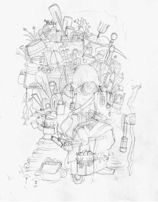
“It quickly spiralled from a person carrying a few tools and supplies to a back-and-forth with us each suggesting more and more items for The Hermit to carry. We added in references to other tracks too, the three-faced hare, a bow and arrows etc etc. We were both really keen for it to be an image you could get lost in, finding something new every time you look at it.”

“The album itself tackles a kind of future where things have, in part, reverted to an almost medieval lifestyle, at least that’s how I’ve interpreted it. There are aspects of futuristic technology scattered throughout, so it was also important to express that through the cover design. I liked the idea of this character weighing themselves down, burdening themselves with things that would maybe one day be useful or valuable, something I can relate to as I hang on to certain things for years that never find a use. I was also able to add in a few objects that are meaningful and personal to me, if you’ve got a keen eye, you might notice there’s one thing that appears twice, there’s a personal reason behind that but I’m not going to talk about that now. My main goal throughout was to try and capture the characters and world that Richard has created within his lyrics.”
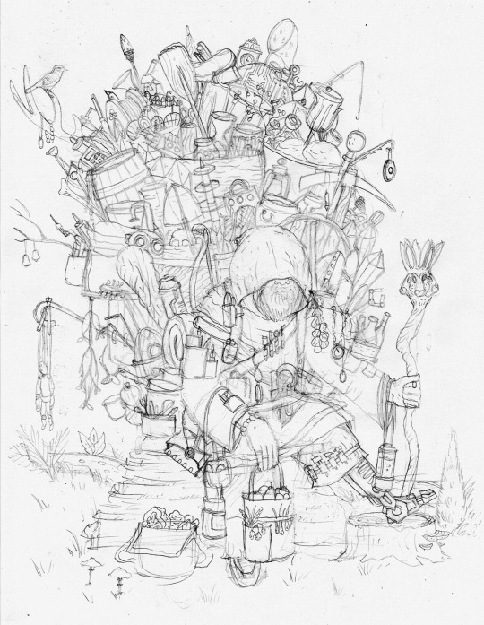
“Once the sketch was finalised, I did the line work with pen and ink and then scanned and coloured digitally. A few elements were changed or added with a graphics tablet and then I made and added textures including the background watercolour. The final thing was to draw the titles and add them in.”
“I was also lucky enough to also work on the back cover and two inner sleeves. For the back cover we wanted to incorporate more of the sci-fi elements from the album, so we went with a mysterious portal, something slightly surreal and unknowable. I tried to incorporate a sense of something organic but also some jarring angular elements and some crystalline structures infecting the local environment. I wanted it to appear intriguing but also slightly threatening.”

“For the inner sleeves we wanted to capture more of the environment in the world of ‘The Ruby Cord’ a harbour, with some sense of life and community, a small patch of society that survived, remains or was rebuilt. For the second inner sleeve we wanted a contrast, so we went with a city in ruins, a place that would normally be bustling with human life, now desolate, not even plants and animals exist here aside from a few specks of moss. An obelisk floats in the sky, what is it? Where did it come from? The album is full of mystery, with a sense of not really knowing what’s real, what happened and why and that’s what I tried to capture within the artwork.”

Ruby Cord by Richard Dawson on Domino Records is nominated for Best Art Vinyl 2022 Artwork by Jake Blanchard. VOTING OPEN UNTIL 12 DEC 2022
0 notes
Text
Uncovered: ‘Keep On With Falling’ by The Boo Radleys
After almost 24 years The Boo Radleys, formed of original members, Sice, Tim Brown and Rob Cieka, released their new 11 track album Keep On With Falling in March 2022 on their own record label Boostr. It stood to reason that they would ask long time collaborating artist/designer, Stephen A. Wood to create the album cover artwork and we asked Stephen to talk us through his striking work, that has been shortlisted for the Best Art Vinyl 2022 Award.

“I was loving that title ‘Keep On With Falling’, suggesting as it does, a nightmarish but fully awake spiralling descent into the white, a colour which is usually associated with ascension, but not, of course, in this case…
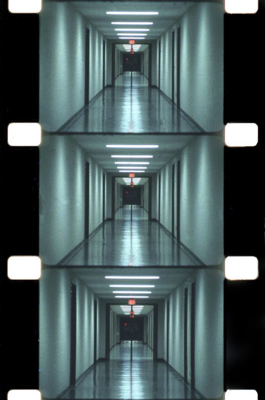
Serene Velocity, the name of a 1970 experimental film, that is anything but serene, showing different focal-length footage of a corridor and detailed in the same cinema textbook from which the first ever Boo Radleys mini-LP sleeve was purloined, has long been a fascination of mine, and I’ve always wondered how best to capture this feeling in one static, stand-alone image.”
“To achieve this on past artworks I’ve often used radiating lines and perspective; this time I added spirals and various bulbous creations too, using the ‘take what you can, and rearrange it’, maxim of the Boo Radleys, to mash and mesh it up even further… so for Keep On With Falling there’s a beatific tumble through the distorted vegetal borders of Giant Steps, orange or black on that sleeve, now turned white-hot and mangled up until it looked like it felt right to me.”

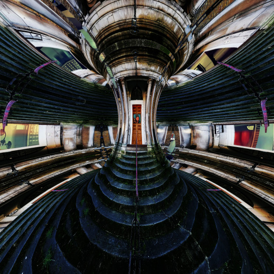
He continues, “The back cover art source is a side-entrance of St. Mary Magdalene on London’s Holloway Road, turned inside out until it looks a bit like a spaceship interior, or maybe (spoiler alert) like something I saw once in Episode 17 of The Prisoner. I think also it suggests a rather more restful scene than the front cover art, and soothes the eyes if you’ve been looking at the front for too long. Which I hope you do anyway, of course!”

Keep On With Falling by The Boo Radleys is nominated for Best Art Vinyl 2022 Artwork by Stephen A Wood
0 notes
Video
QUICK Change record cover display installation!
We knew our frames were quick to change but not that quick! Here we are creating the #BestArtVinyl2022 Nominations Wall at The Collection & Usher Gallery Lincoln. This installation forms just part of the Album Artwork Through the Ages retrospective exhibition. Find out more..
Art Vinyl comes of age and launches the 18th Best Art Vinyl Award - the annual search for the most creative and well-designed record cover of the year. The 2022 winning record cover design is set to join an archive of outstanding sleeve art from the past seventeen years, all of which is exhibited at special anniversary touring exhibition in conjunction with The Civic Barnsley, that spans seven decades of iconic album art, held at the Collection and Usher Gallery in Lincoln from 22nd October 2022 - 22nd January 2023.
The exhibition not only presents all 50 nominations for Best Art Vinyl 2022, but also an outstanding commemoration of iconic album artwork over the years taking visitors on a journey through the art of the album cover from 1949 to present day.


Spanning seven decades of popular art, music and design, the exhibition shines a light on the most iconic album designs in popular culture and explores the fascinating history behind some of the most renowned visual icons of our time. The result is a definitive retrospective of UK popular culture, one 12 inch at a time. The exhibition will include fascinating back stories for the creative process, plus a chance for visitors to capture the unveiling of this year’s 50 nominations for the Best Art Vinyl Award and even vote for their favourites.

VOTE for your favourite album art work of 2022. Voting closes 12 Dec 2022.
Founder of Art Vinyl, Andrew Heeps comments, “As an organisation, we made it our mission to bring back ‘affordable’ art via the ever present, and now hugely popular, Vinyl Record. That mission feels more accomplished today with over 200,000 opinions on contemporary record cover design, expressed and collected over the years to create our touring exhibition archive of the best in sleeve design for our unique Art Prize – The Best Art Vinyl Award.”
He continues, “Running this award now for 18 years, has been a real eye opener to the incredible talent of artists, designers, photographers and sometimes musicians that put their heart and soul into these artworks, that over time, become such personal memories for us all. A big thank you and hats-off to these often unsung heroes of popular culture.”

0 notes
Text
Uncovered: ‘Fever Dreams’ by Villagers
Written over the course of two years, Villagers’ fifth studio album Fever Dreams album cover was created by Brighton artist Paul Phillips. We were lucky enough to have a chat with Paul to get an insight into his inspirations and creative process for the cover art and accompanying alternative three record cover artworks.
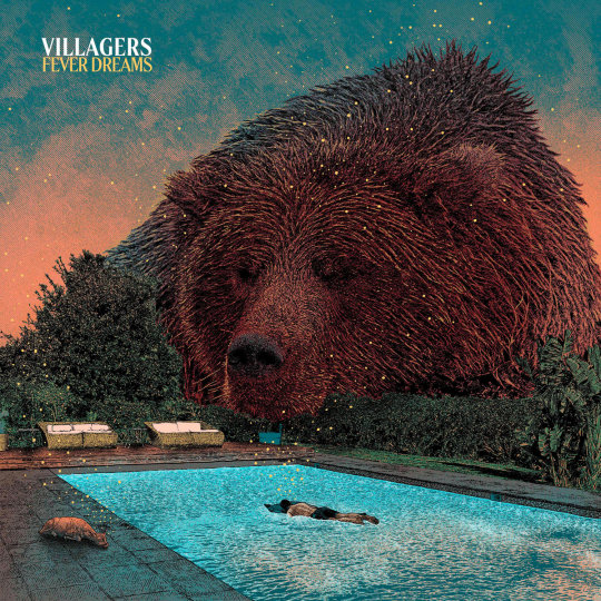
Villagers’ Singer/songwriter Conor O’Brien explains, “I sent [Phillips] about half the album I think, we discussed the themes and I told him I wanted something that reflected some idea of scale, especially in that song ‘Song In Seven’, where it’s talking about lying in the sea looking up at the universe, and thinking about the intellectual curiosity that that might inspire. Then he returned with that bear image and it blew me away instantly, because it connects with the Ursa Major constellation that is mentioned in one of the songs. Then he went and did the other three covers with the constellation idea and how we can put patterns onto our lives.”
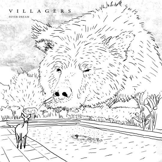
Paul Philips told us, “I was incredibly excited to be approached by Conor's team, I think it was Bart from Domino Records who made initial contact after Conor's management had seen my work and suggested me. Initially Conor sent me a few tracks and the album title which was 'The More I Know the More I Care' at the time which is a sort of totem that runs through the album if you listen carefully. Initially I came up with three sketches based on this a young child reading a book sat on a table in a library that’s filling up with water, a giant boy’s head poking out the sea with waves crashing against it, I forget that third idea but after some consideration Conor's team came back and said he had changed his mind with regards to the album title and it would now be called 'Fever Dreams' and asked if I could come up with some more ideas.”

Phillips continues, “The strongest idea that came from the new batch and the one Conor seemed to like the most was the Bear by the swimming pool, He liked the way it fitted with the theme of Ursa Major on the record which was serendipity as I had not made that connection myself. I had the idea through my love of playing with scale, I like themes of beguilement and being overwhelmed as I've struggled over the years with my own mental health and the subjects of anxiety and being overwhelmed are prevalent in my work.”
“Conor had mentioned he wanted the cover art to convey a mix of serenity juxtaposed with a feeling of threat. I started my usual creative process which is to repeated the concept in my head whilst looking at pictures, I will look through books and images online, not art but photos, travel blogs, nature blogs, typing random words into the search bar on Flickr and seeing what interesting images the world throws out at me, I then try to make mental connections between the image I see and the concept I'm repeating in my head, when I find an image where the connection works I save the image as a reminder, I collect a few images then I go back to them and play with them in photoshop, playing with scale and adding things that also connect with the themes until I find a composition that makes me feel good, I use this rough photoshop composition as a basis for the illustration. I felt a giant sleeping bear was perfect for this concept, I added the man and the doe to hammer home the scale of the Bear and then the yellow dots are the dreams themselves, I liked the idea of all three being asleep as if the image is a dream itself but its open to interpretation as to which one is the one dreaming it, is it the bear dreaming of a man and the doe or is it the man dreaming of the doe and the bear etc, I liked the playful nature of this idea and felt it was a complete piece of work as it connect with the themes on the album in many ways, which is always a goal I have in mind when creating artwork, I want it to connect and represent more than anything else.”
“After having completed the initial artwork and sending it off to Conor he came back with a lovely enthusiastic e-mail and wondered if I would do three more covers so we could make it a big project and have die-cut interchangeable sleeves, obviously I jumped at the chance as it was a bit of a dream job as a designer, Conor specified he wanted one of the images to be an Eagle in mid-air with someone on, I forget what this was inspired by but I thought maybe every image should be a scenario with an image that contains a fever dream of animals that are represented by constellations so I did some research and chose the Elk, and the Snake to go with the Eagle and Bear.”

“Then it was just a case of getting down to it and drawing them. It was a big project and some late nights were needed but I thoroughly enjoyed every second of it and have enjoyed a working relationship with Conor and his management on a few things since, they have been a pleasure to work with and Conor is a great client in that he knows what he wants but also gives you the space to find it on your own rather than trying to control every aspect, I guess the process almost became symbiotic which is great because it allows you both to get excited about the project which is a nice feeling.”

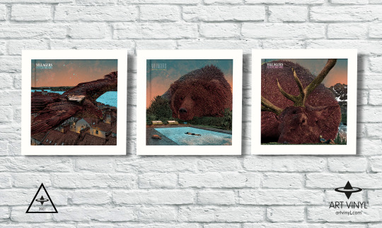
Fever Dreams by Villagers on Domino Records is nominated for Best Art Vinyl 2021 Artwork by Paul Phillips at True Spilt Milk Designs. Design by Matthew Cooper, assisted by Paul J Street.
1 note
·
View note