
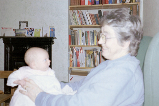
Last Seen Blogs


vampire-babe-forever-blog
BITE ME!

writinginabottle-blog
If not now, then when?

simsviolet
cc finds

thanhlapcongtygiarehcm
Nguyễn Thanh
Text
Exporting and Mockups

I exported the final booklet into a PDF.

I didn't need to worry about printer marks and bleeds as it's just a digital copy. Export as pages NOT spreads.
Turning the front cover into a mockup:

The original photoshop file looks like this, a mockup file from moodle.

On layers double click the transparent icon (smart object) box which will open the smart object into a new linked photoshop document.

The new document will look like this. COMMAND + O to open the exported PDF.

Select the first page (cover) and press OK. It will then open in a new document, the press CMD + C to copy in and then paste it into the linked smart object

CMD + S to save the document and go back to the original mockup file.

It should then be transferred to the mockup. I then changed the background to yellow to have a balance.
We then had to do a mockup of one of the spreads from the booklet. Using pretty much the exact same process.

CMD + O to open the PDF

Select page 6 for doing the mockup of the LEFT page (yellow submarine).
OK
COPY it into the smart object document.
Then do the same but for the RIGHT page (octopus's garden)

CMD + S on both of the documents and it will be linked to the original spread mockup:

It was overall quite fun to create the mockups. Its easy as the programs pretty much do it for you, theres no warping or adjusting size as we are using smart objects. There are plenty of design mockups online for free which is a quick and easy way to make branding/ designing more professional. I definitely would like to play around with other mockup templates in the future.
0 notes
Text
Final Assignment: Beatles Booklet


Overall really happy with how the booklet turned out. A super bright and bubbly design style which I don't usually go for but I'm glad I did because it was a lotta fun. Super nostalgic in someways too, I watched Yellow Submarine when I was real young and while I traced it I couldn't help but think of the movie.
Im happy with the style I chose, very commercial and minimalistic not using any outlines or strokes, just filled in shapes. It's super pleasing to the eye for its simplicity, very popular design trend at the moment. I reckon it works well for a children book as my illustrations are very clear and recognisable.
I'm also very happy with the colour palette, again it is so bright and bold that it's nice to look at, especially for kids. Blue and yellow are very popular with media targeted towards children e.g spongebob, minions, bananas in pyjamas, etc. I used very flat colours, and subtle gradients for the backgrounds.

0 notes
Text
ILLUSTRATIONS FOR BEATLES BOOKLET
Here I will be going over the illustrations I created for the booklet.
Started off by doing some small thumbnail sketches for ideas of layouts, and then started to create some illustrations for the booklet in illustrator.
Yellow Submarine:


Grabbed an image of the yellow submarine from google and traced it within Illustrator using the pen tool. Then separated it into different shapes using the divide path finder tool to get rid of overlapping shapes e.g the red.


Creating the railing using the rectangle tool and pen tool, then arranging it to back so it fits under the bottom shape.


Using the divide tool in path finder to remove overlapping shapes.

All the details done of the yellow submarine.

Created the weird telescope things sticking out but making it extra long. So I could adjust the size to suit the booklet as it will be layered under the submarine


Makes it more flexible and versatile for my booklet.
Some more illustrations I created for my booklet include:


Strawberry: Strawberry fields forever


Octopus: Octopus's Garden


Bubble: frame for text in Octopus's Garden


Sun: Here Comes The Sun
Overall had a lot of fun creating these Illustrations, the shortcuts and different types of points and pen techniques all came in handy while creating these. Mostly using simple shapes, the Yellow Submarine and the Octopus were definitely the most challenging for the amount of different shapes they use.
0 notes
Text
Reflection
Fundamentals class has taught me so many skills and I feel so much more knowledgeable about adobe products compared to when I started.
Out of all the programs I struggled the most with illustrator. The bezier curves and pen tool would drive me insane as I had only used the programme a couple times prior. I was never able to get the shapes I wanted and I tended to add an excessive amount of anchor points to simple shapes. But now every time I use Illustrator I feel like I’m improving which is a great feeling.
I have definitely improved the most in Illustrator. Understanding the bezier curves is probably my biggest accomplishment as I now feel confident in using all 4 anchor point types (corner, curve, hybrid and broken). I have effectively used them throughout this class in a tonne of different contexts.
One thing I would like to improve on is remembering and using shortcuts within InDesign, Photoshop and Illustrator. Toby has done a good job at training us to use these shortcuts but my brain is deciding to be stubborn, I just need to try force myself to use these shortcuts even If I need to look back on my Tumblr or even google them to figure it out which will take up some time but it would definitely be worth it in the long run. There are shortcuts for pretty much everything within Adobe to make the user experience more efficient. If I keep practicing I will eventually wrap my head around a lot of the short cuts. I have been good at pressing V to go to the selection tool, A to get to direct selection and X to swap between fill and stroke in Illustrator. A lot more room for improvement.
During the process of creating this booklet I learned a lot about exporting and mock-up templates. Paying attention to whether you want to export as pages or spreads, if it's going to be printed, check crop marks and bleed, etc. Much more knowledgeable about the properties of how to export and print documents.
I have also learned that mock-up templates exist and I love it. Found it quite easy as photoshop does it pretty much for you if you've downloaded a template. You just have to edit the smart objects and place your design over it and it will appear on the product. It’s so easy yet looks so professional.
My favourite task within the class would be the ‘Jumping Man’, although I wasn’t there for the class I was still able to check moodle and I got a classmate to help me out. I love the look of mixing photography with digital graphics/elements and I felt this task gave us the freedom and opportunity to put our own creativity with the prompt.
Another one of my favorites was the Beatles booklet I designed. Really helped push my understand of InDesign using parent pages, margins and collumns. Just had fun creating it using bright colours and making illustrations of the yellow submarine, octopuses, bubbles, etc. Very childish and had a lot of fun which was quite refreshing.
This task also helped me tone my skills of layer masking and introduced me to smart objects and linking a photoshop file with an illustrator file. I was stupidly happy with my final result of my guy jumping through space, entangled in abstract colours with 2 cats alongside him. It was a fun task where we got to use a lot of different photoshop tools which is a programme I was familiar with prior to this course.
Super happy with fundamentals as a class. It’s helped improve my understanding of adobe products which comes in very handy in my other classes. Definitely want to continue the skills I’ve learned in this class and expand more on it in my future design projects.
1 note
·
View note
Text
Handy Shortcuts
COMMAND + 2 = lock selection
OPTION + COMMAND + 2 = unlock selection
COMMAND + V = paste
SHIFT + COMMAND + V = paste in place
SHIFT + X = swap fill & stroke
shift - constrains
option - to/from centre
0 notes
Text
Creating a new swatch/pattern

Using this vector image I am going to create a pattern. Select the black and the vector image and then drag it into SWATCHES. This means it becomes a new fill colour


Create a blob and then fill in the object with the new swatch, you are able to move the shape around while the pattern stays in the same place.

Then double clicking the the skull in the swatches panel it brings up PATTERN OPTIONS and it shows various pattern tile types e.g 'brick by collumn'


Created a hexagon shape using the shape tool and filling it in with black. Then alt + drag to copy it over to the new shape and arrange to front. Then COPY the hexagon and SHIFT + PASTE it scale down holding COMMAND + OPTION and make the new hexagon with no fill and a 2 point white stroke.
Turn the new hexagon illustration into a swatch.


Duplicate the blob. Double click the hexagon swatch and go to TILE TYPE and select Hex by Row. This will make the hexagons aligned with each other rather tan stacking on each other.

Selected the fill colour and changed it to purple.

2 different variations of the same pattern
Turning text into a shape:


Select the text go to TYPE > CREATE OUTLINES

Then you can manipulate the shape and turn it onto a lil illustration/logo by selecting, adding or removing anchor points or shapes. I turned the 'O' into a happy guy by dragging the inner top anchor point down and adding 2 circles for the eyes.
0 notes
Text
InDesign
Tool Commands:
V: Selection tool
A: Selection tool
Z: Zoom
To exist text edit mode clock outside of text box


We created a full page text box, stretching it out to the margins. And then created a BODY TEXT PARAGRAPH STYLE and changed the font, size and leading. Then changed the font size to 10 and leading to 14 to have good readable text.

Then click the plus icon on the tool and this created a paragraph style 1. Meaning with the selected text that uses these specifics it will turn it into a preset. Easily being able to switch between different paragraph styles.


Then we worked on creating Body Text Headings. Fixing the structure of the place holder text we added headings at the start of each paragraph. Highlighting the heading it and changing the specifics to size 14 with a bold weight and a 16pt leading. Then make it a new style.


We then created another paragraph style, but instead of changing the size, we made it italic. I selected some parts of the body text and applied it.
After creating multiple headings within the document using my new paragraph style it gave it a much better looking structure.

We then went to layout > margin and columns. Added two columns for a more balanced structure.

We then went into moodle and copy & pasted some text to use as bullet points.

Creating a bullet point paragraph style using a similar process.


We downloaded an image of a from and opened it in photoshop and put it into InDesign. we messed around with it in photoshop and then switched to InDesign but the frog didn't update the changes. Once you refresh the link in the links panel it then appeared.


Then learned about the difference between image frames and the image itself in InDesign. you can move the image around the frame, with the frame staying in the same place, which usually leads to some of the image cutting off. However if you SHIFT & COMMAND you can drag or resize it without cropping anything off, treating it as a group.

Then we resized it to a suitable size. Here it is overlapping and cover the text which is not good.
We made a text wrap around the image so the text will work its way around it.

Here there is a 3.5 mm boarder on the right of the image, as thats where the text originally clashes.

Here the text is able to be aligned next to the image, rather than going through it.

Then did the same process but this time giving it a circle image frame. There is an option for text two wrap around circle frames which is helpful.

The final product:

Overall found this task quite difficult, there are a lot of steps to go through when creating an InDesign document. Changing all the various presents with paragraph styles, headings, bullet points, etc was quite tiring but I can see that it would be very helpful for creating multi page documents. Easily being able to swap between various text sizes, weights and leading. I hope once I use Indesign more I will feel more confident with the program.
0 notes
Text
InDesign Week 2: A-Parent
Creating an A5 booklet, using A4 horizontal sheets. You can fit 4 pages on 1 sheet.
Creating a booklet with 8 pages, using 2 sheets of paper. This document has a front cover, 3 spreads and a back cover.
We then made a text box with the word 'front' and you can enlarge the font by dragging the text box while holding SHIFT & COMMAND to make it whatever size you want. Did the same for the back cover.


We then created headings, we had to select the parent page option under pages. Doing this will apply the heading to every single page on the document, you are unable to edit it unless you are editing through the A-Parent.


Then creating page numbers under the A-Parent option, applying to all the pages. Note: If theres are pages you don't want the parent to apply to, just drag the none option (e.g. front and back cover)

A page spread using the A-Parent applications, applied to all the spreads in my booklet.

At the moment every spread has page 1 on the left and page 2 on the right which doesnt make sense for an 8 page document. However if you highlight the page number and go
Type > Insert Special Character > Markers > Current page number
It will apply the correct page numbers according to the spread document itself.

Then made the page numbers smaller as it's not that important for the reader.
Creating Margins and Columns:


Having the A-Parent selected and then going to Layout > Creating Margins and Columns. Made the margins 22mm and added 6 columns.

Filled in using place holder text. You don't have to stick logically to columns e.g having 6 columns doesn't mean you need to have 6 seperate columns of text/images. You can turn them into thirds, half them, go from margin to margin, it's versatile.

Overall a very useful task. The A-Parent page is very helpful and efficient, saves a lot of time to apply, headings, page numbers, column and margin layouts to multiple pages in a book, rather than doing each page individually.
1 note
·
View note
Text
2nd Illustration

Found this sketch in my book from last year and decided to recreate it as a vector illustration


Recreating the old colour test screen TVs used to use. Making lines and alliging them as rows and then adding collumns.
Using the divide pathfinder tool to remove shapes bleeding off the subject.


Using the command 'X' to switch between stroke and fill


Filling in the boses with colours and shades of grey


My 'final' illustration of this TV guy. It is very rushed as I am not the best with time management. I really like the illustration but there's definitely a lot more i could add e.g shading and gradients, as the character feels very flat. I will probably continue the illustration in the future outside of class because he's a pretty cool guy and deserves to be better.
0 notes
Text
Illustrator Skills Show & Tell


Started off by drawing a simple skull using a mix of curved and angular lines. Then had to mark where I believe the anchor points would be. The bigger the curve, the bigger the handle would be.


I then scanned in the drawing and used the pen tool to outline the base shape of the skull (cranium and jaw). I used a mix of different anchor point types to show contrast between shapes while creating this skull, and to overall understand them better.
Here are my examples:

Then worked on the details within the skull using curve points:

Used curved points for the eyes and the nose. I made the eye sockets by using the shape ellipse tool, then using the direct selection tool to change the handle size to have more of a defined shape. I also used the same shape we learned in 'week 2 curves' for the nose, holding shift while placing the anchor points to keep them at the same horizontal angle.


Creating the teeth was fun as i got to be loose with them, just creating rough, oval, lop-sided shapes with various sized handles. The imperfections are what makes it look natural and less corporate. Wasn't really tracing my original drawing for this as I felt I didn't need to.

The end result of my vector outlines. Next I had to turn it into proper shapes. First i gave the base shape of the skull a white fill with no border.


Using the path finder tool I could use the 'minus front' option while having the top layers selected (skull details e.g eye sockets, nose, indents) and the bottom layers (skull base shape e.g cranium and jaw). This pathfinder option will then stamp the top later paths through the bottom layer. Creates a good positive and negative space contrast, with the background colour being the skull's details.


I decided to have the skulls teeth to be purple as I thought it made the image a bit more unique, as skull drawings/images are often overused on platforms. I then decided to give the skull an all seeing eye to add more appeal to the illustration, using the same purple on the eye to match the teeth.

I made an oval shape and then layered 3 ellipse shapes inside the oval, changing the colour and handle size of each circle. This made the eye look a lot more hand made.


Overall very happy with the design.
On the original sketch drawing I was able to understand and pin out all 4 types of anchor points: corner, curved, hybrid and broken. Although, a lot of my handles are pretty off. Definitely something I could have done better on. While make the skull shape in illustrator I found it had the best effect by making the top anchor point have excessively long handles. There were also a couple misplaced anchor points through out my illustration compared to my original sketch. But I feel the more I use the pen and anchor point tools, the more I understand it's theory. I also faced a lot of trial and error trying to remember how to create a broken anchor point (for where the jaw meets the skull). I managed to get there in the end.
Using illustrator I found the various shapes quite easy to make, I did use a descent amount of "command z's" while making this but the shapes were fairly simple overall. The teeth were surprisingly easy to do as I wasn't worried about imperfections, I feel if I was that task would have been a lot harder.
If I were to do this again, I would try challenge myself more by creating more gritty edges in parts of the skull, rather that it being just smooth lines. That would mean i'd be using more anchor points for little details but I think it would have a much better effect. On the design brief it did say to use as few anchor points as possible. I'd like to work on my understanding of anchors and their point handles, just to know exactly how to put them without any trial and error, as it would make design processes a lot quicker.
1 note
·
View note
Text
Jumping man
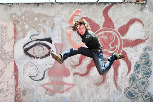
Composite image creation task. We have been tasked to edit an image of a jumping man. First we had to select the man to be seperate from the background, which was a similar process to what we learned last week using the layer masking tool. Firstly I used the object slection tool, but it is not the most precise and it ended up cropping an arm off and attached some of the background to the man. Had to fix it up a fair bit in the masking to get the man selected.

Cutting him out of the background was a massive struggle considering the shapes complexity, but once I got into the groove of it, it became quite easy. To cut him out (using the layer mask filter) I used a mix of the pen tool, polyagonal lasso, and brush - To either mask or unmask parts of the original image. I definitely could have put more time into the cutting to make it cleaner.

For outlining hair I had to use a mix of oppacities to make it look natural, since a lot of the hair isnt a solid colour/shape as it thins out into the background.
After he was fully selected (took a very long time) we then exported and linked the selection to illustrator and drew a backwards 'S' shape over the man. Then once we saved the file in illustrator it would then update the file in photoshop (linked), meaning we could see the edits done from illustrator, in photoshop.

The shape was infront of him, but I wanted the effect of it wrapping around him. So o then selectected the part of the 'S' that overlaps his waist and then masked it. I pushed the original shape under the 'jumping man' layer. This made the area infront of his waist visible with the other two over lapping segments behind him. so it looked like the shape is wrapping around him. He was inbetween two layers, the part that overlaps his waist (top) and the rest of the 'S' (bottom).

I then begain editing the 'S' in illustrator, it was originally a path with a stroke, but i decided to be different and swap the stroke with the fill to give it a more abstract 'S' shape. I decided to go for pink and blue for a more retro colour pallette. Once I'd save the file in illustrator, it would then update it back in photoshop.


I added a gradient on part of the shape to act as a hole/shadow for where the mans leg is sticking out. Played around the the colour intensities and layout of the shapes (circles and lines) to have it be more balanced.
I then added a hyperspace backdrop to show the messy chaotic abstract theme of the piece. Blends futuristic and avant-garde elements together.

Also did the same layer mask effect to cut out the cats, as the task said I had to add two other images to the project. (cats were a good choice)


Used the objects selection on the first cat, the edited and cleaned it up under layer mask.


Used good colour correction to fix up the edges of the cat, like I learned in last weeks class. I used a low opacity brush using the average colour of the orange cat to cover up the harsh, dark brown edging of the cat that occured from the object selection. Also used the polyagonal lasso tool to select the cats whiskers. Not the most realistic but the cats aren't the focal point of the image.
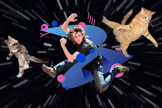
I moved the cats to wear I think is fitting and then used the smudge tool over the cats to make it looks as if they are getting sucked into hyperspace.
Had a lot of fun creating this, learned heaps. I had no clue you could link layers from illlustrator to photoshop. Also the simplicity of overlapping shapes to complicated images is very good to know. This style can come in very handy for creating bold posters or graphics. I'm happy with the outcome. This man is going on a spiritual journey like no other.
1 note
·
View note
Text
Selecting and Masking
In class we learned about selecting and masking objects. Separating objects from the rest of the image.


First we made a copy of the original boat image, put a layer mask on the top layer and made the boat seperate by masking it using a mix of the lasso and brush tool.
After cleaning it up through different different opacity brushes and getting some finer edges we had the boat seperate from the top layer. Could then move and scale it where ever we wanted on the water. The boat was successfuly selected and masked.


For the fruit bowl we duplicated the layer and used the object selection tool and photoshop automatically selected the fruit I clicked on (e.g the orange). I then edited the selection to make it cleaner through layer masking it (adding/removing other fruit that bleed through the selection). Once the selection was separated (layer masked) we could then adjust the hue of the selection, in my case i changed the hue to purple. Then used the same process for the other two fruits. The melon, i selected it entirely using the pen tool and turning it into a selection.

For the succulent we duplicated the layer, masked it and then used the pen tool to outline the 5 succulent leaves.

The pen tool helps with getting clean curves (works pretty much the same as illustrators pen tool). Then once I turned the path into a selection I was able to adjust the hue, giving it a red-maroon effect.


Overall found this task challenging, but I learned a lot of skills around selecting and masking. I used to just use the polygonal lasso tool over an image and the 'command J' the selection. This is definitely a much more professional approach. I am keen to practice this selection technique in other contexts as I've found photoshop is very handy for it. Next up we had to seperate the humming bird from the background

For the humming bird we had to use various selection tools as it's a complicated shape. Mainly used the pen tool to create a path around it. While selecting it I had to use the pen tool to cut shorter in the wings as theres no sharp edge to the original picture.


I then used the blur tool to create a moving effect.

Once it was fully masked I copied it onto a new picture with a flower too look as if it's drinking it's nectar. I then locked the humming bird selection to draw on it. Used a soft low-opacity brush and used the colour picker (eye drop) on the background and used that colour to brush on the edges of the humming bird. This makes it look more like the bird is naturally in the photo using the natural colours in it's environment to reflect off the edges of the bird.

Happy with how the picture turned out, I would not be able to tell this was a collage of two seperate photos. If I zoomed in to the birds tail I could tell it didn't look completely natural, but I doubt any normal person would study this image that intensely.
Learned a lot more about layer masking and using the pen tool in photoshop. The blur tool is also very helpful for this task. It's interesting to see all the different tools you can use when manipulating the edges of a subject for masking e.g pen, brush, blur, sharpen and lasso. Definitely will need to take this into practice for future projects within my course.
0 notes
Text
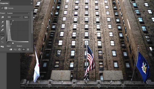
Fixing over + under exposed photos. The task was to choose to photos that need fixing up through the curves tool in photoshop (2 black/white and 2 in colour).
So typically under exposed photos have barely any light so the brightness will lean to the left side of the graph (black). Whereas over exposed photos whave little darkness so the brightness leans to the right of the graph (white). - As shown in my examples.
For this photo I had to balance the darkness with more light, I made a pretty steep curve on the left to make the coverage cross over with the curve. Definines the lights, lowering the shadows and increasing the highlights + mid tones.

The second photo I had to add more darkness for balance. Looks like the photo was used with a flash so it was sorta difficult to balance out the harsh light. I decreased the higlights and increased the shadows. I also upped the saturation to show a bit more contrast between the colours.
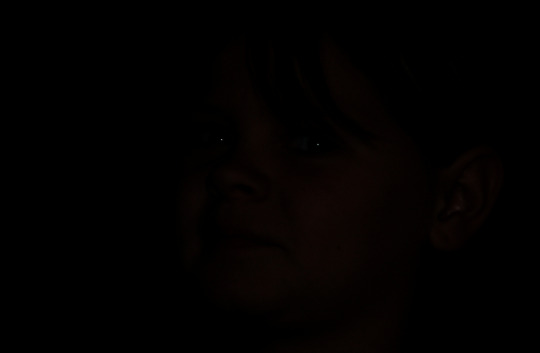

This photo was VERY under exposed to a point where you can only see 2 dots (the reflection highlights in the boy's eyes). I had to move the top right point all the way to the left right before it meets the coverage (moving from extreme darkness to extreme brightness). Then make a sudden vertical drop to get all the light in the photo be visible.

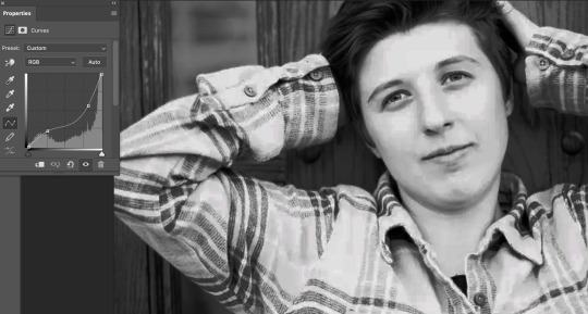
This is a quite an over exposed photo, but there's still a lot of darks in the backgound so the curve does not need to be very steep. I downed the whites a bit and darkened the blacks, creating one small curve on the left and a bigger curve on the right. It was easy to tell when to stop with the curves by looking at the details in the face. Got a good balance between the bright and darks.
Overall a learned a lot from this task, definitely understand more about colour theory and lights vs darks. A lot of it is trial and error which is good as you learn what works and what doesn't. Eventually I should know what type of curvature to use just by viewing the image and it's graph coverage.
0 notes
Text
Week 4: Photoshop
We have been working on adjustment layers in photoshop. We primarily focused on curves, hue/saturation and colour balance. Colour theory was very important in todays class e.g understanding the relationship between warms, colds, complementary colours, etc.

Curves is useful for correcting under or over exposed photos, messing with the blacks, whites, darks and lights. Much more range and versatility than using the brightness tool.


This was the first image we looked at, goal is to bring back life to this faded/over exposed image. Using the curve tool. I brought the bottom point to the left edge bottom of the mountain of coverage, then gave a slight curve to the top right. This enabled it to focus on the blacks being darker and the whites being brighter. Creating a much cleaner sharper contrast.


The Cat was originally a very under exposed and dark photo. Using the curves tool brought the points over to the left to make it brighter, making more whites than blacks. I had to be careful not to make it too bright so I can still see the fur textures in the face which has some shadows. Very successful with this one as the whites arent over powering the blacks, showing good balance.

Hue/Saturation is useful for changing the strength of colours and the position of colours in the spectrum. Good for photos taken in different moods, changing foggy to sunny or night to dawn, etc.


Used the hue/saturation to fix the photo of the villas, originally a very low contrast foggy photo. I played arround with the curve tool a bit to up the brightness (decreasing the shadows). I then added more saturation and lightness to eliminate the dull colours. At this point the vilas were looking too bright/warm so i put the hue down which balanced it out with some green. Making the image looks more realistic.

Colour Balance is useful for changing the relationship of complementary colours e.g cyan over powering red or vice versa. Can be applied to shadows, midtones and highlights.
It's all about balance e.g strengthening the warmer colours to battle the colder colours through the colour balance adjustment. If the image is bright, add some darkness. If there's over powering magenta, add some green. If the colours are dull, add some saturation.


Here I used colour balance on the shadows, midtones and highlights. For the mid tones and shadows (ground and mountains) I pushed the red higher (cyan<red) which helps give the image a warmer tone - For the highlights I pushed the yellows, helps making the the blues brighter (river and sky). Overall turned a cold image filled with blues and greys into a warmer image by increasing the warmer colours to balance it out.


I messed around curves and saturation and hues to show more contrast between the different colours of the image. This image has a very warm tone so I used a bit of everything to balance it out. I increased the colder colours through colour balance. Decreasing the yellow to add more blue in the grass, tree leaves and sky which is needed. Added more darker tones in the shadows to show more contrast of the tree trunks, pavement and the person on the right.
This is a fairly complicated image so I really enjoy the trial and error aspect of it, experimenting until the colours work well together and then learning why they work together. Found the last image the most difficult as i couldn't quite get temperature down without making the greens unrealistically blue. But i got a more subtle balance out of it.
Definitely need to practice with these adjustment options in photoshop. Very helpful for understanding colour theory, contrasts, balance between lights and shadows, midtones, highlights and hues.
0 notes
Text
Week 3: Penguin


To start off the creating the penguin, you use a base shape (just like drawing on paper). Remembering to not use two many anchor points, don't wanna over complicate simple shapes other wise it may warp after adjustments. First we started off the a perfect circle, cut it in half, duplicate it, flipped it vertically and pulled the top layer up, keeping the two halves aligned, command J'd them to connect them together.
Added another anchor point in the bottom right and pulled it further to the right to create tail like-look.
Added more anchor points to the tail and warped them to look like feathers. Added a beak, rounding two of the edges (selection tool). Created the wing as an open shape (command click off the shape without connecting it up). Added to elipse tool shapes to act as eyes. Strengthened the stroke.


Creating the feet was challenging, a lot more steps than what I thought there'd be (badum tss). After creating the first shape, we then duplicated it and flipped it vertically. The using the join command (command + J) which joins two anchor points together. The creates it into a whole shape as you can see on the second image.

The eye was fun to play around with. First time using the gradient tool in illustrator and I feel I understand it well. Tried out various different gradient colours and tensity, this one was my favourite, it set the colour scheme for the rest of my penguin (violet, purples, blues.) I decided to add three colours rather than the standard two to be more visually interesting. I can also adjust the distance of each colour by clicking and dragging either direction.


Created an underbelly for the penguin using the pen tool, the option click command for the top right were handy for the triangular points. Using the fill command I put in a lighter lilac type of colour to be the belly. I made the path outline of the belly join the segment outline of the penguin.
For the shadow I made a shape with multiple sharp points (option click). Just used a low opacity dark grey fill with no stroke, he layer is under the black outlines but over the body colours. Connected it to the outline segment.
The option click is very handy for these type of shapes, feel like I understand illustrators pen tool more.

Overall had a lot of fun creating the penguin. Experimented a lot with bezier curves to create complicated shapes. There were plenty more steps with creating this penguin, took a long time but definitely worth it. I'm proud of how my little goth dude turned out.
I know feel confident with:
Flipping shapes
Add / remove anchor points on a shape
Stroke Properties
Filled shapes
Compound Paths
The pathfinder tool
Layers
Gradients
Colour swatches
Global colours
Group and Ungroup
The colour tool and shape opacity
Adding points to paths
0 notes
Text
Vector Replication
In class we worked on vector replication. We paired up and gave two vector images for our partners to create two vector drawings.


For the drink I found it fairly easy to replicate the image. It's mainly made up of straight lines with geomentric angles. I used the original raster image as a reference and pretty much traced over it using the pen tool in illustrator. I've used the polyagonal lasso tool in photoshop a lot in the past so this concept was not too hard. I was able to 'alt J' the reflection lines to duplicate them and then change their size since they go at the same angle.


This image was much more difficult as it's mostly made up of curves. Went through a lot of trial and error to create these curves. A lesson learned from this experience was to not add more anchorpoints, the simpler the shape, the better it will look. The rocket dome shape only has 3 points (one at the top and two at the bottom - like a triangle). I could have perfected the circle windows more to make them more symmetrical by evening out the handles. Overall I am really happy how it turned out. A much cleaner look to the orginal raster image.
0 notes
Text
Comms Week 2: Curves in Illustrator

Moving from straight lines to curved line using vector shapes in illustrator.
Understanding Bezier Curves. A standard bezier curve will have a segment (the path itself), two anchor points (one at each end) and two handles (one attached to each anchor). As shown in my diagram above.
Basic Curves: Multi-arc Curves:


Learned how to create curves in illustrator, using these curved drawings I made in my book as a guide for making them in illustrator, I drew the handles as well for even more guidance. Struggled a fair bit with these as I have not used Illustrator much before.


After the single and multi-arc curve task I felt confident about trying the closed curves task. Struggled a little bit but overall it went quite well. All about making sure you have the right balance. These shapes were all symmetrical so checking the distance of the anchor points and the size/angles of the handles helped me be more precise with my shapes.
Also created the four different types of anchor points.
The corner point has 3 anchor points with no handles or curves. Holding shift when dragging the line will set it to a preset angle which is helpful for precision.
The curve point can be done with just two anchor points (like i did in the single arc exercise) but having a third point is easier for a symmetrical curve.
The hybrid anchor can be achieved by making a single arc curve and then before releasing the click, hold option and it will create a straight line you can angle in any direction.
The broken anchor point work well for precise particular shapes. Similar to the hybrid anchor you hold option before releasing and instead of creating a straight line, you can curve it before release. Then you can adjust the handles without worrying about it warping the opposite handle.
Definitely feel more confident with using the pen tool in illustrator, I know this course will require me to use it a fair bit more in the future and this was a crucial step for it.
A handy guide on how to control the four anchor point types:

0 notes