
Don't wanna be here? Send us removal request.
Statistics
We looked inside some of the posts by astingoliviahammond and here's what we found interesting.
Average Info
Notes Per Post
1
Likes Per Post
1
Reblog Per Post
0
Reply Per Post
0
Time Between Posts
2 days
Number of Posts By Type
Text
17
Last Seen Tumblr Blogs


Fun Fact
In 2020, 44% of users from Denmark used Tumblr daily.
Text
Book Cover

For my book cover, I transferred the plan one I did on Procreate to Photoshop to finish it off. It had a plain background before, and that made it look flat and not overly interesting, so I added a repeating pattern of crosses in a pale colour just to add something and it does make it a lot less flat. I couldn't really remember how to do the pattern thing on Photoshop, so I had to get some help with that from one of my teachers. It's not brilliant, but I don't think it's awful. I've done a book cover design before a couple years ago and I didn't really like that either, I find it hard to make them look good. This probably could've done with a border of some sort, but I wasn't 100% sure about it when I tried it while planning.
0 notes
Text
Adding The Poster

Once everything had been stained, I had to decide how I wanted to lay the poster out placement wise.


I used some little pins and a small hammer to attach the poster to the wall. I made it look like it had torn through on one side so that I could have it at an angle instead of perfectly straight.
0 notes
Text
Aging The Scene


My teacher made this little platform for my dog to go on. I had to age it in a similar way to how I aged the dog's box, using a scalpel to carve away areas of the wood and to out scratches into it. I also used a hammer to round the corners and put marks into the wood to add to the aging of it. This is one of my favourite things to do as I think carving into the wood is fun.


I then used graphite and coffee to stain the wood, it needed quite a few coats of coffee to get it to more of the colour I wanted it to be. I'm not a huge fan of using the graphite as I always accidentally get too much on the brush and then one area is much darker than the others, but it does bring out the scratches more so that's a plus about using it.


I kept building up the layers of coffee till I thought it was dark enough. I could've added some red paint to be blood stains, but I forgot about it.
0 notes
Text
Posters/Scientist's Notes


I found this diagram of a greyhound-type dog and drew over it to make it look more like my model. I did this so that I could print it somehow and add it to the small scene the dog will be in.


I added the details of the model to this drawing to imply that the scientist that made the dog had plans for what they wanted it to look like (including the gory parts). I also sketched out a breakdown of the mechanical eye, so that that could also be on the wall (I didn't get to do that though).

I used the laser cutter to engrave the dog drawing on some paper, these were the second attempts - on the first ones, the drawing was too grey, so when we tried to print them it was barely visible. I think these look quite nice, even if they aren't perfect (but that does add to the aging of it).


I tested aging the smaller one before doing the bigger one that I wanted to use. I just used coffee and sandpaper to stain and rip the paper. The brush that I used still had graphite on it, so it made it come out more grey than brown in places.


I then moved on to aging the bigger one, making sure to clean off the rest of the graphite so only the coffee colour was put onto the paper. I quite like how this turned out and the brown colour of the engraving makes it look like it's old already.
0 notes
Text
Book Cover Plan

I sketched out a rough plan for what my book cover could look like. This is quite simple and I'll probably try to make it look more interesting for the final thing.


I cut out the dog and its box from a picture I took to see what it could look like with the actual model. I also found a title font on DaFont that I think fits the theme/time frame.


I then played around with colour overlays and different saturations on the image, as I wanted it to have a darker feel to it. I changed it to more black and white/greyscale to see if that would look better, and I'm not really sure. I also added some red to the title to be blood and made it so it was white and grey instead of just white, so it kind of matches with the cushion. I'll have to take better pictures of the model so it looks a bit more professional, but I think this is okay for an idea/visualisation.
0 notes
Text
Painting the Model (Part 2)


I then started painting the ribs and adding the blood. I used white paint at first for the ribs but then decided that it looked too bright and unnatural, so I mixed in some yellow ochre to make it a bit more bone-like. I mixed up some red, black and brown to be the blood colour and added that around and on the ribs and in the flaps of skin on the back/spine.


I started working on painting the mechanical eye (which I wasn't overly happy with after the first attempt/coat, but I ended up adjusting it later). I then painted the real eye and added a slightly darker colour around the eye and other areas just to shade it a bit. I also added more blood to the rest of the body and around the scars/stitches.


I then watered down some brown paint and used it to darken the colours of the whole model (I used a bit of paper towel to lift the colour off so that it didn't end up too dark). I think this makes the dog look a bit grosser/realistic and dirty - especially on the white/lighter parts of it as they looked a bit too clean for what I wanted.


This is the final look of the dog inside of the box/bed. I'm so proud of myself and how this turned out. I was able to do basically all of this by myself with little help from my teacher, which is a first as my previous sculptures I have had quite a lot of help with. I've taken the things I learnt from previous projects and was able to use those skills to be almost fully independent for this project.
0 notes
Text
Painting the Model (Part 1)


I started painting my model up, using a mixture of yellow ochre, brown and white to try to match the colour of my friend's dog. It ended up looking a bit too light so I added a bit more brown to make it a bit darker. I only painted the face, body/torso and left foot in this colour, as I wanted to paint the other legs and the tail other colours to show that they came from different dog breeds.


I then painted the folded ear a dark brown colour (as I wanted it to look like this also came from a different dog breed). I painted the tail in the same colour as the ear and I painted the back left leg a light grey, both of these I hadn't planned colours/patterns for so I just chose colours I thought would work well with the other parts.


I made the front right leg black and white, just to be a bit more interesting. I then painted the back right leg white and added black spots to it, I think these legs are the better looking ones and look a bit more realistic than the other two.

I used black paint to colour the nose and the lips/around the mouth, using the picture of my friend's dog to go off of.
0 notes
Text
Finishing Sculpting and Baking


I added stitches to the top of the dog's head, where I imagine the brain being replaced and I added some to the other back leg. I forgot to add stitches to the chest where I wanted to imply that the heart/other organs had been put in, but that should be okay and it's not too big of a deal.


Once I was happy with the sculpting and felt it was complete, I put it in the oven to bake. I think I put it in for a total of 5 and a half minutes - I put it in for 4 and a half minutes at first and then thought it needed another minute to finish it off. All I have to do now is paint it up (I'll have to be careful when painting the ears so that I don't accidentally break them.
0 notes
Text
More Fur and Mechanical Eye


I continued adding the fur texture to the rest of the dog's body. On the dog's front right leg, I wanted the fur texture to seem a bit longer so I used the same kind of technique that I used on the tail. It was slightly difficult to add the fur texture to the paws as I didn't want to squish the toes together too much while doing it.


I then started trying to make the mechanical eye, which I was unsure of how I would go about it. I tried using grey sculpey for it, but it proved too hard to work with so I changed to pink sculpey. My teacher helped start me off with the eye and I then took it from there and made it look as close to how I wanted it as I could get it.


I added folds in the skin around the eye to maybe imply that the mechanical eye was implanted and is a bit too large for the face to hold properly. Once I had the eye done, I continued adding the fur texture bringing it up the neck and onto the face. I found the process of adding fur to the model quite relaxing and it made it feel more alive as I worked on it.
0 notes
Text
Paws and Fur Texture


I decided to add some paw pads to the back feet as they hover slightly because of how I did the armature. I thought this would be a cute addition that will only be seen if the model is picked up.


I got some help with sculpting fur texture on the tail (which turned out to be similar to how I sculpted hair on my last project). I wanted the tail to look fluffy instead of being like a typical greyhound's tail as I wanted it to look like it came from another dog (fitting with the Frankenstein theme). I also added some stitches with thin sculpey and used a thin pointy tool to make little holes to imply that the stitches are actually inside the dog's skin.


I then started adding some shorter fur texture on one of the legs as this makes it look like a dog and not some kind of smooth-skinned weird thing. I also added some stitches to the leg too, as I plan to paint this up with spots like a Dalmatian's leg.
0 notes
Text
Spine & Ribs


I added a strip of sculpey to the dog's back in preparation for sculpting the spine as I wanted to have a raised spine to make it look more unsettling/creepy. I started marking out the vertebrae and at first they looked very boxy and even more unnatural than I wanted them to be. I rounded them out to make them a bit less harsh.


I then cut down how much the vertebrae came out of the skin, just to make it a bit less extreme. I did then have to reshape them, but that wasn't too much of a problem.


I rolled out a bit of sculpey and made the rough shapes for the ribs. My teacher then gave me some advice about making them look a bit better and more realistic (as well as giving some tips on how to make it a bit more creepy by having the skin peeled up around the ribs and at points on the spine/back). I flattened the ribs slightly to make them less rounded and added a few notches and marks on the spine.
0 notes
Text
Sculpting The Ears & Adjusting Shape


I added some more sculpey to the chest and around the tops of the front legs so that those areas look a bit more realistic. I then started sculpting one of the dog's ears (the one that I wanted to be standing up). The first try (left image) I didn't really like the look of , so I tried again and got a shape I preferred.


I then attached the ear to the dog's head and shaped it to look like the reference of my friend's dog I had open. I flattened and pushed parts of the ear to mimic the actual dog's ear.


I then made the second ear, I tried to get it roughly the same size as the first one but didn't bother trying to do details as I folded it over. Doing this, as well as having the plan to have the eyes be different to each other too, meant I didn't have to worry about getting them to look perfect and symmetrical (it also lead to quite a sweet design).


I started shaping the normal eye first as I had a rough idea of how to do that from previous projects. I started with a small ball of sculpey and added it to the face, smoothed it into the head and then used the clay tools to sculpt out the eyelids and eyeball shapes. Once I had done that, I added some more sculpey to make the dog's jaw more jaw-like and realistic. I then marked out the nose shape and gave the dog a mouth.
0 notes
Text
Starting Sculpting


I started the armature, using the things I had learnt from my previous armatures - this meant that I was able to make this armature by myself with no help from my teacher. I was looking vaguely at pictures of dogs lying down, but I couldn't get it exactly accurate to those.


I tested to see how it might sit in the box throughout the different stages of the process, just to make sure that it would be able to sit properly. Once I felt the wire portion of the armature was done, I started covering it in masking tape (I didn't use any tin foil for this, as it's a bit too small and adding that would bulk it out a bit too much for what I want).


I then started adding the super sculpey to it, not really worrying about details or anything at this point as I just wanted to get it all covered. I'll have to thin some of the legs, add more sculpey to the head and other areas just to make it a bit more realistic (and to give myself more to work with). I'll have to get some reference pictures soon so that I can get the parts looking the way I want.
0 notes
Text
Aging The Cushion


I cut a bit off of the fabric I had used to make the cushion and I tested using paint to stain the material before I did it on the actual cushion. I quite liked how this looked, so I went on to do it on the proper one.


I used grey, brown and yellow paint to add the stains to the cushion, I think these colours not only show it's old but it also hints that the dog maybe had dirt on it when it goes on it and that it maybe had a few accidents on it. I also added some blood stains, as the dog would probably have weeping wounds from all it's different attached appendages and stitches.
0 notes
Text
Making A Cushion


I wanted to make a cushion for the box so that the model has something to sit on. I was given a few colours of fabric and I chose this striped one and a little patch of red as I thought it would be a good combination (and one of my classmates said the black and white is kind of reminiscent of Frankenstein).


I used white thread to sew this all together, I quite like how it looks on the red patch (I also like when stitches can be seen, and I think it works here as it gives the idea that whoever made the dog had to sew on the patch themselves). I did the first side with I think a ladder stitch, although I'm not sure I did it right or if that is what it's called. Doing this left a scraggly edge, which I quite like. I then flipped the fabric inside out and continued sewing that way so that the longer sides had clean stitches, which made it look a bit nicer than having all the sides be messy.


Once I had done all but one of the sides, I put the stuffing in. I made sure not to put too much in, as 1: it's only a small cushion so it wouldn't need much and 2: I think it adds to the old-ness if it's not really plush and full. Finally, I sewed the last side up using the same stitch I used on the first side so both of the shorter sides have the scruffy edges. I checked that it fit into the box at the end, and it fits basically perfect with small gaps either side.
1 note
·
View note
Text
David Carson
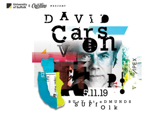
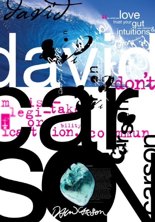

I'm not a huge fan of how messy these designs look, I think they're a bit too busy and the text is quite hard to read for some of them. This style probably appeals to some people and maybe in some advertising/magazines, however I don't think it would work for things like book covers (unless they were really obscure or about the artist) and I wouldn't go for something like this for my cover - and I don't think I would personally pick up or take interest in a book/magazine/poster that had this kind of style of type on it.
0 notes
Text
Aging The Box


I used a scalpel to cut into and carve away parts of the wood to make the box look older and scratched up. I enjoyed carving into the wood to make it look different and how I wanted it, I went around all of the sides and edges and tried to make it less new and perfect. I added scratches with the scalpel on both the outside of the box and the inside, to suggest that the dog had been scratching at it while it was in there.


I then got some graphite and used the scalpel to scrape some off so that I could use it to go over/get into the scratches and crevices (the first section I did this on, I put a bit too much on so it made that part of the box quite a bit darker than the rest). I then got some coffee and used a brush to paint it onto the wood so it would stain it.


After it had dried, I decided it wasn't quite as dark as I wanted it to be, so I used some brown paint to darken it up a bit more and I like how it looks now more than with just the coffee. Once that layer had dried, I added some red paint to be some blood stains, which I quite like.
0 notes