
Welcome! In this space you can find work completed in first year. Studying Visual Communications at AUB.
Don't wanna be here? Send us removal request.
Statistics
We looked inside some of the posts by asvisuals1 and here's what we found interesting.
Average Info
Notes Per Post
13
Likes Per Post
10
Reblog Per Post
2
Reply Per Post
1
Time Between Posts
4 days
Number of Posts By Type
Text
13
Photo
3
Video
1
Last Seen Tumblr Blogs


Fun Fact
Tumblr is available in 18 languages.
Text
FIRST PAGE ANALYSIS

Basic analysis of the first few paragraphs of To Kill A Mockingbird. Gaining basic knowledge of the first page will help me come to an understanding on how to capture the narrative on my page layout and text.
https://www.cliffsnotes.com/literature/t/to-kill-a-mockingbird/summary-and-analysis/part-1-chapter-1
https://www.sparknotes.com/lit/mocking/section1/
https://www.enotes.com/homework-help/how-does-jems-broken-arm-connect-with-boo-radley-73469
0 notes
Text
Detail in typography, Jost Hochuli


Notes taken whilst reading Detail in Typography by Jost Hochuli. A really interesting and visually appealing book which comprehensively analyses typography. Definitely a book I will pick back up again and refresh myself with as there is a lot of information to digest. I do feel as-if I have learned a lot of key information from this book for my next project so I will use this book as reference.
1 note
·
View note
Text
Indesign Live Refresher Session


Notes taken and examples of work done on indesign. Overall I found the session interesting. I am already pretty confident with Indesign so for the session I focused on note-taking and remembering new shortcuts.
0 notes


Text
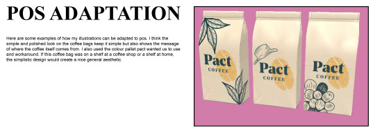
BARISTA EXPERINCE

Sketching how I could create Pact Branded items for behind the coffee bar.
0 notes
Text
IDENTIFYING ELEMENTS OF THE COFFEE SHOP EXPERIENCE

https://uxdesign.cc/analysing-and-improving-the-customer-experience-in-a-caf%C3%A9-f88b332a7820
https://www.marketingstudyguide.com/swot-analysis-example-for-a-coffee-shop/
https://www.aesdes.org/2016/01/20/modern-aesthetics-of-coffee/
https://aesthetics.fandom.com/wiki/Coffee_House/Cafe
https://www.theguardian.com/commentisfree/2016/aug/06/hipster-aesthetic-taking-over-world
https://www.sbdcnet.org/small-business-research-reports/coffee-shop-business
0 notes


Text
Pact Coffee Initial Reaction


Here are some notes I took during the Pact Coffee presentation. Additionally, i made some moodboards on abstract packaging and packaging I saw in the supermarket. I used the Pact Coffee colour scheme in my moodboards to create a brand aesthetic.
0 notes
Text
Case Study Ideas
To get the ball rolling with our case study brief, I decided to make some notes which broke down every elements of work our lecturers were looking for. This helped me get motivated and obtain an understanding of what our lecturers exactly wanted.

After doing this, I visited the DandAD Annual and quickly became overwhelmed on the amount of different creative projects there were to look at and choose from for a case study. I found it extremely interesting and inspiring to look at different design pieces but also get insight to how and why they did it.
An example, would be the Guinness ‘clear’ class idea. They created a new Guinness glass with the word ‘clear’ typed underneath the iconic logo on the glass. Their intention was to encourage their customers to drink more water, and by creating a ‘joke’ of sorts with the idea of a glass of clear Guinness (water), it worked! With 80% of consumers saying they had revisited and moderated their alcohol intake by drinking more water.
https://www.dandad.org/annual/2020/entry/professional/231711/

Another interesting design was an ‘illegal’ blood bank. Elvis Communications teamed up the The LadBible to stop discrimination laws against gay or bisexual men not being able to donate blood. They opened an illegal blood bank specifically for gay or bisexual men, they collected enough blood to save 78 lives. This movement prompted an investigation into the NHS into their blood donating process. What I especially like about this movement is how much of a difference they made to the blood donating world, by stopping discrimination and saving lives. Additionally, the ‘blood bag’ design is genius. They took a stereo-typical blood bag design and re-imagined it to make change. The famous ‘gay icon’ making up the two o’s in the word ‘blood’, the prominent ‘0 lives saved’ with the information underneath highlighting the possibility of three lives being saved, and the ‘bloodwithoutbias’ hashtag are some of my favourite elements of the bag design.
https://www.dandad.org/annual/2020/home/professional/?next=/entry/professional/231700/


These are only two examples of the fantastic work I found on the DandD website. It is an extremely great website to gain inspiration for projects and simply to look at for fun.
Another idea I had was to look at the design process of Ian Splater, Instagrams head of design. I watched an interesting episode of ‘Abstract:The art of Design’ which showed the processes of instagrams design changes, and why they did it. It also highlighted the extreme pressure put on Ian as he had to create a logo which would be used by over a billion users. All in all, I found it extremely insightful and this is definitely something I can look into for my case study.

Finally, Crack Magazine is a publishing agency which I’ve followed for a number of years now. I remember being 16/17 and using them as secondary research for my first lookbook publication. The background history of the agency is motivating as they created their successful company fresh out of uni, something I can do. The magazine showcases artists, musicians and clothing brands directly from my taste. On top of this, the editorial layout of the whole magazine is very aesthetically pleasing to me. This is the kind of company I would like to work for when I’m older so doing a case study on them would be extremely beneficial.
https://crackmagazine.net/

0 notes
Video
tumblr
Using poster design to create an example of where you could find it.
1 note
·
View note


Text
Black Box Challenge
Our teammate Bexley started cracking on with our advertisement video whilst I thought about ways I could contribute. First of all, I recorded an acting student saying a few lines which represents the brand. You can find this in the video that Bexley put together. Additionally, I made a transparent background video for Bexley to inset at the end of his video.
youtube
8 notes
·
View notes
Text
Black Box Challenge
After deciding we wanted couldnt use out own filmed videos, we decided to look into animating. Here is a great animation which Bexly created for our group.
Addionally, I made this quick gif to represent spinning too. To continue with our animation idea, we figured out it would be much more work as alot of our group was unsure on how to animate. We moved past this idea however it was a great part to experiment on and think about.

0 notes
Text
Black Box Challenge
One of the clues from the other group was a horse, which are known for eating oats. We thought that this could be a fun aspect to work from. Some of our ideas included; horses racing to the bowl of oats, humans sharing oats with horses, horses eating oats whilst the humans get the leftovers, humans stealing oats from horses. We figured that the horses could be represented with image, masks, illustrations or even animation. After creating a few story boards and discussing with the group our options, we came to a mutual conclusion that focusing on the horses could send the wrong message and that horses are not our target audience. However, as you can see from our story board, we came up with an idea on focusing on the 'two minute' part and that is what we went onto use as our unique selling point.

After coming up with our '2 minute' idea, we started brainstorming ways we could represent this, including: people running to the microwave, compilation of things that take 2 minutes, oats can be made before song ends, time bomb, emphasis on speed and focus on microwave. After throwing some ideas around we came to a conclusion that we wanted to represent the microwave by using videos of things spinning.
As a group, we all contributed our own spinning videos by filming 2-3 clips each. As we were all working online, we encountered problems when filming separately. This included angles, lighting difference in quality and timing. We could help these issues but we found an alternative way representing spinning through video; stock footage. Heres a video which one of my team mates put together which shows both our footage and stock footage together.
1 note
·
View note
Text
Black Box Challenge
After creating clues for another group, we got given a set of clues which we had to disect and figure out ourselves. Here is what we found.

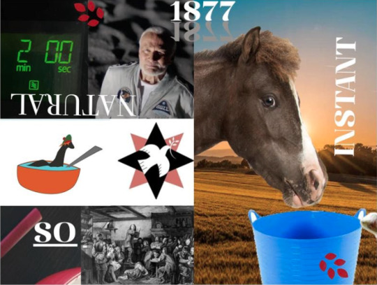
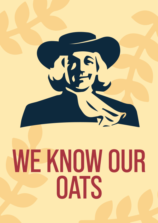
It was pretty obvious once we unsolved the clues that the brand was quaker oats. Our next challenge was to create an advertisement, either in video or poster format.
0 notes