Statistics
We looked inside some of the posts by aurelia-archibald and here's what we found interesting.
Average Info
Notes Per Post
2
Likes Per Post
1
Reblog Per Post
0
Reply Per Post
1
Time Between Posts
2 months
Number of Posts By Type
Photo
7
Text
8
Video
2
Last Seen Tumblr Blogs


Fun Fact
The most popular pages on Tumblr are about Minecraft, GIFs, and David J. Peterson.
Photo


Flow Jam is a hub for flow artists of all skill levels and walks of life to connect. The idea is to connect local artists but we know flowmies love transcends all borders so we decided to focus on online community building as well. We hope you enjoy your time here and find some flow friends or at very least some inspiration.
The app was designed with flowmies colourful spirit in mind. This app will connect local flow artists with other locals as well as artistst that might be farther away. There is resources within the app so that new and more experienced flow artists have a place where they can learn and grow. There was going to be a category for each flow prop but I felt that would keep different prop users seperated so I decided to create a general group that all users could access regardless of what props they use.
0 notes
Text


Happy Mug (Package Design Project) - Final Outcome
The problem I was trying to solve with this package is how to make it more accessible so that it could be interacted with beyond our sense of sight.
The senses I chose to focus on were touch and smell and of course, sight.
By making a hole for the handle to stick out the user can feel the product and get a better sense of what they are purchasing. This targets and benefits all people with or without a seeing disability.
The holes at the top would indicate to someone with low vision that their is something to be interacted with at that part of the package. It could prompt someone to smell the package that would then reveal that their is tea in the product. I could take this idea farther by using braille throughout the design. The string on the outside of the box might also indicate that because strings are associated with tea. When I had the holes line up in a straight line it was hard to actually smell anything so making the three in a pyramid shape resolved that issue. It also looks like eyes and a nose.
To make the package easy to open I fastened magnets to either flap on the opening. At first the magnets I used were not strong enough so I had to find more durable magnets and fasten them differently. I could take this idea farther by hiding the magnets although having them showing could indicate how the package could be reused.
There’s a few ways this package can be reused. The magnet feature indicates that the box has more value that just being packaging. Personally I would reuse this box to store tea or other small items. The package could also be deconstructed and used as fridge magnets and tea coasters. Perforation marks around the edges of each side could suggest that they can be cut out as coasters. The tag on the tea could be designed to indicate it can be used as a book mark. The box could also contain piece of card stock that matches the size of the walls to cover the handle hole. This would make the reusability of the box for storage more versatile.
Happy mug could be developed into a brand that focuses on mental health awareness. Each box could be coloured to represent different moods or mental health disorders and have coping techniques, positive quotes, resources and more on each tea tag. They can be sold as collections where each mug purchase donates a certain percent of profits to mental health awareness organizations.
0 notes
Text


Package Design Blog Update #1
I worked at a pottery production studio over the summer of 2020 and realized how much plastic is used to make sure the wares were delivered to clients without breaking. It was 3 sheets of bubble wrap minimum per ware. A box with 20 wares in it could easily be 60 or more sheets of 2x2ft plastic bubble wrap per box. It seemed really excessive to me. This issue isn’t limited to the pottery industry, it’s been an issue at every single retail environment I have worked at.
I am trying to solve the packaging issue of being eco-friendly, sustainable, functional (for shipping) as well as being inclusive to the disability community. I started by looking at what packaging is already available for ceramics at Canadian tire. I found lots of solutions using cardboard to secure the ceramic mugs. I also found ways of using the product it’s self as part of the packaging.
The Wahl product uses the case of the product as a handle. I figured I could apply this idea to a mug. It makes it accessible to low-sight or blind people because they can feel the product.
Im not sure how to be more inclusive though. I keep referring back to the senses. Design is primarily made for the eyes. I am trying to solve how we can include the other senses in my package design. I am curious if I can engage the sense of smell by including scents related to the product (tea or coffee).
There is the possibility of including braille on the handle of the mug it’s self.
0 notes
Text
Ohraylia Studios
Decided on purple for this!
Phase 1
Research. Today I figured out the direction for the project. I am creating brand assets for my twitch channel. Starting with Twitch Panels & working my way towards designing overlays. I also figured out the brand values associated with the channel. It was hard for me to wrap my head around how I could apply this project to the real world. I realized a style guide can easily be applied for a Twitch channel as it could be for a photography business or any creative business.
Phase 2
Worked on Pattern Design to rely on as brand visuals but it didn’t pan out. It didn’t capture personality I was going for. I wanted a symbol but needed something more expressive and encapsulating the entire brand rather than just the hula hoop portion of it.
Phase 3
Created multiple different alien logos with intention of illustrating the idea of ohraylien nation. Despite liking the logos independently as marks/symbols I don’t really see them as part of my branding. They could be associated with the brand but not the main assets.
Phase 4
I just focused on what I already had. My online username has been the same since I first made my Instagram account “Ohraylia”. I like it because it is me. I don’t try to come across as something that I’m not. I am playful and the spelling of my name as “Ohraylia” is playful it’s simple and it communicates. The whole “oh!” as an exclamation to express an emotion, idea or solution is a lovely idea. It’s easy to brand any line that I come out with and doesn’t pigeon-hole the brand to one idea. There is a ton of space for growth on what I believe to be a sound foundation.
I think there are ways to incorporate the ohraylien illustrations into the brand on clothing items, pottery, social media, and other digital media. However, sticking to the main logo and colours is a good start that can eventually be built on.
Next time I would love the opportunity to connect with classmates on a more regular basis. I feel this would be more similar to class allowing students to exchange ideas along the way.
Overall I am happy with the direction but there is lots of space for improvement. Brands don’t evolve overnight, they evolve through experiences and interactions and that only comes with time. To have an idea is the beginning. Trust the process.


2 notes
·
View notes


Photo


Captions on each photo to explain a bit of my ideas :)
0 notes
Text
Research//Flow Zine Update 09/24/2020
I did research today. I didn’t know where to start so I referenced my layout sketches that gave me hints about the direction I am aiming for. I decided to just start answering the questions or points I wrote next to my layouts which helped me come up with more ideas. Now I think I have most of the pieces I’m just working on how to fit them together in a cohesive way.
0 notes
Video
tumblr


Zine Update September 22, 2020
I decided to make my zine about the flow state and movement illustrated with light painting photographs.
To start, I bought USB LED strips powered by portable power bars and we went out into the night with a skateboard, hula hoop, tape and a camera.
Once we had them taped on I set the camera up for long exposure shots and experimented with various light settings (strobe, flash, solid) and taping the lights to different parts of the body along with various different movements, angles and distances for the best result. Make sure you go somewhere where light pollution won’t be an issue if you try this, otherwise you might end up editing a lot of the pollution out which isn’t ideal or necessary.
Then I learned some basic photoshop skills to get these effects with my photos. Mostly using the mirror, crop, overlapping and blend tools. Editing these photos influenced my layout a lot. A lot of them work best in square format because of the symmetry so the idea felt natural to keep the format of my book square.
I am currently working on layout sketches and doing a few more photo edits to create more art for the zine. I’ve come to realize I need to spend some more time researching the flow state & somatic intelligence.
Thanks for reading, have a nice day now!
0 notes
Video
tumblr


Zine Update September 22, 2020
I decided to make my zine about the flow state and movement illustrated with light painting photographs.
To start, I bought USB LED strips powered by portable power bars and we went out into the night with a skateboard, hula hoop, tape and a camera.
Once we got the lights taped on I set the camera up for long exposure shots and experimented with various light settings (strobe, flash, solid) and taping the lights to different parts of the body and prop. There was experimentation with various different movements, angles and distances for the best result. Make sure you go somewhere where light pollution won’t be an issue if you try this, otherwise you might end up editing a lot of the pollution out which isn’t ideal or necessary.
Then I learned some basic photoshop skills to get these effects with my photos. Mostly using the mirror, crop, overlapping and blend tools. Editing these photos influenced my layout a lot. A lot of them work best in square format because of the symmetry so the idea felt natural to keep the format the book square.
I am currently working on layout sketches and doing a few more photo edits to create more art for the zine. I’ve come to realize I need to spend some more time researching the flow state & somatic intelligence as well.
Thanks for reading, have a nice day now!
0 notes
Text
Visual Identity Zine Project Update - 09/14/2020
This is my moodboard and plan for my zine about movement as medicine shown through light photography. The visual language of the final zine will be inspired by designer Marta Veluda. There are various influences from designers and photographers featured in this post.


0 notes
Photo


These three designs are obviously made for different crowds. The first speaks to a niche community that is concerned with aesthetics and gets joy out of small but pretty things. Would I buy this wine and then save the bottle? Likely. The packaging, to me makes things seem more valuable, not necessarily the wine but I would definitely be willing to pay extra for something like this just because of the packaging. It’s succesful design because it takes a simply bottle and turns it into a functional piece of art if you want it to be.
The second one is too much. I feel like they are trying to put way too many concepts into play and it just doesn’t work. It seems they are trying to sell and oldstyle font as new. Somehow putting an old timey photo and then yellow instead of white writing communicates that its like the old font but different because its yellow. Concept doesn’t read for me and I don’t know who this is geared towards.
I love the last one. Before I even read the company description for Monxuxu, I could tell that they made hand crafted baked goods with love simply for their stickers next to the cookie and that they were aimed towards a younger generation. I like that they incorporate the logo and illustration but it isn’t the focal point of the design and you still get a full idea of the company.
0 notes
Text
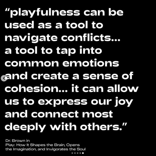
One Thing, Plant House


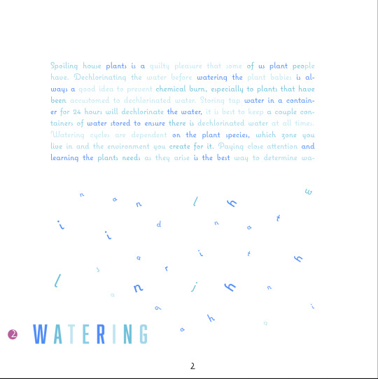


Plant House I chose the typeface Coquette for my main text because it was curly and the little circular elements reminded me of leaves of a plant. It is a very stylized font and I usually stay away from them for large body of text because I worry it is too distracting. In this case it was very stylized but still legible and connected well to my idea. To contrast this playful typeface I chose Aboliton which is a more serious industrial (still highly stylized) typeface. I wanted to contrast the idea of nature, flowly and playful with something more mechanic/man made. It reminded me of the lighting systems I’ve set up in my house for my plants. As soon as I started this project I knew I wanted to take a more illustrative approach to typography than I normally do. Theres usually an aesthetic that I tru to stick with which sometime limits me. I just got all my ideas out this time and then tried to get it all to fit together despite having very different content on each page. The table of contents was a lot of fun to make, it was boring as a plain shape so the lines really added another dimension of interest to the design. It was a good foot to start on to get creativity flowing for this assignment. The watering cloud was tricky for me. I knew the idea made sense but because I was talking about indoor house plants I was worried it would be a stretch being a cloud. I tried with just a srectangel text box but the idea wasn’t there. In the end this idea feels successful in communicating a message through words and illustration/graphics. Some pages were harder than others and the typographic connections are not as obvious but I still tried to but a subtle connection to the content even if it wasn’t as strong as other pages. The fertilization page is a good example, I just thought of the purpose of fertilizing being to grow plants bigger so I made the header of this chapter/topic larger than the rest of the books chapter headers. I always trap myself with my ideas. I tend to come up with ideas think about why it wouldn’t work and then throw it out rather than focusing on what works about the idea and sticking with it. This happened with me for the tree page. I used the name of the tree once to make the leaves/foliage and it didn’t look full or communicate the idea. Instead of dropping it, I left it and moved on. When I came back to it later I realized the idea could work if I used the name more than once to make the foliage fuller. I think the idea communicates strong enough that repeating the name isn’t confusing because you can easily rationalize why I used it more than once and I think it adds more to the idea than takes away from it. The foliage spread stretches over two pages. The chapter also starts on a left page which I think works since it spreads over to pages and the right side of the spread still acts as a chapter page cover. I have been warned not to spread text over two pages but I tried to space it in a way that wouldn’t be obstructed by the page fold. It is less about the individual words but the words together as a whole composition. Although it might seem weird I chose to do this because the idea didn’t flow or communicate as strong stretched over one page since vines are usually known to be long and consume a lot of wall space.
0 notes
Text
TYPEspecimen blog


This entire project was rather holistic because I learned so much about Medicine Hat from an entirely new perspective than I’m use to.
I avoided researching from other typefaces as much as I could so that I didn’t get trapped in those aesthetics and approaches to designing a typeface. I started by getting out into the city and finding a personal connection to something I could turn into a typeface that captures the essence of Medicine Hat. I used tracing paper to trace samples and gather textures from the environment. The most interesting shapes at first were the rigid “1953” numbers on the church and the shadows they casted. Eventually I noticed a reoccurring theme of graffiti with the “73” numbers and “rawk” letters.
Quickly I discovered the rich history of Medicine Hat through unique typography old and young.The one thing that stood out the most was the street art, whenever I go downtown, I get excited to go to the underground tunnel that passes under the train tracks because it is always covered in street art. This time I noticed that far beyond the tunnel there were murals everywhere downtown.
I decided to focus on this aspect of Medicine Hats downtown culture and discovered The Annual Mural Festival started in 2019. I really liked the numbers 73 and based my typeface off of it. Some challenges were getting consistent and even weights, but I embraced the imperfectness of the letter forms because I think it reflects the hand drawn look of the sample I collected. Outside of the digital world no two characters come out the same and I wanted to capture that aesthetic in my digital typeface.
For my poster I drew inspiration from 70’s colour palettes as reference to the number 73 from my sample. I would eventually like to create a set of numbers and rename the typeface to Outland 73. Outland is about being yourself and embracing strangeness, the bizarre and differences. Reminding me of a loved artist that passed away who’s art travels Canada on the train carts that occasionally return to Medicine Hat. Through learning about this artist I learned about the deep history of graffiti, street art and trains. This style of art emerged in the 60s and 70s in New York tying back to why I want to name it Outland 73. It’s interesting how art trends and styles travel accross the world. I hope the gratifi style of this typeface reflects everything in my research about Medicine Hat and street art.
0 notes
Photo

While designing this typeface I learned a lot about the downtown art community. Street art is a way to express ideas and beliefs visually, publicly and most times anonymously. The act of graffiti can speak as a form of vandalism and act of defiance which influences artists to remain anonymous. Medicine Hat street artist had the opportunity to paint murals all through Medicine Hat this summer reversing the way street art is viewed. The event publicly welcomes local and international street artists offering a safe community to practice this style of art. This hand made type sample intrigued me to do research. This is how I learned about The Annual Mural Festival which I believe to be the source and reason why these numbers were painted in the tunnel. The festival focuses on re-energizing downtown buildings through cans of colorful spray paint.
0 notes
Text
TYPOphoto
I drew inspiration from nature in this assignment. My book focuses on images more than type, an image is worth a thousand words and I felt they could speak for themselves. I chose to write a poem rather than describing the photos. I created a mood board where I drew my inspiration from. I saw a range of dynamic layouts involving photos and realized than I don’t have to be limited to a single photo and a tradition square/rectangle frame. Having the pages laid out the same on each page didn’t justify the content on the page. I experimented with cropping, repetition and merging photographs to create a more interesting composition. Finding oneself implies that they are lost and the cropped photos or lines crossing through the photographs relate to a maze. Some of the ideas I used from my research is spreads where one page has a large image and the opposing a small image or an image in the opposite orientation. I used blank pages as a design element, to me it gives it that final finishing touch I strive to incorporate in my work. I merged photographs to create something new and added a pop of colour to the cover in green to relate to nature since the assignment was in black and white. Last minute the printer said I need to have single page document rather than facing pages and I didn’t compensate for how that would affect where the page numbers went so, I have wonky page numbers in the wrong spot. I decided the numbers in the correct spot still did their job to help the reader find their placement in the book, so I decided not to black those out with a sharpie. I wanted a larger book cover than my pages but realized as I was binding that the bottom and top couldn’t be bigger, or it would mess up the binding. So halfway through binding Instead of taking the covers off and cutting them I tried to do it still attached to the book. Big mistake, I messed up the cutting which resulted in me having to trim the rest of the pages in the book which did not go as smoothly as it has for me in the past. Overall, I am happy with the design and printing of my book. When I have the opportunity, I would like to re-print and re-bind as I really enjoy the message and images in the book.

0 notes
Photo


Inspiration board & Brainstorm for Photo Type Essay.
I just want to explain some of my inspiration and how I'm planning to incorporate it into my typography photo book, the numbers on the image correlate to the numbers listed below.
I also included a photo of my brainstorm, some photos I will be using and a breakdown of the grid I’m working with.
1. I loved the idea to have packaging on the book. I’m considering some type of wrapper or outer cover for my book to give it a nice feel, I want to use something natural to tie back into my idea about nature.
2. Having one page flipped upside down on a two-page layout is a really interesting idea. I want to add something interactive like this to my book.
3. I enjoyed the contrast in image size. Going to play around with this for more dynamic asymmetrical layouts in my book.
4. There's a small add in between the two pages. If I end up with some extra photos that don't make it into the layouts of the book I'm considering printing the photos on higher quality paper and adding them as prints that can be put into a frame outside of the book.
5. Since the book is mostly black and white I want to add a pop of color to make it appealing and entice someone to take a closer look inside
6. Just like the layout of this one, I really want to focus on dynamic layouts on every page because I think each image will need its own layout rather than trying to fit all of them into a pre-determined template.
7. The cover idea, instead of choosing one image feature many small previews.
8. Layout with type and text incorporated. I like how information hierarchy is used.
9. Another idea for a layout with type and text. I enjoy the minimalism of this one even though there is still a lot of content.
10. Featuring similar images on a two-page layout seems like a good idea if people want to compare the photos without having to flip back and forth.
11. (purple background) This was just an illustration in one of my textbooks. I'm considering using a bookmark for the book. Not sure if I will yet depending how long I end up making the book, I'm not sure if a bookmark is necessary.
0 notes
Photo
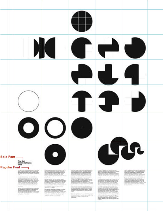
Identifying Grid Structures within layouts. This layout used a modular grid.
0 notes