
Statistics
We looked inside some of the posts by avrilh-grad503 and here's what we found interesting.
Average Info
Notes Per Post
4
Likes Per Post
3
Reblog Per Post
1
Reply Per Post
0
Time Between Posts
2 days
Number of Posts By Type
Text
15
Last Seen Tumblr Blogs


Fun Fact
Tumblr has a 66 index score for customer satisfaction in the US.
Text
Week 5-6: Final Timeline Poster Submission + Final Thoughts

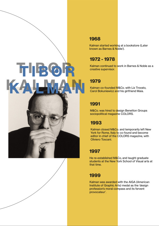
Here is my final timeline poster for Tibor Kalman. In the end, I have decided to narrow down the information to Kalman’s career and briefly covering what he has done. I mostly used Illustrator all throughout concept planning to creating my final designs, and I was able to see just how helpful the lab teaching had been. In this poster, I decided to keep to the minimalistic style I had been aiming for, by spacing out each arrangements evenly and avoiding cluster. I originally wanted to use a photograph of Tibor Kalman, but one of my experiment was to use outlines (I traced around his image) and play around with colours and I thought this worked out much better - with a more consistent colours and contrast in visual image. There are some elements I decided to leave in as part of my final work (such as the typography and bright colours).
Final Thoughts:
503 for far, has been such a ride for me. In the beginning, since I wasn’t very familiar with Adobe, I was immediately concerned that I would fall behind in class. I was quickly rid of my worries after the first few weeks though, slowly going over photoshop and illustrator’s functions was immensely helpful.
Though it tends to get repetitive, I did have a lot of fun documenting each lessons and self directed learning tasks, as I found it satisfying seeing myself grow with every lesson. Reviewing each lessons after class became a helpful habit and I eventually was able to grasp content quicker after forcing myself to focus on materials I missed during class.
The process of designer research wasn’t as tough as actually putting myself in my designer’s shoes. I just couldn’t wrap my head around how I should look at Kalman’s work and what I should be working towards. It took quite a long time before I was able to come around and really start to analyse Kalman’s works and what he is influenced by. I’m now able to point out certain techniques and elements Kalman often has in his works, and how it impacts his designs. I think that this is a big step for me especially, after weeks of just trying to figure things out.
Being online this semester definitely took its toll on me, and I struggled a lot trying to catch up with work and still taking care of myself. I’m glad I was able to come this far regardless and hope I can work better for the rest of the semester.
(06.04.2022)
0 notes
Text
Week 5: Design Process
Week 5, unlike the past few weeks does not have a SDL as it is solely focused on designing our timeline posters ready to be submitted as our formative.

After my initial sketches, I have started to compile those ideas and developed them into concept designs. I worked with a variety of elements as well as approaches, experimenting with various arrangements to find ones that I think would work well in the finals. This type arrangement was meant to be incorporated as a full composition design, but I had trouble working with this and wasn’t sure how to add in more text (timeline) without having the piece look too messy so I left this piece. This was meant to be my take on Tibor Kalman’s use of typefaces. I did quite like the text arrangement, the inconsistent and irregular sizes was an interesting concept to explore. I tried to re-create this method a few more times but ultimately decided that this method would be hard to utilise in a timeline poster that is filled with texts.
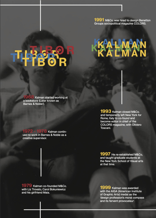
The next arrangement was slightly more simple, and has the minimalistic sense I was going for. In here, I focused more on arranging the texts in a way that is not overwhelming while slowly integrating colours into my works. Since Tibor Kalman works with bright colours, the arrangements was really important for me to highlight specific information. I have to be careful not to place colours randomly as it can very easily distract the audience and allow them to move away from the focal point.
In this composition, I was starting to feel a bit more comfortable with what I was making and how I was approaching these design elements. A lot of these techniques and arrangement are from my understanding of Kalman’s works and why he chooses to use certain text and colours. One of the most notable element in his work are his use of colours. He subtly adds colour onto texts and across pages, easily adding emphasis without the area of focus look to blaring. I tried to interpret this idea into my work here by really experimenting with colours, and using yellow (a naturally bright colour) to test out how and where I should utilise these colours.
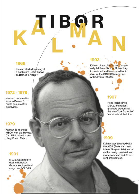
Lastly, this composition was one of my favourite. I re-used many ideas and and techniques I have experimented with, with the previous designs by taking on a different approach. Again, Kalman’s works are highly pictorial, and I had this sudden inspiration to attempt to use a full picture. I was a bit hesitant at first because too much colour in a picture means that texts could easily get lost. But this issue was quickly solved when I properly utilised some filters. For this design, I incorporated Kalman’s typography and use of colour into my work, and tried to highlight the information using a guide (line). This worked out so much better than I had expected and I think the texts on face was a really fun take on Kalman’s use of text.
(05.04.2022)
1 note
·
View note
Text
Week 5: Adobe Illustrator - Layers Importing, Adobe Acrobat, Saving, Printing
Lecture Summary:
As we are nearing the formative submission, this lesson is mostly dedicated to covering/briefing the class on what is required for submission. The latter part of the presentation is then dedicated to answering students’ questions and guiding us regarding our current progress. Most of this lesson is mainly given to us to spend working on our timeline design.
Lab Teaching:
We are also given another brief tutorial on using illustrator. In this tutorial we looked over using colour swatches and manipulating images.
(31.03.2022)
0 notes
Text
Week 4: Timeline Poster Layout Sketches
SDL: Task Two
As for the second category, we are to start compiling these research into concept ideas. We are asked to experiment with layout ideas and sketch them out (with annotations).
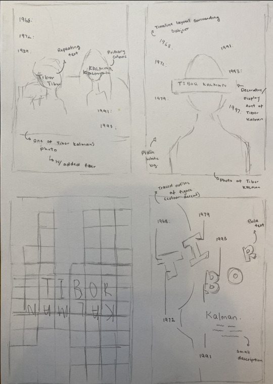
I made a quick few concept sketches on how I want to approach my timeline design. I took into consideration on how I can successfully implement Tibor Kalman’s design elements whilst still incorporating my own ideas. A lot of these sketches really reflect on Kalman’s use of typography and how he arranges his texts. I tried out variations of placement, with ones that rotates around the subject and ones that follows a neat and consistent direction (down the page). I also entertained the idea of implementing illustrations into the design and using bright colours to emphasis on certain points of add a stronger accent to the otherwise plain backgrounds. I think this is definitely a good start to my posters as I have an idea on how I want the final outcome to look like, and how I should develop these ideas.
Type & Colour
I have selected and narrowed down some font and colours that I am considering to incorporate into my timeline poster. Tibor Kalman works with San serif fonts, and to avoid confusing texts, I am also choosing to use fonts that are thinner and easier to identity (read).


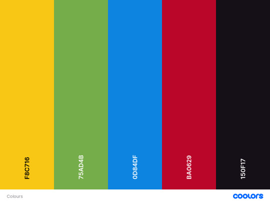
As for the colour palette, after closely reviewing Kalman’s works, I noticed that he uses a lot of bright, especially primary colours that stands out from the image. He often uses these colours to add emphasis and accent that either isolates the text or adds highlight to specific areas of the image.
(29.03.2022)
0 notes
Text
Week 4: Finalised Timeline Information
SDL:
As part of our week 4 SDL (unrelated to research and concept sketches) we are to provide a written (and spell checked) final draft of the text based content that we will need to include in our poster timeline design.
Here is the finalised text I have decided on:
1968: Kalman started working at a bookstore (Later known as Barnes & Noble’).
1972 - 1978: Kalman continued to work in Barnes & Noble as a creative supervisor.
1979: Kalman co-founded M&Co. with Liz Trovato, Carol Bokuniewicz and his girlfriend Maia.
1991: M&Co. was hired to design Benetton Groups sociopolitical magazine COLORS.
1993: Kalman closed M&Co. and temporarily left New York for Rome, Italy to co-found and become editor in chief of the COLORS magazine, with Oliviero Toscani.
1997: He re-established M&Co, and taught graduate students at the New York School of Visual arts at that time.
02.05.1999: Kalman was awarded with the AIGA (American Institute of Graphic Arts) medal as the ‘design profession’s moral compass and its fervent provocateur’.
(28.03.2022)
0 notes
Text
Week 4: Designer Research (III) & Visual References
SDL:
For our SDL this week, our tasks are separated into two categories. We are asked to collect more research and various information ranging from designer reseach to visual references.
Designer Research & Analysis

(Colors Magazine. Top row - 1, 2, 4, 5, 7, 8. Bottom row - 9, 10, 11, 12, 13)
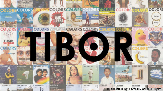
To start off my research, I first started by collecting various work Tibor Kalman has done. After a while of looking through his design works, which were all vastly different and contributes to different purposes, I decided to settle and focus on his most prominent works. Kalman’s most notable works are the ‘Colors’ magazine, where he directed and contributed to 13 issues that sparked various controversial topics.
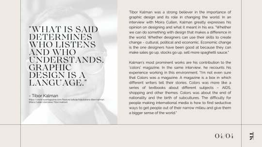
“The work of Tibor Kalman blurred the boundaries between design, journalism, art and politics, but, above all, he trusted the power of the image.” (Guardian)
“The combination of typography and Kalman’s provocative use of confrontational imagery is what made the publication “ a magazine about the rest of the world.” For example, on the very first issue of Colors Magazine, to represent the “birth” of the publication, Kalman included an image of a doctor holding newborn baby with its umbilical cord still attached; he emphasised the baby crying by placing text in a radial pattern around the infant.” (Designhistory)
As seen all throughout Kalman’s works, his designs are all highly pictorial and relies a lot on what the image conveys. On top of his bold choice of visual images, there are also a considerable use of typography. His texts are all easy to read - despite some being laid out inconsistently.
Visual References
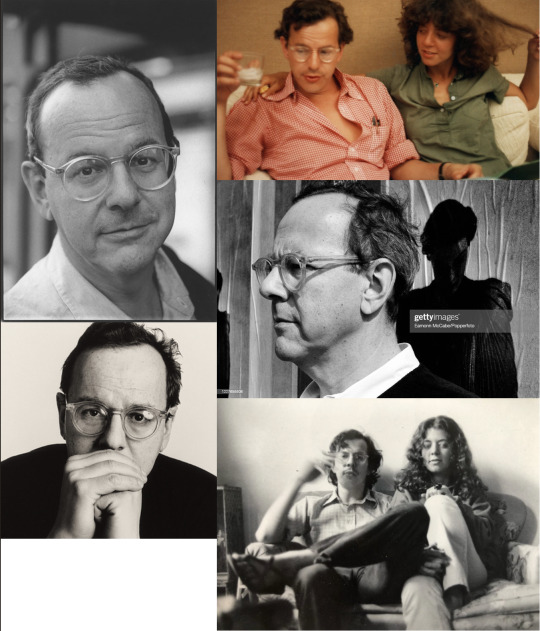
I’ve collected various photos of Tibor Kalman that I am considering to incorporate alongside my timeline design. Surprisingly, I wasn’t able to find a lot of photos of Kalman, and was only able to collect a few photos of him and a few of him with his wife, Maira Kalman.
I am considering using the top left image alongside the bottom right image. As most of his photos only come in black and white, I thought i’d use only the monochrome photographs. I am considering cutting out the image (erasing the background) and focus on highlighting Kalman as the main subject/focal point. This seems to be the appropriate approach when referring back to Kalman’s extensive use of visual elements.
Visual References - Timeline Examples
I have collected a few timeline posters that really stood out to me, and are closely linked to either my designer’s style of work, or contains elements I wish to explore in my own poster design.

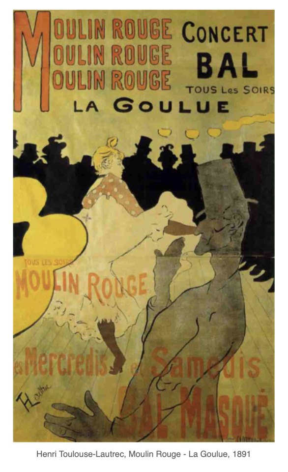
While researching, I came across this poster timeline design of Tibor Kalman by Josh Jackson. Other than the fact that this poster served as an example of how I could approach my timeline design, I was immediately taken in by the illustration and unique subject arrangement. The texts are neatly arranged (not overbearing), the yellow, despite it being quite strong, did not hinder the overall design with its bright colour. To top off this arrangement, the visual element in this poster was so strong and communicates a clear direction. Though I am not considering implementing any illustrations, I am definitely drawn in by the strong compositional style.
Tibor Kalman by Daphne van Drenth.
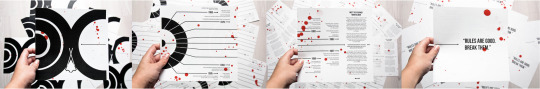
This was another timeline design on Tibor Kalman that I managed to find. Though this was more of an infographic rather than a timeline poster, I decided to include this as one of my visual reference. This particular design was very unique and relies a lot more on typographic arrangement. The overall design is very minimal and clean, paired with a strong accent of red (where droplets of red are splattered across the page). The direction/flow and the purpose of the arrangements are clear and easy to follow. I want to explore this minimal and fluent arrangement and see how this type of composition works with Kalman’s spontaneous design.


Graphic Design Timeline with a Focus on Bauhaus by Seham Hakmi
This timeline design was one that was introduced to us by Karol in the earlier presentations. I am interested in how this design is structured (in a way that is both consistent and easy to follow) and want to incorporate this concept into my own work. This timeline uses a lot of flat images and shapes throughout its arrangements, and are effectively placed in a way that does not crowd the page nor the information. I think that minimal or neat arrangements would work well with Kalman’s style of works, and am inclined to test out these concept ideas.
Sources:
https://www.theguardian.com/news/1999/may/07/guardianobituaries.markporter#:~:text=Tibor's%20restless%2C%20eclectic%20mind%20was,his%20children%2C%20Lulu%20and%20Alexander.
http://designhistorymashup.blogspot.com/2008/04/tibor-kalman.html
(28.03.2022)
1 note
·
View note
Text
Week 4: Adobe Illustrator - Brief and Timeline Discussion
Lecture Summary:
In week 4, we are given more details on the formative submission and what our timeline will revolve around starting from this week. We then moved on to discussing the design process, this is vital for us to review as we will need to follow this process when designing our timeline posters.

In short, the design process follows this pattern; defining the problem, brainstorming, gathering resources, drafting/developing ideas and creating works. To expand on this, we reviewed the designer, Ellen Lupton’s description of a design process. She narrows down these steps into three major categories; Defining the problem - inventing ideas - creating forms. In the presentation, we closely examined what these categories meant, and how we could achieve these steps in our design. For instance, we discussed how we could brainstorm and gather resources by using tools that are provided to us, such as the AUT library.
A few other notable point in the design process was the use of mind mapping, documentation and proofing. Mind mapping, also called radiant thinking, is a form of mental research that allows designers to quickly explore the scope of a given problem. This was an interesting concept as I had not previously touched on this topic before. Mind mapping would be incredibly helpful during this process, as I will be able to organise and categorise information based on its importance. Documentation in this context refer to collecting every bits of work I will, or have produced throughout designing. This will be an important step especially for this paper as we will need to constantly jolt down thought processes, give annotations and context. Lastly, proofing was another interesting step to touch on. Though I am familiar with constantly gaining feedback on design work, it hasn’t really occurred to me that I need to be regularly ‘proofing’ (testing) my design solutions and reviewing parts that needs to be further worked on.
Furthermore, in the latter half of this presentation we started reviewing various examples of iterative design processes. An example that stood out to me in the presentation is;

In Lab Teaching:
In this week’s in lab teaching, it is a continuation of our illustrator introduction. We are further introduced to other tools and functions, such as the use of grids in adobe files.
(24.03.2022)
0 notes
Text
Week 3: Illustrator Tasks
SDL:
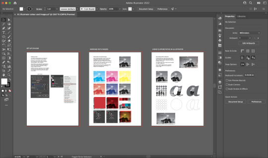
For this week’s SDL, we are tasked to complete another exercise sheet that was given during the lecture. We are to use the supplied practice files, continue following the listed directions and further practice on the techniques that was shown in class.
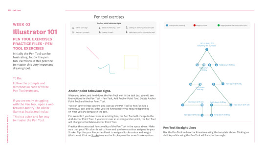
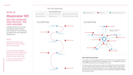
The first two tasks included experimenting and familiarising ourselves with the ‘pen tool’ and learning to create curves by utilising the points correctly. This task was a little tricky to grasp but once I started understanding how the tool works I was able to quickly finish off the tasks. As seen in class and in materials given outside of class, being able to grasp the pen tool would play a significant role when we start to delve into creating our own timeline posters.
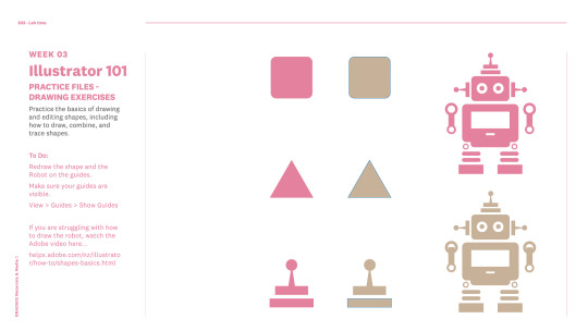
The last task for this activity sheet was to re-create an image using the shape tool. (Mine is beige coloured) This activity was also quite easy to do, as it mostly involved re-using the same shapes.
(22.03.2022)
0 notes
Text
Week 3: Adobe Illustrator Interface and Tools
Lecture Summary:
In this week’s lecture, we started off with some feedback regarding the work we have done so far. It is here that I realised my work and research are quite vague and was not enough overall. Following this feedback, I plan to go back to my previous posts and edit my research. I want to include more details in lesson discussions as well as my research on Tibor Kalman. After reviewing what information I had of Kalman, I realised that it wasn’t enough and for me to produce a timeline infographic, I need to understand Tibor Kalman style of work better.
Lab Teaching:
Today’s class mainly focused on lab teaching, where we are given a detailed introduction to illustrator, and various tools used in the programme. First, we are given an overview to the basics of illustrator. Here, Karol explained the contents of vector graphics, file formats, illustrator artboards. Following this introduction, David continued the session by directing the class through a more detailed explanation on how to use the tools while we follow along.
We are given an AI file that acts as an activity sheet where we can review the materials while following David’s explanation.
I really enjoyed this particular lesson, as it was fun to utilise different tools and play around with each functions. This was also extremely helpful for me to build a better understanding on illustrator. Though I have used illustrator before, I realised that there were many functions that I could’ve utilised better for a faster result.
(17.03.2022)
0 notes
Text
Week 2: Adobe Photoshop Interface and Tools
The second task of our SDL was to continue experimenting and exploring photoshop features that we went over in class. This was to be done using the photographs of our allocated designer.
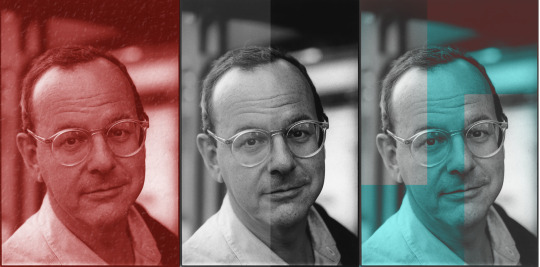
Since I am quite unfamiliar with Photoshop, I started by referring back to the lesson presentation and experimenting with what we had covered. These three photos are a mixture of layer blending, image correction as well as using different tools such as clipping masks. It became pretty self-explanatory after a while of trying out different settings and I was able to adjust easily to the programme. These tools, especially the image corrections tool will prove to be extremely helpful when I need to include Tibor Kalman’s photographs. I am not able to find a lot of clear photos of him, so being able to freely manipulate the images would help clear this problem. Tibor Kalman works a lot with bright colours and typefaces, so working with layer blending would be an interesting way to bring out his work elements, such as utilising colours to add emphasis or contrast to a point of interest.
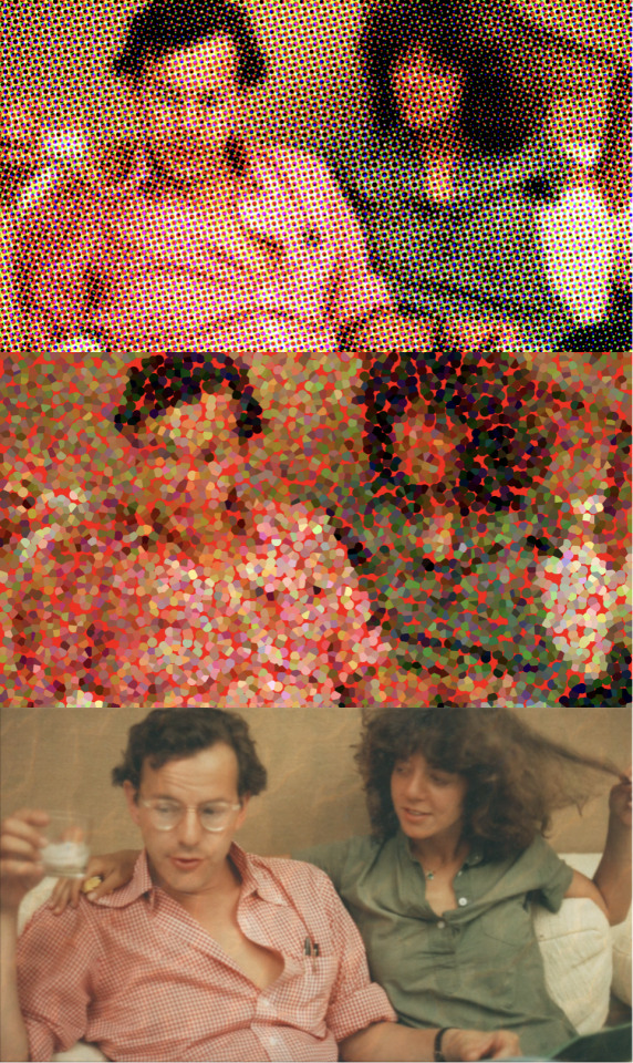
Fortunately, after hours of looking through various visual materials, I was able to find a coloured photograph of Tibor Kalman and his wife. I focused on utilising smart layers and filters in these photos (following the class presentation), and experimenting with textures. I played/explored the many filters that photoshop provides, such as blurring, colour halftone effect as well as the Pointilize filter. Playing around with the filters really stood out to me, as I really found myself enjoying the process of trying out different filters and just seeing how different the image becomes. The Pointilize filter really stood out to me in this task, I was drawn in by the unrefined and rough clutters of colours. This was incredibly fascinating to me, and I believe that this concept of work would look really well alongside Tibor Kalman’s unconventional and spontaneous work flow.
(16.03.2022)
0 notes
Text
Week 2: Designer Research (III)
SDL:
For this week’s SDL, we are given two tasks. We are first tasked to research our allocated designer further and to narrow/specify what years within the designer’s life we will be putting in the timeline. This also meant that we are given the choice of picking to only focus on the designer’s career or lay out a full biography.
06.07.1949: Date of birth
1956: Kalman and his family moved to Poughkeepsie, New York after the Soviet invasion.
1967: Enrolled in New York University as a journalism student. While he was an active member of the ‘Students for a Democratic Society’, he met Maria, his greatest influence and later on, wife.
1968: Kalman dropped out after a year of journalism classes and worked as a bartender before Maia convinced him to work at ‘Student Book Exchange’ (the unofficial bookstore) where he was given the opportunity to organise and design various parts of the store such as window dressing, alphabetising books and designing signs. There was an instance where Kalman assembled random milk crates to form a unique and unconventional bookshelf that helped the store make a great deal of business as the style piqued the interests of many. The owner, Leonard Reggio, was especially fond of Kalman that when he opened a local chain of book stores (Barnes & Noble’) he appointed Kalman as the creative supervisor.
1971: Kalman’s career in the bookstore did not last long before he left for Cuba, picking cotton in a program for middle class Americans to help support the communists (Venceremos Brigade).
1972 - 1978: Kalman returned to New York to continue working in Barnes & Noble. For eight years, he worked on bag design, store signs (the original B&N bookplate trademark) and other visual merchandising. For Kalman, this was his only design training throughout his early career.
1979: Kalman co-founded M&Co. with Liz Trovato, Carol Bokuniewicz and his girlfriend Maia. Within a few years, the firm attracted numerous high profile clients such as Restaurant Florent and Talking Heads.
1981: Married his wife, Maria Kalmam, an illustrator and author.
1991: M&Co. was hired to design Benetton Groups sociopolitical magazine COLORS. The magazine was produced in-house at the studio until 1993.
1993: Kalman closed M&Co. and temporarily left New York for Rome, Italy to co-found and become editor in chief of the COLORS magazine, with Oliviero Toscani.
1995: Kalman was diagnosed with Non-Hodgkin’s Lymphoma.
1997: Kalman returned to New York to seek treatment. He re-established M&Co, and taught graduate students at the New York School of Visual arts at that time.
02.05.1999: Kalman was awarded with the AIGA (American Institute of Graphic Arts) medal as the ‘design profession’s moral compass and its fervent provocateur’. Passed away due to cancer at the age of 49.
I have decided to note down Tibor Kalman’s overall biography rather than just focusing on his works as I thought it would be quite interesting to see how his background during the time affected his designs. All the information I have so far collected will change and be assessed on further as I plan to include better detailed information.
Sources:
https://medium.com/@aattar/tibor-kalman-a-biography-be06906608e2
https://www.creativebloq.com/graphic-design/great-names-graphic-design-tibor-kalman-7133661https://en.wikipedia.org/wiki/Tibor_Kalman
https://www.famousgraphicdesigners.org/tibor-kalman
(To ensure I am collecting information that is accurate and correct, I have cross referenced the first four website when noting down specific years and dates. This was really helpful as I did not have to constantly re-enter keywords into my search bar to see if the information I have gathered are inaccurate.)
(16.03.2022)
0 notes
Text
Week 2: Overview of Timeline Poster
Lecture Summary:
In this week’s Lecture, the class is split into two parts, class lecture and in lab teaching. In the first part, we explore various types of design and what its influences were depending on the era. We looked over the development of poster designs as well as timeline examples. A few notable takeaways in this lecture was understanding how posters are structured and what purpose it serves.
“Posters tell visual stories, announce events, and bring ideas to life. Posters are a simplification of complex information and ideas. Using visual metaphors and pared down icons help to communicate big ideas while reducing clutter - absence of elements.”
It was interesting to see how posters develop over time, as it was one of the earliest forms of advertisements (Dating back to early 19th century). When we reviewed each posters over the years, it was clear posters had a significant role in our history, communicating various ideas with large amount of audiences when technology was not as advanced as today.

Here, we can see a clear difference in how drastically the designs have changed, from the Art Nouveau era and moving towards the post war era. For me, this part of the lecture was incredibly informative and helpful.
Later in this lecture, we also looked at various timeline (infographic) examples.


“Infographics, a compound word of ‘information’ and ‘graphics’, are design compositions that quickly and clearly represent information, data, or knowledge. Infographics improve understanding by utilizing images, graphics and text to enhance an audiences ability to see patterns and trends and to make connections.”
“Timeline infographics are a type of infographic that offer a way to visualise a process over a period of time. This style of infographic is often used to portray the history of a specific event, a figure or movement. Timelines often have a very linear progression.”
In the second part, we were given the opportunity to explore an adobe programme, or more specifically photoshop. We went over different basics of photoshop and various functions such as filtering, layering and blending. I have little experience with using photoshop, so these tutorials are incredibly helpful, and I now have a better understanding on what I would need to work on.
(10.03.2022)
1 note
·
View note
Text
Week 1: Designer Research (II)
In addition to the surface information I have gathered of my allocated designer, I also wanted to further study on their past work. I feel that it is important that I have a rough idea of my given designer’s style of works and understanding the design elements they have inputted. Tibor Kalman was described to be eccentric, spontaneous, innovative and most importantly, creative. He worked on various projects throughout his career, such as the COLORS magazine and collaboration with Talking Head. I have compiled my research (as well as the website links) down below.

In addition to my initial research, I included more information on Kalman’s design beliefs. These research are mostly directly collected from my sources, and I have underlined the important takeaways of each passage.


To understand Tibor Kalman’s designs, I needed to look into what ‘Vernacular Design’ is. Basically, the Vernacular design refers to the spontaneous, unconfined and free flowing design that Kalman often includes in his works.

I wanted to find a more in-depth analysis of Kalman’s work and style, so I did a further research on the COLORS magazine. From this research, I realised that Kalman did not have a prominent design style. Though he does work a lot with typefaces and various styles of typographies, Kalman believes the unconventional style of ‘Vernacular Design’, which allows him to produce various designs that are not bound to a specific style.

Template & Resources:
https://designhistory2013.wordpress.com/2013/05/31/tibor-kalman-2/
https://www.moma.org/artists/23028
https://issuu.com/mecagd/docs/tibor_kalman_book_2
https://www.typotheque.com/articles/tibor_kalman_perverse_optimist
https://lab-zine.com/blog/2007/jan/25/tibor-vernacular-design/
https://designassembly.org.nz/2018/03/23/censoring-colour/
https://www.researchgate.net/publication/236213519_Vernacular_design_a_discussion_on_its_concept
https://collection.cooperhewitt.org/objects/18643983/
https://www.researchgate.net/publication/343600533_Tibor_Kalman-_The_Bad_Boy_of_Graphic_Design
(05.03.2022)
1 note
·
View note
Text
Week 1: MM1 Brief
Following the lecture from week 1, we went over the brief for this paper. We are given a basic introduction of what is required of us for this brief, such as the hours we are expected to spend for this paper, and extra materials we would need to refer back to in our own time. We are then instructed to review this brief in our own time. I took some time to look through the brief and highlighting/underlining important keywords and requirements. By doing so, it was easier for me to understand how the work in class and outside of class correlates to the brief.
(05.03.2022)
0 notes
Text
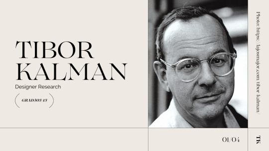
Week 1: Designer Research (Tibor Kalman)
Lecture Summary:
In our first materials and medias lecture, we are introduced to general information regarding the course contents as well as future assignments. For this paper, we will be randomly assigned a designer, and will be asked to design a visual timeline (formative) for said designer. During this session, we are guided through various programmes we will be using throughout this semester (such as adobe suit and canvas).
Self-Directed Learning (SDL):
For this week, we are instructed to gather and research rudimentary information (date of birth, place of work, etc) regarding our assigned designer. I have compiled my findings as shown below.
During the lecture, it is explained that we are given starter packs of basic information on our allocated designer that are compiled together. This was extremely helpful as I had a better idea of how I could direct my research and what sorts of materials I would need to research to add more details into the starter information.

To start, I wrote down a very simplified explanation of Tibor Kalman’s background and career using the starter pack information that was given. This helped lay out a foundation knowledge regarding my allocated designer’s background and also provided helpful pointers in how I may want to consider what sorts of information I should be incorporating into the timeline.

Regarding Kalman’s past works, I have put together very few works/projects Kalman was involved in. I plan to further develop this research by looking for more specific information such as an analysis of Kalman’s design elements.
In the given starter pack, there was an interview of Tibor Kalman where he expresses many of his opinions regarding the controversy of his produced works and current concerns and beliefs in the design industry. I thought it would be fitting to include small snippets of his interview as it provided helpful backgrounds in understanding Kalman’s character and his design purposes.
Template taken from: https://www.canva.com/templates/EAExvbSAbiw-nude-warm-neutral-classic-minimal-photography-photography-online-portfolio/
(03.03.2022)
0 notes