
Don't wanna be here? Send us removal request.
Statistics
We looked inside some of the posts by ayushv4 and here's what we found interesting.
Average Info
Notes Per Post
0
Likes Per Post
0
Reblog Per Post
0
Reply Per Post
0
Time Between Posts
6 months
Number of Posts By Type
Text
16
Last Seen Tumblr Blogs


Fun Fact
In 2020, Tumblr had 29.4 million users in the US.
Text
CAP Theorem
Consistency: Read will return most recent write i.e. there won't be any inconsistency in the data.
Availability: Non-failing node will return response in reasonable amount of time.
Partition Tolerance: System will continue to work in case network partition.
Networks are bound to fail, hence there is a tradeoff between consistency and availability. This is not binary, rather we can have a degree of availability and partition tolerance.
0 notes
Text
Data Visulization - week2 (SAS)
Started week 2 with gapminder dataset. The variables I’d selected are continuous, hence frequency tables are not much useful, unless I categorize them using percentiles.
Frequency table with continuous variables:

SAS Code:
*LIBNAME tells sas where to find the data, where mydata is variable name; LIBNAME mydata "/courses/d1406ae5ba27fe300 " access=readonly; *Read data using DATA keyword; DATA new; set mydata.gapminder; LABEL incomeperperson="Income per person" internetuserate="Internet use rate" lifeexpectancy="Life expectancy"; * logic statements to subset data;
*Sort data; PROC SORT; by Country;
*Frequency procedure; proc FREQ;Tables incomeperperson internetuserate lifeexpectancy; * Execute all previous statements; Run;
0 notes
Text
Data Visualization - week1 (SAS)
Starting data visualization course in SAS.
Dataset: Gapminder (incomeperperson, Internetuserate, lifeexpectancy )
Research question: Income Inequality, Internet Use Rate, and Life Expectancy.
Hypothesis: Income disparities and internet use rates are negatively associated with life expectancy.
0 notes
Text
Replace value of R dataframe based on frequency count
After trying various approaches on this, found the solution
The value I’m trying to update should be a factor variable.
counts <- table(train$category) notkeep <- names(res[res < 500]) keep <- names(res)[!names(res) %in% notkeep] names(keep) <- keep levels(train$category) <- c(keep, list("other" = notkeep))
source stackoverflow
0 notes
Text
Titanic gender class model
In the first submission to kaggle we did the plain 1 and 0 for survived column based on whether gender is female or not
In this approach we are adding the pclass and the fare bin, along with gender, to see if the survival rate changed. Below is percentage survival table for female. Here row are the pclass while columns are fare bin.
[[[ 0. 0. 0.83333333 0.97727273] [ 0. 0.91428571 0.9 1. ] [ 0.59375 0.58139535 0.33333333 0.125 ]]
We can see that survival is high only for a few combinations.
For male, however the table survival rate is low for all cases.
[[ 0. 0. 0.4 0.38372093] [ 0. 0.15873016 0.16 0.21428571] [ 0.11153846 0.23684211 0.125 0.24 ]]]
After applying setting the survival 1 for percentage > 0.5 we get below tables
Female:
[[[ 0. 0. 1. 1.] [ 0. 1. 1. 1.] [ 1. 1. 0. 0.]]
Male:
[[ 0. 0. 0. 0.] [ 0. 0. 0. 0.] [ 0. 0. 0. 0.]]]
Hence in this approach instead of putting 1 for each female we are putting 1 based on the above table. To do this we iterate over each row of test data and determine the fare bin index:
If no valid fare exist, fare-bin = pclass -1
if fare-bin is greater than 40, fare-bin = 2
else fare-bin is J if row[8] >= j*fare_bracket_size) and (row[8] < (j+1)*fare_bracket_size
Next we read the value from the above matrix using fare-bin, pclass for female and male resp.
Using this we managed to improve kaggle score just by 0.01435, which is not much, but this approach is pretty interesting.
0 notes
Text
Lasso Regression on Titanic Data
Lasso is a supervised machine learning method that is often used to select subset of variables. Here are the result
Regression coefficients for each variable:
{'Age': -0.060682083621113346, 'Embarked_num': 0.0090246347551968149, 'Fare': 0.0, 'Parch': -0.0038484568985880153, 'Pclass': -0.1464785111979624, 'Sex_num': -0.22754323249360653, 'SibSp': -0.036887331625642318}
We can see form the regression coefficients for Fare variable it’s 0, hence removed from model while sex and Pclass has the largest coefficients i.e. the strongest predictors.
Regression coefficients progression path

Plot of mean squared error on each fold

Mean squared error on training and test data
Training data MSE 0.142294585912 Test data MSE 0.155566866219
Since MSE for test and train data is close which means the prediction accuracy was stable across two dataset.
R square on training and test data
Training data R-squared 0.406907001822 Test data R-squared 0.359609869181
Model explained 40% and 35% variance across the dataset.
0 notes
Text
Titanic prediction using Decision Trees
Predicted the kaggle’s titanic competition. Here target variable is Survived. We ran the decision tree and got 63.48% accuracy.
Confusion matrix:
[[151 74]
[ 56 75]]
Accuracy score: 0.634831460674
To make this model work we removed the Cabin column as most of the values were missing. Below is the code
from sklearn.cross_validation import train_test_split from sklearn.tree import DecisionTreeClassifier from sklearn.metrics import classification_report import sklearn.metrics
data = pd.read_csv('data/train.csv')
data = data.drop('Cabin', axis=1) # remove cabin as many values are missing data_clean = data.dropna()
# split into train and test set predictors = data_clean[['Pclass','Age','SibSp','Parch','Fare']]
targets = data_clean.Survived
X_train, X_test, y_train, y_test = train_test_split(predictors, targets, test_size=.4) print X_train.shape, X_test.shape, y_train.shape, y_test.shape
classifier = DecisionTreeClassifier() classifier = classifier.fit(X_train, y_train)
pred_vals = classifier.predict(X_test)
print "Confusion matrix:" print sklearn.metrics.confusion_matrix(y_test, pred_vals)
print 'Accuracy score:', sklearn.metrics.accuracy_score(y_test, pred_vals)
0 notes
Text
Titanic Data Analysis using Logistic Regression
After analysing the logistic regression model we only found three variables affecting the response variable: Sex, Pclass, and Embarked. All other explanatory variables have large p-value that association insignificant.

Here is the odd ratio, along with confidence interval:

The result rejected the hypothesis for explanatory variables: Parch, SibSp, and faregrp, while supporting hypothesis for Sex, Pclass, and Embarked.
Pclass has the confounding effect on the faregrp variable. See below summary

0 notes
Text
Multiple regression - week3
While we now have evidence that breast cancer rate is significantly associated with urban rate and income per person. What if it’s urban rate that is responsible and not income per person.
We used multiple regression to to evaluate multiple predictors.
Looking at the confidence intervals we can rule out the possibility that association between urban rate and breast cancer rate is 0.

To check whether association is linear or curvilinear we added the polynomial term to the urban rate. From below graph we can see that straight line is the best fit.

From below regression result we can see that R-value doesn't increase much from .325 to .357 i.e. by adding the quadratic term the amount of variability in breast cancer rate increases just by 3.2%

The below residual plot show that residuals doesn't follow a straight line i.e. perfect normal distribution, which means that the association we have observed earlier in scatter plot may be fully estimated by quadratic term. There might be other explanatory variables.

The below plot describes the outlier by plotting standarized residuals (mean=0 and sd=1) for each observation. There a two values which are more than 3 standard deviations that could be the extreme outliers.

The partial regression plot below show the effect of adding urban rate as additional variable. Plot shows a linear pattern for urban rate.

The leverage plot also shows that there are a few outliers.

0 notes
Text
Statistical Analysis on Titanic data
I’m starting the kaggle’s Titanic competition by performing statistical analysis on a few variables to see the correlation between them, and I found that there is strong association between most of the variables. Below are the results of Chi-Square Test of Independence.
Survived vs Sex
(260.71702016732104, 1.1973570627755645e-58, 1, array([[ 193.47474747, 355.52525253],[ 120.52525253, 221.47474747]]))
Survived vs Embarked
(26.489149839237619, 1.769922284120912e-06, 2, array([[ 103.7480315, 47.5511811, 397.7007874],[ 64.2519685, 29.4488189, 246.2992126]]))
Survived vs Pclass
(102.88898875696056, 4.5492517112987927e-23, 2, array([[ 133.09090909, 113.37373737, 302.53535354],[ 82.90909091, 70.62626263, 88.46464646]]))
Survived vs SibSp
(37.271792915204308, 1.5585810465902116e-06, 6, array([[ 374.62626263, 128.77777778, 17.25252525, 9.85858586,11.09090909, 3.08080808, 4.31313131], [ 233.37373737, 80.22222222, 10.74747475, 6.14141414, 6.90909091, 1.91919192, 2.68686869]]))
Survived vs Parch
(27.925784060236168, 9.7035264210399973e-05, 6, array([[ 4.17757576e+02, 7.27070707e+01, 4.92929293e+01, 3.08080808e+00, 2.46464646e+00, 3.08080808e+00, 6.16161616e-01],[ 2.60242424e+02, 4.52929293e+01, 3.07070707e+01,1.91919192e+00, 1.53535354e+00, 1.91919192e+00, 3.83838384e-01]]))
Survived vs Fare
I categorised the fare into three groups based on < 14, <31, and others.
48.974612958515024, 2.5929696463727534e-12, 1, array([[ 410.36363636, 138.63636364],[ 255.63636364, 86.36363636]]))
Survived vs Age
Age has some missing values, so I replaced those with the mean. I also categorised age into two variables based on age > 66 and others. Though, I was expecting a significant association between survived and age (based on personal preference), but results shows no such association.
0.8576097318531849, 0.35440845669774768, 1, array([[ 544.68686869, 4.31313131],[ 339.31313131, 2.68686869]]))
From results we can see that Survived has significant association with Sex, Embarked, Pclass, SibSp, Parch, and Fare.
I will continue to explore this dataset further by applying linear regression modeling techniques.
0 notes
Text
Exploring statistical interaction - week4
Statistical interaction describes a relationship between two variables that is dependant upon, or moderated by, a third variable.
To see the relationship between income per person and breast cancer rate moderated by urban rate, we test for moderation within the context of the correlation coefficient.
We categorised the urban rate into three parts based on the percentiles using qcut, and then ran correlation coefficients on these sub groups. Below are the findings of pearson correlation test (correlation coefficients and p-value):
Low urban rate:
(0.5166962683887929, 0.00017005319155702838)
Moderate urban rate:
(0.62782289031247585, 1.3753173851906869e-06)
High urban rate:
(0.686103395810572, 2.7411707976896442e-07)
Here we can see the significant association between income per person and breast cancer rate across all the urban rate groups. Hence, urban rate doesn’t moderate the relationship.
0 notes
Text
Pearson Correlation - Week3
To analyse the linear relationship between quantitative variables - breast cancer rate (Y), income per person (X), and urban rate (X) - we have calculated the pearson correlation coefficient between these variables.
The correlation coeffiecient varies between -1 and +1 with 0 implying no correlation. Correlations of -1 or +1 imply an exact linear relationship.
Here is scatter plot


From looking at the scatter plots we can guess that association is positive. Now let’s look at the correlation coefficients
Association between income perp person and breast cancer rate
(0.73139851823791835, 6.7680050678785747e-29)
Association between urban rate and breast cancer rate
(0.57721793332990379, 4.8461295565483764e-16)
From correlation coefficients we can interpret that the association is positive as already shown in the scatter plot.
Below is code
scat1 = seaborn.regplot(x='urbanrate', y='breastcancerper100th', fit_reg=True, data=data) plt.xlabel('Urban rate') plt.ylabel('Breat cancer rate') plt.title('Scatterplot for association between urban rate and breast cancer rate')
scat1 = seaborn.regplot(x='incomeperperson', y='breastcancerper100th', fit_reg=True, data=data) plt.xlabel('Income per person') plt.ylabel('Breat cancer rate') plt.title('Scatterplot for association between income per person and breast cancer rate')
scipy.stats.pearsonr(data_clean.urbanrate, data_clean.breastcancerper100th)
scipy.stats.pearsonr(data_clean.incomeperperson, data_clean.breastcancerper100th)
0 notes
Text
Chi Square Test of Independence - Week2
This week we are interested in chi-square test of independence, which is done when both response and explanatory variables are categorical. So we converted the breastcancerrate into two categories based on whether the value is greater than the mean of it.
Result of chisquare test:
Contingency table
incomegrp4 25 50 75 100 cancergrp2 False 46 37 31 16 True 2 10 16 32
Column percentages
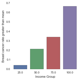
incomegrp4 25 50 75 100 cancergrp2 False 0.958333 0.787234 0.659574 0.333333 True 0.041667 0.212766 0.340426 0.666667
Chi-square, p-value, expected counts
(46.484610838334248, 4.4735064420145792e-10, 3, array([[ 32.84210526, 32.15789474, 32.15789474, 32.84210526], [ 15.15789474, 14.84210526, 14.84210526, 15.15789474]]))
Here the chi-square value is large and p-value is very small, which means that there is significant association between income and breastcancer rate.
Since the explanatory variable has more than two levels, the chi-square statistic and associated p value, do not provide insight into why the null hypothesis can be rejected. To determine which groups are different from the others, we performed post hoc test.
No of comparisons required = 6
Benferroni Adjustment = 0.05/6 i.e. reject null hypothesis only when p-value is less than 0.008
Post hoc test
Income group 25 and 50 - Accept null hypothesis
chi-square value, p value, expected counts (4.8444281336338264, 0.027735587478823206, 1, array([[ 41.93684211, 41.06315789], [ 6.06315789, 5.93684211]]))
Income group 25 and 75 - Reject null hypothesis
chi-square value, p value, expected counts
(11.92513846353607, 0.00055381510961757775, 1, array([[ 38.90526316, 38.09473684], [ 9.09473684, 8.90526316]]))
Income group 25 and 100 - Reject null hypothesis
chi-square value, p value, expected counts (38.299810246679314, 6.0668544779763472e-10, 1, array([[ 31., 31.], [ 17., 17.]]))
Income group 50 and 75
chi-square value, p value, expected counts - Accept null hypothesis (1.3291855203619911, 0.24895016623866095, 1, array([[ 34., 34.], [ 13., 13.]]))
Income group 50 and 100
chi-square value, p value, expected counts - Reject null hypothesis (18.038642237053399, 2.164661777630137e-05, 1, array([[ 26.22105263, 26.77894737], [ 20.77894737, 21.22105263]]))
Income group 75 and 100
chi-square value, p value, expected counts - Reject null hypothesis (24.453177499394826, 7.6137837637939807e-07, 1, array([[ 11.06557377, 13.93442623], [ 15.93442623, 20.06557377]]))
Below is the code
data['cancergrp2'] = data.breastcancerper100th > 37
ct1 = pd.crosstab(data.cancergrp2, data.incomegrp4)
colsum = ct1.sum(axis=0) # sum in each col colpct = ct1/colsum
data.incomegrp4 = data.incomegrp4.astype('category') data.cancergrp2 = data.cancergrp2.convert_objects(convert_numeric=True)
%matplotlib inline seaborn.factorplot(x='incomegrp4', y='cancergrp2', data=data,kind='bar',ci=None) plt.xlabel('Income Group') plt.ylabel('Breast cancer rate greater than mean')
# Choose only two income groups at a time recode2 = {25:25,50:50} data['comp1v2'] = data.incomegrp4.map(recode2)
#data['resp1v2'] = data.cancergrp2.map(recode2)
ct2 = pd.crosstab(data.cancergrp2, data.comp1v2) print ct2
# Column percentages colsum = ct2.sum(axis=0) colpct = ct2/colsum print colpct
print('chi-square value, p value, expected counts') cs2 = scipy.stats.chi2_contingency(ct2) print cs2
0 notes
Text
Hypothesis Testing and ANOVA - Week1
Research Question: Is there any correlation between income group and breast cancer rate?
Null Hypothesis: There is no correlation and difference is mere chance.
Alternate Hypothesis: There exist a positive correlation.
In the previous entry we graphically visualised the positive correlation between the income group and the breast cancer rate. Following this we ran a few statistics test to test the hypothesis. We ran ANOVA and Tukey hsd as post hoc test.
Below are the results:
ANOVA: The p-value is 3.72e-25, which is significantly small that rejects the Null hypothesis.

Since the explanatory variable ‘incomegrp4′ has more than one group, ANOVA doesn’t tell us which groups are different from the other. Hence, we ran Post-hoc test to prevent the Type1 error.
TukeyHSD:
Below we can see that in row 2, 3, 5, and 6 meandiff between groups is high. We can say that breast cancer rate is significantly high between income group 25-75, 25-100, 50-100, and 75-100. Hence, rejecting the Null hypothesis.

Below is the code snippet:
data = pd.read_csv('week2/gapminder.csv') data.internetuserate = data.internetuserate.convert_objects(convert_numeric=True) data.urbanrate = data.urbanrate.convert_objects(convert_numeric=True) data.incomeperperson = data.incomeperperson.convert_objects(convert_numeric=True) data.hivrate = data.hivrate.convert_objects(convert_numeric=True) data.breastcancerper100th = data.breastcancerper100th.convert_objects(convert_numeric=True)# Group incomeperperson data['incomegrp4'] = pd.qcut(data.incomeperperson, 4,labels=['25','50','75','100']) data.incomegrp4 = data.incomegrp4.convert_objects(convert_numeric=True)
# Using ols function to calculate f-statistics and associated p-values model1 = smf.ols(formula='breastcancerper100th ~ C(incomegrp4) ', data=data) result = model1.fit() result.summary()
# Posthoc test mc1 = multi.MultiComparison(sub1['breastcancerper100th'],sub1['incomegrp4']) res1 = mc1.tukeyhsd() res1.summary()
0 notes
Text
Visualizing Data - week4
This week started with univariate and bivariate graph analysis. The question I was interested in the factors that might affect the breast cancer rate.
The below graph shows the positive correlation between “breast cancer rate” and the “income per person”.
There is also a positive correlation between “income per person” and “internet use rate”, which is also reflected in the “breast cancer rate” and “internet use”.
There might be many factors that might lead to high breast cancer among high income group: lifestyle, food habits, etc. that cannot be analyzed with existing data.


Below is the code snippet from same
import pandas as pd import numpy as np import matplotlib.pyplot as plt import seaborn
data = pd.read_csv('week2/gapminder.csv') data.incomeperperson = pd.to_numeric(data.incomeperperson, errors='coerce') data.alcconsumption = pd.to_numeric(data.alcconsumption, errors='coerce') data.femaleemployrate = pd.to_numeric(data.femaleemployrate, errors='coerce') data.breastcancerper100th = pd.to_numeric(data.breastcancerper100th, errors='coerce') data.lifeexpectancy = pd.to_numeric(data.lifeexpectancy, errors='coerce') data.hivrate = pd.to_numeric(data.hivrate, errors='coerce') data.internetuserate = pd.to_numeric(data.internetuserate, errors='coerce') data.employrate = pd.to_numeric(data.employrate, errors='coerce')
# Group incomeperperson print('Income per person - 4 categories - quartiles') data['incomegrp4'] = pd.qcut(data.incomeperperson, 4, labels=['1=25%tile','2=50%tile', '3=75%tile','4=100%tile']) data.incomegrp4.value_counts(sort=False, dropna=True)
seaborn.factorplot(x='incomegrp4', y='breastcancerper100th',data=data, kind='bar', ci=None) seaborn.regplot(x=data.internetuserate, y=data.breastcancerper100th) seaborn.factorplot(x='incomegrp4',y='internetuserate', data=data,kind='bar',ci=None)
0 notes
Text
Managing Data - week3
Week 3 assignment for data visualization course on coursera. Exploring the GapMinder dataset
Tried to answer just a few basic questions using frequency tables.
Output:
Frequency Tables
Percentage of female employ rate low 8.45 medium 32.86 high 32.39 veryhigh 9.86 dtype: float64 Percentage of life expectancy low 13.15 medium 12.21 high 29.58 veryhigh 34.74 dtype: float64 Percentage of urban rate low 19.72 medium 23.94 high 31.92 veryhigh 19.72 dtype: float64 Percentage of alcohol consumption low 42.25 medium 30.05 high 13.62 veryhigh 1.88 dtype: float64 Percentage of income per person low 79.34 medium 8.45 high 0.47 veryhigh 0.94 dtype: float64
Does life expectency increases with urban rate? Yes, with very high in very high urban areas
life expectency percentage in LOW urban rate: low 28.57 medium 26.19 high 28.57 veryhigh 9.52 dtype: float64 life expectency percentage in MEDIUM urban rate: low 23.53 medium 17.65 high 33.33 veryhigh 19.61 dtype: float64 life expectency percentage in HIGH urban rate: low 5.88 medium 5.88 high 42.65 veryhigh 42.65 dtype: float64 life expectency percentage in VERYHIGH urban rate: low 0.00 medium 4.76 high 11.90 veryhigh 66.67 dtype: float64
Does alcohol consumption increases with increase in income per person? No, rather alcohol consumption is only in low income areas, but this also could be that data might be missing.
alcohol consumption percentage in LOW income per person: low 48.52 medium 32.54 high 13.61 veryhigh 2.37 dtype: float64 alcohol consumption percentage in MEDIUM income per person: low 11.11 medium 38.89 high 33.33 veryhigh 0.00 dtype: float64 alcohol consumption percentage in HIGH income per person: low 0 medium 0 high 0 veryhigh 0 dtype: float64 alcohol consumption percentage in VERYHIGH income per person: low 0 medium 0 high 0 veryhigh 0 dtype: float64
0 notes