
Statistics
We looked inside some of the posts by ba1a-ali and here's what we found interesting.
Average Info
Notes Per Post
0
Likes Per Post
0
Reblog Per Post
0
Reply Per Post
0
Time Between Posts
5 hours
Number of Posts By Type
Text
17
Last Seen Tumblr Blogs


Fun Fact
Tumblr has been banned in Indonesia for providing people with access to pornographic content.
Text
Week 3 After Effects Tasks
Here are my week 3 animation tasks. This week we learned about looping, using null objects as controllers, and using the pen tool to make a path for an object to follow. This animation was more advanced than what I had previously attempted, but this also made for some more impressive outcomes.
These tasks forced me to think more systematically than I had been previously, which I know will be useful in future work. My favourite clip from this week was the assault course, as it allowed for more creativity in that I could create my own objects, and the outcome was quite satisfying to watch because it was believable.
I think something that I have avoided throughout my After Effects work is using squash and stretch in bouncing ball animation. While I have attempted this, every time I tried it did it work and made the movement seem weird and unnatural. This is something I intend to spend some time on because I understand that it will probably become more necessary as I move forward, and to understand what I am doing wrong so I can correct it I will need to understand how to do it right, so my intention is to research squash and stretch tutorials on YouTube in my spare time, and try these excersises again.
Overall I have enjoyed using after effects thoroughly, even though it can be frustrating at times and can also be quite difficult, I learned something new and I’m quite proud of myself for that. Generally computers and technology is an area I find quite daunting but I think my confidence in using them has grown significantly from learning to use after effects. I look forward to being able to use it more for more creative projects, such as taking my own drawings and animating them similarly to how I have been animating in these sessions.
0 notes
Text
Week 2 After Effects Tasks
In this weeks tasks, we learned about how the graph editor tool works in After Effects, which can be used to manually adjust the way an object eases in and out of a position. This is useful, because while the key frame assistant tools do work, this is more refined and can be adjusted to specifically fit a particular action, and therefore will more accurately obey the laws of physics.
Something else these tasks taught me was about separating the X and Y dimensions of the position key frame tool. This was so helpful for creating smooth, regular animation of the bouncy balls, especially for going down steps which was something that had completely bewildered me until now. With some adjustment of the graph editor, I was able to make these movements look more realistic.
I think even with my new appreciation for the graph editor tool, some of these clips don’t look quite as believable as they should, in particular the first and second bouncing ball exercise, the movements of which I find to look a little aggressive considering the height the ball drops from. I did try to amend this with the graph editor tool but they still feel too strong, and I don’t quite know what I should to do fix this.
I think the final of this weeks tasks, the balloon, tennis ball and bowling ball, was my most successful work, as the movements do seem to obey the laws of physics. Galileo stated that all objects fall at the same speed regardless of mass, effected only by air resistance, so I tried to make sure that where necessary this is how my animation came across. I learned this theory while I was doing my GCSE physics, and it made me realise that a lot of the stuff I learned in those lessons would be applicable to animation, so I intend on refreshing my memory on this area, as I think it will be beneficial to my work.
0 notes
Text

After refining the images that I liked, I went back to the locations to photograph them from different angles, taking symmetry and the rule of thirds into consideration as well as thinking about the landscape that I will have to work with when manipulating my images in photoshop.

0 notes
Text
New Photoshop Project: Journey

After our briefing for our new project, we had a session where we went through the basics of photoshop. I am fairly experienced with the programme so a lot of what we learned wasn’t new to me, but I hadn’t really used the pen tool to select a shape before so that was something I got to learn. We photoshopped a fish into a photo of Norwich as practice for our final image, which will be a photo of Norwich that we have taken ourselves and edited another element into it.
This process made a pleasant change after the after effects lessons, which were new to me and I felt a little out of my depth. This was something I already knew how to do, so it was easier to be more enthusiastic about it.
While this was an excersise I’m already familiar with, I found that using the pen tool was new and will take some practice for me to get used to, but I appreciated the challenge and the opportunity to learn something new.
Additionally, after I had finished with the first fish I decided to add another one. I looked for an image that was a little more dynamic than this first, so I chose the koi fish because I liked that the photo was taken from the front, however this presented its own challenges in terms of shallow depth of field, as this didn’t match the focus of the wide angle shot of the Forum. Also, the photo of the koi fish was taken on a black background, and the fins are pretty transparent towards the end, meaning the old background shines through and they’re too dark, which is pretty annoying but the lesson learned is that next time I should choose an image where this won’t be a problem.
This process was a useful recap on something that I haven't done for a while, and I'm glad I got the opportunity to practice these techniques before having to use them in my final images.
0 notes
Text
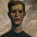
Simon Stalenhag
source link (used 10/11/20 11:10AM)


Simon stalenhag is a Swedish artist. he creates dystopian images that typically feature the picturesque Scandinavian scenery of his home country, but are littered with remains of robots and machines. within the images, the machines are commonplace and life is portrayed to keep moving around them.
Simon stalenhag was inspired by the Sci-Fi movies he watched growing up in rural Sweden, and as a result his work is simultaneously futuristic and has the nostalgic feel of the 80s.
Dante D’Orazio wrote for the Verge in 2013 that “the artwork is impactful as a result of this juxtaposition between the harsh realities of life and the Sci-Fi technologies of our dreams... the universe created by the artist seems to continue well beyond the edge of the canvas.” i felt this was a really good way of describing the feel of his work. the sense of narrative in his work is extremely present; the images speak for themselves without the need for a description.
despite the stark contrast between the rural landscapes and the decaying robots and machines, i really like how subtle the images are - the machines have a history in their world and the characters barely interact with them, suggesting that they are commonplace, and while they may be considered unusual to us as the spectator, within their own world its just another day.
compositionally i like the way that the Sci-Fi additions to these images are never the main focus; they are often to the side or in the background, allowing them to more easily blend into their environment. this is something i will be paying particular attention to in my own work, as i think this will be important when trying to add objects into an environment in a way that might ordinarily reject them.
another element of his work that i like is the way he uses colour. typically the colours in his paintings are somewhat faded, often with overcast skies or sunsets; and i think this consideration of colour is part of what makes his images flow so nicely and have a consistent feel to them. colour is something i think will be very important to my own work in terms of creating a flow from one image to the next - so when taking my final photos for my project i will need to consider lighting and colour in the various locations across Norwich so that my images have a consistent feel also.
additionally, something that is more of a personal preference about his work is the derelict nature of the structures in is paintings. i think this gives them a story of their own within the overall image, and is something i would like to try and emulate in my own photos.
0 notes
Text

after practicing perspective drawing, i decided to do some practice, so i drew the laundry room in my uni accommodation while i waited for my clothes. i’m quite happy with the outcome, as i think i did a pretty good job in terms of the perspective, however i think i need to invest in some mechanical pencils so i can get sharp, clean lines, as i think this would make the drawing look more sophisticated.
0 notes
Text
Drawing Workshop: Perspective and Composition


during these drawing sessions we practiced using different kinds of perspective in drawing, and experimented with composition in drawing to give the most pleasing layout.
i liked these drawing sessions because they were quite technical; there were clear building blocks to the foundation of drawing in a 3D space. however, this technical element was also frustrating when drawing more complex shapes like a tetrahedron because it is more difficult to see where the lines of perspective go.
i will be able to use different kinds of perspective in my work when drawing scenery and working in a 3D space, and i will be able to use composition in my work as well when i need to consider the layout of my drawings
0 notes
Text
Mood board/mindmap

I decided to make a moodboard of sorts just to help me visualise my ideas and get me thinking about imagery, colour, composition and visual elements that I may want to include. Some of the images I chose were of Simon Stålenhag’s work, others were photos of derelict settings, and I also researched Chernobyl and a photographer called Tommy Ingberg whose work I have been interested in for a long time, and I thought was relevant because of his photo manipulation work and the surrealist themes to his work.

0 notes
Text
Photoshop Brief: taking photos around Norwich

After our briefing on our new project, I went out that evening to take photos of different places around Norwich that I’d seen already and had stuck in my mind. I walked all around the city, and chose to go at night because I knew there would be less people around and I’d be able to see the city in a more stripped down state - I also took some photos of new places I found at the weekend during the day. While these photos will not be used as part of my final outcome I wanted to get a feeling for the space I will be working with, as well as map out some kind of route for the ‘journey’ I will be depicting.
The large building in Anglia Square definitely made an impression on me; it’s size and derelict nature make it quite foreboding, and it certainly has a lot of presence in its environment. The run down, deserted atmosphere reminded me of the work of Simon Stålenhag - the artist we discussed in the briefing. I really liked thiss artist’s work and I thought there was a lot to learn from the dark, surrealist elements, so I will be researching this in more detail in due course.
The thing about Norwich is that it has a lot of quite different looking environments, which generally I love, but the changes in texture and colour and even the sense of history across the city definitely presents some challenges in terms of creating a clear narrative. Therefore I think an important next step would be to take some photos of places that correlate well in their appearance - for instance, the anglia square building would work well in sequence with the underpass, as they’re both quite empty and unkempt and have some colourful grafiti and art on the walls, whereas pairing places like these with photos of Elm Walk for instance, with its cobbled streets and picturesque old buildings, may not work as well. I think a next step Would be to plan my journey with this in mind, thinking about similarities in colours, environment and the energy and composition of the photos as well. This will help me form the basis of a narrative for my final photos


0 notes
Text
Drawing workshop: Life drawing


as part of our weekly drawing sessions, we began practicing life drawing. i have done some life drawing before, but not very much and until now i have only drawn women, so while it wasn’t an entirely new practice there was still a bit of learning to do. in the first week, we focused on line work, the second we started to work more tonally, as well as starting to draw some 3D shapes that the life models were holding, and in the third week we focused on drawing hands as it is an area that collectively we were more lacking in. each week, Will would give us a short window of time to sketch the model, in several poses, varying from 30s to 4mins, and then at the end of the session we would spend longer, around 25 mins, on a more detailed sketch.
during these sessions i found that i got frustrated with the short amount of time we had to draw the life model, and felt that i didn’t have enough time to finish, but usually found that after a few drawings i would get more into it and relax, and this meant my work looked better and i felt better.
i felt this task was a good exercise in speed, and taught me a lot about the scale of the human body. as i mentioned, i had never drawn the male form before so it was a learning curve for me and i liked learning something new.
i think part of what frustrated me during these sessions was seeing the work of my peers and feeling that it was better than my own, which isn’t really a good way of judging my own work, especially seeing as many of them have had more practice than i have. i intend on doing lots more life drawing in my own time so i can properly get the hang of it and feel more confident in myself.
going forward, life drawing skills will be crucial to my animation work, as it will help me draw characters and understand how they move better. this is why it is important that i keep practicing so i can improve and put these skills to use in my work. in my own time i intend on drawing my friends as well as going to public areas like the local park to draw people in a more natural, candid state.
0 notes
Text
Research task: clip 15
Exaggeration
A key element of the character design in Frankenweenie is the exaggerated eye size, which make the characters look more creepy or unnerved. It makes sense that they would make use of this feature to convey emotion - here you can see that the character’s eyes move quickly as they both look in the direction of victor’s mother, which guides the viewers eyes in the same direction and helps convey a thought or message.
Secondary action
To add to Edgar’s ‘creepy’ characteristics, as a secondary action while he speaks, he also wrings his hands. Again, the character design assists this, due to the long, thin nature of his fingers.
0 notes
Text
Research task: clip 14
Anticipation
As the box trolls and the boy are flying through the air, they kick their legs and the box trolls recede into their boxes in anticipation of the impact ahead. This prepares the viewer for the major action and also emphasises the box troll’s timid nature.
Squash and stretch
As the box trolls hit the roof tops, their boxes squash and stretch with the impact. This gives the illusion of weight and volume.
Perspective shot
At the end of the clip, the camera switches to a perspective shot, so you see what’s happening from a first person point of view. This draws the viewer in and makes them feel like they’re a part of the action.
0 notes
Text
Research task clip 13
Anticipation
Before the cat picks up the third cup, he smiles and rubs his hands together in anticipation. This draws out the action and builds up suspense, which is then interrupted when Cinderella appears at the table.
Follow through
Before he picks up each cup, the cat hunches down towards it, and as his fur is lighter and would have more air resistance it takes a moment for it to catch up to the main body. This creates the illusion of softness and also makes his movements feel more erratic.
0 notes
Text
Research task: clip 12
Staging
at the start of the clip the camera pans out, leaving billie in the background and the city and blohsh people in the foreground. this is done to emphasise the scale of the protagonist in comparison to her surroundings, so as to make her come across as intimidating or powerful.
0 notes
Text
Research task: clip 11
anticipation
as the petal falls away from beneath the troll, leaving her floating in the air for a second, her expression changes so she looks more alarmed, signifying that she is in danger.
arcs
as the troll lands, she swings herself up over her hair and onto the ‘stairs’ in one fluid motion. creating one smooth movement for this gives the scenario an element of control, giving the character a sense of confidence in an otherwise uneasy situation.
0 notes
Text
Research task: clip 10
Slow in to overshoot
As the vehicles approach baymax they come to a sudden stop as the velocity gives them momentum, the car body leans forward and springs backwards as the energy disperses.
Staging
In the first shot, the viewer gets a birds eye shot of the scene, so they can see the situation in full. Then the camera cuts and you see baymax in the foreground with the vehicles behind him, showing the chaos he leaves in his wake.
0 notes