
Don't wanna be here? Send us removal request.
Statistics
We looked inside some of the posts by baileytomkinsviscomblog and here's what we found interesting.
Average Info
Notes Per Post
1
Likes Per Post
1
Reblog Per Post
0
Reply Per Post
0
Time Between Posts
15 days
Number of Posts By Type
Text
17
Last Seen Tumblr Blogs


Fun Fact
Tumblr has 4 main sources of revenue.
Text
Depop Final Plan
Title: Depopify
Idea summary:
Depop D&AD Concept
My project is a fast-paced, visually engaging video that brings various fashion subcultures to life through illustration, rhythm, and community interaction, accompanied by 2–3 posters showcasing real user engagement.
The video features a rhyming narration introducing different Depop users, each representing popular styles among 18–25-year-olds (e.g., skaters, ravers, vintage enthusiasts). These descriptions are paired with minimalist black-and-white illustrations, designed with distinct clothing details that reflect each style. The visuals will sync with the narration, increasing in speed as momentum builds. A local indie rock band will create a custom soundtrack to match the video’s energy, further tying Depop’s brand identity to music culture as a form of self-expression.
Community Engagement & “Depopify” Concept To emphasize real user creativity, I will interview Depop sellers, ask them to style and pose in an outfit, and then illustrate them in my cartoon style. These will be paired with their photos and quotes about their experience, encouraging authenticity and engagement.
I also coined "Depopify", a term describing the transformation of real people into illustrated versions of themselves, which could be imagined as a Depop or social media feature. The related "Depopper" concept plays on interchangeable nouns ending in “-er” (e.g., “raver,” “skater”)—viewers can create their own personalized noun and tag their style online, reinforcing user participation and individuality, both core aspects of Depop’s brand.
Video text:
Whatever your style, Depop can find it
Wether you’re a….
baggy skater, mid day raver, 90s styler, look designer, jogger, blogger, vintage cropper, dreamer, climber, bargain finder, retro lover, crochet glover, fancy dresser, style investor, sneaker peeker, denim seeker, gothic rocker, stripy socker, puffy slayer, in all dayer, bling flasher, outfit masher, skirt twirler, floral shirter, café sitter, solo tripper, K-pop dancer, fashion chancer…
Inhale
Possible taglines:
“Don’t just be a shopper. Be a Depopper.” “Don’t just shop it. Depop it.”
0 notes
Text
Depop - Second Stage Feedback
Group Tutorial Feedback
At this stage, we were expected to have expanded on our idea and developed visuals beyond initial sketches.
I presented research on Depop's past advertising campaigns, highlighting their energetic and consistent style, alongside a Vinted ad to show contrasting approaches to second-hand fashion marketing.
I then showcased my illustrations and rough mock-up layouts, explaining how they align with the brief. The illustrations, in a minimalist and consistent style, represent the different personas described in my rhyme. I expanded on my idea, to use a video where these illustrations appear alongside relevant clothing images from Depop, syncing with the narrated rhyme, which increases in speed. The layout would feature the Depop logo, a search bar typing out words as they were read, and seller usernames beneath the clothing images.
Feedback
Strengths:
The group praised the overall concept and illustrations.
The rhyme was seen as a unique, comedic element that fits Depop’s brand identity and reinforces the sense of community in the brief.
The black-and-white palette was considered effective, maintaining Depop’s brand uniformity without unnecessary distractions.
Areas for Improvement:
Placing clothing images alongside illustrations could split viewer attention; the focus should remain on the illustrations.
The illustrations were well-received but could be more expressive and detailed.
Instead of a single narrator, using multiple voices could enhance energy and better represent different subcultures.
Ideas for Development
The illustrations could be adapted into stickers for social media or physical use, placed in relevant locations (e.g., a skater sticker on a skateboard, a raver sticker in a club).
During discussion, I coined the term "Depopify"—transforming real-life images into this distinct illustration style. This could encourage engagement by allowing users to submit outfit photos and receive personalized avatars.
I suggested my brother’s indie rock band create a simple soundtrack, with the band members illustrated in this style, reinforcing the “Depopify” concept while engaging Gen Z’s indie/rock fashion subculture.


0 notes
Text
Depop - Advertising Campaign Research
Here are examples of advertising campaigns and strategies from other fashion brands and resale markets.
It was interesting to explore the different approaches each business took, what aspects they aimed to promote, how and where the campaigns were shared, and their target audiences.
Vinted - Too Many?
Vinted's "Too Many" campaign focuses primarily on the selling aspect of the platform. It highlights consumer culture and the fact that most of us simply own too many clothes, many of which we never wear. This advert adopts a humorous tone, using a series of shots featuring individuals wearing multiple layers of the same garment at once – for example, hats, hair clips, or bags. The result is visually engaging, creatively directed, and easy to understand, with a broad target audience.
The campaign builds on one of Vinted's key strengths: its user-friendly design, which makes buying and selling quick and effortless.
As an already well-established brand, Vinted didn’t need to include extensive information about its offerings. Instead, the advert creates a fun and memorable experience, effectively reinforcing Vinted’s position in people’s minds.
Vinted differs from Depop in its clear focus on facilitating quick and efficient buying and selling, whereas Depop places more emphasis on fashion and community. Depop aims to foster a space where users can build their own following, connect with others, and explore individual styles.


Depop - Find it on Depop
This advert is high-energy, with quick edits, stylish photography, and eye-catching on-screen graphics. It highlights several real Depop sellers modelling outfits, dancing, browsing their clothes, and scrolling through Depop on their phones. Their individual Depop usernames are featured on-screen.
The audio complements the dynamic visuals, with an upbeat track and voiceovers from the sellers sharing their opinions and insights about their Depop experience.
Here are some quotes from the advert:
"It's about finding something different."
"I like vintage that's actually vintage."
"Old to them, new to me."
"That t-shirt there was from 1987, on that date, at that certain time."
"Buy, sell, look, there's so much to explore."
Featuring real sellers modelling their own items and sharing their thoughts gives the advert a personal and authentic touch, highlighting Depop's strong sense of community. Additionally, showcasing a diverse range of sellers with unique styles emphasises individuality and variety, effectively appealing to a wider audience. Meanwhile, the fast-paced edits, mix of photographic styles, and high-energy beat emphasise Depop's trendy and vibrant personality, keeping the viewer engaged throughout. Overall, this is an effective and well-executed advert.


Vinted, 2024. Too Many?. YouTube video. Available at: https://www.youtube.com/watch?v=yoVa6zgXM-c (Accessed: 26 January 2025).
0 notes
Text
Idea - Design a Look
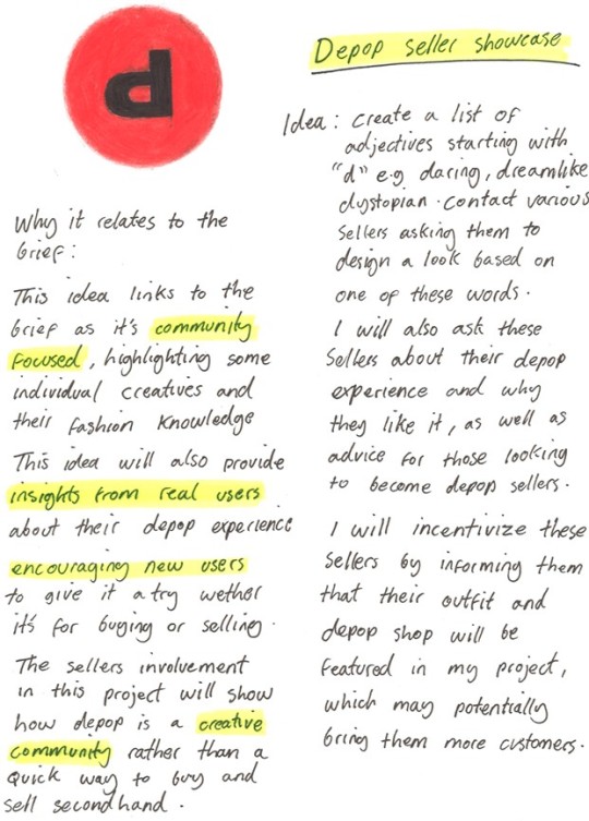
Idea Summary
The idea is to create a list of adjectives starting with "d" e.g. daring, dreamlike, distinguished. The plan is to then contact a few Depop sellers asking them to create an outfit or pick an item based on one of these words. I will also ask the sellers about their Depop experience and possibly for some advice aimed at those looking to become successful sellers in the Depop community.
Strengths
Seller Involvement
Scalable & Feasible
Dual Value
Easily Shareable Format
Weaknesses
Weaknesses
Reliant on Seller Participation
Lacks a Strong Call to Action for Buyers
Not as Visually Striking as Other Concepts
How it relates to the brief
This idea relates to the brief by reshaping fashion storytelling through seller-driven content, encouraging engagement and emphasising the fashion knowledge and skill of members of the Depop community. By asking Depop sellers to interpret adjectives through outfits and share their experiences, it creates an organic narrative that feels authentic to the platform. The concept encourages creativity while reinforcing Depop’s role as a space for individuality and social connection.
Visuals
Social Media Carousel (Instagram-Style)
A slide-based post featuring a bold "D" adjective on the first slide (e.g., Daring in a stylish typeface) followed by various items or outfits created by a few different sellers, featuring quotes from them about their Depop experience. The last slide could feature this text: "Discover more styles on Depop" including a hashtag like #DepopDefined.
Short Video or Reel
A simple montage of seller images with a voiceover reading the adjectives (or animated text). Another idea could be to edit the photos of the sellers items into a dynamic slideshow with energetic music matching the adjectives.
The video/slideshow could end with a tagline similar to this "Define your style. Don't just shop it, Depop it."
0 notes
Text
Idea: Whatever Your Style
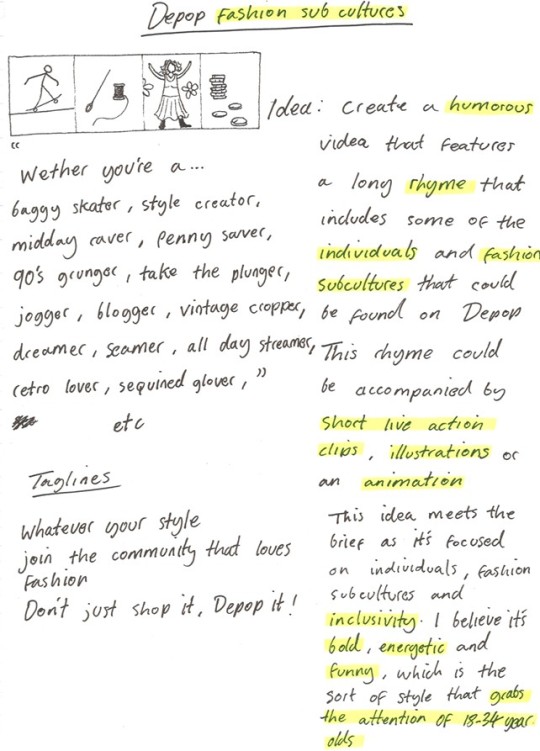
This idea also focuses on community by celebrating difference and individuality. The plan is to create a video that celebrates different style subcultures by creating a long humorous rhyme that builds in speed throughout the video accompanied by the relevant visuals of different items that might be worn by the people in these subcultures. This idea will present Depop as a fun, energetic brand, breaking away from a dull, corporate image.
A strategy to engage the audience could be to challenge them to memorize and recite the rhyme as quickly as possible, which could go viral, especially if popular Depop sellers take part. Another idea is to invite viewers to add their own verse, incorporating a unique subculture or personality trait they identify with.
The rhyme:
"Whether you’re a baggy skater, mid day raver, 90s styler, look designer, jogger, blogger, vintage cropper, dreamer, climber, bargain finder, retro lover, crochet glover, funky dresser, style investor, sneaker peeker, denim seeker, gothic rocker, neon shocker, seller, spender, outfit mender..."
Taglines:
"Join the community that loves fashion"
"Whatever your style"
"Don't just shop it. Depop it!"
Strengths:
Memorability
Broad appeal
Community-driven
Budget-friendly execution
Weaknesses:
Execution complexity
Risk of oversaturation
Limited representation
How it answers the brief:
This idea blends humour, energy, and creativity to focus on style diversity, making Depop stand out from competitors such as Vinted. By celebrating individuality and showcasing various subcultures, it reinforces Depop’s community-driven values and doesn't rely on the usual resale tropes like broad inclusivity or convenience and affordability. The catchy rhyme and visuals make the campaign engaging and memorable, encouraging viewers to identify with the platform and participate through hashtags and social media interactions.
The target audience of 18-34-year-olds would connect strongly with this idea, as they’re accustomed to a fast-paced culture and are drawn to content that grabs and holds their attention.
Visuals
Dynamic Video Clips
Create short, fast-paced video clips of different people representing each subculture. I could film the clips myself using friends and students, or source some stock videos. These videos would be edited so that they match the beat of the rhyme being read out. Items from a variety of real sellers could also be displayed on screen, appearing next to their relevant sub culture e.g. Baggy denim jeans next to "baggy skater".
Animated Text Overlays
Text animations could accompany video clips or images with a range of unique and bold fonts matching the sub cultures and items being featured. Having on screen text to read may also help viewers to better understand what's being read as the fast pace may cause some difficulty with this.
Collage/Pop-Art Style Graphics
Create a collage-style image for each subculture by combining photos of relevant items (like sneakers for a "sneaker peeker") with bold, colourful text that highlights the rhyme.
User-Generated Content (UGC)
I could encourage users to submit their own videos, pictures or audio files of them reciting the rhyme or showing off their style. An incentive could be that their username and shop will be featured in my submission that may increase their followers/buyers.
GIFs or Memes
Memes and GIFs could appear alongside clothing items to represent subcultures, tapping into their role in modern communication. Their inclusion would boost engagement and highlight Depop’s understanding of humour and youth culture.
Feedback
Feedback for this idea was very positive; my peers and tutor expressed interest in the rhyme idea, commenting that it was well-written and humorous and offered a lot of room and potential for visualisation.
Some ideas for execution involved using friends and peers to model some items and activities, as well as potentially lending their voices to read out the rhyme.
I could experiment with Illustration and animation as it's a medium that's currently trending and hasn't really been used before in previous Depop ad campaigns. It was also mentioned by my tutor that illustration is one of my strong points, so tapping into that could be beneficial for my outcome.
Criticisms
There may be too much happening at once which may cause the viewer to become confused or not fully recognise the purpose of the ad.
I could try and include more viewer/user engagement in the project, for example creating a survey that helps to better understand the different fashion/cultural subcultures that people identify with.
I should work on a more striking and concise tagline, as the current one is a bit too long and doesn't flow very well. However the suggestion for "Don't just shop it. Depop it" received praise for it's simplicity.
Next steps
After presenting each of my ideas, it seemed like the group opinion was that this idea had the most potential and was most relevant to the brief.
At this stage, I need to spend more time thinking about the layout and mediums for the video, the length, speed, and tone of the rhyme, as well as researching similar campaigns for inspiration.
0 notes
Text
Idea: Shop the Story/Fashion Journeys

Idea summary
The idea for this project is to highlight and showcase the story behind some of the more unique items that can be found on Depop. The plan is to contact sellers and ask them about the story behind one of their favourite or most unique items that they have for sale, e.g. if they wore it to a festival or created it from various other garments or found it whilst travelling etc. This not only reinforces the circular fashion model but shines a light on how each second hand item is unique and has been through some experiences which you can then add to if you buy it.
This idea could possibly have some buyer engagement, encouraging users to share their fashion stories on social media with hashtags like #shopthestory.
Strengths
Highlights Depop's uniqueness
Community-centred
Engaging and shareable
Sustainability message
Weaknesses
Scalability
Limited appeal
Unpredictable
How it relates to the brief
The campaign aligns with the brief by taking a bold, unexpected approach that highlights the emotional and personal side of circular fashion, setting Depop apart from competitors. It’s community-driven, showcasing sellers' stories and encouraging buyer engagement through interactive elements like hashtags and social sharing. The idea humanizes second-hand fashion and creates a stronger connection between buyers/sellers and the Depop community.
Visuals
Collage
Use clear, well lit images in a potentially hand collaged or digitally collaged style with text on the side from the sellers that I've contacted about the story behind the item. The text could potentially be in the handwriting styles of each seller and feature audio clips from them reading it, which would give a more personal and engaging feel.
Before and after
Could use stock images or videos that give some context and visual aid for the story of each item and then show it being modelled or upcycled in a different way. In the same way I could select upcycled pieces and ask sellers to share some before and after images e.g. a pile of materials, vs the finished product.
Use simple, well-lit photos of items styled on a plain background or modelled by the seller. Add handwritten captions (digitally or scanned) with the item's story, creating an authentic and personal aesthetic.
Audience engagement
Create posters or billboards that asks viewers to take a picture? selfie of their current outfit then scan a QR code to share the image and the story behind one or more of the items they're wearing.
Posters
A more simple route would be to create a series of posters featuring images of certain items, with bold typographic quotes from the sellers next to it. These posters would be very stylised and unique, with the imagery and aesthetic matching the story of the item.
Example quotes:
"I wore this jacket to my first-ever festival—it survived the mud, the music, and mosh pits. Now it’s ready for its next adventure!"
"This dress was my DIY lockdown project. I upcycled it from two old shirts and added the embroidery myself."
"I thrifted this bag on a trip to Barcelona. It’s been my go-to travel buddy, but now it’s time for someone else to take it places."
0 notes
Text
Depop - Analysing the brief
My first step in the creative process was to analyze the brief, deconstruct it, and take note of the key information to better prepare a plan for formulating an appropriate response.
I found these notes helpful to refer back to whenever I got stuck in a certain area or needed to refresh myself on the most important aspects of creating a successful solution to the problem.
0 notes
Text
Depop Survey
I designed a short survey to explore Depop usage, including user preferences, dislikes, and alternative online fashion marketplaces. The survey was distributed via email to the Visual Communication course, shared on my Instagram, and further promoted through word of mouth among friends and family. I kept the survey relatively short to encourage greater audience participation.
The question were as follows.
Do you use Depop?
Yes
No
(If No) What are the reasons you don’t use Depop?
(If Yes) How often do you use Depop?
Daily
Weekly
Occasionally
Monthly
What do you use Depop for?
Buying
Selling
Browsing ideas
All of the above
What do you like the most about Depop?
What frustrates you about Depop?
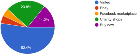
What other fashion platforms do you use?
Vinted
Charity shops
Facebook marketplace
eBay
Buy new
Is the community aspect of Depop important to you?
What could Depop do to improve your experience?
The results
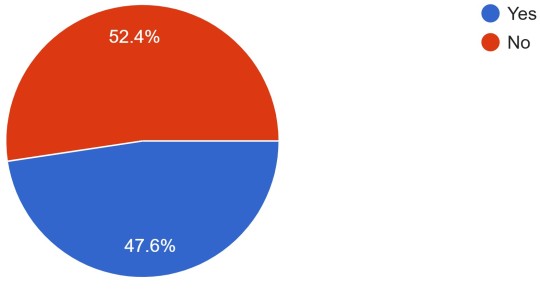
Do you use Depop?
Out of 21 participants, 11 said they don't use Depop, 10 said they do.
(If no) What are the reasons you don't use Depop? (11 responses)
I prefer Vinted!
it’s too expensive compared to vinted
i don’t like the layout i prefer Vinted
I forget to look and feel vinted is more advertised
I have contamination ocd
Didn’t hear about it before this questionnaire.
I don’t know it
I use vinted instead
I use vinted more often
I feel I have to try things on before to see if it'll work on me or not
When I used it I found it was more expensive than charity shops + money doesn't go to charity
(If Yes) How often do you use Depop? (12 responses)
Daily: 0
Weekly: 2
Monthly: 1
Occasionally: 9

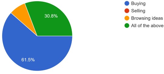
What do you use Depop for? (13 responses)
Buying: 8
Selling: 0
Browsing ideas: 1
All of the above: 4
What do you like the most about Depop? (14 responses)
easy app to use
cool stuff to look at
It being second hand
second hand things r cool
having high quality items for a more affordable cost
guaranteed authenticity
I like the highly categorized structure of choosing the clothes I want
Variety of fashion styles that aren’t found in most high street shops
Environmental aspect of second hand shopping
The vintage clothing and keeping fashion circular
Its easy to use and nice to find hidden gems without leaving the house
Very sought out items that are sold out. Like shoes
Low prices and environmental benefit of buying second hand
more high end brands (in my opinion) than other platforms
What frustrates you about Depop?
Unethical purchase of Y2K clothes being sold for too much money
resellers who price things too expensive
layout
Things being sold as too high a price
scalpers
sometimes people are incredibly cheap which makes it difficult to sell
prices are quite high
Nothing much really
Too expensive for second hand
Don’t know
overpriced items
The prices, people are selling used items for the same price they bought them for
Not used as much so hard to sell, payment methods and people asking for family friend pay via PayPal, scammers, shipping, delays with posting
GUI and search results relevance
the layout of the app, it’s more expensive
What other fashion platforms do you use? (21 responses)
Vinted: 11
Charity shops: 5
Buy new: 3
eBay: 1
Facebook marketplace: 1
Is the community aspect of Depop important to you? (14 responses)
No: 8
Not particularly: 4
Somewhat: 1
Yes: 1
What could Depop do to improve your experience?
Regulate sellers
stop letting idiots on the app
Not sure
not sure
I'm not too sure, I think their app could maybe be more easily designed for users
A more colourful website
Reduce reseller prices
Not sure
It’s pretty good as it is
Key insights
Depop usage
I found from my results that the majority of people use Depop for buying however the most popular preference was occasional use, which could be interpreted as not very often.
Reasons for Non-Use
The negative responses to Depop generally pointed three main aspects:
Pricing
Layout/Usability
Low awareness
Positive Aspects of Depop
Participants praised the platform for these qualities:
Sustainability
Fashion diversity
Convenience
Categorization
Frustrations with Depop
Common complaints from Depop users included pricing, platform usability, and unethical practices:
High prices/resellers
Scalpers
Layout
Limited activity
Alternative Platforms
Vinted was the most popular alternative, praised for its simple and user-friendly layout. Charity shops ranked second, while eBay, Facebook Marketplace, and buying new were the least favoured.
This trend may reflect the demographics of the survey participants—predominantly Gen Z (ages 18-25)—a group that tends to prefer second-hand marketplaces like Vinted. In contrast, older generations often gravitate towards platforms like eBay and Facebook Marketplace.
Community Aspect
The community aspect was unimportant to most participants, with 8 saying no and 4 saying not particularly. Only 1 participant said the community was important, and 1 said it was somewhat important.
Suggestions for Improvement
Suggestions for improvements to Depop's platform included:
Regulating sellers
Pricing
Improving layout
General Consensus
Depop stands out for its diverse offerings, curated fashion finds, and trendy, inclusive vibe. However, it faces strong competition from Vinted, which attracts users with its lower prices and simplistic, user-friendly interface.
Depop also appears to fall short in visibility compared to Vinted, particularly within the UK market.
People primarily use Depop for buying rather than selling and seem to favour occasional visits instead opposed to regular use.
0 notes
Text
Depop Research
This is some key information summarised from Depop's website.
1. Mission Statement:
Depop aims to make second-hand fashion mainstream and promote a circular fashion economy while championing creativity and community.
2. Platform Overview:
Depop is a circular fashion marketplace for buying, selling, and discovering second-hand fashion.
It emphasizes unique and affordable preloved fashion.
The platform features diverse styles, catering to various moods and occasions.
3. Community Impact:
Since 2011, Depop has amassed 35 million registered users globally.
It fosters a culture of resale, helping to extend the life cycle of clothing and encouraging sustainable fashion practices.
The community drives trends, unique styles, and the creation of new looks from old items.
4. Distinguishing Features:
Depop's core values are style, sustainability, community and value. It offers a creative and inspiring alternative to buying new.
It has a focus on user-generated content, where community members contribute to trends and create new designs from preloved items.
5. Origins and Growth:
Depop was founded as a social shopping app where readers of fashion and culture magazine PIG could buy items from the creatives featured
It's now a peer-to-peer marketplace on web and app platforms.
Acquired by Etsy in 2021 but continues to operate as an independent company.
Headquartered in London, with additional offices in New York and Manchester.
It currently has a community of 35 million users
It currently has over 34 million items for sale,
6. Scale and Structure:
Depop employs 400 people and operates globally.
It serves as a hub for vintage finds, cult brand emergence, and celebrity stylist sourcing.
Summary:
Depop is a circular fashion marketplace currently with 35 million users worldwide. It promotes sustainable, diverse and accessible second-hand fashion with a focus on it's community of creative users.
Depop vs Vinted
Vinted (2025):
65M+ registered users in 21 countries
800M+ items available for sale
Depop (2025)
30M+ registered users in over 150 countries
32M+ items available for sale
Similar D&AD Projects
I couldn't find any previous Depop D&AD briefs, but I came across some from similar industries, including eBay.
Ebay
The 2023 eBay New Blood Awards brief challenged participants to create an innovative solution to engage Gen Z in the UK, encouraging them to sell their preloved items on eBay, despite their possible preference for other online second-hand marketplaces.
Sell Where Your Stuff Is Cool (graphite pencil winner)
This submission effectively uses humour and irony to address the brief while showcasing a strong understanding of Gen Z’s fashion habits and the challenges they face when selling certain preloved items. It highlights how rapidly changing trends make it difficult to resell out-of-demand pieces and positions eBay as an inclusive platform for all demographics, offering a solution beyond trend-driven marketplaces. The narrative reframes outdated items as empowering expressions of individuality rather than embarrassing relics of the past, appealing to those who prioritize personal style over fleeting trends.
A minor drawback is the potential stereotype of older generations being out of touch, though the focus on individual preferences with details like adding names next to the images helps to mitigate this. While the presentation could be stronger, the concept is bold, unique, and thoughtfully addresses the brief.


The Missing Object (silver pencil winner)
This submission cleverly bridges Gen Z's shopping and entertainment habits through an interactive partnership between Netflix and eBay. By leveraging Netflix's popularity among Gen Z, the concept includes a video demonstrating how users can navigate Netflix to find TV/movie posters with missing items and click a button linking directly to eBay to purchase them. It also introduces a dedicated section on eBay showcasing these items from popular shows and movies, appealing to Gen Z's curiosity and fandom.
The submission shows a clear understanding of its audience, offering a fun, interactive, and straightforward way to engage Gen Z and drive them to eBay via their love of Netflix originals. A potential limitation is its narrow focus on the specific items from these posters, which may not fully showcase eBay's broader marketplace. However, it serves as a compelling entry point for new users, sparking interest in eBay.


0 notes
Text
Depop Research - Simon Beckerman
To understand a but more about the origin and values of Depop as well as it's general cultural impact I listened to an episode of the BBC sounds podcast The Bottom Line, featuring the founder of Depop - Simon Beckerman.
Simon Beckerman always had a passion for entrepreneurship, describing himself as "disobedient" he discussed how he had always wanted to create his own business and did not enjoy working for others. Beckerman had a creative background, studying industrial design at university and then launching his own creative agency in 1997 which achieved some financial success but was abandoned after a few years in pursuit of other projects.
Beckerman had a few other creative projects including PIG (People In Groove) which was a magazine for people who wanted to discover and read about new & talented artists in music, fashion, cinema, arts ,and design as well as a business selling unique high end sunglasses.
After the success of these ventures Beckerman decided to create an ecommerce site, selling certain items from featured brands, however after a brainwave from Beckerman he decided to cut out the middle man and created a marketplace for people to buy and sell their own unique, vintage fashion. Beckerman's vision for this site was to make it not just a marketplace but a community for people to connect over their shared love of fashion and individual style. He explained that Depop differed from sites like eBay as it was much inspired by the switch to mobile that was happening at the time as well as the increase in online sociability popular among Gen Z. Depop was one of the first mobile marketplaces that combined second-hand fashion with a social platform.
Originally named "Garage", reminiscent of a garage sale, the name was changed to Depop, for a combination of reasons such as the word Depot, Beckerman's friend's nickname "Depop" and the fact that Depop means "about pop" In Latin which was relevant to Beckerman's dreams of Depop becoming a big part of pop culture.
Davis, E. (2024) The Decisions That Made Me A Leader: The Depop Story. The Decisions That Made Me [Podcast] 13 June. Available at: https://www.bbc.co.uk/programmes/m001znny (Accessed: 25 January 2025).
0 notes
Text
D&AD Brief


For this brief we were given 9 D&AD briefs to examine. These briefs were set from companies including Xbox, HSBC, Giff Gaff, Depop, and Morris & Co. Each had a different set of goals, but the most common was to appeal to a certain target audience and ultimately get more customers by showcasing different aspects of their business in a new and creative way.
D&AD judging criteria, tips and guides
I read through the D&AD submission guides and summarised some of the key points that i can refer back to throughout my creative process.
Is it a great creative idea? Is it well executed? Is it on brief?
These are the more specific judging criteria for Advertising/big idea briefs which is what my chosen brief falls under.
Is it on brief? Does the idea answer the brief and the brand’s needs? It can push the brief in some ways, but at its core it must solve the problem the brief is asking it to solve.
Is it a great creative idea? Is the idea inspiring or unique? Does it use audience/ product insights to deliver an idea that will really create an impact?
Is it well executed? Is the idea well presented, easy to understand and fully rounded?
Stay on brief
Read the brief, read it again, then read it again. Each year the number one piece of feedback from the judges on where work fell short is that it wasn't on brief.
Research
Research is an integral part of the creative process. make sure to spend time researching not just the brand (and what they've done before), but also their competitors, audience and anything that might be relevant to help solve the problem.
Speak to your audience
Keep the main focus on the audience, get to know them and consider what will capture their attention. Think about how to enter the spaces where they exist and directly engage with them.
Be realistic
While some briefs seek large-scale concepts, others prefer more nuanced ideas. Creativity should balance innovation with practicality, avoiding overly costly or technologically unrealistic solutions. Be adventurous but stay grounded.
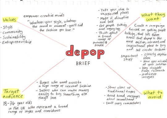
Depop
I chose Depop as I felt the subject matter and goals set within the brief would offer me a new and creative challenge that would take me out of my comfort zone as a designer.
Summary of the brief
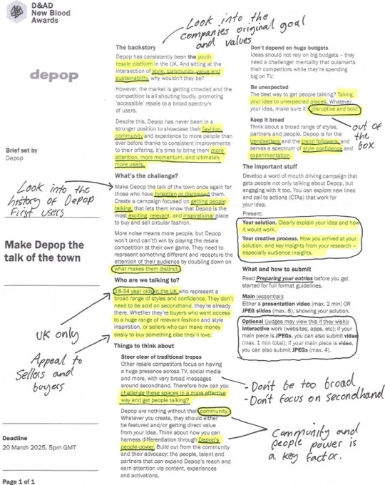
Backstory:
Depop is a leading youth resale platform in the UK, thriving at the intersection of style, community, value, and sustainability.
The market is becoming crowded with competitors promoting "accessible" resale broadly.
Depop has improved its offering and is in a strong position to gain more attention and users.
Challenge:
Make Depop exciting and relevant again, especially for those who have overlooked it.
Create a bold, disruptive campaign that highlights Depop’s uniqueness and gets people talking.
Focus on Depop’s distinct attributes, like its community, rather than competing directly with other resale platforms.
Target Audience:
UK-based 18-34-year-olds with varied styles and confidence levels.
Buyers seek style inspiration and a wide range of fashion, while sellers want to earn money easily to buy new favourites.
Considerations for the Campaign:
Avoid Clichés: Stay away from generic resale themes used by competitors.
Leverage the Community: Feature Depop��s people, talent, and partners to drive differentiation.
Think Small but Smart: Create impactful ideas without relying on a big budget.
Be Unexpected: Develop bold, disruptive concepts that grab attention in unique ways.
Appeal Broadly: Cater to both trendsetters and followers across diverse styles.
Deliverables:
A word-of-mouth campaign encouraging discussion and engagement with Depop.
Explore new CTAs and lines that align with the idea.
Present the solution via a 2-minute video or 8 JPEG slides, clearly explaining the idea, process, and audience insights. Optional extras include interactive work or supporting formats.
Summary: The task is to create a bold, community-driven campaign that reinvigorates Depop’s relevance and gets its target audience talking and engaging, all while using a challenger mindset to outsmart competitors without a huge budget.
0 notes
Text
Intervention + Interpretation - Research
Here are a few typography examples that I find visually striking, unique, and inspiring.
Pangram - Talisman Font
I appreciate the sleek minimalism and symmetrical design of this font. The subtle details in letters like e, c, o, and x showcase how small, thoughtful adjustments can make a significant impact.
Bold
Geometric
Versatile


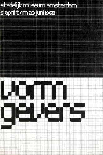
Architype Stedelijk
Architype Stedelijk is part of the Crouwel collection. A set of typefaces created in close collaboration with Wim Crouwel, following his agreement with The Foundry in 1996 to create digital fonts from his experimental alphabets.
Crouwel created a rigid grid system across the poster of 57 vertical by 41 horizontal lines, forming the basis for the construction of the letterforms. Although all hand drawn, the resulting typeface had a machine-made appearance.
Bold
Striking
Mechanical


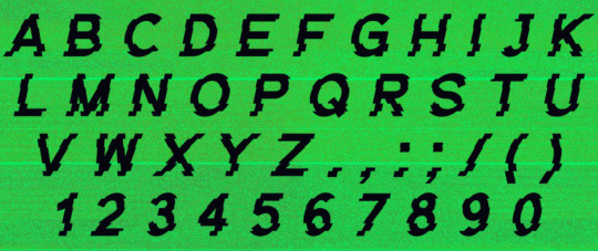
My Name Is Wendy - Blackjack font
The Blackjack font showcases deconstructed letterforms that merge technological and vintage aesthetics. It exudes energy and spontaneity, with each letter's unpredictable design coming together cohesively in the overall style. I appreciate how the irregularity of the individual characters creates a unique yet harmonious effect.
Playful
Irregular
Expressive
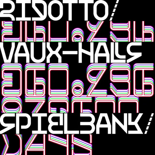
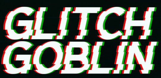
I admire these two fonts for their use of glitching, a characteristic often associated with flaws and low quality, yet here it is harnessed to create abstract and compelling letterforms. I’m particularly drawn to the concept of taking complete letterforms and distorting or manipulating them to form something entirely new and cohesive.
Distorted
Chaotic
Futuristic
Dystopian
Glitch Goblin
U-Haul Logo
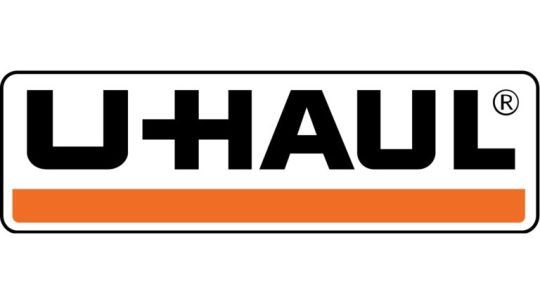
The Haul logo font is modern and clean, featuring sans-serif characteristics that emphasise simplicity and readability. Its geometric gives it a contemporary feel. This logo inspires me with its bold, minimal modular style, reflecting the fonts I’ve been experimenting with. Its emphasis on readability aligns perfectly with the project brief's key considerations.
Bold
Clean
Straightforward
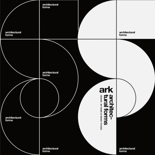
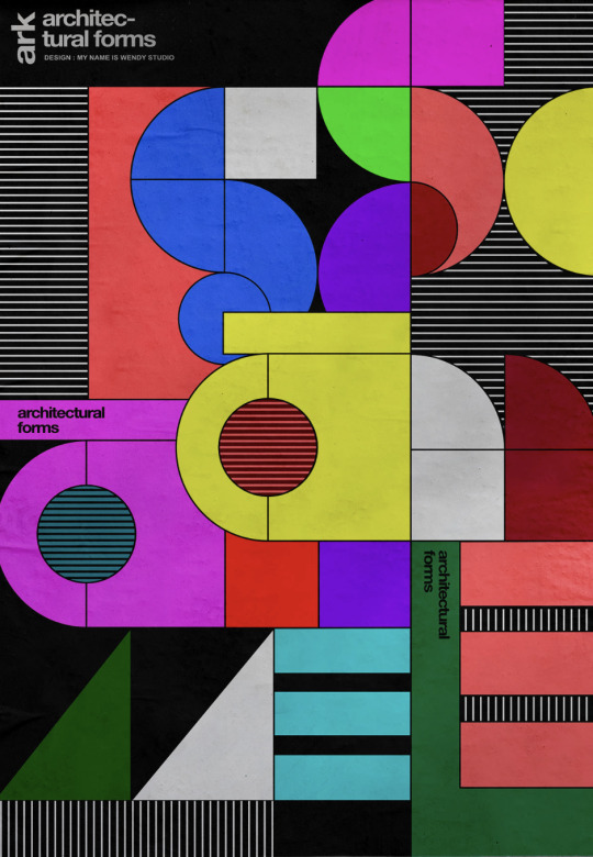
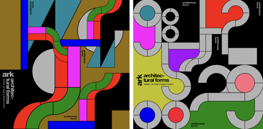
My Name Is Wendy - Ark Font
"Ark" is a series of four visuals that blend architecture and construction through shapes and letters. I admire the clean geometric forms and how they interlock with each other, paired effectively with bright, solid colours.
Angular
Condensed
Industrial
Futura
Futura, designed by Paul Renner in 1927, is a modular sans-serif font that remains influential nearly a century later. Reflecting the Bauhaus emphasis on functional design and simplicity, it features geometric shapes and clean, precise lines. Its tall ascenders, extending beyond the height of uppercase characters, give the typeface a distinctive, elegant style. This unique balance of modernity and readability helped Futura become widely used in advertising, TV, and film. Despite its simplicity and versatility, its low x-height can make it challenging to read in long-form text.
When exploring modular typefaces, I often gravitated toward more complex and abstract designs. However, I found it valuable to examine timeless examples like this one, as they helped me better understand the core design principles and gain inspiration for what makes a font both unique and memorable.
Precise
Functional
Timeless


Massimo Vignelli
Listening to the legendary designer Massimo Vignelli on Design Matters with Debbie Millman offered valuable insight and inspiration. Massimo believed that if you can design one thing, you can design anything, as all design is grounded in the same principles and disciplines.
He famously worked with only four typefaces: Garamond, Bodoni, Century Expanded, and Helvetica. While this might seem restrictive to some, he argued these fonts exemplify elegance, impact, and legibility as the finest examples of serif and sans-serif design. Rejecting "trendy" aesthetics, Massimo championed timeless design.
This conversation provided a deeper understanding of Massimo's design philosophy and sparked reflection on my own font design—challenging me to make it more impactful and unique.


PP🅐F (no date) Talisman Compact - A Powerful versatile font - Free to Try Font – Pangram Pangram Foundry. Available at: https://pangrampangram.com/products/talisman-compact (Accessed: 23 October 2024).
Architype Stedelijk (2020) The Foundry Types. Available at: https://www.thefoundrytypes.com/fonts/architype-stedelijk/ (Accessed: 24 October 2024).
‘Not too exotic, workable and original’: My Name is Wendy on its latest typeface, Blackjack (no date) It’s Nice That. Available at: https://www.itsnicethat.com/articles/my-name-is-wendy-blackjack-graphic-design-301120 (Accessed: 24 October 2024).
Sudezine, GGBotNet, Fonts, B. A., Typefactory, DavidLibeau, Graphicsauceco, JoannaVu, CloutierFontes, Ffeeaarr, Wepfont and Maknastudio
Sudezine, GGBotNet, Fonts, B. A., Typefactory, DavidLibeau, Graphicsauceco, JoannaVu, CloutierFontes, Ffeeaarr, Wepfont and Maknastudio (no date) Glitch Fonts, fontspace. Available at: https://www.fontspace.com/category/glitch (Accessed: 24 October 2024).
U-Haul Logo (no date) U-Haul Logo and symbol, meaning, history, PNG, brand. Available at: https://1000logos.net/u-haul-logo/ (Accessed: 24 October 2024).
Studio, M.N. is W. (no date) Ark, Behance. Available at: https://www.behance.net/gallery/210425983/Ark (Accessed: 25 October 2024).
Keung, L. (2020) All About the Futura Font and Its History: Envato Tuts+, Design & Illustration Envato Tuts+. Envato Tuts. Available at: https://design.tutsplus.com/articles/all-about-futura-font-and-its-history--cms-35382 (Accessed: 8 November 2024).
Century Expanded (no date) T26 Type Foundry. Available at: https://www.t26.com/fonts/10119-Century-Expanded- (Accessed: 27 November 2024).
TYPE·01/09/2022 and Type (2022) The Story Of The World’s Most Famous Font: Helvetica, Design & Paper. Available at: https://www.designandpaper.com/the-story-of-the-worlds-most-famous-font-helvetica/ (Accessed: 27 November 2024).
Farnbeyond (2019) Typographic Design Poster Series - 003 Bodoni Typeface: Far’n’Beyond, FarnBeyond | Design Print Digital. Available at: https://www.designprintdigital.com/blog/typography/typographic-poster-series-003-bodoni/ (Accessed: 27 November 2024).
Millman, D. (2010) ‘Massimo Vignelli’, Design Matters, Design Observer, September. Available at: https://designobserver.com (Accessed: 27 November 2024).
Millman, D. (2015) ‘Michael Bierut’, Design Matters, Design Observer, November. Available at: https://designobserver.com (Accessed: 27 November 2024).
Massimo Vignelli (2016) Olnick Spanu. Available at: https://olnickspanu.com/contributors/massimo-vignelli/ (Accessed: 27 November 2024).
1 note
·
View note
Text
Intervention + Interpretation
Project Launch
The brief:
"Create a typeface that uses a set system of shapes to create each letter"
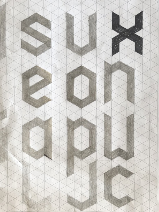
Things to consider:
Modular forms Construct letters using a set of modular forms, such as curves, lines, and shapes that repeat throughout the font.
Font width Regular width fonts are usually best for readability, but condensed and extended fonts can have specific emotional associations.
Readability The most important feature of a typeface is that it's readable so the message can be communicated.
Modular scale A modular scale can help determine typographic sizes and layout proportions.
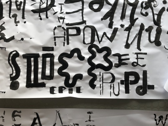
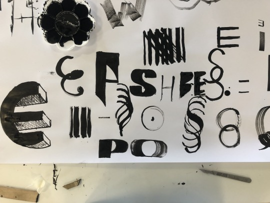
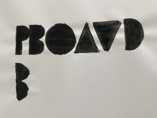
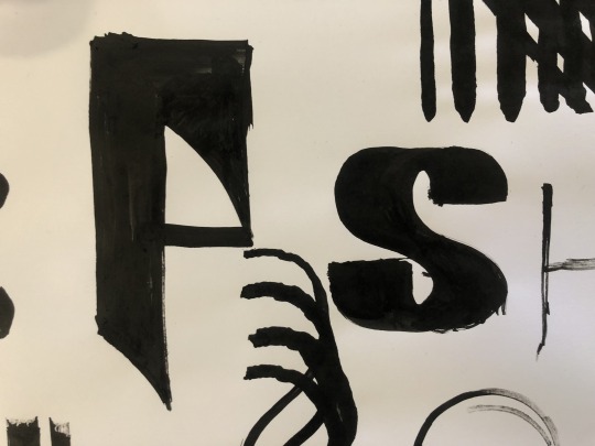
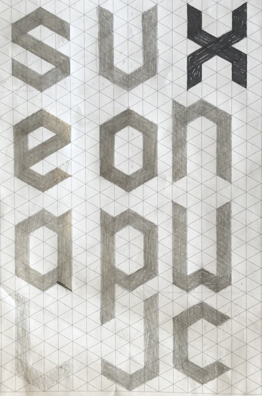
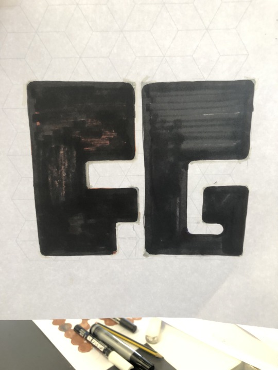
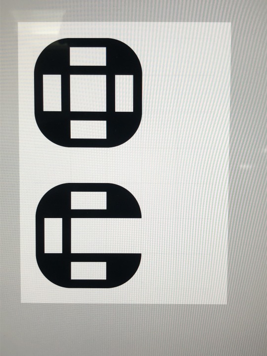
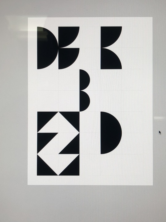
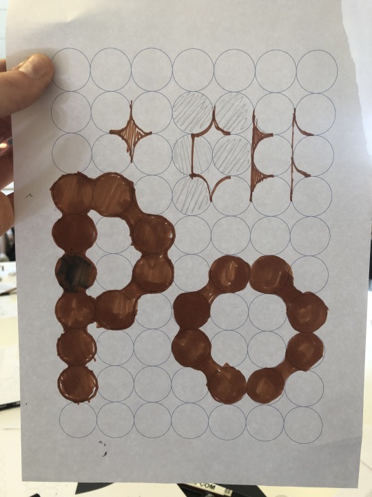
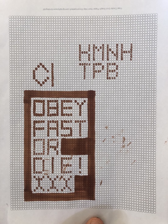
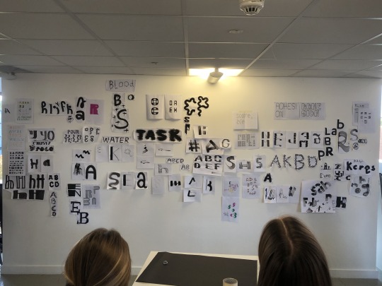
Font Experimentation Workshop
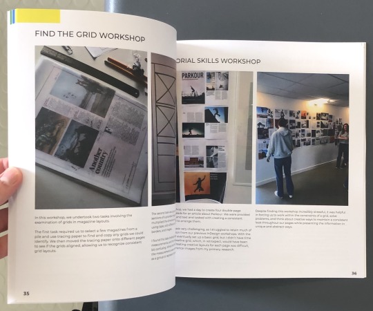
To kick off the project, our class divided into groups and rotated through stations, each featuring different mediums to experiment with creating custom font designs. The tools included ink, paintbrushes, wood pieces, various types of grid paper, and online resources like shiftingstructures.com, which let us combine and reorder modular shapes. We finally pinned our favourite designs on the wall giving us a chance to observe and compare each other's work.
0 notes
Text
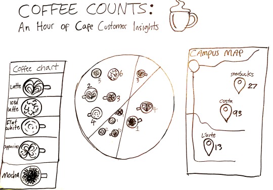
Collection = Interpretation - Final Poster
After finalizing our layout, we discussed creative elements—style, color palette, typography—and chose an illustrative approach inspired by artists like Visual Cinnamon. We opted for digital illustrations with a hand-drawn style to create a light, approachable aesthetic
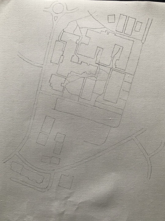
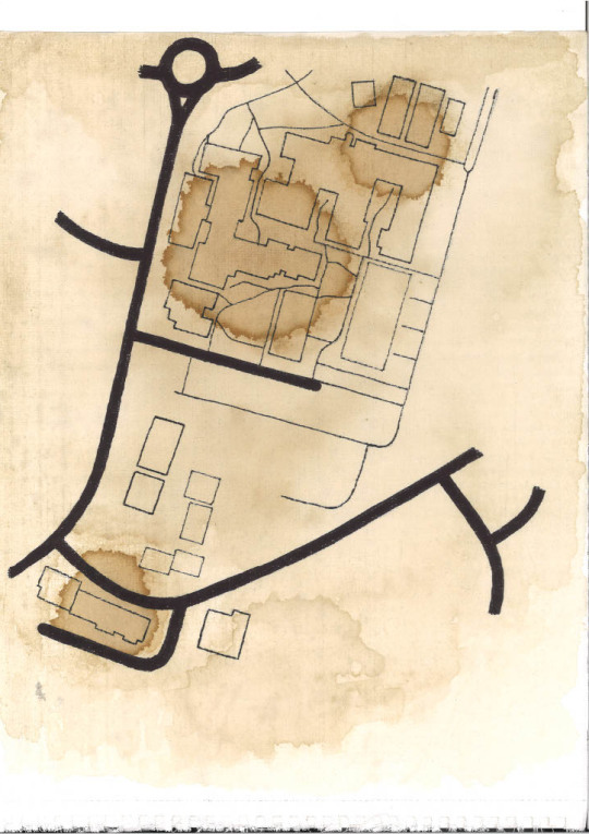
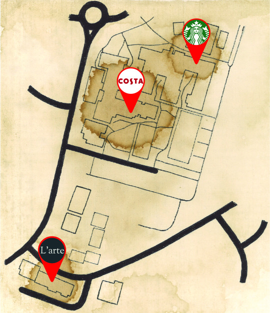
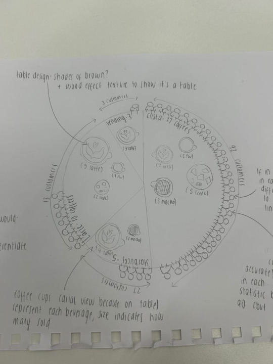
I took charge of planning the composition, coordinating tasks, tracking progress, and designing a hand-drawn, coffee-painted campus map to reinforce the coffee theme. Another member handled the customer illustrations and final layout, while others focused on coffee cup illustrations and the coffee table design..
To create the map, I traced the campus area from Google Maps, ensuring it covered all three café locations. This was challenging due to unwanted markers cluttering the screen, obstructing paths and buildings. I then transferred the design to paper I mistakenly thought was mixed-media but turned out to be acrylic, which didn’t suit the coffee medium well.
Using different coffee and water mixtures, I layered washes over the map, darkening areas around each café to reflect their popularity. Although I aimed for a gradient effect, the paper’s texture created stain-like marks, which still partially captured the desired aesthetic. Finally, I inked the pencil lines, scanned the design, and added digital markers for each location.
Apart from the campus map, all poster elements were designed in Photoshop. Some team members faced Adobe license issues, limiting their software options and pushing them outside their comfort zones. Despite this, they rose to the challenge and produced strong designs.

Critical Analysis
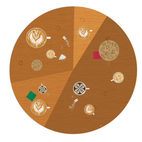
This project posed unique challenges, from selecting a cohesive color palette to integrating hand-drawn and digital elements, while balancing aesthetics and functionality. We largely met these challenges, working cohesively despite differing styles and opinions. The illustrations, textures, and color palette create visual interest and make the data engaging.
However, issues remain with sizing, composition, and data clarity.
Feedback
Peer feedback was positive overall; they appreciated the strong concept and well-executed illustrations, noting thoughtful details like each customer’s clothing reflecting their brand’s colors.
Our tutors commended our work ethic and research, which contributed to our final result. However, they felt that the data, a key component, wasn’t effectively presented. They also noted minor issues with layout, scale, and font choices.
0 notes
Text
Collection = Interpretation
- Data Collection & Planning
The Brief:
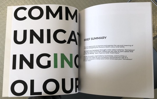
"Working in your allocated teams, you are asked to design a graphic system / convention that translates data into clear information about a specific moment in time to your audience, using an A2 sheet of paper. Aim to make boring data compelling and allow viewers to discern a data-driven narrative that about the period that they would not know without the aid of your design. How you use the A2 paper is up to you but should be cohesive, relevant and professionally presented."
In the first stage of our group project, we brainstormed ideas for data collection, keeping in mind limitations of location and time. Despite these constraints, we identified several areas for data gathering on campus, including fashion, social behaviour, smoking/vaping, and coffee.
We also couldn’t help but laugh at how suspicious we’d look, furiously scribbling notes while obsessively observing our fellow students. It felt a bit like we were undercover agents.
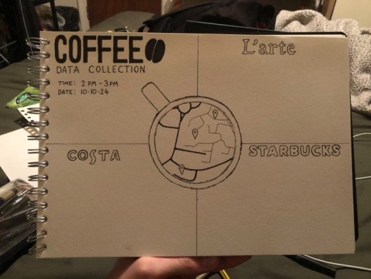
"We chose to focus on coffee and planned to collect data from three cafes on and around campus: Starbucks, Art's Bar (Costa), and L'arte. To do this efficiently, we split into three groups and collected data simultaneously within the same time window."
We spent time deciding what to learn from the cafes and customers within the one-hour window, as well as defining our target audience. We chose not to focus on design at this stage, believing it would be easier to visualize the data once collected. We decided to record the number of customers and their coffee orders.


After collecting the data, we began discussing and sketching ideas for presenting it on an A2 sheet. Our main form of communication was an online group chat, though we also met in person. Each of us shared our concepts, drawing inspiration from our collective research, and discussed what worked and what didn’t. This stage was challenging as we had many strong ideas but needed to narrow them down and compromise. With everyone having different opinions on what looked best, we explored various approaches, including illustrations, maps, and 3D elements.
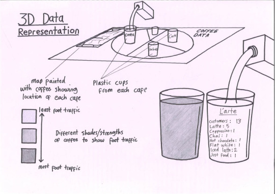
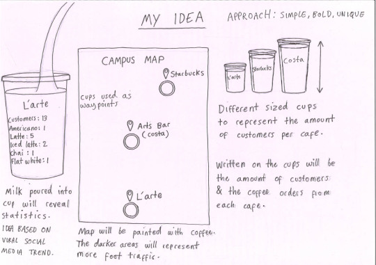
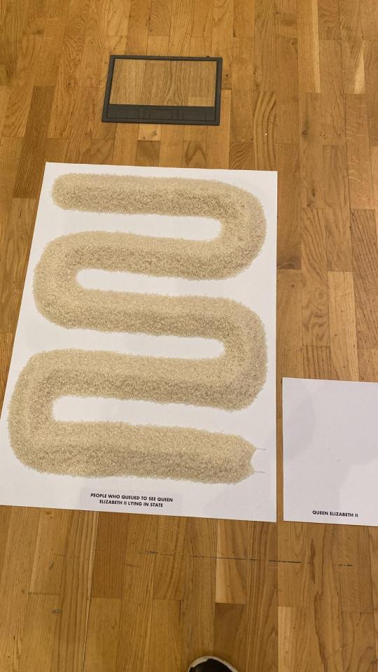
My personal preference was a 3D approach, inspired by artists like Jer Thorpe and Scott Kildall, as well as an exhibit I saw in Birmingham that used large piles of rice to visualize global data sets.
I was also influenced by a social media trend where people revealed hidden messages on plastic or glass cups filled with black coffee by pouring in milk. My idea was to create a giant campus map on an A2 sheet, with a cup of black coffee marking each data location. The size of the cup would reflect the popularity of the location, and the data would be revealed by pouring milk into each cup, showing information written on the side. I believed this would offer a unique and engaging way to present the data, but the rest of the group disagreed, so I couldn't pursue it.
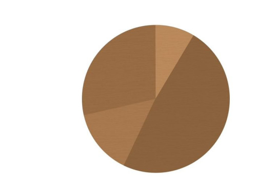
After discussing and comparing all our ideas, we settled on a final design: an illustrative pie chart viewed from above, using a coffee table with different coffee illustrations representing the data from each location. The design would include a key to label each coffee type, as well as a campus map showing café locations and corresponding foot traffic. The result would be a simple, clear, and concise presentation.
0 notes
Text
Collection = Interpretation - Research
Coffee and Bee Decline Infographics - James Protano
This series of infographics by James Protano visualizes data from a 2015 online survey about coffee shop habits, including time spent in cafes, daily coffee consumption, tipping, and drink preferences. I admire the design's simplicity, presenting clear, concise data without overwhelming the viewer, complemented by a calming colour palette that ties in perfectly with the coffee theme.


James Protano Freelance Graphic Designer NYC (no date) James Protano - Graphic Design, Creative Direction in Brooklyn, NYC. Available at: https://jamesprotano.com/ (Accessed: 1 November 2024).
Smoking Infographic - Crista Rose Nauta
This infographic by Crista Rose Nauta visualizes data on smoking habits and related illnesses in the U.S. I admire the artist's straightforward approach, using powerful imagery like tumours and graves to highlight the shocking smoking-related death rates and emphasize the issue’s severity. The colour palette mirrors a cigarette, and subtle details, like cigarettes poking from the top, create a cigarette carton aesthetic that reinforces the theme.
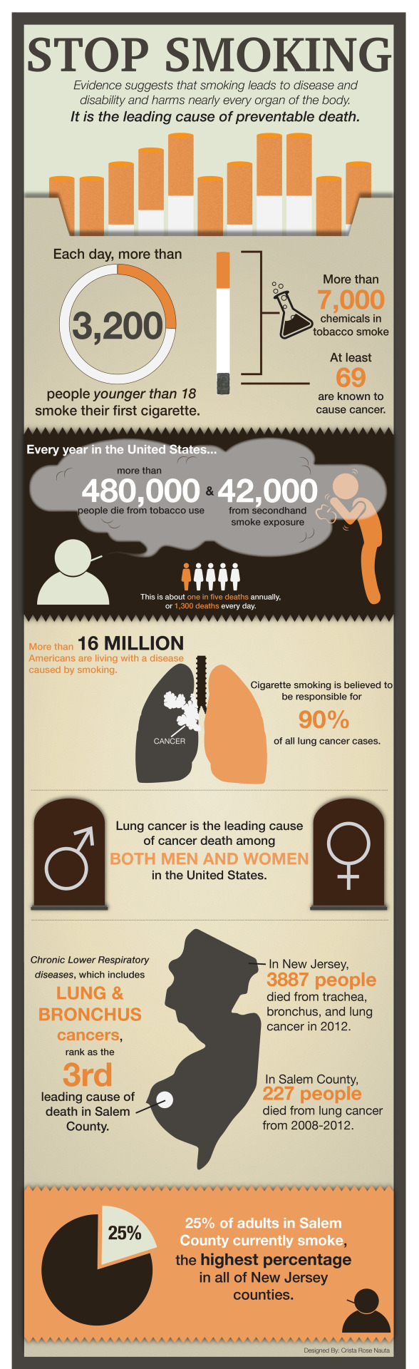
Nauta, C. R. (no date) SMOKING Infographic, Behance. Available at: https://www.behance.net/gallery/35944601/SMOKING-Infographic (Accessed: 1 November 2024).
Elemental Flows - Visual Cinnamon
The artist's collection, "Generative meets Data Art," features five pieces representing essential elements for human life: Earth, Water, Air, Sun, and Digital. Each piece uses the same flow algorithm but is fine-tuned to visually convey its specific element. Relevant data is integrated as "obstacles" in the flows: tree density for Earth, rainfall for Water, air quality for Air, and sunshine hours for Sun.
While the data may not be immediately apparent, I find the abstract approach both endearing and unique. The visualizations are striking enough to stand alone as beautiful artworks, independent of their data visualization aspects.


Why do cats & dogs …? - Visual Cinnamon
"Why do cats & dogs …?" is a project that explores popular Google search questions about pet behaviour, focusing on about 4,400 queries that begin with "why does/are/is my/a cat(s)/dog(s)." The artist uses R (a programming language for data analysis and visualization) to create large "sentence trees" that visualize common topics in pet behaviour. The project starts with an introduction to key themes and allows users to dive into specific questions. It features interactive visuals for both desktop and mobile, highlighting interesting insights into pet behaviour.
The project features a light visual style with colourful, playful illustrations that capture the light-hearted nature of the data and the personalities of cats and dogs. This illustrative style inspired our group’s approach to data visualization.


Bremer, N. (no date) An Award-winning Data Visualization Designer, Visual Cinnamon. Available at: https://www.visualcinnamon.com/ (Accessed: 1 November 2024).
Data Crystals - Scott Kildall
Artist Scott Kildall creates "Data Crystals" — 3D prints that he algorithmically generates using data as input. He designs 3D data visualizations for aesthetics over legibility to show off what can be done with code and 3D printing.
There are many types of data Kildall represents, often fun and useful datasets such as: people's favourite lottery numbers, income levels for every single household in San Francisco and every single shipwreck in history.


Data Crystals (2022) Scott Kildall. Available at: https://kildall.com/newest-artworks/datacrystals (Accessed: 5 November 2024).
Jer Thorpe
As an artist whose medium is data, Jer Thorp creates striking visualizations that represent his chosen sets of information with elegant comprehensiveness that packs an aesthetic punch. He works in both digital and 3D mediums.

His charting of the relationships among the most frequently mentioned people and organizations in the Times in 1999
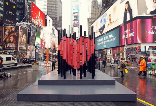
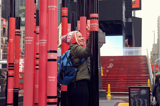
We Were Strangers Once Too was a public data sculpture that highlighted the role immigrants played in the founding, development, and continued vibrancy of New York City.
The sculpture, made of 33 metal poles inscribed with the nations of NYC’s immigrant population, forms a heart when viewed from the Statue of Father Duffy in Times Square. This heart shape might also evoke Milton Glaser's iconic "I Love New York" logo, reinforcing the theme of love and connection to the city.
I was inspired by Jer Thorpe's innovative use of perspective, strategic placement of the sculpture, and thoughtful integration of data to create a powerful yet simple symbol. His work shows how art and data can come together to form something both meaningful and emotionally resonant.
Of All The People In All The World - Stan's Café
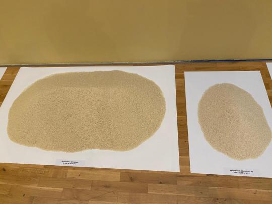
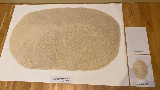
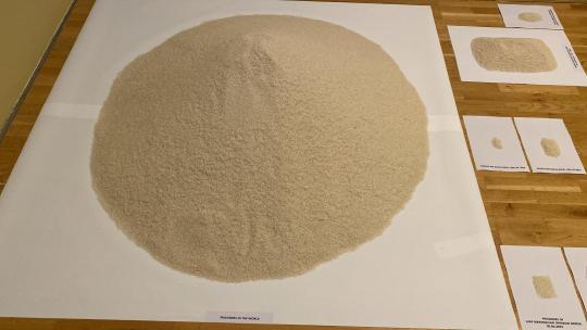
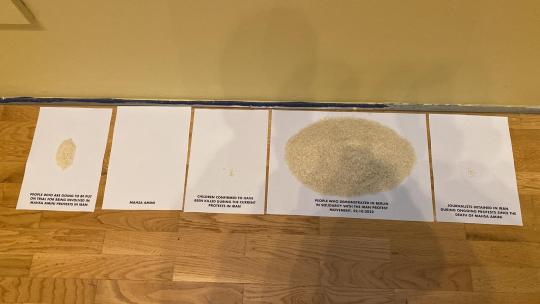
During my research, I recalled an exhibit I visited a year ago at the Midlands Art Centre in Birmingham. It used piles of rice to represent global data sets, making the scale of certain statistics more tangible than numbers alone. Some rice piles were deliberately placed side by side for impact, contrasting data like the daily number of McDonald's customers in the UK with participants in Veganuary 2022, or the number of Africans transported as slaves on British ships from 1640 to 1807 with the Black population in Britain in 1780.
0 notes
Text
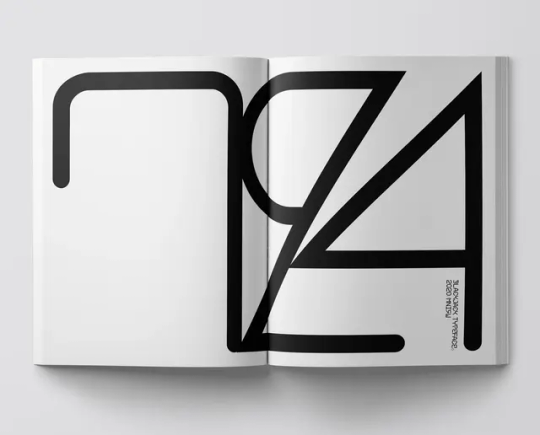
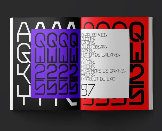
Process Book - Completed
The approach I took with my process book emphasized function over decoration. The design was minimal, and the language style was informative and professional. I implemented a basic three-colour coding system for each project, using small blue, yellow, and green sections in the corner of each page.
For the title page and introductory pages, I chose a large, bold font. Despite its simplicity, I am pleased with the modern aesthetic and the reduced legibility, which I believe adds an interesting edge. The back cover image features my side profile with an echo effect, a blue hue, and a creased paper texture. The echoing effect is intended to represent how the reader is stepping into my layered thought process. The textured paper look with the blue hue gives the design a handmade feel, with the imperfections symbolizing the trial and error aspect of the process book. The blue adds vibrancy compared to the dullness of black and white.
The cover page follows the same design style as my other typographic pages, with an added echo circle effect within the black words, mirroring the concept of the cover image. Breaking up the words with colour created an interesting effect that subtly and stylishly improved legibility.
There were a few mistakes with the process book, including the misplacement of the spine section and various spelling errors that I only noticed after printing; however, I've since corrected them for the digital submission.
Despite these mistakes, I am happy with my first process book. The information and images fit nicely within the grids, and the font choice is pleasing and readable. Next time, I plan to explore more creative design approaches, feature more images and less text, and give the language a more personal feel.


0 notes