
Statistics
We looked inside some of the posts by bau-hau5 and here's what we found interesting.
Average Info
Notes Per Post
12
Likes Per Post
2
Reblog Per Post
9
Reply Per Post
1
Time Between Posts
4 days
Number of Posts By Type
Photo
5
Text
6
Link
1
Last Seen Tumblr Blogs


Fun Fact
Hackers stole 65M passwords from Tumblr in 2013.
Photo

a photo collage from last Spring when my partner and i visited dia:Beacon. he has no background in art history and minimalism went right over his head. in discussing the ways in which american minimalism is not publicly accessible i immediately thought of this experience where he was tremendously underwhelmed.
0 notes
Photo
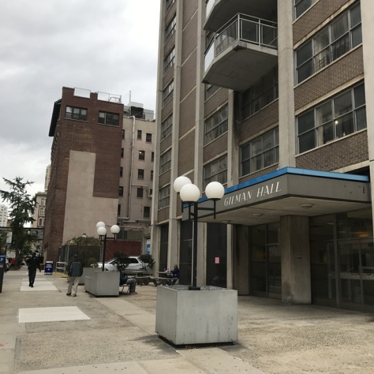


APOPS
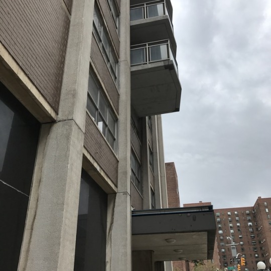
353 East 17th Street - Gilman Hall
I decided to approach Gilman Hall with little to no context under my belt. The site interested me on the APOPS website for one particular reason: a fence built around the area, with no legal authority. The APOPS submission was published in 2000, so I assumed the listing was outdated, and wanted to discover for myself how the area had changed from this 17-year-old photo:

(Image: https://apops.mas.org/pops/686/)
As I approached the facility I noticed the fence no longer stood. The most remarkable changes to the area had been this removal, the addition of two circular picnic tables, and some very obvious wear on the site’s planters, benches, and other infrastructure. I noticed the rust from the fence remained on the concrete where it used to stand.
From the perspective of one of the round picnic tables, I observed two individuals engaging in the environment. One appeared to be a homeless, or otherwise mobile person sitting with a large trash bag of what I assumed to be belongings on a bench facing the building’s glass entrance. From where he sat, the man directly faced the building’s lobby and front desk attendant, divided only by a wall of glass. The other outdoor benches faced black slabs of faux-granite wall, rather than the busy street behind them.
The other visitor appeared to be on a lunch break from work, adorned in some sort of uniform and simultaneously filling out a crossword puzzle, eating a sandwich, and smoking a cigarette.
I observed what looked like attempts at corporate campus-style architecture, matched with an obvious lack of upkeep. The cube-like planters surrounding the area, as well as the circular tables for work and meals were recalled theories of corporate use of images of pastoral, communal spaces. Details like the dying plants, scattered trash, strange graffiti, and cylindrical umbrella-holders devoid of umbrellas, added an eerie, abandoned tone. I sensed that this development had been created by the building’s previous owners and namely used before being acquired, and therein disregarded by new tenants.
The architecture of the building itself instantly recalled images from the opening scene of Playtime, where the site of action verges on several functions, making ambiguous the space’s practical purpose. Marked by a lack of activity or signage, Gilman Hall proved equally ambiguous. The faux-granite exterior of the first story, presented plainly to bench-sitters, alludes to the corporate architecture of high-rise wealthy buildings, namely found in midtown or the financial district. This, along with the benches and tables, gave the building a corporate air.
The neighborhood itself is characterized by the medical industry, specifically Mount Sinai Beth Israel’s several hospital buildings, and a number of pharmacies. This context, along with the grid-like arrangement of windows, glass entryway, outdoor awning, and overall neutrality (gray tones and lack of signage), added to my suspicion that the building was a medical facility or dormitory.
I was surprised to discover that the building was residential, having been recently bought from Mount Sinai Beth Israel, who had used the space for medical dormitories. This legacy matched the eery tone of the space. With this knowledge, it became clear that the space had been illegally reserved for patients (marked by the fence) as it had served as a medical building, and the addition of the picnic tables was a cheap attempt at rendering the space an outdoor luxury and real estate amenity.
Despite its decrepit appearance, I realized the accessibility which comes along with a space which appears run down. Had the space been more luxurious or updated, it would appear unapproachable to the public, especially homeless populations who arguably need such spaces in the first place. My visit left me questioning: where is the line drawn between maintained and private (aesthetically)? Is there a way to create well-kept public spaces which invite the mingling of residents with the public?
0 notes
Text
Response to Dan Graham’s “Art in Relation to Architecture / Architecture in Relation to Art”
Dan Graham’s opening analysis of Dan Flavin’s infamous light-based installation works strike a chord with me as a visual artist and curator. Graham compares the works conceptually to the anti-art of Marcell Duchamp, whose readymade sculptures, composed of everyday, basically unaltered items, continue to question the authority of any artistic institution in which it is viewed. What it lacks in form, Duchamp’s work makes up for in concept as what is left to critique is the context and his tactful use of space (intentionally, rather than formally). While Duchamp’s work employs the connotations of specific objects as they exist compared to that of the gallery, Flavin’s work directly engages in the gallery’s structural components to produce an equally engaging conceptual work, arguably an institutional critique.
Conceptual art, and its vast amount of sibling artistic movements, employ what Graham refers to as a “social technology”, rather than a visual, compositional, or structural language or weight. Graham asserts the same distinction between ornament and minimalism in architecture, as both styles are hard at work in engaging participants, active or passive. In its structural simplicity which leaves viewers wondering what lies beyond a visual surface, minimalist art challenges its audience to question what other daily technologies are ripe with internal meaning and serve as an illusion. To say that (as it is advertised) modernist architecture remains completely and efficiently neutral, as opposed to the carefully influential style of ornamentation, is to refute the sphere of influence of minimalist art as well. Though modernist architectural thinkers would like to position the movement as completely polarized from ornament, the two are very alike in their tactful employment of visual cues, overt or discrete as they are.
0 notes
Text
Response to Louise A. Mozingo’s “Pastoral Capitalism”
Reading Louise A. Mozingo’s “Pastoral Capitalism”, I was most captivated by the idea of the movement of corporate middle-management to suburban locations as a creation (or at least solidification) of the American middle class. With this inevitably came the definition of the lower class American, and the literal distance and distinction in lifestyles, neighborhoods, and working conditions (to name a few factors) widened the gap between the manual laborer and the clerical laborer (as a simplification of terms). I am also interested in converting this logic into present day issues of the apparent disappearance of the middle class, as it relates to climate change and the disintegration of the pastoral landscape.
I also was interested in the breakdown of corporate hierarchy as each level occupies a specific type of environment (lowest - urban; middle - suburban; highest - countryside/natural estate). I wanted to examine the presence of that same highest class of corporate status as it resides in the urban environment, and the potential of that environment as its own pastoral landscape.
It is interesting to consider the polarized notions, and spacial representation, of extreme corporate wealth. The first, described in Mozingo’s essay, is far removed from the urban environment, and is expansive laterally. Referred to as corporate estates, these locations are often considerably more ornamented than its factory and office park counterparts, as a display of wealth. It is a space which explores luxury to the extent of relaxation and solitude. The second side of this coin of corporate wealth refers to the high-rise office building, often located at the center of urban activity. In stark contrast with the ornamented and serene corporate estate, the high rise expands vertically, models refinement, and is an environment of active business. I am curious about the distinctions between the two. If the landscape of the estate is tactfully employed as a visual element, what natural visuals are at play in the urban high rise? How do the activity of the two locations actually present a mirror capitalist image, though contrasting visually and in attitude?
I would be interested in seeing an analysis of pastoral capitalism and its hierarchy of space as it operates within a strictly urban, or strictly rural landscape. Mozingo describes this logic spread out over an entire country, on the macro. How do these dynamics exist on the micro, within smaller cities and counties, and in smaller businesses?
1 note
·
View note
Text
Response to Joe Day’s “Collections and Corrections”
Reading Joe Day’s introduction to “Collections and Corrections” strongly connected the work I’ve been doing in this class to that of another where we explore histories of museum collections (art and otherwise). One of the first readings we did in the class was the introduction written by John Elsner and Roger Cardinal from the book “Cultures of Collecting”, where the two connect collecting to power with the example of the Holocaust. I immediately connected Joe Day’s ideas of the similarities between collecting bodies and collecting artifacts, and was interested in the question he directly asked: How is a museum like a prison?
To Elsner and Cardinal, systematic collecting is inextricably linked to power, in that the collector delegates a higher order onto what they choose to include - and exclude - from the group. It is not just the act of selecting, but also of placing, categorizing, naming, and displaying or treating which makes the museum a place of powerful taxonomy, classification, and a manifestation of social hierarchy. It decides for the public what is to be seen, what is to be considered a certain way, and what is to be discarded or labeled of little worth. That museums have as much impact on what they don’t display as what they do display leads one to examine the same power of the justice system.
When referring to museums and correctional facilities, Day positions the former opposite the concept of display, in saying such things as “institutions of constraint and display” (15) or “institutions of display and discipline” (17). I disagree with this polarization of the terms, as I believe the prison acts as a symbol of systemic display. Rather than drawing the public’s attention to any specific artifact or exhibition, the criminal justice system works to maintain a peripheral presence in the everyday citizen. Specifically in New York, the “If You See Something, Say Something” banners make all aware of the consequences of Doing Something, and violent officer-on-suspect disputes in the public eye make a spectacle of the vulnerable body, which then disappears into the unknowable site of the criminal justice system. Similar to the way in which walking out of a museum, you are more likely to be attracted to art which matches the displayed aesthetic, the criminal justice system makes clear the Type of person who is incarcerated, the aesthetic qualities of the criminal. Through its overt systems of displaying this stereotype, the public eye is similarly conditioned to reject this type and make sure they never exist within that taxonomy. Prisons and museums represent the opposite extremes of public display, the first negative and unattractive, and the second an alluring cultural luxury.
1 note
·
View note
Link
0 notes
Text
Watching Playtime reminded me of an episode of Spongebob which I would watch a lot as a kid, named Squidville. In the episode, Squidward decides to abandon his eclectic neighborhood and join a private residential community where all residents look, behave, and self-regulate in a way which mimics his own behaviors. In this community, Squidward loses all sense of individuality and operates as one of the pack, biking, playing music, and interpretive dancing alongside replicas of himself. As the episode evolves, Squidward becomes less enthused with this community and, in a climactic scene, envies a worker who maintains the aesthetic appeal of the community, and seizes his reef blower to start a commotion. Squidward’s act of radical agency leads to his eventual departure from the community, both on his own decision and with pressure from the residents.
The themes of Playtime resound perhaps subconsciously in this episode, as Squidward’s transition to his new community is in many ways a tour de force of modernist thinking. The emphasis on architecture is especially of note, as Squidward’s decision to leave Bikini Bottom is in direct reaction to Spongebob and Patrick’s absurdist rearrangement of his home, as their reef blowers displace his windows and doors to make the home inaccessible. As the home is a symbol of stability and identity, a metaphor especially considered as Squidward’s home’s exterior mirrors the image of his face, this displacement is a symbolic rearrangement of Squidward’s identity. His aim is then to restore his sense of identity and order, goals at the core of modernist advertisement.
Within Tentacle Acres, too, all houses look the same (again resembling Squidward’s face, which is also the face of every resident). Every community member looks the same, lives within the architectural embodiment of their mirror image, and consumes the same culture. As they partake in acts of cultural individualism, such as interpretive dance and playing music, they sustain illusions of identity and class. As every day in Tentacle Acres begins with a group bike ride, the residents sustain a collective image of health and fitness, again core to the modernist ideal. Then, when shopping for food, Squidward is pleased to find Canned Bread in the supermarket, an example of a streamlined, efficient commodity which replaces the ornamented loaf. Here, Squidward participates in modernist consumption, at first excited by the innovation of a foreign product, yet he grows increasingly used to, and bored by, the same food. As the illusion of modernity fades without the cyclical presentation of a new spectacle, Squidward begins to critique his existence in a way that classical modernism often successfully prevents its subjects from realizing.
“Squidville” illustrates the capitalist illusion which sustains modernist societies, the necessary presentation of a better life, new innovation, cultural stimulation, and, perhaps most importantly, involvement in systems of labor. Though he claims to resent the establishment he works for, Squidward relies on The Krusty Krab as a source of distraction and illusion of productivity. As long as Squidward is preoccupied by the corporate machine, he can envision endless realities in which he is happier, more creative, and appreciated. Once the capitalist curtain is lifted and he is able to realize these dreams, Squidward finds that this goal is unattainable. In the climactic scene where Squidward officially deviates from the norm and returns to his old life, he is at first captivated by the tool of the worker, envying the laborer and the potential for difference in his routine. It is this tool which literally propels him back to his former reality, suggesting that he would rather sustain the capitalist illusion of potential than to live it fully.
http://spongebob.wikia.com/wiki/Squidville
2 notes
·
View notes

Photo

McDonalds uniforms as of April 2017. Very modernist, streamlined, equalizing, efficient, non-aesthetic, industrial...
1 note
·
View note
Photo


The Standard Hotel in Chelsea ... You can see the luxury hotel from the balconies at the Whitney Museum, and from the High Line - two cultural tourist attractions. The site is also notorious for its porn shoots.
Glass architecture ... pornography ... the private on display ... the glass box-turned-white cube ...
2 notes
·
View notes
Text
The Grand Project - Anette Fiero
In reading Fiero’s assessment of the Grand Project in Paris, I was most captivated by one of her key points, which she summarizes in saying, “The accomplishment of nineteenth-century Parisian urbanism was to render society itself as a spectacle” (19). As we are relating the use of glass within the two styles of architecture, the idea of the spectacle seems completely contrary to that of modernist design, which advocates for simplicity, efficiency, and lack of excess. While modernism boasts a lack of regard for a building’s aesthetic quality, the very definition of spectacle describes the phenomena as “an event or scene regarded in terms of its visual impact”, with an emphasis on the object’s captivation, as well as the subject’s exhibition.
Though supposedly the mission of the Grand Project and that of modernist architecture seem to exist in contrast, the two styles strategically employ glass in a very similar, though conceptually opposing way. Fiero goes in to great detail describing the many physical and symbolic uses of glass as a main material in the rejuvenation of French architectural culture: as a way of creating an illusion of political or public transparency, as a material symbol of French manufacturing, as a Foucaultian method of inspiring relationships of surveillance, and as a Enlightenment-esque connection between the building and the body, especially in terms of health, purity, and exposure. Although the fathers of modernist architecture would argue their rejection of such transcendental intention, their use of the material in many ways relies on modes of interpretation rather than the structural and functional focus they claim to support. For instance, glass in modernist architecture is continually and tactfully employed to signify political openness - and its intentional inversion, through offering limited transparency. The exposure granted through glass walls and buildings inevitably creates a dichotomy of the watched and the watching, the object and the subject, turning any building - no matter how practically inclined the architect may be - into a capitalist window display, as those outside become the buyer, while those inside become commodities. This system of spectacle, though staunchly opposed by traditional theory of modernism, are very much in play in any modernist use of glass design.
1 note
·
View note
Text
Space as a key word- David Harvey
Harvey describes relative, relational, and absolute spaces. Absolute space is the easiest concept for me to grasp, it is fixed and depends on boundary, typically operating within a monopoly system to define property. Absolute spaces include countries, provinces, or the apartment I live in. It is made very clear the absolute space begins and what it is meant to include. Relative space is a space of motion - it is, to me, the conceptual space which my brain invents when my package hasn’t arrived. It is the post office, post truck, mailbox, that I visualize to make sense of the transit. It is also all of these spaces as they actually exist. Relational spaces rely on human activity and interaction, as well as other, similar spaces for definition. This is probably the most difficult term for me to grasp - but what comes to mind as examples are the school (dependent on the existence of a student body and faculty), a bank (dependent on the existence of other banks, and customers), or a memorial (dependent on the beliefs of its community, as well as the history of whatever it claims to memorialize).
I also became very interested in the idea of the monument vs. the memorial, in regards to Ground Zero. It made me question what we choose to memorialize, and what we choose to historicize, and how these are different spatial processes. What is now the memorial at Ground Zero has been criticized as spectacle, and inviting casual observance and passive interaction. To erect a monument and name the victims of a tragedy is to say that it is over, when this is hardly the case given the repercussions it has had on the U.S, especially its Middle Eastern populations, as well as those around the world. It reminds me of a piece I just saw at the Brooklyn Museum’s show “Legacy of Lynching”, where the family of a lynched man returns to the tree where he was hung and gathers the soil in jars to preserve and memorialize. It is an extremely cathartic experience for them. A commentator calls into question the difference in honoring the victims of 9/11, versus those of American lynching. Where would we erect a memorial for lynched Americans? What is the spatial site of racial violence?
3 notes
·
View notes