
Don't wanna be here? Send us removal request.
Statistics
We looked inside some of the posts by beccaatchley-blog and here's what we found interesting.
Average Info
Notes Per Post
0
Likes Per Post
0
Reblog Per Post
0
Reply Per Post
0
Time Between Posts
4 days
Number of Posts By Type
Text
14
Photo
3
Last Seen Tumblr Blogs


Fun Fact
Tumblr has 4 main sources of revenue.
Text
Ad Analysis: Fruit Loops
1. Gaze Motion: The toucan’s eye seems to be looking at the bowl, which makes the viewer look at the bowl too
2. Color: Bright colors are used throughout to create unity. The colors of the loops in “froot loops” are mostly complements of each other when you look at them diagonally.
3. Informal Balance: The image is quite busy, but a major part of the ad is set on the left side. The logo for the cereal and Kelloggs is all on one side as well as Sam and “natural fruit flavors”
4. Illusion of Space: Sam’s nose and arm appear to be coming at the viewer, because they get larger as they reach the end.
5. Texture: The loops are done in a way that you can see the bumps and ridges within them.
6. Size: The loops are, for the most part, larger than in reality. Making the viewer also feel larger than they are since this is aimed at kids.
7. The illusion of Motion: The loops on the right side look to be falling into the bowl. The milk splash helps to indicate this.
8. Focal Point: The fruit loops logo seems to be the main focal point, sense it is the largest. the bowl of cereal seems to be another focal point. Also Sam could possibly be argued as a focal point too.
9. Composition: It appears the rule of thirds is being used in this ad. The bowl is in the lower right and the froot loop is for the most part in the upper left.
0 notes
Text
Final Project 3
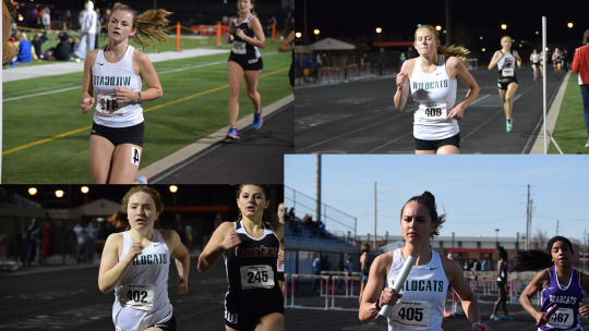
Leading the way
This did not end up how I wanted it to at all. I only had 2 meets with the opportunity to get pictures at since my schedule got messed up majorly. I know this could have been a lot cooler, but I’m happy with how these images came out. But I used four images from a meet of girls all from the same team. In each image, they are in the lead, or at least in front of one other runner that can be seen in the image, which creates unity. Also, they’re all in the same uniform so that also creates a unity. I think the focal point would be more along the lines of the girl on the bottom right since it is daytime then and the others are at night under the lights.
0 notes
Text
M14 Ad Analysis
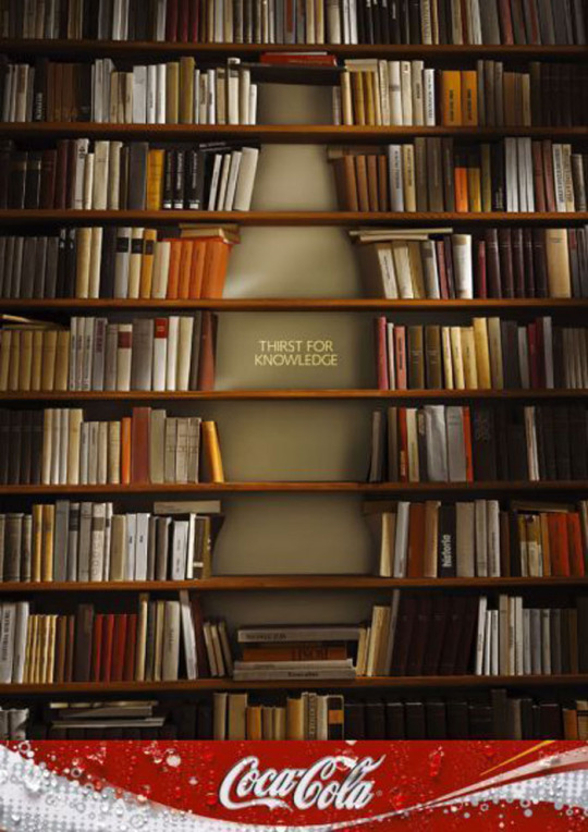
Found here: http://www.designyourway.net/drb/clash-of-the-titans-coca-cola-and-pepsi-print-ads/
- Uses abstraction to create a bottle inside the bookshelves.
- Equal balance created on either side
- Mute, dark colors used for the most part
- Texture is created through the books
- Psychology of color: the color brown helps to make the viewer feel a calming sensation
- Coke logo at the bottom is a pop that is unexpected
- Lighter color books are towards the middle, helping to emphasize the bottle.
- Imperfections are shown with the books. Books don’t normally curve inwards like a few in this ad.
0 notes
Photo
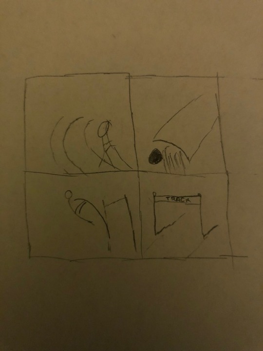
M14: Project 3 Sketches
Please ignore the terrible drawing skills. But this is a rough hand sketch of what I’m hoping to do with my final project. I plan on taking shots of 4 different elements of a track meet and making them into a 2x2 framework. The top left is representing a distance runner coming around the curve. The top right is a shot, for shot put in the ring. Bottom left is a pole vaulter just before they clear the bar and drop their pole. I hope the bottom right is obvious but it will be a hurdle, most likely on it’s own. I may switch up the order of the images and make the shot and hurdle be across from each other diagonally so the left isn’t so people heavy. I haven’t settled on a focal point yet, but that will come once I have some shots. I left my camera at home at the meets I went to this past week so I didn’t get any shots. With the amazing weather this week though I know I’ll be able to get some great shots.
0 notes
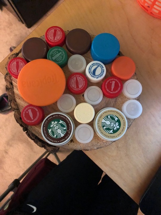
Text
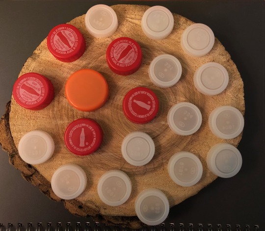
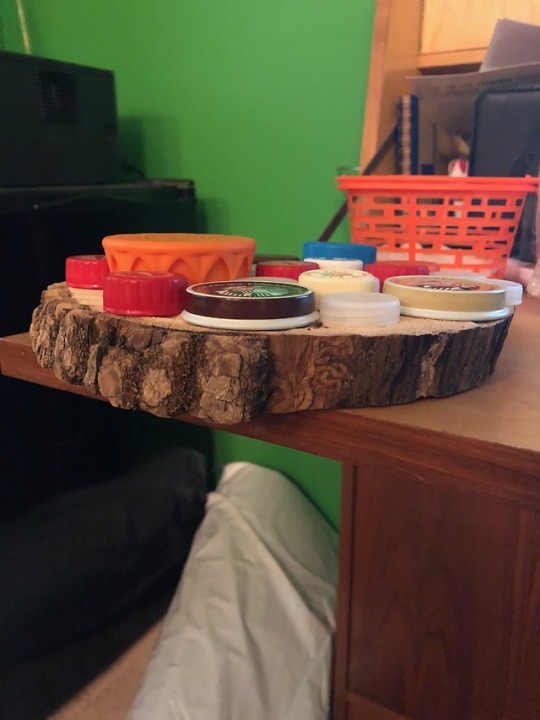
Project 2 Final
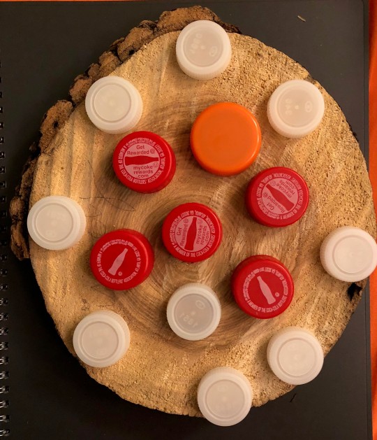
For this project, I used a round piece of wood and bottle caps. I had originally thought of doing something completely different but couldn’t get the idea to work when I put it into reality. I kept this really simple using just 2 types of caps, coke, water bottle and a gatorade cap. I used the coke caps to my advantage to focus in on the orange cap by using the detail within them and pointed each cap’s bottle towards the orange cap.
I enjoyed this project much more than the last one because there was a lot more freedom and the whole concept clicked better in my head. Not having a specific way we had to mount it also helped with this project. The last one was just very confusing to me. I would do something similar to this in the future.
0 notes
Text
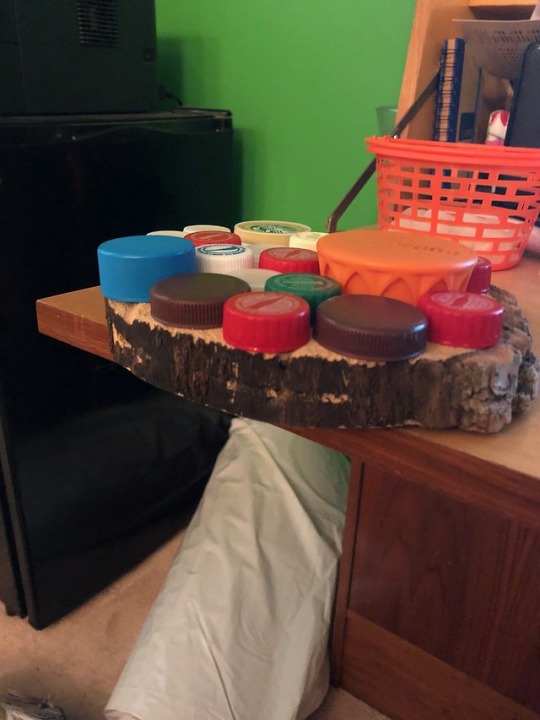
M12: Progress Shots
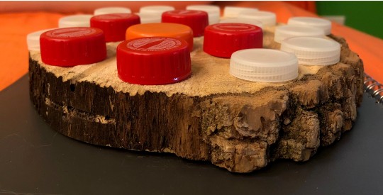
I’ve decided to go with the caps on wood idea. I elminated someone of the huge amounts of color from it and went simple. I still have a bunch of caps so I can easily change things around.
0 notes
Text
M11: Ad Exercise
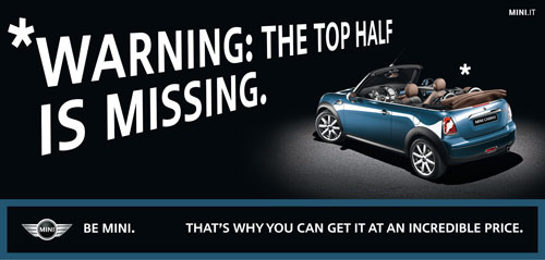
Found here: http://designrfix.com/inspiration/advertising-clever-automobile-ads
• The focal point of this ad is the car, which is created by the spotlight and the blue color of the car on the black background. This ties into a secondary focal point, the logo on the bottom which is outlined in the same color of the car.
• I would say the composition has a clear balance because the focal point is on the right while the less important words are (for the most part) on the left. Also, the warning label and the car are both set on diagonals that make them feel equal and if you were in the drivers seat the warning would be right in front of you.
• Color Dominance is used to make the car pop. A warm color helps to keep it subtle but still pop to the viewer. It’s not a bright sky blue that would come as a surprise. The only other color that is meant to bring attention in the ad is the giant white letters. Mini tends to do a great job with ads like this. They keep it simple but still get the point across.
• The warning label leads you to the car as you read it. So there is a directional line, sort of like a gaze motion or an implied line.
• The ad is realistic because it is a basic photo of a car that is lit from above. You could possibly see this car in a parking garage that is mostly dark or in your own garage when you turn the light on at night.
0 notes
Photo
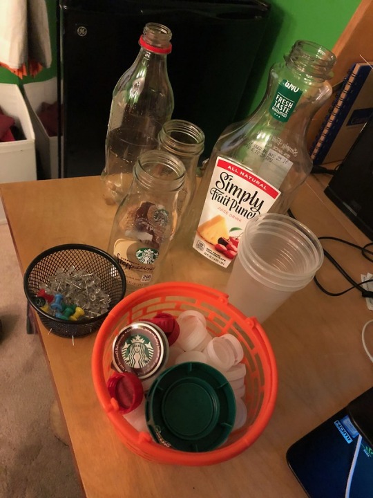
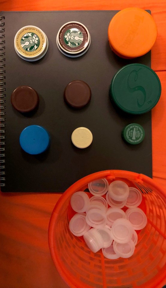
M11: Project 2 Progress Shots.
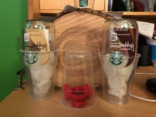
I did not have much time this past week to work on this project much so I have some super basic ideas going and haven’t made a whole lot of progress besides getting my supplies all in one place.
I’m liking the one with the bottle caps of all different sizes on the piece of wood the most right now. I don’t know what else to add to it though to make it better than just a bunch of caps on wood.
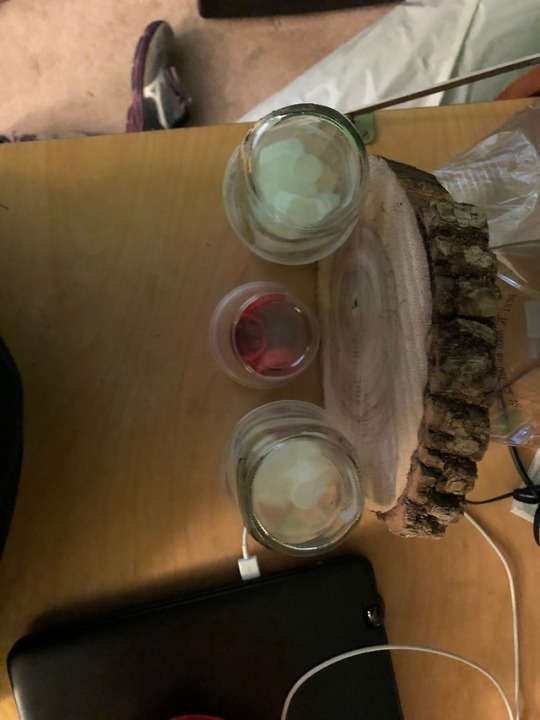
I still really like the filled bottle idea though. I just can’t figure out what do with it yet.
I’m still in the phase of figuring everything out, but it’s nice to have everything in one place. Finding a good background for the bottles is my biggest challenge right now. I hope to have this better figured out by next week.
0 notes
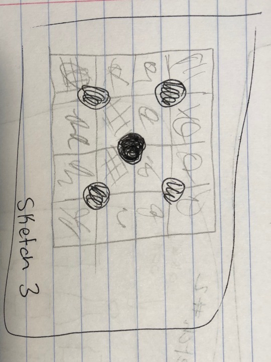
Text
Project 2 Sketches Pt. 3
Sketch 3: The background would be made of a bunch of different color swatches(like the ones you can get at Lowes in the paint section. The black dots would be washers or something similar. I’m still working on finding the focal point construction.
0 notes
Text
Project 2 Sketches Pt 2
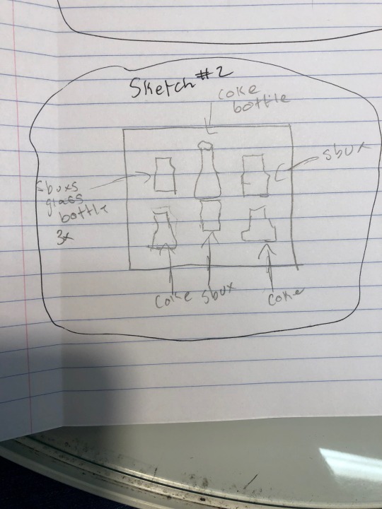
Sketch 2: This one would change directions completely. I would mount 6 bottles to a piece of wood. Some of the bottles would get nails(or similar) inside them. Then one would get colored push pins in it to create a focal point.
0 notes
Text
Project 2 Sketches Pt.1
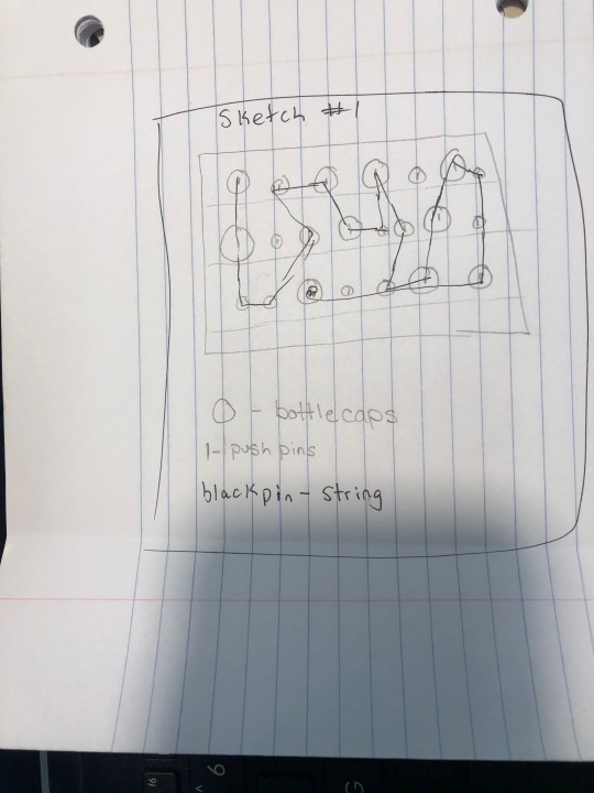
Sketch 1: This one would go a simple route, string wrapped. I would use bottle caps, push pins and then yarn.
I haven’t decided on the exact focal point. Everything would be put onto either a piece of wood or cardboard.
0 notes
Text
Session 10: Texture Ads Pt. 3
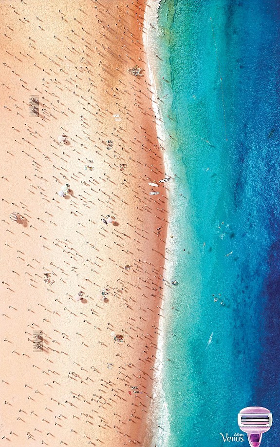
Image 3
Found here: http://www.bestadsontv.com/ad/87126/Gillette-Beach
There is a clear asymmetrical line going through this. It is heavier on the left since that is supposed to represent the hair. The texture is created by the people on the beach and how they are supposed to represent leg hair and the beach is the leg.
0 notes
Text
Session 10: Texture Ads Pt. 2
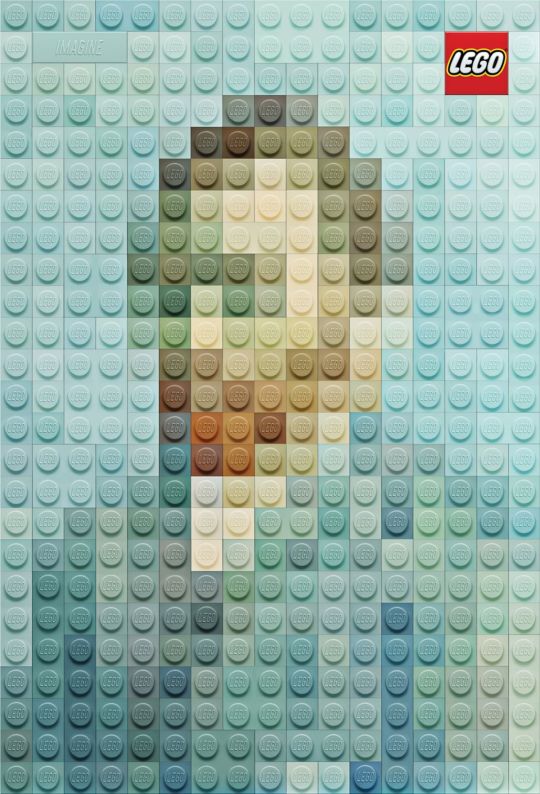
Image 2
We all know the feeling of a lego. They take a different approach here by creating a famous piece of artwork out of legos.
Unity is created from the lego pieces and the little circles on the top of the pieces. It is symmetrical almost anyway you cut it.
Found here: http://www.adruby.com/print-ads/lego-imagine
0 notes
Text
Session 10: Texture Ads Pt.1
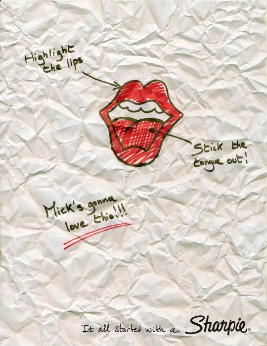
Image 1
This ad has a clear texture to it of crumpled up paper.
Unity is created by each amount of text only having two lines. The focal point is the mouth in the middle.
Found here: https://www.adsoftheworld.com/media/print/sharpie_rolling_stones
0 notes
Text
Session 9: Shape and Volume
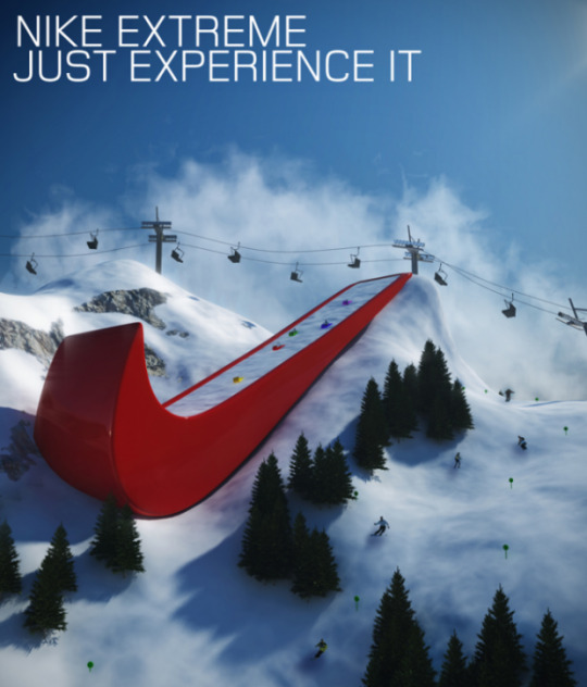
Image 1
Found Here: https://theultralinx.com/2014/01/80-ultra-creative-clever-inspirational-ads/
This ad shows a change in the size of the shape, so distortion. It catches your eye because the Nike logo is so large.
3 other elements noticed
. Repetition - the ski lifts at the top are sort of repeating as well as creating a pattern.
. The focal point in this is quite obvious, the giant ski jump, made through the Nike logo is meant to be the focal point.
. The balance on this image is very heavy on the left side. All the words and the focal point are focused on that side, leaving us with much of nothing to look at on the right side.
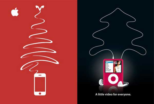
Image 2
Found here: https://www.business2community.com/marketing/top-15-creative-christmas-advertisements-0702017
This ad shows a form of abstraction. The headphones are meant to create a Christmas tree.
3 other elements
. There is a sense of symmetry. The image splits right down the middle, almost creating two ads. They are even on both sides.
. The focal point is made through a change in color. The focal point appears to be the ipod on the right since it is in a color and shows a playlist on the screen,
.

Image 3
Found here: https://www.quora.com/What-are-some-of-the-funniest-and-most-clever-advertisements
I believe this image would be a sense of distortion and change in shape. It is a billboard so it is expected that the elements would be larger but the slingshot is much larger than any other element.
3 other elements
. I’m sure if you could see this ad head on, you could see the almost even symmetry through it.
.The lines from the slingshot lead you back to the guy in the seat.
. The focal point is kind of hard to identify in this image. On first glance, I would think it would be the slingshot, since it is the largest element. But I think the goal is for it to be the man that is unbuckled.
0 notes
Text
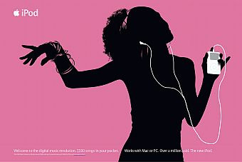
Session 7: Line in Advertising, silhouette, actual lines. This is a very popular style for Apple with their advertising. They use the outline of a person and then put their product in white to make it stand out. It’s a very simple concept but it obviously works for them. Having a one color background forces the viewer to look a the person and see they are enjoying listening to music on their Ipod.
Found here http://www.pophistorydig.com/topics/ipod-silhouettes-2000-2011/
0 notes