
Statistics
We looked inside some of the posts by beigemandu-blog and here's what we found interesting.
Average Info
Notes Per Post
0
Likes Per Post
0
Reblog Per Post
0
Reply Per Post
0
Time Between Posts
5 days
Number of Posts By Type
Text
5
Last Seen Tumblr Blogs


Fun Fact
Tumblr Inc. is using 66 technologies for its website.
Text
Week 4 || 9 Nov 2018 ✧
— ACTUAL SITEMAP

This is the full site map, I added some extra functions that I think would benefit the users and rearranged some items so that it will fit the category more.
— REFLECTION
When I did this general site map, I am able to notice some missing tools that might affect the experience of the users. Through all the sitemaps practice, I learn how to improve and add more details for the site maps
I also tried to be as simple as possible so that I would not be confused when I look at it later
(I will add on the site map for the search bar and filter bar below as I want to expand on it more)
— SOLVING ISSUES
The main issue I would like to touch on is from the HMW we came up based on “How might we help users who could not find the functions and food to locate the different functions easier by making it more visible” statements. Most of the people agreed that the functions are mostly hidden and they have to explore the page even further to find the different functions. Hence, I would feel that a search bar and a filter bar might aid people in finding the functions more easily.

I split the search bar category into two, one being the page and the other is the tool. The tool allows users to search up anything even keywords which makes it faster and easier.
But I will be doing on the page, the page is both search tool and filter tool together. I did a separate site map from the general sitemap, I categorise search function in a more general group while the filter ones are more smaller
— NAVIGATIONAL FLOW

— HOW IT WORKS
SEARCH FUNCTION

A search bar will be added to the top of the main menu of the website
People are able to use this function to find whatever they want more easily. and a when the user click on the word, the user will be brought to the page
This saves time and make it convenient for users as they would not need to constantly explore the page for something

This has a more refine sorting for each category, the users have a general view of all category.
The users will then be linked to this page where it shows a general category for each function represented by symbols
This reduce the time spend for the users to scroll and look everywhere for the different functions, when clicking the search bar, everything would be there for them and it would be easier to look at.

A filter bar will be added to the middle,of the main menu of the website
People are able to use this tool to filter anything they would like to find specifically
This will save time for the user from searching the things they want from so many categories
When they click this, they would be linked to another page

When directed to this page after clicking the filter button, the users will have to and tick the specific things they are searching for. Then the page will then link to whatever page they want to look at
It saves time from searching and clicking for each category if the users are unsure where are the items or functions they are looking for is at.

This is the page that will show after a person select chicken, mild set, family etc.
All the meals that include the selection that the user pick will pop up for them to look at.

The user will then get the information that they are looking for in a more detailed and more convenient way
— Reflection
After doing the sitemaps and the planning, I realised that it is not easy to come out with designs to improve the experience of user, one must consider the other aspects and how it might affect the interface. When I did my user interface, I went around from my family to my friends to ask them what they would want to see in the KFC website and gather some comments, I then asked them if a search bar and a filter tool will help and that was how I got my idea. I feel that the sitemap and the crazy 8 have benefitted me a lot, it help me to expand my idea, thinking and understanding in the website and IA in general. Although the steps are tedious, I thoroughly enjoyed the whole process together.
0 notes
Text
Week 3 || 2 Nov 2018 ✧
This week, Me and my partner, Jia Ying got into our respective groups for the F&B brands.Together, with another pair that chose the same group, KFC, We work together to get the class activities done.
— Activity 1
We started out with listing likes and dislikes. Me and Jia Ying worked on the mobile app while the other pair is in-charge of the website


After carefully analysing the app itself we found out there where were multiple things we enjoyed having and there were some things we feel that the app could improve. We wrote each like and dislike on pieces of paper.

I am able to understand the importance of experiencing the app before. With this we are able to understand the app even further as we view the app as a viewer point of view
After comparing with the other pair, we realised that there are some points they have that we felt that was somewhat similar when we look at the app

For example, we also felt that the app is very clean too due to the colours they chose and their neat arrangement.

- Challenges faced during the dot sorting process:
I feel that dot voting process is inaccurate due to people not participating, voting too many times or voting anyhow due to unwillingness, this will affect the results.
Luckily, we have fewer people, we can count and know who did not vote but if this a larger group, it would be harder to conduct.
OUR RESULTS

App
Like: most people voted for the order tracker
Dislike: most people voted for the hidden functions
Website
Like: the likes ended with a draw
Dislike: most of us voted with the confusion of “hot deals”
- For the likes for the app, most of us agree that the order tracker is a beneficial to the app as it help us to find out where our order is so that we can prepare when we can collect and we do not have to worry that our order is lost. Not all apps have such function.
- For the dislikes for the app, we agree that one of the problems is that the functions are hidden which make users difficult to find out where to go for the different functions such as promotions. This will create confusion and frustration for the users as they have to spend time searching.
- For the likes for the website, each of us agree that the app is straight-forward and it provides the information that we need (although someone did not vote)
- For the dislikes for the website, most of us agree that the app should not start with “hot deals” although it might be a good advertising technique, it might confuse the users as they might think that KFC only sells those items.
We then presented our findings to the class

— HMW (How Might We) opportunity for target group
We formed sentences with the how might we insight statement structure by rephrasing our dislikes into sentences. By doing so, to turn those challenges into opportunities for design.

- Challenges:
When we list out into statements, we found out to most of our ideas clash with each other.
This makes it harder for us to come up with design later on
— Research for How Might we
How do we use how might we structure?
- After doing your crazy 8, ask yourself if it allows for a variety of solutions. If it doesn’t, broaden it. Your How Might We should generate a number of possible answers and it would help in brainstorming for solutions
- Your How Might We should not be too broad, if it is too broad, it would be hard for us to generate ideas.
- It will help in exploring ideas and coming up with ideas
— Crazy 8
We did the crazy 8 activity where we come out with 8 sketches and idea (8 minutes total, 1 minute each). The idea is to generate as many ideas as possible within a short timeframe, focusing on quantity of ideas not quality.

This is the crazy 8 drawings I came up in 8 seconds. I try to solve the problems I feel the users would face and I feel that these functions will be beneficial for them
- Challenges:
When I was coming up with the ideas I could only recall the KFC website that I did visited.
This brings down my creativity as I mainly only work on improving the existing design rather than creating a new design to help the users.
— Reflection
As I did the designs I recalled that the company I visited previously, Jin design studios. They make us did similar activities, they made us rethink of an idea to make the golden village website more attract and I was wondering why is it beneficial for us up to today.
But this activity made me realise that sometimes quantity over quality works, you never know the design that you drew could be actually a good idea, when we go out to work in the future, we might be given a short period of time to solve a problem and the crazy 8 might actually help us to come up with a good design.
— Sitemap (in class) (NOT ACTUAL ONE)

I did a draft of the actual submission of the site map I was supposed to submit in class.
I felt that this sitemap was quite messy and I did not write it out in a way so that it would benefit the users of the website
Other than that, I moved the some of the parts of the site map I felt that will be easier to categorise it
0 notes
Text
Week 2 || 26 Oct 2018 ✧
— Activity 1
This week we got into groups of threes for our class activities. we were given a McCafe screenshot set and some blank papers. We were tasked to make an open sort while considering how McCafe sorts out their app.

we sorted out the cards into four categories “functions, instructions, our story, profile” as we felt that the respective cards serves the purpose that we written down.

Challenges: There were some cards that we could not figure out the category for, we had to read carefully and analyse in order to find the respective category
later on, we went on to other groups to observe how they sorted out their card, they had more category which I find that it might help the users to view the website more easily.
This is one of the other groups work. Compared to our sorting, this group name outlets and promotions differently

we were then given examples of how wireframing of an app is being drawn.
From this, I learn what is a wire framing, and wireframing are created for the purpose of arranging elements to best accomplish a particular purpose.

— Activity 2
This time we were tasked to sort a closed set arrangement with the same cards that our lecturer gave us before.

However, the lecturers gave us the headings instead of us coming out with. On top of that we realise that the menu and FAQ are not included in the arrangement set. We decided to draw a wireframe of the menu and FAQ and added it in.

The lecturer then shared with us how the actual app to let us have a view on how they sort their website to let us have a better understanding.
— Activity 3
This time we were given a lot more McCafe cards that includes food items and we asked to sort it out in open card sort. We then came out with 5 other categories that we find that it fits best in the menu

We came out with 5 categories: cakes, muffins, hot beverages, ice beverages and others
At first, we have problems, finding the category for the cinnamon melt and brownie, we decided to put them under a generic heading so that it would not be that confusing
— Activity 4
In this activity we were tasked to draw a sitemap on how our application interface should look like. Firstly, we arranged the cards to its categories. We narrowed it down so that it would be easier for us to analyse. We then remove all the cards to make things less complicated and we added the basic tabs that we think that every McCafe app would have and what we thought that the users of the website would like to see when they use our website.
Challenges:
As we did not refer to anything or the app itself, we had to use our imagination to come out and recall with the different functions we have

These are necessities that the users would need when they use their apps. We then finalised our idea into 5 groups ( menu, FAQ, About us, Promotions, Membership) and wrote it into a sitemap.

Through this activity, it allows me to practice drawing a site map without any reference, this activity also shows me how drawing a sitemap is essential and beneficial for the design of the website or mobile.
— Revised First week activities
In our same groups of three, we sorted the same McDonald meal into different categorise which helped me recapped the importance of making things more user-friendly and detailed. This would benefit us in analysis in IA. We learned to make things easier and less complicated for the users by combing the hotcakes into a more general category called “Platters” instead of creating another category just for the hotcakes.
We did this week sorting differently from last week, we created 5 categories: Breakfast bundles, children meal, platter, burgers, others.
Challenges:
As we did these sorting of the cards before, we challenged ourselves to create another setup that is different from the first weeks, it was challenging as we have a memory of what we created the last time.

Reflection
Sitemaps helps me to get an overview of our website, it shows the structure of the site, the sections in and the links between. Sitemaps make navigating the website easier. With different people in the group we always face difficulties due to the different opinion that each of us have, the more the people, the more challenges we have. Through these activities we learnt that wireframing and drawing sitemaps is beneficial for our IA design
0 notes
Text
Week 1 || 19 Oct 2018 ✧
On our first lesson of Interactions & Service Fundamentals (ISF), we were introduced to IA (Information Architecture). From this introduction, I am able to learn what is IA, importance of IA, the benefits.
Information architecture is all about organising the content in a way that it can be understood in an easiest manner. In terms of digital design, a good IA it helps people to understand the content of the websites, apps or software and find the content they need and also help them to know where they are currently while using the service.
We were then split into groups of 4 for our class activities. My teammates includes Yusheng, Ee ping, Xue ting and me. Our group name is called Walnut Chestnut Coconut Doughnut. We were given cards that contains the different meals in Mcdonald and were tasked to sort out according to our own interpretation.
— Activity 1

For this activity we were suppose to form an open card sort. At first we came out with 4 catogories only, Breakfast, Burger, Special and Sets.

However, there were similar cards in the same group so our lecturers adviced us to split the cards to a more smaller group so that all the cards would not fall into the same category. We then added a new group, the children meal.

After more thoughts after the activity, I felt that we still could further group the cards into smaller groups. For example, adding a lunch set for all the burgers and happy meal. We also could have improved by moving the extra cards to another grouping. For example, since there are two red rice porridge cards, we could move one to the breakfast set. This will make it more detailed and less confusing for people to look at.
— Activity 2
This time we were tasked to arrange it in a close card sort, we were given categorized labels, breakfast meal, promotion meal and happy meal. Our lecturer advised that we split up the meals more for activity the next, do that it would be more easier for the to look at the website.

There are 3 groupings given to us: Breakfast & value meals, promotion meals, happy meals
Challenges:
As the card increases, it was hard for us to decide the categories for the card since everyone have different opinions
— Activity 3
This was it was back to open card sort. This time we listened to the lecturers comments and work towards it. We added in even more groups and I can say that the groupings are improving as it is even more detailed and user-friendly.

There are 8 main groupings that we created: Porridge, pancake, wrap, breakfast, Burger, special, set and children
We also added 2 side groups: pancake set and wrap set
— Activity 4
We were given new cards however the cards have even more food type like drinks etc. It is an open sort arrangement and many more groupings are needed in this activity. We grouped in as detailed as possible and tried not to mix up the groupings.
We split into 9 main groups: Porridge, burger with sesame seeds, burger, happy meal, wrap, salad, dessert beverages
We created 3 more subgroups: cold beverages, warm beverages and Mccafe.

Challenges:
There were too many cards, it got confusing half way
Improvements: we can still split the burger and snack groupings even smaller so it is more detailed
Compare and Contrast
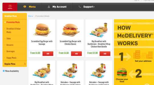
When i went to the Mcdonald delivery website to compare what we have been doing, i feel that hat we are doing now relates to whatever we are doing right now, the groupings in the actual website are similar to ours, I find it interesting to look at how other people look at the Mcdonald meals and group them differently.
I found out there were many different groupings that Mcdonald named it and group it differently.
They did not over group it as over-grouping and creating a lot of sub groups will create confusion
When I used the website, I have a pleasant experience as the Menus are well categorized that makes it easier when I look for the food I want to order
— Reflection
Through IA, we are able to make website, apps or any platform more convenient for people. We could do so by dividing a bunch of information into small pieces, labelling them and organising them carefully so that the information can be found easily and can be effective to use. There are no fixed categories, we have the freedom to create new categories as long as it benefits the users. To do so, we should always see our designs in the point of view of the users to get a better understanding and to see if our design works. Through the activities I learn about card sorting. It is method used to help design or evaluate the IA of a site. Card sorting helps me to understand my users' expectations and understanding of my topics. Open card sort is when organising the topics of the website by trying to make sense to them and then name each group in a way that they feel accurately describes the content. Close sort refers to sorting topics out with predefined categories of a website. I believe these exercises that we practice will help us to understand and design a website better.
the pictures are so blur even after uploading 4 times i dont know why
0 notes
