
Don't wanna be here? Send us removal request.
Statistics
We looked inside some of the posts by bellerobbie-dsn512 and here's what we found interesting.
Average Info
Notes Per Post
0
Likes Per Post
0
Reblog Per Post
0
Reply Per Post
0
Time Between Posts
2 days
Number of Posts By Type
Text
17
Last Seen Tumblr Blogs


Fun Fact
The most popular pages on Tumblr are about Minecraft, GIFs, and David J. Peterson.
Text
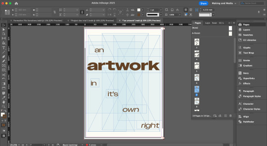
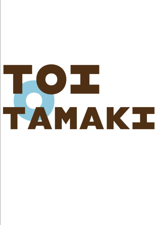
Final Poster + Animation + Rationale + In the hallway


Printed and pinned!
So unfortunately there was many a mishap in regards to colour printing at Warehouse stationary. The brown came out much darker and the beige paper came out more white. After 5 retry’s and a JPEG conversion I wouldn’t dare post the results of, I decided to proceed with this version. Aside from the specific colours, I am very happy with the borders, clarity and overall look of the poster
*Honourable mention to my 2018 MacBook Air that has bravely conquered InDesign, Illustrator AND AfterEffects all at once with minimal overheating and fan-whirring.*
0 notes
Text
12.1 Final feedback
Today I had my final feedback session. This week was really just finishing touches, so I feel like I am in a great position for hand-in next week!

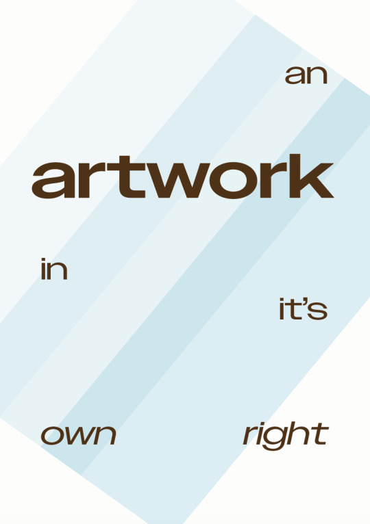
Test print for final check of colours. Blue is looking a bit flat still so I am going to some extra tweaks to the shades for some diversity. The brown is very dark so I am going to take some black out of the swatch. Otherwise I am happy with this.
In regards to the border, I need to rotate the bottom line so it's not upside down (why on earth did I do that???). The main issue I am facing is the word distribution. Aakifa suggested leaving the spaces and just moving some of the awards around but that confuses me so I would like to try getting them as even as possible sans spaces. She also told me to move the margins inwards as there is plenty of room to do so.

My work screen - to fill the space, I did further research on the awards that the gallery had won. Turns out, I had missed quite a few! I then spent a lot of time moving the awards around to even them out. I also extended the margins from 12mm to 14mm which made a huge difference.

Finalised spacing. This took sooo long. Since there was so much variation in word lengths this took a lot of fine tuning. I used spacing and margins but I needed to ensure it was all even and visually okay (not majorly obvious there is differences). I'm very happy with this outcome, and I think this is my final poster!
One other adjustment I made was changing the glass panes in the background. I played around with some different swatches, making small adjustments to the cyan, yellow and magenta. I stayed away from black in all of them as I wanted to keep them very light. I also make it so they were all set at 25% opacity as a kind of baseline then adjusted the tint from there.
Also I adjusted the kerning between the a and r in artwork as well as the w and o.
0 notes
Text
12. Animation final touches!
Feeling very clever with this.
I've used scale and opacity to create this and I think it really well communicates my idea. I like that the timing of the words is staggered which helps readability. Once the main type is in frame, the border featuring the awards appears to back my statement. The complimentary type slowly fades leaving only "artwork."
Though simple, I'm very happy with the turnout of my animation and I really think it has the narrative I was hoping to tell.
0 notes
Text
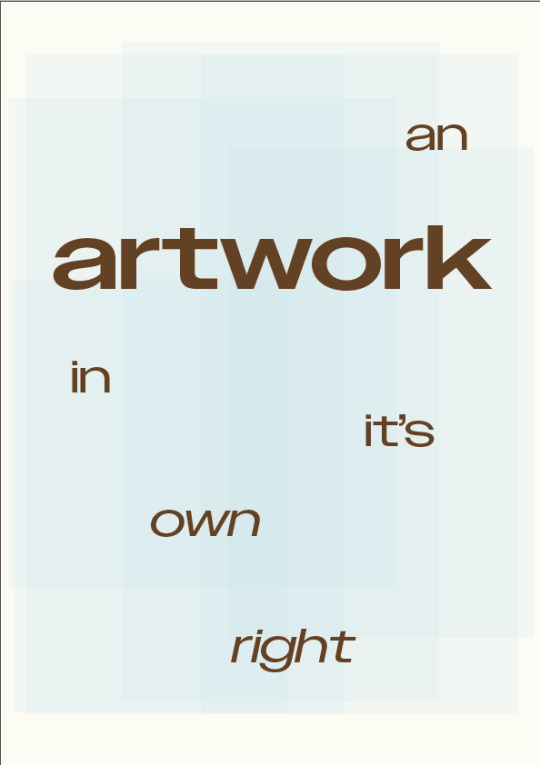
12 Project Document Style Finalisation


For the final touches of my project document I changed the colours around to align with my posters colour palette. The type is all in dark brown now and the paper colour is that off-white beige shade. Both add very subtle differences and don't hugely affect the initial look but when paired with my poster and animation they marry really well.
Not all of the writing is final but I can go back and adjust as needed when I have cleaned it up for hand-in.
0 notes
Text
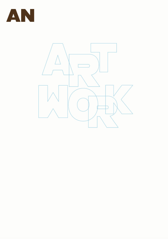
12. Adding animation to my poster
I am trying to add emphasis on 'artwork'. I think maybe the "in it's own right" could be coming in a bit faster as it feel like a slow read...
In this iteration, I combined the scale of the main type with the position of the border. This video cut a little bit short for some reason but all the lines slide in from different directions. I like that they all come in at the same time so it's not taking the focus away from the main type. Maybe it looks a little bit busy though?
0 notes
Text
11.1 Lecturer feedback + development
I came to my feedback session with many different options but I felt like none of them were complete. When I showed them to Aikifa she said I had good ideas but I needed to combine things:
glass panes in background like the ones I used in formative
no more chunky font - its not working anymore!
use the border but not using type on a path as it will skew all words and spacing - use margins instead
refine positioning of words to improve readability

Yay, starting to come together!
0 notes
Text
10.3 Project document development
After playing around with margins, gutters and the addition of grids, I have landed with the project document set up I am quite happy with.


Everything is lined up very evenly, it is so satisfying... I understand that this is a very simple set up but I like that it follows the design conventions of my poster but is very polished.
0 notes
Text
10.2 Adding motion
A simple poster but I wanted to really pare back the content and see how scale will affect the poster... I really like this concept. I like the staggered entry of the words and how it's kind of like stepping down stairs (like in the gallery).
0 notes
Text
10.1 Lecturer feedback + Poster development
Off the back of my less than impressive experiments from last week I had a feedback session with Caroline for some fresh eyes on my word. Instantly she told me to ditch the toi o tamaki as the main words and focus on my own generation content.
"An artwork in its own right."
I really randomly wrote this as kind of a subheading for toi o tamaki and didn't think much of it but looking at it now, it seems obvious since I was told to generate more text content.


Still a bit attached to using the place name eeeek. These experiments kind of showed me that they're not really necessary, but I do need some more visual elements. I'm also starting to move away from this font choice! Feels quite clunky in this format.


Playing around with formatting.


Starting the add the glass panes concept but updating ut with some different formats. The angular one is a bit random lol not super interested in that. I think the far right one has legs if the boxes can aid readability.


A couple of rogue designs. The box box one was kind of trying to frame the words as pieces of art.


Playing around with some different graphics I could use instead of the glass panes perhaps??
0 notes
Text
9.3 Project document trials
After following the Panpoto tutorials I have set up my first project document. Much easier than expected thankfully!


Setting up columns, margins and gutters. I followed the exact tutorial of 6 margins but I'm unsure if I'll use that many in my project document? Having a play around with setting up the paragraph styles was interesting too - A little challanging at first but I got there.


Then I experimented with adding some of my contextual annotations... I quickly forgot everything I had learnt a mere half an hour ago so I found myself revisiting the tutorials very often. I also tried using four columns rather than 6. Not sure if I love this, it looks like more of a wordy powerpoint presentation now.
0 notes
Text
9.2 Adding motion

Illustrator work-around. Definitely the hardest part, but very satisfying when all the layers work! This part of the process has helped me be more selective of what elements belong on my posters.
I lke this motion, I think it's very cute. I like how the circle rolls in and acts as a translation for toi.. This is an improvement from the last animation I did of this poster as the black background is not revealed. I also decided not to animate the graphic as I think that is reverting back to my formative work where the type is not the main focus.
0 notes
Text
9.1 Poster development + Lecturer feedback
Today I had feedback with Aakifa which I found super helpful. I've been feeling very stuck with how to develop further. From looking at my poster, she told me to focus on the main text down the bottom, play around with scale and see how I can use the o.

Here I have removed all the irrelevant text (e.g. address, hours, admission) and I've centered the toi o tamaki as the main point of the page. In these developments I removed the graphic to focus more on the type. Out of the three of these iterations I like the far right most. In these experiments I am more playing with the positioning and scale before adding other elements. I think this is helping me as my formative poster was very busy, whereas this is a more pared back simple way of working.


I am also working on some more variation in text content and in line with the architectural themes of my poster, I wanted to feature the awards the gallery has won for the design and interior of the structure.


Aakifa also suggested I listed the awards as a border instead in order to reduce overcrowding the page. For some reason the colour went super pale when it was supposed to be the dark brown colour... Also type on a path is extremely difficult to distribute the type without it overflowing.


Here are my attempts of adding the awards as text content. I think these are all absolute abominations against design and I need serious help with developing. I tried coming up with some of my own text content too which adds context to the awards I think.
Feeling very stuck. Though these iterations have confirmed that I really like the glass pane graphics in the background.
Adding motion - playing with opacity and position. I like the idea of the glass fading into the frame but I'd need to adjust the background to white instead so only the blue merges in rather than the whole image which reveals the black underneath.
0 notes
Text
8.2 Adding motion to my poster design
My first animation of one of my posters! Though this is not the poster I will be taking further as it needs development, the circle element was a good opportunity for me to experiment with basic animation.
I like what the rotation motion adds to the poster. The text is "toi" and "art" - so the text is kind of translating as it rotates.
0 notes
Text
7.5 Further animation experiments
After our initial tutorial, the instructions were to create some motion that relate to our poster and site but not to get started on our actual poster animation quite yet.
Here I created a basic animation using scale as the main design convention (the type not the animation). Then I played around with the positioning of the 'a' and 't'. This took me a lot longer than I'd care to admit - the use of time frames is something I am still getting a grasp of. Also the spacing of the letter is insane. This is something I would fine tune if the concept goes further.
0 notes
Text
7.4 First motion in-class tutorials
This was a rather daughting lesson to come back to after the break but I ended up really enjoying it albeit confused, lost and afraid at times. The video content we watched in preparation did little to comfort me but in practice, I was alright.
Now you have to believe me when I say that I did do the in class poster animation but the file is completely corrupted. If you look closely, you will see that the elements are in the right position. This tutorial ran us through the use of the position, opacity, speed and time marks (?) in the transformation section of After Effects.
We were then left to our own devices to play around with what we had just learnt. I clearly took a liking to the elipse tool and made lots of flowers then applied scale, positioning, opacity and rotation. This started to give me a feel of how animation can add something to the communication and narrative of my poster. For example, the yellow spinning flower is cute and maybe a bit kitschy whereas the orange flower in the top right corner is very ominous and domineering.
More experiments to follow!
0 notes
Text
7.2 Contextual Annotation
instagram
Designer: Paul Voggenreiter
I like the type in the poster moves harmoniously with the shape. I interpret the type and shape moving from top to bottom as the sun setting and the festival spanning across many days, with events/screenings day and night.
(Select one example and write more short critical review notes (prompts in the class presentation) —use these notes as the basis for writing a Design Annotation of 100 words.)
0 notes