
Don't wanna be here? Send us removal request.
Statistics
We looked inside some of the posts by bendingbone and here's what we found interesting.
Average Info
Notes Per Post
828K
Likes Per Post
421K
Reblog Per Post
407K
Reply Per Post
463
Time Between Posts
2 months
Number of Posts By Type
Link
1
Photo
13
Video
2
Text
1
Last Seen Tumblr Blogs


Fun Fact
Mobile US users spent an average of 115.8 minutes on Tumblr app monthly.
Link
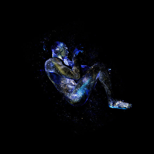
Mikael Chukwuma Owunna, a queer Nigerian-Swedish artist raised in Pittsburgh, has spent the past two and a half years photographing Black men and women for a series titled Infinite Essence. Hand-painted using fluorescent paints and photographed in complete darkness, Owunna’s subjects are illuminated by a flash outfitted with a UV filter, which turns their nude bodies into glowing celestial figures.
Owunna tells Colossal that the series was his response to the frequent images and videos of Black people being killed by those sworn to protect them: the police. The photographer’s friends, family members, dancers, and one person he connected with on Instagram serve as models for the project, which is named after an idea from his Igbo heritage. “All of our individual spirits are just one ray of the infinite essence of the sun,” Owunna explains. “By transcending the visible spectrum, I work to illuminate a world beyond our visible structures of racism, sexism, homophobia and transphobia where the black body is free.”
53K notes
·
View notes
Photo

“The Mirrored Night Sky”, by Xiaohua Zhao, China
“An enthralled stargazer is immersed in the stars as the luminous purple sky is mirrored in the thin sheet of water across the world’s largest salt flat, Salar de Uyuni in Bolivia.” – Astronomy Photographer of the Year 2015
45K notes
·
View notes
Text
it’s sort of funny that the current cultural idea of the flapper dates not from the 1920s, but the 1950s when costume designers took the radical, gender-fluid, sexual, sexually liberated ideas and fashions of the 20s and made them sexy. as in sexual objectifying.
because 1950s and fuck female agency.
67K notes
·
View notes
Photo


Cittàgazze by Jeremy Paillotin
Inspired by Philip Pullman’s “His Dark Materials”.
231 notes
·
View notes
Photo
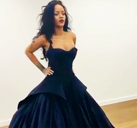


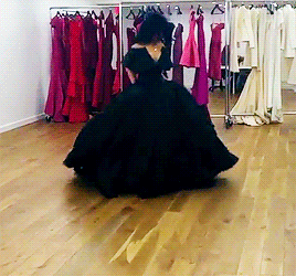
rihanna + trying on zac posen dresses (✿ ♥‿♥)
12K notes
·
View notes
Photo
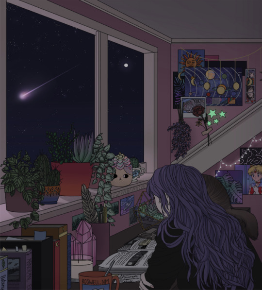
| Quiet Night, Quiet Stars |
Original | Shop | Instagram
4K notes
·
View notes
Photo
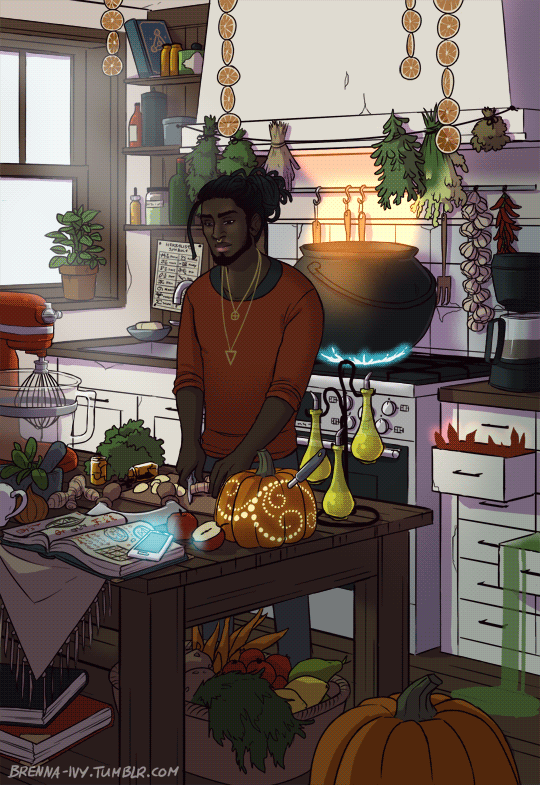

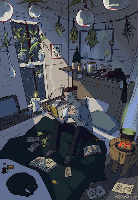
Modern Male Witch Project, by Brenna-Ivy on Tumblr and Society6
250K notes
·
View notes

Photo


As far as trompe l'oeil architecture go, French artist Pierre Delavie has it nailed. He uses canopies and canvases to create realistic illusions that will have people believing that they are living in the dream world of ‘Inception.’ Unfortunately, there is no Leonardo DiCaprio to help make sense of the warped buildings. Instead, people will have to rely on their own senses to determine what is real and what is not. Titled ‘architectural abduction,’ the trompe l'oeil architecture illusions are impressively large-scale. Some of installations are simple, others are more elaborate, but all of them play with people’s perceptions in a big way. This is especially the case since many of his chosen sites appear to revolve around landmarks that both locals and tourists would be interested in. The trompe l'oeil architecture touches make them even more special. (Source)
2K notes
·
View notes
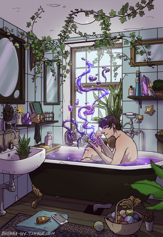
Photo

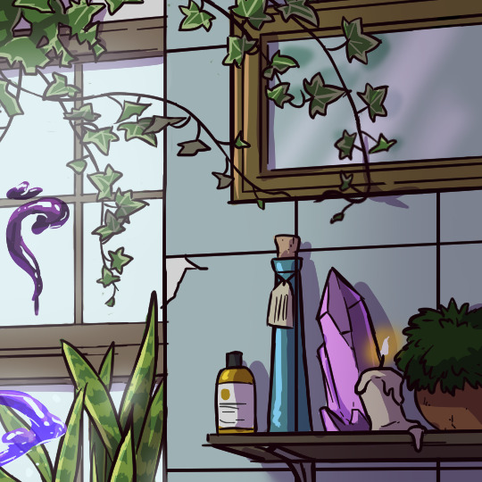
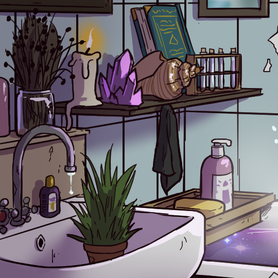
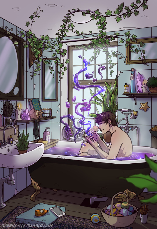
To celebrate the start of 2017, I give you the Modern Male Witch Bathroom! I’ve been casually working on this for weeks and I finally finished the animation today.
This is an older version of the flower witch boy I designed a while ago. I thought he would fit nicely in this setting. He is now a plant/crystal/water witch <3
This is the second piece in my Modern Male Witch Project.
45K notes
·
View notes
Photo
Thank you so much! It's so nice to hear feedback 😊


Gateway
The inspiration for Gateway came from my favourite book series called His Dark Materials by Philip Pullman. In this series, there is a knife which can cut holes into the fabric of reality and create portals to other worlds. In the books they are often described to look like holes in the air, showing something completely different from the place around it. I have always found that image very intriguing and inspiring and that led me to create the photo set you can see here.
My aim while taking these photos was capturing a moment that looks almost impossible. I think there is something very magical in the whole idea of alternate reality and I wanted to bring that same feeling into these photos. At first I was actually going to just take pictures of opposite objects with the help of mirrors (so that you could see e.g. fire from behind the mirror and water from the mirror) but once I started looking at the pictures I had taken, I realised that I had done something entirely different. Nevertheless, I am happier with capturing these photographs than with my original idea.
Even though I was quite happy with the natural lighting of these photos, I ended up editing them a bit on my computer because I felt that they weren’t magical-looking enough. What I did to each of the photos was adjust the contrast so that the light and dark parts of the photos would be more striking. This created more depth and drama, which was exactly what I wanted. Upping the contrast makes the pieces of mirror seem more detached from their surroundings and emphasises the colour differences.
This photo set is one of my favourites and I am very happy with how it turned out. I have actually been considering to make this into a series with photos of these portals in different settings. I think it would be an interesting project to do at some point. Also, If I am going to have Gateway in my final exhibition, I think I will want to find some gold coloured picture frames for each of the photos.
99 notes
·
View notes
Photo


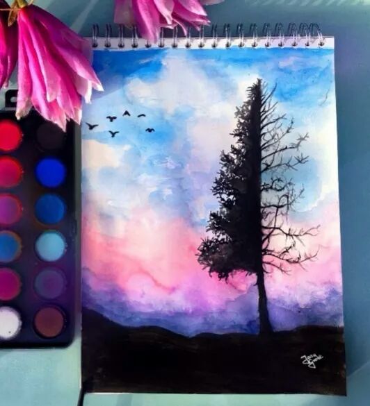


Watercolor Art by German Artist Jana Grote
105K notes
·
View notes
Photo


AMBIANCE
“We’ve all got both light and dark inside of us” J.K. Rowling
I got the idea for creating Ambiance when I stumbled upon a painting by Jimmy Lawlor called Dragonflies. I admired the way the artist had created an intricate image by painting mostly small dots in different colours. I loved the ethereal and light mood the painting has, as well as the gorgeous pose the woman is in. The painting made me want to create my own work, with acrylic paint also. I wanted to paint a dancer with some kind of skirt or dress and use the same technique as Lawlor did.

Jimmy Lawlor, Dragonflies
Jimmy Lawlor is an Irish surrealist painter, known for his extremely life-like human characters and comic scenes often present in his work. He always uses light and shadow in his paintings very effectively, creating realistic scenes with intricate details. He plays with the rural Ireland image and mixes it with traffic cones flying in the air and plastic ducks on the beach. The artist himself has said that he doesn’t put that much thought into his paintings but rather just lets the painting become what it will, without putting any symbols or meaning behind it. He wants people to interpret what they want from his work.

Jimmy Lawlor, Going with the Flow

Jimmy Lawlor, Light Reading

Jimmy Lawlor, Fire Dance
At first I was only going to make one painting but when I started sketching, I realised that I wanted both the characters to be quite large and to contrast each other. As with basically all my works, the paintings changed quite a lot during the creation process. The only thing that actually stayed as I planned it in the beginning was the poses the dancers are in. Initially the dresses the dancers would be wearing were supposed to be quite a bit smaller and I was going to paint cracks coming from the corners of the white painting and roses into the black one. Later I decided that I wanted the characters and the dresses to be the focal point of the paintings and other designs would be too much.

I started by sketching the dancers with pencil and then painting both of the canvases with the background colour. The white painting has actually various different shades of white in the background which aren’t that visible in these pictures. After that I painted the dancers themselves and used darker colours for shading. After the characters were ready, I started on the dresses.


I used various greens and greys in the black painting for the dress and a gradient of colours that are usually present in fire for the white one. The green dress was quite easy to make, even though the small dots were quite time consuming, but I had a bit of trouble with the fire dress. The shape of it was supposed to be like a flame, but when I had done that it looked more like a Chinese temple building, so I decided to cover up the edges of it (which you can see in the picture above) and paint a more of a flowy design for it. It still didn’t really come out exactly as I would have wanted, but nevertheless I didn’t change it again.

Ambiance doesn’t really have a definite message behind it, rather I just wanted to create something mysterious and alluring. The contrast between the background colours is very important since I wanted the two paintings to be different but also very similar at the same time. The main point of the paintings can be seen in the name and that is the mood. I tried to create a mysterious and ethereal mood while painting and I hope the viewer will be able to sense that also.
38 notes
·
View notes