
bethanylf-art
90 posts
Bethany Lacey-Freeman's Personal Development Plan + Graphic Design Processes/Practice blog for BA Graphic Design [YEAR 1 OF 3]
Don't wanna be here? Send us removal request.
Statistics
We looked inside some of the posts by bethanylf-art and here's what we found interesting.
Average Info
Notes Per Post
1
Likes Per Post
1
Reblog Per Post
0
Reply Per Post
0
Time Between Posts
11 days
Number of Posts By Type
Text
16
Link
1
Last Seen Tumblr Blogs


Fun Fact
After the announcement of the deal with Yahoo!, there were 170K signatures of unhappy Tumblr users petitioning to prevent the sale in 2013.
Text
Action Plan
When I gave my presentation for my Personal Planning module, I talked about what I would like to do in the future. This includes (particularly in the summer);
- Making more personal artwork
- Showcase said work online
- Try to transfer to NUA, if not this year then the next
If I were being more broad and open with my actions/desires, I would include an abundance of other goals, including;
- Stream development of work as it happens online via streaming service, or at least make progress videos to help me get started.
- Make and edit films! Even short ones! Even ones that don’t make sense! Including vlogs!
- Do more things that make me happy (watching films, playing video games, doing my makeup, etc.)
- Manage my time better to keep my mental health from declining- just do work when it is assigned.
- Keep up with my daily sketchbook and try to grow from pencil to other mediums such as ink and brush.
0 notes
Text
Personal Planning Presentation Aftermath
Once again, I was beyond nervous for this presentation. Making the slideshow was fun, just like the last slideshow I had to present. I wish I had added another slide that showcased the self-learning I do outside of school- watching videos from Skillshare, Aaron Blaise, YouTube, Twitch streamers and Adobe Live streams, as well as drawing daily in a sketchbook- to let the audience know that this is what I will be doing and learning from during the summer and years to come. However, I was actually over my time limit anyway.
Shockingly (to myself), my presentation went on for more or less 15 minutes. It felt much shorter than that in hindsight, but when I was actually up there, time seemed to have stopped- or at least slowed immensely, since I was so nervous. When I am scared out of my mind, time seems to drag, but I had had no idea that so much time had gone by so quickly. This makes me wonder how much I must have rambled. I was hoping I hadn’t come off as too complaining, negative, critical nor self-deprecating, and am worried that I was. To add insult to injury, I constantly had this shaky voice. I couldn’t help it; I could not relax and speak normally- yet I desperately wanted to.
I would never want to be unfair to other people’s presentations. I genuinely thought that I had too little to say and would be under the time limit. It’s strange that what actually happened was the opposite.
Perhaps I managed to go over time because I was this weird combination of terrified and comfortable enough to talk about myself and my goals. Maybe I was hyperaware of my anxiety during the presentation and went through erratic highs and lows of pseudo-comfort and terror.
I also had two different prospectuses (BA and MA) from Norwich to show during my presentation, but I completely forgot about them when I was presenting. I was supposed to bring them out during my slide about Norwich, naturally. When I had finished the presentation, I answered my tutor’s question about Norwich whilst also quickly mentioning and showing the class the prospectuses “in case they would like to look through them”. I wish I had referred to them when I should have. I even added a little label inside the BA prospectus to show where the page on the Illustration course is so I wouldn’t fumble with the book during my performance and lose time (as well as marks).
I honestly feel like I will never get over the fear and awkwardness of presenting, even if I try. The best I can tell myself is to be more prepared and test/rehearse the presentation multiple times before the big day. I’ll also have to try to not beat a dead horse and repeat myself when explaining things. This is an issue I have when writing my blogs as well.
Also, I do believe my notes saved my performance! As awkward as I was, my notes were really helpful and followed the organisation of the slideshow; though, I possibly ranted/digressed too much or even spoke about information that was better suited to be mentioned on a different slide. I was able to speak about the topics freely after reading my notes about said topics aloud, so I am glad I did not have to rely on a script (which would have probably cost me marks). Also, at least I actually read my notes this time, in contrast to my last presentation!
1 note
·
View note
Text
Fitbit Ad: Finding Typography
I was trying to figure out a good composition and hierarchy for text in my Fitbit advertisement. I didn’t have my pictures of my sister on me but, with what little time I had left in the day, I figured I needed to practice my InDesign type skills anyway.
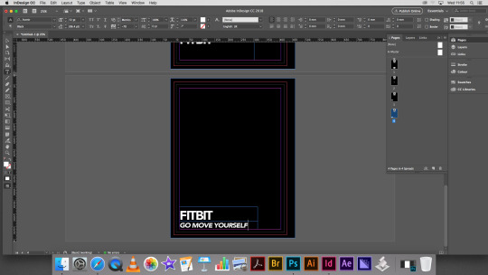
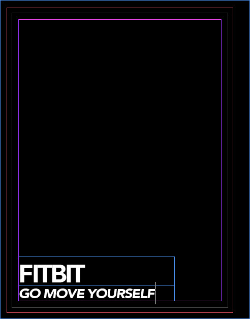
I played a little bit with the tracking, skew and boldness of the text to create something eye-catching and more unique than simple capital lettering left as is. One of the most fun things about messing with text is experimenting with the typefaces and positioning of the letters; I can squish, shorten, elongate, space out, and pretty much do anything else to the lettering to produce multiple potential ideas in a short amount of time, which is great for sketchbook/development work.
Above, I have shown how to efficiently organise different layouts (pages) of text and image in InDesign within the same file- this is useful for zines, booklets and portfolio PDFs for pieces of work displayed in one place.
0 notes
Link
Above is a useful (and referenced!) page that explains health and safety measures that photographers should understand. The guide is so detailed; I think it’s helpful that the rules are more than simply “do not leave the lightbox on without supervision”.
0 notes
Text
Photography for Advertising Research
Since I aspire to become an illustrator, I’ve decided to include illustration in my poster. I believe this is a good way to attract attention since the idea isn’t massively common in Western advertising.
0 notes
Text
Illustrated Essay Aftermath
I thought my essay question was going to be easy to answer- and I suppose it was. I truly felt I had answered the question, which was the goal in the first place. However, I was severely below the word count, even a week before hand-in. No matter how hard I tried, I could not answer my question any further without feeling as if I were rambling or using too many examples just to fill up space. I was massively disheartened when I had to submit my essay with only less than 450 words.
I liked my essay question so much that I thought I could truly go on and on about the answer, and when I couldn't, I was dejected (especially knowing that I am a decent writer and can write thousands upon thousands of words for my blog posts- but apparently not for the essay). I knew I could not ramble or fill the essay with fluff, so I probably worried myself out of doing that. Part of me thinks I should have rambled and use more examples anyway just to increase the word count even a little bit.
I suppose I enjoyed the examples I had used in my essay. I’m constantly seeing artists, illustrators, animators, designers and whatnot on my social media every day since I follow them and use them as inspiration. Therefore, I’d like to think that I know what I’m talking about when using these artists in my college work. I briefly mentioned Nic ter Horst but I could have talked about the many artists I look up to and mentioned their resumes as well as their tendency to move from one studio/company/job to another. On the other hand, like I had said, I was worried about having too may examples as a crutch without an actual clear answer.
0 notes
Text
My (Second) Trip to Norwich
I went back to Norwich to have a private tour of the university. A 3rd Year student named Hannah showed me around but, unfortunately, any photos I took that trip were wiped when I had to restore my phone weeks later. I lost my photos from the middle of April up until early May, but I found pictures online of the Illustration studios. This uni is so different compared to the Institute- much bigger class sizes (dozens and dozens compared to my humble class of 11-13), lecturers who are in the industry, “speed-dating” that pairs students with people in the industry, and more. There’s also more of a sense of independence since the university buildings are right in town and student accommodation is a walk or bike ride away. It will definitely be nerve-wracking if I get accepted.
Source(s): Reviews about Norwich
https://asiancorrespondent.com/2013/02/norwich-university-college-of-the-arts/#QP2brf2TflyH7B9y.97
https://asiancorrespondent.com/2013/04/norwich-university-of-the-arts/#VTTgiXpeRKTlVAA5.97
0 notes
Text
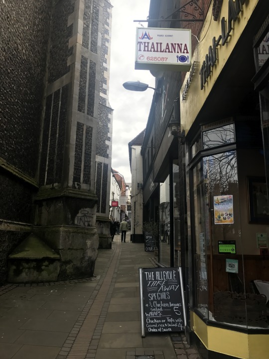
My Trip to Norwich
During the Easter break, I went up to Norwich to check out the art university and their galleries. I also wanted to inquire about their courses. Unfortunately, they were all closed for the break, but I still managed to get a good look around anyway.
Above, Hymn, Damien Hirst
The town is unlike any other town I have been to. It is young and diverse, probably due to the universities in town. It also exists in a circle of sorts and has many alleyways, nooks and crannies- perfect for diamonds in the rough and hidden gems in terms of shops and/or art inspiration. Maybe I have not been to too many cities, but Norwich in particular just feels different from London and especially Colchester. There are aged English churches dotted all around the place, next to modern small businesses such as Thai restaurants (below). The contrast is slightly comical but somehow sweet (maybe it’s the history buff in me who loves the old buildings but also appreciates modern life to an extent). To live and work beside beautiful historical sites day after day is like something out of a fantasy world.
Since Norwich has a plethora of young and diverse people, I noticed the result of this in the town shops and marketplace. There were foreign restaurants and barber shops as well as record stores and vegan cafes for the young artist/hipster crowd. I feel like this city is full of like-minded artsy people and I would be able to fit in quite nicely.
I believe this trip connects to my PDP module (and even the Photography for Advertising module) because this trip, albeit not a gallery, helps me exercise my contextual- and creative- studies by looking at a city in an artistic way. I can go through a city and find little sparks of inspiration and probably make some work out of them whilst understanding/learning about the things said work is influenced by. Study and research the sparks of inspiration! It is good practice to find something in town, study it, learn new things about it, then make work. However, this does not always happen for me- I sometimes simply jump to illustration ideas as soon as I see something inspiring (which I don’t think is necessarily a bad thing- especially if it is just personal artwork). It would be beneficial for me to actually do some more research before working, even just a tiny bit, to make the inspired work that much more accurate.
The same above could be said for Photography for Advertising; snapping pictures in town is a good foundation for potential research, but I should branch out and study the things in those photos further so even more ideas can blossom.
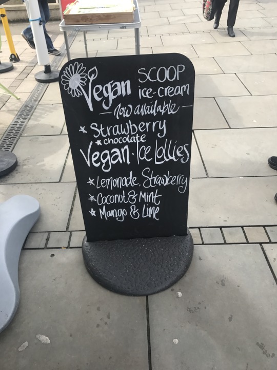
In terms of my Graphic Design Practice module, I believe there is a brief where we are supposed to rebrand a local business and make an invitation for them. Walking around the town, I saw many shops that could spark ideas for me. Of course, the business would probably have to be in Essex, but it was worth looking around anyway. There was a vegan ice cream pop-up shop in the marketplace that made me think about the vegan eateries in Colchester. I want to choose a business that reflects my views and I feel that vegan eateries are right up my alley. Perhaps The Nourish Co.?
0 notes
Text
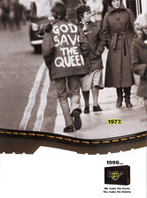
Historical Research Assignment
Dr. Martens
I’ve chosen Dr. Martens as my subject for the historical research assignment because the shoes have certainly had an intriguing history with customers ranging from housewives over 40 years old to counterculture youth.
Above, 1990s
Dr. Martens has a constant theme of “alternative nostalgia” through its advertising. Even in the 1990s (an era that the youth of today tends to admire), the brand was using its own popularity in another decade to advertise itself to people in the 90s- nostalgia is quite powerful.
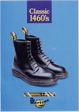
Above, 1990s
This actually looks like an ad of DMs from the 1960s- this is probably intentional, considering the ad is for their classic 1460 shoe. It’s interesting how smart certain advertising ideas can be, especially for DMs, who is so popular and experienced that their ads could be quite ‘out there’ and get away with it.
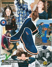
Above, 2013
This ad speaks for itself- it is aimed at women and even uses a hopeful, positive hashtag to, once again, reach youth and internet culture.
Source(s):
https://www.drmartens.com/uk/history
http://www.advertisingarchives.co.uk/?service=search&action=do_quick_search&language=en&q=Doc%20Martens
0 notes
Text
London Exhibitions
House of Illustration’s Made in North Korea: Everyday Graphics from the DPRK
Our first destination was the House of Illustration. On display were decades of North Korean graphic design, and yet the overall look of the exhibition remained practically the same. I was very fond of the colourful yet secretive and even idealistic portrayal of the nation. I think pastels look quite sweet and stem from retro popular colour palettes, and as a history lover, I thrived in that tiny exhibition- I even purchased the book about the exhibition that was on sale in the gift shop. Unfortunately, the posters are not in the book, but a great deal of the exhibition is. All of the posters and comic books, however, are available as thumbnails (along with their English translations) on the exhibition guide. Photos were not permitted for this exhibition, but I am glad I managed to purchase something from the shop.
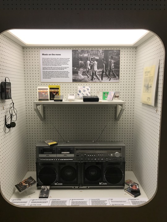
British Library’s Listen: 140 Years of Recorded Sound
I was not expecting to see an exhibition like this in the British Library, but I wanted to note it in my blog anyway- just in case I would want to use it as research and part of my development for any of my projects. The exhibition focused on recorded sound, and though I found it all interesting, I snapped photos of displays that I thought I could possibly use for- at least- my photography module.
“Music on the move” is a perfect development opportunity for my photography module because it involves moving- and being fit- in ways that we do not really think about. The tutors noted at the beginning of the module that we, as creative people, should think outside of the box of ‘athlete doing sports or working out’- we were advised to think about how normal people exercise and even how normal people move/get fit without trying to work out. I feel like the concept of carrying a boombox and walking from one place to another is definitely a form of indirect exercise and could bring an innovative idea about advertising a Fitbit to life, especially if I include my mixed media/illustration concept.
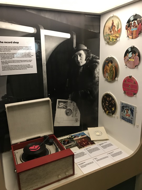
I also made sure to take photos of this display informing about the beginnings of “the record shop”, continuing with the vintage/retro/historic trend I kept observing in exhibitions thus far.
There was also an area to look at old texts from around the world, including the Magna Carta (which I don’t think was actually on display), but photos were not permitted for this exhibition. I loved looking at the old texts though, for I enjoy text and history. There was a suffragette journal from a prison where the author would write and even draw her experiences as well as so many beautiful examples of penmanship and book covers that involved jewels.
Campaign Against Living Miserably’s Project 84
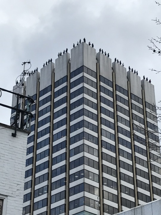
CALM is a charity that dedicates itself to preventing male suicide. Walking to the National Theatre, we found these sculptures or mannequins standing on the edge of the ITV Studio 8 building. We walked down further towards the theatre and found another taller building in the distance with even more statues lined up on the edge of the roof. I wanted to include this in my blog to mention how controversial or shocking art can highlight an idea or topic, in this case, male suicide in the UK. The statues, standing like real people, at first cause distress to an audience, and then serve as a cautionary tale of sorts, informing the masses about an issue that needs to be addressed. Shock, in my opinion, is a great and effective way to grab attention, but it is harder to keep the attention. Shock (and shock in art) can be blown off as nonsense or shocking for shock’s sake. However, when shock is applied creatively as an art form (visual art, music, performance art, etc.), audiences tend to take notice of not only the shock, but the message implied- but only if there is well-thought out connotation. People, I believe, are also more likely to keep their attention on shocking art that not only has a meaning, but also a meaning/idea/issue that they- the people- care about, or never really considered before but would want something done about it nonetheless. Male suicide could be a perfect example of this, obviously being an issue but perhaps not very looked upon until this statue project was publicly exhibited.
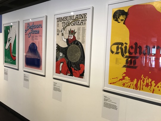
National Theatre Posters
When we found the National Theatre, we observed posters from all throughout the establishment’s history- that were made for the theatre’s shows specifically. The impression that I got was that the theatre posters have had their fair share of trends over the decades (possibly due to personal designer stylisation and/or designers adhering to what the theatre wanted) but still had a specific, distinctive style for that theatre. Many- if not all- of the designers involved had produced a poster for multiple shows. Depending on the poster, there was a lot of play with typography and composition, which could be tricky due to the amount of information that needed to be applied to the poster in order to be effective.
There was also developmental work on display, showing me a glimpse into the process of some posters, which I was excited to see. I love to look at processes because I believe seeing bare-bone development (as well as the steps to completion) helps a student understand how something works just as much- if not more- than simply a final piece.
(Some things I do to watch others’ development is to look at their sketchbooks as well as watch Adobe Live and speed art on YouTube.)
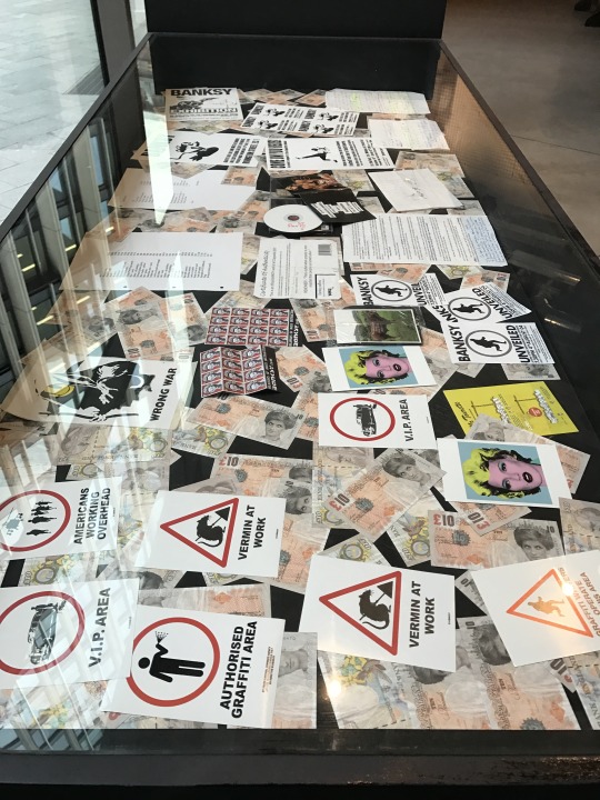
Banksy Print Gallery
Finally, we found a somewhat hidden- and small- gallery of Banksy prints. Though they weren’t original pieces of walls that Banksy had tagged himself, these prints were signed by him. I believe some of his sketchbooks and produced false currency were also on display. I liked the way his graffiti was translated onto paper/poster- it made me think of how some forms of art and design can be put on prints for mass production. Merchandising and print production are definitely something I want to get into, considering I wish to become an illustrator, at the very least. This includes running a booth in comic villages/artist alleys at conventions, where artists sell their own prints, zines, stickers, pins and other produced merch.
0 notes
Text
National Icons and Scamps
National Icons + London 2012
We started the day by looking at a slideshow of British icons/creations, from the telephone box to the anglepoise lamp. It got me thinking how there are so many under-appreciated inventions/creations in the world. With these items being British, maybe I could shed some light onto some of these creations by including them in my posters. Perhaps they can simply be referenced or subtly inserted as an ‘inside’ joke rather than focused on directly (since people may not vacation in the U.K. simply to see telephone boxes, let alone anglepoise lamps- those are available everywhere!). Audiences who look at the posters will also not have the knowledge of obscure British inventions. Some of the objects shown were obvious, such as the Spitfire or telephone box, but others were much more obscure and their British origins would probably be unknown to the masses. If I do choose to use smaller icons such as these, I would have to think very carefully about how I use them in the posters in order for them to come off as inviting, positive and even clever (like an advert) whilst successfully communicating to the viewers (making sure they understand the references). With strange references like these (anglepoise lamps, etc), using ‘cleverness’ is a usual tactic in advertising for things like that (as well as advertising in general- humour/cleverness are very common themes), which probably actually makes the process more difficult! It is actually deceitfully challenging to make an ad look seamlessly funny or clever.
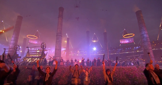
Afterwards, we briefly skimmed through the opening ceremony for the London 2012 Olympic Games. From the opening video to the actual choreographed stage ‘show’, it was all packed with British references, history and culture- icons. I am massively inspired by visuals and music, especially art as grand as the imagery/editing and score used for the opening ceremony of any Olympics. Opening ceremonies show the history and culture of the host country for every Olympics and they get me so immersed, excited and even patriotic (no matter the country, funnily enough). Truth be told, I temporarily forgot about the negative, mundane and problematic things about my country when I watched the video of the ceremony because it is so patriotic and shows Great Britain in such a positive light through rose-coloured glasses. I know I adore immersion and grandeur, but I always have my pessimism sitting in the back of my mind, constantly reminding me of the ‘reality’. I always have to kick myself and remind myself that the world isn’t all that great, but that cannot stop an artist/designer from perceiving the world/a product in an optimistic light, even just for an advertisement commission- that is what graphic design for advertising work is about. I’ll have to try to portray Great Britain as friendly and as positive as possible for the brief! I suppose to get me in that kind of mood, I’ll have to watch the 2012 opening ceremony as often as I can, since it inspired me so much.
Speaking of grandeur, I found it interesting how the ceremony made the pollution of the Industrial Revolution look ‘good’. I loved the transitions through history (as a history lover) and the showcasing of the eras of Great Britain, but I found it funny and intriguing that the smoke and smog of the Industrial Revolution was celebrated and part of the grandeur. It makes me wonder what other negative aspects of Great Britain can be presented as positive or awe-inspiring, and maybe even humorous (satire). After all, making positive points and potentials out of limitations can and will be a challenge for a graphic designer- or anyone in the advertising industry.
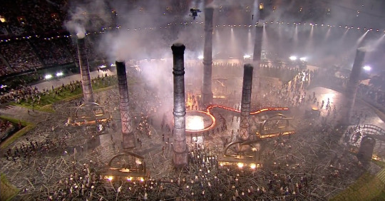
Above, below, The Complete London 2012 Opening Ceremony
Scamps
After the slideshow and video, we were told about scamps and how they are basically 3-minute drawings of what a final poster could look like. Barry showed us his ones from previous jobs, some of them incredibly detailed, others simple, sloppy marker drawings. I see scamps as developmental work simply done quickly in marker. It is a great way for me to practice getting ideas down in a fast, non-precious manner, which is sometimes painful for me because I am such a perfectionist that I even want my development work to be nice-looking. But I feel like practicing with marker on a time limit would be healthy for my artistic development since it can help me become less precious with the drawings so I can make more of them- and make them quicker- and therefore help my drawing skills improve in speed as well as quality with (hopefully) every drawing I make.
We paired up with a partner and tried to draw each other’s ideas- another skill an aspiring graphic designer should hone. My partner and I were asking back and forth how the image looks in their head and what should go where. We figured it would be easier and quicker to draw our ideas ourselves, but that probably defeats the purpose. This was an opportunity to use communication skills to form ideas through another hand, as this is how designers work together as well as with clients. Whenever he and I drew something ‘just as imagined’ on the scamps, I personally felt pleased and accomplished that we could feel comfortable enough with one another to successfully present and communicate our ideas to each other and- more or less- know what the other person had in mind.
0 notes
Text
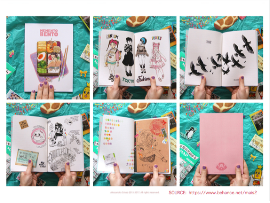
Critical and Contextual Presentation Aftermath
I wanted my presentation to highlight one of the artists I would be referencing in my essay. Since I am such a big follower of Alessandra Criseo and since her work is relevant to my essay question, I thought that her different types of artwork (illustrative, zines, even product design) would be perfect to make apparent to an audience.
I was always anxious about the presentation, even though I knew practically everything about Criseo. It did not help that I was misled by other students that we were presenting in a completely different room entirely, so that definitely threw me off further- especially considering I was the very first person to present! I did not know what to expect because of this. I desperately wish I had done better and even wish to do it over again. I wanted many more slides and barely looked at my notes, even though I had a decently organised order to them and they matched my slideshow’s order as well, but for some reason, I did not follow them.
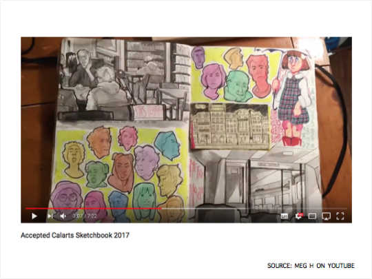
To add some flair and comparison skills (which is what my essay question needs anyway), I wanted to end the slideshow on a mention of another source of inspiration for myself- accepted sketchbooks used as part of portfolio submissions for prestigious art colleges. I made sure to relate Criseo’s work to them by saying that her zine Memento Bento looked just like these fleshed-out sketchbooks. I admired the way her Memento Bento was so obviously a sketchbook and yet still incredibly well-made.
What I also did do correctly was bring ‘props’- examples of Criseo’s work. I handed out my copies of two of her zines as well as two enamel pins. I felt it was a great opportunity to prove my dedication to the artist and show my research, so to speak. Honestly, sharing those works with my peers calmed my anxiety, if only a little bit.
0 notes
Text
Passport Critique and Paper Folding
Passport Critiques
This morning we had our newly-designed passports critiqued. Most were the new navy blue colour (that will be implemented in the UK soon) with different designs or placements, but some were white or even purple. I had mentioned before that designing a new passport cover is easier said than done due to questioning the legality and requirements of a passport cover, the coat of arms, artistic integrity and freedom, and more. But seeming as the short brief we were assigned did not mention how ‘serious’ or ‘legally binding’ the cover had to be, I suppose we were free to do whatever we wanted to our covers, and that is exactly what some people did- take artistic liberty and create a whole new passport, whether or not it looked as similarly stoic as ‘real’ passports.
Not only did the designs and colours vary, but the visual context of them did as well. Some were very patriotic/proud and almost regal/royalist (but not in an obvious Brexiteer kind of way), others more obviously commiserating and negative about the split, or even celebratory of independence.
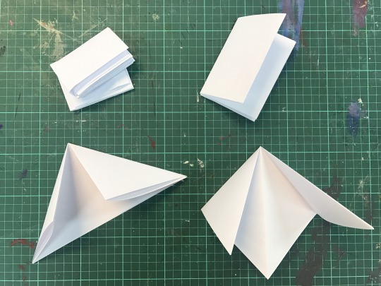
Paper Folding
After the critique the class learnt a bit about paper folding. Since I am a perfectionist, I take longer to produce work and get massively discouraged when I mess up. Since paper folding, in my opinion, is painstakingly detailed and cared for (or it should be, anyway), there is no room for mistakes. If a mistake is made, even during the first fold, the whole booklet is ruined- or at least wonky- by the end of the folding.
The first concertina with an A3 sheet of paper I made was abhorrent from when I began trying to close the booklet. I knew the folds were not equal, and continuing to fold the paper into itself made it all look worse and worse. This is a major shame and discouraged me greatly since the booklets mine was supposed to look like in the end looked really nice, thick, equal and satisfying to the eye. Unfortunately, mine was so unequal that the folded valleys I was forced to make near the end of the booklet did not match the valleys I had made in the first steps! I suppose one could argue that the chaos and disorganisation of the booklet could represent/be related to something like punk. I’m sure punks would not care for ‘perfectly/properly-folded’ zines and booklets anyway (although the forced valleys made the original valleys look unnecessary and accidental).
Invitation Mockup
After lunch, we continued the workshop and was assigned a task to produce a mockup of a folded invitation of some sort for a location of interest in Essex. My attempt was about Southend Pier- the longest pleasure pier in the world. I wanted to make a concertina map-like fold with an illustration of the pier stretching across the whole A3 page to demonstrate the length of the pier in a fun and hopefully engaging/creative way. On the small rectangular fold in the bottom right-hand corner of the ‘map’, I wanted to either list more attractions that one would find near Southend-On-Sea or illustrate a small map of the actual part of town, but I found it difficult to make an exact map of the town (since it is difficult to say where Southend starts and ends from simply glancing at Google Maps) as well as provide even a semi-detailed map on such little surface area.
I did not know what I was going to have on the back of the paper. I thought about drawing my map idea (which provides information and utility on much larger surface area than on a tiny rectangle), but the tutor suggested a nighttime scene of the same image on the back. I thought that was a great idea, yet I spent some time wondering which way I wanted the images to face. If someone were to hold the paper in their hands, which way would they turn the paper over- vertically or horizontally? Furthermore, which position is the most pleasing to the eye? I must remember to keep the audience in mind- that is what this whole brief is about!
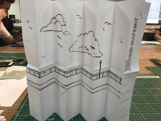
In addition to figuring out which positions the two major illustrations should face, I also had a little bit of trouble with the title/header written on the paper while it is folded closed. This is the first impression of the whole product, so it is crucial to get the positioning of the title correct. I wanted the type to be capitalised, sans-serif and vertical against the top right corner of the little rectangle to emulate a modern look that one would see on pamphlets and booklets. I wanted to make sure that the title was not only attractive on the invitation in its closing state, but in its totally unfolded/open state as well (up against everything else on the A3 page). At first, I thought I had carefully planned where the title should go and what position it should be in. Upon further re-folding and drawing on the paper, I noticed that when the paper was unfolded, the title was facing away from the image rather than towards the image. I made another draft to test out different ways of organising the title specifically, in addition to testing the other ‘way’ of opening a folded A3 page.
I figured that if I cannot have the title on the upper right-hand corner of the folded invite as well as the upper right-hand corner of the whole page itself (since the paper is also folded in half when it is closed), I would try to play with what I could do with the title instead. If I did want to keep to my original idea as much as possible, I would have to flip the title to the opposite side of the rectangle and probably even change which corner it will be positioned on. If I change my idea completely, I may just do a safe central logo of sorts on that bit. I will have to make developmental work/multiple versions of this particular folded piece because even if I do not use it as the final piece for briefs 1-3, I will still receive marks for including such development. I have so many ideas already.
0 notes
Text
Potential Graphic Design Practice Sources
DCMS
DCMS (more)
DCMS (blog)
Vivienne Westwood
Paul Smith
Norman Foster’s UK Work
Charlotte Day’s Work (LUSH, flowers, etc.)
Owen Gildersleeve (LUSH, paper, etc.)
Steven Sugar (Lead Background Designer on Steven Universe)
0 notes
Text
Zine Attempt
Since I was ill the previous week, I could not complete my fanzine, nor get it critiqued. I tried to throw an example one together today, but the printer will not print my InDesign zine in the correct order. I knew there was an issue with the printers (and that everyone is scrambling to get their own zines finished correctly), so I am trying to stay positive with what I have done, regardless of if the zine is correct or not.
My zine, from the beginning, was going to be slightly different from the theme itself that was suggested in the brief. I was told I could tweak the theme to my liking, so I wanted to work with repetition from the start. I wanted something that reminded the audience of band gig posters that weather outside over time. The zine is merely a test and is in no way a final product, so there is no colour, binding, correct organisation, nor even type- I was simply playing. However, even mistakes, misalignments and cut-offs in the images seem fine by me because imperfections like those have a sense of punky editing to it. Punk, as a movement, was never worried about perfection in art (nor music and appearance), and I feel like I should not have to worry either. Punks were just trying to send messages in their own weird and chaotic ways. Worrying about the perfection of something that should be deemed “punk” seems a tad disingenuous to me.
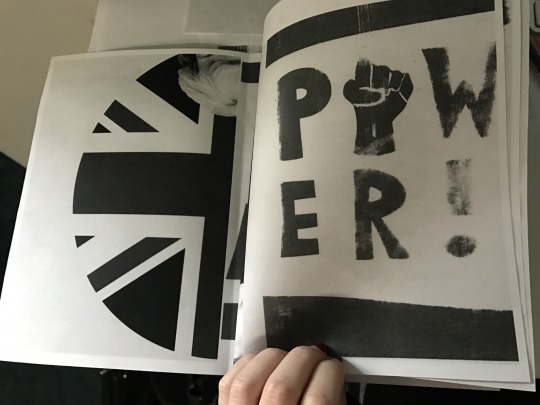
A lot of this project involves knowing how to work around the printer issues at college, but it also involves learning how to do certain things in order to get the results I desire. For example, if I am going to be producing zines, I should watch Skillshare videos about InDesign and zine-making in order to make the process immensely easier on myself.
After looking at my InDesign file, my tutor suggested I use type to name the issue of the fanzine, as well as use type throughout the zine itself to bring more than just imagery to it in order to more clearly convey the message I want to send. I was also offered that I should use four pages of repetition on one page instead. This, to me, will enhance the idea of repetition much easier for the viewer because the viewer would not have to flip through pages to see the change in the prints.
I also wish to practice with drawn type, using phrases such as “EAT THE RICH” and “STARVE THE RICH” to bring more individuality and diversity to the zine. I do not want to forget about typography since it is essential to learn about in graphic design.
0 notes
Text
Jonathan Kelham
Jonathan Kelham came in to talk about his work, utopias and space manipulation. Personally, not much came of this lecture, but not because I was not interested. In fact, quite the opposite. I wished to further understand what he was talking about, especially since his intro video had used a Joy Division song, which naturally grabbed my attention. I so badly wanted to understand his art, and yet I felt lost. My notes for the lecture are more or less a mess of words and names I had written down, give or take a few arrows.
Kelham spoke of taking ideas of youth and innocence and making them darker in his earlier work. He then moved on to make an ongoing project called Leaders of Men, where he takes heads of egotistical, narcissistic and even contradicting white Englishmen and place them on cartoon characters. I appreciate the humour in art like this- I’m always open to the mocking of has-been politicians and paedophiles, although I do find it strange for Kelham to speak fondly of the weird janitor figure who had apparently written the longest prose in the world... about raped women. Odd. Nevertheless, there is also a case to be made for his affinity for utopias, as he mentioned Thomas More’s Utopia and other writers of utopian poems and stories.
I have a disembodied sentence in my notes that reads “space manipulation so the audience can use it”. I assume I jotted this down when Kelham was speaking about work that involves bird-eye views and work that involves more direct views. I know he had worked on connect-the-dot-type artwork made for other people to draw on, and this causes the audience to “use” the work. These pieces were found in phone booths and around towns- spaces we the people use. I found this quite bold, daring and had the same kind of exposure not unlike 70s/80s/90s punk-esque flyers, pamphlets, posters and zines.
This moves on to when Kelham worked with/for UGO Project Space- a program that showcases contemporary artists via a billboard in Southampton. This also reminds me of punk flyer/poster exposure since the work is outside- in spaces people walk and drive by every day. However, instead of repeated, weathered and ripped band gig advertisements, the billboard contains a giant piece of art.
After the seminar, my tutor had noted that Kelham was highlighting that we do not always practice what we preach. Even if we do not have a “dark side”, we still have an “other side” to ourselves. Kelham was making connections with contradictions- duality was key in his art.
The tutor also mentioned drawing. He said that drawing is a language- the origins of language itself- visual language. Drawing, to me, has many purposes; it can be the beginning, middle, or the end of ideas. Drawing can be used for sketching or final pieces and can be done using all sorts of mediums (pencils, pens, ink, etc). I find it massively helpful and personally fulfilling (both in skill-building and self-care) to draw at least one thing every day, no matter how simple the doodle is. So far in this new year, all of my daily drawings have been done with a light HB pencil and are no bigger than my hand, but hopefully they will become more complicated and done with riskier, more permanent tools (much like the “sketches” of those artists I follow on Twitter- whom can make amazing 10-minute doodles without even trying).
0 notes
Text
Self-Expression Through Pop, Minimalism & Conceptual Art
This lecture briefly went over Pop, Minimalism and Conceptual art to explain neither subjectivity nor objectivity, but rather a whole new meaning for art altogether- self-expression.
Clement Greenberg believed that making art about the medium was important (medium specificity), but as the years went on, circumstances changed and mixed media (as well as new reasons/ideas to make art) became prominent in the art world. Mixed media fails to be modernist; because there is no medium purity, there is more of a chance that the work cannot be seen as totally functional (perhaps more medium equals more focus to form or ornamentation and therefore strays from modernist art). The rise of mixed media- especially in these three movements- meant there was more room for structural pieces that embraced all of the possibilities of form. There was no care nor need for functionality because that was not a goal.
Pop Art
I always love learning about and researching Pop Art, for it celebrates consumerism and the popular culture during its time of popularity. I understand that Warhol’s Marilyn Diptych is a tired and non-perfect example of American Pop Art, but the theme of death in this work, to me, intends that celebrities (as well as his artwork, perhaps) are more than meets the eye. However, maybe Warhol did not mean to humanise Marilyn; maybe all he wanted to do was sensationalise her death (or even simply bring it to attention) the same way she lived- plastered repeatedly. I suppose re-personifying the symbol she became is something I am doing myself and Warhol never intended to have this piece come across that way.
According to the Tate, the repetitiveness of the starlet represents her constant presence in the media (much like the mass advertisement/production of the many flavours of Campbell’s Soup Cans- a common household item) and the black and white/fading effect on the right suggests her mortality.

In Lindsay Ellis’ mini video essay on Marilyn Monroe, she interprets that the black and white part of the work represents Norma Jean- her ‘normal’, ‘human’ self- and the vivid side represents Marilyn Monroe. I find Ellis’ video very informative and thought-provoking- it sheds light on how we see Monroe as a symbol rather than a person, and I suppose that is why her untimely death was so tragic; Norma Jean was a person with problems and the audience could never see it. Marilyn was, is, and will always be a symbol of many things- glamour, pop culture, and eventually, even tragedy- mass-produced like a soup can onto every film and television screen, seen by everyone and yet known by very few, if anyone.
Warhol’s themes of death, the media, consumerism and the cult of celebrity personally interest me greatly. I could even use these themes as puzzle pieces of sorts for my Power to the People brief. My zine is about anti-establishment, so maybe I can incorporate those subjects somehow. In the lecture, it was said that Warhol used repetitiveness to numb the response of death, which is admittedly more compelling than using repetitiveness as simply a nod to the amount of mass-production that pop culture can ultimately cause.
Minimalism
Minimalism is an interesting movement that, in my opinion, should be simple in theory, but seems much too mathematically complex for me to mimic. Minimalism uses geometric shapes and even blurs the line between painting and sculpture.

Above, greens crossing greens (to Piet Mondrian who lacked green), Dan Flavin
Dan Flavin’s work using lights are quite aesthetically pleasing. I had never thought of using light and bulbs in a piece, but the way his are arranged emit a feeling of warmth, as fluorescent as they are (some lights are warmer/brighter- metaphorically as well as literally- than others due to bulb colour and wattage variants). I think his art reminds me of nightlife. Those works of his may have a totally different meaning and reason for existing than other fluorescent signs (which I also find inspiration in), but this part of the lecture, for me, was about getting excited over strange- yet new- ideas.

According to artist Donald Judd, the materials used were exactly what they were- they were not expressive. There are other ideas in Minimalism such as Robert Morris’ opinion that there is no perception without a body, hence the uniqueness of his mirrored cubes, Untitled, above. Something about these sparked my interest- though I am not really sure why. Part of me saw these and was reminded of those modern art pieces that were seen in houses of the wealthy in magazines and movies, next to massive expensive-modern-house windows and probably missing the point of the movement altogether. When I saw these cubes, however, I was also excited to see something quite new and learn why these types of pieces exist. What could four mirrored cubes mean? What was the purpose? If they are not expressive, what are they? If one thing is for sure, they weren’t just for sitting in rich people’s houses to look aesthetically matching in their expensive modern home. There were ideas tied to these initially confusing works- and understanding why such different-looking pieces exist seems like a fun treasure hunt of sorts.
Conceptual Art
If Pop Art is the flesh and Minimalist art is the skeleton, then Conceptual art is probably the soul; perhaps it does not exist or cannot be visible- it is a concept. Apparently, the ideas themselves are the art and the medium is taken away, but work is still hung in galleries. However, perhaps that is not what is meant by “the medium is taken away”. Personally, conceptual art is difficult to wrap my brain around.

Above, Twentysix Gasoline Stations, Edward Ruscha
Ed Ruscha took non-professional photos of gas stations as a collection of facts- a representation of the everyday/the banal, and maybe that was the point, that was the art itself; the concept of simply capturing banality. In a way, this idea- as well as this movement- can make art more accessible to those less skilful (not that I believe that Ruscha is less skilful than other photographers) or to those with very specific and different ideas of art. However, I also do believe that if one is to produce conceptual art, the artist must know the concept they are going for. There is no point in making nor seeing purposeless (unless that is the purpose) conceptual art. Just because many non-professional photos of gas stations seems like no work at all (to some), does not mean that Ruscha’s work is any less legitimate, for the work is more about the idea than the piece itself... and even then, I am fond of the piece anyway, no matter how easy or difficult it may or may not have been.
With my Image Manipulation module as well as my Graphic Design module, I could use my amateur photography ‘skills’ as a medium (I obviously definitely will with Digital Imaging). My Power to the People brief for Graphic Design could include photography on its own or even elements of photography- collage, for example. Collage is popular amongst punk-inspired art.
0 notes