
bethbridelphotographyblog-blog
Beth B Photo Blog
166 posts
Don't wanna be here? Send us removal request.
Last Seen Blogs

iptvexpress
IPTV Express

the-angst-trio
The angst trio

shiroi-susanoo
Queen Of Crows

marciusdk
Untitled
Text
Business Cards
There are many reasons why someone would feel the need to have business cards. Apart from the obvious of having your contact details, there are many other things to think about. A business card has the potential to create you a new client. Because of this, your card will be the first impression to your customer and it is important to make it stand out.
Size
85mm-55mm is the average business card size. This is so the card will fit perfectly into a purse or wallet as a credit card would and people won’t throw it away. If you want to use size as a stand out point “2x2” or “1x3”, however this won’t fit in a business card holder.
Advertising
Use the card to not only advertise yourself, but also your website, online portfolio and events
Contact details
Put your name, address, email, phone number, work number, website and any other contact details
Font
Use easy to read fonts in black or white. This will make your car stand out as well as making it easier to read. This will also allow people who are colour blind to use your card.
Layout
1 sided card
2 sided car
Folded card/Opens out
Mini portfolio made from stapling multiple cards together
Paper type
Normal paper types can be used for business cards, however 400gsm print paper if often used, as it is a thick sturdy paper that won’t bend or tear easily. Card and other thicker papers can also be used.
Card style
Make sure you target your card design at the correct audience. If you are a wedding photographer, you will use colours and fonts that relate to that, for example, cream, ivory white and black. If you are a wildlife or nature photographer, you may want to use greens and brows, colour often associated with nature. If you choose to include images, make sure they work with the colour pallet of your business card.
Online or Homemade?
Online cards often look much more professional and could be the preferred choice over handmade or mixed media cards. However, if you consider yourself a fine art or arty photographer, you may opt for this look. Online cards are typically cheaper, quicker and easier to create in bulk than homemade cards.
Will I place an image on my card?
An image on your card will show the potential client your style of work, however you have to be careful when selecting as the image could also put of customers. With a folded card or mini portfolio layout, you may have more space to include several images showing varying styles of work.
0 notes
Text
Portfolio Questionnaire
1. What genres are in your portfolio?
2. How will you develop them further?
3. Will you add additional genres?
4. Develop existing work?
5. What type of physical portfolio will you consider?
6. How many images will I have?
What genres will be in your portfolio?
I first started by researching what Universities are looking for in an application portfolio. I then decided in what genres my portfolio would contain.
In my portfolio, I want to have a range of genres to show how diverse my work is. I will use portrait, landscape documentary, wildlife, flora and fauna.
I will develop my portfolio further by adding additional genres and removing images that aren’t to a high enough standard, as a portfolio should be a showcase of your best work. I will take time to re-order images and place black and white prints together for ease of viewing. I will group images of the same genres together, but try to transition between genres to help the portfolio flow. I will use varying size prints to keep the portfolio interesting and date and title all images. I will use post-processing software such as Photoshop to edit images to the highest standard I can.
I will place my strongest images at the beginning, middle and end. This is so that my portfolio starts and ends with my best work, and if someone flicks to the middle of my book, the images are still strong and I will places my weakest images in-between these. I will also get my peers and tutors to critique my portfolio.
What type of physical portfolio will you consider?
I will be using an A3 hardback binder portfolio, this is because it is rigid, so my images won’t bend and it is easy to look through. It will also enable me to easily remove and replace images if necessary.
How many images will you have in your portfolio?
I will use 20-30 images in my portfolio, this will be based on how many pages there are in the book, and how I choose to lay them out. Having this number of images allows me to have a reasonable number of prints in each genre. For my online portfolio, I will be able to use more images, as I won’t have to worry about page layout or the amount of pages in a book. I currently have a portfolio on Wix, but will be developing this further.
0 notes
Text
Portfolio
What genres will be in your portfolio? I first started by researching what Universities are looking for in an application portfolio. I then decided in what genres my portfolio would contain. In my portfolio, I want to have a range of genres to show how diverse my work is. I will use portrait, landscape documentary, wildlife, flora and fauna. I will develop my portfolio further by adding additional genres and removing images that aren’t to a high enough standard, as a portfolio should be a showcase of your best work. I will take time to re-order images and place black and white prints together for ease of viewing. I will group images of the same genres together, but try to transition between genres to help the portfolio flow. I will use varying size prints to keep the portfolio interesting and date and title all images. I will use post-processing software such as Photoshop to edit images to the highest standard I can. I will place my strongest images at the beginning, middle and end. This is so that my portfolio starts and ends with my best work, and if someone flicks to the middle of my book, the images are still strong and I will places my weakest images in-between these. I will also get my peers and tutors to critique my portfolio. What type of physical portfolio will you consider? I will be using an A3 hardback binder portfolio, this is because it is rigid, so my images won’t bend and it is easy to look through. It will also enable me to easily remove and replace images if necessary. How many images will you have in your portfolio? I will use 20-30 images in my portfolio, this will be based on how many pages there are in the book, and how I choose to lay them out. Having this number of images allows me to have a reasonable number of prints in each genre. For my online portfolio, I will be able to use more images, as I won’t have to worry about page layout or the amount of pages in a book. I currently have a portfolio on Wix, but will be developing this further.
1 note
·
View note
Text
Scanning and editing my negatives
I started by opening up the Epsom scanner icon on the Mac. I then opened the scanner and placed my negatives in the holder shiny side down. I had to make sure the glass in the scanner and my negatives didn't have any visible dust of dirt. This is so that when the negs are scanned, the dust and dirt doesn't show up. The film is placed shiny side down so that the detail can be captured rather than silhouetted. I then place this into the scanner. I selected "professional mode" for media type, document type "Black and White film", film type "Negative" and 24 BIT colour resolution and target size 5x7. This is so the negative will be blown up to a larger scale for me to view and edit. I select preview scan, and wait for the image to appear on the screen. I then take the "select" tool and draw a box around the negative I want to scan. I next clicked "zoom" which zoomed in on the area of film that I had selected. I positioned the film and the box so that no black or white was showing outside the negative. This is to avoid your film scanning at a different exposure. Once you have done this select "scan" and save your image as a TIFF and JPEG. This is so you have a high quality image for editing and a lower quality image copy.
0 notes
Text
Different Flash types and their uses
Flash is measured in Kelvin's, whichis the rate of flash output.
Types:
Hot shot flash range on distance 10-15 feet
potato master Flash 10-20 feet
0 notes
Text
First B/W film shoot- around campus
First, we were given already exposed film and a reel to practiced winding the film onto the reel in the light. Once we had got the hang of it, we went into the darkroom to try winding in the dark.
We were then given a film camera in pairs with an Ilford FP4 125 Black and White film to load. Then instructed to shoot around college campus, Danni and me went to the college gardens and noted down each aperture and shutter speed.
We then went into the darkroom to develop our film; in the dark we opened the canister and removed the roll of film. We wound the film onto the reel and placed it into the developing tank and added 300ml of developer and agitated every ten seconds for fifteen minutes. After pouring this away, we added 300ml of stop bath for five minutes, still agitating at intervals, poured this away and added 300ml of fixer for three minutes. Finally, we poured this away, washed the film and hung in to dry for five minutes in the drier.
0 notes
Text
Corinne Day Case Study
Corinne Day
British documentary and fashion photographer - February 19th 1962-August 28th 2010
Corrine day was a self-taught photographer from brought up in Ickenham by her grandparents and younger brother. At age sixteen she left school and worked in a local bank as an assistant for a year, until she became an international mail courier. While working here at age seventeen a friend suggested she tried modelling. Her career took off and she left the couriering service and worked as a catalogue model for several years until she met Mark Szaszy in Tokyo on a train in 1985. Szaszy was a male model who had a keen interest in film and photography and during a trip to Hong Kong and Thailand; Szaszy taught Day how to use a camera.
In 1987 they moved to Milan together and Corinne created images of Szaszy and their friends for modelling portfolio’s and she applied for magazines for work; here Corinne’s photography career started.
Later that year Corinne met Phil Bicker, the art director for the magazine “The Face”, and shot the cover and eight page spread titled “The Third summer of Love”.
The spread was shot as fashion documentary/story using a sixteen year old Kate Moss as model and featured clothing by Ralf Lauren, Romeo Gigli and Covent Garden boutique World. The images were shot at Camber Sands and were compiled of Moss semi-nude giggling on the beach. The magazine was published in July 1990 and these launched Corinne’s career as a fashion photographer and also kick started Kate Moss’ modelling career. The photograph of Moss wearing the feather head-dress featured on the front cover of the magazine is now one of Day's most recognised images.
Neither Kate nor her modelling agency were happy with the photographs, finding them too raw, stripped down and basic.
Day said she had brought her own modelling experience into the shoot. She later said, "It was something I just felt so deep inside, being a model and hating the way I was made up. The photographer always made me into someone I wasn't. I wanted to go in the opposite direction."
In 1993 Corinne photographed Kate Moss again in her own flat for a cover in British Vogue. The shoot was intended to be a high-end lingerie fashion editorial with 19year-old Moss in her East London flat. Her images were documentary rather than the high fashion, glossy refined images, usually found in Vogue. The spread gave an intimate insight into this young models life but when published to the public there was a controversy. The medial claimed a scandal and the “Daily Mail” and “Independent” claiming the images were hideous, exploitive and verging on child pornography.
The height of her Corinne’s career was in the 1990’s as she brought a hardedge grunge style to fashion images, inspired by her documentary work. Day worked closely with Kate Moss and other models, which allowed her to capture intimate and candid portraits. She continued to work with “The Face” as well as other magazines such as “i-D”, “Ray-Gun” and “Penthouse”, all which embraced youth and youth culture, fitting to her style of photography.
My favourite works by Day were her personal projects and exhibitions; “Fifteen”, “Face of Fashion”, “Tara” and “Diary”. Here are some images from the collection “Diary” which represents 10 years of her life, in which she kept an intermittent photographic diary of friends, family, experiences and places she’d been. Here is a quote I found on her website: "Good friends make you face the truth about yourself and you do the same for them, as painful, or as pleasurable, as the truth may be." “Diary” was later turned into a book.
I really like how Corinne managed to capture the raw and gritty lives of youths in the 90’s. Her work is themed heavily on drug use and youth culture. Her photographs in “Diary” were natural, candid snapshots but also very personal and she has only been able to achieve these images through befriending the models and this has enabled her to capture unique insight that is often unseen and undermined in the media. All of her work is extremely emotive and honest, she photographs real peoples lives and struggles. Corinne’s work inspires me to take intimate, personal and emotive shots of people, as I want the audience to feel something when they see my images. I feel I will be able to achieve this, as I am close with a lot of the people I am photographing. The trust I share with them will allow them to relax and be themselves, allowing me to capture natural and emotional images.
0 notes
Text
Nan Goldin Case Study
Nan Goldin
American Photographer September 12th 1953
Nan Golding was born to middle-class Jewish parents in Washington D.C. but grew up in a Boston suburb called Lexington. Goldin’s father worked in broadcasting but after her sister committed suicide she ran away from home, aged 14, to live in a series of care homes. In 1968 Nan (age 15) was first introduced to a camera by a teacher at her school as a teenager, when a Polaroid camera was passed out in class. Her friends became her surrogate family, and she began documenting them using black and white film and shooting with any light that was available. At this stage Nan was more of a “Happy Snapper” than a photographer.
In 1973 Nan had her first solo show in Boston, her work was based on her journeys among the city’s transsexual and gay communities in Boston who she befriended during the late 1970’s. Her images contained themes of drugs, sex and violence which she later produced into the books “The Ballad of Sexual Dependency” (1981) and “The Family of Nan” While studying at Tufts University Nan discovered colour film, she claims that her first use of colour film was an accident, thinking she had placed loaded black and white film into the camera. As well as this she began exploring flash instead of natural light.
In 1977 Nan received a Bachelor of Fine Arts degree from Tufts University along with an additional Fifth Year Certificate in 1978. She progressed as a photographer through the educational system and began using and working with transparency film and Cibachrome printing. Goldin created her prints from slides rather than negatives; this allows the process to enhance the saturated hues of the photographs, as well as giving bright colours and enhanced the texture and colours of lines.
Nan Goldin’s collection “The Ballad of Sexual Dependency”, published in 1986, primarily revolves around drug use, but it also portrays her own addiction, abusive relationship and deaths of her friends due to AIDS. When Goldin was 19 she made the decision to reduce her drug intake. “You could say that when I was 19, I put the needle down and I think that decision saved my life. And, though I mixed heroin and cocaine, I never smoked crack. There is something genetic inside me that is about surviving, but, so many people I know have gone that I do have survivor's guilt.”
“I spent two years in my room. Drugs became my full-time occupation and about the only people I saw were my dealers. I never answered the phone. I have the answer phone tapes, but I'm afraid to listen to them." She pauses again, as if wary of what she is saying. "But, for years, I used drugs before I abused them, and I had a good time. People take drugs because they feel good. Especially people who don't have a skin, who are really raw like I was. With heroin, you don't feel any pain. For me, cocaine was worse than smack. It's an evil drug. It sent me to the bottom."
Does she think now that drugs were a way of numbing the pain of her sister's death? "No, I can't use that excuse. I wanted to get high from a really early age. I wanted to be a junkie. That's what intrigues me. Part was the Velvet Underground and the Beats and all that stuff. But, really, I wanted to be as different from my mother as I could and define myself as far as possible from the suburban life I was brought up in."
In 1988, Goldin went into rehab, taking her camera and a copy of “The Ballad of Sexual Dependency”, both of these were immediately confiscated by the staff.
I was really inspired by the raw gritty images Nan creates around the themes of sex, drug addiction and violence.
For my project, I am trying to capture a different insight into drug use and addiction, from the usual negative association. I wanted to try and make the audience feel something for the subjects in my pieces. As well as drug addiction, I also want to focus on mental health, and how people use substances as coping mechanisms and distractions from the real world. In Nan’s work, none of her models look happy or euphoric, words often associated with being high; the images are honest and un-staged and contain real people, which give the audience an insight into a world that is often unseen in public media. The images are very personal and Goldin has only been able to capture them through her connections and friends within these cultures. I want to try and create similar images with teens as “drug culture” is a growing problem is today’s society.
0 notes


Text
Case Study #2 Sally Mann
Sally Mann
American Photographer-May 1st, 1951 (63)
Sally Man first got into photography while at school in 1969 but she claims her motive was to be alone in the darkroom with her boyfriend.
Despite this, Mann made her first photographic debut in Putney School in 1969, with an image of a nude classmate. Her father encouraged her to continue photography and let her use his 5x7 camera, and this inspired her to use large format cameras today.
After graduating from Hollins College Mann worked as a photographer at Washington and Lee University until she photographed the construction of the new Law building in the mid 1970’s. This lead to her first exhibition in 1977 at the Corcoran Gallery of Art in Washington D.C. These images later went on to feature in her first book, “Second Sight” in 1984.
Mann’s most famous and controversial images where those from the collection “Immediate Family”. The collection is composed of 65 black and white photographs of her three children. The photographs were captured while her children were all under the age of 10 and mostly while staying in a Summer Cabin along the river.
These images cause such controversy due to the fact that many of the images her of children were while they played and swam in the nude. She not only captures standard childhood themes, such as playing, napping, dressing up but also experiments with more complex themes, like insecurities, loneliness and death. Sally was accused of child pornography in America and abroad.
The dark themes in Sally’s photography of “Injury, loneliness, insecurities and death” inspire me to create images around mental health in “Youth and Young Ones”. By using monochrome film and expressionless faces I feel Mann has captured a darker side of childhood. The image on the left could connote the dangers of young drivers and the image of the girls dressed up with babies, prams and cigarettes could connote to the pressures and worried of teenage pregnancy.
Even if people didn’t agree or like Sally Mann’s images, a huge amount of publicity and attention was created around the works. The simple and raw images grab the attention of the audience and provoke strong negative and positive emotions.
I love Sally’s work, and will continue researching her works to inspire my own.
1 note
·
View note
Text
Case Study #1 Ansel Adams
Ansel Easton Adams
American Photographer- February 20th 1902-April 1984
In 1916, Adams visited Yosemite National Park with his family for the first time. During his stay his father gave him his first camera, a Kodak Brownie Box camera and he took his first photographs. In 1917, Adams returned to Yosemite with his own better quality cameras and a tripod. In the winter of 1917 he learnt basic darkroom techniques while working part-time for a San Francisco photo finisher. He read countless photography magazines, attended camera clubs and visited photography and art exhibits.
At age 17 Adams joined the Sierra Club, which was dedicated to protecting wild places of the earth, and was hired to be the summer caretaker of Sierra Club visitor centre in Yosemite Valley from 1920-1924
Adams became close to the Best family, who owned Best’s Studio and he later married Virginia Best. Virginia inherited the studio in 1935 and the Adams family operated the studio until 1971. It is now known as the Ansel Adams Gallery, and is still run by the family. His first images were published in 1921 and Best’s Studio began selling the prints of Yosemite in 1922.
Ansel Adams is most well known for his vast landscape and nature shots of America’s national parks. In these images he is able to capture the huge scale and grandeur but also the finest details.
Adams is not just known as a talented photographer, but also a master of the dark room, post processing and printing. He developed all his own film, post processed all his images and printed them himself to ensure he captured them perfectly. He had not only a darkroom at his parents’ house, but also had several portable darkrooms which he would take on location with him while shooting. In order to get the maximum detail as possible in his prints Adams said he, “expose’s for the shadows and develops for the highlights”. Adams said he started printing with Matte paper, but moved onto Glossy paper because it increased the tonal range in his images.
Adams primarily used medium and large (8x10) format cameras as these enabled him to capture large, high quality images which ultimately are the best for large scale printing. As well as these, he used lens mounted filters; usually red to darken blue skies which gave contrast between the sky and the clouds. Each shot that Adams took, required a light metre reading, from there he worked out the correct settings for aperture size (in order to control depth of field) and the amount of time the film was exposed to light.
I love the sharpness and detail in the shot, how it can be one photograph, but at the same time each individual tree and boulder can be seen; the depth of field is incredible . I think the contrast between the light dusting of snow and the dark shadowed trees enhances and frames the image. I also love his interest in texture; the smooth water, the feathery trees, the spikey evergreens and the layered mountains. It’s so difficult to capture both the expanse and detail of a landscape in a photograph. The wide tonal range accentuates the texture and it makes a photograph more dramatic. The main reason I love this photo, and nearly all of Adams’ work, is his use of monochrome film to achieve detail and contrast. I feel monochrome images show more detail, as you don’t get distracted by colours and take more notice in pattern and texture.
Ansel Adam’s black and white images are the most iconic, which were created using a sharp focus, heightened contrast and precise exposure. Adams often used processes such as “Dodging and Burning”, where you expose certain parts of the image to light to heighten the contrast. This heightening combined with the use of Black and White film draws attention to texture and gives the image a 3D feel.
I first heard of Ansel Adams when researching landscape photography a few years ago and instantly fell in love with his work. Last year I visited an exhibition of his work at Greenwich Maritime Museum Gallery to see “From the Mountains to the Sea”. This collection of work was themed around water in all its forms; clouds, ice, snow, rivers, ponds, waterfalls, geysers and seascapes. These prints ranged from miniatures to murals almost 3metres in height.
I still continue to be inspired by his work.
0 notes
Text
Connotation and Denotation
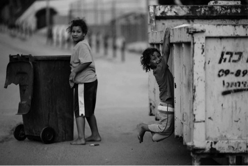
This is a documentary photograph of Jisr az-Zarqa (an Arab town in Israel) taken by Victor Berzrkov. In this image two young girls are playing by bins. The girl in the left of the image looks as though she has just turned around to glance at the camera, where as the girl on the right has posed for the image by hanging off of the bin. At first glance the image looks like two girls having fun and playing, but you soon start to notice that everything is not as nice as it seems.
Neither of the girls have shoes and their clothes are oversized and worn, suggesting they’re poor and can’t afford they’re own clothes or shoes. I also think this image was taken in a far eastern country, as the girls have darker skin and black hair. This would also suggest why they are wearing shorts and T-shirts. The girl on the left looks like she may have been going through the bin, possibly to find food or items to sell and the girl on the left is climbing the bin, this could also be to search through for food or clothing. Both bins are in bad condition, hinting that they live in a rough or poor area. There are no other people in the image; this could be because the girls are homeless or beggars on the streets.
0 notes
Photo

Lighting diagram for still life shoot- Keyboard
Light & Honeycomb diffuser
Keyboard
Equipment:
Cannon camera
18-55 mm lens
Flash sync
0 notes
Photo
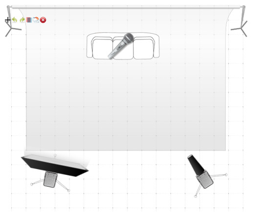
Lighting Diagram for still life shoot- Guitar
White backdrop
Sofa
Guitar (microphone icon)
Soft box & stand
Light with snoot & stand
Equipment:
Nikon Camera
Bellows Macro lens (Lee's)
Flash sync
0 notes
Text
Travel Kit Flash
To under expose the sky you have to take a light reading of the sky. With the aperture you get for example f/8, set the light to the same f/8 and change your camera two stops up so it is f/16
0 notes
Text
Fill In Flash
To get the background darker, use the light reading on the camera on the brightest part of the scene. For example, f/4- bring it down by 2 stop using the flash compensation. By using this setting, you lower it to -2.0 so that the camera lowers the f/stops, not affecting the Fill In Flash.
0 notes