Don't wanna be here? Send us removal request.
Statistics
We looked inside some of the posts by bethingletonbcu and here's what we found interesting.
Average Info
Notes Per Post
8
Likes Per Post
8
Reblog Per Post
0
Reply Per Post
0
Time Between Posts
23 days
Number of Posts By Type
Text
16
Photo
1
Last Seen Tumblr Blogs


Fun Fact
There are dozens of funny blogs to kill time on Tumblr.
Text
Personal Bio – Portfolio Masterclass
Professional:
Beth Ingleton is a freelance graphic artist based in birmingham.
her practice spans printmaking, collage, typography and experimenting with digital technologies, applying them to a range of projects.
she’s all about creating beautiful work and sharing her process and passions.
a keen collaborator, she loves working with others, including cinnamon collective, a trio of avid printmakers, and void_lab, a cohort exploring emerging technologies in art.
when she’s not busy working on her degree at BCU, she’s being a mum to her many plants or attempting to play bass guitar.
Beth is currently available for freelance projects, as well as being in the market for internships and graduate opportunities.
Friendly:
Hello! I’m Beth Ingleton, a Graphic Artist based in Birmingham.
My practice spans printmaking, collage, typography and experimenting with digital technologies, applying these to a range of projects.
I’m all about creating beautiful work and sharing my process and passions.
A keen collaborator, I love working with others, including Cinnamon Collective, a trio of avid printmakers, and VOID_lab, a cohort exploring emerging technologies in art.
When I’m not busy working on my degree at BCU, I’m being a mum to my many plants or attempting to play bass guitar.
I’m currently available for freelance projects, as well as being in the market for internships and graduate opportunities.
0 notes
Text
Coffee Lounge – L6 Takeover

vimeo
I hosted the L6 takeover of Coffee Lounge, exploring the idea of adapting analogue. This featured a presentation by myself, including other L6 student work, followed by a presentation from Henry, surrounding the Weirdo Collective & his own work. We then followed it up with an open conversation, answering other student questions about all things L6, exploring our own practice and more.
Video of my slides is above and the whole recorded coffee lounge should be available through teams.
0 notes
Text
Childrens’ Magazines and Books Research - Land of Plenty
Eyeyah! Magazine

Eyeyah! Magazine is a magazine for children, using illustration and design to educate children about social issues.
It’s first issue was around the topic of the internet, exploring it’s history and benefits, as well as it’s dangers like social media and strangers.
They aim to “inspire children, changing perceptions and provoking new points of view”.
The magazine includes various artists and illustrators from around the world, as well as encouraging children to get involved and create their own artwork.
Using such a range of illustrators makes looking through the magazine pages exciting and fun, engaging children in learning about important issues, while being entertaining, friendly and feeling approachable.
This magazine shows that you can do a lot with a children's magazine, without making it feel overly childish or immature. It feels approachable to older kids, as well as younger children, making it's audience quite broad.
In my work for this brief, I want to do something similar, creating something fun and cool in it's own right that would be appealing to most kids.
0 notes
Text
Visual Research - Land of Plenty
Ian Barnard
Ian Barnard is a hand lettering artist, whose work includes lettering murals, live calligraphy and custom lettering. On his social media channels, alongside his usual work, he shares his vegetable calligraphy, using vegetables to letter their name, or a relevant phrase. As well as the more obvious ways of doing this, like dipping a carrot in ink, he also uses techniques like injecting ink into beans and chilis.
In a caption of one of his vegetable calligraphy videos, he shares what it’s taught him over the past few years.
“1. It doesn’t matter what tools you own, it’s about the practice and investment in your skills that matter the most.
2. The internet loves it when 2 things come together that you wouldn’t normally see.
3. Play is such an important part of the process. It’s helps your brain to connect the dotes between old ideas and crazy ideas, to enable you to come up with original new ideas.”
The result is always a great piece of lettering that also shows the imperfections of the tools. It’s a really playful approach to lettering and also demystifies it for a lot of people who think they can’t do it because they don’t have the tools to.
While this is the result of just playing around with lettering, it opens up possibilities to create new textures and strokes in calligraphy, beyond the usual tools.This will inspire my own work on this project as I will definitely give vegetable calligraphy a go as well as the mark making I had planned to do with vegetables and food.
Ian Barnard’s Website
Ian Barnard’s Instagram
Ian Barnard’s Youtube
Darren John

0 notes
Text
Feedback from Marc Atkinson - Land of Plenty
“There’s loads of ideas. I was really impressed by how much research you’d done to understand the audience. Often you’d be given that information but it’s not always the case that you are, so I think it’s really important, even if you don’t have to do the research yourself. It’s a case of asking the questions so that you know who the people are. And then what you’ve done is put yourself in their shoes which is what we do as designers, you know, we have to, a bit like acting in some ways, you have to try and understand who it is that you’re talking to. Put yourself in your shoes and talk their language.
I would say, just focus in on the ones that excite you the most, don’t try and do too much. You know, it’s brilliant to get it all out there, get all the ideas out there and then focus in on the ones that excite you and don’t try to do all of it.
The simplest ideas, we often come up with an idea that’s simpler and we disregard it because it’s too obvious, but actually, they’re often the ones that work so well. So the potato prints and printmaking using veg, for me they’re the things that jump out because they’re the simplest way of communicating and it’s not too complex for you to do.
We’ve got the luxury of this as well, because it’s not a brief where we have to satisfy a client, you have the luxury to be able to say, ‘actually, you know I don’t need to satisfy every single parent with children, I can just aim at this small audience’ and explore the things that interest you. And just make something really fantastic for that audience.
You could focus in on colours that you have in vegetables rather than colours that you associate with boys and girls. Or even colours from the type of food that you’re making.”
0 notes
Text
Museum Collection Centre Visit
For my visit for the collaborative practice module, I chose to go to the Museums Collection Centre. It was a fun trip and I’m glad I made the choice to go there. To start off, we were told a few rules for safety and a little background on the collection. They hold 80% of the Birmingham museums collections there, so the stuff you see in places like BMAG is just the tip of the iceberg. he collection centre holds around 900,00 items! The museums they have are: Birmingham Museum & Art Gallery, Thinktank, Aston Hall, Blakesley Hall, Museum of the Jewellery Quarter, Sarehole Mill, Soho House & Weoley Castle. T
We started off in store 3, where all the items were in metal cages. There were dolls, typewriters, taxidermy, a huge range of different things, with a lot of them being linked to Birmingham in some way. As I walked around store 3, I started to decide I wanted to search for typography in some of the items to inform our logo design and typography for our deliverables.
Even though there was loads of stuff to see in there alone, we didn’t have long since there was so much more to see in the warehouse and the extension.

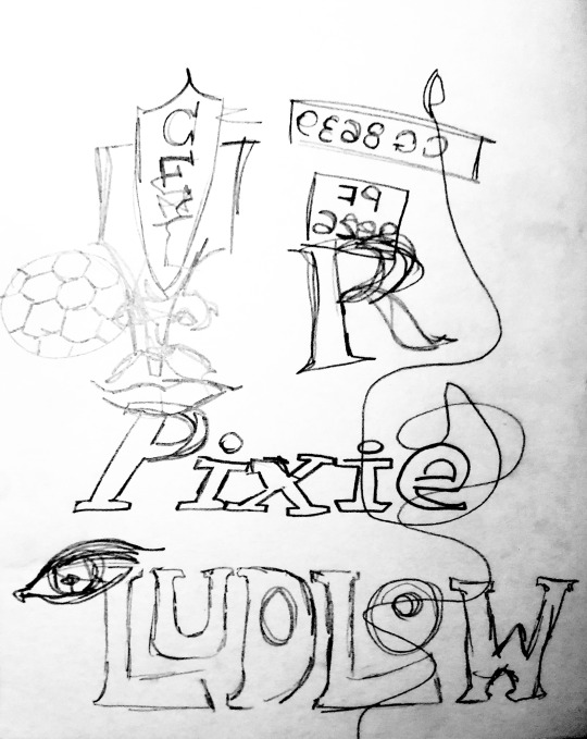
^ sketches from store 3

^ typewriter in store 3
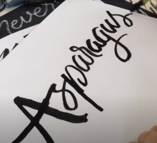
^ phonographs in store 3
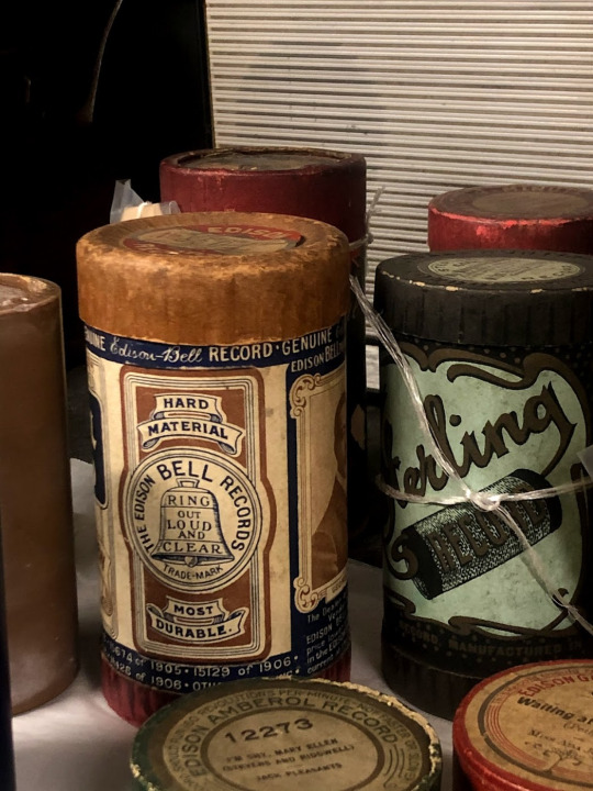
^ beer trays & bottles in store 3
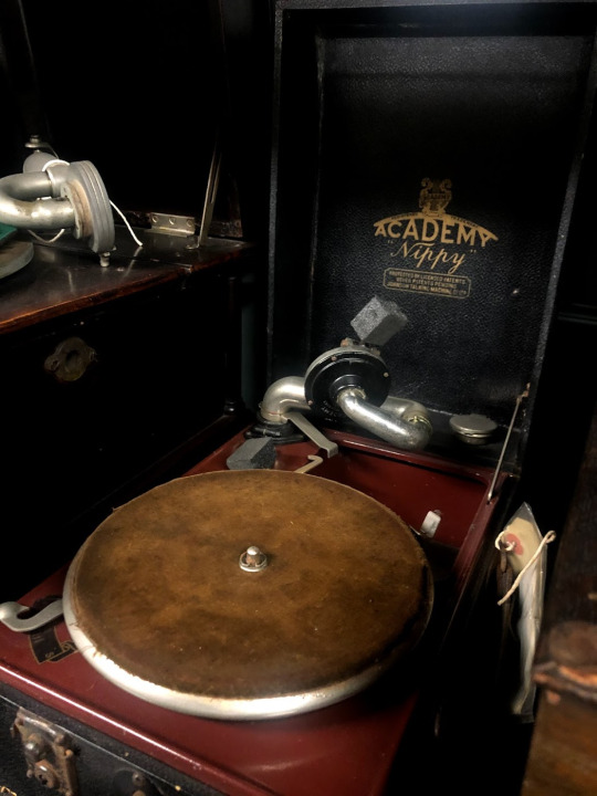
^ record player in store 3

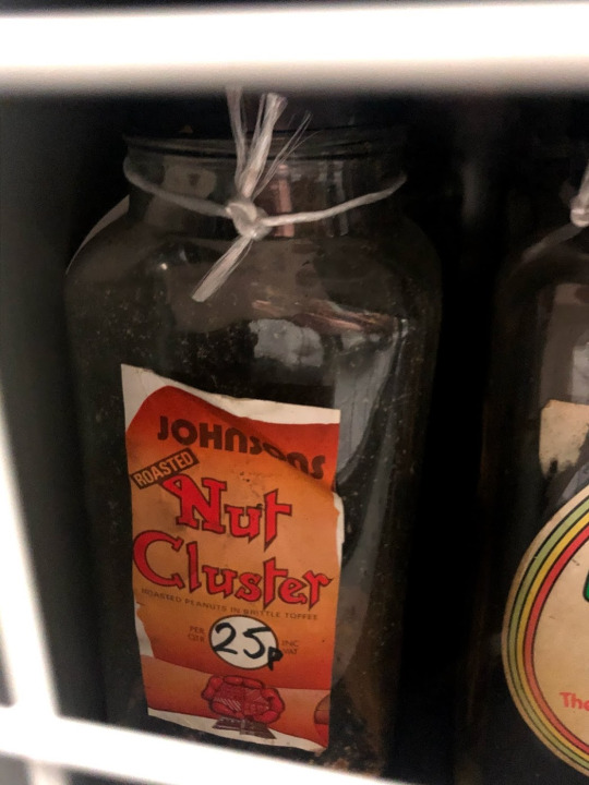
^ pick & mix jars in store 3

^ Cadbury’s packaging in store 3
We walked through to the main warehouse and through the shelves to the extension. As we walked through, we already saw some really cool stuff, like a huge spider crab in a display case. Myself and Bob (who was also there, so we walked around together) love crabs so we knew we wanted to go back there and find it later. The extension held lots of automobiles, such as cars, trucks and some super cool motorbikes. There was also an original clay model of the bullring bull that we found. There was no label or anything for it, but we guessed it must have been an initial design of the bull! Since I had shared it with Neeraj, a few days later he showed me that it was actually in a book he has about Birmingham and it was indeed the initial model of it! I really enjoyed looking around the extension as there were some really cool cars! My family have always been very interested in classic cars, so it’s something I’ve ended up being pretty passionate about as well. There were also vintage (pre 1939) cars too.
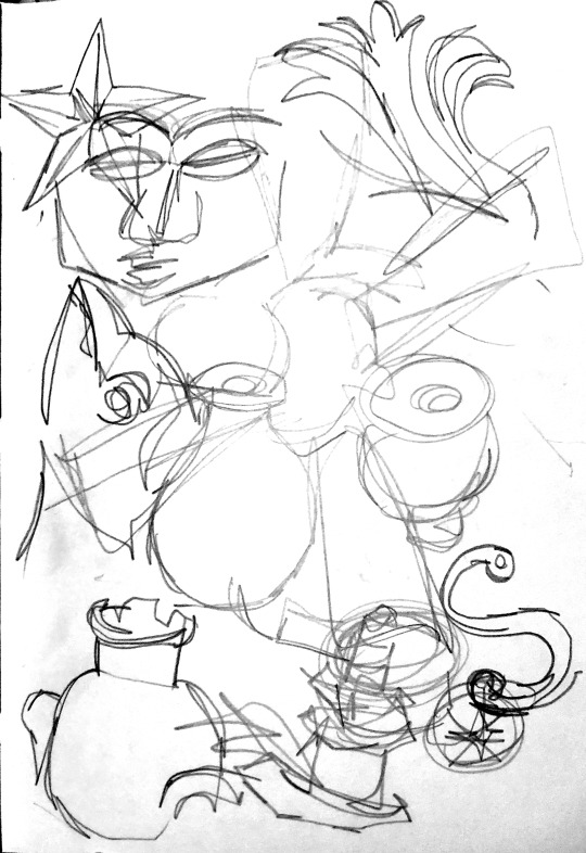
^ sketches from the extension and warehouse
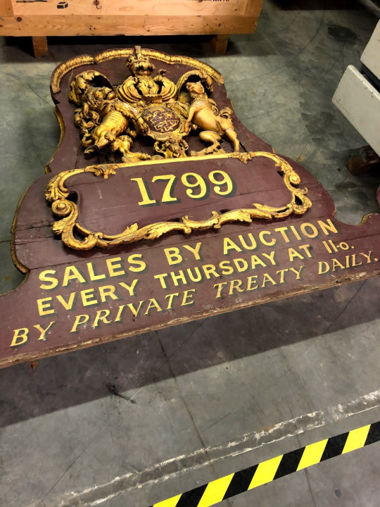
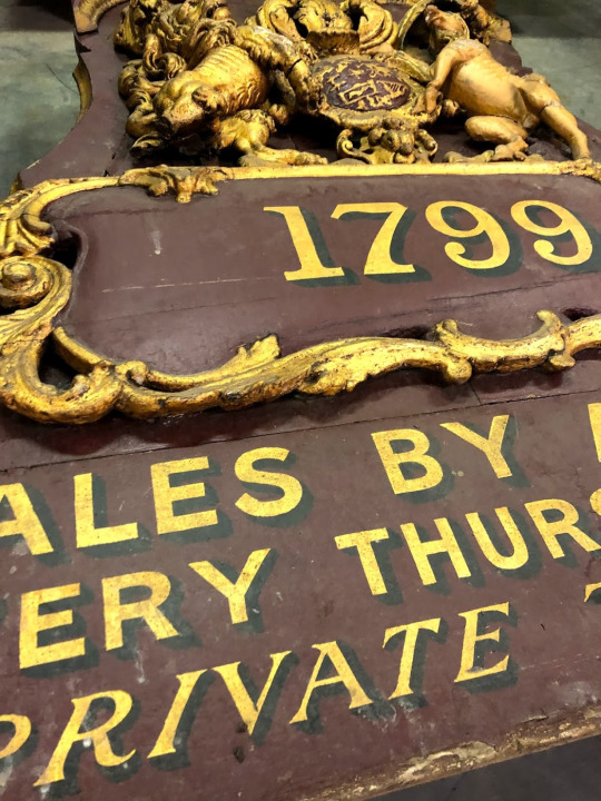
^ wooden sign in the extension

^ sauce light up sign! in the extension
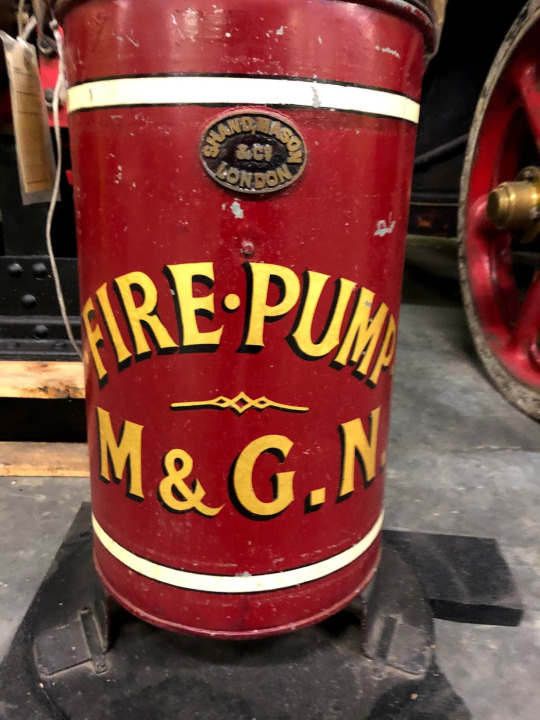
^ fire pump in the extension
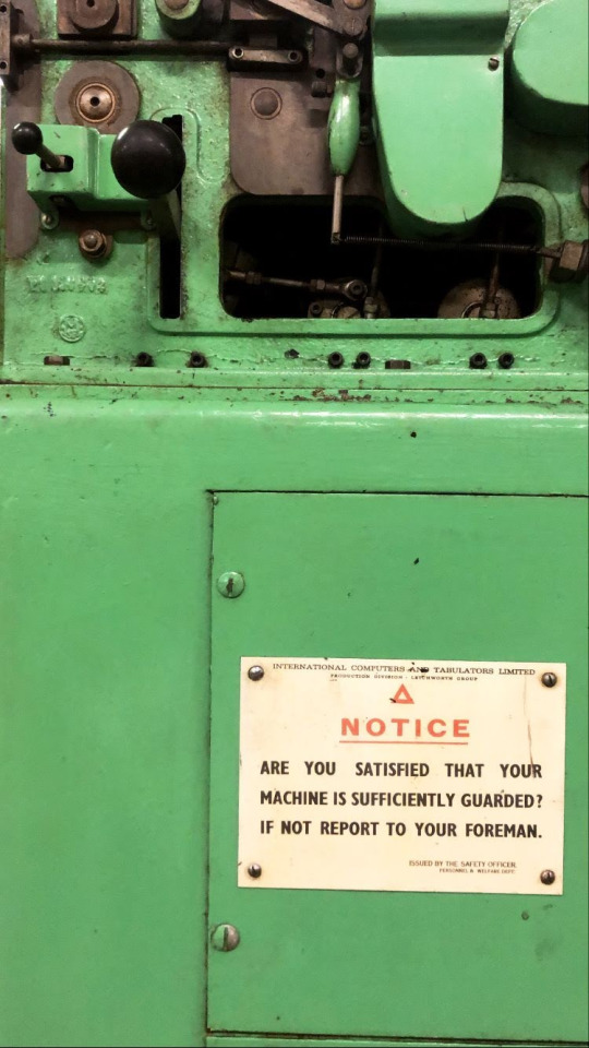
^ lovely type on a machine in the extension
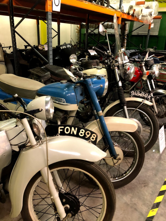
^ motorboikes in the extension
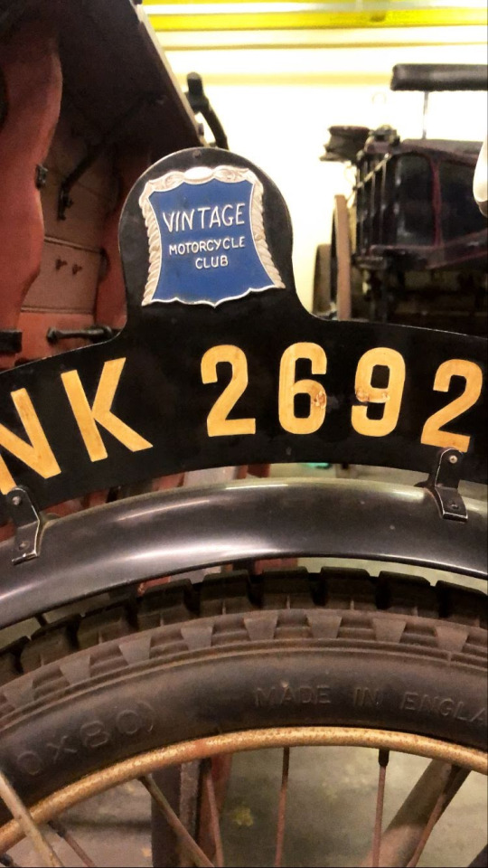
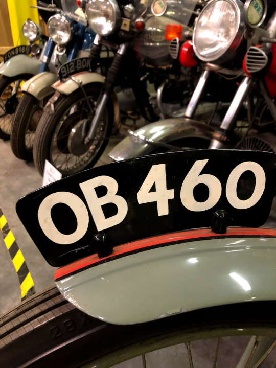
^ motorbikes with number plate in the extension
Since 1975, these black and silver number plates have been out of use, so any vehicle baring them is from before that year.
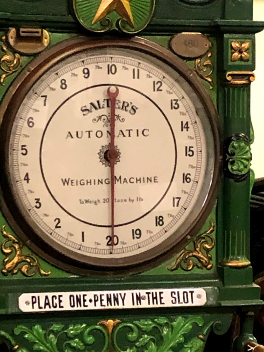
^ old Salter’s weighing machine in the extension
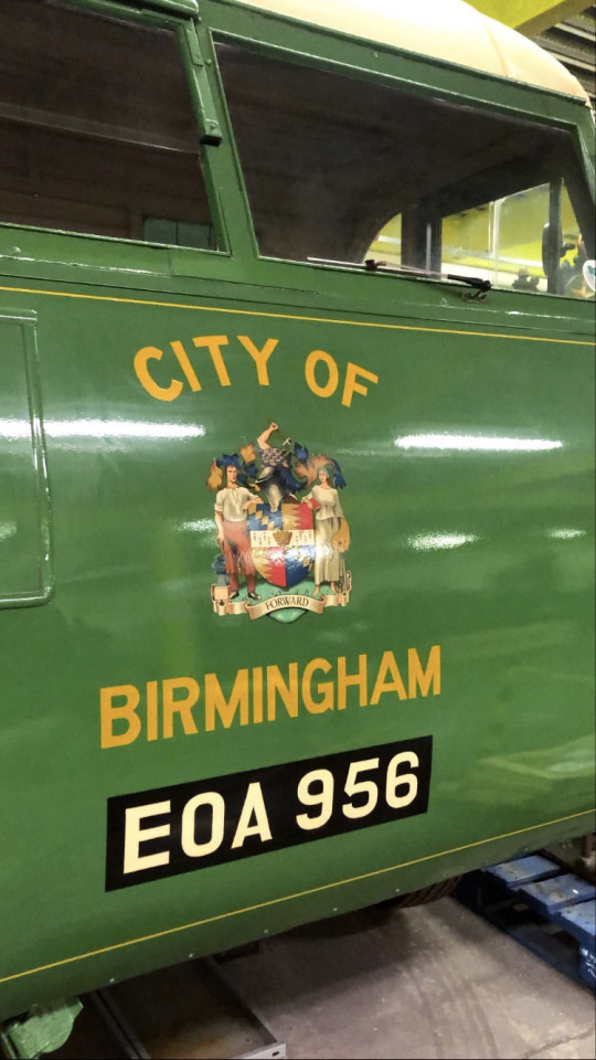
^ City of Birmingham truck in the extension
When we were done in the extension, we went through to the warehouse. There was loads of stuff in there, mostly machinery but there was some really cool typography dotted around and some interesting items here and there

^ not a collection piece but a box for one!
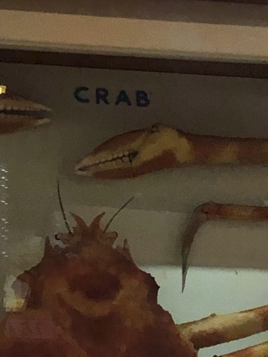
^ spider crab in the warehouse
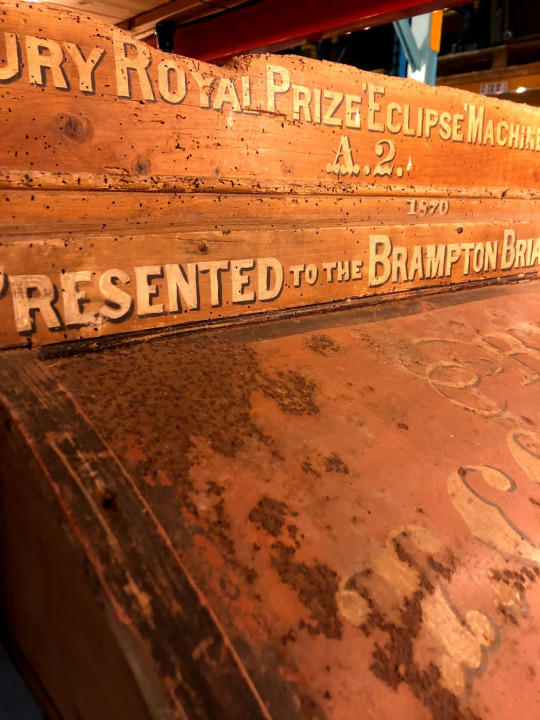
^ an eclipse machine in the warehouse

^ some sort of award thing! in the warehouse


^ a sheep dipping machine! in the warehouse

^ some mystery type in the warehouse

^ car engine in the warehouse
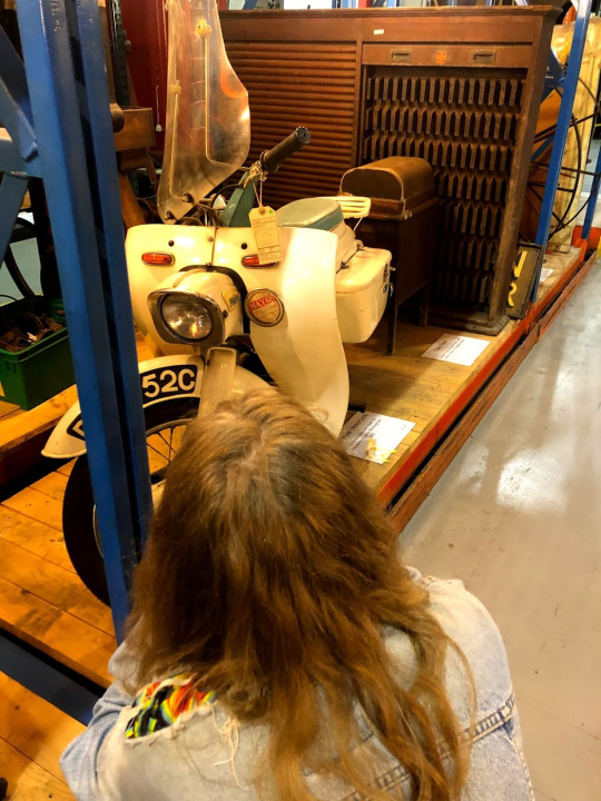
^ pixie scooter in the warehouse
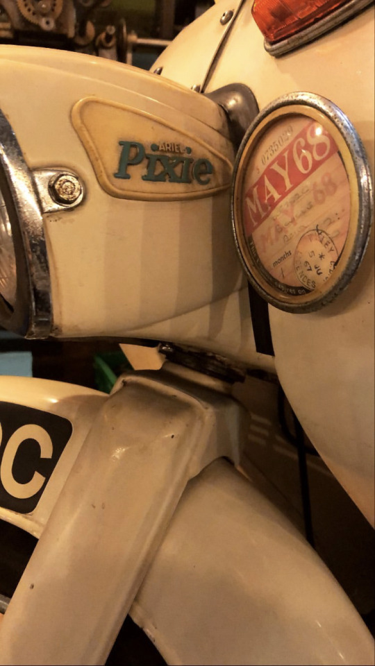

^ pixie scooter in the warehouse

^ street sign in the warehouse

^ no clue what this machine does! in the warehouse

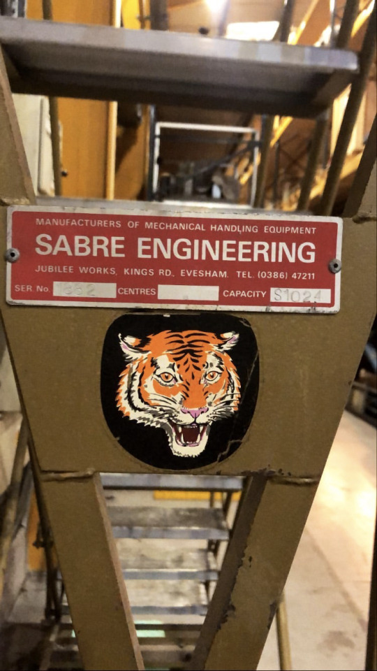
^ metal sign in the warehouse
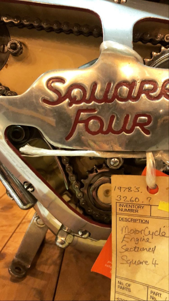
^ motorbike engine in the warehouse

^ eye test machine in the warehouse. I couldn’t get any closer as that part of the aisle was blocked off

^ fire bucket in the warehouse

^ fisher & ludlow badge in the warehouse

^ weighing machine in the warehouse
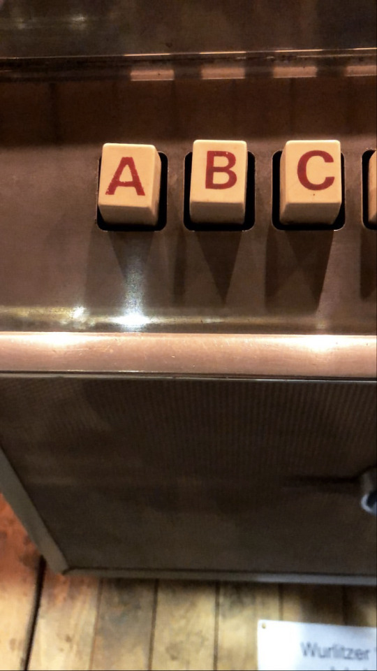
^ some sort of machine in the warehouse, I think it was a jukebox?!

^ detail from a carousel horse in the warehouse
^ not a collection piece but still cool! ladder in the warehouse
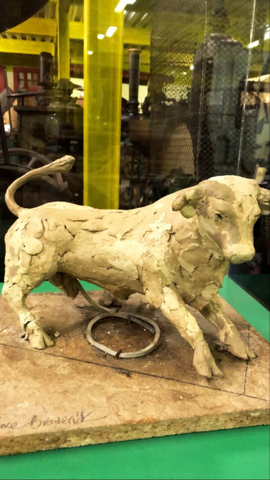
^ bull clay model in the extension
This trip was really fun and I found a lot of inspiration I was looking for to use in this project. I’d definitely want to go back some day as I’m sure there’s stuff I missed so I’ll have to try and make it down for an open day!
0 notes
Text
Letterpress Business Cards
I letterpress printed some business cards in my personal branding colours. I used wood type for this! I still need to print the back, but I’ll use metal type for that and I’m a little rusty (no pun intended) so I’ll need a few pointers from Naomi!
0 notes
Text
Generative Collage - Pins
I then scanned in my favourite badges and pins from my collection, changed the colours to monotone matching my personal brand colour palette.
vimeo
1 note
·
View note
Text
Generative Collage - Initial Experiment
I’ve been playing around with processing and found this bit of code in a book I’ve been reading about it. It uses an array to retrieve images from the data folder and then places them on a random place in the display and randomly rotates them to create a collage every time you press the mouse. You can also apply blend modes to it to create an interesting effect.
I started using this code with some of my mini collages and elements from the open_collab session we did. I saved them as PNGs so the background would be transparent.
initial:
vimeo
using blend modes:
vimeo
1 note
·
View note

Text
Feedback On Last Module
I had a chat to Jane about some feedback for last module as I want to aim as high as I can and improve my submissions! I took away from our talk that I should do more in depth case studies. I am always influenced by a number of different practitioners and I would do better to research these more in depth and do write ups. I also need to go more in depth about my process and everything I do. I’m always worried about writing too much and waffling on but I think going forward I will try to write more about everything I’m doing.
1 note
·
View note
Text
Imbue Q&A - Professional Futures Notes
Imbue Q&A
inspired by street art
making things he enjoys
he makes lots of stuff!
social media
people all around the world being able to see your work online is amazing
prefers instagram (me too bobby, me too)
pressure from social media
pressure to post more
good pressure?
to keep making stuff
positive spin on it to be fair
make sure to capture good images to put on instagram like at his exhibition
capture the moment
taking picture of stuff in shit setting
gotta make it look good lol
block da haterz
social media helpful to his career ! whoo, go internet!
on likes etc on instagram & social media
understand there’s an algorithm at play and you might just have been unlucky
how important is the website?
super important
portfolio and also selling stuff on it
don’t put all your eggs in one basket with instagram etc
custom packaging everything builds up to a believable brand
take yourself seriously
never had a business plan
which led to making money, running out of it and repeating the cycle
so having a business plan is important i suppose!
there isn’t any right or wrong thing to do
you can do anything
you won’t stand out by doing the same thing
0 notes
Text
Jane Anderson LinkedIn Talk - Professional Futures
10 tips for linkedin
DO:
keep profile up to date be engaged and productive
highlight strongest selling points in a prominent manner. like an online cv. skills! polish it up and sell yourself. write an about section
connect with people in your industry. add a personalised note asking them to accept and explaining what you have in common
follow companies, post content and join relevant groups. post stuff!
make your intentions known
DON’T:
use an inappropriate profile picture.
rely on jargon or cliches.
lie or exaggerate
use linkedin as a social media site
have spelling errors in your profile
1 note
·
View note
Text
Sound Play Notes
immersion from idea & senses
tides - nils dude
human connections
6 ways to how brain translates sound into feelings
brain-stem reflex
evaluative conditioning
emotional contagion
visual imagery
episodic memory
music expectancy
1 note
·
View note
Text
Luke Tonge Talk - Professional Futures
personal brand online portfolio social presence print collateral
personal branding use a consistent name your personality is your brand be authentic and real be consistent linkedin don’t spend hours on a logo proof read everything what you stand for
be findable, consistent and authentic
name/logo graphics/style behaving/acting
who are you? who is your audience? (primary- commissioners etc, secondary- family friends + public where will your brand live? (primary- online, secondary- offline) what will you be called
1 note
·
View note
Text
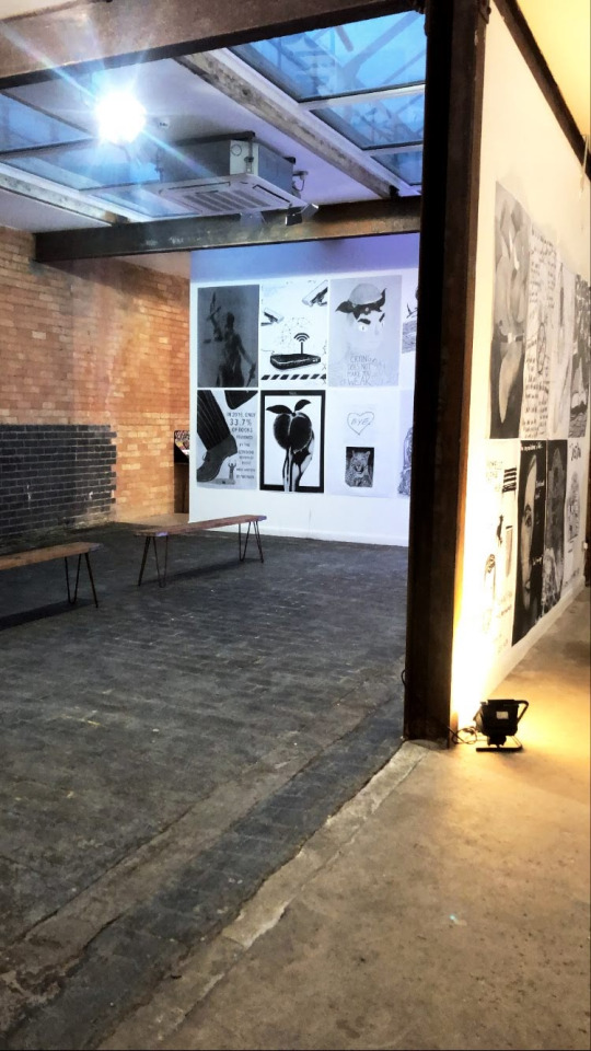
Elephant In The Room Exhibition


We went to the Illustration Exhibition of protest posters. it was held in Ironhouse and it was a cool exhibition! I’ve always been interested in protest and design so this was particularly exciting for me. There was also an opportunity to create your own protest posters using selected words and sticking them onto cardboard.
1 note
·
View note