
Don't wanna be here? Send us removal request.
Statistics
We looked inside some of the posts by bgoodwin2005 and here's what we found interesting.
Average Info
Notes Per Post
2
Likes Per Post
2
Reblog Per Post
0
Reply Per Post
0
Time Between Posts
7 days
Number of Posts By Type
Text
7
Last Seen Tumblr Blogs


Fun Fact
Average visit duration of Tumblr.com is 10 mins and 25 secs.
Text
Final Exam
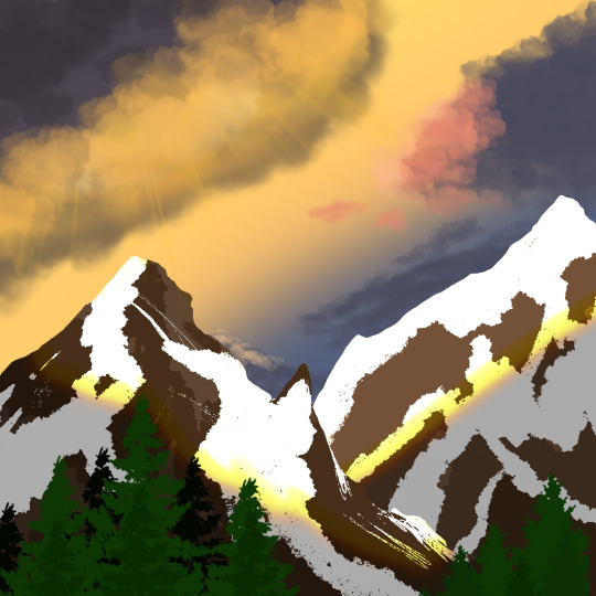


This was all done on an Ipad Pro, using a digital app called Procreate. This was all hand drawn, including the rough sketch of the mountain idea, and the final product.
This will be an untitled piece as well.
0 notes
Text
Virtual Sketchbook section 3


Walking into the museum and seeing all of these paintings and sculptures for the first time in a couple years felt surreal. Stepping through the rooms and seeing all of these works from centuries ago made it very powerful and emotional. Seeing Salvator Rosa’s work Landscape with a Lake, Mountains and Five Soldiers in the Foreground, made me feel these emotions. The simplicity of the painting stood out to me because of the history behind it and how this painting was made. This work was an Oil on canvas made in 1656 by Italian artist Salvator Rosa. The work is 124.1 x 204.5 cm and had a rugged color scheme with lots of black and gray in the water and mountains. The artwork is balanced in terms of colors and the way it was painted with a darker theme than most of the other artworks in the museum. This artwork evoked feelings of power, passion, and unity because of the history behind the artist Salvator Rosa. Dating back to the 1600’s, Salvator Rosa was one of the many different artists who changed the way European artists and others around the world create their art. For centuries now artists in Europe would travel to Italy to learn about the achievements of the past and create art with links towards these past achievements. Many of these artists would not return home, and would instead stay in Italy with foreign ambassadors, courts, and travelers on the Grand Tour. Salvator Rosa was one of the Italian artists that helped inspire the French artists. Salvator Rosa, who was active in both Rome and Naples, was in Rome during the Renaissance when Rome became the gathering place for artists helping the cause. I picked this piece of art by Salvator Rosa because of the cultural background behind it that made me feel emotional with the amount of passion and power into it. This work of art didn’t just change society but the world with the century’s long gatherings in Rome, Italy that are still present today. This artwork should be seen and talked about for the rest of time as it will always have that feeling of passion, power, unity and pride.
0 notes
Text
Photo/Design

Good ad above
What makes a good design is the effectiveness of getting the message across easily, a coherent text that doesn't confuse you as you read, and small details like; backgrounds or word choice. The intent for this layout is to make you feel happy, and the Coke product allures to that...with a Coca-Cola you are happy. Yes, it fulfills it's purpose because for one, the background is a green field with sunlight, which adds to a happy tone. Secondly, the Coca-Cola looks refreshing, like if you were out in the field all day you would have a cold Coca-Cola product to satiate you.

Bad image above
What makes this a bad design is the image, which can be lost on some with the baby drinking the product, as well as the text, which has a slogan, but the rest of the text isn't as concise. Their intent I believe was to say they had the youngest customers in the business, they could have put someone slightly older instead of a baby, because now the ad could be felt like it's targeting babies. It fulfills it's purpose by poorly executing a not-as-concise message while also falsely targeting a younger generation. It also could have used a different slogan that wouldn't have referred to the baby.
0 notes

Text
Connecting Art to Your World
I was with my family when I drove back from college and saw a beautiful sunset with red on the horizon and everything else above was grey. The hues were red and grey. It was highly saturated red on the horizon. It was an intense red, like scarlet. If I had to pick a color scheme for my life, it would be a monochromatic red and black since the red colors are cooler shades and combinations of the two I like most.
0 notes
Text
Writing and Looking
Pieter de Hooch, "INTERIOR OF A DUTCH HOUSE". 4.1 is where it's located.
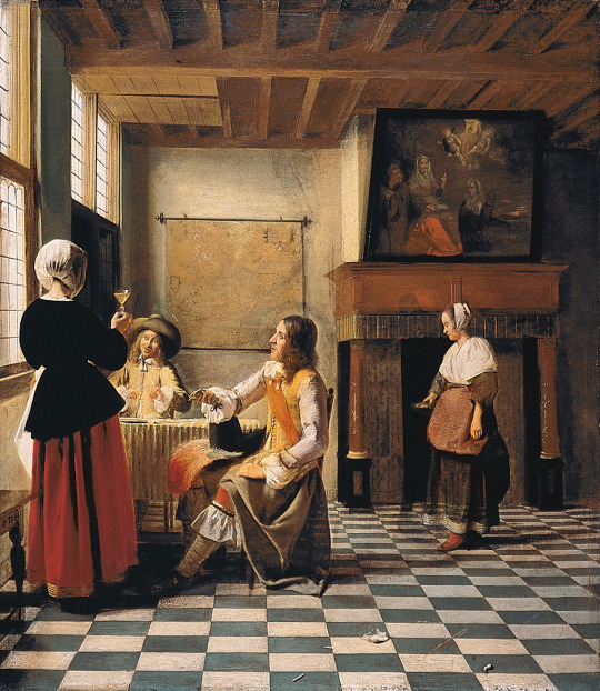
There is variety in this piece by all the characters, objects, and items. It is asymmetrical because nothing is similar to either side of the piece. In the background however, the girl standing before the fireplace is symmetrically lined up. Our focal point, our emphasis, is drawn to the people sitting around the table. The subordination of the art piece would be the girl, painting, roof and windows in the background. The directional pathway that our eyes are being led to are straight ahead to the guy in the yellow shirt. Repetition and rhythm are shown in the roof with the wooden panels, and on the floor with the checkerboard pattern. The piece experiences scale and proportion through the people sitting around the smaller table. Or, the lady standing next to the windows. Another example would be the fireplace compared to the lady standing before it.
1 note
·
View note
Text
Journaling - Principles of Design
Unity and Variety -
Unity is defined as something "boring" through it's singular form or color it has taken by the artist. An example would be a red cube. Variety is the chaotic contrast, where there are many elements that seem to make the art appear clustered in a chaotic form. An example would be a bedroom with cluttered mess.
Balance -
Balance is the aspect of trying to find equilibrium. Symmetrical balance is when one side of the piece of work is replicated on the other. One example would be butterfly wings. Asymmetrical balance is when something on one side does not mirror the other. One example would be our house, how in the front we have a palm tree to the right and a larger flower tree to the left, so the sides of the house are not similar.
Emphasis and Subordination -
Emphasis is defined as the eyes being drawn to a certain area, where the shape, light, or figure would be the focal point. An example is a picture of two friends standing before a building, they could be in the forefront, therefore being the focal points of the picture. Subordination is defined as having objects of less importance around the focal point, that do nothing essentially to keep us from the point of emphasis, where our eyes are first drawn. An example of this, is when I enter my sister's messy, cluttered room, but I am focused only on her.
Directional Forces -
It is defined as an invisible or actual pathway that leads the eyes in a certain direction. An example is a long sidewalk, where a dog is in the center far away, so the sidewalk is drawing our eyes to that certain area.
Repetition and Rhythm -
Repetition is the regular/frequent occurrence of a pattern or style. An example is Islamic stars that form patterns in buildings with repeating shapes. Rhythm is the same occurrence with related deviations of the same design. An example is the Greek pillars in Greek architecture.
Scale and Proportion -
Scale is defined as the size of two things. An example would be the height difference of someone short standing next to a tall person. Proportion is defined as many parts of a piece compared to a whole. An example is a face, with the small eyes, on a big head, with small ears, and big/small lips.
1 note
·
View note