I have collected over 15 years of drawing books and will be posting them in a mostly chronological order. ALL MY ORIGINAL ARTWORK, I AM ONLY INSULTING MYSELF. You will see how I've struggled to slowly improve as an artist, and maybe from that, you will pick up a pencil and start struggling alongside me!
Don't wanna be here? Send us removal request.
Statistics
We looked inside some of the posts by big-waifu and here's what we found interesting.
Average Info
Notes Per Post
2
Likes Per Post
2
Reblog Per Post
0
Reply Per Post
0
Time Between Posts
20 days
Number of Posts By Type
Text
17
Last Seen Tumblr Blogs


Fun Fact
When “GIF” was named word of the year in 2012, Oxford Dictionaries U.S.A. credited Tumblr for pushing the word.
Text

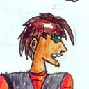
BOOK: #3
DATE: Summer/Fall 2003
I saw it fit to produce a diagram of Pyre’s design changes throughout the years I have been drawing him. I think it’s nice to have a record of styles in which I drew characters- though that implied that I had any real method of drawing Pyre and that he wasn’t just kind of the one guy I could draw. Additionally in this case each iteration is more or less fabricated. It’s not as if I’d come back to this years later and keep drawing one of my flagship OCs with new perspective every so often. It’d be cool if I did that, huh?
Of note is that the first Pyre on the top left is from a single drawing I did of him a year or so prior. I’ve mentioned before that Pyre’s Story is something I came up with a bit before I actually was able to make anything of it (though I think I did make a crappy Click and Create game using edited Megaman sprites.) This first drawing is lost as far as I can tell, and it is almost nice that I preserved the design in some way, because I more than likely would have forgotten this single drawing ever existed. Notice how it is a bit divorced from the anime influenced trappings in style. At least, sort of. I had not quite empowered myself to train in the styles of my 90s anime masters.
Another quick note is the dotted eyed Pyre is actually a “western cartoon style” Pyre I had drawn a few times in book 2, but the pages featuring this style were otherwise kind of uninteresting to share and ultimately is sort of an evolutionary dead end with the character.
Well I guess all of his designs are dead ends now, in a sense.
0 notes
Text

BOOK: #3
DATE: Summer 2003
Another inevitable image of romance between Melanie and her ex. The concept I think was that they were having one of those duels that you both hold a kerchief while you fight. Of course this type of closeness ultimately leads to nonviolent interaction- and kissing.
I think this one is pretty ambitiously posed and rendered. A lot of detail went into their outfits and even the little dotty stubble on Robbie’s beard, though I assure you Melanie’s torn sleeve is likely a consideration because I couldn’t figure out how to make it look natural if it were in tact. Intrigue aside, I posted this one to really hammer home just how much I fixated on the romantic aspects of my worlds as a kid. I can’t state enough how much I gravitated towards it.
At least Melanie is also over there in the chair enjoying the show, I guess.
0 notes
Text

BOOK: #3
DATE: Summer 2003
These are some creatures I decided fit into the world of Cut-Lass. The idea was they were like, both entirely designed to be good at treasure hunting. The shovel ant could dig and the “Cartogs” were really knowledgable about maps. Their one hand even has plumes that become lovely quill pens! These guys were a cute attempt by younger me to do some world building. Ultimately, they wouldn’t be a good fit for the world, so I never drew them again.
Really sorry about the pimp remark!
1 note
·
View note
Text

BOOK: #3
DATE: Summer 2003
There manifested a plan for Cut-Lass to reach a point in the story where a time skip was necessary. In this duration, Melanie took on a more traditional feminine look and gave the pirate life a break. All for her to go back to the swashbuckling life for Cut-Lass 2 (post on that coming soon)!
This was an attempt to draw a larger portrait of the time skip Melanie. I had a hard time not working at the tiny scale I was used to, so this picture got out of my hands quickly to the point where I did an intricate claw mark cross out and declared “DEATH 2” which I’m not particularly sure what that means. It kind of feels like how the early translations of Final Fantasy games would just put numbers after the higher level spells (FIRE2 instead of Fira, etc).
Needless to say, this design and concept didn’t really stick.
0 notes
Text

BOOK: #3
DATE: Summer 2003
As I’ve stated before, my brother drew comics like I did. Rather- I drew comics like he did. By the time he was in high school he was already trying his hand at sequential art. One of these comics was about a girl who finds a ring which grants her access to a little demon partner.
Ultimately the comic known as Djinn never went anywhere, but that didn’t stop me from producing a little critter inspired by the comic. This isn’t the first or last time my brother’s presence would be known in my development as an artist!
We also have Melanie cosplaying as a sexy devil. I think I just wanted to fill space…
0 notes
Text


BOOK: #3
DATE: Summer 2003
A little fan-art frenzy for this book. The Peter Griffin is actually probably a landmark piece since I think this would have been from when Family Guy returned from its prior cancellation in a big way that we are still suffering the consequences of. I used this Link picture to date some things in this book since I wouldn’t have drawn toon link until after Wind Waker’s US release, so this is likely from very late summer.
The candy dance is an in-joke reference to what we called the little victory dance Link does when he’d defeat a boss.
Additionally I’m sorry to report that that candy dance never came. I left the page blank for years hoping I’d return to finish what I had promised. Turning to the next page just reveals a bunch of lascivious drawings I drew years later. I will not be showing these due to the fact that they are literally just pornography drawn by a younger version of me that technically wasn’t even old enough to buy porn.
0 notes
Text

BOOK: #3
DATE: Spring 2003
There is no uncertainty about the fact that I had an interest in crafting elaborate swimwear for girls. It went beyond the objectifying fantasy of girls in less clothes (though I guess it was still an inevitable consequence of the interest), since I’m not sure why or how some of these aesthetic choices would be made just for that. Piece by piece, I’d like to draw attention to why this outfit is just so goofy to me.
First I want to talk about two things in one breath. The bow on the back and the loincloth are really strange elements that rear their heads constantly in future work. I don't know if the interest in loincloths draping over the crotch reason were out of some strange interest in bottom wear that covers just a little more, or if my 13-year old self just didn’t know what to do about the area connecting the legs without putting a whole curtain over it.
I think the gloves and boots can probably be talked about at the same time, as they aren’t really your typical beachwear either. It really makes the whole look feel like it’s some kind of uniform. The boots especially are funny because other than their little wing decorations, they’re not terribly elegant boots. Even today, I often fantasize about the look of wearing a very breezy and ornate femme outfit paired with a oversized set of big stompy men’s boots, but my partner insists to me that it never works out. I’ll prove them wrong someday.
Last but not least-like- do I even need to say much about the streamers? The idea of having big long ribbons of sheer on the heels of your boots make me feel like I’m going to trip and fall on my face despite the fact that I am sitting down writing this. It’s too funny.
I really like walking through these outfits. I make such strange decisions, but honestly, with the right skills, I think someone could probably redesign these into something chic. Maybe I should give it a try sometime.
0 notes
Text

BOOK: #3
DATE: Spring 2003
A friend of mine came up with this character. This is Spongerob Rectangleshirt, and I think he had some sort of mafia connections. Honestly I think this what would pass as effectively a prototype to a Spongebob AU nowadays. Very good character- ahead of his time.
0 notes
Text


BOOK: #3
DATE: Spring 2003
For a chunk of this book, there are various sketches of Cut-Lass- the lost little webcomic I was producing at the time. I was really excited to have a character like her to work with, and as I’ve said before, she starts to take the center stage as the main creative interest, and with that comes lots of drawings of her in various imagined scenarios I’d one day get to writing and drawing. You may be wondering what these floating decimal numbers are around her. For some reason, I considered Cut-Lass’s design to be a development process with movements from one version of her to another. Each time I’d redesign her in a way that I felt was a large departure from the way I had been drawing her, I assigned that new design a number up, using the drawings that led up to that version as in between numbers. For example, this is Cut-Lass version 2.0 and 2.5 respectively, so I was just coasting on what I considered a redesign for a little while. Pretty soon we reach Cut-Lass version 3.0, you’ll know. Trust me.


Additionally, around this time I introduce Robbie, a womanizing swashbuckler with a heart of gold underneath all that crap. He is also Melanie’s (Cut-Lass’s actual name) ex-boyfriend. As you can see, he uses guns, and Melanie hates him. He is somewhat modeled after Guybrush Threepwood of Monkey Island fame, and was designed to be both a foil and a romantic interest in a sort of “will they won’t they reconcile” since their breaking up was based on sort of a misunderstanding. Of course, I always find a way to insert romantic tension and misunderstandings into any piece of fiction I write. I was like a closeted trans Shakespere, I was.
It does bear mentioning that Robbie’s last name is “Wolfang” at this time, which is actually Pyre’s last name (yaknow, from “Pyre Story”). The idea was in my head for some reason that Robbie is Pyre’s ancestor and technically shares a dormant version of his elemental powers. The concept of succession over generations interconnecting a huge fantasy narrative interested me back then, and even to this day is still being built upon in its own way. How exciting to see it budding here.
0 notes
Text

BOOK:#3
DATE: Spring 2003
For no particular reason, I just like this mermaid. She was likely meant to be a bit part in Cut-Lass, but it was so insignificant that I couldn’t even tell you what’s up with her. I like that there are a few attempts at drawing a clamshell for her top. I guarantee I didn’t think to look at one to learn how they looked, so this is just what we get.
I like the genuine attempt to accessorize her with bracelets and earrings and even a sort of unique hairstyle. I wasn’t quite sure how to give people memorable or reasonable hair shapes, so I’d usually just fall back on a bunch of messy triangles plopped on their head. I don’t get hooked on mermaids the way I do with other things, but I do draw them from time to time. Something about the animal/human hybrid is a soft spot for me…
0 notes
Text


BOOK: #3
DATE: Spring 2003
The second time posting these fairy/sprite forms- this time with the rest of the main cast of “Pyre Story.” Also with this concept sheet seems to be some kind of special armored form? I’ve talked about super forms once before, but I think this was meant to be something less severe.
There’s something about this state of pure energy that always felt like the end game for these characters in their stories. I can’t be sure exactly why, but admittedly there is something freeing about the idea. I found it amusing that I gave Freya and Romano angel and devil wings for some reason, as if they were allowed to break the established convention of little dragonfly wings. Rule of Cool, I guess!

Before you ask: I didn’t leave out Katie Psychicgirl, she just had a giant drawing by 20 year old me attached to her part of this series. I’m not 100% sure, but I might actually have a digital painting I did off of this newer drawing. Maybe I’ll post it when I get to 2010 on this blog…
It just goes to show that in 2010 I was still enamored with this concept, apparently!
0 notes
Text


BOOK: #3
DATE: Spring 2003/2007?
The larger drawing space of this book opened itself up to possibilities for larger and more detailed images. Knowing that I was the Monarch of Wasted Space, I chose to instead draw fairly small figures. At least this time I was courteous enough to cram as many doodles in as possible.
And just look at these doodles! Between the action shot on the first page and the lady with the tribal aesthetic, it looked like I was really starting to push my boundaries and use these silly OCs I made to start acting on my fantasies. Whatever was going on the second page before, my older self decided to draw a new picture of Beta so good an even older version of myself had to play detective based on the squiggly cat picture to figure out when I had even drawn it! If only they had known that years and years later I’d revisit this book as an aging woman trying to pin exactly what Gamecube games were out at the time of drawing any of these pictures to determine the date they were drawn!
0 notes
Text

WELCOME TO BOOK #3
This handsome large Bienfang sketchpad with its ripped off cover was started around April of 2003, judging by the date on the first page. Some of this book’s notable features include an actively changing design history of Cut-Lass, my pirate adventure comic, as well as a ramping priority in attempting to create more stylish and complicate outfit designs for my characters. I think this book is also where my ability to render people starts to really temper into more ambitious territory (despite my fundamental abilities not being ready for it, probably.)
I did not photograph the actual first page because it is covered in some ungodly brown stains that I would rather the public not spend time conjecturing their origins. It will not be featured on this blog for the same reason, but I’ll speak briefly about it.
The first page features a small dated note among some attempts at drawing Cut-Lass that my brother “tried to ruin her design” by giving his (likely solicited by me) advice. My brother was and still is an extremely talented illustrator and I had always felt like I was playing catch up with him, so I asked for his help a lot. He would give pretty reasonable advice- such as needing to plan and structure drawings and look at real life models as examples. I would then get upset with him for not saying my work was perfect and then proceed do whatever I want. This sort of stubborn fear of critique pushed me deeper into a shell and probably stunted my growth as an illustrator, but it is at least worth noting that this page also has a dated note 2 years after the first note (April 2005) that my 13 year old self was entirely wrong about this. 15 year old me is an interesting character, but that’s a story for another time.
0 notes
Text

BOOK: #2
DATE: Winter 2003/2005/2008(?)
To finish off Book #2, I thought it would be appropriate to provide a group shot of the main cast of “Pyre Story.” Even though the characters and concept are fading into the background for a project I am more interested in, I still saw it fit to include a little picture of everyone designed in my current as of 2003 style.
Just as a weird aside- the guy with the sword is a rival character turned main that I wholly just never drew once until this moment. I just never thought it was important. His name is Romano, he was an archetypal snobby rich swordsman- not unlike one Tatewaki Kuno.

The 5 of these characters made up the essential heroes of the story, each bearing a special mark that grants them power over the elements. When all of them converge, they bring about great change to the world (with the help of some friends, of course). This is a recurring motif in a lot of my works, both subtle and direct depending on the story. What you also may notice is that in the initial redraw of this crew using a style I grow into 2005 is that I didn’t even get around to redrawing Pyre in this crew picture, opting to put Katie Psychicgirl in the front as the most important character and face of this story. Read into this as you will.
With this the brief run of Sketchbook #2 is finished! It’s a bit of a stopgap in the grand scheme of things, but I feel it is a pivotal book nonetheless! As the next book begins, I remember the weather warming up, and my friends and I would start opting to walk home from school instead of taking the bus. I had kind of gotten my act together academically, but I still didn’t have the whole, “studying or doing my classwork” thing quite down. Maybe my 8th grade year will be better, but before that, I have a summer vacation to worry about!
0 notes
Text


BOOK: #2
DATE: Winter 2002/2003 (and I think a redraw from 2005)
I would regularly revisit the scant fashions of the swimsuit in some sort of attempt to check my understanding of how to express the feminine ways. I think a lot about intent when I look at art, partially because I believe in art as a communication tool from an artists inevitable worldview. Inevitable, in that no matter how the artists obfuscates the intent to be a non sequitur, even that obfuscation becomes part of their expressed worldview.
Now, I’m not saying that creating a work that seems to express views satirically that the artist doesn’t believe in isn’t a possibility, but since communication is two way, you always run the risk of using irony/satire causing your work to miscommunicate to someone. It’s not a good or bad thing, it’s just a thing.
Anyway, I think about this a lot because I look at my old work, specifically that of girls, and the memory I have of their creation just displays an entirely different approach and attitude mentally than when I drew literally anything else. I felt some sort of indescribable elation that made me feel so good that I was afraid I was doing something wrong. As such, I felt implicitly ashamed to never show off my more feminine work. I had assumed the feeling was because I had drawn a girl showing her bellybutton, and the idea that drawing a girl in something about as revealing as Samus Aran’s speedrun ending outfit in Metroid Fusion (which had just come out around when I drew this, just saying) was something I couldn’t show anyone.

Maybe it was just the optics of a boy drawing a girl and what questions about why I had such interest in them. At the end of the day I think this is something a lot of people deal with, and that it really can mean a myriad of things. It’s pretty unimportant to do all this work to link it irrefutably and retroactively to gender identity, so all I want to say is that now I am genuinely happy that l took this time I did to practice this freeform expression of femininity.
Because of the girl I turned out to be, it allowed me a head start on finding ways to give complicated feelings about a burgeoning womanhood a clear voice. It also gives me the peace of mind to know that to some extent I was experiencing and exploring womanhood even when I couldn’t do it in my real life due to factors that were beyond my knowledge and control.
I feel less regret about not getting to have certain experiences as a young girl, because I can at least say that in my own way, I had been giving that feminine and true part of me room to exist all along the way, allowing it to grow as I developed my art.
Conversely, this also manifests itself later on in some very “interesting” subconscious themes that are concerning in their own right. We’ll get to that soon enough.
1 note
·
View note
Text

BOOK: #2
DATE: Winter 2002/2003
Just another reminder to not let anyone- especially teenage boys- draw in your sketchbook if you value the drawings on your page.
To be fair, now it serves as a happy memory of a time gone by, so I do now treasure this page.
0 notes
Text

BOOK: #2
DATE: Winter 2003
Surprisingly despite my kick of pirate characters, the “Sail of Ark ®️” is actually intended for Pyre… for some reason? I don’t know why it seemed imperative for me to give him an extremely cool almost retro-styled mecha, but I can beg for your understanding that it was 2003 and only a few years prior did kids my age have any idea Gundams existed.
Somewhere down the line you then research every single Gundam Super Famicom game and download roms (perfectly legally off of very reputable websites of course) and get exposed to over two decades of mecha-anime culture condensed into 16 bits. Finding out about the Super Robot Wars games through this and seeing the intersection of tons of franchises is likely why I was inspired to make the crotch down of this robot so Mazinger-like.

I think the blame for the interest in drawing this actually might be pinned on Megas XLR of all things? In 2002 Cartoon Network ran the pilot (then titled LowBrow) and I remembered wanting it to be made into a full show so badly.

Of course, that year the premiere cartoon to earn its place among the new “Cartoon Cartoons” was Billy and Mandy- a worthy addition. Thankfully, Megas XLR did eventually get its time to shine a few years later.
All in all, I don’t draw mecha very often. Technical art isn’t really my forte, and I never had the genuine passion for machines in motion the way I did boys and girls kissing each other and having personal drama.
0 notes