
Don't wanna be here? Send us removal request.
Statistics
We looked inside some of the posts by blakegopnik and here's what we found interesting.
Average Info
Notes Per Post
235
Likes Per Post
180
Reblog Per Post
55
Reply Per Post
0
Time Between Posts
1 month
Number of Posts By Type
Text
17
Last Seen Tumblr Blogs


Fun Fact
12.7% of mobile users access Tumblr.
Text


Another thought on Ben Shahn that didn't fit into my New York Times review of his Jewish Museum show: That his most famous posters (like the two shown here) aren't really works of "graphic art," but paintings that happen to be photo-mechanically reproduced onto paper. That means that they function — and Shahn thinks of them — within the tradition of Old Master paintings, as "windows on the world" that have suddenly appeared on (or in) a building's wall. (And see my last post, of a painting where Shahn makes that explicit.)
My two vintage photographs, from the Shahn papers at the Archives of American Art, show Shahn's posters "in action" in the world. One of them has been blown up to full mural size, linking it to murals by Raphael and his ilk.
6 notes
·
View notes
Text

My image is Ben Shahn's “Contemporary American Sculpture," from 1940 and now hanging in his landmark retrospective at the Jewish Museum in New York. It shows a gallery full of sculptures from that January's survey of American art at the Whitney—a survey Shahn was left out of. In a kind of revenge or correction, he imagines the walls of the gallery full of his own paintings.
When I reviewed the show for the New York Times last week, I talked about this painting as the key to Shahn's entire project. Shahn's imagined paintings, I said, give us "scenes of everyday life during the Great Depression — decrepit workers’ housing; a farmer by his shack; poor Black women at a welfare hospital — depicted as though the Whitney’s walls have been pierced to reveal the all-too-real world out beyond. It recalls how Renaissance murals pierced church walls to let in the more-real world of the Bible."
But there's one important detail in Shahn's “Contemporary American Sculpture" that I didn't have room to discuss—how he makes the cinder-block wall behind the two Black women continue "out" of the space of that scene and into the "real" world of the Whitney gallery, where it entirely blocks one entrance to the room.
His “Contemporary American Sculpture" represents a kind of ideal scenario where his visions of a troubled nation quite replace the more comfortable reality that most museumgoers experience. His paintings aren't merely framed art objects (note the absence of frames in his Whitney image); they are true portholes into other worlds, on the model of the "quadratura" paintings of Renaissance and Baroque churches, where the real ceiling is utterly dissolved and replaced by a painted view into the roiling heavens.
In reality, Shahn's paintings might have circulated in any number of sizes, to be hung in any number of places where they'd have no illusionistic effects. But “Contemporary American Sculpture" tells us how to think about what they want to achieve, and the scale of their ambitions. (Image copyright estate of Ben Shahn/Licensed by VAGA at Artists Rights Society (ARS), NY; via Art Institute of Chicago)
6 notes
·
View notes
Text
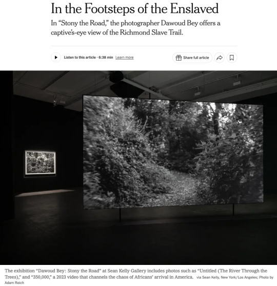
Happy to see my review of Dawoud Bey's great show at Sean Kelly Gallery getting nice play in the New York Times. The full text is below (click on "Keep reading") but one thing I didn't have room to dwell on, as much as I would have liked, is the vitally important tension between Bey's video and his stills. That's a tension (as I see it) between the “gaze” of the enslaved, in the fractured video, and of Europeans, in the elegant, traditionally artistic, even "sublime," prints. It would be so easy for someone to think the prints were just elegant, knock-off commodities meant to fund the more truly important, more challenging video. But I think the reflection back and forth, between the settled elegance and the unsettling challenge, is vital to the entire project.
IN THE FOOTSTEPS OF THE ENSLAVED - THE NEW YORK TIMES
CRITIC’S PICK
By Blake Gopnik
Jan. 30, 2025, 5:00 a.m. ET
The terrifying first capture in Africa.
The deadly crossing of the Middle Passage.
The brutality of slave markets and servitude.
It’s almost impossible to imagine, let alone depict, the full horrors of American slavery, although writers, directors and artists have tried.
But there’s one moment that seems to have caught their attention less often: the first encounter of kidnapped Africans with the strange new land where they were marched into enslavement.
In a remarkable exhibition called “Stony the Road,” at Sean Kelly Gallery in New York, the artist Dawoud Bey takes us on the path that tens of thousands were forced to walk, from the slave ships that landed at the James River’s docks to Richmond’s slave pens and markets.
With 14 still photos and a vast, two-sided video projection, Bey explores the Richmond Slave Trail that extends for several miles in Virginia’s capital. At Sean Kelly, Bey’s stills
are the first art you encounter. Those deluxe black-and-whites, almost a yard across, show various wooded spots along the trail, avoiding any details that speak of our era. (In fact, the trail now crosses many modern settings.) We get a view of trees and ground, of bits of river and patches of distant sky, such as an African might have encountered 250 years ago.
The images were shot on old-fashioned film and printed on traditional photographic paper, so we’re treated to the velvety blacks and sparkling whites of landscapes by Ansel Adams and Edward Weston and other pioneers of American photography. It’s tempting to linger with those tasteful, orderly images — in the gallery, and in this review — but I discovered that they get a whole new meaning after seeing Bey’s video at the gallery’s rear.
That video is titled “350,000,” an estimate of the total number of enslaved people who passed through Richmond’s trading markets. (The piece was originally commissioned for a major Bey show at the Virginia Museum of Fine Arts in Richmond in 2023.) Ten minutes of black-and-white footage appear on a screen that bisects a big space and reaches almost to its high ceiling. It shows the same wooded path as in Bey’s prints, but to utterly different effect.
The piece works hard to put us in the place — physical, but above all psychological — of one of Richmond’s newly disembarked. The images are projected at “life scale,” Bey told me, so that the path’s tree trunks and branches are the same size on the screen as they would be if they were there before us in life. And the trip down the path is captured in a single take, without edits, by a Steadicam held at an adult’s head-height, giving a captive’s-eye view of the passage up the trail.
But the goal isn’t to create a crisp, immersive substitute for a past reality. (Bey insists that his piece isn’t about faking some kind of long-lost documentation.) It’s about using the visible artifice of fine art to encourage a trip into a past we need to confront. In some ways Bey’s video has more in common with a poet’s evocative description than with a Spielbergish attempt at historical re-enactment.
So Bey’s cinematographer, Bron Moyi, shot all the footage with a century-old Petzval lens, once used for dream sequences in silent movies. It blurs all but the middle of the scene it shows, giving an almost drunken effect to Bey’s footage, which is also shown in somewhat slow-motion. Real vision never really works quite like that, but the Petzval provides an excellent metaphor for the kind of disorientation Africans must have felt on first being shoved ashore in Virginia.
They couldn’t have known quite where they were going, or what the endgame might be — most couldn’t understand their tormentors’ language — and “350,000” has a similar lack of plot or endpoint. Its camera’s “eye” rarely looks straight down the path toward some far-off goal. Instead, it veers from earth to treetops; from river, down at right, to undergrowth that hems the path at left.
No one knows if captives would really have looked anywhere but at their own stumbling feet or at the back of the chained figure ahead, but the camera’s wandering eye evokes the fracturing of any normal they might have known. Even the flora in Bey’s video, sure to strike most Americans as an average woodland scene, must have seemed foreign.
Bey makes his disjunctive technique stand for the utter confusion — physical, cognitive, spiritual — that captives must have felt. A soundtrack, commissioned by Bey from the dance scholar E. Gaynell Sherrod, adds to the effect: It’s a mash-up of random footfalls and birdcalls, of heartbeats and hoofbeats, of grunts and sighs and clinking chains. It doesn’t quite reproduce what the enslaved might actually have heard, but it sometimes adds Hollywood melodrama that the visuals smartly avoid. However, Sherrod’s soundtrack, and its lack of obvious sync to Bey’s visuals, maps onto how trauma can fracture our perceptions.
“Bey’s installation doesn’t recreate a single moment in someone’s pain,” our critic writes. “It condenses all the moments that thousands of subjects might have suffered on the Richmond Slave Trail.” via Sean Kelly, New York/Los Angeles; Photo by Adam Reich
In a final touch, Bey gives art viewers a more immediate taste of that same bewilderment: The occasional visitor who peers around to the other side of Bey’s screen will eventually realize that the view there is actually the same path but seen on a different trudge down it. That gives a sense that Bey’s installation doesn't recreate a single moment in someone’s pain; it condenses all the moments that thousands of subjects might have suffered on the Richmond Slave Trail.
And then, leaving the video behind, you encounter Bey’s stills once again, and now they seem to play a different role in his story. After witnessing the splintered sights in his video, his stills now seem to stand for the very firm and settled present that today’s art world lives in, at so many removes from an enslaved person’s view.
They give us something like the stable, settled view favored by Europe’s artistic culture, circa 1800, when wild nature promised escape from the everyday into the sublime. It’s almost as though Bey’s prints offer a bright light at the end of their forest path, so that, as in many an Ansel Adams photo, the white of the immaculate silver print becomes the white of escape and transcendence. The prints have a stable authority, in their confident choice of subject, the snapping of the shutter, their deluxe printing, that isn’t there in the video.
Bey’s show gets its name from a passage in the second stanza of ���Lift Every Voice and Sing,” the hymn by James Weldon Johnson that premiered in 1900 and is known as the Black national anthem: “Stony the road we trod/Bitter the chastening rod.”
Here’s how the stanza ends: “Out from the gloomy past/’Til now we stand at last/Where the white gleam of our bright star is cast.”
Now, 125 years later, Bey’s gloom seems to cast new light on art’s gleam.
17 notes
·
View notes
Text

THE FRIDAY PIC is an installation shot from "Amerika," the wonderful new projection by Javier Téllez at the Center for Art, Research and Alliances, a two-year-old space in Greenwich Village in New York.
In today's New York Times, I published a long feature explaining the genesis of the piece, for which Téllez hired eight recent migrants from Venezuela to collaborate with him on a Charlie Chaplin-inspired film, as both its scriptwriters and its actors.
Writing the piece, I realized that a lot of my own ancestors, although always described as "immigrants," were really more like today's asylum-seekers. In the mid-1920s, my paternal grandfather's family were fleeing the first stages of Stalin's oppressions, after barely surviving decades of pogroms. They barely squeaked-in before immigration to the U.S. got shut down by the Johnson-Reed Act.
Somehow, I'm glad they didn't have to specify the horrors they were fleeing, the way today's migrants are forced to do. They could just sail into a new nation, and start a new life.
They didn't need a Téllez quite as badly as we do today. (Although they had Chaplin, in "The Immigrant" — which my parents used to screen for us many times a year, in Super-8.)
4 notes
·
View notes
Text

THE FRIDAY PIC is a photo by Stephen Shore titled "Kingston, New York, November 8, 2020, 41°56.9443167N, 74°1.7406167W." (I love all that specificity.) The image is from Shore's fabulous new show of photographs shot from drones, at 303 gallery in New York.
I'm amazed that Shore can preserve — and yet transform — the trademark feel of his art while looking through the eyes of a remotely-piloted flying machine.
That remote, disembodied gaze reminds me of the products of a similar, much earlier one: The gaze we witness in constructed, one-point perspective.
When Renaissance perspectivists wanted to show off, they'd choose a viewpoint that no human eye was likely to achieve. Think the "bird's eye" view of Jacopo de' Barbari's great, balloon-free map of Venice, or the worm's-eye view in Mantegna's famous oculus in Mantua. They wanted to demonstrate the power of their artifice, and how it was independent of mere human observation.
Even though we know how Shore achieved his new views of America — how he got his "eye" to where it was in each shot — his images retain a whiff of Renaissance artifice. Somehow, that lets them emphasize the cultural construction of the land we live in.
6 notes
·
View notes
Text

THE FRIDAY PIC is a little-known drawing by Andy Warhol, probably from early in 1962 or late 1961. (It was on display years ago at the Paul Kasmin Gallery in New York.) I think it's THE crucial hinge between the important homoerotic fine art Warhol did in the 1950s (which got reliably ignored or lambasted) and the Pop works that made him famous in the '60s, whose gay references got sublimated into their hidden camp content — a sublimation that Warhol made explicit, for maybe the only time, in this drawing.
I discuss this drawing, and the relationship in general between Warhol's 50s work and his later Pop and Business Art, in the latest Art Angle podcast just released by Artnet.com.
(Image ©Andy Warhol Foundation for the Visual Arts, Inc.)
27 notes
·
View notes
Text

THE FRIDAY PIC is a frame from Carl Theodor Dreyer's 1928 "Passion of Joan of Arc." I got my latest look at the film in a gorgeous room-filling projection in "The Madness of Crowds," yet another brilliant group show at Carriage Trade gallery in New York.
I was more blown away than ever by Dreyer's film, and especially by his use of almost-static close ups. For a Warholian like me, they immediately made me think of Warhol's Screen Tests, but I admit that the connection seemed unlikely.

Then, five minutes ago, I checked my vast Warhol database ... and found an obscure text where the owner of the amazing Outlines gallery in Pittsburgh, a vital hangout for Warhol in the 1940s, said that she did indeed show the Dreyer, as part of her wildly ambitious program of screenings.
Knowing how Warhol was a Dyson vacuum for telling imagery, I feel almost certain that Dreyer was a real and direct influence on the Screen Tests.
34 notes
·
View notes
Text

THE FRIDAY PIC shows Charles Ray's piece "Everyone takes off their pants at least once a day," from his fantastic new show at Mathew Marks gallery in New York.
The secret to understanding the magical effects of Ray's sculpture, I think, is to recognize that they aren't actually sculptural. What they do is translate two-dimensional or digital phenomena into sculptural terms, which is what makes them so strange and compelling.
In the case of this huge image of a woman putting on her pants, he seems to be capturing issues of focus — which are issues that belong to 2D images — and expressing them in 3D.
Questions of scale, which have always been so vital to Ray, are also fundamentally two-dimensional: Images (at least perspectival and photographic ones) naturally exist at many different sizes, for good perceptual reasons; 3D objects much more rarely get enlarged or shrunk. (Hence the lasting magic of model trains and doll's house miniatures.)
In other sculptures by Ray, he allows the traces of 3D digital scanning to persist in his sculptures, giving them a material presence that by rights those traces shouldn't have.

I'm reminded of sculptures by Leonardo da Vinci's nephew Pierino, a wildly talented artist who died absurdly young. He seemed to translate the soft focus of his uncle's sfumato technique into sculptural terms.

17 notes
·
View notes
Text

THE FRIDAY PIC (admittedly a day late) is a tremendous 1946 photomontage by Lotte Jacobi — one of the so-called "photogenics" she started making in New York after World War II, a decade after her flight from Nazi Germany. I saw it in the Bruce Silverstein booth at the AIPAD "Photography Show" at the Park Avenue armory, where it filled a good chunk of a wall, and will through fair's end tomorrow. (Silverstein didn't know quite why Jacobi would have made the huge print or where she might have shown it.)
Unlike similar works that came out of prewar Germany, this one seems less interested in revealing its fractures than hiding them; it doesn't pull the world apart so much as rebuild it into a new and fantastical and quite photographic reality. If it was meant to represent a musical moment, it's less Schoenberg than Weill — or maybe it's all about Ellington, in one of the Carnegie Hall compositions he had just started writing. The soprano sax seems right for that.
Throughout the fair, I was struck by how its vintage images, from any of photography's first 150 years, seemed wildly more compelling than anything more recent. I think that's because the concept of "fine-art photography" that structures the fair only makes sense retrospectively. Bring it into the current era, and it simply falls apart. Today's most serious photography only makes sense set into the larger art conversation; if it can't sit there, I wonder how serious it really is.
It ends up looking backward toward a conversation that is basically over.
14 notes
·
View notes
Text

THE FRIDAY PIC is a pair of small bronzes by Richmond Barthé: Feral Benga (1935) and Stevedore (1937) from the little survey at Michael Rosenfeld in New York.
I wrote about the show (and two others) in today's New York Times. (See the text of my Barthé piece, below).
In the Times, I argued that Barthé's work should be seen as a kind of 3D photography, presenting Black people as a "normal" part of the everyday, contemporary reality of prewar America, not needing to be dressed up in the stylish (and often primitivizing) trappings of modernist art. (Or in any of the other stereotypes African Americans were forced to embody.) What I didn't have room to point out (or claim) was that Barthé, a gay man, maybe does the same with his homoerotic images, which also normalize, maybe even naturalize, gay desire and its objects. Only a high-realist style, aligned with the illusionism of photography, had the power to do that.
And here's what I wrote about Barthé in the Times (go to the whole article to read my other two brief reviews):
Richmond Barthé, the great African American sculptor, gets kudos for his realism, but that’s faint praise that damns him: In the 1930s, when his career took off, there were hundreds of artists who had as fine a technique; there are still lots in Times Square, sculpting tourists’ faces in clay.
Looking at the 16 busts and figures in the Barthé survey at Rosenfeld — it’s curated by the British artist Isaac Julien, who has a stunning video in the Whitney Biennial — I realized that it’s best to ignore technique and to think of them as three-dimensional photographs, or as much as you possibly could before the age of 3-D scanners. The sculptures look forward to our technology, not backward at traditional realism.
The best of Barthés’s figures make his Black sitters as directly available as possible to our eyes, the way a photo seems to. There’s no interfering dose of modernist style, which was imbued with stereotypes about Blackness and “primitive” African art that invoked ideas of the “savage” and the “primeval,” or, calling on an opposite set of clichés, of the “Edenic” and “authentic.” Those were applied to African Americans in Barthé’s era, forcing them into cultural pigeonholes.
He gives his subjects more room to breathe.
“African Woman,” from 1935, shows someone whose hairdo may distance her from 1930s America, but she’s not exotic or ancestral. She’s another person of today who happens to come from far away.
The male head in “The Negro Looks Ahead” enacts its title by just being there and looking out onto the world.
Three portraits of Black boys are just three children waiting to grow up, into a world they still imagine might treat them fairly.
7 notes
·
View notes
Text
THE FRIDAY PIC is Mavis Pusey's Within Manhattan, from 1977, now in the 2024 Whitney Biennial.
The almost-sort-of-maybe-not abstractions by Pusey (1928-2019) really feel as though they had something to say about art, and the world, as both existed at the moment she was making this work.
I can't say as much about pretty much anything else in the Biennial, except Isaac Julien's brilliant piece on Albert Barnes and Alain Locke. But then, I'm not impartial on that front — I'm just now on my last days of writing Barnes's biography, and Locke of course figures in it.
Image © Estate of Mavis Pusey. Photograph by Elon Schoenholz. Courtesy of the Whitney Museum of American Art.
10 notes
·
View notes
Text

THE FRIDAY PIC is "Untitled (Make-up)," a 20" x 24" Ektacolor photo, dated 1982–84, from the show called "Richard Prince: Early Photography, 1977–87," at Gagosian gallery in New York.
Looking at the exhibition, I felt distinctly looked-at.
An ad for Kool-Aid, offered in a 1983 copy-shot by Prince, shows a pitcher bearing the drink's trademark smiley face, its two eyes locked onto ours.
In an ad for Trix cereal, copied by Prince that same year, the googly gaze of the brand's "silly rabbit" looks out at us, knowing we're looking back.
In Prince's famous grid of photos titled "Live Free or Die," reproduced from biker magazines in 1986, nine motorcycle molls stare out, as though, like Kool-Aid, they can deliver "more smiles per gallon."
It's hardly an overstatement — in fact, by now it's almost a cliché — to say that our culture is a culture of consumption and that Prince's art gets at the vital role of images and vision in that culture. Before we buy, we look, less at the objects of desire themselves than at the photos that teach us what to want. In the 62 early works at Gagosian, Prince lets us look at that looking. But also, as I've just begun to notice, at how those images, and this art, look back at us.
Today's Friday Pic shows a young woman gazing into the mirror that's hinged onto the back of a deluxe box of eye shadow: In the act of looking at herself in that mirror — of making-up her eyes to look perfect for looking — she presents herself to the admiring eyes of a magazine's reader. And then, by copying the shot that offers her up, Prince sets us up to watch that complex transaction between looker and reader, adding our art-loving gaze into the equation. It's an infinite regress of desiring glances.
At Gagosian, the woman in that shot, like the women and men — and silly rabbits — in other Prince works, are also looking out of them at us, art lovers, as we look in on them. Just because we're standing in a fancy gallery doesn't mean we aren't part of the same vision culture, the same vision economy, as everyone and everything captured in Prince's images of images. Our gaze at a work by Prince is the gaze of readers looking at an eye-shadow ad, which is the gaze deployed by the woman as she looks at herself in her mirror, which is the same gaze an admirer is meant to direct at her, now that she's made herself worth gazing at.
But there is one thing that distinguishes a work by Prince from the image it copies, our sight of a Prince from our sight of an ad. Unlike an ad, an artwork's first and chief function is simply to offer itself up to our eyes and minds — it has no plan for what comes after. If someone buys it, that's none of its business.
Even in an art world that is so much about sales, the early works of Prince are selling us a chance to see and think, not to buy.
(Image © Richard Prince. Photo: Prudence Cuming Associates Ltd. Courtesy the artist and Gagosian)
16 notes
·
View notes
Text
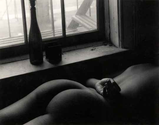
THE FRIDAY PIC is an untitled nude from the 1960s by Ray Francis, whose solo show I just wrote about in the New York Times.
In that piece, I set up a comparison with Ansel Adams's great "Moonrise, Hernandez, New Mexico, 1941," below. (Jokes about "moons" are strictly forbidden.)
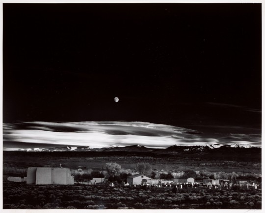
... but my goal was to point out how different they are, in their equally exquisite use of the black tones that mattered so much to their moment in "fine-art" photography.
Adams's shot is about nature, used to balance, even hide, the technologized world that shot comes out of — which includes the photographic technologies that allow for its blacks. (See my old piece that develops that idea.)
Whereas Francis's nude, for all its "naturalness", is about culture and nurture (or sometimes, lack of such), and about how culture shapes what black tones can mean.
16 notes
·
View notes
Text

On this 36th anniversary of Andy Warhol's passing, at 58, I thought it right to post this poignant photo by Peter Bellamy, which catches Warhol taking one of his very last limo rides.
“I believe in death after death,” Warhol once said. And, “When it’s over, it’s over.” Maybe that's why he made such great use of the one life he did have — until it was broken off short.
31 notes
·
View notes
Text
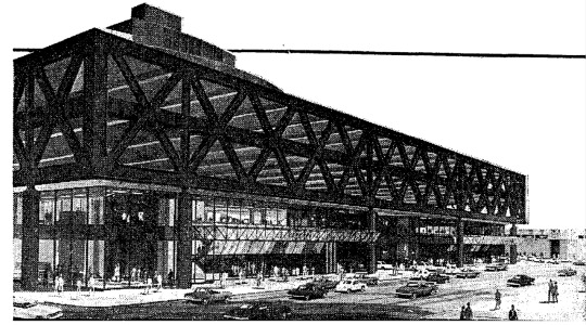
THE FRIDAY PIC is a 1980s rendering of New York's Port Authority Bus Terminal, in the news again as plans to replace it are moving forward, to much celebration. A few years ago, I published a love letter to the PABT: https://brooklynrail.org/2021/02/special-report/Praising-the-Port-Authority-Terminal. Rereading that piece today, in the face of all that celebration of its coming demise, I feel I should apologize for what I wrote: It was too half-hearted in its praise of the building. I'm more than ever convinced that it is one of the truly great structures in New York, and by a long shot one of the most original. It's a fabulous example of functionalist Brutalism, descended straight from such functional treasures as the Roman aqueduct in Segovia. We mourn the loss of the old Penn Station, even though plenty of experts once thought it was the height of Beaux Arts kitsch. Judging from the drawings I've seen for the PABT's banal replacement, we'll mourn the loss of its Brutalist ancestor just as much.
6 notes
·
View notes
Text
THE FRIDAY PIC is a 1905 image by Henri Matisse, drawn when he was at the port of Collioure, in the South of France, and now in the collection of the Musée d'art moderne in nearby Céret.
"Vertigo of Color: Matisse, Derain, and the Origins of Fauvism," at the Metropolitan Museum of Art, is all about the two artists' stay in Collioure.
Like every discussion of Fauvism, the Met's (as per its title) dwells on the movement's "pioneering" use of bright and unnatural colors — while mostly ignoring the powerful precedents set by van Gogh and Toulouse-Lautrec and even, in some ways, Monet.
I think the real radicalism on view in this show comes in its drawings. They are crude to the point of truly evoking the scratchings of "wild beasts." I'm not sure there's any precedent for their deliberate, extravagant ham-fistedness -- which they aren't using as a new style (earlier "bad" drawing could work as that) but as the refusal of anything like consistent, coherent, credible style.
I have a feeling that, in some sense, the wild color used by the Fauves was a kind of camouflage for the much wilder, weirder — uglier — drawing that lurked below it. Color, however bizarre, can always have a certain appeal. "Bad" drawing can feel like an attack on the world.
Image © Succession H. Matisse, photo Hélène Barbier.
16 notes
·
View notes
Text
THE FRIDAY PIC is a still from Ed Atkins’s “Pianowork 2,” a 16-minute video projection from 2023 that closes tomorrow at Gladstone Gallery's 21st Street space.
This image is one of the rare stills that captures the heart of a video work: Its figure looks so close to something real in the world, while giving telltale signs that it was born in a computer. And where does that leave the emotions it shows?
More on that work, and another Atkins video, below, in the little piece I wrote about his Gladstone show for the New York Times:
Atkins’s 16-minute “Pianowork 2” plunges deep inside the so-called uncanny valley, where digital simulations come close to perfect realism and seem the weirder for it. Using motion-capture technology, Atkins recorded himself playing a modernist piece for piano; the collected data was then turned into a nearly perfect digital animation of the same scene — “nearly” being the operative word. Atkins’s avatar emotes at the keyboard, just as any human pianist might — as we assume Atkins did, playing — but tiny glitches tell us that we are watching a digital creature that could never feel real emotions.
With traditional animation, we’d know that everything onscreen came from someone’s imagination; with a traditional video recording, we’d assume the scene had some real-world analogue. But “Pianowork 2” suggests the real, while making sure we don’t trust it.
Its companion at Gladstone, an 80-minute projection called “Sorcerer,” is a collaboration with the writer Steven Zultanski. It seems like the straightforward record of a theatrical piece: Two women and a man recite lines on a set that more or less recreates someone’s living room; their dialogue sounds like the almost-random chatter of friends, transcribed direct from life. Without going digital, this results in some of the same tensions as “Pianowork 2”: The transcribed chatter evokes the real, but putting it onstage is all about artifice.
Maybe the uncanny valley has always been a place where human culture likes to hang out.
2 notes
·
View notes