Last Seen Blogs

oracieotu
HoneyOTU

rozciel
graciel
tiegom48813
TiegoM48813

annapurnamarriages
Annapurna Marriages Services

caliowl333
Random Fandom Blog

Text
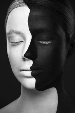
Contrast means: using the similar element in designing but make one element looks different from the other. It usually refers to texture, colour and size etc. When using the design strategies of contrast, make design has a change in the elements. That allows the design strengthen visual impact. Using contrast in design in order to emphasize the theme and what is important in the design. Sometimes, using contrast can lead viewer’s eyes. As the photo show besides, it shows a contrast between black and white.
( https://www.buzzfeed.com/daves4/can-you-make-it-through-this-post-without-being-fo?utm_term=.aa10vx85z#.nsWNq07ZL )
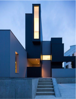
Hierarchy is about all the elements which we use in designing. For example, the colour, spacing and shape etc. To organise and prioritise the elements using in design is the meaning of hierarchy. Hierarchy is helping the designer to build up a focal point and provide an entry point to direct designer’s design and show to viewers where is the importance. The picture of the house on the side has shown an example of the hierarchy. This house is combined with several different cuboids. Those cuboid seem organised randomly, but it is well-proportioned. That makes viewers can immediately find the importance.
(https://www.pinterest.nz/pin/503981014524655597/)
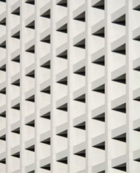
Repetition is using the similar elements, which are a similar shape, line, objects etc, using them into design more than once. When applying repetition into the design, it helps design stand out from the surrounding. That helps design can easily catch viewer’s eyes and make a deep impression on viewers.
(https://www.pinterest.nz/pin/67835538121421010/)
Continuity is using line elements to direct viewer’s eyes from one information to the other. It is a way to help viewers immediately see the important information, instead of missing them. Continuity help designers to control viewer’s eyes. As the picture shows besides, the wooden frame helps our view from the nearer to far.
(https://www.pinterest.nz/pin/349521621066916902/)

Symmetrical balance gives viewers a feeling of stable and visually striking. Applying symmetrical balance into the design by placing the elements into a regular order, which makes the elements well-ordered.
Just as the photos show besides, it is a picture of symmetrical balance. If draw a guild line through the middle, which finds the left side is exactly the same as the right.
(https://www.pinterest.nz/pin/576320083544287278/)

0 notes


Text
First-day at Uni!
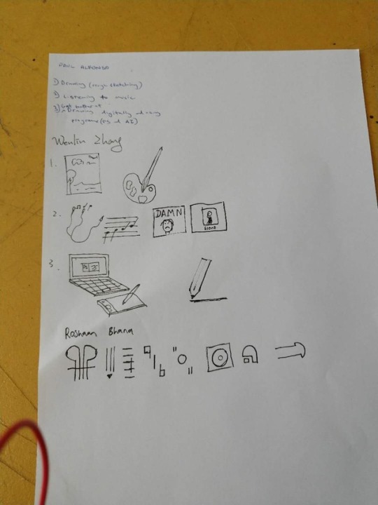
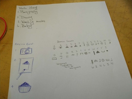
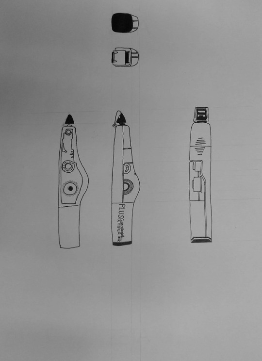
It is the first class of DSDN 101 today. After I have been arranged into a group, I started to do the assigned activity. I write my specialty and habit on the paper then switch the paper next to me. According to the Task one, I draw symbols for them. Those symbols are inspired by life,. Task three is asked us to create a new language. My inspiration is from the prehistoric human. They create a new language by pictures, by what they are drawing. Therefore, I draw those habit from Task one in an easy way. Drawing and creating is an attractive process, which makes me being immersed in them.
0 notes