
Statistics
We looked inside some of the posts by blogbygabe-blog and here's what we found interesting.
Average Info
Notes Per Post
0
Likes Per Post
0
Reblog Per Post
0
Reply Per Post
0
Time Between Posts
6 days
Number of Posts By Type
Text
9
Last Seen Tumblr Blogs


Fun Fact
In 2020, 27% of US Tumblr users had an annual household income of over $100,000.
Text
Blog 9
OUTLINE FOR THE THESIS
I. Introduction:
Minimalism is everywhere. Posters, television, book covers, in a café you visit, even the design for your favourite soap is most likely to be minimalistic. It has become not only a trend, but an obsession, especially in graphic design. The question is then, why is that so, and will it continue to remain a trend or will it disappear and evolve into something else.
Thesis statement: Minimalism will continue to evolve and will still remain the central design movement in use by contemporary designers to come.
II. Minimalism
A: To be able to talk about the influence of minimalistic design on the future of design, we need to first explore what Minimalism actually is.
1. Tate.org, (2017) Minimalism [Online]. http://www.tate.org.uk/art/art-terms/m/minimalism (Accessed 8 November 2017).
“Minimalism or minimalist art can be seen as extending the abstract idea that art should have its own reality and not be an imitation of some other thing.” (Tate.org, 2017)
2. J. Wolf (2017) "Minimalism Movement Overview and Analysis" [Online]. http://www.theartstory.org/movement-minimalism.htm (Accessed 6 December 2017)
“Minimalists distanced themselves from the Abstract Expressionists by removing suggestions of biography from their art or, indeed, metaphors of any kind”
“The artists who became Minimalists wanted instead to produce an art that was less personal and more substantial, believing that a work of art should not refer to anything other than itself (J. Wolf, 2017)”
B: The minimalistic idea did not just appear. It was a made as a reaction towards other art movements.
1. Novin, G. (2016) Minimalism [Online]. http://guity-novin.blogspot.cz/2010/03/history-of-graphic-design-minamalism.html (Accessed 15 November 2017)
“Black Square against white background became the symbol of non-representational art of the past century and an icon representing Modernism which by the late 20th century descended into the realm of absurd and vulgar. (Novin, 2016)”
2. J. Wolf (2017) "Minimalism Movement Overview and Analysis" [Online]. http://www.theartstory.org/movement-minimalism.htm (Accessed 6 December 2017)
“Minimalists distanced themselves from the Abstract Expressionists by removing suggestions of biography from their art or, indeed, metaphors of any kind”
C: The minimalistic movement has faced many criticisms throughout the years.
1. Greanes, P. (2012) Introduction to literary minimalism in American short story [Online]. https://philgreaney.wordpress.com/2012/02/07/an-introduction-to-literary-minimalism-in-the-american-short-story/
“There’s something about ‘minimalist’ that smacks of smallness of vision and execution that I don’t like. (Greanes P.)”
“Over the last thirty years, critical appraisals of minimalism are disproportionately few, and when they do appear, they are largely antagonistic. Consequently, it appears – with the odd exception, as noted below – that minimalism has not been given the critical reading it deserves. (Greanes P.)”
III. Minimalism and design
A: Minimalism does not only exist as an art movement
1. Sande. K. (2012) A brief history of minimalism [Online]. http://www.factmag.com/2010/02/01/a-brief-history-of-minimalism/
“In music in particular, minimalism was the single most important idea of the last century, the one that made possible virtually all that we now listen to and hold dear, from punk and techno to ambient and grime. (Sande, 2012)”
2. Charles Klark R. (2011) American literary minimalism [Online]. https://getd.libs.uga.edu/pdfs/clark_robert_c_201105_phd.pdf
“The [minimalistic] prose is “spare” and “clean”; important plot details are often omitted or left out; practitioners tend to excise material during the editing process; and stories tend to be about “common people” as opposed to the powerful and aristocratic.(Clark, 2011)”
“The core idea that differentiates American Minimalism from other movements is that prose and poetry should be extremely efficient, allusive, and implicative.” .(Clark, 2011)”
B: Art has always been the indicator of how we are thinking and how our society manifests itself and since design is made for people that have been shaped by a certain culture and societies, art and design share a connection.
1. Hoffmann M. (2016) Art as a compass for Design [Online]. http://www.howdesign.com/how-design-blog/the-relationship-between-art-and-design/ (Accessed 15 November 2017).
“As designers, we should not forget that the work we create will be judged by an audience that was already shaped by culture and more or less popular art(ifacts)” (Hofmann, 2013).”
“We need to be careful not to design for designers, but for all people, and we owe it to our clients to do so. This means we need to objectively step outside society and understand how culture manifests itself. That’s when art comes in” (Hofmann, 2013).
“The aim of graphic design is to elucidate a specific visual message and communicate it to a wide range of audiences.” (Novin, 2016)”
C: Minimalism is connected to simplicity and clearness and it allows design to speak more clearly.
1. Bassey, J. (2016) Minimalism in design. [Online]. https://hatchedlondon.com/minimalism-in-design/ (Accessed 8 November 2017).
“Minimalism should not be confused for empty space for the sake of empty space…Without putting the audience first you can run the risk of creating a bad experience…” ( Bassey, 2016).
“What we now see in design is a clear focus on content or the message, without clutter from other elements.” ( Bassey, 2016)”
“To capture this rarefied attention, the massage needs to be clearly exposed, that is to be laid open to view and to be unconcealed and uninterrupted by irrelevant disturbances.” (Novin, 2016).”
2. Vellest R. (2012) The psychology of logo design [Online https://www.webdesignerdepot.com/2012/08/the-psychology-of-logo-design/ (Accessed 29 November 2017).
“Essentially, what you need to remember is that every attribute that allows creation of additional meaning, can be used to create meaning, and will eventually — whether you intend it or not — be used to create meaning.(Vellest, 2012)”
IV. Future of design
A: The future is already happening and it has manifested itself in Graphic design through new technology and hardware, different trends, and different corporate needs.
1. Maybury, P. (2016) The future of graphic design [Online]. https://www.petermaybury.com/the-future-of-graphic-design/ (Accessed 22 November 2017).
“To talk about the future of graphic design we must first determine the parameters of ‘the future’ and of ‘graphic design’.” (Mabury, 2016)”
“While we could say we are in a transitional period, the walls and ceilings have already eroded – convergence is everywhere – public and private, hardware and software, real and virtual, external and reflexive, work and leisure, consumption and passivity, information and noise, are all being renegotiated, so it seems less like transition and more that a new paradigm already exists, we are just catching up.” (Mabury, 2016)”
B: Minimalism has manifested itself in contemporary design, and has become a popular design choice and a discussion element.
1. Novin, G. (2016) Minimalism [Online]. http://guity-novin.blogspot.cz/2010/03/history-of-graphic-design-minamalism.html (Accessed 15 November 2017).
“To capture this rarefied attention, the massage needs to be clearly exposed, that is to be laid open to view and to be unconcealed and uninterrupted by irrelevant disturbances.” (Novin, 2016).”
"What information consumes is rather obvious: it consumes the attention of its recipients” (Simon H., Unknown)”
2. Cezzar, J. (2016) The future of graphic and communication design[Online]. http://designobserver.com/feature/the-future-of-graphic-and-communication-design/39668 (Accessed 22 November 2017).
“Where design is integral to a company’s product or service, people look at the size and quality of their design teams to predict their future success” (Cezzar, 2017).”
C: Design has evolved and will continue to evolve in a minimalistic manner.
1. Jones Cann M. (2017) Inspirational graphic design trends for 2018 [Online https://99designs.com/blog/trends/graphic-design-trends-2018/ (Accessed 7 December 2017).
Visual examples:
V. Conlusion:
Minimalism never gets old. It is a movement that has been evolving for a long period of time and will continue to evolve. Contemporary Graphic design has empowered the minimalistic idea and is leading the evolution of minimalism. It has manifested itself through design due to its simplicity, clearness and hidden complexity, which in the era of visual pollution is key to successful design. People crave for simplicity and design is made for people and this is the key reason why minimalism will remain an on going trend, it will evolve, but it will not go away.
0 notes
Text
Blog 8
SOMETHING ABOUT CONTEMPORARY MINIMAL DESIGN
Graphic design is the process of visual communication. But from a designer’s perspective, it is a lot more than just conveying the message to your audience. Therefore, graphic design can be separated into many different branches. We have mass text design (book design), corporate identity design, poster design, website design, illustration, animation, etc. I have decided to focus my research on contemporary minimal design on four of those branches: Logo design, website design and poster design.
LOGO DESIGN
We have seen a lot of CID (corporate identity) changes, bigger companies changing the looks of their brand. This tells a lot about the changing of trends in the graphic design history as branding is the biggest contributor to the graphic design industry and does in a way even set the trends in the industry. Furthermore, it is true, that this does not apply only to CID design specifically and can be seen in other branches of design as well, but CID design effects everybody on a daily basis and the changes here can be noticed very quickly if not instantaneously by the majority of the people.
Let’s take a look of some famous contemporary logo designs.
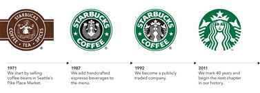
Starbucks logo has been changing a lot throughout the years. We don’t even have to take a closer look to see what they were and are going for with the redesigns. They are aiming for simplicity. Everything is becoming simpler to understand, easier to see and recognize. Logo design usually aims for meaning and identification. “The term “logo” is used to refer to any symbol created for the purpose of identification” (Vellest, 2012). Minimalism offers that meaning is conveyed almost instantaneously. Starbucks have developed so strong of an identity that they can afford to be as minimal as they can and still be recognized as the famous coffee place. They have removed the name of the brand from the logo and kept only the symbol leaving the typography as the separate part. The choice of the mascot (the mermaid), which was created based on the famous book, Moby Dick has already been made 40 years, everybody knows the symbol, and so they can afford to emphasize it even more, and leave all of the rest aside.
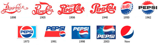
Another great example of minimal evolution in logo design is the Pepsi logo. Again, we can really see how the trends have changed throughout the years. Not only have they changed the typeface they use, but also the symbol. Only when we look at the logo evolution, we can realize that the new contemporary logo derives from the 1950’s bottle cap logo. But it doesn’t really matter that nobody knows what it means. Everybody knows what it represents. And this is what matters most. In the case of the Pepsi logo making it minimal was not only following the trends, but also making it easier to remember. Like Starbucks, the symbol is separated from the type, only showing the icon. And it is absolutely enough for almost everybody to recognize it as Pepsi.
Another really important thing to mention is the colour. The colours of the contemporary brands have gotten minimal as well. No gradients, mixing of colour, only one chosen colour that personalizes and if chosen really well embodies the idea of the brand. But they don’t always embody the same idea. Ray Vellest in the article about The Psychology of logo design wrote “Yes, colors do have additional meaning, but they aren’t set in stone. People have been giving meaning to colors throughout the centuries, and the continuous process of attributing the same meaning to the same colors again and again is what ends up solidifying it” (Vellest, 2012). The meaning of colours change, and minimalism offers us that we focus on one that really matters to us and applies to the idea of the brand itself. Green as natural and friendly, red and blue as aggressive but balanced, Starbucks and Pepsi’s colours I think contributed the most to the recognition of the brand. And minimalizing those colours helped the recognition to be even stronger.
Source that helped :
Raghav S. (2012) Sturbucks logo – An overview of Design, History and Evolution [Online http://www.designhill.com/design-blog/starbucks-logo-overview-of-design-history-and-evolution/ (Accessed 29 November 2017).
Vellest R. (2012) The psychology of logo design [Online https://www.webdesignerdepot.com/2012/08/the-psychology-of-logo-design/ (Accessed 29 November 2017).
WEBSITE DESIGN
Website design is something completely different from other branches of design. It one of the few that is never printed but is always seen only on the screen. All the way from the smallest mobile screen, to the big TV screen. And we have already reached the most important part of website design. Responsiveness. “Responsive Web design is the approach that suggests that design and development should respond to the user’s behavior and environment based on screen size, platform and orientation“ (Smashing magazine, 2017). Contemporary website design work only on the principle of responsiveness, because in contemporary era responsiveness is everything. Again let’s look at an example of contemporary website design.

A good example of a simple contemporary designed website is the website for the “taxi service” called Uber. And notice how I emphasized simple. In modern web design, simplicity, minimalism is everything. Let me explain. Website is not a book. Website are made to provide information and . when a user opens up a website, he needs to absorb the information on it as soon as he can (This is usually referred to as user experience). And this is what minimalism is. “The artist needs to clarify the core of a message with maximum efficiency so that a viewer would be able to absorb it as fast as possible” (Novin, 2016).” The given example of the Uber website, bombards us with different information as soon as possible but in an orderly fashion. Even if we don’t know anything about Uber the picture of a guy in the car, the slogan – get there and the sign up sheet gives a 4 important pieces of information: This is a car service, it is subscription based, I can either become the driver myself or ride with another driver. All of this is the matter of seconds. Minimalism as said before conveys information quickly and websites are one of the best visual examples of contemporary minimal design, not only because they are stripped of visual elements but also because there is the reason behind the simplicity. It is not only responsiveness but also user experience and the transfer of information.
Smash Magazine (2011) Responsive web design, what it is and how to use it [Online https://www.smashingmagazine.com/2011/01/guidelines-for-responsive-web-design/ (Accessed 29 November 2017).
POSTER DESIGN
In my previous blog entries I have already talked about the amazing simplicity in Lex Drawinski’s posters. But the topic I want to explore in this part is general use of minimalism in contemporary poster design.
Poster design is very peculiar, because I think in general we can separate it into 2 different “sections”. The posters that want to convey and idea and posters that provide information. And there is a big difference between the two groups. The posters that are there merely for the ideological purpose act the same way as the websites do. They need to convey the idea as soon as possible to the observers. The goal of these kind of posters are that people stop and think about the message on the poster. And as said many times before, minimalism is a way of conveying ideas quickly. On the other hand posters that need to provide information, let this be an event or a price of bread in the supermarket, need not be engaging as much, they have no deeper message to convey and are usually there to sell you something. Most of the billboards we see, fit into the second category. So the question in why are they all becoming more and more minimalistic? Lets look at some examples
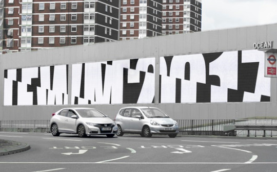
This was a series of graphics made to tie together the leading fashion events in London, made by Pentagram design agency. Even though it is beautifully simplistic and does indeed only inform us about something, we are not only intrigued by its minimalistic design, but are also interested what this is about. We suddenly became interested in a poster because it has so much to hide and not much to show. Minimalism hides complexity. And this is really important in the contemporary era, the era of bombardment with visual “trash”. Contemporary poster design has become minimalistic especially because of that reason. The poster that fit into the second category, the informational one don’t bombard you with information nobody reads, they give you a reason for you to want to know more about them. And here, the minimalism plays the leading role.
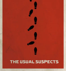
Sometimes though, posters not only try to convey the idea but also give us an insight into something particular. I have always liked minimal movie posters, the ones that were also made famous by Saul Bass. The really good ones, not only catch our attention, but provide us with visual clues, insight information about the movies and the stories itself. I am particulary keen of the poster for the movie The usual suspect made by an Matt Owen. It embodies the idea of the movie and provides you with an amazingly simple but at the same time very important clue that can if one is smart enough reveal the plot twist of the story. In the end this is exactly what makes minimalism so beautiful. It tells a whole story with so little elements. And this is why it has become so popular. We are fed up with complexity in our everyday lives. We need something simple yet insightful and this is exactly what minimalism offers.
0 notes
Text
Blog 7
SOURCE 5:
THE FUTURE OF GRAPHIC DESIGN
The article was written by Peter Maybury, and it talks about the future of graphic design. This may be useful, because I want to explore how the future of design will be and how it will be influenced by contemporary minimal design.
In the beginning of the article, Maybury identifies what “the future” actually means. He describes that the expression “future” can have different versions (possible, probable or aspirational). In the article he talks about the aspirational one, the future that “has occured in modes of communication, access to information, and perception and definitions of environment” (Maybury, 2016), therefore evaluating it as the best one to describe the future of design. He also interprets that the transitional period that is so talked about may have already happened. “Public and private, hardware and software, real and virtual, external and reflexive, work and leisure, consumption and passivity, information and noise, are all being renegotiated, so it seems less like transition and more that a new paradigm already exists, we are just catching up. (Maybury, 2016)”. He continues with the description of graphic design “graphic design is the commonly accepted term for various activities relating to (visual) communication” (Maybury, 2016), and evaluates it as a bad description, because the technologies around it evolved, but the term was kept unhanged. He also evaluates the problem of Graphic design, as it is often described as the “add-on” to a larger design process but for him it is an activity firmly rooted in thought, which is often called design thinking and it combines creativity and analysis. Maybury uses Cage’s observation that design is holistic, collaborative, conceptual, intellectual and it is about people. He also evaluates these tools for very powerful ones. In the end he describes the roll of designers to be merely the shapers of the content, but theorizes that the future is a chance for graphic design “to redefine itself, to un-annex itself from the larger design process… to not only shape but to author content, and societal concerns” (Maybury 2016).
The article was probably inspired by the literal description of Graphic Design, which the author claims has lost its meaning during the years. Times change and design is not only, and will not only be about shaping the content but authoring it as well. He claims he “approaches design as a joint venture, a series of exchanges between the various parties involved” (Maybury, 2016), which I think is very true, because as the author also explains, that “convergence is everywhere – public and private, hardware and software, real and virtual, external and reflexive, work and leisure, consumption and passivity, information and noise,.. “ (Mabury, 2016).
“To talk about the future of graphic design we must first determine the parameters of ‘the future’ and of ‘graphic design’.” (Mabury, 2016)
“While we could say we are in a transitional period, the walls and ceilings have already eroded – convergence is everywhere – public and private, hardware and software, real and virtual, external and reflexive, work and leisure, consumption and passivity, information and noise, are all being renegotiated, so it seems less like transition and more that a new paradigm already exists, we are just catching up.” (Mabury, 2016)
“The heart of the problem is that Graphic Design is widely held to be an add-on aspect of a larger design process.” (Maybury, 2016)
“I approach design as a joint venture, a series of exchanges between the various parties involved.” (Maybury, 2016)
“[The future] is a chance for ‘graphic design’ to redefine itself, to un-annex itself from the larger design process; more central to an integrated, holistic process, working collaboratively to not only shape but to author content, and societal concerns.”(Maybury, 2016)
Maybury, P. (2016) The future of graphic design [Online]. https://www.petermaybury.com/the-future-of-graphic-design/ (Accessed 22 November 2017).
SOURCE 6:
THE FUTURE OF GRAPHIC AND COMMUNICATION DESIGN
The article was written by Juliette Cezzar, and it talks about the future of graphic and communication design and how it will affect the designer’s work. Again, the article may be useful, since I am exploring the possible future of design.
In the beginning of the article Cezzar says that it is not enough “to think about new hardware, corporate needs, or visual trends.” (Cezzar, 2017). He theorizes that “digital design will move beyond screens to physical surfaces and augmented or artificial environments, and designers will occupy more positions where they are directing or consulting on larger and more complex systems of experience.” (Cezzar, 2017). He also goes on by evaluating the contemporary design as less visual but more collaborative and claims the future of it will be like this. Next, he analyses the issue graphic designer as an object in the work place. He theorizes that work is changing and “companies of all sizes have been rethinking 1950s models of working” (Cezzar, 2017). Furthermore, he also theorizes that in the next 20 or so years, the workplace itself will take the leading roll, and public perception of what goes on there has never mattered more. Here, the author is implying to the quality of the design teams. He explains this, by analysing how and why bigger companies higher designer. He theorizes that bigger companies higher in-house designers when they are in a growth mindset, and when they focus on maintaining and not growing their business they outsource to individuals, studios or agencies. Cezzar than theorizes that design positions are vulnerable to automation, because they are becoming more and more digital meaning where and when your work does not have a bad impact on the company. In the end analyses that even though, in the future when the rolls of the designers, will change there will be more design problems to solve, not less.
The article, was probably inspired by the author’s realization that the future is here, and the graphic designer’s work will change. He makes a valid point when he explains why certain design jobs are needed and why the companies actually higher designers. Although, In the end he gives a positive outlook to the future of design, and says that there will always be design work to do, even if some part of it is highly prone to automaton.
“In the short term, digital design will move beyond screens to physical surfaces and augmented or artificial environments, and designers will occupy more positions where they are directing or consulting on larger and more complex systems of experience" (Cezzar, 2017).
“Companies of all sizes have been rethinking 1950s models of working” (Cezzar, 2017).
“Where design is integral to a company’s product or service, people look at the size and quality of their design teams to predict their future success” (Cezzar, 2017).
“If the bulk of your work and communication is digital, deciding where you work and when you work already has less of a negative impact on your company or team. This lack of tangibility, though, also makes many design positions vulnerable to automation, especially those that are reliant on interpreting data, or strictly bound by rules or processes” (Cezzar, 2017).
“Finally, when there are no job titles, when all of the tools have changed, when the role designers play in the larger culture have completely changed, there will be more design problems to solve, not less” (Cezzar, 2017).
Cezzar, J. (2016) The future of graphic and communication design[Online]. http://designobserver.com/feature/the-future-of-graphic-and-communication-design/39668 (Accessed 22 November 2017).
0 notes
Text
Blog 6
SOURCE 3:
HISTORY OF MINIMALISM
The third source, is the article written by Guity Novin. Since I am writing about the influence of minimalistic design on the future of design, the article, among other things, talks about the history of minimalism, which is important for concluding how the future of minimalistic design unfold. She also writes why minimalistic design good design.
In the beginning the author creates an introduction to minimalism, by explaining (with visual examples) why thinking minimal can not only be easier, but also more productive in design. She theorizes, that the “capacity of various communication vehicles for conveying a message is limited, and the viewers time for the gleaning of a message is scarce, the artist needs to clarify the core of a message with maximum efficiency so that a viewer would be able to absorb it as fast as possible” (Novin, 2016). She uses the quote of scientist Herbert Simon, "What information consumes is rather obvious: it consumes the attention of its recipients," to theorize that the more information the given media gives, the less attention it will get from a potential viewer. She continues by stating that to capture the attention of the viewer the message needs to be clearly exposed and uninterrupted by irrelevant disturbances. To support the claim, Novin gives 3 examples of Red Cross posters that convey the same message.

She continues with the “analysis” of the 3 images, describing them in semi-detail. In the end she makes the conclusion that, you can remove the text in the images and the message will be still conveyed to the viewer. Although not necessarily stated, we can also conclude that by stating this, the author evaluates the minimal design as a better form of visual communication.
In the second part of the article the author gives a quick “tour” through history of minimalism. She theorizes that Black Square by Kazimir Malevich that was made in 1915, is an icon representing minimalism and the most celebrated piece of Russian art in the 20th century. She continues with the example of the De Stijl movement that was organized by Theo Van Doesburg, and analyses that the movement emphasized the need of abstraction and simplification. Novin than theorizes that “This abstraction was the conduit for artists to explore and universalize their new minimalism aesthetics”(Novin, 2016).
In the last part of the article, the author focuses on the history of minimalism in the USA that started in the 1960’s. She theorizes that in America the movement started as a reaction towards the flooding of the Abstract expressionism. Novin goes on by saying that Warhol was the father of American minimalism because of his reduction of elements on the canvas to the very minimal, meaning that any further reduction of elements would alter the image drastically. She supports that by with the Einstein’s razor in which he says: “Everything should be made as simple as possible, but no simpler." Novin than continues with other examples of American minimalists, such as Frank Stella, James Rosenquist, Elsworth Kelly and Ad Reinhardt.
The minimalistic movement did not just appear. It comes from the idea of removing elements from the canvas in order to make it easier and clearer for people to understand. Especially in the beginning of the article, Novin was probably inspired by the contemporary era when she was writing this article, and how limited amounts of time in our busy lifestyle affect the way we may perceive visual media. I think that this is one of the reasons, why she tried to explore the idea how time and elements on the “canvas” affect the viewer’s perception of the message, the given media is trying to convey.
“The aim of graphic design is to elucidate a specific visual message and communicate it to a wide range of audiences.” (Novin, 2016)
"What information consumes is rather obvious: it consumes the attention of its recipients” (Simon H., Unknown)
“Capacity of various communication vehicles for conveying a message is limited, and the viewers time for the gleaning of a message is scarce, the artist needs to clarify the core of a message with maximum efficiency so that a viewer would be able to absorb it as fast as possible” (Novin, 2016).
“To capture this rarefied attention, the massage needs to be clearly exposed, that is to be laid open to view and to be unconcealed and uninterrupted by irrelevant disturbances.” (Novin, 2016).
“Black Square against white background became the symbol of non-representational art of the past century and an icon representing Modernism which by the late 20th century descended into the realm of absurd and vulgar. (Novin, 2016)
“De Stijl means ‘The Style’, in Dutch, and the aim was to create an international art in the spirit of peace and harmony” (Novin, 2016)
“The movement [De Stijl] emphasized on the need for abstraction and simplification, and concentrated on the dimensions of forms and colors in abstract from nature.” (Novin, 2016)
Novin, G. (2016) Minimalism [Online]. http://guity-novin.blogspot.cz/2010/03/history-of-graphic-design-minamalism.html (Accessed 15 November 2017).
SOURCE 4:
ART AS A COMPASS FOR DESIGN
The article that was written by Martin Hohmann talks about the connection between art and design. This can be very useful for me, because a lot of sources explore the history of minimalism through art and not design. Therefore I want to find connections between art and design, to use the historical theories in minimalism correctly in my thesis.
In the beginning Hofmann theorizes that not enough designers spend time looking for inspiration in modern-contemporary art. He evaluates it as a bad thing, and supports the evaluation by claiming that in the post war era of the 20th century, not only designer, but also architects and composers, were all influenced by the 60’s and 70’s minimalism. He continues, by saying that :“this is a reoccurring net of links that weaves within every century and decade” (Hohmann, 2013). He also theorizes that all of the movements were created by reflecting the world we live in. Furthermore, Hofmann says that “art has always been… the indicator of how we are thinking and how our society manifests itself, from thought to philosophy to attitude” (Hofmann, 2013). He continues by interpreting design as a purposeful media, and art as an expressive one. Nevertheless, Hofmann sees the connection between design and its audience really important. He claims, that we should not design for designer but for all people, people that were already shaped by culture and popular artefacts. In connection to that, Hofmann says that “we need to objectively step outside society and understand how culture manifests itself. That’s when art comes in” (Hofmann, 2013). He evaluates the design connected to art as a better design. Not only it will bring the design closer to the audience but it will become simpler to understand.
The article was written by Hofmann, because he noticed that all design, especially the design in the 90’s was starting to loose its purpose. “It all started in the late ’90s when designers seemed to be copying other graphic work or trying to be clever or futuristic just for the sake of it” (Hofmann, 2013). In the end I can easily connect the idea of art and design relationship with the idea of minimalism. Bringing it closer to the audience and making it simpler to understand.
“It all started in the late ’90s when designers seemed to be copying other graphic work or trying to be clever or futuristic just for the sake of it” (Hofmann, 2013).
“Our visual intuition (and that includes everyone: “us” as in designers, business strategists, clients and anyone who is exposed to a commercial artifact) is shaped by our time and the culture we live in” (Hofmann, 2013).
“Successful works of art embody our cultural state in their form and message” (Hofmann, 2013)
“As designers, we should not forget that the work we create will be judged by an audience that was already shaped by culture and more or less popular art(ifacts)” (Hofmann, 2013).
“We need to be careful not to design for designers, but for all people, and we owe it to our clients to do so. This means we need to objectively step outside society and understand how culture manifests itself. That’s when art comes in” (Hofmann, 2013).
Hofmann M. (2016) Art as a compass for Design [Online]. http://www.howdesign.com/how-design-blog/the-relationship-between-art-and-design/ (Accessed 15 November 2017).
0 notes
Text
Blog 5
SOURCE 1:
MINIMALISM
The article explains what minimalism in art is and how it evolved through time. The article does not have a known author.
The author uses some the theory in art criticism to give examples why minimalism evolved. The author explains that minimalistic artists rejected the personal expression, because it only works as a distraction to the art object. The materials used are also non-referential. The author than uses “description” to support that claim. Minimalism uses repeated and geometrical forms, it is usually 3 dimensional with simple colours and factory- manufactured materials. It offers a highly purified form of beauty. The article, however does not include the evaluation of the artworks, keeping the minimalistic and objective feeling.
Furthermore, the article does a good job at summarizing what minimalism is and how it evolved. The author says, that most of the time we look for things that an artwork that is in front of us could represent or what they could reflect, weather this is a soup, a landscape or a person. But minimalism persuades the viewer to only think and respond what is in front of them. The article also links the creation of minimalism to conceptual art which was not about the art piece necessarily, but the concept and idea behind it. Both art movements tackle the idea that art itself should not be that important. What is important is what the observer thinks about it.
“Minimalism is an extreme form of abstract art developed in the USA in the 1960s and typified by artworks composed of simple geometric shapes based on the square and the rectangle” (Tate.org, 2017)
“Minimalism or minimalist art can be seen as extending the abstract idea that art should have its own reality and not be an imitation of some other thing.” (Tate.org, 2017)
“Aesthetically, minimalist art offers a highly purified form of beauty” (Tate.org, 2017)
Tate.org, (2017) Minimalism [Online]. http://www.tate.org.uk/art/art-terms/m/minimalism (Accessed 8 November 2017).
SOURCE 2:
MINIMALISM IN DESIGN
This source is an article written by Naomi Bassey. In my research and thesis I will try to explore the influence of minimalism on future design and this article explains what minimalism in design actually is, which is a helpfull start.
In a quick explenation, the author gives a couple of examples of how minimalism is used in graphic design in contemporary era. Through analyssis, she argues that in minimalism simplicity is interlaced with functionality. She evaluates simple design, minimalistic design as good design, because it is conveyed through clear communication and helps the viewer focus on what is important, rather than be distracted by the clutter of other elements. When she talks about the revolutionary era of smartphones and digital evoultion, she uses the »theory« part of art criticism to explain, that by introducing smartphones and smart-devices that need responsive design, we are obliged to remove the unimportant clutter and focus only on what is important. We therefore must be Minimalists.
Minimalism is connected to simplicity and clearness. The author argues that simplicity in design has one purpose. To empower a brand purpose. She continues by saying that simplicity allows the brand to speak more clearly and encourages all design elements to be showcased. But she also warns that going headless for the minimalistic approach does not always work. Some designer forget the audience first design, which is of course contradictory to the meaning of minimalism. Simplicity is key and in minimalism everything has to have its purpose. Less is not always more, or sometimes less is too much. ( Bassey, 2016)
“The term ( she means minimalism) reflects function over form, well utilised space, a balanced harmony between elements such as beautifully refined typography, or a well crafted and, sometimes, geometric illustration or decoration.” ( Bassey, 2016).
”Minimalism should not be confused for empty space for the sake of empty space...Without putting the audience first you can run the risk of creating a bad experience…” ( Bassey, 2016).
“What we now see in design is a clear focus on content or the message, without clutter from other elements.” ( Bassey, 2016).
Bassey, J. (2016) Minimalism in design. [Online]. https://hatchedlondon.com/minimalism-in-design/ (Accessed 8 November 2017).
0 notes
Text
Blog entry 4
Something about ideology and Lex Drawinsky
Ideologies change. So does the meaning of them. Throughout the history many explanations of what “ideology” is, have been said and written. “A system of ideas and ideals, especially one which forms the basis of economic or political theory and policy”, has been the most recent explanation found in the oxford dictionary. However, let’s talk about what ideology is to a person and how it could be portrayed through his work. First of all, ideologies are subjective, because the ideas and ideals that they represent change from person to person. Furthermore, someone could understand a certain ideology in a way that no one else can, because of his background, social status or any other reasons. This has a particularly great effect in art and design. A lot of art related works not only through the 20th century but also in the 21st century are trying to express an idea, political opinion, they try to tackle all sorts of world and social issues and therefore the creators of these works follow a certain ideology that they want to convey to the viewer of the artwork.
A contemporary German artist called Lex Drawinski, is famous for his clever way of conveying his ideas, beliefs and ideologies through his visually attractive and minimalistic poster design. So in this part, I will explore the ideas behind some of his works.
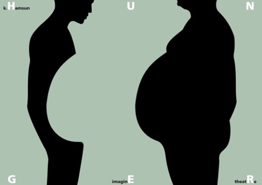
One of his earlier artworks tackles the problem of poverty. In a broader perspective, Drawinski was also trying to criticize capitalistic ideology and what effect it has on power over people. So how does he do that? On the poster, he portrays 2 people. One with a rather large stomach and another figure which has the equal amount less of his stomach. It seems to the viewer, like the figure on the right “stole” the stomach of the left figure. Furthermore, the right figure, also has his head higher and seems a little taller than the figure on the left. The letters on top and bottom form the word hunger. Drawinski made a really straight-forward and aggressive statement here, that tackles the problem with capitalistic ideology and how in capitalism, rich people not only control the lives of others (higher posture, head held high), but also take what should be granted for everybody in the world. Food. But the idea that Drawinski was trying to convey may not be clear to everybody. We automatically associate a figure on the right to a rich person, because this is the image that we got implemented into our heads throughout our lives, even though it is definitely not a real representation of somebody who has a lot of money. And an understanding that the person on the right is somebody rich, is key for understanding that the work is a social-economic critique. Therefore the capitalistic critique does not always work. The understanding of an ideology and ideas is connected to the experiences that the observer has had. And not always does the critique and the idea reach the viewer.
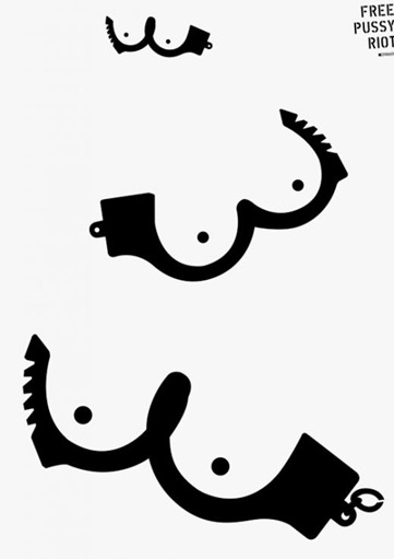
An example of a poster’s idea not always reaching at all can be this poster from Drawinski. To understand it you not only have to recognize what the imagery represents (which is indeed not that hard) but also need the background and the story that triggered the creation of the poster. If you don’t, the poster becomes meaningless and the ideologies behind it get lost in translation. So what is it about? Drawinski created this poster right after a punk-rock group called “Pussy Riot”, got arrested and sent to jail, because of their Controversial and politically provocative performances in Moscow, Russia. Drawinski therefore not only critiques the choice of Russian government to arrest the group, but also embreaces the group’s ideology of free speech behind the performances and tries to persuade the viewer onto doing the same.
But sometimes the different experiences lead to ideas expressed through the artwork to be understood in more than one way.
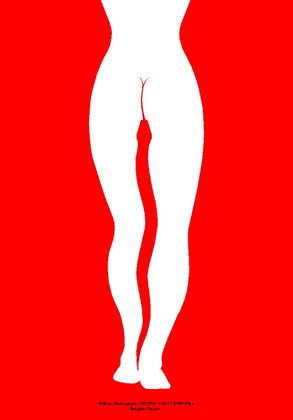
Let’s take a look at this poster from Drawinski called Antony and Cleopatra. It represents a simple shape of a woman lower body, that has a snake between her legs. But WHAT does is represent? As observers we try to explain the meanings and ideas of works to ourselves and these explanations are based on our own ideologies, experiences and knowledge. The snake is a symbol of immortality, and femininity, so Drawinski could easily be referring to that. There is also a more general symbolism of a snake. Evil and Drawinski could easily be making a gender critique. Furthermore, Drawinski could also be referring to not only the Shakespeare play called Anthony and Cleopatra , but also the love story between the two. If we read the title we can than associate the idea behind the poster with the story (if we know it) and how Cleopatra dies with a snake bite. So what was Drawinski referring to? I think there is no correct answer. And in the end it all comes down to the viewers personal ideology and experience. If the viewer is strongly in favour of gender equality, he will take this poster as an insult. If the viewer is a historical enthusiast he will recognize the story. If the viewer knows all of different symbolisms behind the snake the poster may not seem offensive at all. In the end, it all comes down to YOU. With the same artwork, different understandings and different ideologies are conveyed. And every person perceives them differently.
0 notes
Text
Blog entry 3
Something about me
It is interesting how people say that you find your interest of what you would like to do in life, in school, but I realized that that is almost never the case. We find our passion, our interests through other media, and the biggest influence when it comes to interests and creativity has and always will be the family and the enviorment you grew up in.
Since I've been a child, there were always paintings and sculptures hanging in our home. So many of them actually, that they usually filled up every empty space on the walls around the apartment. The weird thing was, now that I think of it, is that I've never asked myself WHY there are so many of these just hanging around. I wasn't really a curious child you see, but my parents did definitely tell me why and where they are from, but I guess that I just was not interested at all. It was only at a later point in my life, that I started getting intrigued by the different watercolour landscapes and weird (sometimes scary looking) sculptures. That was probably around the time when I was old enough to go and visit my friends’ houses and realized that not everybody has these weird things at their place. Well at least not in a number we do.
I come from an artistic family. Well I guess I could call it semi-artistic. My grandfather by my mother’s side, which I sadly didn't have a chance to meet, was an artist himself. Well, a painter and a sculptor, that also studied arts in Prague (also one of the answers to a question I’ve been getting recently, why Prague). My mother picked a lot of the artistic sense she has from her father, but sadly, never became an artist. As does taste, interests also carry around through family’s blood, and I think my mom always secretly wanted me or either my brother, to become an artist. She just never wants to admit it. I can remember many times when I was child, that she unknowingly persuaded me to write, or talk about artists or art for different projects in school, or just being involved with art in general. I guess this is also the reason why a bronze cast of my head that was made about 10 years ago by a friend of ours, has been sitting on top of our piano in our house. It would seem that throughout the years I somehow absorbed that persuasion, combined it with my other interests and decided to be graphic designer.
Something about politics, nationalism, and creativity
I think that political talk especially in our national culture, is almost always separated from one’s work (well of course it isn’t if you are a politician, but we will leave that aside at the moment). So what do I mean with that. Politics is a topic everybody always wants to talk about, especially the younger generation but is never actually talked about. We talk about politics over a coffee, a beer at lunch time, at home, but we never talk about it at work. There is a saying, “to never mix politics with your work” and I think that this originates from the idea that political opinions differ and to talk about them in a work environment is simply not appropriate. Now, graphic design is different. It gives an opportunity and actually encourages designers to tackle political problems through their work, since every designer is definitely sure that a poster can undeniably change the world. But I wouldn’t say a lot of my work is political. I guess that I belong in that first group of people, and I inherited a little bit of Slovenian DNA. But maybe you misunderstood me. Not that I don’t want to express political opinion through my work, but I don’t really find the need to do so. I rather talk about politics over a beer, coffee at a restaurant or at home. But there is another really interesting thing about us Slovenians. We are extremely nationalistic. Especially the older generation that witnessed the independence of Slovenian nation and the fall of SFR Yugoslavia. Which is contradictory, because the general opinion about the economic and political state of the country is far from good. Well a lot of people not only think it is far from good but agree that it is actually really bad. Moreover, that means that like every artist has a little bit of himself in his work, every Slovenian artist has a little bit of Slovenia in his work. Now I was born 6 years after the independence and the inner “nationalistic me” is not that strong, which you could have already realized since I study in Czech republic. Therefore my work is nor political neither really Slovenian, but I think that is not a bad thing. Getting stuck in the old nationalistic mind-set is not good. I tend to focus on design trends, designers that are my “look after” and focus on the future rather than on the past.
So the question in the end is does all of the above effect the creativity of the designer. And I think it absolutely does not. Part of creativity originates from interests and interests differ from person to person and other part from knowledge. I am trying to extend the knowledge of design, its history, present, and future and apply that to my designs rather than anything else. All in all for now I am concentrating on what I am interesting in, and leaving the political, economical and other context be just a part of the conversation over a beer or a coffee.
0 notes
Text
Blog entry 2
Something about meaning in design
Art is subjective. Therefore, to assign meaning to an artwork can sometimes be tricky. Mostly because every person interprets the given art in a different way – hence the subjectivity. Artists and philosophers have therefore spoken and written many theories, about the interpretation, communication and finally meaning of art, through human history (there is even a whole part of philosophy dedicated only to beauty and taste, called Aesthetics). One of the theories is called, semiotics.
Semiotics is a study of meaning making. It takes the idea of the dependence of language on conventions and codes and it applies it to image analysis through adaptation of 3 guys :
Pierce, a philosopher and a mathematician who had an idea that 3 kind of signs exist; Iconic, indexical and symbolic.
Saussere, a Swiss linguist and his idea, that relations between things and words are not fixed and are dependent on the signifier and the signified.
Barthens, philosopher and linguist and his idea that images images are produced according to social and aesthetic conventions and can therefore be assigned a denotative and a connotative meaning.
Let’s explore some of these principles through examples.
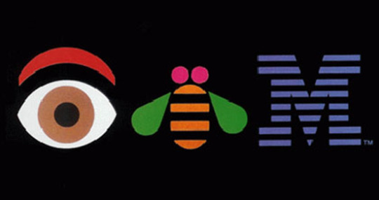
The first chosen imagery is a well- known one to all the designers around the world. It is the IBM (eye-bee-m) poster from a famous designer – Paul Rand.
To denote means to indicate, to be a mark of, to signify, therefore denotation is a translation of a sign to its meaning, well precisely to its literal meaning. So what are the denotation in Paul Rand’s IBM poster? I think we can guess that from the name can’t we? The denoted meaning is therefore an eye as a human organ, a bee as an animal, and a letter M. As simple as that. However, there is something more than just 3 random objects to this poster. Moreover, this is where connotative meaning comes in play. Connotation is a secondary meaning in addition to its primary meaning. Before the creation of this particular poster, Rand created one of the most famous logos to date. The logo for an international business machines corporation (one of the largest multinational technology company)- the IBM logo (hence the eye and bee). In 1981 Rand deigned this poster based on the this logo. His idea was to create a visual rebus that not only engages the reader but also humanizes the big corporate giant through a fun rebus. Eye and a bee therefore connotes fun, friendliness, simplicity and help the viewer’s emotions connect with a strict, technological giant such as the IBM. However, I think that it is safe to say, in this particular poster, that more connotations can be seen. I think the bee and an eye can also connote the letters that they are meant to represent. E and B. Clever Paul, Clever!
Now let’s explore the signs used in the poster. An iconic sign is a sign where the signifier resembles the signified. Therefore, the iconic sign in this particular poster can the bee and an eye. Why? Well both of these represent what they are meant to represent the animal-bee and a human vision organ-eye. However, they can also be seen as the indexical signs. The indexical sign is a sign where the signifier does not resemble the signified. In this particular example the bee and an eye represent something you hear when you say the names of the objects because of the pronunciation. An eye (you hear the letter I) and a Bee (you hear the letter B). It is worth noting that language has a big effect on the indexical signs, and this is clearly shown in this example, because this poster only makes sense in a language it was designed, English. The last group of signs are called the symbolic signs. The meaning of symbolic signs is assigned arbitrary and should be learned. The symbolic meaning of a bee is therefore something natural, fun, hardworking. And the symbolic meaning of an eye is vision. The vision of a brighter, better, more technologically advanced future the company.
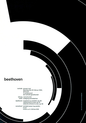
This is one of the most famous posters from Joseph-Muller-Brockmann that was made in 1955 for an event and was suppose to portray Beethoven’s music through its visual style.
But we are more interested in its communication through the meaning it is trying to portray. So, what is the denotative and connotative meaning of it? I think that again, the denotative meaning is easy to find. It is after-all just a poster with some typography and black geometrical patterns. The denotative meaning is therefore just that. Because of the abstract shapes it doesn’t even represent anything specific and therefore the shapes just remain the geometrical circular shapes, and the poster well remains just a poster. The words than, represent Beethoven as the musical artist and time and place and other information of the event. But the connotations are different. With the circular shapes, Brockmann was trying to recreate the feel Beethoven’s music. The geometrical shapes represent the complexity and form of his music, while the circular shape imitates the completion and how he always brought his music to a satisfying and. All of this ideas are then transferred to his name written with small case on the left. It is interesting how Brockmann connected the visual representation of his music to his actual name. It is therefore safe to say, that the name Beethoven not only connotes the artist, his music and his impressive life work, but also the imagery presented on the right.
The signs that Brockmann used are interesting as well. Iconic signs of this poster are therefore what we see. That would mean the iconic sign is again, the geometrical circle, which also some may argue is in a shape of a music note.
On one hand, the indexical sign are a little harder to find. There is I think one indexical sign that is harder to explain but quite interesting. Most of Beethoven’s music was written in minor scale, and minor scale is said to be sadder than for example major scale (Mozart). Therefore the black colour used can also be an indexial sign of a minor scale, because of the feelings it represents.
On the other hand, there are many symbolical signs. For example the black colour, symbolizes something said, sometimes grief and even death, and I could guess that Brockmann used it because he felt that Beethoven’s music portrays this kind of feelings. Overall, Geometrical shapes symbolize precision, complexity and the circle is a symbolic sign for something closed, tight, like the symphonies and his in music in general tended to be. Furthermore, the word Beethoven is definitely and symbolic sign. The word has nothing to do with one of the best musicians in history. They are just a combination of letter and sounds, that make up his name. But they do not represent the artist itself. It is interesting, for example because that the name can be written in different alphabets (Chinese ,Arabic,…) and therefore confirms the theory that it is just an symbolic sign.
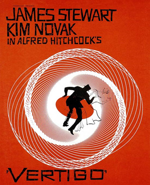
The third and final image, is poster from a well- known designer – Saul Bass. It is a movie poster, that he created for one of Hitchcock’s blockbusters, Vertigo.
The denotative meaning of this poster as a whole, well that this is a poster. Nothing more. What about the elements that are included on the poster and their denotative meaning? The black shape in the middle is a man wearing a hat, that is surrounded by uneven geometrical spirals which turn white in the middle. We read the director’ name - Hitchcock and two of the main actors. We can also see the word vertigo which denotative meaning is “a medical condition where a person feels like the object around him are moving”. And this is where it gets interesting. The whole idea and therefore connotative meaning behind the poster, actually derives from denotative meaning of the word VERTIGO. Bass, therefore applies the denotative meaning of the word to the spirals and the men in the centre, giving them a connotation. Therefore, the connotative meaning of the men and the spirals is the confusion, dizziness, you get when experiencing vertigo. Similar to Brockmman, Bass connected the words and at first glance unconnected images, brilliantly and clearly.
Let’s explore the signs as well. The iconic sign in the image is of course the silhouette of a man, a middle age gentlemen to be exact, and we can gather that from the type of hat and a suit he is wearing. Another iconic sign are the lines that together make a circular composition called a spiral. Furthermore, the symbolical signs can also be found in the man and the spiral. The spirals are usually a symbol of something that moves, circles, and it is the same in this poster. They are a symbol of vertigo that the artist is trying to show. But the most interesting one mention’s the weird spiral again. I would say, that way spirals are drawn and the way they start coming together until they are just white space is an symbolic sign of falling, and the artist showcases this in and interesting way. The symbol of falling is therefore interlaced between the spiral the orange circle and the man.
I think there aren’t many indexical signs.I think that with the idea of falling and dizziness we do have a correlation with the medical conditions and this can therefore be viewed as an indexical signs.
0 notes
Text
Communicative art writing (Blog entry ONE)
It is hard to imagine a world without communication. Communication is important. Wherever and in whatever form it may appear. We communicate through speaking, watching, listening, we even communicate by forms of body and sign language. We communicate with people we do not know, people we have never seen or heard, sometimes we don’t communicate with people at all. However, without communication, there is no us nor the world we live in. With communication, we convey meaning. Design is the leading communicator with people in modern world. Posters, flyers, logos, business cards, billboards, commercials, computer screens, phones and many, many more things we see and are used to seeing on a daily basis, are a product of design that has something to say. Every form of design, therefore has its own meaning. How do you than, as a designer, through design, properly communicate your ideas with the very subjective mind of the observer?
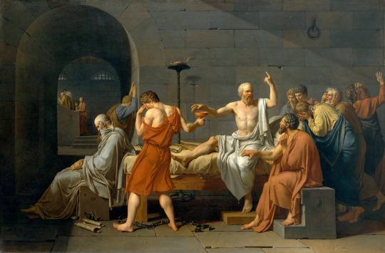
This is The death of Socrates by Jacques Luis David. It is an oil on canvas and it was painted just two years before the start of the French revolution in 1787. It is one of my favourite paintings of all time since it is more an achievement in its meaning and interpretation rather than it is in its technique. Although we definitely should not overlook the artist’s technical skill of many precise brush strokes for the depiction of fabric, bodies and the separation from a simplistic and flat background in this almost 2 meters wide neoclassical masterpiece.
As the title already suggests, it depicts the death of Socrates (middle) which was put on trial for impiety and corruption of the youth of Athens and decided to perform his execution himself, by drinking poisonous hemlock (jar in Socrates hand) in 399 B.C. Furthermore, the painting can be read in 2 directions from right to left and vies versa. On the right, David portrayed Socrates followers as the ones in grief, continues with Socrates (in white) himself and one of his most respected students Crito with whom the artist itself relates a lot (signes his name on his chair). The Socrates with one hand leaning over the hamlock and the other one in the air, conveys the idea, that philosopher’s ideology does not end with his death. David continues with the “executioner” in red (mind the difference of colour in clothes between him and Socrates) and ends with Plato in the end. Plato at the time of Socrates death, was only a child, therefore the painting can also be read from left to right. The imagery seems to explode from Plato’s head as if were a memory. Plato remembers Socrates and mourns in grief. It should be noted that Plato praised Socrates in many of his works and the story of his death is described in his Pheado, which was Daivd’s principal source. This is why he signs his initials for the second time on Plato’s chair as well.
Jaque Louis David “invented” neoclassical era and showed us that an entire story can be told through a still image. It truly is a work of art.
Nerdwriter. (2015). How to read a paitning: Death of Socrates. [Online Video]. 20 March 2015. Available from: https://www.youtube.com/watch?v=rKhfFBbVtFg. [Accessed: 17 October 2017].
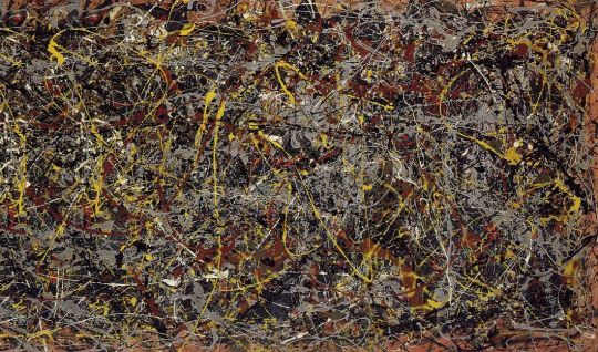
Jackson's Pollock number 5 was made in 1948. It is oil on fiberboard, measures 2.4mx1,2m and it resembles a drawing of a child that doesn't mean anything. There I said it. I don't like this painting and I probably never will. It was sold at an auction for 140 million dollars.
I made and wrote a research paper on Pollock last year, only to get a deeper understanding of why and how he did his work and maybe if his work has a deeper meaning that I so aggressively seek in every artists work. But it doesn’t. It means nothing. Pollock said, he was trying to find new ways of expression on canvas, that is why he invented the dripping technique. And so as he was painting his later paintings (this is one of his newest ones) he wasn’t thinking of anything. He just painted.
Therefore people assigned the meaning to his work, because we as do I, so aggressively seek the meaning in everything. I have heard many different interpretations of what this painting could mean. But all I can think of is this: Would we still have Jackson Pollock if he knew what he was painting?
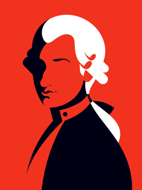
Malika Favre is definitely one of my favourite artists of all time. This particular work is named Mostly Mozart and is a poster that was made for 2017 Lincoln's centre musical season. The title already describes what the poster represents W.A Mozart. Her art is always presented with flat, Plakatstil inspired imagery, which Favre as many other contemporary artists popularized.
The intriguing part especially in flat design is, that it is meant to be beautiful. Aesthetically pleasing rather, since beauty is a too subjective term. The meaning of the work (not like neoclassicism) always loses its identity. And interestingly enough this aggressiveness inside of us, that always looks for meaning in things, fades away. We, start to admire the beauty of the work, focusing on maybe the shear complexity of the work, rather than on its meaning. And so, Favre’s work is just beautiful. It always represents what it needs to represent. It never exceeds the limits of simplicity and it never needs the attention of the assigned meaning.
All in all, this why her work and many other artists like her, are popular in this day of age. They offer a form of relaxation where, as an observer, you can take a minute to relax from all the bombardment of graphical noise in the world, only to enjoy the work and think nothing more but only how exceptionally beautiful it is.
0 notes