
Don't wanna be here? Send us removal request.
Statistics
We looked inside some of the posts by blogvishaldahiya-blog and here's what we found interesting.
Average Info
Notes Per Post
2
Likes Per Post
2
Reblog Per Post
0
Reply Per Post
0
Time Between Posts
1 month
Number of Posts By Type
Text
17
Last Seen Tumblr Blogs


Fun Fact
Forty percent of Tumblr users are between the ages of 18 to 25.
Text
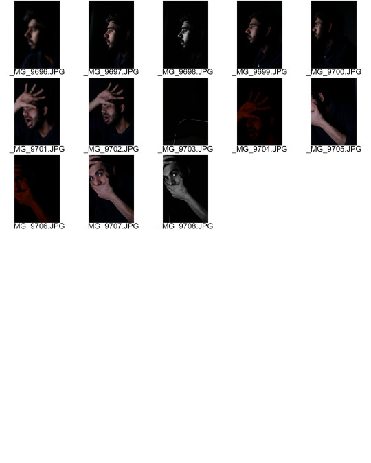
final images analysis
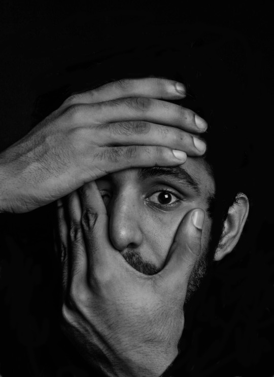
Subject is in the dead centre create composition. As the one eye is hidden direct notice goes to the open eyes. Hands covering the face fills the frame which leads viewer attention to open eye and makes it a focus point.. During depression first thing we notice is that our eyes changes, our pupil dilate and we become sensitive to light.
For this image I imagined that my camera is a mirror and I am checking or representing how my eyes have changed. I used short light for this to add a character in the image.

through consideration of sadness I photographed this image. I used the spilt lighting in it and placed it very near to myself so that intensity in the image is create. reason for putting light on the half side of the face was to create secrecy and sense of denial.
I think the hand on the face creates the sense of innocence and plays an significant role in construction proximity between the ambience and hand itself.

the image portrays tension, stress and isolation. face is partially seen because I had a intention to depict or insight into what it is like to be depression.
I put my soft box in front of the face and set the camera besides the face to get a different perspective of it.
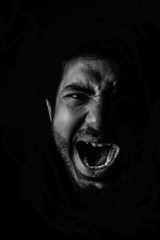
The image evokes the frustration and outburst. speaks a lot about the issue. it gives a feeling of being trapped and intention to get out form the situation.
I think this image will cause a response in the viewer might be through scene or abstract treatment. scream itself most powerful part and will offer interpretations.
Although it is a outward expression, but if poorly executed, it can be seen as mocking and provocative.

it seems confessional. hand shape shows the complexities of mental health. it also communicates with other who shares same afflictions to talk about it more and have a conversation.
I think its a great example of action speaks louder than voice. I preferred short lighting for this so that face and hand is fully visible. high contrast and depth are the elements for which I used it.

it shows an impression of being fed up and overthinking. it about how at last people get fed up of by this and start to think to get rid of it. this is considered as last part of the illness.
standing right in front of the camera but looking down can shown a sense of disinterest and hands add up layer to this.
0 notes
Text
post production
LIGHTROOM AND PHTOTSHOP

Black and white


when it comes to post production I will say I had very less to do in it. for post production I used lighting room and photoshop. as we can see in the images that I was wearing a blue shirt so first of all I had to remove that In some of the images. my motive was to create a contrast between light and shadow and it was a obstacle to me.
I didn’t have to play around with contrast and brightness as I was able to achieve it during the shoot through suitable lighting. I did increase the clarity for the detailing in the image.
0 notes
Text
test shoot and experiment
shoot 2
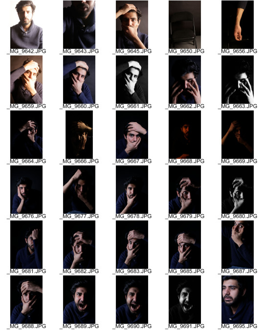
After first shoot I was well organised for my second shoot. I was certain about I need to do next. so started moving a lighting a lot and took images from picture give it a perspective. components like framing and camera setting where I had faced issues in first shoot where not there in second after a planning.
0 notes
Text
test shoot and experiment
shoot 1


During my first shoot I spend a specific amount of time to try different expression and became comfortable. As I was not afraid to shoot myself it went well for me. only difficultly I faced was framing as I was not using camera trigger I had to move myself a lot to change the settings. I adjusted my framing by looking directly into the lens because I was able to see myself in lens.
when I started shooting I had few shadows coming on the backdrop to get rid of the moved myself further away from backdrop and placed a black foam board behind me next to light when experimenting spilt lighting.
Use of lighting (experiment)
I mainly used and experimented with two lighting techniques( spilt and short lighting). Reason for doing is to create a dramatic effect and to create a element of secrecy. I think the contrast and texture in spilt lighting make them more intense. it gave my images a sense of conviction .To add up more intensity I placed my soft box near to myself.
short lighting
it gave high contrast and narrow the face I did by placing light the light 90 degree angle. I used it for few image where I had to made a conversation with audience.
Use of filter (experiment)
i used red filter in few of my images. As we know red colour attracts viewer eyes and red colour is a colour of danger and determination but I was also afraid that by using this colour I will lose photos value because I was taking close up portraits and wanted them to be dark and vivid. I think this colour gives a feeling of aggressive and comfort which would have been not been suitable in this type of work.
0 notes
Text
ARTIST RESEARCH
EDWARD HONAKAR
He is a young photographer from California battling depression. He was diagnosed with depression and anxiety two years ago, but up until that point he was confused by his crippling emotions. After learning the cause of his persistent melancholy, he turned to his camera to document his personal experience.
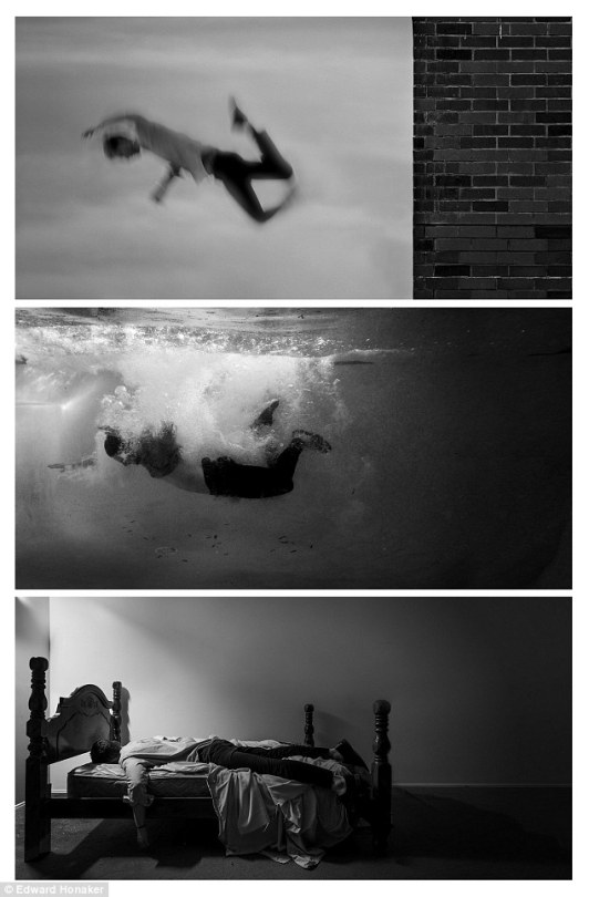
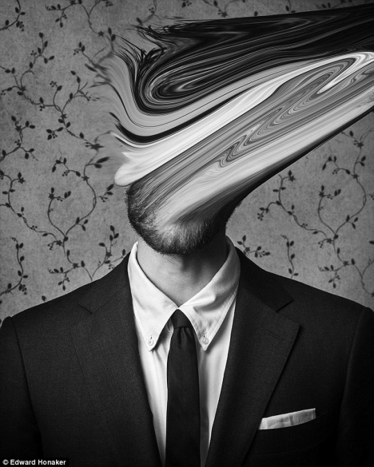
According to me his work combat the stigma and encourages others to be there for those who are suffering I have tried to incorporate same thing in my work. through his work he has depicted the emotions and behaviour during the period of illness.
when I looked at his work I was able to find myself into his work. I was able related it to myself.
his work looks unsettled because of blurry effects and distortion created through camera technique and manipulation. while mine will be based on emotion, behaviour and lighting techniques. I recognized that in most of his images he shows his back to the camera which can be essential characteristic part to show fear, loneliness.
if we look at his first image its gives a feeling of falling, drowning and isolation. whereas in the second image he is looking into the camera but face is blurry which might show mixed up emotions. it seems he want to talk to audience but back in the head he is very much concerned about it.
1 note
·
View note
Text
Studio Self portrait Title - Tell us to train our muscles not our brain.
My idea is self portraying about mental health. through my work I want to depict how anxiety and depression affects our body and change the behaviour. I am interested in raising a vital question on why it has not been taken seriously. Since 1949 Month May has been known as mental health awareness month after the May I wonder why we are not encouraged to be aware of mental health all year. they tell us to train our muscles not our brain. I had suffered from depression years ago so its both personal and public. Those who do struggle with mental health , battle in silence due to lack of understanding and compassion for the situation.
SKETCH
I made sketches before the shoot to get ag general idea how I an supposed to shoot.


0 notes


Text
experiment
on the first location I tried to create both dark and bright images. so I shoot on cloudy day then to make images brighter I made changes in camera setting. I wanted model to be in the middle of the image as he is a centre of the image. I also told model to wear same colour outfits which matches with the background I did this to avoid contrast in the images.


I was shooting on the sunny day and sun was acting as hard light source light was harsh and creating shadows around the subject and on the wall. so to eliminate the shadows I used soft box as diffuse light. I experiment with soft box by putting it at different angle. my theme was ‘’ winter look’’ so want to create moody look. as we can see in first image sun is bright and long shadows are seen on the wall.so I put the soft at 45 degree angle on the opposite side of the sunlight and raise the soft box so that the middle is just above the eyes. Another reason for using soft box was to put more light on model face so it stands out well. by including both hard light and soft light i was able to capture different colour temperature.
0 notes
Text
Artist Research
Valentin Giacobetti
Her recent exhibition was hello, Goodbye ! on October 2018 in Paris, France.
Recently shoot Niall walker for browns menswear campaign.

BEHIND THE BLIND
working style
her work shows both dark and bright looking pictures. she has done both studio and outdoor shoots. I like the way she uses shadows created by sunlight to create dramatic look.
for the outdoor shoot she uses natural light which helps her to create feel of innocent and pure. I incorporated that in my work.
after looking at her work I recognised she uses photoshop to add grain. filters and retouching these are basic things but change a image dramatically.
1 note
·
View note
Text
ARTIST RESEARCH
Emily Soto
Emily Soto is an American photographer based in new York. she is recognised and requested by various top editors due to her unique style shown through out her photography.Each image captured by Soto emanates with her distinct visionary and romantic style characterized by a perennial stream of emotively captivating, artistically adept, visual pieces.
she has done photoshoot for Vogue Australia, Vogue Ukraine, Allure, V Magazine, Billboard, Teen Vogue, The Cut, Glamour, Wonderland, Rolla coaster, Paper and InStyle.
http://www.emilysoto.com/about

I got inspired by her working style. Her images appears to be bold yet playful on magazine covers. Her images looks dark and mysterious. The reason for choosing her work is shallow depth of field in her photography. in most of her images main focus on the face always try to use eye contact.
0 notes
Text
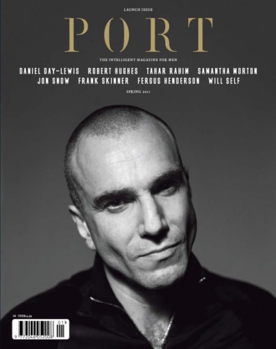
ARTIST RESEARCH
Oliver Pedrosa
Oliver Pedrosa is a fashion, Advertising and editorial photographer based in Madrid.
https://www.oliverpedrosa.com/contact
He recently photographs pau for Spanish publication in November 2019 for port Magazine. most of the time his models are the centre of the story curates impressive wardrobe.
if I talk about his work. his images has great colour temperature and depth of field. in most of his work he has used background in a most creative way to create a story. I can say his images appears to be bold and dramatic.

pau ( port magazine) Spanish
narrative- working my way up.

0 notes
Text
MAGAZINE RESEARCH
PORT MAGAZINE

port is a biannual style magazine with a focus on beautiful and intelligent content for the modern reader
By invoking the lost spirit of high-quality biannual magazines, together with the most current and engaging of subject matter, Port is setting a new standard for modern titles. Essays and profiles from the world’s foremost and iconic practitioners are featured in the magazine in fields such as architecture, design, business, film, environment, politics, literature and comedy alongside timeless examples of classic style and fashion.
This is a publication founded on a rigorous desire to explore some of the most interesting and important aspects of our lives today, without ever losing that all important joie de vivre. Elegant and informed, Port magazine is an independent haven where the love of pleasure and the love of unbiased knowledge go hand in hand modern reader.
when it launched seven years ago, port’s proud subtitle- the intelligent magazine for men- seemed a reasonable qualifier.In the trashy, dying days of Loaded and Maxim, the qualification made sense. But arriving in a #metoo culture wary of tainted male celebrity, the (assumed) gender exclusivity of PORT and indeed the very notion of a ‘men’s magazine’ seems more problematic. Just what exactly is a men’s magazine? Port's smart new look can’t conceal an underlying editorial anxiety about its own identity. A frank editorial by founding editor Dan Crowe admits that it’s “time to make some changes around here", the theme of the new issue – freedom – firmly establishing Port's commitment to inclusivity. And the new cover does show the magazine breaking with the past.
https://www.port-magazine.com/about/
https://www.creativebloq.com/reviews/port-magazine-review
0 notes
Text
Lightroom process


I used lightroom for these two picture but just to change the colour to black and white. light was good in both the images I just cropped the second images by using crop option in lightroom. I just the image from the left side a little bit to give subject more area. both the images were highlighted properly. i just used vignette filter in Adope Photo shop to turn the edges of the first picture more darker.
0 notes
Text
Lightroom process


i had taken this image in London. i used Lightroom for the image. i took this image in daytime so light was good and i just had to make little bit change in the image. i reduced the contrast to -85 and highlights to -7. I increased the temperature to +8. I also played with other options but they did not work for me. i did not use Adope photoshop as i just had to play with lighting so it was not required.
0 notes
Text
Lightroom process


i took this image in London. i used Lightroom for this image to make it more effective. it was a simple picture step for this image in Lightroom because there was very less stuff to change and improve. i just reduced the contrast to 91 an exposure to 0.05 to highlight everything in the picture and according to me subject stands out more in the image. light was good in this image so i did not had to change it.
0 notes
Text
Lightroom process


it took so much to get the picture i wanted on the Lightroom. first of all i used develop option on Lightroom. then i went on basic option and increased the temperature to 26 to give it a new look and to give it a orange colour then i reduced the contrast to 64 and exposure 0.05 which highlighted everything perfectly in the image. Even i used the selection tool to select the street and change the colour of it. i also used tone curve to give add more light in same portion of the image
0 notes
Text
Lightroom process


i used lightroom for this image. through lightroom i just change the colour and contrast of the image. to do so i open my image in lightroom then choose the develop option and increased a contrast to above 50 percent and under develop option chose black and white option to change the colour of the image. i also used shadow and Hightlights options to make it more affective in the image.
0 notes