
This blog will document my artistic journey towards the creation of my final major project in British Higher School of Art and Design based in Moscow, Russia.
Don't wanna be here? Send us removal request.
Statistics
We looked inside some of the posts by bogdanhmel and here's what we found interesting.
Average Info
Notes Per Post
0
Likes Per Post
0
Reblog Per Post
0
Reply Per Post
0
Time Between Posts
7 hours
Number of Posts By Type
Text
17
Last Seen Tumblr Blogs


Fun Fact
1,644 Tumblr posts in 1 second.
Text
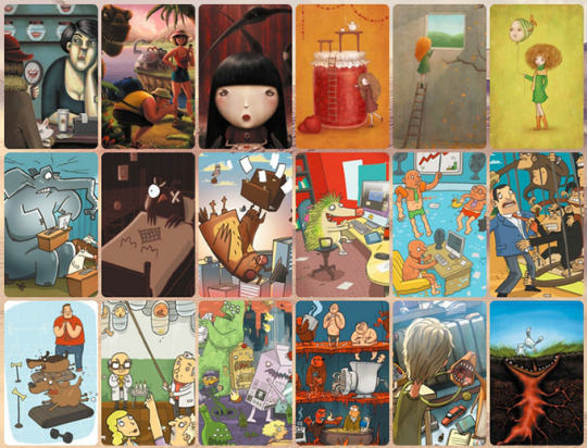
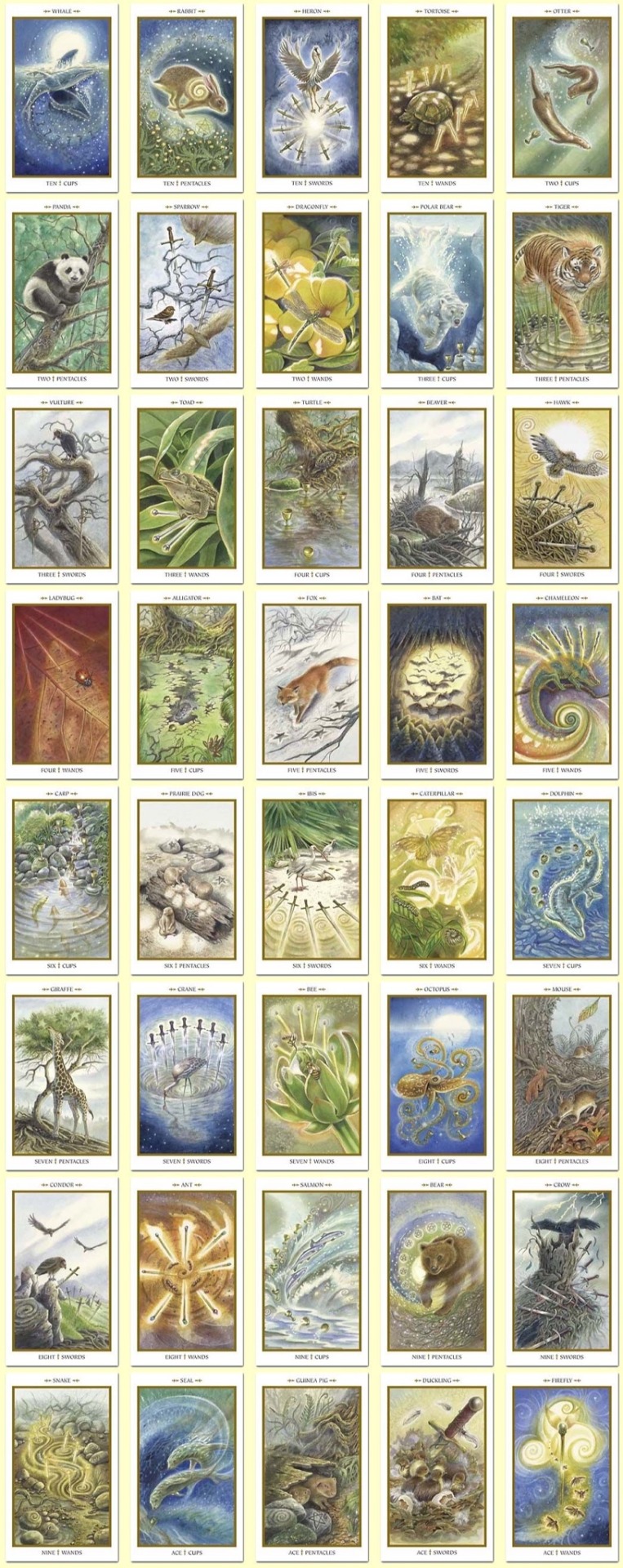
Also a good reference here would be Imaginarium cards. It’s a boards game based on an associations play. It’s also very dreamy because it speaks directly to our subconsciousness. However, images the decks can be very different in terms of style and even done by different artist that convey very different ideas, emotions and symbols. So I thought that even if my cards wouldn’t be completely identical, it wouldn’t make it worse, since each card translate a separate dream and a unique world.
0 notes
Text
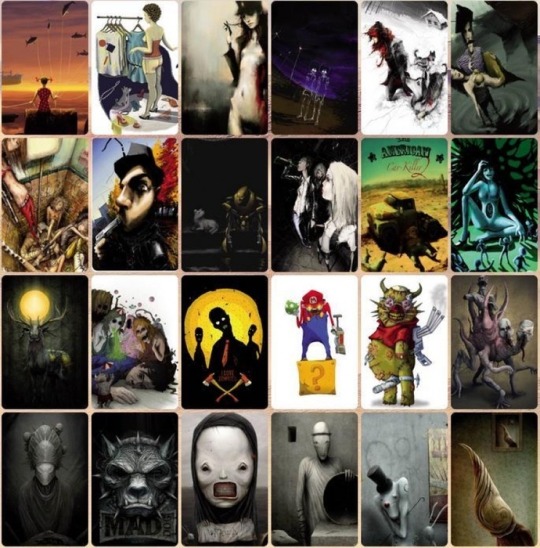
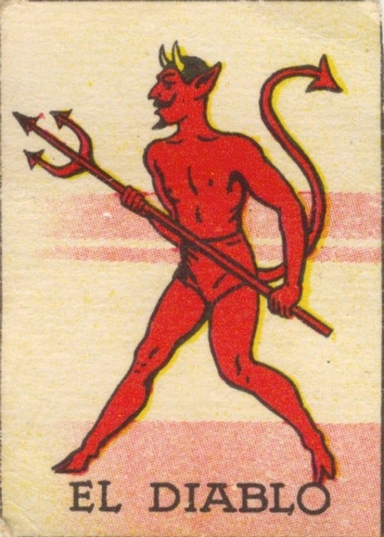
References part 2.
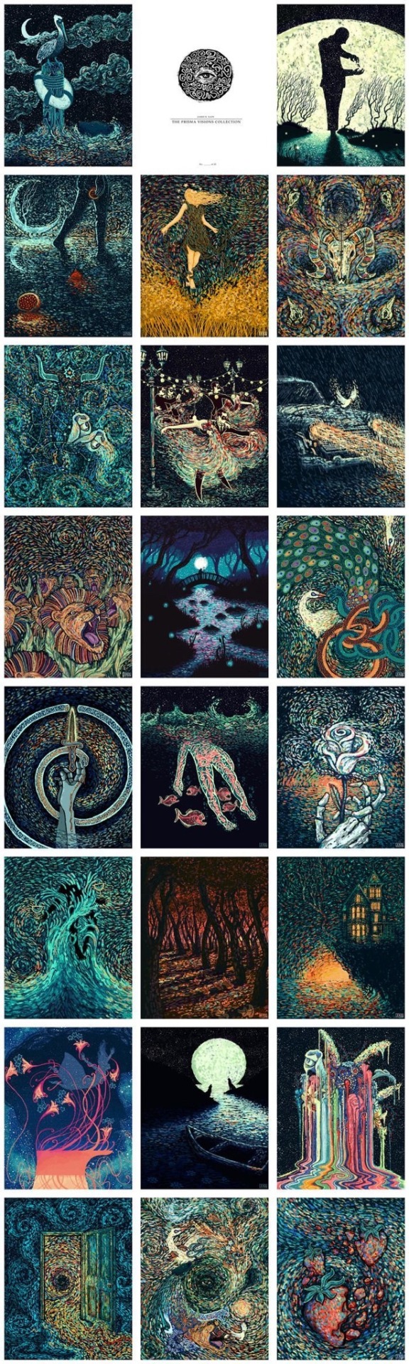
These are more “verified” card collections that are noticeably more experimental compare to the ones from the last post. I payed more attention to these guys because I didn’t want to oversimplify my images neither in therms of style nor in terms of color. I wanted to find a middle ground between them so deck of cards would look unified but all images wouldn’t bee too similar.
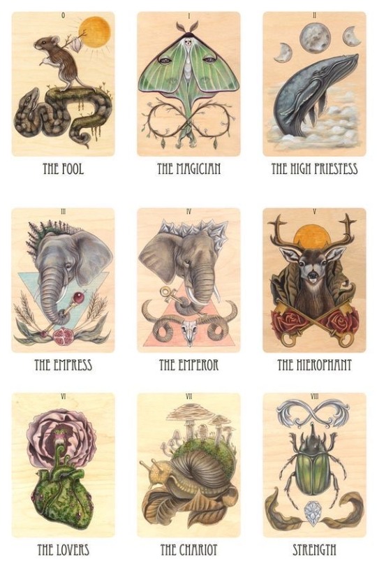
0 notes
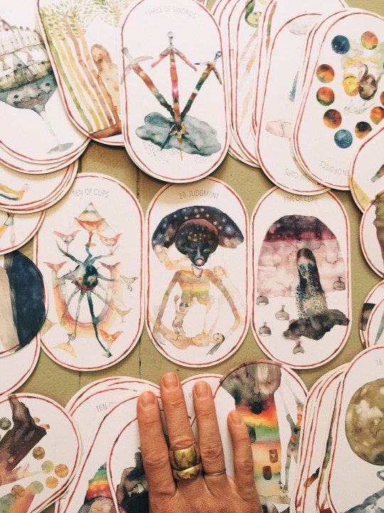
Text
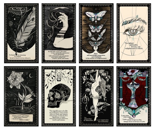
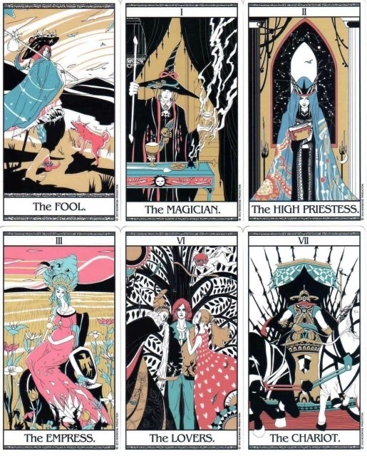
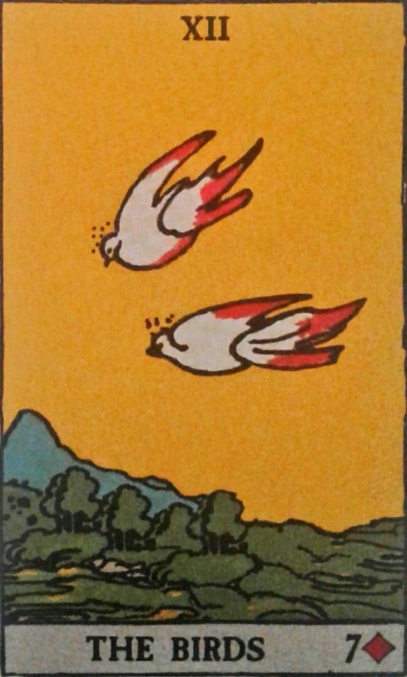
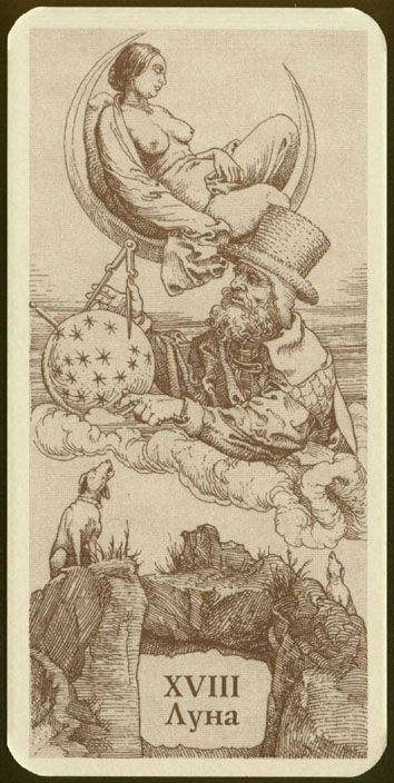
Also some time ago I started a small research on tarot cards. I was interested how different artists treat their mission to accomplish a deck of cards that should be harmonical and look like one whole. I came across multiple ways of unifying imagery:
- limited color palette (In many cases limited to about three colors so the product looks “stylish”)
- using similar graphics techniques wheather linear or with half tones, screentones and crosshatchings
I stumbled upon very minimalistic and vice versa very detailed imagery, which gave , the undertanding that I apparently can go whatever the way I want.
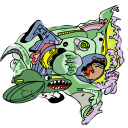
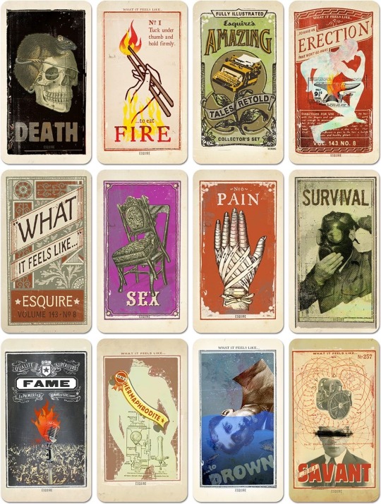
References part 1. There are more traditional tarot decks with big empahasis on graphicss
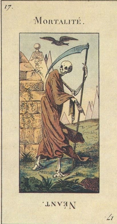
0 notes
Text

Image 2
Dream about a sky full of stars that turn out to be fireflies and start dancing once the frog played the flute.
0 notes
Text
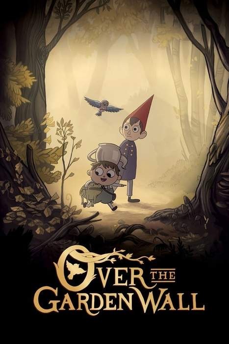
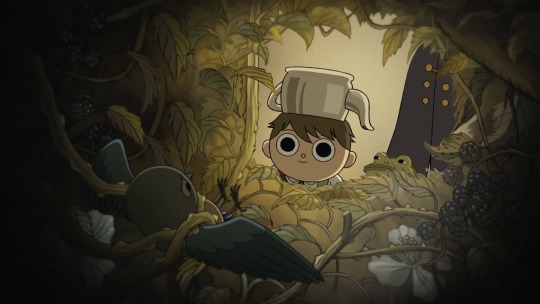
Speaking about references, I have to say that a masterpiece called “Over the Garden Wall” created by Patrick McHale and Cartoon Network had a great impact on me even though I watched it a while ago. A twister of reality and fairytale, constantly questioning life, death, friendship, love, betrayal and many other important issues, beautifully drawn and instantly dragging the viewer inside the authentic magical and a bit noir atmosphere conquered my heart entirely. The very unusual humor that it conveys also relates a lot to my goodnight wishes, that’s why probably there are going to be some subconsiosly created links between OGW and my little dreamland.

0 notes
Text
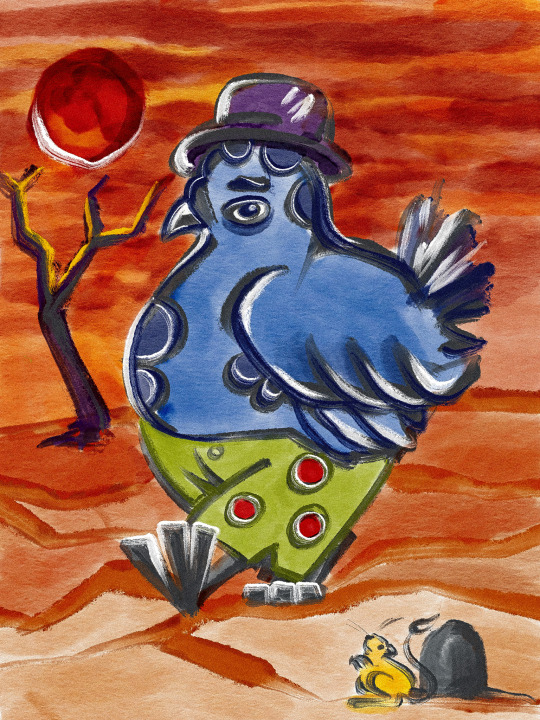
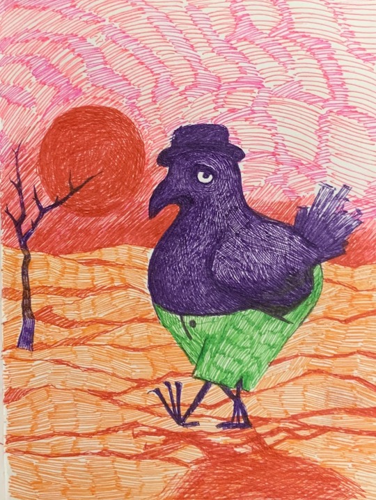
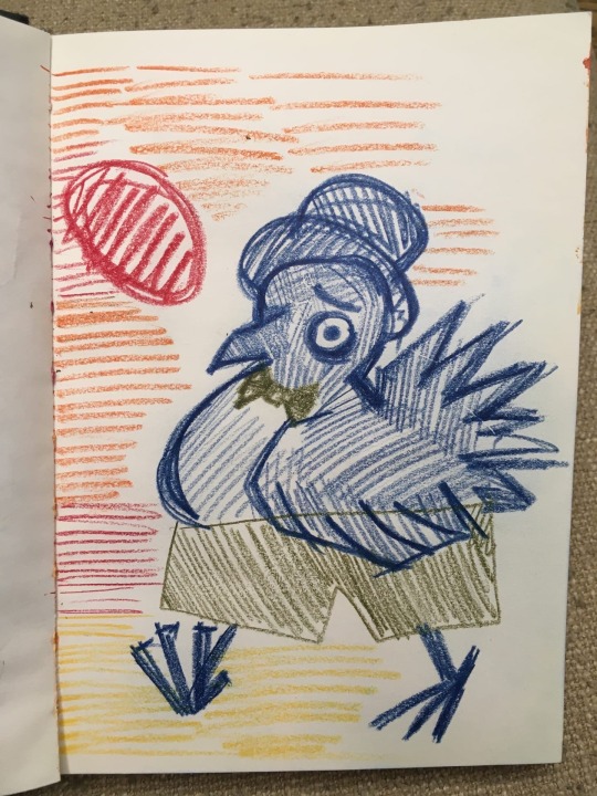
Finally I chose my hero and decided to dare try making all of the cards in the visual style. Here’s the first image of the pigeon ready for it.
Image 1
0 notes
Text
The next and the most important step in the developement of my Fmp was finding the visual style I want to complete my cards in. It was definitelty the hardest decision for me because I wanted these cards to be both dreamy, romantic and humorous, both bright and gentle and all these contridictions were driving me crazy. Eventually I realized I have to start trying out different other options to at least get a glimpse of the desired visual style and made a decision to take one goodnight wish and portray it in various ways
This one was the following: Dream about an elegant pigeon named Andreay walking around Zimbabwe in his lettuce green britches.


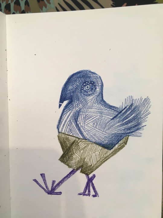
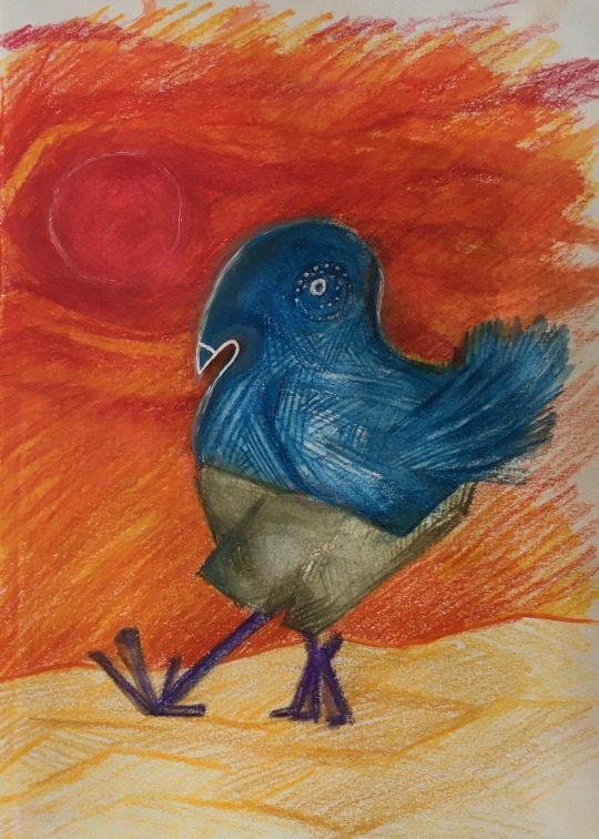
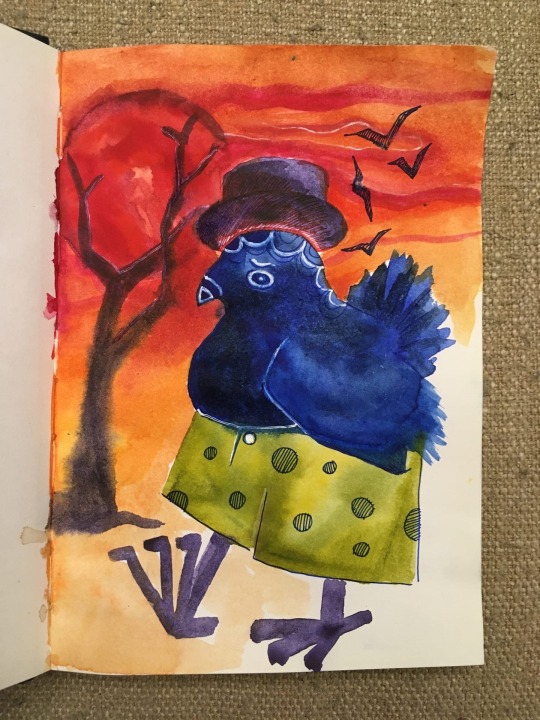
To be honest, I got a little crazy in the variety of all these pigeons, however I had several criteria that led me to making my decision
- how much the style suits my concept
- how comfortable I am in this visual style
- how possible it is to make such image into a series of them
I even made a questionnaire among a lot of people for them to choose their favourite one (which was the 4th with a huge advantage compare to the others) but I found him too plane and simple for my concept.
0 notes


Text
I finished the comic strip in indesign so now it’s finally ready. Here you can see the screenshots of the spreads from it and how they appear when you approach them as a book.
Part 1


0 notes


Text
Then it was the time to start working on the front and the back cover. I wanted it to be intense and started off with abstract drawings. Then I combined them with my favourite image from the comic strip “The butterfly road” and made a lot of experiments with multilayering before I reached the result I was satisfied with. This is the process of making of the front cover.


0 notes
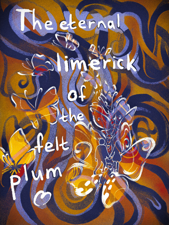
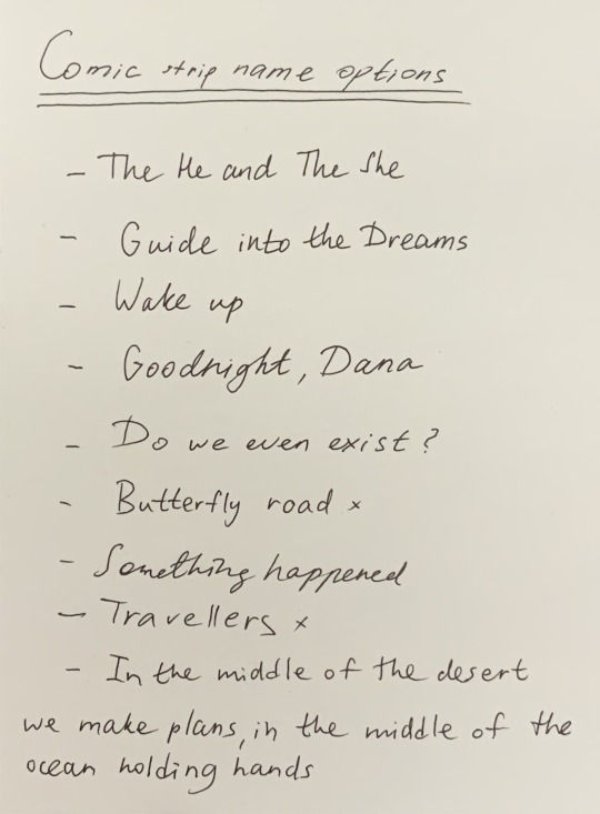
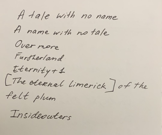
Text
After ending up all of the illustrations except for the front and the back cover, I started thinking of a name for my comic strip. I considered many options, however the final version turned out to be the following:
The Eternal Limerick of the Felt Plum
0 notes
Text


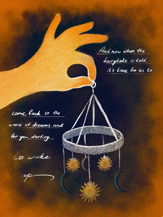
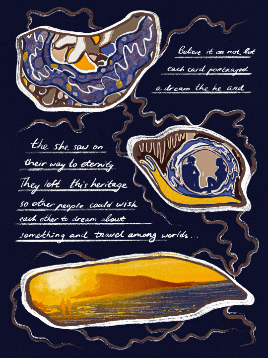
This is the final illustration which ends our story with a little plot twist. When the story only begins, it is told in “There once was a he and a she” format which probably leads us to the belief that there’s some type of a narrator who is apparently telling the story to us, readers.
However, on the last page it suddenly changes and we find out that the story wasn’t told by somebody alien, it was The He and The She who told us the story. Right after the reader realizes that they have been spoken to directly by the main heroes of the fairytale, they also realize something else. Not only the whole thing happened the way they didn’t think of, but moreover the entire time he or she has been reading, he or she was also dreaming, and the world of dreams is the place where he or she met The He and The She and heard the story with own ears. That’s why once finishing the comic strip, the reader has to wake up and decide whether he wants to start his own journey among the worlds of dreams with the cards that got left from The He and The She. Ta - da!
0 notes
Text
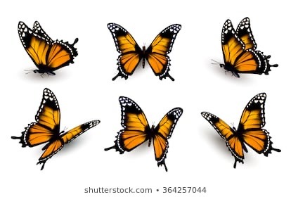
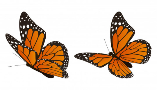

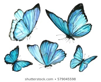

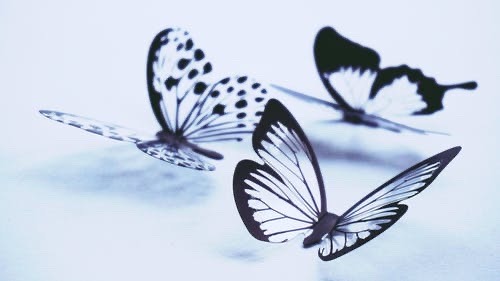
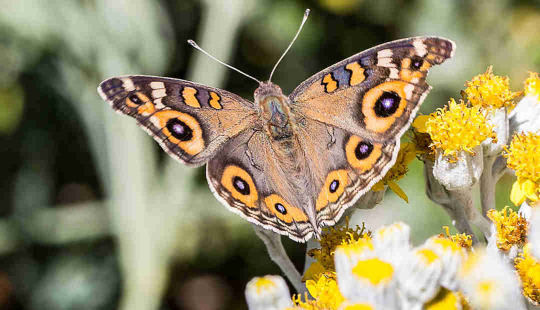

There are some references I had to use for the final illustrations. Especially it concerned the butterfly spread, because I had very little knowledge in their anatomy.
0 notes
Text
Have to say sorry, at the moment I was posting my illustrations I was nearly done with finishing my comic strip in indesign (except for the front and the back cover) and now I suddenly realized I totally forgot about one more illustration that was supposed to be after the “And then something happened” page. Here it is. It’s totally key to the development of the story because it carries the essential information about the appearance of the deck of cards. I realized that portraying the deck in a static position wouldn’t look like a wonder happening so I added some whoosh and let them fly in a mini hurricane. Overall, this post and the previous post have to switch places.

0 notes
Text
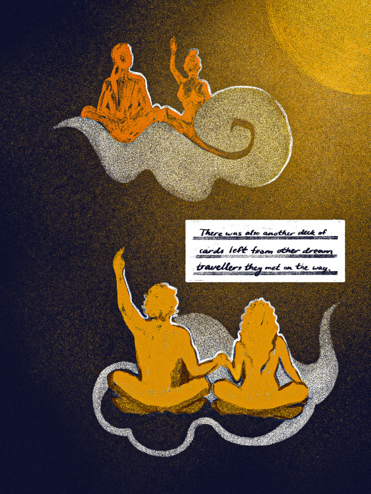
This spread is the last before the end. It explains the end of the story and leads the reader to the understanding of the final product of my project - the deck of cards with the goodnight wishes produced by me and the other deck produced by my fellow dream travelers from the Army of Me project.
0 notes