
Last Seen Blogs


Photo
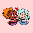
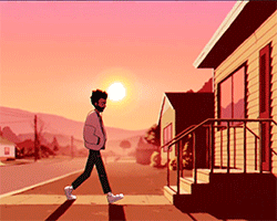
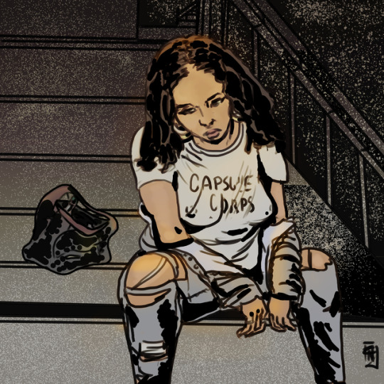
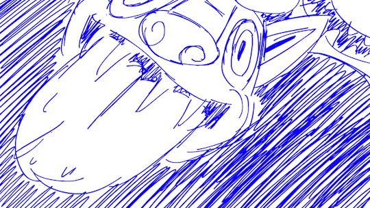
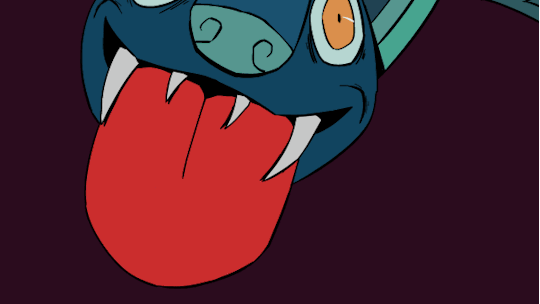
Webcomic otw
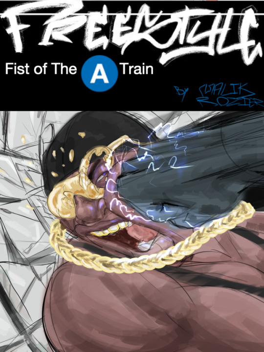
A test cover for my web comic currently in the works[ Freestyle: Fist of the A train]. I’m trying out different stuff for the main logo (graffiti lettering is a must but there’s always legibility issue with it) so final result may be totally different. Also got an ass load more character teasers coming up soon ( minor tweaks keep popping up)
7 notes
·
View notes
Video
incineroar mains in a nutshell
Last smash meme from me for a while. I could say I’ll come back and actually finish this but we all know that’s a lie :’(
73 notes
·
View notes
Photo
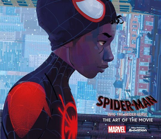


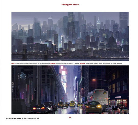
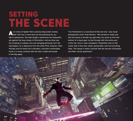
Preview of “Spider-Man: Into the Spider-Verse - The Art of the Movie” artbook.
Available this December.
Pre-order on Amazon >> USA | France | Canada | UK | Japan
17K notes
·
View notes


Video
Rough animatic for part 1 of this DBS fan thing I’ve been fiddling with. So much line clean up to do so little time
62 notes
·
View notes
Text
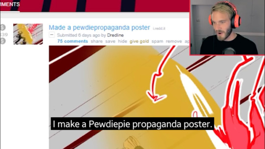
@dredline Made a youtuber thing. Got props from said youtuber. Everyone go follow.
0 notes
Photo

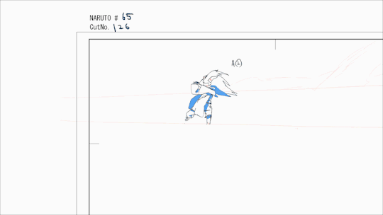
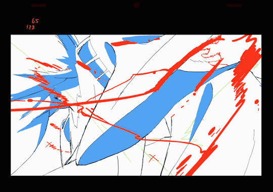
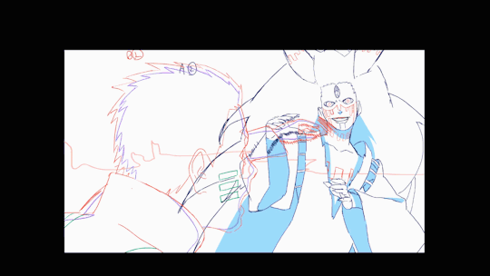
Thank you for watching Boruto #65, My director, Chengxi Huang gave me a lot of freedom in designing the choreography…Thank you very much. Momoshiki was supposed to use “ba gua zhang” and Naruto was supposed to use a “wing chun” esque fighting style. I hope those two fighting styles can be seen somewhat in my cut…
18K notes
·
View notes
Text
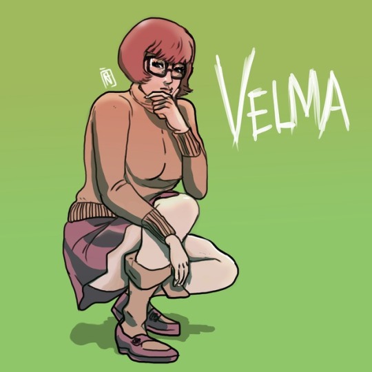
@bossrayden #velma #comics #dccomics #scoobydoo #jinkies #oppai ;)
0 notes
Video
Rough animatic for part 1 of this DBS fan thing I’ve been fiddling with. So much line clean up to do so little time
62 notes
·
View notes


Video
Finally finished this game grumps animated. Took me WAAAYYYYY too long and didn’t turn out as good as I wanted, but such is life. Audio from this ep
https://www.youtube.com/watch?v=V_-EE-9XGU8
709 notes
·
View notes
Note
That shot is incredible ! Would you perhaps consider showing us part of your process ? I just assumed you used 3D for the camera movement, it's amazing.
I shall present thou my process, but consider that it ‘ll be the exact same process as any other animation, it’s basicly like “i did a rough and a tie down, and i cleaned it”.I assume that by asking this, thou wanted to know some “ways” of doing this kind of thing, but sadly i didn’t use any tricks, and i could have of course, but i just felt that if i was trying to find a way to avoid doing it, i would just not be doing it, and the rsult would have not been the one i wanted.
So in order to make this process as interesting as it could possibly be, i’ll try to explain my thought during each steps as much as i can.
So here is the rough, basicly if i recall correctly this was like my third version (i didn’t find the other one) i tried to have here “key moments” and not exactly “key movements”, i tried to define the most importants parts of the curve my camera’s describing. The thing is, i wanted to be sure where to slow down the pacing of my camera, and when to speed it up, and at the same time i wanted to know what the crowd would looks like.

Here’s my kind of tie down, it’s the thing i used in order to do the cleaning later, here, i juste came back to re-define a little better the last part, the fast parts are easier to read and i know where my characters are.Something i also did (and lost by now so i can’t show it) is like a top view map of the crowd, with each character to always help me remember where each one is.
Note that i cleaned and colored the “ghost” first here, as he’s hiding characters, i wanted to know exactly where he would be to avoid unecessary drawings.
And here whe have the final cleaning, here is the part i’ll need to explain the most, because sadly there’s no real “inbetween” before this part and the tie down.
The first thing i did was to clean all the images i already had during the tie down, then i got all the models checked with the character designers Lady Hagdahl Sörebo and Lady Zhang to be absolutly sure that the things i would be inbeetwining would be the exact models (i thought lady Hagdahl Sörebo was going to die during that part).The thing i did at the same time was to define the size of the brush during each “key moments”, you may notice on the gif above that the further away the characters are, the thinner their line is.This is one of the thing that helps achieving this “3D like” aspect, it helps feeling depht in each frames and makes your eyes’s understanding of each characters easier.Once i had my key movements perfectly lined, i started beaking it down, i inbetweened all the images i had, BUT i started to think about each characters’s movement, you may notice it , but the characters are not all totally still, some of them are moving, doing something, for exemple, the xingtiang (the ball-like things with arms who carrys bowl of food) wave their arms and bowl a little as they can’t exactly sustain their weight perfectly.It’s that part that helped creating life in that shot, if the characters had been just standing still, the shot would have felt flat, and a bit life-less.
Once i had all my characters on models, my lines’s size defined, and my characters animation set in stone, i just had to inbetween everything to reach a ratio of 25 frames/1 second, it’s what we call a 1′s exposition in french, i don’t know how to say it in english, but the important part is that it helps your eyes understanding the movement, and in a shot with so many characters, and a movement as fast as this one, it was absolutly necessary to have everything at one, it’s also one of the thing that helps achieving this 3D effect, as we tend to see most of our 2D animation at 2 or 3 and our 3D animation at 1 (or 0.5)

And we’re nearly finished! after that i just colorised the characters, once they were, i was sure of the negative space around them, and were to put the confettis you see on the ground, it’s an other thing that helps defining depth in the shot, a solid ground under the feets of the characters.

And of course once i had everything in place i just had to add the flying confettis! I animated them straight ahead, as i already had my camera movement and my characters it was child’s play to guess the size, the orientation and everything else; it’s like animating in 2D on a 3D scene, thou know exactly where thou are, but it doesn’t have the cons 3D scene have, the space isn’t so big you get lost in it, thou know exactly what’s on screen, and it doesn’t feel dead.
I wanted them to flow through in order to lead the eyes of the audience and to make the whole movement flow more fluently, this way thou don’t look too much at all the characters and thou don’t get lost in the details, because thy eyes are attracted by the colored and bright moving dots through the image.

And that’s it! An other intersting thing about this shot is that i cuted it in 3 parts in order to simplify the tvpaint file.It means this process only cover this part, which is the second one, the others weren’t exactly done the same way, but the process was more interesting for this part, that’s why i didn’t added the others.Hope it’ll help thou in thy journey.
2K notes
·
View notes