
Don't wanna be here? Send us removal request.
Statistics
We looked inside some of the posts by bradenhnc and here's what we found interesting.
Average Info
Notes Per Post
7
Likes Per Post
7
Reblog Per Post
0
Reply Per Post
0
Time Between Posts
5 days
Number of Posts By Type
Text
12
Photo
5
Last Seen Tumblr Blogs


Fun Fact
130K people were victims of a chain letter scam that affected Tumblr in May 2011.

Photo

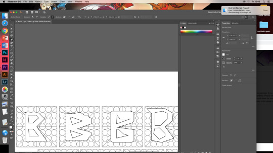


Experimenting with type using a grid system first attempts and finalised example of a type face. I feel I did pretty well with my tests of using illustrator for making types with a grid system because they look readable and presentable
1 note
·
View note


Photo

Instagram slide for transgender awareness
the reasons why I chose this to to spread awareness was I resonate with this community personally I tried to replicate the guardian article colour scheme and font as close as I could for authenticity
0 notes
Photo

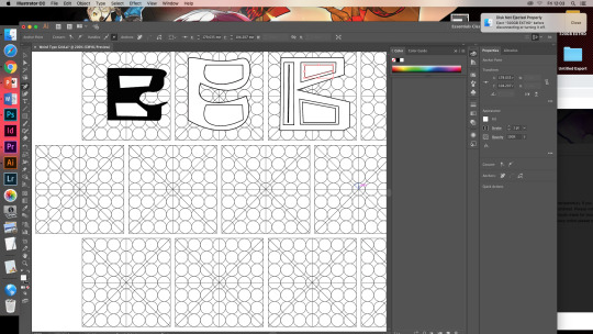
Typeface FORGE
The design elements I used for my type face was abstract shapes and very irregular which adds to the appeal of my fonts
0 notes


Text
Working From Home Poster

the design elements from my poster was to show the versatility of colour that my type would go well with the lines were for graphic elements to attach it to my work making it seem like it was all connected, this is because I work in different areas of my house that most artist have one space they work and create art where I work sometimes on my bed or my desk to the downstairs table
If feel I did decently with colour scheme though with the poster feel I need to plan more effectively my time management with creating my project in the future
1 note
·
View note
Text
type foundry research
Type foundry historical vs contemporize types faces
A type foundry is a company who distributes/ sells type and fonts to clients and projects.
Before digital type foundries would commission artist to make type and fonts, these types have been digitised as well in modern age.
Type foundry’s started 1476, when William Caxton made the printing press, importing at least some of the type that he used in printing. Until William Caslon (1692–1766), however, English type generally had a weak reputation with the best type imported from Holland.
Types of modern type foundries
· Adobe Type, a division of Adobe Systems
· Apple Inc.
· Google LLC
· Letraset
· Many more
Historical type foundries
· American Type Founders
· Barnhart Brothers & Spindler
· Bauer Type
· Binny & Ronaldson
· Bruce's New York Type Foundry
· Many more
0 notes


Text


Graphics legal legislation and laws that are graphic artist need to know about
0 notes
Text
Legislation for UK and US how laws are passed
Album desgin drafts and research for screamadelica by primal scream 1991
The art direction was the type face know as cheee which would be incoperated useing auto players magazine as art direction the desgin sketches below are using elements from all three research points as I tried to link the crazy and mad logo of of orginal logo while using the eyes and squares in the magazine then using different letters and abrivations of the albums name so it's more clear of a name I feel I the fronts I did some work others are to cramped and cluttered so I will be refining them for a better desgin


1 note
·
View note


Text
Screen shots of my typography information poster however I couldn't work more on it since of working from home and not able to get the fully poster complete

1 note
·
View note
Text
Screen shots of my typography information poster however I couldn't work more on it since of working from home and not able to get the fully poster complete

0 notes
Text
Iron works is the name of my font I decided on using the angular point for the spark and the more refined font segments for the hilt as the serif was made to look like a sword hilt I used for my experiments I made prior I also made the d and c more angular however I kept "o" the same to show privious devopment and the metal being put in water and being bent and stretched out of shape as I liked what it brought to font which was uniqueness and abstract desgin

0 notes
Text


After getting feed back from my tutor I started working on iteration on sections of my tyoe ie the spark mark on the top of the letters and the hilt desgin on that are joint to different parts of the letters to show clear links to my theme tho they are in pencil since my fineliners have run out, for the spark I want to use 4th desgin since itta sharp and hexagonal in it line work and has some styling to it
0 notes