
Don't wanna be here? Send us removal request.
Statistics
We looked inside some of the posts by bradytgeorge and here's what we found interesting.
Average Info
Notes Per Post
4K
Likes Per Post
3K
Reblog Per Post
1K
Reply Per Post
1
Time Between Posts
6 days
Number of Posts By Type
Photo
16
Text
1
Last Seen Tumblr Blogs


Fun Fact
70% of Tumblr users say the Dashboard is their favorite place to spend time online.
Photo


[GAC PROJECT_FINAL]
In working through this project, flexibility was an absolute must. I began with the idea of advocating for cork forests in an effort to save them from being neglected and/or destroyed in order to make way for other industries. That never changed throughout the length of the project. Nearly everything else did though. Cork forests are great for the environment both in their ability to absorb carbon emissions, and for the protection they give to the land from soil erosion, desertification, and shrubbery overgrowth. Additionally, they are the habitat of hundreds of plants and animals, like the Iberian Lynx, which are critically endangered.
As a result of the strength and unity of this brand’s realization, I feel that C.RK is a complete success. If not for having made it myself, I would definitely believe that it’s a fully operational wine business that gives all its proceeds to cork farmers and processors in the Portugal cork region. They just seem like a wine company that cares, which was always the goal. This is mainly communicated through the thoughtful use of previously existing wine imagery (the wine bottle, the color palette, the pretentious air that it carries) combined with visual tweaks to push the branding (and brand as a result) towards something less like a private yacht club, and more like an expensive brand that you can find almost anywhere. Through needing to be relatable yet professional and official, the topic’s voice really found itself more than I found it. Get the facts across confidently, but pepper in as jab at other wine brands or a light roast of the customers themselves, that’s just C.RK, and that’s just how the target market acts. Raised by a strange combination of the internet and parents, millennials understand the values of both environmental consciousness, and of humor. C.RK is both of those things, and it gets you drunk too.
Restarting the creative process from square one is never easy. Which is why after a bad critique, I was urged not to, and more or less listened. I initially wanted to make the forest side of the business more obvious, and put trees on things, but couldn’t figure out a way top make that cohesive with my intended audience and product. Quite simply, my first plan was bad and wrong. So I spent a weekend recreating the brand from the ground up, with the new focus being less on the good that the brand does, and more on being a believable brand. Giving money to people that need it is one thing, but being a non-profit isn’t much if you aren’t selling anything, or don’t have anything to sell in the first place. So my process became in working to crystallize the design elements and layout first, then to tackle the actual advocacy side of things second. After the first big overall, everything was rather easy, and each of the steps just helped to refine the idea down, rather than being just another addition of work. One major lesson from this project is the need for a stronger concept before trying to move forward. If I had that, I wouldn’t have ever been behind from the start.
I feel that there were a lot of failures for me on weekend one, but that everything since then, has been success stories. I think that the C.RK brand is unified to a fault, strong in contrast and general color palette (by using a limited palette and expanding on the limits through hue and saturation shifts), and a complete success in targeting its audience, through both design and content framing. I am really proud of the concept’s strength, as well as the overall polish that I was able to achieve, and of the work that I put into this. As far as the campaign becoming real, it very much could, and I would definitely not mind if it did, though I don’t really have much interest in the consumption, creation, or sale of wine. So that is a bit of a barrier to this becoming a real business for me.
0 notes
Photo

[IDA PROJECT_FINAL]
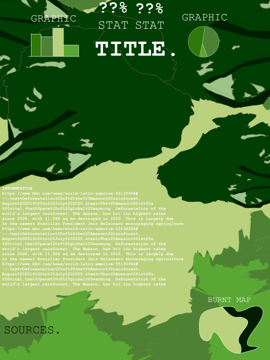
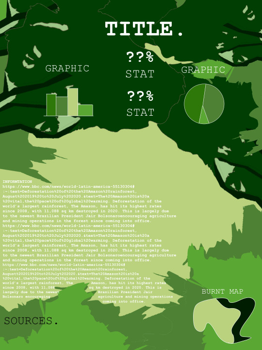
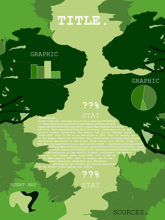
The Amazon is an area of environmental conservation that I didn’t have much experience with at the start of this project, and while that was initially very clear, I think that as I learned more, my poster began to communicate that, becoming what it is now. I feel that through both the illustrative graphic and the text that is included (as well as the information graphics present), the dire need for recourse in the Amazon is made very clear. The choices of creating a sidebar, and doing the popout circles for the graphics that were suggested during critique have been incredibly helpful in adding unity and solving the strange and strained graphic-text relationship that was present in my initial wireframes. I would say confidently that the current and final version of this poster is both legible, and balanced in its ratio of image to information content.
Additionally, there is a strong sense of unity brought out by the color palette, and a strong grab on viewers attention. This poster demands attention when you first glance at it, though I do not know how informative it would be to someone who just quickly looks at it. The infographics are strong in communicating the need for change, but without reading some of the text, the problem isn’t necessarily clear. However, I tried to keep the information short and sweet, so it isn’t much of a stretch to read all of the poster’s information in roughly one and a half minutes.
This strategy of paring down was vital to the entire poster making process for me. Initially, I planned on fully illustrating the forest scene, rather than relying on implied forms sculpted from shapes. After starting the work in Illustrator though, it became clear that the program had some very serious limitations in digital painting, and more traditional-mimicking illustration in general. So while I didn’t enjoy betraying my vision, I think that the end result turned out much better than it would have if I’d been stubborn about making the program do things it didn’t want to. Coming from a psychology research background, the research for this wasn’t difficult, and I already knew how to incorporate research in a way that gives readers the information they need to know, while holding back just a bit of what they want to know (in order to get them to read more). Following the steps after the research stage though, was very beneficial to my development of the concept for my poster, and its end result. As always, selective implementation of critique was vital to this poster becoming what it is now, since good design is never truly a solo endeavor.
1 note
·
View note
Photo


Design Proposal
Some things are worth the effort put into them. With the work I’ve done for C.RK brand, I think this is especially true. In the beginning, the focus of the design was nearly nonexistent, and there was no unity between what was being advocated for and what the advocating business was. Advocating for cork forests is no easy task, since the best way to support these environmental saviors is to cut their bark off. Instead, the bark trimming is necessary, and the easiest way to use this miracle bark is in wine stoppers, more commonly known as wine corks.
In order to both show the usefulness of cork and to generate money to put right back into the Portugese cork industry, creating a non-profit business seemed like the best move to me. In creating this business though, I wanted it to be viable. In order to make a viable business, one needs a realistic audience of consumers, who engage with the product frequently. I didn’t think I would have much luck in catering to the higher end wine drinkers or “wine snobs”, so a more accessible demographic was needed. Enter: millennials. Millennials, (in addition to being of drinking age and having a penchant for wine) are statistically less wealthy than other generations, and grew up during the time of the internet’s creation. They were some of the pioneers of “meme culture”, and are regarded ubiquitously as fans of snarky yet tasteful jokes. In light of this, C.RK is a more affordable wine that bases its marketing on balancing two scales: posh aesthetic and risque, relatable humor.
With the target audience chosen, and the branding style decided, all that is left is to decide where to fight the battle for the cork forests of Portugal. Cork forests are truly incredible, being home to many plants and animals indiginous to the area, combating desertification and erosion, being downright gorgeous, and providing income to thousands of Portuguese families. However, many of these facts, while being great reasons to advocate for these trees, are not interesting to Americans in the age range of 22-30. Instead, the focus is going to be turned to the general environmental damage that the trees not existing would cause, and the natural, 100% biodegradable nature of cork stoppers. Millennials are one of the more environmentally-conscious generations of Americans, so as a result, having a product that they like, with packaging/branding that appeals to their tastes, and supports a cause that they care about spells out success.
The color palette filled with deep reds, and featuring excessive black and white space inspires elegance while also creating a stark contrast that still feels natural when looking at it. While the posters and brochures for this campaign might not look it, even from a distance (and even if the viewer is colorblind) they have contrast and are legible. The use of serif typefaces with lack of thick-to-thin (think anti-Baskerville) was instrumental in creating this readability, as well as further enforcing the posh look that C.RK aimed for. As far as actually raising money for the cause, there will be a website for C.RK that has a link to directly donate to the cause, as well as all profits from wine and merchandising sales going straight to the cork farmers too. This approach allows C.RK to make money, with or without the customer “feeling generous”.
Research
https://link.springer.com/article/10.1007/s13595-012-0197-0
Cork forests are not being protected due to people not wanting to invest in them, and the general lack of commercial uses for cork. Cork trees are highly important to the desert areas they occupy, and are replaced by useless and persistent shrubbery when they die. As a result, in order to save them, people need to make the uses of cork more widespread, and begin investing in these forests.
http://www.corkforest.org/cork-facts/#:~:text=Approximately%206.6%20million%20acres%20of,only%20to%20the%20Amazonian%20Rainforest.
Lots of good facts here. Including that cork trees are not cut down in order to harvest cork, rather the outer player of bark is removed every nine years. The trees live nearly 300 years, meaning one tree can be harvested 33 times. Also, synthetic wine corks are not biodegradable, not replaceable to reseal wine, and are not recycles (when they are aluminum screwcap tops). Also cork forest collection is a source of income for “thousands of families”.
https://www.amorim.com/en/cork/cork-oak-forest/
22% of Portugal is occupied by cork trees, and along with the trees of Spain, Morocco, and Algeria, create 200,000 tonnes of cork per year, without killing any trees.
https://amorimcorkcomposites.com/en-us/why-cork/facts-and-curiosities/about-oak-forest/
Cork forests are fire retardant, are among the 35 most important ecosystems in the world (in terms of biodiversity there are over 200 animal species that live within them), and house multiple endangered animal species. Additionally, cork forests are a great captor of CO2, and a counter to desertification. 55% of the world’s cork comes from Portugal.
https://www.smartertravel.com/alentejo-portugals-cork-country/
Wine cork is entirely biodegradable, and funds the protection of cork trees, which in turn protects the wildlife and plantlife that inhabit the cork forests. Wine cork was first used by Dom Perignon in the 17th century, and has been used ever since. Creating wine corks uses the sheet of cork bark that is boiled, then creating the cork shapes with a punch. The cork oak is the only tree that can regenerate its bark indefinitely. Portugal’s cork forests are growing by roughly 4% each year due to sustainability efforts.
https://www.apcor.pt/en/montado/forest/
Portugal’s cork forests make up 34% of the world’s cork forests. The word for a cork forest is a “montado”. These montados have been a part of Western Mediterranean historical culture, and part of the regional identity for some areas.
https://www.apcor.pt/en/portfolio-posts/the-art-of-cork-stripping/
Cork stripping is a very nuanced process that takes training in order to do properly (i.e. without damaging the tree), so those who are able to strip the trees in Portugal are incredibly proud of their job and the work that they do to keep their national trees safe and producing cork.
https://daily.jstor.org/the-cork-oak-forests-want-you-to-drink-more-wine/
Removing the shrubbery from the area surrounding cork trees is yet another way that humans are helpful in maintaining the cork forest ecosystem. The shrubbery would make living in the forests nearly impossible for many of the animals and plants there, so this is an absolute necessity in order to keep these ecosystems afloat. These shrubs also increase the risk of fire, since they are dry and act as tinder to a forest fire.
https://www.decanter.com/sponsored/environmental-benefits-of-cork-environment-389053/
Cork trees counter desertification, as well as manage water runoff and soil erosion. Additionally, they provide a habitat for wildlife, some of which like the Iberian Lynx, are critically endangered. Cork trees in only Portugal retain over four million tonnes of CO2 each year, and real cork creates far less pollution than synthetic cork does.
https://medium.com/@corature/3-ways-that-cork-makes-a-positive-environmental-impact-f7fcca205404
Cork harvesters are known as “triadors”, and are symbiotic with the cork forest due to it being their livelihood to keep it in high quality and health. Sustainable products are at high demand now, and cork is fully sustainable, and environmentally safe. Cork can make bottle stops, as well as be used to make wallets, handbags, and in pace of leather in many goods.
Citation List
Acácio, Vanda, and Milena Holmgren. “Pathways for Resilience in Mediterranean Cork Oak Land Use Systems.” Annals of Forest Science, Springer Paris, 7 Mar. 2012, link.springer.com/article/10.1007/s13595-012-0197-0.
Corature. “3 Ways That Cork Makes a Positive Environmental Impact.” Medium, Medium, 6 Aug. 2017, medium.com/@corature/3-ways-that-cork-makes-a-positive-environmental-impact-f7fcca205404.
“Cork Facts.” Cork Forest Conservation Alliance, www.corkforest.org/cork-facts/#:~:text=Approximately%206.6%20million%20acres%20of,only%20to%20the%20Amazonian%20Rainforest.
“Cork Oak Forest - Cork.” Corticeira Amorim, World's Biggest Cork Processing Group, www.amorim.com/en/cork/cork-oak-forest/.
Independent Traveler. “Alentejo: Portugal's Cork Country.” SmarterTravel, SmarterTravel, 15 May 2017, www.smartertravel.com/alentejo-portugals-cork-country/.
MacDonald, James. “The Cork Oak Forests Want You to Drink More Wine.” JSTOR Daily, JSTOR, 18 Jan. 2017, daily.jstor.org/the-cork-oak-forests-want-you-to-drink-more-wine/.
Mark O'Halleron. “Environmental Benefits of Cork.” Decanter, 2 May 2018, www.decanter.com/sponsored/environmental-benefits-of-cork-environment-389053/.
Portugal, Fullsix. “About Oak Forest: Facts and Curiosities.” Amorim Cork Composites, amorimcorkcomposites.com/en-us/why-cork/facts-and-curiosities/about-oak-forest/.
“Realcork – Forest.” Realcork RSS, www.apcor.pt/en/montado/forest/.
“Realcork – The Art of Cork Stripping.” Realcork RSS, www.apcor.pt/en/portfolio-posts/the-art-of-cork-stripping/.
0 notes
Photo


[IDA_PROCESS MATERIALS]
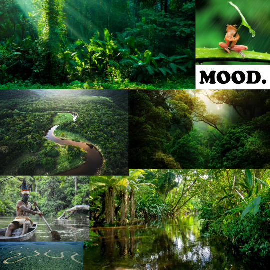
Top left is the Mood Board, with the Style Tile to the right of it. Then below those are my sketches and various options in search of a good layout for the information and graphical elements.
Design Proposal:
There are many corners of the world, each with massive diversity, and impossible to recreate conditions. Above them all though, stands the Amazon rainforest, that is home to 10% of the world’s biodiversity, and that counters global warming on an incredible scale just by existing. Advocating for the protection of the Amazon Rainforest therefore, is a must. The target audience for this project is the younger generation in South America who have started to fight against their governments on the issue of destroying the forest. The main offender of the Amazon is Brazil’s president, so Brrazilian teens and young adults are in particular a major part of the target audience. Additionally, American teens and young adults are part of the target, though for a different reason. American teens cannot be there to help protest, but they can share social media efforts and “signal boost” information about the issue. Therefore, American teens are a secondary audience.
This topic is important due to the climate and wildlife loss that our planet is in danger of, but also due to the dangers of the countries where the forest is themselves. The Amazon rainforest is being cut and burned largely to make more land for farming, a trade that while important, can be done on the land that is already clear. This means that the Amazon is being cut, burned, and destroyed due to the government’s selfish desires to expand agriculture for monetary gain even more than it already has. In the poster, communicating this selfishness and the innocent beauty of the forest are paramount, since the harsh dichotomy between the two is vital to reaching the intended audiences. To communicate this, I plan to use a lot of graphics showing the damage done to the forest over recent years, as well as what is at risk (like biodiversity, animal and plant life, et cetera). I plan on creating statistics in the text that pop out in order to draw reader attention without the need to read the entire poster, and small graphs/charts for the graphic side of this communication.
As far as design goes, pushing the forest look is a must, without letting the poster get too busy in the process. As a result, I elected to create paper-cut looking shapes of rainforest leaves/trees that can be layered to create the illusion of a dense forest, while still being relatively flat-looking and not distracting the eye away from the text. Since I’m working with a forest, there are a lot of greens in the palette, but a strong use of off-white will also be present to make whatever is in that color really pop out from the forested background. As far as the typefaces go, something that is cleanly yet not too dull was a must, so the current plan is to use the Bahnscrift typeface, which has varied weights/strokes, all of which are very legible.
Full Citation List:
11, August, et al. “Brazil and the Amazon Forest.” Greenpeace USA, 11 Aug. 2020, www.greenpeace.org/usa/issues/brazil-and-the-amazon-forest/.
Brazil's Amazon: Deforestation 'SURGES to 12-Year High'. 30 Nov. 2020, www.bbc.com/news/world-latin-america-55130304#:~:text=Deforestation%20of%20the%20Amazon%20rainforest,August%202019%20to%20July%202020.&text=The%20Amazon%20is%20a%20vital,the%20pace%20of%20global%20warming.
Butler, Rhett A. “Deforestation in the Amazon.” Mongabay, Mongabay, 4 Dec. 2020, rainforests.mongabay.com/amazon/amazon_destruction.html.
“Deforestation and Forest Degradation.” WWF, World Wildlife Fund, www.worldwildlife.org/threats/deforestation-and-forest-degradation.
Deforestation Fronts: Drivers And Responses In A Changing World. WWF, 2021.
Osborn, Catherine. “SOS From Brazil's Amazon Fire Protesters: 'We Need The World's Help Right Now'.” NPR, NPR, 26 Aug. 2019, www.npr.org/2019/08/26/754292402/sos-from-brazils-amazon-fire-protesters-we-need-the-world-s-help-right-now.
“Why Is the Amazon Rain Forest Disappearing?” Time, Time, time.com/amazon-rainforest-disappearing/.
0 notes
Photo

[HUMAN RIGHTS POSTER_DESIGN RATIONALE]
I think that my poster does in fact advocate well for my Human Rights issue. I was targetting the pain and anguish that are brought about by torture, and so I think that the agonized face of a human is a great way to tackle that issue graphically. I didn’t want to have to over-explain the graphic, and I think that worked well, since the design reads as its purpose well (in my opinion). As far as the text is concerned, I think that once I messed around with the typefaces enough, I got the text to a good pace pretty early, as opposed to having to fight with it for an extended period of time. I wanted something clean, crisp, and that doesn’t pull attention away from the graphic, and I think Banhscript was a good fit as a result.
This font choice was also great due to it being a san serif, and is therefore less crowded/busy. Therefore, a font with more of a more blocky/clean look was a necessity. This let me make both the larger “Article 5” and the smaller text legible and unified. Additionally, I think that my graphic is very readable due to me using the pen too and contrasted levels of black, grey, and white to make up the shapes of the face rather than relying on lineart. I wanted to do this both to make the graphic stand out more, and also to make a very clean looking facial topographic map that can be used to show the difference in light on the parts of the face. As a result of everything just mentioned, I think that I created a poster that strikes out to people, regardless of language. Pain, like other emotions, has no real language, which is part of what makes the agonized face such a powerful communication tool.
In reading all the articles, number five stood out immediately, due to the serious and stark nature of the content. Torture has a really tangible feeling of combined despair and pain, so I immediately had ideas of how to translate that into an illustration. I took a few different turns with my concept before getting to the final poster, but I think that throughout all of my work with this project I held true to the feeling I was aiming to evoke. I eventually came to the idea that I really wanted to express the pain of torture in a truly human way, which is what created the human face screaming out idea. It is a bit literal as far as what it symbolizes, but I think that’s alright, and makes it so viewers don’t have to “read into” the design too much.
I think that the research process for this project specifically did not really make a massive impact on my process or concept, but I am very confident that for other projects I’m currently working on, research has been incredibly important. I think the only reason it wasn’t vital to this was because of how headstrong I was about my original concept and idea to show human pain by a human going through pain. Critique was a great tool in order to lay out the text better, and get some ideas for how I wanted to pull together the entire piece as a whole. Before critique, the text positioning was troubling me, and while I didn’t exactly use any of the ideas from critique directly, the points brought up definitely influenced the final text’s position.
I really wanted to push the envelope and not settle on this piece, since in past ones, I’ve accepted some less than perfect results. While I still ended up making some concessions (like a lack of rendering on the torso), I poured a lot more time into this than I have on past work. I think that definitely shows in the final piece.
SOURCES:
ooGleb. Scream. DepositPhotos.
“United Nations Logo Vector.” Un.org, United Nations.
0 notes
Text
[IDA PROJECT_RESEARCH]
Deforestation of the world’s largest rainforest, The Amazon, has hit its highest rates since 2008, with 11,088 sq km destroyed in 2020. This is largely due to the newest Brazilian President Jair Bolsonaro encouraging agriculture and mining operations in the forest since coming into office.
80 percent of the world’s land-based species live in forests, and these forests (not specifically rainforests) cover roughly a third of the land on our planet. Additionally, forests act to purify the air and protect our ozone layer by being a carbon sink. Rainforests like the Amazon are home to immense biodiversity, so them being targeted is even scarier on the animal life conservation side of things. 17% of the Amazon has been lost over the last 50 years.
Since 1978 roughly one million sq km has been destroyed of the Amazon, with more than three quarters of the destruction being for large scale cattle-ranching. The past drop in forest destruction in the Amazon was due to “increased law enforcement, satellite monitoring, pressure from environmentalists, private and public sector initiatives, new protected areas, and macroeconomic trends”. This means that there is a way to lower the level of deforestation again.
What drives people to deforest changes with global trends, but is almost always related to agriculture, plantations, creating infrastructure, and extraction of resources. The pdf shows breakdowns of what specifically “drives” the deforestation in each front of the Amazon, from Peru to Venezuela, in specific. Over time, the need for corporations to agree with anti-deforestation efforts has increased, since there is no longer the ability to influence deforestation solely through rules and regulations.
At the current speed the forest is being destroyed, WWF predicts that 27% of the Amazon will be gone by 2030. This year coincides with the year climatologists predict humans with have done irreversible damage to the planet's ozone layer and icecaps (weird coincidence huh). In August of 2019, the Amazon was raged by fires, and while there are often fires used to slash and burn trees, the number of fires that year increased by 111%. These fires were not well received by other world leaders either, and upset both the German Chancellor and French President, the first of many world governments to take action against the deforestation.
The Amazon houses not only roughly 10% of all the world’s biodiversity, but also 24 million people, which includes 180 different groups of indiginous people. This forest isn’t just home to animals, it is home to living and breathing humans too. There are 40,000 species of plants in the forest, and nearly 1,300 unique species of bird as well. I mentioned the carbon sink earlier, but not the amount, which is roughly 100 billion metric tons of carbon-more than ten times the annual global emissions from fossil fuels. The area of the rainforest already destroyed is comparable to the state of California in size.
The G-7 summit at France motivated President Bolsonaro to take action against the 2019 fires, though his stance on deforestation is questionable. Claudio Angelo of Brazil’s Climate Observatory, said “The president is encircled by climate deniers and conspiracy theorists… it is very difficult to imagine a real change” of the President. This sentiment was mainly echoed by the rest of the country, with many taking to the streets to protest the Amazon’s destruction, and the effect that it would have not only on Brazil, but on the world.
Full Citation List:
11, August, et al. “Brazil and the Amazon Forest.” Greenpeace USA, 11 Aug. 2020, www.greenpeace.org/usa/issues/brazil-and-the-amazon-forest/.
Brazil's Amazon: Deforestation 'SURGES to 12-Year High'. 30 Nov. 2020, www.bbc.com/news/world-latin-america-55130304#:~:text=Deforestation%20of%20the%20Amazon%20rainforest,August%202019%20to%20July%202020.&text=The%20Amazon%20is%20a%20vital,the%20pace%20of%20global%20warming.
Butler, Rhett A. “Deforestation in the Amazon.” Mongabay, Mongabay, 4 Dec. 2020, rainforests.mongabay.com/amazon/amazon_destruction.html.
“Deforestation and Forest Degradation.” WWF, World Wildlife Fund, www.worldwildlife.org/threats/deforestation-and-forest-degradation.
Deforestation Fronts: Drivers And Responses In A Changing World. WWF, 2021.
Osborn, Catherine. “SOS From Brazil's Amazon Fire Protesters: 'We Need The World's Help Right Now'.” NPR, NPR, 26 Aug. 2019, www.npr.org/2019/08/26/754292402/sos-from-brazils-amazon-fire-protesters-we-need-the-world-s-help-right-now.
2 notes
·
View notes
Photo

[FINAL TYPOGRAPHER POSTCARD]
In this design, I would say that I am definitely disappointed. It is simple and clean like I aimed for it to be, but has a real lack of punch to it. It leaves me wanting for more, in the sense of it looking almost incomplete. Maybe that thematically is good, since everything I found about Baskerville left me feeling the same way, but I think one way or another, that needs to be addressed.
However, I am quite proud of the concept and the overall cleanliness that the work has. I often like to clutter and overdesign things with pictures, leaving little text behind when I can, so this piece was a step back from my usual style. That is definitely something I am proud of.
To be honest, I really don’t remember what evoked the original idea for the card was, though I know that I wanted a forced perspective fisheye look to it, and the reverse on the back. This concept kind of overruled any other hierarchical choices, since neglecting to play with the text around the circles would have absolutely shattered the fisheye concept as a whole, at the expense of the card’s unity.
Without the ellipse tool this wouldn’t have been possible. Well I could have used the circular selection to just select and delete then paint bucketed in spaces, but it would have been much more tedious is the point.
I don’t feel that I grew as a designer from this, but I think that was my own fault. While this minimalism was definitely out of my comfort zone, I think that I let it box me into creating something that borders on mundane. Design is meant to communicate, but also entertain, and this is not entertaining. That was the point of the whole “Baskerville not John” idea, but it still feels wrong.
I learned a lot about the limits of minimalism. In the past, any minimalism I did was stark and spacious, with very little actual space filled, which I think is a very shock-oriented way of handling minimalism. From this project though, I was forced to move beyond a truly subjective use of minimalism due to the need to communicate about Baskerville. I was forced to use minimalism for design rather than for a “fine art” purpose. Additionally, I learned a lot about Photoshop and the ways that it can be used to create minimalist designs, as well as its very serious limits in the field of minimalism (AKA no symmetry rulers, lack of vector support, convoluted menus, poorly optimized shape/pen tools, et cetera).
PHOTO:
Millar, J. (1774). John Baskerville [Photograph]. National Portrait Gallery, London.
0 notes
Photo


[HUMAN RIGHTS ILLUSTRATOR SKETCHES]
I would like to start by saying that I didn’t create these sketches in Illustrator, but while creating them, I kept in mind that my final work would have to be done in it. Therefore, I tried to create designs that would lend themselves to Illustrator’s toolset and capabilities.
I think that there are a few of these sketches that are very strong, as well as a few that are not worth much, and won’t be pursued. Specifically, I don’t think I want to use the Article 16 sketch, or the first Article 5 sketch (the one with the crying face), due to both lacking in comparison to the others.
I think the two designs I’m most interested in working on are the Article 5 design of the face in pain without the blood (the third Article 5 sketch), and the 3x3 Article 26 sketch (the second Article 26 sketch). These two sketches are the closest to the vision that I had while making them, and are the most fully developed from a visual standpoint. I think that the emotion and shock value of the Article 5 sketch is really captivating, while at the same time, the Article 26 sketch has a great visual balance and manages to be engaging while still fitting a lot of text comfortably.
Overall, I think the direction I’m most likely moving in is the Article 26 choice, since the pen I used to create the Article 5 option is a Clip Studio Paint exclusive, and I doubt I can get the same toothiness out of any Illustrator brushes. Along with this, the Article 26 sketch just more clearly communicates its information than the Article 5 sketch does.
0 notes
Photo


[REPRODUCTION PROJECT]
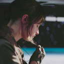
I don’t think that the 1Q84 cover by Chip Kidd was hard to recreate the look of due to the generally minimalist and simple design properties of it. However, recreating the actual feeling that the original gave off is a different story, and was difficult to capture for myself. The original 1Q84 cover uses expression and lighting to create a portrait of a woman who is a combination of blasé and confused, all while looking a bit washed out. This look is relevant to the narrative of the book, which follows a woman lost in a world similar but not the same as her own. Creating this expression using stock photographs was a bit more difficult than expected.
As a result, my reproduction looks a bit less confused, and a bit more determined, since that was the general expression of the woman in the photo that I used. She originally had a smile on her face and more light in her eyes, as well as more color in her face (a bit of a blush), which I edited to decrease the mood that her expression was giving off. I couldn’t create an expression that was exactly like the original, so I elected to create something that would at least still work with the book’s narrative. One drastic difference between my reproduction and the original is the lack of= transformation present. The original has a vellum layer that can be removed to slightly distort the image of the woman’s face. However, due to this being a digital work (and not an actual cover of a book), I could not recreate that.
In the original, I appreciate the minimalism used and the ties that the cover makes to the story’s context. I also like the more muted color palette and the dazed expression of the woman’s face, which I think contribute to these ties. Additionally, the positioning of the woman’s eyes in the area that the 1 and Q are in allows them to pop out from the page a bit more, which I think is an interesting touch. If I had more knowledge and time with Photoshop, I probably would have spent a bit more time working on the color balance of the face in order to more accurately achieve the muted tone that the woman on the original gives off. I would have also spent even more time looking for photos to use/maybe found a model and taken my own to more accurately achieve the expression in the original cover.
Sources:
Woman Wearing Black Spaghetti Strap Top [Photograph]. (2016, July 24). Pixabay.
0 notes
Photo

[TYPOGRAPHER RESEARCH]
John Baskerville was a typographer, inventor, and creator of the typeface with his namesake. Baskerville improved the printing press with his own modifications to it, as well as using higher quality ink and paper than anyone else at the time. Unfortunately, John Baskerville is nothing more than a name at this stage of history, since there is quite little remembered about the man himself, with his typeface and legacy truly preceding him. The Baskerville typeface itself was designed traditionally, and its matrices and letter stamps can be found at the University of Cambridge presently. The baskerville typeface is an incredibly uniform and consistent serif typeface that is legible at small sizes, and
Born January 28th, 1706 in England, Baskerville made his start as a stonecutter, before making an exceptional profit working on “Japanware” (a style of decor that was influenced by Japanese and generally Eastern Asian pottery and decor). Following the success of his Japanware, Baskerville pivoted to what he became known globally for, printing. Baskerville took a holistic approach to printing, focusing on the entire process rather than only the letterforms. This meant choosing paper of exceptional quality, ink that works well with said paper and is dark and rich, bindings and covers that are durable and elegant, and more. The books printed by Baskerville were exceptional in quality, and as such were items made almost entirely for the elite, wealthy, and rigorously educated.
After his death, Baskerville’s typeface fell out of popular view and into the shadows, until Benjamin Franklin brought it to the United States. Baskerville’s influence also reached Bodoni and Didot, which led to the Baskerville font being a staple look in the transitional/modern style of typography. However, in 1917 Zuzanna Licko created the font Mrs. Eaves based directly upon the Baskerville typeface. This work made Baskerville the font that it is, and pushed it back into the mainstream where it has remained ever since.
Sources:
Industry and GENIUS: John Baskerville & the Beauty of Letters historywm.com/films/industry-and-genius-john-baskerville-the-beauty-of-letters#:~:text=Baskerville%20not%20only%20designed%20a,the%20quality%20of%20printing%20inks.
John Baskerville. 24 Jan. 2021, www.britannica.com/biography/John-Baskerville.
Millar, J. (1774). John Baskerville [Photograph]. National Portrait Gallery, London.
Monotype GmbH, [email protected]. Font Designer – John Baskerville. www.linotype.com/702/john-baskerville.html.
Robinson, Jon. “Understanding Typography: John Baskerville and the King's Roman.”
Medium, UX Collective, 11 Aug. 2020, uxdesign.cc/understanding-typography-john-baskerville-and-the-kings-roman-fb152e3129be.
0 notes
Photo

[FOUND OBJECTS]
In this Found Objects construction piece, I had less trouble than I originally anticipated. I expected the vanilla, chocolate, and sugar to give me a lot of problems when it came to the actually creation of the letterforms, and the flour to be messy and end up all over everything else in one way or another. However, there were no major hang-ups when it came to creating this. I went letter by letter from the middle out, creating the brown sugar e, then the vanilla r, the baking soda n, et cetera.
The setting of this piece is a kitchen countertop, which I thought was only fitting given the deconstructed chocolate chip cookie nature of the piece. Everything was arranged, prepared, and photographed in the kitchen, and while the cleanup was a bit messy, I don’t think I could have picked a better area to work in, both thematically and practically. My goal was to use baking ingredients to create something that evokes the same calm and enjoyable feeling that baking does for me, so doing this anywhere other than a kitchen that I’ve baked in would have been very counterintuitive.
I think that my treatment of the typographic forms was heavily influenced by the materials themselves, but that’s alright given that the entire impetus of the design was deconstructing a cookie to describe the feeling baking it evokes. The letterforms are a bit loose, but this created a sense of relaxed tone/feels a bit more natural than if I had constructed rigid letterforms. I did not use the Lupton book in my creation of this, though the principles of spacing type described in the book were used in this. So in a way, the Lupton readings did come into play I guess. These letterforms bordered on a more traditional typeface as opposed to something Avante Garde, however the r and final e are somewhat reminiscent of the font “Chiller”, which is an incredibly untraditional set of letterforms. More than anything, using baking ingredients made me want each letter to appear to be an entirely different typeface in order to push the narrative of disparate items creating something wonderful together.
I feel that this assignment was manageable and that I did well on it. I think that it wasn’t too difficult once I had a concept that I liked and that the materials I used likely made it easier for me than for other people, since they were each mostly malleable and easy to work with, as opposed to solid objects like Sharpie markers or pencils. Whenever a letter wasn’t looking right, I always could just work a little bit more material into the shape to get the look I wanted. I think that conceptually, this assignment is great since it forces people to create something from a semi-limited selection of items.
0 notes
Photo

[REPRODUCTION RESEARCH POST]
The design I am reproducing is the 2011 novel cover to 1Q84 by Haruki Murakami. The design was done by Chip Kidd, a designer who has worked with Murakami on nine of his other books’ covers. The story of 1Q84 follows two characters, a woman name Aomame and a man named Tengo, who are both in twisted and nonstandard versions of the real world, unable to escape. The two are faced with different barriers and challenged along the novel’s progression, but slowly get closer to one another, creating a mystery-romance dystopian journey centered on deception and warped perceptions. The Q in the title, stands both for question, as well as being
Kidd knew all this due to reading one of Murakami’s manuscripts for the book, and as a result, incorporated this deception into the novel’s cover design. Kidd used a semi-transparent vellum sheet in order to create the half-opacity white screen over the majority of the design, yet when you remove the sheet, the design is misshapen and in Kidd’s words “if you separate the two, the image falls apart”. This sheet and the lack of cohesion without it, was intended to allude to the deception and interweaving of Aomame and Tengo’s disparate stories with the slightly off-kilter world they are existing in.
[CITATIONS]
Shapiro, Lila. “The Stories Behind Haruki Murakami's Most Iconic Book Covers.” Vulture, 21 Sept. 2018, www.vulture.com/2018/09/haruki-murakami-book-covers-stories-behind-them.html.
Hmadmin. “About the Book 1Q84.” Haruki Murakami, 7 Oct. 2014, www.harukimurakami.com/book_summary/1q84-summary.
0 notes
Photo


[Found Objects Planning]
For the Found Objects project, I chose baking supplies due to my suite having an excess of them, and my love for baking. The variety of the look and feel of the different ingredients was also a major factor in my decision though. I had two main ideas, with the first being using only the flour and then pushing away the words “KEEP DRY” to reveal the table below, and the second being the word “SerenE” using multiple ingredients.
I think that as far as creating a design with a nonstandard method is concerned, the flour idea is superior. I planned to wet part of the flour in order to create a sense of irony as well as create a contrasting color/texture in part of the composition. However, the serene option allows for a lot more color and shape variation, as well as a composition that is more in line with the feeling that baking gives me. With the serene design, I want to push the look of a smooth reverse bell curve shape in order to comfortably move the eye through the design. This combined with the word choice create a real feeling of relaxation and general lack of rush/worry, which is exactly how baking makes me feel.
0 notes
Photo


[Letter O:
This was the most visually interesting composition from the single letter entries I created, since I feel that the use of the O and the gradient as a background creates a rising sun adjacent look to it, which I like a lot. I think it was the one of the three that was most creative and nonstandard.]
[Letters XY:
I feel that while this design is slightly difficult to read as both X and Y, not just X with a bar through it, it is visually interesting enough to make up for the slight inability to read it. I initially had a very different design for this, but after reading the regulations and noticing the font restrictions, I elected to attempt to go for something less ambiguous than my original design, resulting in this.]
[HiDeoUS:
After doing the words “Face” and “Ascend” which were relatively mundane ideas to translate into type, I began to grow tired of using the same three typefaces and their respective fonts. From the beginning sans serifs are not very visually appealing to me, so creating a design to reflect my disdain for them seemed obvious. I initially had only used variations of Helvetica for the whole word, but then I realized that incorporating Geneva and Futura as well (along with the warping and transformations) could create a truly hideous design. I made spacing, font, scale, and positioning choices intentionally to make this composition as visually unappealing as possible, and I feel that I succeeded. To be honest, I kind of want to put this on a shirt.]
[Hierarchy Business Cards:
I liked the modular look that was created from this design, and feel that the hierarchy of the text created a good sense of eye movement from the large initials to my name, then down the information, finally ending at my contact information as the finale.]
0 notes
Photo

With this exercise, I was able to learn a lot about the differences between Clip Studio Paint and Photoshop as far as photo editing and transformation abilities are concerned. I think what I learned the most from this exercise was that Photoshop really is quite great when it comes to making non-destructive edits to photos and other images that are pulled into it. I have yet to learn how to do more chaotic and visually interesting warping and editing, so I hope that more time with the program will allow me to learn how to do this. The tool that was most helpful to me in this project was the hue/saturation adjustment tool, though I did use the rectangular selection tool heavily as well. I think that more time with the program and its tools will surely allow for more visually interesting work in the future.
0 notes

Photo

Hey, I’m Brady. I’m a graphic design and psychology dual major and digital artist.
A lot of my inspiration for art comes from psychological horror, internet/digital culture, music, video games, and anime. I forgot what else I’m supposed to put in this little introduction.
I mainly like chaotic designs filled with minute details and references.
1 note
·
View note