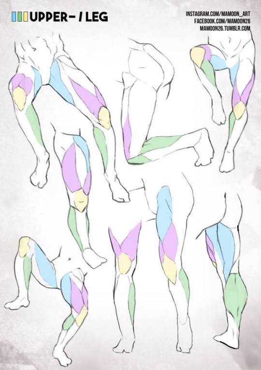
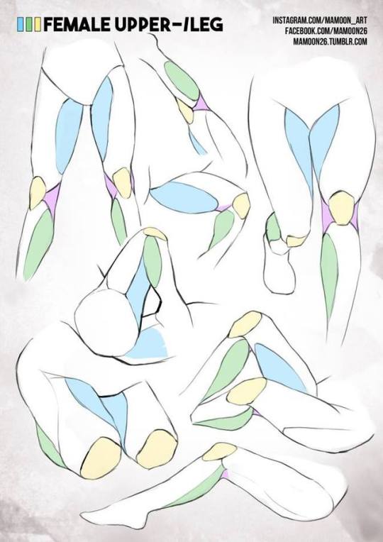
Bramble's art. Main blog: http://bramble-star.tumblr.com/. Commissions of any sort are closed until I git gud.
Don't wanna be here? Send us removal request.
Photo
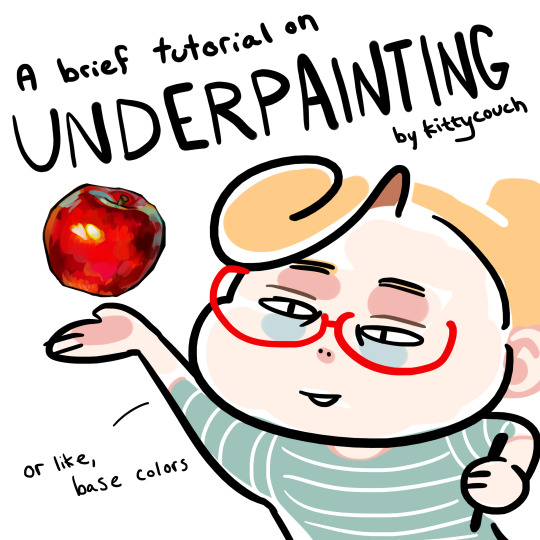
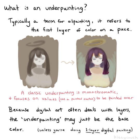
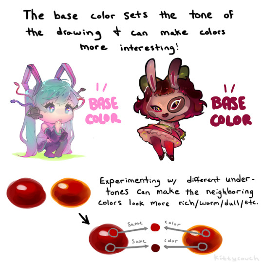
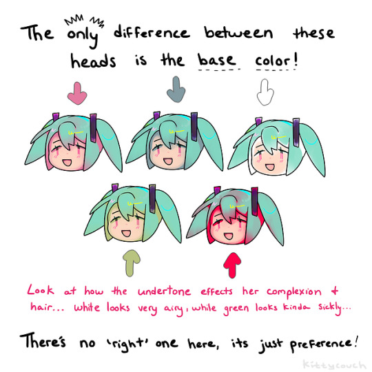
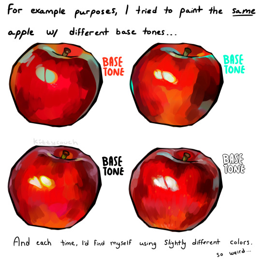
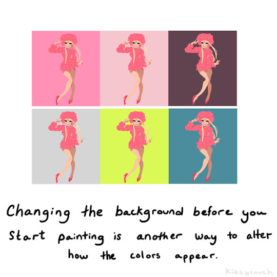
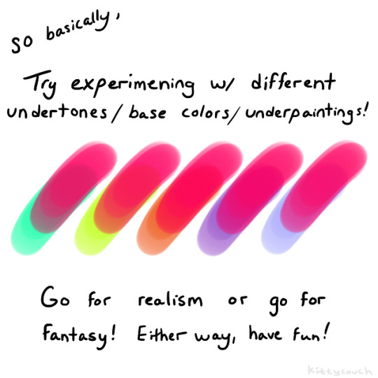
No one asked but here’s a brief tutorial on digital underpainting and how it can add some extra flavor to your art!
(I got asked this a couple times so just to clarify: I used “overlay” in the second slide… but the rest of these examples are JUST painted on, no effects! Try playing with the opacity on your pencil/water/brush tool to allow the base color to show through!)
52K notes
·
View notes
Photo

Johan Christian Claussen Dahl, Moon Night over Dresden, 1827
763 notes
·
View notes
Photo
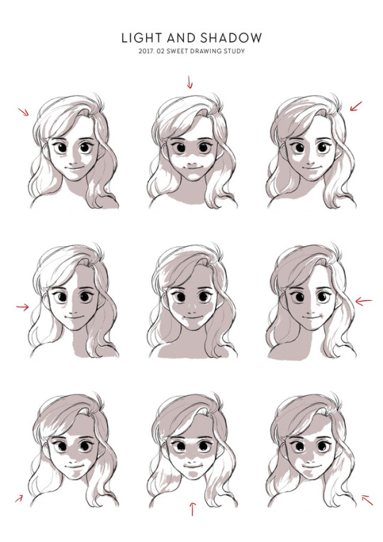
20170226
Drawing Study of February - Light and Shadow
118K notes
·
View notes
Photo
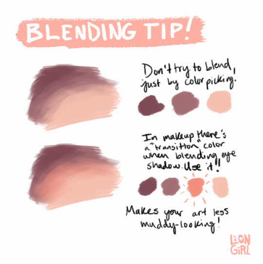
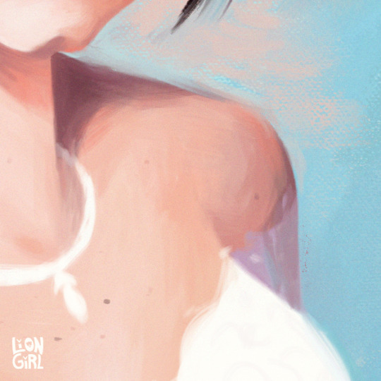
A tip for blending when painting digitally: use a transition color! I quickly made this when my brother asked for art advice while I was working on a painting for my best friend. (I was watching a lot of makeup videos to pick out her gifts).
80K notes
·
View notes
Photo

“Cheat sheet for drawing heads” by mannequin-atelier: http://bit.ly/2x64ht6
Drawing heads from any angle can be tricky, so here are some tips to help you face the challenge!
3K notes
·
View notes
Text
Advice: Colouring (shading)
Good:

=>
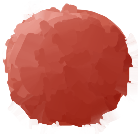
Better:
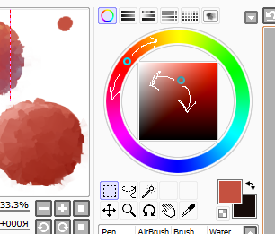
=>
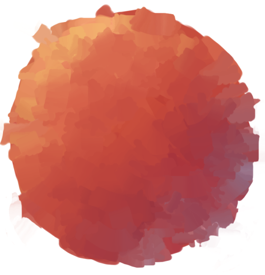
36K notes
·
View notes
Video
tumblr
also made a quick thing of the sketch for those who’re interested :> spent waaayyy too long on the face/head because seems like that’s just how today is so i had to cut it for video length reasons hgjdsl
100 notes
·
View notes
Video
youtube
I’ve taught drawing and painting for 10 years now. I’ve seen a lot of portfolios. I’ve critiqued thousands of assignments. And the problems I saw in student work back when I first started teaching are the same one’s I’m still seeing now. These are fundamental issues that don’t change with the latest version of photoshop or even what century you live in.
Before we jump in, I want to quickly mention that I’m working on a drawing basics course. It’s meant to be a new artist’s first course, to get you started doing the right things and hit the ground running. If you don’t want to miss it when it comes out, get on the newsletter.
So, here are 5 shading mistakes you’re probably making, and how to fix them.
#5 – Icing Before Cake
I meet artists all the time who are just starting out, and they’re practicing techniques and anatomy and shading details and all this really cool stuff… But it’s not making their drawings better. Why is that?
While they’re focused on all the fancy fun stuff, they’re making huge proportion mistakes, their perspective is off, and their gesture is stiff. That’s not even icing before cake, that’s icing without cake. You’ve got to build your pictures and your skills with the fundamentals first.
Each concept builds on the last. Surface stuff like anatomy, techniques and rendering details are all at the tippy-top; awesome but initially unnecessary and less important than the stuff at the bottom. You can’t shade correctly if you don’t know the simple form; you can’t draw the simple form if you don’t understand perspective; The forms don’t matter if you can’t draw a straight line, keep your proportions in check or establish a dynamic pose.

Below are some drawings I did a few years into my studies. If you think it’s really good, you’ve fallen for my tricks. At this point in my development I got good at shading. But it’s filled with structural errors. I didn’t really understand form. I just learned some effective tricks to make the drawing appear 3D. An exaggerated core shadow, some reflected light, and a bright highlight as a cherry on top. Wow, it’s so easy! But it’s all just a cheap distraction from the uninformed construction.

The icing might be the part that makes it look pretty or makes it stand out, but icing by itself is gross… It’s empty calories. Remember this every time you want to draw eyelashes before the eye socket.
#4 – Bad reference
Whoa, hold up guys, I just got tagged and I’ve got to take a selfie… let’s see… First, camera up high, very slimming. Kinda dark in here, turn flash on… Click… Alright, now I’ve got to choose a nice filter… Hmm… Tweak that a little bit… Perfect.
A photo like that is distorted and edited. It might be flattering or maybe even a good photo, but photography and drawing are two different fields. Something that makes a good photo won’t necessarily make good reference for drawing.
Drawing from bad photos is super common, and super easy to fix. I wrote a blog post about it ages ago, so you can go there for a more detailed lesson on what makes good photo reference. But to paraphrase…

When looking for reference, look for photos with good lighting and clear shadows. This will translate into a dimensional drawing. Drawing from a flash photo with no shadows makes it much harder to define the forms in your drawing. It’s possible, I’ve done it, but it takes a trained eye and ability to use subtle halftones to define the forms. Beginners usually end up with flat, muddy looking patches of tone. If you’re just getting started, I recommend sticking to photos with lighting that clearly defines the forms.
You can find photo packs made specifically for artists that have good lighting and minimal touch-ups. I’ve got some here. In the long run, the best thing to do is learn how to take your own reference photos. And if you can draw from life instead, that’s better than any photo.
#3 – Outlines
There’s always a silver lining, but there’s also not, because the real world doesn’t have outlines. Yet as beginners, we all start by drawing thick, dark outlines around everything. Now, there’s nothing wrong with linear drawing or cartoons if that’s your intention. But if you’re trying to draw realistically, you need to be thoughtful about your outlines. It’s ok to use them. It’s a mistake to overuse them, or use them as a crutch.

Stop thinking of 2D shapes and start thinking of 3D planes. Knowing the structure of the nose – that means the planes of the nose, which are based off of anatomy, will help you place patches of tone that make it look like a convincing nose. No need for outlines. You can draw a whole picture without any outlines, since that’s how we actually see things.

Masters like John Singer Sargent, know how to use both. In the face of this drawing, he’s not using outlines, just tone. It’s the center of interest, so he makes it more realistic. In all these secondary elements, he uses outlines. The outlines are deliberate. The tonal face and the outlined parts have a nice contrast. And the outlines don’t look boring. They have a variety to their weight. The jaw and neck are outlined. But the ear isn’t. The edge is lost into the background. He used the outline sparingly only in areas where he wanted the forms to pop. The left side of the figure is separated from the background with a value difference.
The jaw, neck, shirt, bowtie, and jacket are all very similar in value. To separate them with tone, would require very subtle shading. In a quick drawing like this, too much detail in secondary elements could look overworked. A well placed outline is clean and simple. It does the job.
#2 – Afraid of the Dark
The next mistake is not going dark enough with your shadows. I see this all the time, especially on portraits. People are afraid to put dark shadows on fair skin, because they know that the local color of the skin is pale, so they think light skin, light values. But the shadow is just a shadow. It’s the lack of light. It’s supposed to be dark. Or some people are afraid to go too dark because they might not be able to erase it, so their shadows end up being just as light as their halftones.

By removing the shadows, you remove the mood that the lighting created. And you’re losing the 3-dimensionality of the forms. If you didn’t like the lighting in the photo, why did you use the photo? Retake it! Don’t make it that hard on yourself. Inventing a new light setup on a face is really hard. If you’re advanced you can do whatever. You can draw a pretty girl while looking at a beaver! But if you’re a beginner, don’t.
So, to avoid muddy or cartoony drawings, learn how to see values correctly. When you’re drawing, make sure you separate the light family from the shadow family. Remember the rule: the lightest dark is darker than the darkest light. If you’re not sure what that means, this next mistake is for you.

#1 – Sloppy Values

The most common shading mistake I see is not organizing your values correctly. Not making your shadows dark enough like I mentioned in the last mistake is one way, but making your halftones too dark is just as bad. So, general sloppiness with your value control is the bigger issue.
The first thing that is important to understand is that the value on any particular point on the surface is mostly determined by the angle of the surface in relation to the light source. Unless you’re dealing with highly reflective surfaces, then they act more like a mirror to the environment. For now, let’s stick to surfaces like skin, which are slightly reflective.

I did a lesson on “How to Shade a Drawing” a while ago. I highly recommend you watch that next. But generally, the part of the surface that points directly toward the light is called the center light.
It will be the brightest spot, excluding any reflected highlights.
As the surface turns away from the light source, those planes will get progressively darker. These are known as halftones. The more they face away the darker they are.
After we pass what’s called the “terminator” the planes don’t receive any direct light from the light source, since they are facing away from the light.
Everything in there is shadow. Unless you’re in space, shadows won’t be pure black.
Light will bounce off other things in the environment. So, within the shadows you’ll have bounce light, or reflected light. But those are still darker than the halftones in the lit side. That’s the general concept. There’s also occlusion shadows, cast shadows, core shadows and highlights, but you can go watch the other lesson for the full explanation.
Ok, now that you understand form and how light reveals form, it’s important to stay consistent throughout your drawing. Light reveals the 3 dimensional forms because the value of a plane tells the viewer the angle of that plane. If you make your halftones as dark as your shadows, then you’re not communicating the correct plane angles and that breaks the illusion of form. That brings us back to that rule: the lightest dark is darker than the darkest light. Let me rephrase that a little. The lightest shadow is darker than the darkest halftone. Make a little more sense?

You might think that the reflected light under the jaw would be lighter than the halftone on the side of his check, but you’d be wrong. Just sample the colors and extend them out to see.
So, if it’s in the shadow family, it should be darker than anything in the light family. Organize your values and use them correctly in your drawing.

And the key is to stay consistent with that throughout your drawing. If you break that, it should be intentional.
There’s also incomplete shadows: scratchy shading that has all these little holes of light in the shadow.
The holes are as light as a highlight, and they break up the shadow and ruin the effect of light on form. So the shadows don’t actually look dark, they just look spotty. Shadows look like halftones and halftones look like shadows… The result is dirty looking skin. You can fix this by filling in the holes manually, blending, or preventing it from happening in the first place by shading with tight, close-together lines.
When the shadows are consistent and clean like the image below, it has a much more realistic and 3-dimensional feeling. The goal is to clearly communicate what is light and what is shadow. That makes clear 3D form.
Check out Stephen Bauman’s patreon and instagram.

Below is another example of a master breaking the rules. Harry Carmean doesn’t always fill in his shadows with clean tone. But, he’s still clearly communicating what is shadow and what is light. He uses the dark pencil only in the shadows. He uses the white pencil only in the lights. This clearly distinguishes the two. His mess is extremely well controlled. It’s full of energy and fun to look at. It’s skillfully designed, the anatomy is accurate and dynamic. It all holds together.

Again, if you want to participate in the Drawing Basics course, make sure you’re subscribed.
And if you have a few seconds, do me favor. If you have any friends or classmates that make some of these mistakes, save them! Tell them about this video.
7K notes
·
View notes
Note
I cant draw guys for anything, help a girl out with like drawing male upper bodies and legs
I was actually mid trying to design sci-fi clothing but it just wasn’t working (for now) but I realised I had already drawn an upper body and decided it was perfect for me to use that for a tutorial.
Before I start, I would like you to know that there are a billion different ways you can draw male upper bodies because bodies can vary greatly. I’m going to assume you want me to teach you how to draw a triangle body. For this tutorial, I’ll be using examples from my own experiences: what I wanted to draw vs what I drew (which ended up incorrect). You can apply this technique to most body types by following the key suggestions that I will show if you’re aiming for this specific type of body proportions (this means that this doesn’t cover the body mass — only the proportions for a typical “triangle” body.)
I would also like you to know that my drawings lately has been a struggle for some unknown reason so the examples will look a little wonky, sorry about that!
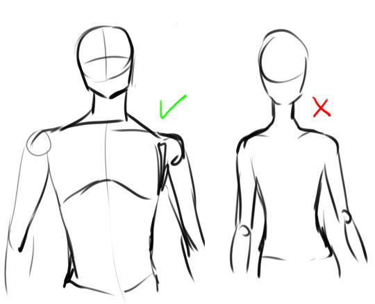
So, when I start drawing a male body with a triangle shape this is what it typically looks like (it will vary, still, depending on the body type overall, but this is usually what I draw as a rough sketch). Note the lines and shapes used in the “correct” option. Here is a tutorial I made a while ago explaining the typical shapes I use for male bodies. When I was younger, I used to draw all men like the example to the right. Note how it lacks the shapes shown on the left. I still draw petite guys now and then, but often, this wasn’t what I was trying to draw, it was literally the only thing I could draw. What you should keep in mind is:
The size of the neck. A broader neck immediately makes a body look less petite, even with small shoulders.
Don’t be afraid to widen the shoulders or make them a little less sloping. If you worry that the shoulders look too small, go outside your comfort zone and make them wider. With time you’ll learn what looks overdone and what does not, it’s all about practice.
Keep note of how wide you draw the hips in comparison to the waist. I currently have a problem where I tend to draw the hips too small! The ideal is to not to make them wider than the chest or shoulders.
This might be surprising, but keep the focus on the chest as much as you do on the shoulders. The torso itself will that way create a triangle-shape that many often struggle to draw, even with the wider hips!

This is how triangle-shaped bodies can end up looking like (please ignore the one dislocated shoulder). Again, it might vary depending on the body mass such as fat and muscle, but with his mass, it becomes even more clear.

And as you can see, the triangle shape is still very clear even when his muscle isn’t visible.
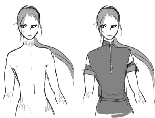
Now, if you dress the second body type, you’ll notice that the focus become more on the waist and hips more than the shoulders, even if there was an attempt to make them wider. This is a good body type if you’re going for smaller body types, or guys with pear-shaped bodies, teens, etc. But if you’re going for a triangle shape then it’s clearly not doing it. The hips and waist are too exaggerated and his shapes are too soft-looking.
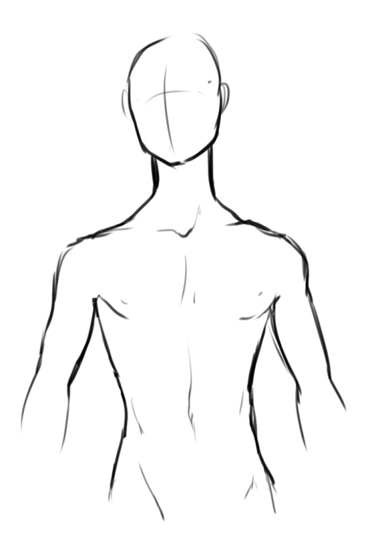
Now there’s always “hybrids” of triangle-shaped bodies. Again, all bodies can vary greatly. You can still make petite bodies with triangle shapes or even wider hips, you just have to be subtle about it and be careful where you draw your lines. So what’s the key secret, you might wonder?
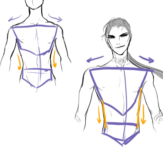
Again, it’s all about the shapes! Again, here’s a tutorial I did earlier on shapes you can use for bodies in case you missed it. As you can see, the key with triangle shapes is wider shoulders that jut out quite a bit, and are quite straight, with more narrow hips. Many overlook the fact that the waist is quite straight and indeed quite shapeless!
But again, bodies vary and so do “hybrids”. For example, the body shown above has slightly sloping and less wide shoulders, the waist curve in a little bit, while the hips are a touch wider. But note how the chest itself is still quite wide! Again, keep the focus on the chest. (Just don’t go overboard like this unfortunate 90′s drawing of Captain America…)

Now, if we compare it to the other version, you can see quite a drastic change in shapes. Notice the clear curve inwards for the waist, and how the hips have a big curve out, and the torso i is nowhere as wide as the triangle body. Notice how the shoulders go down and are much smaller compared to a typical triangle shape.
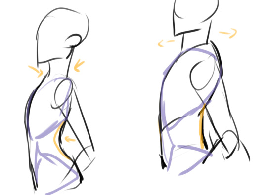
Just to quickly demostrate: these rules apply to the side as well. Notice how the chest is still in focus and wider at the top as a triangle body. Notice the the straight waist and the wider neck!
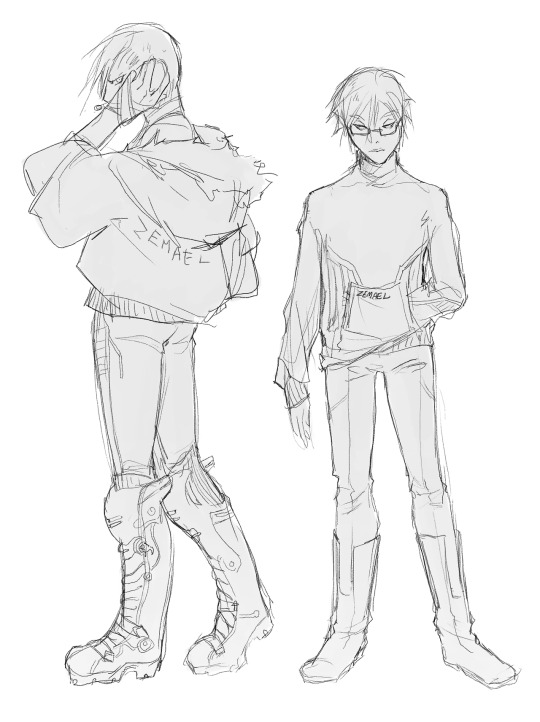
As for legs, I don’t really have a tip on “male” legs, really. I have two tutorials on legs in general here and here. As you can see above, they got different types of legs, with Roscoe’s (left) being bigger than Specs’s. I think the general tip I have is to not make them too round or the hips very big (as mentioned above) if you’re drawing a body with a triangle shape.
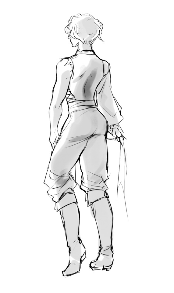
Here’s Rooi, a guy with an hourglass shape, for example! I’ll just stop it at there. ♥ Hope this was helpful! If you have any other requests with bodies, please let me know, especially if you’re looking for a specific type/shape! (I can’t cover all bodies at once, sadly.)
If you found this helpful or like what I do, please consider donating to my Ko-Fi! Thank you. ♥
9K notes
·
View notes
Note
Hi, Lana! Any resources for artists you wouldn't mind sharing with a newbie? (Links, websites, YouTube channels, tumbles, etc) I don't really know where to start when it comes to learning how to draw people
Hey nonnie, sorry for the delay of course you knocked on the right door ! or ask haha I wanna be as helpful as possible so I’ll link as many ressources as possible, add my own process with pictures (literally started a new piece just to screenshot my process lmao dedication) and I’ll add how I learnt to draw faces
it’ll be long so I’ll put a read more ! If you need more drop me an ask, I’ll try to assist as much as possible, I’m also still learning too !

Let me say first don’t worry about stylization yet, I know a lot of artists have their own style when it comes to drawing faces but you don’t have to have one right away, just start portrait sketching I like to call that profiling, find diverse faces you like and inspire you and try to reproduce them ! When I start I like to have a base as you can see below, I sketch a circle and then I place the eyebrow and from there I kinda know where goes what, some artists just go straight to the face shape but I feel less anxious when I rely on that you can too ! I drew Alana and i’ll post the final result after
Keep reading
264 notes
·
View notes
Photo
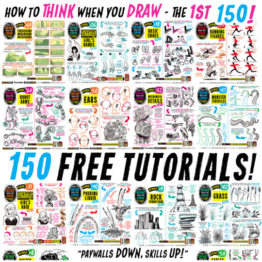
For those of you that like everything neatly organised, here’s links to EVERY ONE of my first 150 how to THINK when you draw TUTORIALS, in ALPHABETICAL ORDER for #SkillUpSunday! Enjoy, link, pin, share! Cheers! Lorenzo! How to draw ANGRY EXPRESSIONS How to draw BIRD HEADS How to draw BOOKS How to draw BOXES How to draw BREAKING GLASS How to draw BRICKWORK How to draw CABLES and WIRES How to draw CAR CHASES How to draw CATERPILLAR TRACKS How to draw CAVES How to draw CHARACTERS (3-SHAPES) How to draw CHARACTERS (FLIPPED-SHAPES) How to draw CHARACTER SHAPES How to draw COMIC COVERS How to draw COMPOSITION How to draw CROSS-CONTOURS How to draw EARS How to draw FABRIC How to draw FEET & SHOES How to draw FEMALE HANDS PART ONE How to draw FEMALE HANDS PART TWO How to draw FOREGROUND MIDGROUND BACKGROUND How to draw GAME BUILDINGS How to draw GEMS and CRYSTALS How to draw GIRL’S HAIR How to draw GRASS How to draw HAIR (1940s styles) How to draw HAPPY EXPRESSIONS How to draw HORNS How to draw HORSE HEADS How to draw IMPACT DEBRIS How to draw IN 3D How to draw INTEGRATING LOGOS How to draw INTERIOR BASICS How to draw IN-WORLD TYPOGRAPHY How to draw JUNGLE PLANT CLUSTERS How to draw JUNK HOUSES How to draw LAMP POSTS How to draw LAVA How to draw LIGHTNING and ELECTRICITY How to draw MECHANICAL DETAILS How to draw MUSHROOMS and FUNGUS How to draw MONSTER HEADS How to draw MONSTER TENTACLES How to draw MOUNTAINS How to draw NEGATIVE SPACE How to draw NEWSPAPERS How to draw NOSES How to draw PERSPECTIVE BOXES How to draw PIGS How to draw POD HOUSES How to draw POURING LIQUID How to draw ROBOT ARMS How to draw ROCK FORMATIONS How to draw RUNNING FIGURES How to draw SAUSAGE DOGS How to draw SEA WEED How to draw SHADOW COMPOSITION How to draw SHOULDER ARMOUR How to draw SIEGE WEAPONS How to draw SILHOUETTE THUMBNAILS How to draw SMOKE EFFECTS How to draw SNOW How to draw SPACE BIKES How to draw SQUIRRELS How to draw STICK FIGURES How to draw THE HORIZON How to draw TIKI STATUES How to draw TREASURE CHESTS How to draw TREE BARK How to draw TREE ROOTS How to draw VEHICLES How to draw VINTAGE PLANES How to draw WATER How to draw WOODEN HOUSES
93K notes
·
View notes
Text
HEY THIS IS IMPORTANT whats your favorite place to find drawing references?
214K notes
·
View notes
Video
youtube
How to draw a basic head construction
By REIQ
678 notes
·
View notes
Photo
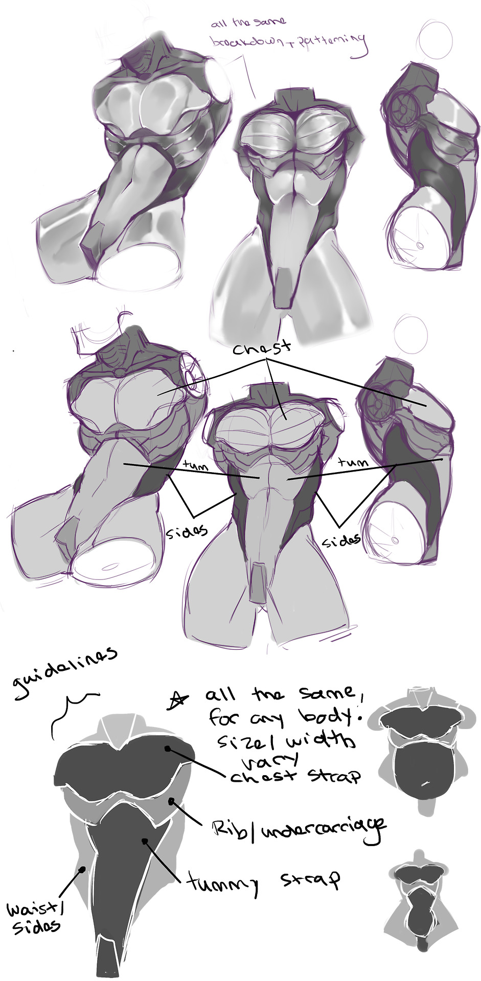
How I break down anatomy and make it mechanical while still looking organic/streamline in shape. These guidelines can be stretched, squished, pulled, and widened however you see fit. They will work for any shape, from big and squishy to thin and spindly.
You can ref from this where needed, I encourage you trace this image in your private/personal studies, just please refrain from posting the image if you trace from this!
9K notes
·
View notes
Photo
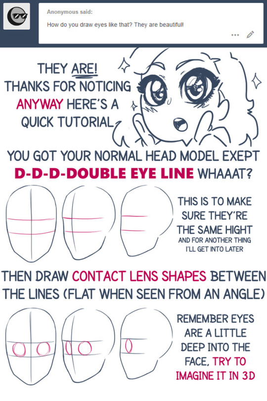
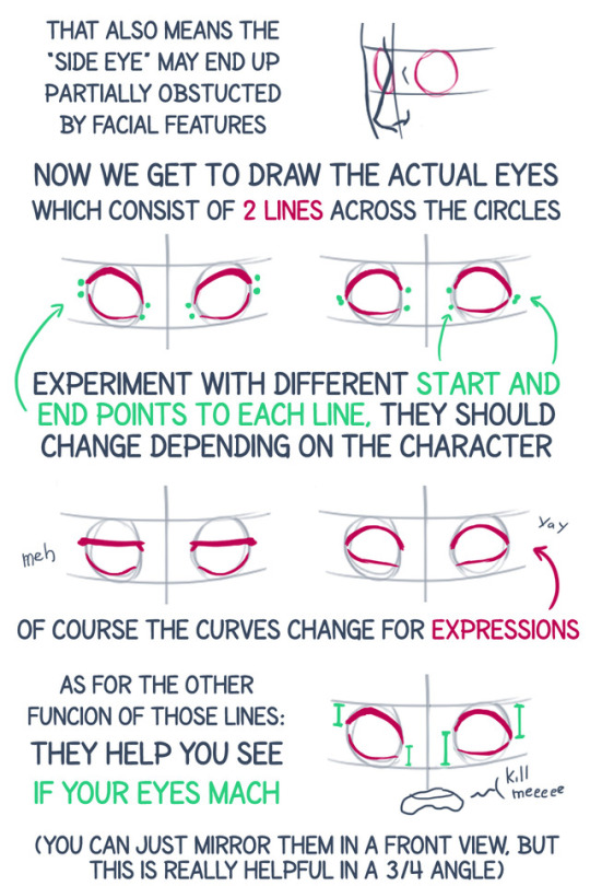
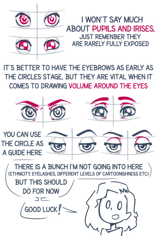
How I draw eyes
This is the thing I get asked about the most so here’s an honest try.
40K notes
·
View notes
