
Don't wanna be here? Send us removal request.
Statistics
We looked inside some of the posts by brandonappreciatesart and here's what we found interesting.
Average Info
Notes Per Post
1
Likes Per Post
1
Reblog Per Post
0
Reply Per Post
0
Time Between Posts
21 days
Number of Posts By Type
Text
5
Last Seen Tumblr Blogs


Fun Fact
Tumblr has 16.74 million mobile monthly users in the US.
Text
"Final Exam"
Below will be the documentation for my final project. In this documentation I have pictures of the materials that I used and how I put all the materials together in order to create the scene which I took a picture of and titled "The Noise of Ideas".


The picture below is the finished artwork titled :The Noise of Ideas"
Artist: Brandon Smith
Media: Photograph

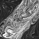
The photograph “The noise of ideas” is a visual representation of a man's ideals. The foundation itself, this being wood, is comprised of many colors and notches. It's a foundation that has much wear but is one that is solid. This wood shows how sturdy the foundation of a person's ideas is. The slight haziness in the middle of the camera shows how much a person has going on in their head and how sometimes the ideas themselves might not seem so concrete or even the direction of the ideas might be so clear, but they are ideas, nonetheless. The individual shoes represent different ideas. There are some ideas which have been forgotten or ones that have been given up on. However, there are others that have not been forgotten and that are still being worked on or entertained. One thing is clear Ideas are present but there is much noise present as well.
0 notes
Text
Virtual sketchbook 4
Writing Thinking and Looking Critique - Pollock had been studying under Thomas Hart Benton and would use the representational style in his own way, almost creating something of an idea or topic then subconsciously telling people how he felt. I believe that the abstraction which he had studied earlier is still present in his paintings. The base of his paintings has many abstract ideas such and I believe can be seen in the initial layers, many of which had various themes to them. He then covered over these themes removing all the images with his famous “drip paintings”. I believe what was mentioned before could be representation of a topic and the “drip” in the painting is how he felt subconsciously about the topic. His paintings always feel so balanced, and, in this balance, I believe he is ultimately describing how he feels. The various colors being emotions and subconscious thoughts, thoughts which he could not say but merely feel. It is in these various colors that we can maybe began to start to understand what was going on in Pollocks head at this time. It is no secret that alcohol plagued Pollocks life, and I believe the paintings helped him to get away from these thoughts. The various themes or brushwork in the beginning could be a topic or idea maybe brought by his feelings towards alcohol. But he would express how he feels with his “drip” work. It is in this work that he can ultimately escape the grasp that alcohol has on his mind. While he didn’t drink for a long time prior till his death, he most definitely had the topic of drinking on his mind. The “drip” may seem so primal, but it is just feelings of a man who cannot express himself with words. When people go to look at his work he says he should not try to be actively trying to find something, but to passively look at the work. All the chaos in the painting can paint a picture of what might be being said, literally. But if we look at one of his pieces of work with the intention of trying to find anything we won’t consider the raw emotions and subconscious thoughts which are present all throughout his piece of art.
2. Art Project - The title is, different but interconnected.
I use colored pencils in order to create this work on a blank piece of paper.

0 notes
Text
Virtual Sketchbook three
Title: Hermes Rescues Odysseus from Circa
Date: 1718
Artist: Giovanni Paolo Panini and workshop
Media: Oil on Canvas
The painting “Hermes rescues Odysseus from circa” is a renaissance painting made up of oil paints and was created in the year 1718 by the famous painter, Giovanni Paolo. The painting is approximately 51 x 63 5/8 in. (129.5 x 161.6 cm) and the frame of the painting is 62 7/8 × 75 1/2 × 2 7/8 in. (159.7 × 191.8 × 7.3 cm). There are warm colors which I see encompassing people, buildings, and the environment. Reds and oranges are used to create the people almost creating a sense of divinity in the painting, something transcending reality. A deep blue for the endless sky and light green for trees, some fleshy colors, for the bystanders, and non-divine people. Paolo used many straight and curved lines for grand buildings and terrain. Key subjects include Hermes, Odysseus, and Circa. Another subject Paolo would want to present would be protection and intervention; Hermes is holding a caduceus. The caduceus symbolizes protection, this could be his protection over Odysseus and intervention in this scene. The work has a mosaic balance to it. With your attention being drawn to the scene involving Hermes, Odysseus and Circa. Many triangular elements and mythological scenes are present. The colors and light are balanced, there feels to be a more weight on some figures making them the focus. While the painting is balanced, the scene is not balanced. There is emphasis on the hero (Odysseus's journey) and the trials he faced. Rhythm is emphasized in this piece of art between poses, shapes, and figures. There is a lack of unity in the scenes, the theme and composition blend nicely. There is also variety in the architecture and textures.
When I look at this painting, I feel a sense of awe. It is unbelievable how someone could paint something so marvelous many centuries ago. It also makes me have such an appreciation for someone who has these skills. I am curious to learn more about the story to the scene. The movement associated with this painting is the baroque movement. The painting was commissioned by Cardinal Alessandro Albani, the subjects being Hermes, Odysseus, and Circa. The artwork could talk about how Giovanni loved Greek mythology. The importance of this artwork to society is to not only showcase Paolo’s master skills. But to depict the how heavily influencing Greek mythology was to everyday life. This painting could be made to show praises to the Greek gods and to help show people the attributes you need in life, the attributes Odysseus had to pass his trials. Lastly, this painting is important ethical and moral lessons in Greek life that ordinary people should strive for.
Giovanni Paolo's Hermes rescues Odyessues from Circa

Proof of me at the Ringling Museum, Sorry that I didn't take a selfie I hope this counts.

Work Cited
Ferrari, Anna Maria. "Panini [Pannini], Giovanni [Gian] Paolo." Grove Art Online. 2003. Oxford University Press. Date of access 26 Oct. 2024,
Mann, Judith Walker. “Baroque Into Rococo: Seventeenth and Eighteenth Century Italian Paintings.” Bulletin (St. Louis Art Museum), vol. 22, no. 2, 1997, pp. 1–63. JSTOR, http://www.jstor.org/stable/40716181. Accessed 26 Oct. 2024.
Musem, Ringling. “Hermes Rescues Odysseus from Circe.” eMuseum, 1 Jan. 1970, emuseum.ringling.org/objects/23644/hermes-rescues-odysseus-from-circe?ctx=cdcd7c803751054092e57d5138c8e1258a3153e8&idx=0.
SCHEIN, SETH L. “THE ILIAD & ODYSSEY IN SOPHOCLES’ PHILOCTETES: GENERIC COMPLEXITY AND ETHICAL AMBIGUITY.” Bulletin of the Institute of Classical Studies. Supplement, no. 87, 2006, pp. 129–40. JSTOR, http://www.jstor.org/stable/43768114. Accessed 26 Oct. 2024.
0 notes
Text
Virtual Sketchbook two
Journaling:

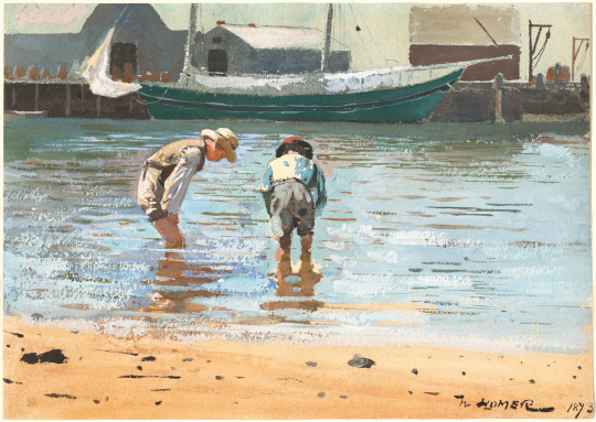
Writing and Looking: Title: Boys Wading by Winslow Homer created in 1873, this painting is in chapter 7, sub section 7.2 page 4 titled: watercolors
Homers artwork, Boys Wading contains watercolors, horizontal lines, which are used to emphasis the beautiful endless sky and reflecting water. Rule of thirds, the placement of the boys aligning with the horizontal lines I mentioned before. Muted colors, which convey a sense of calmness in the artwork. These colors include the blue water and green boat, they help to make the artist feel tranquil and calm. Contrasted colors, Warm hues which can be seen in the boys themselves and softer hue colors which can be seen in the setting that the boys are in. Reflections, of the lights in the water. Loose brushstrokes, which make everything feel so seamless and fluid, this is seen in the transition from the boys to the water itself. Central figures, the boys being the main focal point of the painting. Visual Harmoney, which makes it, so no element is more overpowering than another in the painting. Nothing draws your attention too much. A natural setting, A setting which you would find anywhere in the world. Homer likes to create very idyllic pieces of art and have nostalgic atmospheres. Lastly, tranquility This is the overall tone which is set to create a feeling of calmness and being relaxed. Obe thing that helps this is the gentle color pallet chosen.
Connecting Art To your World: Color has made me feel happier and content with life, friends, and family. Back in high school I would say that my color scheme then was one of achromatic. I would one only wear colors that would fit in this color scheme and two, I would always look at situations, decisions, and life as that. I would not think of all the distinct factors or colors that were around me and limited my horizon to what I thought was known. Then around the beginning of my senior year I met my best friend Geronimo who did not limit his decisions and life to just an achromatic color scheme. I remember after a couple of weeks of hanging out with each other we went to the beach with a group of friends. The sun had just begun to set and the colors I saw that day were like none other. The organeish pinkish sunset made me feel so content and so fulfilled in that moment. That there was more to looking at life than an achromatic color scheme. The hue of the sunset that day was something called a light coral hue. The sunset seemed to be highly saturated with color making everything about the sky pop out. The value of the sunset that day was very light so light that it changed how i would think and look at everything else in my life. The saturated intense colors that day came together to have such a fierce and bright intensity that pieced through the horizon and sky. If I had to pick a color scheme for my life today, I would pick a tetradic color scheme. You can get the best of both worlds when it comes to color, and you look at life in a variety of different lenses. None to focused on one specific thing but a variety and large diversity of things in life. Everything may be different, but it is somehow closely related to something else.
Art Project: Comic Panel: A story of unconditional love

Photo/Design:
Group: 6, Photography
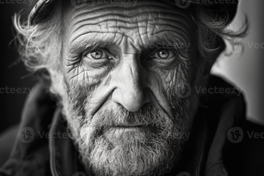
Black & White:
Colored:

The main thing that motivates the choice of the black and white photo is to show the life that person might have left in them. I think this is effective because it expresses the energy the old man has and how he might not have much life left and energy in him since he has lived for so long. The thing that motivates color is to show how much energy and youthfulness the young adults in the photo have. This is effective because it demonstrates a stark contrast to how much life the kids have to live and energy they have when compared to the old man seen before. The black and white photo has a feeling of something dying or coming to an end while in the colored photo i feel the exact opposite.
0 notes
Text
virtual sketchbook one
2. I got artwork number 15, titled, "The Gates" by, Christo and Jeanne Claude 1979-2005. Here are five facts I learned about the assigned art and artist.
The project "The Gates" took nearly 30 years to be realized since the idea was first conceived, the project lasted a period of about 2 weeks in New York's one and only Central Park.
There was a little over 7,500 gates spanning 16 feet tall and going on for 23 miles in all directions of Central Park's Walkways.
The pair Christo and Jeanne Claude met in Paris and were later married in 1959.They shared the love of complex and elaborate projects, that sometimes took years and maybe even decades to be realized.
The pair received the 1995 Praemium Imperiale award, which highlights extraordinary contributions for promotion in the development and progress of the arts.
The artwork was made so that it wouldn't change the environment that it is displayed through at all. For example, there were no holes drilled to make the steel for the legs in the gates.
3. Yes, absolutely, my perspective from the initial glance at this artwork has changed the more that I look at it. I do see something different now in the artwork. Initially I thought that the gates symbolized the perception of our environment how something such as a sidewalk can have such significance that is often overlooked by many. However, now I've come to think of the idea of "The Gates" as a passage of time. The project took decades before it was eventually realized and throughout this time there was much preparation in order to make this idea a reality. The "Gates" symbolizes the aforementioned passage of time, while the surrounding park tells a greater story. This being all the choices and decisions the artists needed to make in this passage of time.
Here is a photo of the artwork:

The painting I have selected is precious to me, not only is it one I enjoy but the painter Marcus Jansen is also my uncle, my dad's cousin. The painting is titled (decolonize #18) and was released (2024). The media used to create this work was acrylic paints on arches paper through the process called (monotype), using a gel pad to achieve the effect he wanted. Which is like works in the series called “Decolonize.” The art serves a use as a cultural enriching tool to find something unique that reflects contemporary times to our visual history purposes. I do think that this painting is beautiful, it is something my uncle worked hard to produce and shows his grit and determination for the arts. This gives me a sense of pride in this painting and his artwork. I also enjoy the meaning of the painting and how it literally paints a picture of colonial figures and the power and supremacy these figures had over that of many.

While I dug deep to find the baggage that has followed me in art. I bring along a very analytical and personal perception when I look at art. I try to find a sense of empathy in artwork. I feel that in life, especially today, people tend to not be emphatic towards each other and I have experienced this firsthand. This is why I bring the “baggage” mentioned before with me. I am 19 years old, the gender I align with is a male, I was born in New York but have grown up and been raised in Florida since an early age, I am ethnically mixed, my father being Caribbean and my Mother European. Additionally, for fun I like to go to the beach with friends and my family, especially to watch the sunset. I am a member of the FBLA and HPSC clubs at SCF (State College of Florida,). I work at a restaurant. Some things that I feel make me uniquely me is my passion for wanting to take care of my family which can be seen in how I am profoundly serious about finances at an early age (especially the stock market). I have been trading stocks ever since the day I turned 18. This has made me in a sense disconnected from material objects and monetarily needs. This has made me put more weight on family values and the needs of others before myself, most importantly their perspective.
In my daily life I am always so fascinated by the complexity of nature and how so many individual things work so well with others. Also, I am always so curious about space which is translated into my curiosity of people and their decision making. Lastly, the biggest thing in my daily life is the fascination to do better than the previous day. Here is a self-portrait which describes me.

1 note
·
View note