
Don't wanna be here? Send us removal request.
Statistics
We looked inside some of the posts by brcommer and here's what we found interesting.
Average Info
Notes Per Post
2
Likes Per Post
1
Reblog Per Post
1
Reply Per Post
0
Time Between Posts
6 days
Number of Posts By Type
Text
15
Last Seen Tumblr Blogs


Fun Fact
Tumblr was named as a finalist in Lead411’s New York City Hot 125 in Aug 2010.
Text
Week 15 - Final Thoughts
I see the future of design going a million different ways, seeing as it gone to places no one thought possible, nothing is off the table. One type of design I see is the increase of AI, and its move into homes. A prime example of this is autonomous cars, which are becoming more and more prevalent. Although Tesla was one of the first to bring it to the mainstream, autonomous driving is in the near future for brands such as Volvo, BMW, and Mercedes-Benz. The technology for these designs isn’t exactly perfect yet, but as time goes on I believe there will be a huge emphasis on getting it to work perfectly. Another direction I see design going is minimalist and modern. So many designs used in everyday life have been updated to stay with trends. Things like blenders, coffee makers, and fire alarms, have all been updated from clunky looking designs to sleek, minimal, and modern designs that almost could be a piece of art. I believe this is partly because the technology in these devices has changed over the years, allowing them to be smaller and simpler. Another reason is because the current “modern” design trends are these sleek minimal designs, that feel “high-tech” and new. Finally, the design trend I believe we are in now is the shift of everyday designs to smart technology. Door locks, light switches, and doorbells are amongst the first few designs to get the “smart treatment.” These designs can be controlled by a smart device, and oftentimes solve problems. These allow you to make sure you locked the door when you left, or can turn on your heat before you get home from work, without having to be there to do/see it. This shift is slowly creeping into designs like refrigerators and cars. The market seems to be large, and these designs are part of an ongoing growth in technological innovations, which is why I believe there will be a huge emphasis on them soon.
0 notes
Text
Week 14 - Your Choice
One aspect of design, specifically graphic design, that I notice is how similar things are becoming. This is typically seen in packaging and rebranding. Although I love minimalism, I believe there is a time and place for it, and not everything has to be minimal to be modern. The Tropicana orange juice rebrand is an example of this.
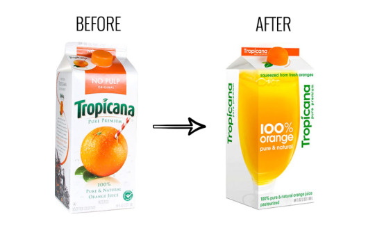
Their branding was recognizable and unique, and the choice to shift to a sans serif font and minimalist artwork didn’t work well. Although I understand the need they felt to keep up with similarly designed products on the shelves, keeping the integrity of the brand (the red and white straw) is more important. This is something I think about a lot as a designer, I don’t want to be the person who comes into a brand and “modernizes” it by making the packaging more minimal. There has to be a point where one can say, “this is good the way it is,” that decision would definitely be hard, but could pay off in the long run.
There isn’t one design that I feel has especially captured my attention, because, almost every design has caught my attention. Thinking about the process that goes into each design, and who the first person who designed it was makes that item even more interesting. The dresser in my room, for example, that underwent testing and redesigned to make sure it not only looked good, but also worked well. Taking a moment to notice the small things that may go unnoticed is something that this class has taught me.
0 notes
Text
Week 13 - New Media
The digital aesthetic is the aesthetic style we are currently in, which is very minimal and textureless. This aesthetic can be seen nearly everywhere; packaging, logos, websites. I believe this is so popular at the moment because they help the viewer get straight to the point while still making it light hearted and fun.

This style of illustration is incredibly popular and can be seen in many tech companies apps

The Apple logo has changed to fit with the times, eventually becoming this very flat and minimal logo

The Instacart website is an example of having a warm and welcoming website, while still making the information the most important aspect
0 notes
Text
Week 11 - Graphic Design
A citizens designer is a designer who, rather than creates designs for clients such a logos, they make designs that tackle current problems. These could range from HIV/AIDS to climate change. They also often times take note of issues with consumerism. This idea is relevant as it goes to show that designers do not have to be closed into one box. I think that when people hear “graphic design,” they think of the people who create logos and make websites. When, in reality, they can do almost anything. With any art form, artists can create art for fun, decor, business, but also for change. Infographics are an element of art that can be used for good, they can be posters that tell when a protest is, or show the amount of emissions a factory is putting out. In any case, they are important. This ties back to the idea of citizen designers, who make designs for change.
0 notes
Text
Week 12 - New Media
One field that has an impact on interactive design is social media. This is a field that is constantly changing and getting new features, so making sure the interactive design is intuitive is essential. This is a relatively new practice for interactive design, but has quickly become a pioneer of ux design. Another field is cars, specifically the technology inside of them. The screens in cars have several uses, but they also need to be quick and easy to look at while driving. Keeping a simplistic layout for interactive design in cars is crucial as the driver’s safety could be at risk. Some cars more than others have kept their in-car technology to a minimum, relying on physical buttons to change things such as volume and the air system, which allows for quick and intuitive access. In cars such as Teslas and Volvos, a majority of controls are on screen, so the designer who laid out the displays had to make sure they were quick and easy to use. The final field that has an impact on interactive design is televisions. With new technology coming out every year, it can be hard to keep up with the features that one’s tv has, so keeping a relatively simple interactive design interface that doesn’t change too drastically is important. Another reason why interactive design is so important is because for many people, finding what to watch is hard, and with so many options, it can get overwhelming. Keeping a clean and minimalistic design helps the user find what to watch, without having to focus seeing their options.
0 notes
Text
Week 10 - Graphic Design
The first idea I found very interesting in the readings is the opportunities ink printing created for type in the 19th century. This was when sans serif was first invented, but it also allowed for very ornamental type to be created in ways never before. On page 47, figure 1.25 shows a type specimen sheet that has several different styles of type on it. There were 3 dimensional, decorative, bold, and several more styles that were created, something that is used less commonly today. Another idea I found interesting was the section on Bauhaus type. Although developed in the early 20th century, it still feels incredibly modern and new. It feels this way because many of the fonts created at this time are still used today, such as Futura. Finally, an idea that was fascinating to me was MoMA’s hiccup with their logo. Because the type they used was scanned into the computer to only be used in small forms, it had imperfect proportions. Using this font as a reference, the designers then created an entire typeface with improper proportions, making it unusable for large scale situations such as a logo. This was interesting to me as it feels like a problem that sounds foreign today, seeing as so many fonts have been perfected on computers for years.
0 notes
Text
Week 9 - Industrial Design
Milwaukee fits in to the history of industrial design mainly because of the industrial designers from here. The MAM website states that most industrial designers were in New York City, Stevens’ choice to stay here helped us fit into the history of industrial design. Brooks Stevens Industrial Design’s location in Milwaukee interlaced the city with industrial design because of what designs were created here. Objects like the Miller High Life carrying case and the Oscar Mayer hot dog truck are inventions designed in Milwaukee that are still being used today around the country. Stevens’ decision to stay, because it was, “where the business was,” helped bring Industrial design to Milwaukee.
0 notes
Text
Week 8 - Industrial Design

Street Light

Candle

Water Bottle

Phone

Hammer

Clock

Car

Chair
My microwave is built into the cabinets and is shaped like a drawer. The outside is steel and glass, while the inside is black plastic. The controls are concealed in a panel that flips up and down to be hidden when not in use. The buttons respond to touch rather than pressure and there is screen indicating time. On the inside there is a glass plate on rollers that spins when in use, rotating the object it is heating up.

Sketch of a dish soap bottle
0 notes
Text
Week 7 - Architecture
Simple & Intuitive Use - use of design is easy to understand, regardless of the user’s experience, knowledge, language skills, or current concentration level. My computer mouse is a good example of this, it is as easy as plugging in the connector, and turning it on. While using it, the buttons are intuitive, and require little to no concentration to use.
Low Physical Effort - the design can be used efficiently and comfortably and with a minimum of fatigue. Cellphones are a great example of this. Everything you need requires just a tap and your finger to move a few inches max to get there. They fit comfortably in your hand and in your pocket/bag, making it very easy to bring with you.
0 notes
Text
Week 6 - Architecture
Architecture in Milwaukee has a plethora of styles that ranges from Neo Gothic to Art Deco to Modernism, amongst others. Looking at the skyline today, many buildings such as the Northwestern Mutual are very modern. However, one can still spot Art Deco style buildings such as the Wisconsin Gas Building. A majority of other styles and influences can be seen in churches or other religious buildings like the Trinity Lutheran Church.


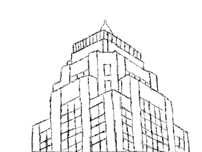
Sketch of roof of Wisconsin Gas Building
0 notes
Text
Week 5 - History of Design
Bauhaus Ausstellung by Fritz Schleifer on page 222 reminded me of the minimalist style I see everyday, whether it’s a logo or wall art, many things I see are minimally designed. An example of this would be the the Apple logo

Futura Typeface by Paul Renner on page 232 stood out to me because it is a font that is used in several logos that we see everyday. These include; Bed Bath & Beyond, Discover, and Calvin Klein amongst others.


Zephyr Clock by Kem Weber on page 261 stood out ot me because this piece seems like one that is being recreated today. The mid century modern style is incredibly popular in interior design at the moment, and this clock is a perfect representation of this style and how many people want their homes to look.

1 note
·
View note
Text
Week 4 - Found Object
While on my walk, I came across several mailboxes, but there was one that stood out to me. Rather than being on its own post, or a slot on the door, it was a box attached to the house. This mailbox appeared to be made of medal, and was mostly black, with a large bronze emblem on the front. The door to open the box was on the top, and was placed conveniently by the door, to allow for easy access. This design reminded me somewhat of a rod iron railing, not aesthetically, but physically. It appears that the mailbox was made out of iron, and had a very heavy bold look to it. This made me think of other objects that have a heavy look, and immediately thought of a railing. To me, many people want rod iron railings not only for their looks, but also their strength, and this mailbox seemed like it would be very strong and durable.
0 notes
Text
Week 3 - History of Design
Desk Lamp
Egg Carton

Toaster Oven

Soap Pump

Washing Machine

Stationary Bike

Space Heater

Metal Straw

Computer Mouse

My remote is made up of plastic and rubber on the exterior. The body is a black rectangular shape that is rounded on the bottom, and has rounded corners. On the top of the remote, there is a small light that turns red when any buttons are compressed. The buttons are mostly circular and ovular, but there are a few at the top that are square. These buttons do not get pressed as much, as they are the “input” and “info” buttons, among others. On the center of the remote there is a large circle button with a smaller one in the middle, the large circle makes up the scrolling buttons, while the smaller one is the “select” button. At the bottom of the remote, there are red, green, yellow, and blue buttons. These control the DVR settings.
0 notes
Text
Week 2 - Design Thinking
Design is such a broad word that it’s hard to pinpoint exactly what it means. To put it simply, I would define design as a method of creative problem solving. In order to design, one must use design thinking. “Design Thinking,” taught me that design thinking is, “innovation [that] is powered by... thorough understanding,... direct observation, of what people want and need in their lives and what they like or dis-like about the way particular products are made, packaged, marketed, sold, and supported,” (Brown). What stood out to me, is the the idea that designing comes out of what people need and want in their lives. This was significant to me because it almost feels like designers could be thought of as public servants that make your everyday life go a bit smoother, and you might not even realize it. The way your coffee maker makes coffee in the morning, or how your computer fits perfectly in your backpack on the way to class. These were thought of by a designer, and they might not be noticable, because they just makes sense.
A product I use everyday that most obviously design thinking for every aspect of it is my car. From the placement of the volume controls, to the shape of the headlights, everything about this car was meticulously thought out to solve the needs/wants of the customers. Another product that I use is a mug. Mugs are such a simple design and they have existed for who knows how long. The idea that one can enjoy a hot drink without burning their hands is genius and it came out of necessity. This leads to the idea that if design is well done, it will feel seamless and like it was meant to exist.
0 notes
Text
Week 1 - About Me
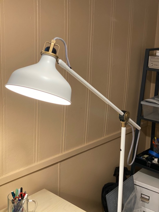
Hi! My name is Ben Commer and I’m a second year DVC student here at UWM. I was born and raised in Milwaukee and am fairly new to design, but I’m excited to expand my knowledge on the subject! I took this class to learn more about what makes design, design. I don’t know much more about it other than the fact that it’s a form of art and that it solves visual problems. My experience in design is fairly limited, I’ve taken Art-118 and did some simple graphic design projects in high school, but that’s about it. I try to practice as much on my own as I can and I like to learn new skills from the internet. I get inspired by seeing the possibilities of what others can do. I love going to the store and seeing a product with great packaging, or going on a website with a very professional interface. It makes me realize what I am capable of and what I like to create. I am also greatly inspired by music; I love listening to music when creating. I believe that listening to music can help set the tone for what I am about to create. The last thing I purchased where design was a factor was a desk lamp. I wanted one that was not only practical but also aesthetically pleasing. IKEA has a massive selection of lamps, so I had to find the perfect balance of what looks good and what I needed.
1 note
·
View note