
Don't wanna be here? Send us removal request.
Statistics
We looked inside some of the posts by breilamia and here's what we found interesting.
Average Info
Notes Per Post
0
Likes Per Post
0
Reblog Per Post
0
Reply Per Post
0
Time Between Posts
4 days
Number of Posts By Type
Text
17
Last Seen Tumblr Blogs


Fun Fact
Tumblr Inc. has $15.1M in annual revenue.
Text
Final reflection -
This project opened my eyes to many new design skills, pushing past learned barriers. I got frustrated with my limitations and blocks and had to take many steps back to reassess. This taught me to persevere and make sure you are looking at things from the right angle, so as to not burn myself out. I enjoyed exploring a topic I am passionate about and making that come to life in a way that came across well to my audience, the young men of Gen Z. I tried to design my campaign in a way that would appeal/relate and be easily digestible. I struggled with typefaces and incorporating text into the zine that related and worked in a good system. If I could do it again, I would ensure I nailed the type down first so I could feel confident about it. Overall I am very pleased with how it turned out, I feel it is well thought out and conveys my message successfully with depth while being visually appealing, I am proud of my photography.
0 notes


Text
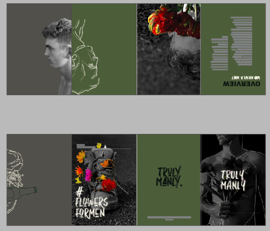
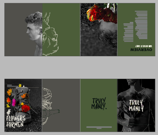
Printing Zine -
final zine and poster before printing process and after, in order -


Printing edits:
I went into uni today to print my zine, I knew this was going to take multiple tries and wanted to test print 1st to see if I needed to alter any colours that may potentially come out darker than I intended. This did happen and I lightened the greyscale in the photography elements with brightness, bringing each of them up “39,” as well as the green and grey backgrounds, even the dark green type. After making these edits and printing again I was so happy with the outcome and thought that was all I needed to do before I noticed a few other errors.

I made sure to fold my practice zine before I left, this let me see that I had forgotten to flip the facing faces and the stats on them! I was going to flip both images before noticing the illustration matched up with the neighbouring photograph and its illustrated hair. I thought this linked all three frames and was a good way to keep a story going throughout my zine.

The last change I made was going back through one last time with a thorough look and realised I had focused too much on making sure the logotype designs and headings were all cohesive and hadn’t looked at the body text or subheadings. Both of these head mismatching full stops and actually unfinished sentences which I had meant to go back to. So I’m very glad I caught those and now I have finished my physical zine!
I also edited the post’s green text to match the green backgrounds on the zine to make sure everything is cohesive
I am so happy with how it has turned out it’s exactly what I envisioned it to be with a few little errors concerning the folding, even though I made sure to fold all my practices beforehand I still have slightly overlaying pages when you fold the zine into a booklet. However, I do not feel it is a major and is absolutely the best that I could do even if I had done it again. Overall the printing process went very smoothly and I feel very satisfied with how this day has gone.
final printed zine and poster in the next post -
0 notes
Text
Final feedback -
I went into class this week to get some final guidance on the visuals of my zine and process workbook, this consisted of:
Left-aligned text - difficult to process?
my solution: I feel the left-aligned text works well with my zine layout, adding a bit of interest and is also best position-wise to not cover my photography but still display important information. So, I have added drop caps where the reader should draw their eye to to prevent confusion.
Consistency with titles/logo and font spacing:
my solution: I have now made sure all my fonts are consistent within each other capital, punctuation and size-wise. They were also different spaces away from each other so I made sure to go through each heading, subheading and body copy to make sure they all matched up by adding master text layers.
If you want the arial black, add it into the zine largely to make sure everything is integrated.
my solution: - “What is truly manly and why does it matter” ( instead of 'overview.') across the first and second page in Arial black.
break up the chessboard effect with a background colour
my solution - use a red that relates with the flowers, breaking it up while bringing it all together so it looks cohesive.
hero one stat?
I’ve heroe'd the second stat because it’s the cause of the surrounding ones, so I've made the others in the same font and sizing and separated the middle - mixing up the font and sizing to keep an interesting look as well.


0 notes
Text
Week 12 - edits
after making those edits, I came out with this below. I feel it has made it much tidier and has taken use of the space better, leaving it more open. I think I am heading in the right direction.

0 notes
Text
Week 12.1
Today we presented a couple of current pages of our project document and current zine.

I again got a lot of helpful feedback that has allowed me to make some connections in my head about my work, and am now very excited to apply it and tidy up the message of my work in the zine.
the feedback and my takeouts:
Illustration can be a transition, faces facing each other, manly boot to ‘feminine’ boot. - young men coming into themselves/morphing - communicate why, give a reason for the illustration.
Maybe Overlay laces and hair in other photographic elements with illustration - buried self/half-formed self
Typography layout, margins? One column? Left aligned?
Don’t cover the image, one column on the boot page
Stats creates a random outcome
Legibility of text
A page for just photography and colour on project document, have columns
Create a grid on the zine
Face is with stats to create personal relation to them.
0 notes
Text
design systems explanation -
contrasting black and white with colour photography - I am using black and white on the masculine deemed object or man, and colours on the typically feminine flowers. This is to represent the
illustration: I am using line work illustration for two reasons. One, because it enhances the raw and authentic feel that one of my typefaces does and would hopefully resonate with the young men seeing the campaign that the communication is human to human, giving them another thing to relate and feel at ease with. two, the positioning/actual line work imagery represents another version of themselves, the more 'feminine' in line with my story, that is only a shadow/not a complete self. The buried side adds to my message of boys not being able to show emotion in NZ society.
0 notes
Text
Week 11.2 -
We did an exercise during class of sketching a plan as to how our campaign would gain awareness if it entered the world. This helped me visualise a solid realistic process and reinforce who my audience was and why because of where I would 'advertise' my campaign. ( Young males, typically masculine jobs etc)

0 notes
Text
Week 11 -
Over the past week I have worked on a base for my zine, the second image is what I came into class with.


After feedback:
Too many directions
What assets work for the campaign not for me
The colour settings are basically the same for each image
Photography, illustration, both, is one system - flower and boots is another but is lighter
Is giving a dark feeling right now
Set masters and paragraph/ text styles to help keep everything together
Dropping line work because it doesn’t do anything for my work- actually crowds it unnecessarily & makes it look a bit too trendy
---------------
I edited multiple images and tried to narrow down my asset's direction. Starting with the front page didn't match the message of contrasting feminine and masculine or the rest of my photography so I ended up with the last image as it matched better. Also slightly moving the line work because it signifies that your second self is different to the one you present -


I decided to run with the idea of using manly things, the boot and literal image of a man, contrasting with feminine flowers and incorporating illustration as a' shadow self.'
With this, the colour palette changed. Looking at my work, it wasn't in line with the message of support and didn't have a welcoming atmosphere but rather just depressing. Working around the black-and-white contrast levels of the boot image and the pop in the flowers, I changed the colour palette. Aiming for a lighter, calm and inviting but still important vibe.
Using the feedback I created a new feel that fell in better with my original idea and has calmed my brain down a lot, I feel the connections are better defined so far.
This is my current work with multiple layouts so I can just see, as I've done an accidental chessboard effect I'm not fond of.


systems:
contrasting colour photography
masculine & feminine
cutout photogtsphy on coloured background
illustration line work
type
0 notes
Text
Week 10 -
Raul gave me some feedback regarding the standstill I was having with my type and its placing/sizing. Typography has never been my strong point nor something I enjoy so it was good to have a push in the right direction. I played around with multiple new layouts - still wanting the fonts I had previously picked out. I used it to fill up space and take charge of it in different ways that gave different atmospheres - more mature etc.


Eventually, I settled on this because I felt it took charge of the space confidently but without overwhelming the poster and also had colour matches for the logo text.

0 notes
Text
Other iterations & final edits


final edits:
after printing out my final I realised the colour matches weren't the same on the computer vs paper. So I've lightened the focal points on the poster so they come out correctly. This as well as the edits from the feedback -

0 notes
Text
WEEK 8 SDL & WEEK 9 FEEDBACK
For our week 8 SDL we were asked to create four a3 pages of the work we have currently done describing where we were at. Over the weekend I did a photo shoot from which I created several final posters and content for the rest of my zine. I also created iterations of my overview page. This is so I could lay out how I want my text to look and can set the tone for the rest of the type pages.
Firstly with the overview page I just slapped on the text that would be going on that page and put it in a hierarchy with its fonts from my previous research. Moving on I started to play with the colours from my colour palette on the text as well as getting a feel for what placement felt right. On the third page I made the text paragraphs smaller and moved them to the right slightly away from the headings. It was here I realised that the colours that were supposed to represent my tone of being calm and watered down actually gave it an immature and too much of a light/ happy feel. So in the fourth, I colour picked a dark green from the stems of the flowers in my photo shoot to tie everything together and give it more of a personal feel. also bringing in my elements of illustration and line work to box everything in and follow my design systems.


With the photo shoot initially I put them into black-and-white from colour because I wanted to give that deep feeling. what I found was that this went in the complete opposite direction of what my type page did and felt too depressing and mature for my target audience. So, I played around and opted for leaving the image in colour & having a black background, putting in a green tint over the image & lowering the saturation so it low key but appealing. I didn’t quite like this so then I tried making only the flowers in colour and the rest black-and-white. I did this to highlight the metaphorical aspect of my campaign, which is the femininity of flowers, representing typical feminine traits and how the balance of that with masculinity is what will allow a man to be emotionally healthy: that feminine traits of emotion shouldn’t be considered just feminine & weak for men to portray. I really liked this. With text I played around with the hierarchy and spacing, realising I didn’t want my work to look too cluttered for a main poster. I made a lot of iterations with the feminine type before deciding to scrap that in the last poster because it just didn’t make sense and wasn’t continued throughout my work. Opting for the raw, hand drawn text to add a unique look as well as represent the campaigns authenticity.


My feed back week 9: was to altar the spacing with be a man?, make the flowers the focal point with being even more vibrant and attempt to edit the capitals and lowercase because capital writing consistently is hard for our eye to digest.
I wanted to explain why I use illustration also, because I feel it adds to the raw authenticity from being human to human and gives an extra relatable aspect for men with flowers because they’ve drawn before even if they haven’t received flowers. I also feel it gives an interesting look to the campaign that it would be missing.
Photoshoot snippets:


0 notes
Text
week 8.2 -
I was also happy to see that I already organise my work with folders within folders which is what Raul suggested we do. I always felt that this keeps my mind organised and allows me to work efficiently with breaking sections up.
0 notes
Text
Week 8.2


Today I figured out how to order and set up my zine, what software to use (InDesign) and planned out how I could make my campaign represent my message with my assets.
my next step is to do a photography shoot to have more assets for my zine.
0 notes
Text
Week 8.1 - Next step/where I'm at
After listening to the lecture I took some notes planning how I could begin to lay out and create my zine for the campaign and a few of the things I now need to begin doing to make the steps in the right direction.
During class, we did a messy task, to create visual assets which is what this week is all about. I thought of some more design aspects that I could incorporate but feel my next step is to bring everything I have researched and designed already together and see how I can move forward and change from that -


I tried my luck with painting after getting inspiration with the smudge effect from the presentation at the start of class - I am not the most skilled painter and decided that I wouldn't go down the paint road. This is because I would replace the illustration elements with that so the system was cohesive and didn't have too much going on. And frankly, I don't like it or feel it was really doing anything for my work. It was fun though, it would have given an authentic feel to the campaign. I will be creating the smudge effect digitally.
0 notes
Text
Proposal document & reflection -
Within this document is a collection of research, generated assets and my thoughts on the process and purpose of each element going into the campaign.
So far I have thought out how I want my campaign to appear visually and what content I want to talk about throughout. This with colour, assets, atmosphere and research. I want to further my ideas with the social media idea of #flowersformen and get to designing the inside of my campaign. I will need to conduct more research for this.
I am excited about where my campaign is going, and how I can add more depth. I want to narrow down the collected information I have, and will continue to collect so that I can convey my message effectively. At the moment I am feeling overwhelmed with the ideas and specific information. I tried to keep on top of my time management this first half of the semester and did the work, but realised I spent too much time perfecting my initial thoughts and illustrations when I should have slapped everything I was thinking of drawing, taking pictures of or my ideas for research down and then refined. However, I am proud of the photography route I am taking and the purpose behind each element I have nailed down and think I am going well with representation and my thought process.


0 notes
Text
further design
based on my inspiration I created a final poster draft and some more sketches and digital illustrations.


0 notes